|
| Group |
Round |
C/R |
Comment |
Date |
Image |
| 1 |
Jul 21 |
Comment |
I like the image, sharp and composed, with the ocean waves hitting the shore. The detail on the rusting track, shows it age. Good job. |
Jul 4th |
| 1 |
Jul 21 |
Comment |
Dennis, I see to much sky. My only suggestion ,would be to crop some of the sky out. |
Jul 4th |
 |
2 comments - 0 replies for Group 1
|
| 14 |
Jul 21 |
Comment |
A nice image and cropped nicely . I agree with Tom I would prefer to see it in color. I feel it would make the image POP. |
Jul 5th |
1 comment - 0 replies for Group 14
|
| 16 |
Jul 21 |
Comment |
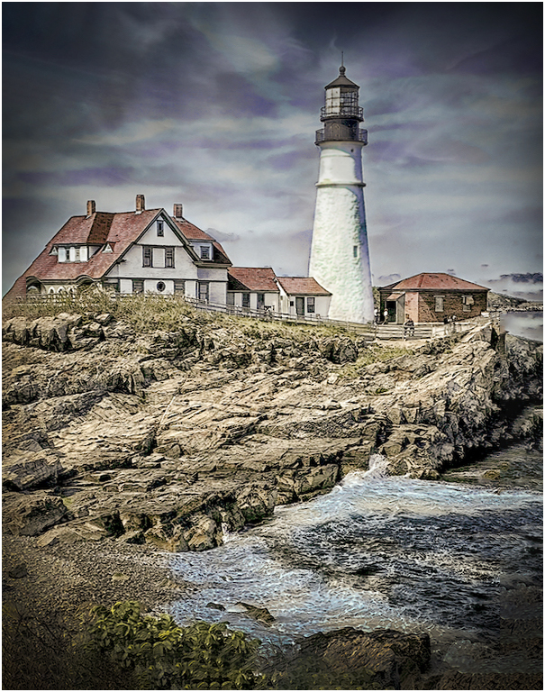
Hi Terry! A very nice image, I liked what you did with the sky. My only suggestion would be to straighten the image (it's tilted to the left a little bit) As you darkened the sky, I would add a little mor contrast to darken the rocks more. |
Jul 5th |
 |
| 16 |
Jul 21 |
Comment |
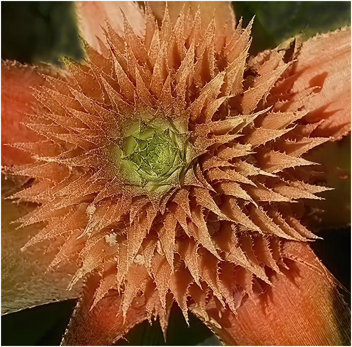
very nice image, I like the coloring, but I feel it should be cropped closer. As I look at it now my eyes goes to the Green, before the flower. What I did was a tight crop of the flower and darkened the Green leaves. I also added a small white frame (3pix) around the image, which, I feel brings your directly to the center of. the flower. |
Jul 5th |
 |
2 comments - 0 replies for Group 16
|
| 22 |
Jul 21 |
Comment |
I agree with most of the comments. With the background you have uses, and the props not moving, it look like a model plane you placed on this background. I used the photoshop "sky" program and selected a Sky. Even though The propellers aren't moving, it looks like a real plane flying. Beside the background you used, you did a great job |
Jul 6th |
 |
1 comment - 0 replies for Group 22
|
| 25 |
Jul 21 |
Comment |
The flowers are lovely. I would suggest that you should run the image through De-noise and Sharpen, I would remove the flower behind the green leaf or darken it(between the flowers at the center) , as well as the flower at the bottom on the left side. This is what I came up with. |
Jul 10th |
 |
1 comment - 0 replies for Group 25
|
| 26 |
Jul 21 |
Comment |
Bob, all I can say is GREAT IMAGE. Sharp as a tack and a nice background color for the Dandelions. |
Jul 6th |
| 26 |
Jul 21 |
Comment |
Mervyn, a very nice black and white image. Have you tried removing the dark branch in front. My eye goes to that branch before looking at the building beyond. |
Jul 5th |
2 comments - 0 replies for Group 26
|
| 29 |
Jul 21 |
Reply |
You did a great job on this image. |
Jul 16th |
| 29 |
Jul 21 |
Comment |
Hi Bill.
I like it, the colors are fine as well as your crop. I feel the image could be bighted a little. I put the image Topaz De-noise, lightened the image a very small amount an added a small white frame around the image, which draws your eye into the image. good job |
Jul 7th |
 |
1 comment - 1 reply for Group 29
|
| 30 |
Jul 21 |
Comment |
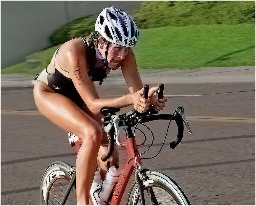
i like the image and the expression on her face, as see peddles on. I do feel the person on the sidewalk and the runner should be removed. The subject is the bike racer. |
Jul 7th |
 |
| 30 |
Jul 21 |
Comment |
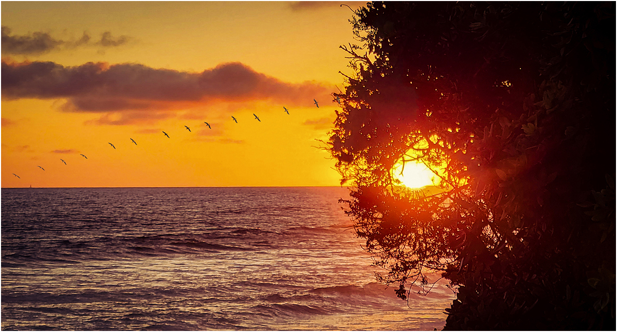
A nice image, I like the colors and mood of the image. My only suggestion, as you can't see where the image starts or ends on the right side, I would add a small frame .(3pix) |
Jul 5th |
 |
2 comments - 0 replies for Group 30
|
| 33 |
Jul 21 |
Comment |
Hi Marilyn,
I like your image, color is great. My only suggestion is. there is to much dead space at the bottom. If you crop some water from the bottom, it will bring the raft closer. |
Jul 7th |
 |
1 comment - 0 replies for Group 33
|
| 42 |
Jul 21 |
Comment |
thanks for your comment |
Jul 9th |
| 42 |
Jul 21 |
Comment |
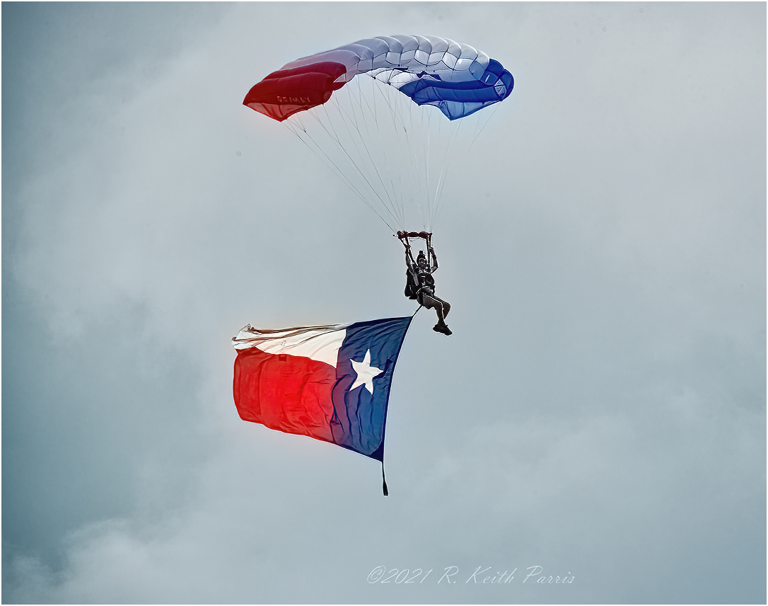
Hi Keith,
I like the shot. sharp and in a nice clear sky. The jumper must have been a good distant away, as you were using a 500mm lens. The only suggestion, I feel you just have more sky, than needed. I cropped the image, which brings it closer. |
Jul 8th |
 |
| 42 |
Jul 21 |
Reply |
That's what it is. |
Jul 7th |
| 42 |
Jul 21 |
Reply |
your welcome |
Jul 7th |
| 42 |
Jul 21 |
Comment |
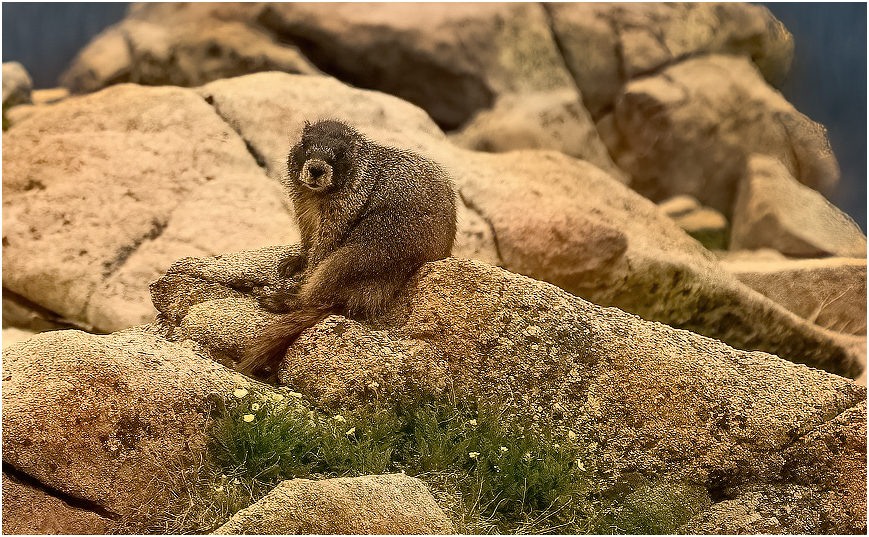
Sarita, A nice shot of the Marmots and the flowers on the rocks in front among the rocks. My eyes go to the out of focus rocks behind the Marmots. What I did was crop the picture from the top and right side. I then darkened the out off focus rocks, and it seems to help. What do you think? |
Jul 6th |
 |
| 42 |
Jul 21 |
Comment |
Hi Heather! I liked what you did, it's different. My only suggestion would be to remove that little branch sticking up from the center of the flower. My other suggestion, is to change the color of the border. My eye goes to the flower and boot and then to the border (color). I removed the little stick and went to a narrow (3pix) White border. This is what I came up with. |
Jul 6th |
 |
| 42 |
Jul 21 |
Reply |
Thanks for your comment, usually the sand is a light brown. It looks like it came from the beach at the ocean. Most of the sand from the waters edge looks this color. It had to be trucked in and dumped on the building floor, so that they could build it on the convention floor. Most of the sand castles are put together outside in open air, The Florida Sun dries it out fast, and looks like the regular beach sand. |
Jul 4th |
| 42 |
Jul 21 |
Comment |
Very nice, sharp image. The colors are great. I would suggest that you tone down the green or blur them out a little. If you tone them down a little your eye would go directly to the flower and the green would blend in with the background. |
Jul 4th |
| 42 |
Jul 21 |
Comment |
Very nice, sharp image. The colors are great. I would suggest that you tone down the green or blur them out a little. If you tone them down a little your eye would go directly to the flower and the green would blend in with the background. |
Jul 4th |
| 42 |
Jul 21 |
Comment |
Very nice, sharp image. The colors are great. I would suggest that you tone down the green or blur them out a little. If you tone them down a little your eye would go directly to the flower and the green would blend in with the background. |
Jul 4th |
| 42 |
Jul 21 |
Comment |
Nice sharp image. I don't know is the Moose is saying " She's taking my picture" or "should I go after him". You caught the sparkle in her eyes. Very nice shot |
Jul 4th |
8 comments - 3 replies for Group 42
|
| 48 |
Jul 21 |
Comment |
A very nice street image, but I feel it could use some more cropping. I would crop the man out on the right side and the Stone on the left side. The image looks sharp and the colors look fine. |
Jul 4th |
 |
1 comment - 0 replies for Group 48
|
| 53 |
Jul 21 |
Comment |
Very nice image, it tells a story. My only suggestion, would be to tone down or remove some of the white spots near his hand on the right side and a couple more spots on the image. |
Jul 10th |
| 53 |
Jul 21 |
Comment |
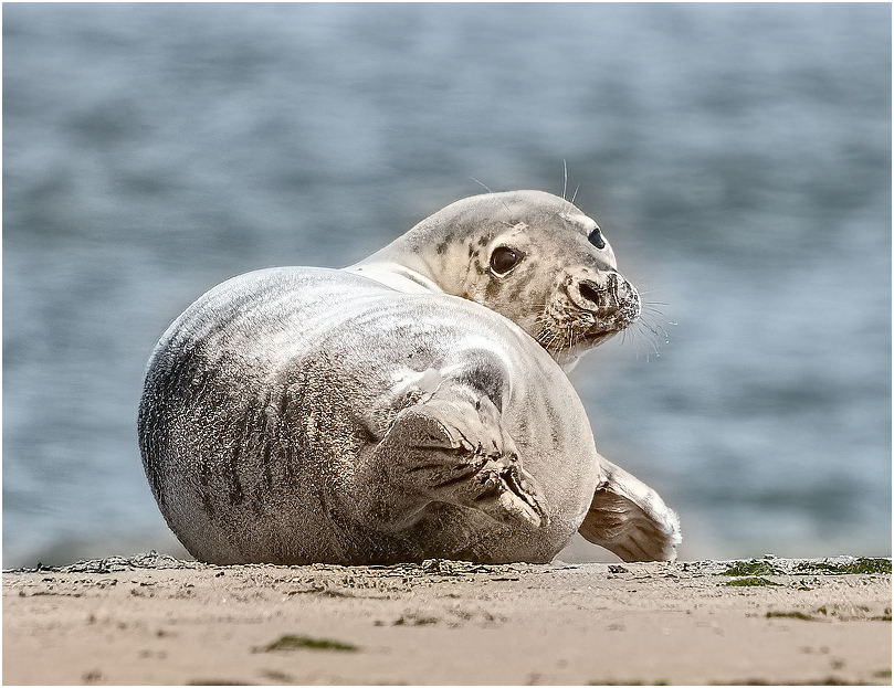
I love it! I put your image through Topaz DeNoise and Topaz Sharpen. I then cropped a little more, to show the cute fase of this Pup. |
Jul 10th |
 |
2 comments - 0 replies for Group 53
|
| 57 |
Jul 21 |
Comment |
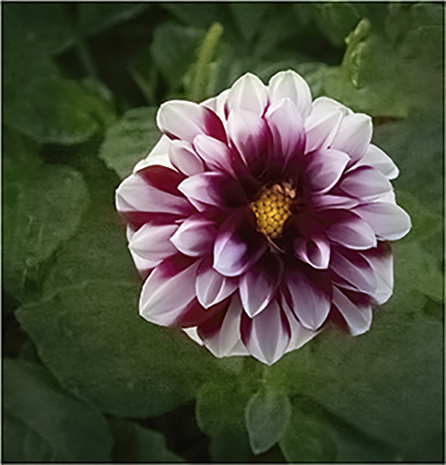
Very nice looking Dahlia. My only suggestion, would be to remove the other piece of a flower at the top right side. I would also add a small white frame around your image. I feel it would draw your eye toward the flower. Nice job. |
Jul 10th |
 |
1 comment - 0 replies for Group 57
|
| 63 |
Jul 21 |
Comment |
Very nice, I would darken the branch on the bottom left side, as well as the stork on the bottom right side. Good job. |
Jul 10th |
| 63 |
Jul 21 |
Comment |
I Like it. Nice image, good job. |
Jul 10th |
| 63 |
Jul 21 |
Comment |
Hi Gary, A very nice close-up. I feel the sharpness needs a little work I took your image and ran it through Topaz De-noise and Topaz Sharpen and this is what i got. Nice Job. |
Jul 10th |
 |
3 comments - 0 replies for Group 63
|
| 75 |
Jul 21 |
Comment |
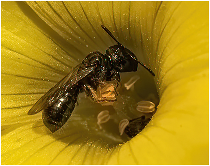
A nice capture, but I feel it needs a lot more work. What you did fine, but it needs more work. If you want to keep the image as you have it, you should remove the brown area on the bottom right side. As it is now, as you look at the bee in the flower your eyes go to the brown area on the right side. I like the bee in the center of the flower. You can crop the image down to that area. I cropped the image down, just to the center of the flower, ran it through Topaz De-noise Ai and Topaz Sharen Ai. This what I came up with. Pollen all over the bee. |
Jul 10th |
 |
| 75 |
Jul 21 |
Comment |
I liked your crop on the right side. I feel you should crop some off some from the left side. What I did first was to remove the bridge from the landscape. I put your image through Topaz De-noise Ai and Topaz Sharpen Ai. I then cropped some off the left side and this is what I came up with. You captured a nice image, |
Jul 10th |
 |
2 comments - 0 replies for Group 75
|
| 80 |
Jul 21 |
Comment |
Nice image and nice crop. The only thing I would is to darken the top left side between the and the pole. |
Jul 10th |
 |
| 80 |
Jul 21 |
Comment |
Hi Bill, I like the image, but you have a lot of dead space at the bottom. It covers 50% of the image.I cropped some off the bottom and added a small white border around the image, so that it seperates the picture from the "Non" picture area. |
Jul 10th |
 |
2 comments - 0 replies for Group 80
|
| 81 |
Jul 21 |
Comment |
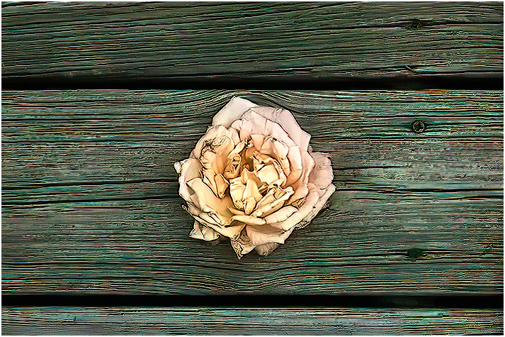
Looking at both images, I think I like the Colored image. I don't see much of a separation, between the flower and the wood in the B/W version. I played with the colored image in Topaz and this is what I came up with.
i |
Jul 10th |
 |
1 comment - 0 replies for Group 81
|
| 87 |
Jul 21 |
Comment |
Good capture, the only thing I would suggest would to crop some off the right side. This would bring your eye toward the bird first, instead of the tree trunk. (my opinion) |
Jul 10th |
 |
1 comment - 0 replies for Group 87
|
34 comments - 4 replies Total
|