|
| Group |
Round |
C/R |
Comment |
Date |
Image |
| 1 |
May 21 |
Reply |
You are correct. You can look at something 100 times and never see it and someone looks at it once, and spots it the first time. But it's a a great image. |
May 3rd |
| 1 |
May 21 |
Comment |
a very nice image. The only suggestion that I can make is to remove that stone or metal block on the left side as my eye goes directly to that object, or blur it out.(my opinion) |
May 3rd |
 |
1 comment - 1 reply for Group 1
|
| 2 |
May 21 |
Comment |
You have a nice image. I put your image through Topaz Studio, then Topaz Denoise Ai, Topaz Sharpen Ai. this what I came up with, a little more detail and sharper. |
May 3rd |
 |
1 comment - 0 replies for Group 2
|
| 7 |
May 21 |
Comment |
A very nice image. I liked the way you cropped and darkened the image .The picture is clear and sharp. |
May 7th |
| 7 |
May 21 |
Comment |
I prefer the color image a lot more than the B & W. On the black & White image, the route map on the right side and the part of the bench on the left side doesn't do anything for the image The color image tells a story. Three people , each who are doing something (reading ,knitting etc.)Also I feel the color image shows more detail. Also I would crop the part of the person on the left side in the colored image. |
May 7th |
| 7 |
May 21 |
Comment |
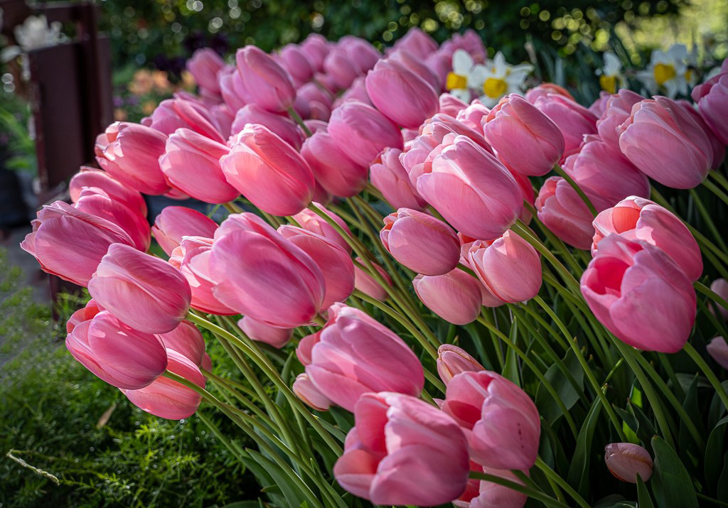
A nice image of the Flame Tulip. I find my eye going to that blurred tulip on the left side. I would remove it or darken it so it doesn't stand out. I would also add a small white frame around the image, which would allow the flower to stand out (2or 3pix max) |
May 7th |
 |
3 comments - 0 replies for Group 7
|
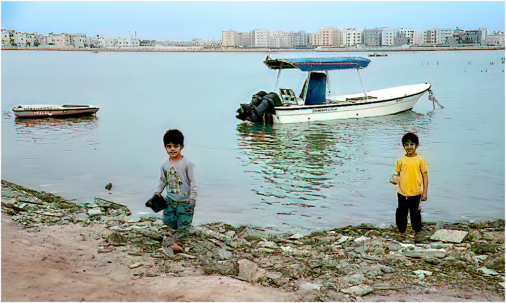
| 8 |
May 21 |
Comment |
A very nice image. I would suggest running Topaz denoise and Topaz Sharpen (Stabilize). As the kids are the main feature, I would crop some of the bottom. This would bring the kids closer. |
May 7th |
 |
| 8 |
May 21 |
Comment |
Very nice image, sharp and colorful . The person sitting on the bench draws your eye through the image directly to him. The only thing, I would suggest is to remove the branches on the lower bottom right side. I also would change the border to 2pix or 3pix.This would separate your image, but without drawing it into the picture. |
May 7th |
2 comments - 0 replies for Group 8
|
| 17 |
May 21 |
Comment |
Hi John, I like your image taken at the Bird of Prey Center. I liked your background. I took your image and put it through Topaz DeNoise Ai first, then Through Topaz Sharpen Ai (Stabilizer), then lightened the eyes and this is what I came up with. |
May 8th |
 |
1 comment - 0 replies for Group 17
|
| 22 |
May 21 |
Comment |
Your picture does tilt to the left. Straighten it up and you will see the difference. It's a great shot, it makes you feel you want to go inside for lunch. |
May 8th |
1 comment - 0 replies for Group 22
|
| 25 |
May 21 |
Comment |
A nice sharp image of the Golden Gate Bridge. The only thing that throws off the image are the trunks of bother trees on the angle. What I did was to add a small white frame around the image. (3pix) This is what I have. |
May 9th |
 |
| 25 |
May 21 |
Comment |
A very nice image of a rose. I would suggest you crop off some
from the top, just below the bud. This would have your eye going directly to the rose. I also cropped a little from the bottom. our border around the image is to wide. I use 3pix as my width. see picture below. I also but the image through Topaz DeNoise and Topaz Sharpen |
May 9th |
 |
2 comments - 0 replies for Group 25
|
| 26 |
May 21 |
Comment |
Hi! Mervyn, I can't find a boat on the horizon so I wouldn't worry about it. The image is sharp as a tack and your eye follows the pier all the way out into the ocean. Very nice image, I like it. |
May 9th |
1 comment - 0 replies for Group 26
|
| 27 |
May 21 |
Comment |
A nice image of a bird with nesting material in its mouth. I would like to make a suggestion that you remove the twig that looks like it is coming through the top of his head and the twig that's coming over its head. I put your image through Topaz DeNoise and Topaz sharpen and this is what I came up with. |
May 9th |
 |
1 comment - 0 replies for Group 27
|
| 33 |
May 21 |
Comment |
The tones and colors are great also the image is sharp. I would have cropped some off the bottom and the sky above. |
May 9th |
 |
1 comment - 0 replies for Group 33
|
| 34 |
May 21 |
Comment |
Very nice image putting everything together. To make it more realistic, first I darkened the boat as the color you had still remind me of a model boat. In Photoshop I went to there new sky program and changed the sky to look like a storm sky, to match the water and this what I got. |
May 9th |
 |
1 comment - 0 replies for Group 34
|
| 36 |
May 21 |
Comment |
Larry, a nice image. As I look at the image my eyes go both to the bridge and sky. If you crop some off the top your eyes goes directly to the bridge. |
May 9th |
1 comment - 0 replies for Group 36
|
| 37 |
May 21 |
Comment |
Nice old house, but I would straighten it up a little. |
May 9th |
 |
1 comment - 0 replies for Group 37
|
| 42 |
May 21 |
Comment |
A nice image, but I feel the image was over sharpened. See if you work on the swan's face so that you can see the eyes, it's a little to dark. The wave in front of the swan shows motion, which is good. All and all, you did a nice job capturing the Swan. |
May 8th |
| 42 |
May 21 |
Comment |
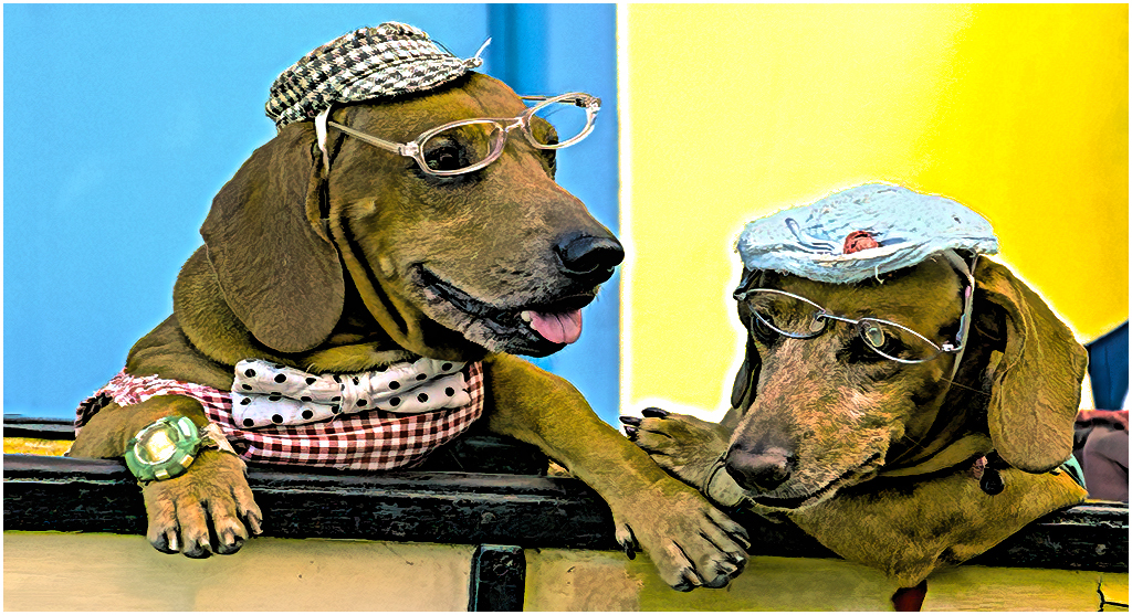
A very nice image. I like how the sunlight hits the top part of the hats and the shadows from the top work it way toward the bottom. My only suggestion would be to remove the piece of the hat behind the top of the hat ,behind the center row of hats. |
May 7th |
| 42 |
May 21 |
Comment |
Sarita, it's a very nice image, but I feel it could be sharpened a little. I put it through Topaz Sharpen. I feel you need a little more space on the bottom, as you have cut off some of the flower. I love the color of the butterfly and its shadow on the flower |
May 3rd |
 |
| 42 |
May 21 |
Reply |
I feel you need the big green leave on the left to be kept to balance out the image. |
May 3rd |
| 42 |
May 21 |
Reply |
I noticed the pealing paint, but left it in ,because looking at the brick, the morter between the brick are not smooth ,so that it balanced with the peeling paint.
Thanks again for your comments, that's what our group tries to do. Again welcome to our group. |
May 3rd |
| 42 |
May 21 |
Reply |
Thanks Michael, I didn't even notice that. As this was originally a slide ,which I converted to digital, was was busy remove the spots and clearing up her face. I remember which camera I used. It was a Maxium. |
May 3rd |
| 42 |
May 21 |
Comment |
I would agree with Bev's comment about the leaf at the bottom on the right side. If you didn't remove the leaf, you would have to move the bottom of the image as the leaf is cut off. You also have a light line coming from one of the stamens, which should be darkened or removed . I also darken some of the leaves on the top left( my opinion) The color and sharpness of the flower is excellent. Good Job.
Again welcome to group 42 |
May 2nd |
| 42 |
May 21 |
Comment |
Great shot, sharpness and color are on the button. It looks like the crocodile is about to grab her. I went back in the file and found your Cuban crocodile picture you posted in August 2019. That images was close enough and looked a lot smaller then this crocodile.
Stay safe, stayaway from Crocodiles. |
May 2nd |
5 comments - 3 replies for Group 42
|
22 comments - 4 replies Total
|