|
| Group |
Round |
C/R |
Comment |
Date |
Image |
| 1 |
Oct 19 |
Comment |
I like the shot, but I would have blurred out the dark upright starting from his hose and going up, or made it the same color(light Gray) as the rest of the background. As it is now, my eye goes toward the bulls eye and the dark gray part of the gate.
|
Oct 7th |
1 comment - 0 replies for Group 1
|
| 2 |
Oct 19 |
Comment |
Great shot, and excellent color. My only suggestion would be to make the frame not as wide. |
Oct 7th |
1 comment - 0 replies for Group 2
|
| 6 |
Oct 19 |
Comment |
Hi tom.
I agree with Janet , that some of the top be cropped.I also used the new Topaz Sharpen A1. There is also a spot above the right eye which should be darkened. |
Oct 10th |
 |
1 comment - 0 replies for Group 6
|
| 16 |
Oct 19 |
Comment |
I think the picture is fine. The most important part of the image is its head and eye. It's sharp and tells a story with the flower in its mouth. |
Oct 10th |
1 comment - 0 replies for Group 16
|
| 22 |
Oct 19 |
Comment |
Hi Mike,
I agree with Peggy. I would crop off some of the top |
Oct 10th |
 |
1 comment - 0 replies for Group 22
|
| 23 |
Oct 19 |
Comment |
I like the image and just put it through the new Topaz Sharpen A1. this is what I got. |
Oct 11th |
 |
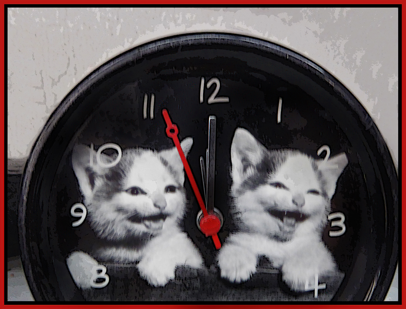
| 23 |
Oct 19 |
Comment |
Cute picture, but I find the cats are not sharp. I put your image through new Topaz Sharpen A1 and it helps a little. |
Oct 10th |
 |
2 comments - 0 replies for Group 23
|
| 26 |
Oct 19 |
Comment |
Hi Mervyn; great shot. You can look at this image all day long.from the sand bottom to the top of the building The variation of colors make this a great image. |
Oct 10th |
1 comment - 0 replies for Group 26
|
| 32 |
Oct 19 |
Comment |
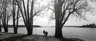
Hi Stephen, I like the correction Lance made regarding a more black and white image. I would crop closer. If you compare the image you have and crop out the path you would have a more dynamic image. this will bring your wife and son, along with the trees closer.Enjoy trying both ways.Using Lance's image it would look like this.
Stu Caine Admin Group 42 |
Oct 7th |
 |
1 comment - 0 replies for Group 32
|
| 42 |
Oct 19 |
Comment |
Very nice image ,sharp and the reflection is very nice. |
Oct 11th |
| 42 |
Oct 19 |
Reply |
I agree about the vertical line |
Oct 10th |
 |
| 42 |
Oct 19 |
Reply |
thanks for your comments. I feel the sharpening is coming from the new Topaz Sharpen A1, which I just received and seems to work great. |
Oct 7th |
| 42 |
Oct 19 |
Comment |
my screen shows the head is out of focus also. The head would have more detail then the wings and should make the Damselfly stand out a little more. In general it's a nice image. |
Oct 7th |
| 42 |
Oct 19 |
Comment |
Nice image, the rust against the red make a nice contrast.Also the layers of rust show the depth of rust. good job. |
Oct 7th |
| 42 |
Oct 19 |
Comment |
Very nice image, I would agree with Michael, I would blur out the flower at the bottom and te one on the right side. |
Oct 7th |
| 42 |
Oct 19 |
Comment |
Hi Sarah, Very nice image, sharp and the red flowers at the front of the entrance, guides you eye through the middle of the picture. Regarding the manhole covers ,I agree they should removed. I would crop out the front cover and remove the one inside the gate. |
Oct 7th |
| 42 |
Oct 19 |
Comment |
Nice Picture.It looks like a three dimensional image.sharp and the reflections on the water makes the whole picture pop.
I purchased a unit called "Wolverine". ,which converts slide to digital.It does a nice job. |
Oct 7th |
| 42 |
Oct 19 |
Reply |
Hi Michael, I don't think this is over processed. I used the new Topaz Sharpen A1. It's a great app. |
Oct 7th |
6 comments - 3 replies for Group 42
|
15 comments - 3 replies Total
|