|
| Group |
Round |
C/R |
Comment |
Date |
Image |
| 41 |
Jul 19 |
Reply |
* Photobook ... not phonebook.. haha! |
Jul 10th |
| 41 |
Jul 19 |
Reply |
These are great ideas Brad. It's amazing how when we first create an image our brains can block out all the distracting elements, but other people viewing our images see them as they don't have the emotional involvement. |
Jul 10th |
| 41 |
Jul 19 |
Reply |
Kathy that would look great wouldn't it! |
Jul 10th |
| 41 |
Jul 19 |
Comment |
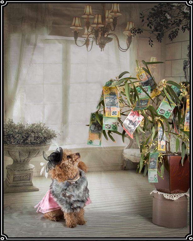
Great image!
In my opinion your original image of Santorini looks quite busy when you view it in it's original state, but giving it this softer appearance with these gorgeous colours makes it look picture perfect! I love how you've emphasised the warm colours in parts of the image that are more interesting. It takes my eye straight to these interesting parts of the image.
I agree with Kathy that a calendar company and/or travel brochure would love to have this. |
Jul 10th |
| 41 |
Jul 19 |
Comment |
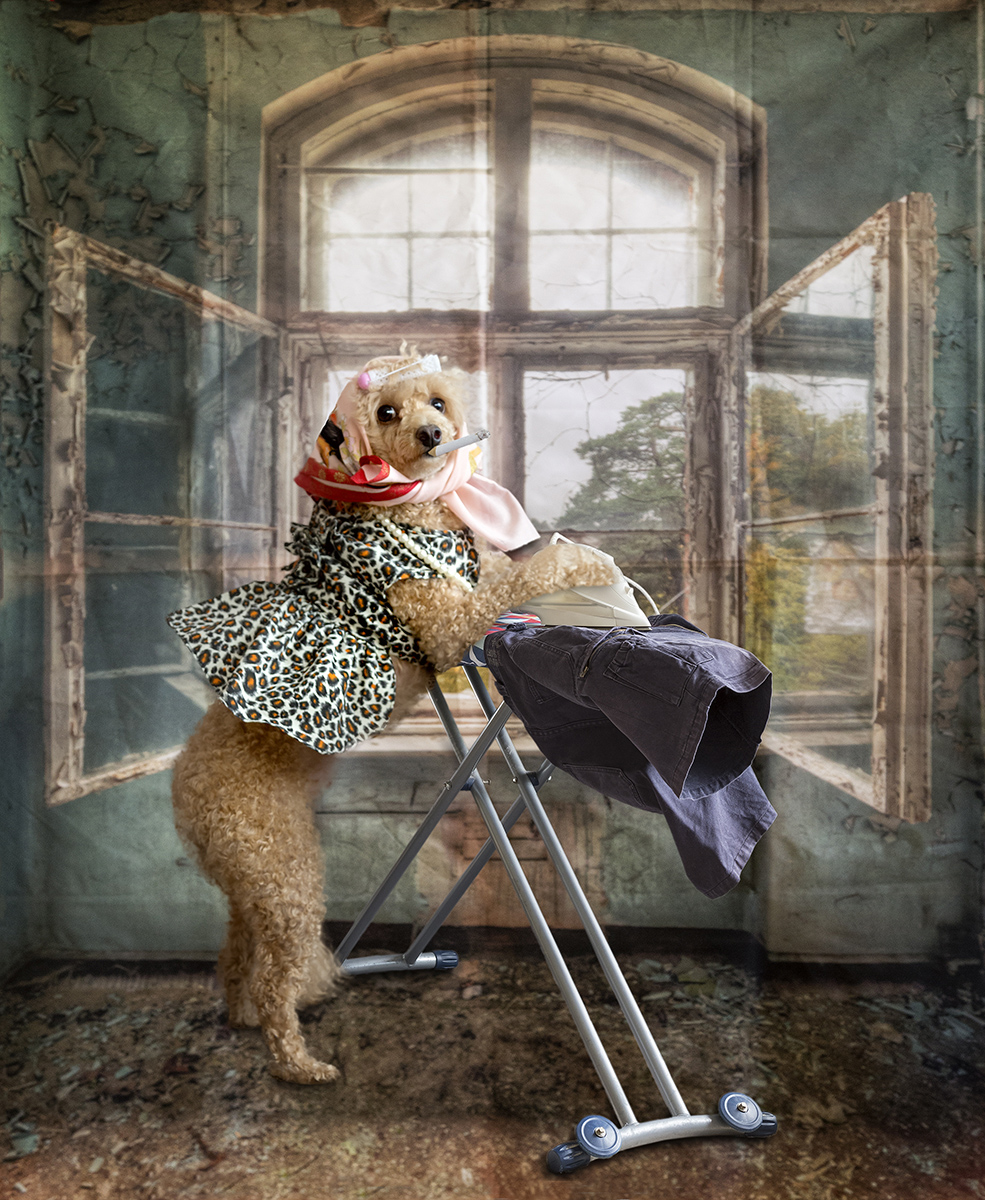
What a great introduction page this would be to a phonebook of your travels to Costa Rica.
Contrary to what you state... I think this is both artistic and creative. Well done! |
Jul 9th |
| 41 |
Jul 19 |
Comment |
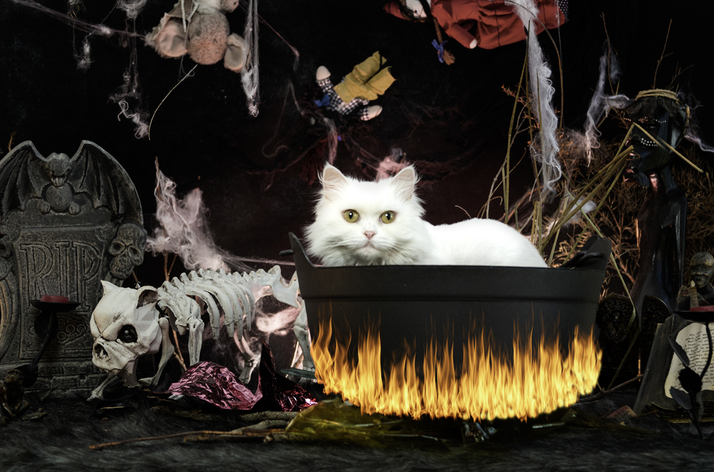
This gave me a laugh. Well done! |
Jul 9th |
| 41 |
Jul 19 |
Comment |
Gorgeous. Great image! I love the colours you've chosen.
Just 1 little suggestion.. the green bits to the left of her head catch my eye a bit. I'm wondering if it would look better if they were blurred. Just a thought! |
Jul 9th |
| 41 |
Jul 19 |
Comment |
When I read above that your daughter is applying to different colleges, this image really made sense. What a great way to convey the feelings that she would be going through, it really can be a big blur when trying to make life decisions. Well done! |
Jul 9th |
5 comments - 3 replies for Group 41
|
5 comments - 3 replies Total
|