Activity for User 1025 - Cheryl Dubois - cdubois917@gmail.com
Avatar
Close this Tab when done
302 Comments / 23 Replies Posted
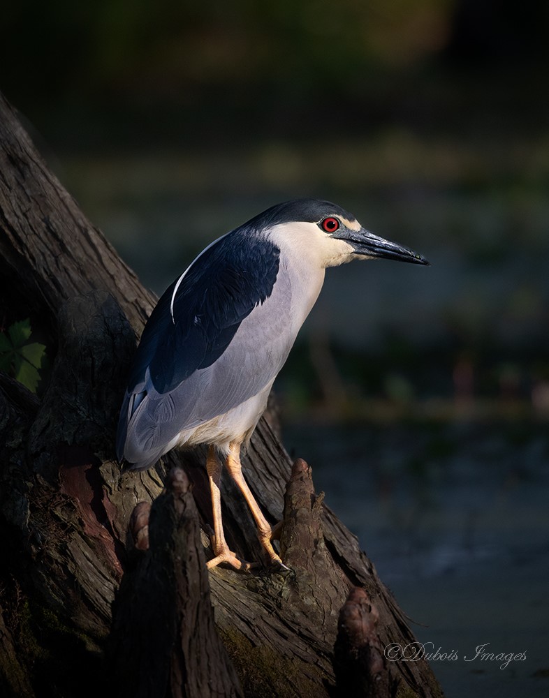
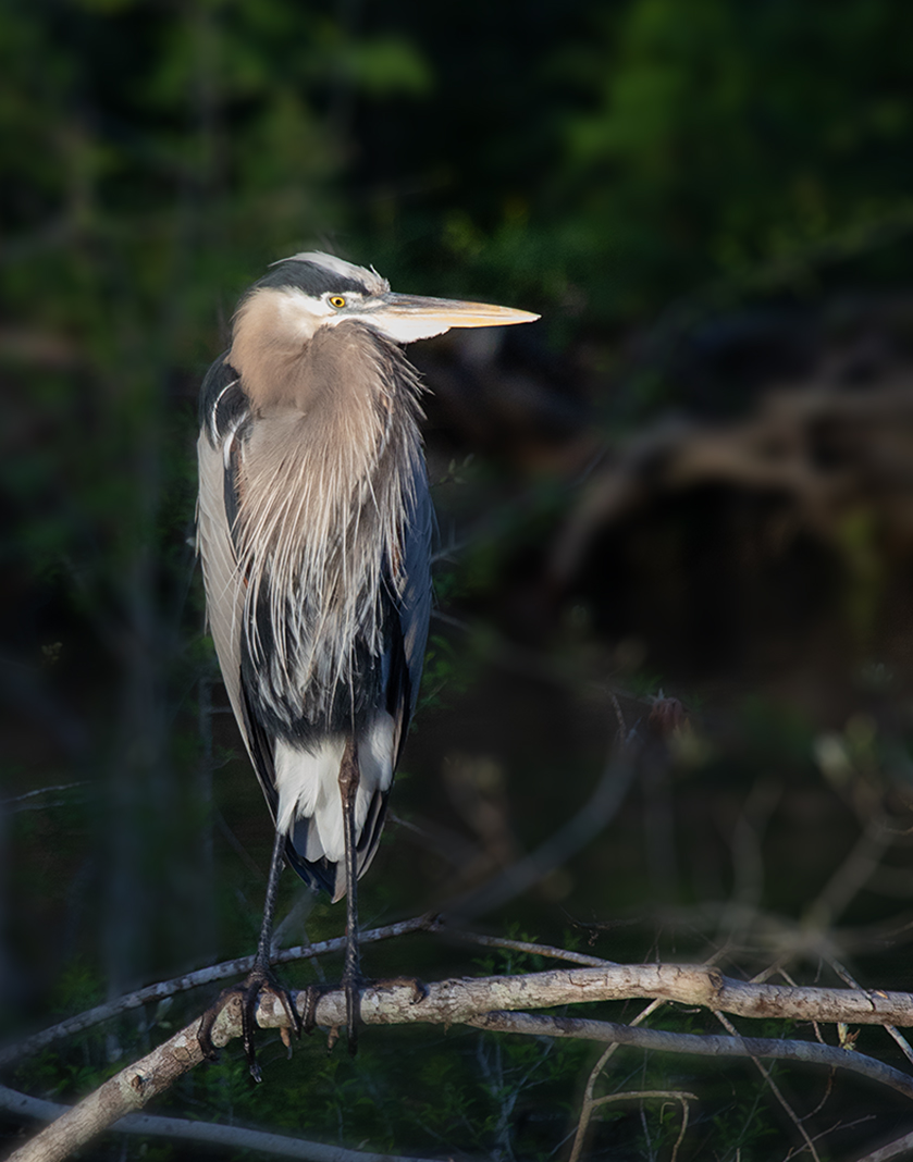
67 Images Posted
| = Current Round | = Previous Round |
| Group 61 | |||||||||||
|---|---|---|---|---|---|---|---|---|---|---|---|
 Apr 21 |
 Mar 21 |
 Feb 21 |
 Jan 21 |
 Dec 20 |
 Nov 20 |
 Oct 20 |
 Sep 20 |
 Aug 20 |
 Jul 20 |
 Jun 20 |
 May 20 |
 Apr 20 |
 Mar 20 |
 Jan 20 |
 Dec 19 |
 Nov 19 |
|||||||
| Group 81 | |||||||||||
 Nov 23 |
 Aug 23 |
 Jul 23 |
 Jun 23 |
 May 23 |
 Apr 23 |
 Mar 23 |
 Feb 23 |
 Nov 22 |
 Oct 22 |
 Sep 22 |
 Aug 22 |
 Jul 22 |
 Apr 22 |
 Mar 22 |
 Feb 22 |
 Jan 22 |
 Nov 21 |
 Oct 21 |
 Aug 21 |
 Jul 21 |
 Jun 21 |
 Apr 21 |
 Mar 21 |
 Feb 21 |
 Jan 21 |
 Dec 20 |
 Nov 20 |
 Oct 20 |
 Sep 20 |
 Aug 20 |
 Jul 20 |
 Jun 20 |
 May 20 |
 Apr 20 |
 Mar 20 |
 Jan 20 |
 Dec 19 |
 Nov 19 |
 Oct 19 |
 Sep 19 |
 Jul 19 |
 Jun 19 |
 May 19 |
 Apr 19 |
 Mar 19 |
 Feb 19 |
 Jan 19 |
 Dec 18 |
 Nov 18 |
||||||||||