|
| Group |
Round |
C/R |
Comment |
Date |
Image |
| 61 |
Sep 20 |
Comment |
Love the subject and I really like the original background! The subject does appear a bit soft, but combined with the background there is a painterly feel to the image. Perhaps consider adding some paint strokes to his mane and use the original background and just crop in on the left to remove the distracting spot on the right side of the image? I like horses too - and enjoyed your sharing more information about this beautiful creature. |
Sep 2nd |
| 61 |
Sep 20 |
Comment |
I really like both images. I like the grittiness and drama of the original. I think the dramatic lighting suits the environment. Regarding the submitted image, way you have managed to open the shadows and reveal the details of the shop is really terrific. Can you explain a little about your post processing? |
Sep 2nd |
| 61 |
Sep 20 |
Reply |
Thanks! I was wanting something with a little more drama. I do need to correct myself and say the modifier was on the backlight, the front light was a speedlight with NO modifier. I have a friend who will come out with me to do some more night shoots and I will give your suggestions a go - thanks! |
Sep 2nd |
| 61 |
Sep 20 |
Comment |
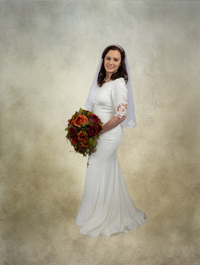
The light was a speedlight with a 24 inch modifier. It was probably about 5-6 feet away. I need to get closer right? And feather it across her face? This was a night time shoot and we were in an alley. Limited room. I like your square crop.
|
Sep 2nd |
3 comments - 1 reply for Group 61
|
| 81 |
Sep 20 |
Comment |
Angela this is creative. You did a good job getting all the elements to a pleasing realistic scale. I hope you win your contest! |
Sep 16th |
| 81 |
Sep 20 |
Comment |
Makes me think of ET. Nice job of the background geometric shape leading into the sculpture. |
Sep 16th |
| 81 |
Sep 20 |
Comment |
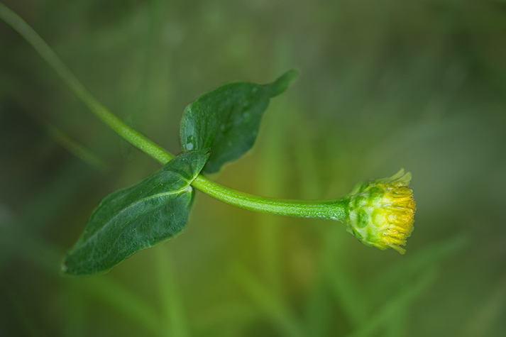
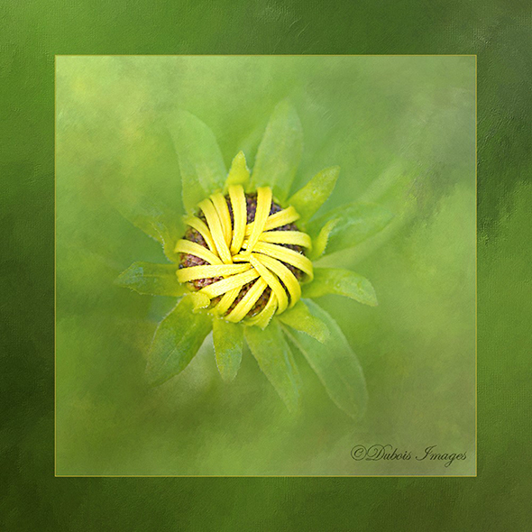
The petals look so lovely and soft. I agree that I would try to remove the bee. I like that you didn't center the flower, but left room for the eye to travel in to the subject.
|
Sep 16th |
| 81 |
Sep 20 |
Comment |
The detail in the sharpest part of the image is very lovely. My yoga instructor often references Ganesha. I do find the yellow and very bright part of the image, just in the center a bit distracting. I wonder how this might look in a square crop? |
Sep 16th |
| 81 |
Sep 20 |
Comment |
Very nice. I enjoy Kathleen Clemons as well. The curves look great. I like that the "horizon" is in toward the bottom third of the image. The symmetry of the curves is lovely, as is the color harmony.
|
Sep 16th |
5 comments - 0 replies for Group 81
|
8 comments - 1 reply Total
|