|
| Group |
Round |
C/R |
Comment |
Date |
Image |
| 61 |
Jul 20 |
Comment |
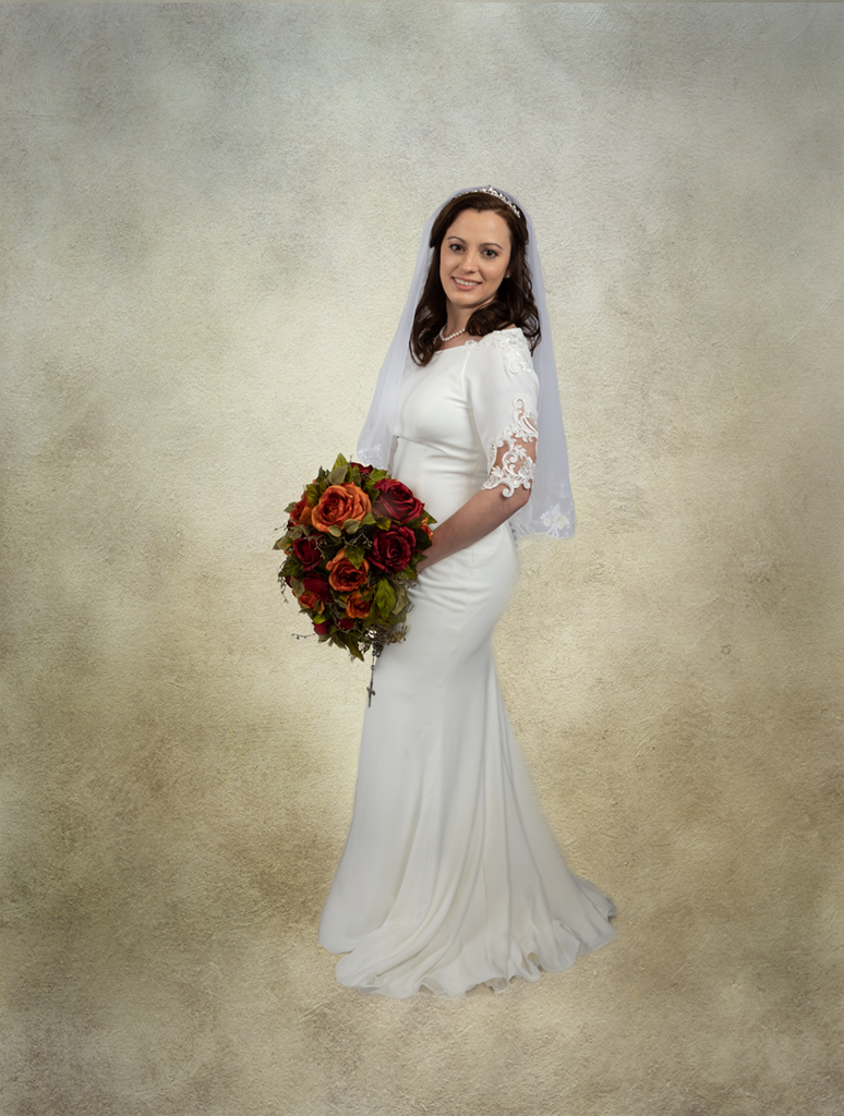
Both the original and the image with the added texture are very nice. The posing is lovely. |
Jul 20th |
| 61 |
Jul 20 |
Comment |
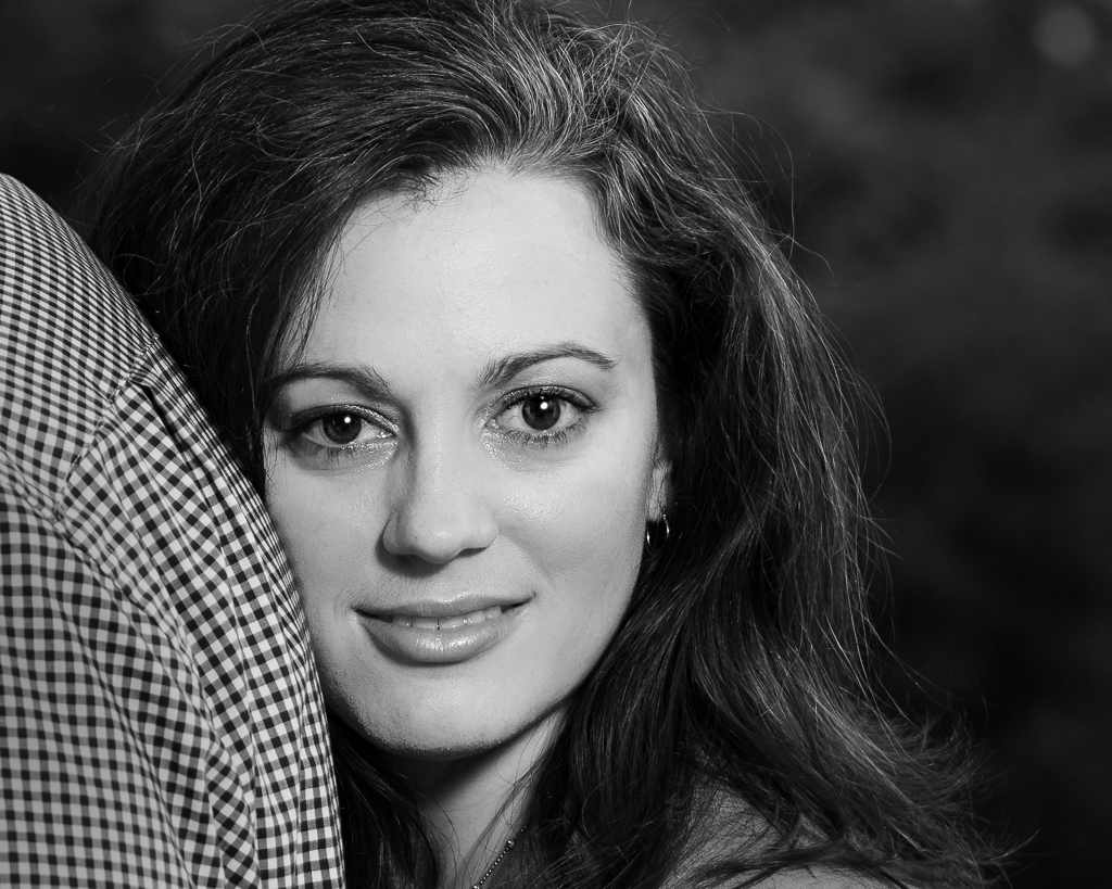
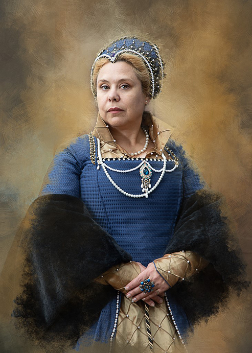
Wonderful image. I'm drawn right into the work of the potter. You made a great choice in converting this to a black and white images, removing the distraction of the background. I do like Manfred's suggestion of the darkening of the cloth. |
Jul 20th |
| 61 |
Jul 20 |
Comment |
Wonderful image. I really like the direction of light. The adjusted square crop works very well. The image has very nice color harmony.
|
Jul 20th |
| 61 |
Jul 20 |
Reply |
Thank you Manfred - I agree with your comments. Darkening the shirt is very doable and I will pay more attention to the compression aspects! Appreciate your comments! |
Jul 7th |
3 comments - 1 reply for Group 61
|
| 81 |
Jul 20 |
Comment |
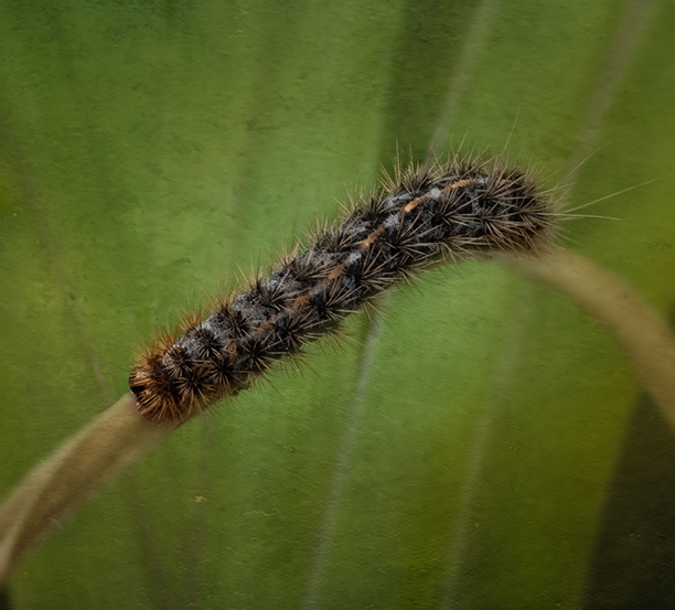
This is awesome.I agree with Angela and Randall about the stroke.I admire your focus stacking patience! |
Jul 20th |
| 81 |
Jul 20 |
Comment |
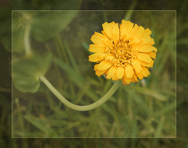
You are so creative. This is a very compelling image. Once you make your final adjustments - you should print into Christmas cards or create a wall print for the Christmas season!
|
Jul 20th |
| 81 |
Jul 20 |
Comment |
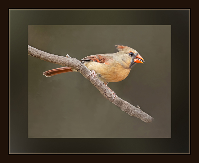
I like this image of the robin in his natural habitat. Whether or not you crop a bit off the top, you may want to consider burning the upper left corner with a soft black brush set at 20% to keep the eye on the robin. I might even try burning the fence just a bit, as well, to help bring out the robin a bit more. |
Jul 20th |
| 81 |
Jul 20 |
Comment |
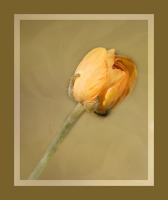
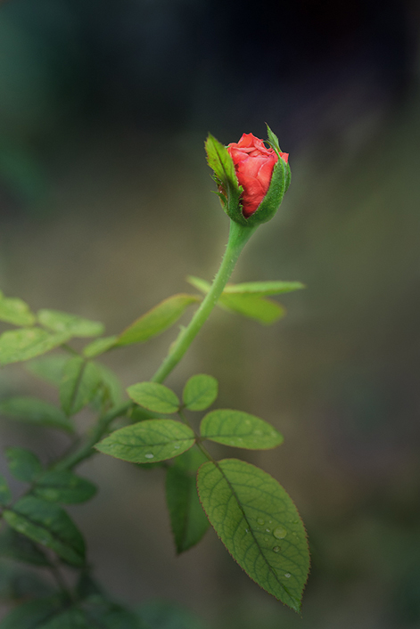
Nice image Brent. Cosmos is on my planting list next year. Whatever is on the left side of the flower has broad strokes and I actually thought you did a bit of post work that involved adding some painterly effect. Again very nice and nice color harmony. I also like the touch of golden light coming in at the top of the frame.
|
Jul 20th |
| 81 |
Jul 20 |
Comment |
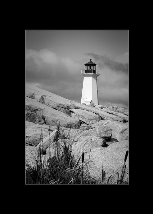
Very nice image. I like the black and white. The image has pleasing contrast. I too would be interested in seeing this with a bit cropped off the bottom and the right. |
Jul 20th |
| 81 |
Jul 20 |
Comment |
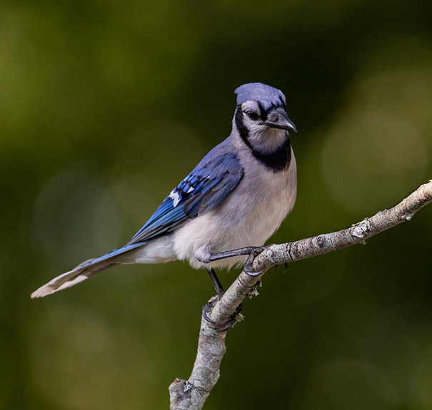
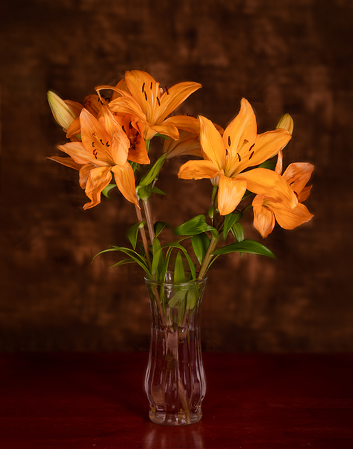
This lovely. I love the color harmony. And yes the original does look like a grumpy cat. I like the crop and your post processing
|
Jul 20th |
6 comments - 0 replies for Group 81
|
9 comments - 1 reply Total
|