|
| Group |
Round |
C/R |
Comment |
Date |
Image |
| 15 |
Apr 24 |
Comment |
Kathy, nice pose and sharp. I would like to see you post an action shot here, as while this is nice, it will not hold the viewer's attention as much as an action shot. Here, one can feel the intense stare, and that elevates this shot. |
Apr 15th |
| 15 |
Apr 24 |
Comment |
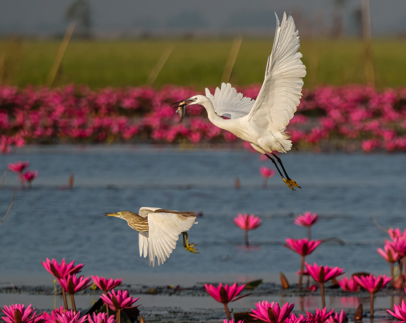
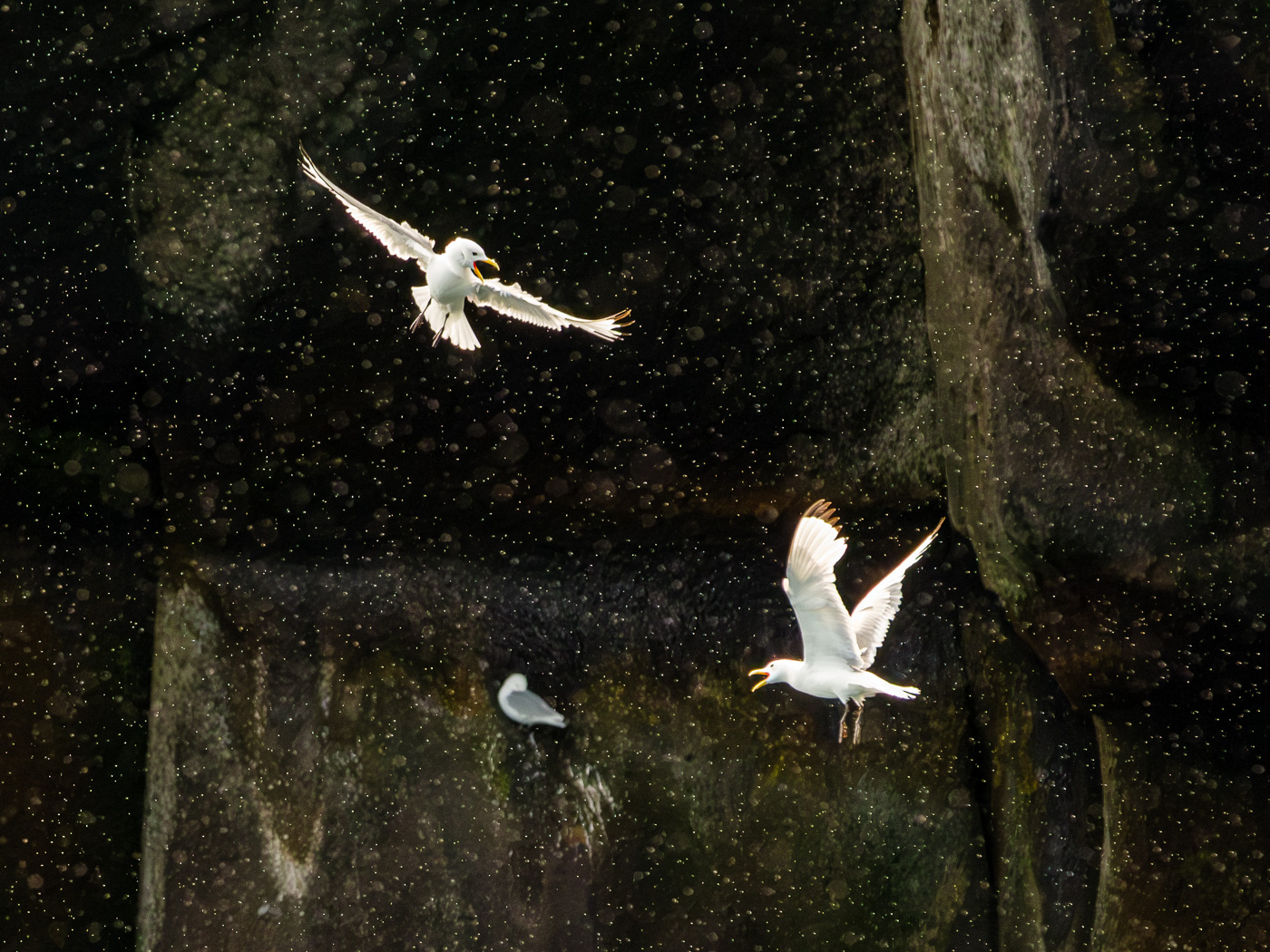
Sarita, I love the shot, but wish the background was different. Nothing you could do about that. Wonderful to get all three together and have each face showing! And you have great timing of the one just off the road, defending itself and its territory. no mergers! Still wonderful detail from a tight crop. Three wing positions and cohesive too. |
Apr 15th |
| 15 |
Apr 24 |
Comment |
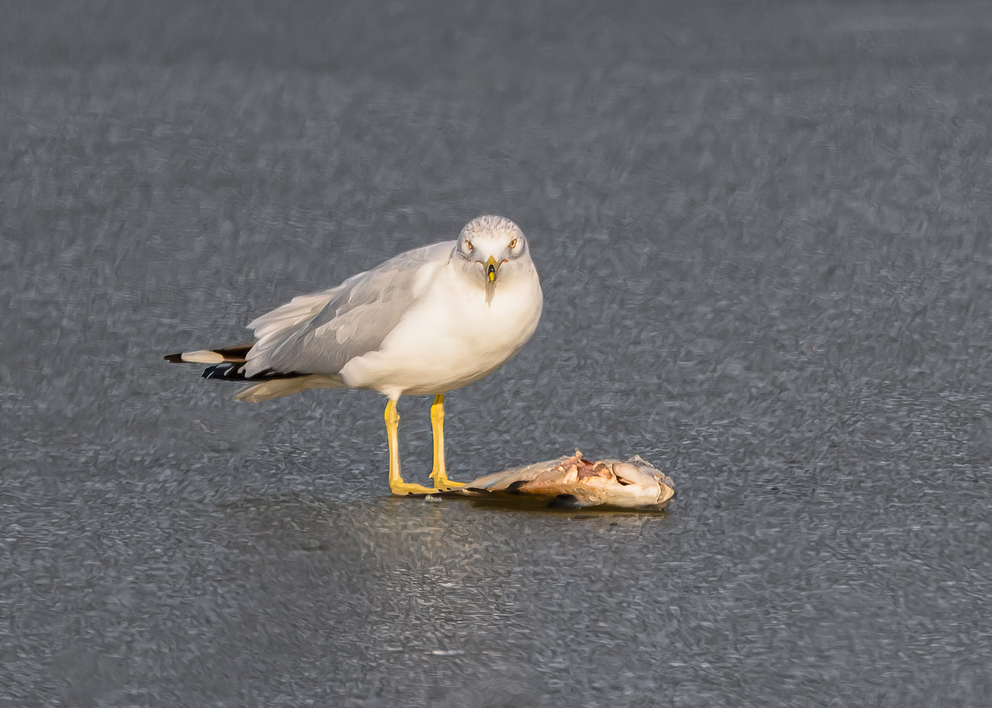
Pei-Fan, a wonderful capture. As well as your picture. lol.
A picture to be proud of. I like the colors of the original better and that has a lot to do with brightening the picture. What I liked was the glow of the fish, and that is kind of lost. I suggest the Kingfisher be rendered in between it being a bit dark on the original and for me too bright for the processed shot. Definitely get that white spot on the left out. As to flipping, that is such a personal choice, and for me I prefer the original direction, as I focus on the fish and feel the energy of the Kingfisher, and flipped it feels like it is holding up the fish. By the way, my monitor from which I am viewing this picture may be on the bright end, so you just might have the right exposure, but I do encourage you to review your shot to make sure you have that fish glow and the richness of the Kingfisher. |
Apr 15th |
| 15 |
Apr 24 |
Comment |
Mike, I like it. I find the stature of the Great Blue Heron to make this picture. I love its pose, kind of hunchback. I think you have done well here. The subject does not have to be large in the picture, and you nailed it here. I like the colors. |
Apr 15th |
| 15 |
Apr 24 |
Comment |
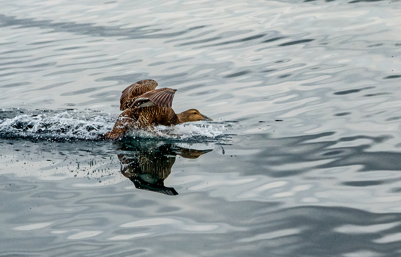
Jim, nice capture and good idea to get motion. Proud Wood Duck. I actually like the more muted colors of the original. I think the wings might extend further and you may have another shot showing that. Pleasing as is, but we look to make suggestions for the maker. Well seen. |
Apr 15th |
| 15 |
Apr 24 |
Comment |
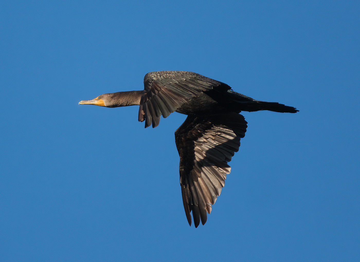
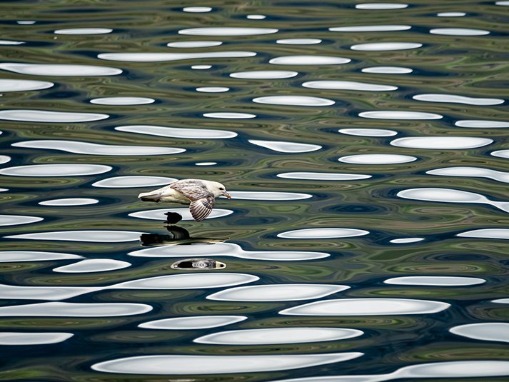
Dr, what a wonderful shot. The wing touching down is a great gesture. The water is fantastic. The reflection is superb. I just love that line in the water from the wing. Beautiful. |
Apr 3rd |
| 15 |
Apr 24 |
Reply |
Dr, thank you for your comments, and for the identity. I am not good with that but beginning to work on that aspect of my photography and presentations. I appreciate your bailing me out here. Topaz salvaged this image. I am working diligently on getting sharper images out of camera. |
Apr 3rd |
6 comments - 1 reply for Group 15
|
| 81 |
Apr 24 |
Comment |
Hey Creative Girl, you did well. Maybe someday you will submit something for us to make suggestions for improvement. lol. So, let's get real picky here. I would have liked to see the 4 little triangles in between the vases to be the same size, as you have everything else so well in order. Same as to the vertical (leans to the right) and horizontal lines (kind of curved) between the vases. I do find the white little on the middle right of the chrysanthemum to be distracting. So there, my suggestions, and I love the creativity and the reflections. |
Apr 7th |
| 81 |
Apr 24 |
Comment |
Tom, a good rendition of the scene. I would like a rectangle framing here and would probably take off half of the left side from frame to back of light legs. You did a good job not having mergers of the people with each other or objects. i might add back some to the top, as the original has more depth, and the submitted version seems a bit flat. |
Apr 7th |
| 81 |
Apr 24 |
Comment |
Kurt, the color is spot on. Camera looks like I could just grab it and take some shots. I am not sold on the interest, and it feels like the camera leans down to the left, but that is probably the angle of it to the camera, but it does distract me. Good choices you made pre and post processing for this image. |
Apr 7th |
| 81 |
Apr 24 |
Comment |
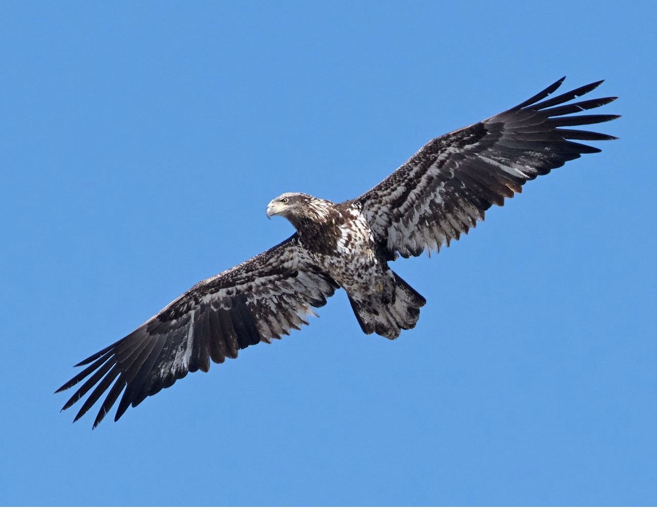
Rose, great timing. A good find for you and the hawk. I would like to see a tighter crop from the left. You might even try a vertical or square. Topaz Photo AI will sharpen it without mucking it up. |
Apr 7th |
| 81 |
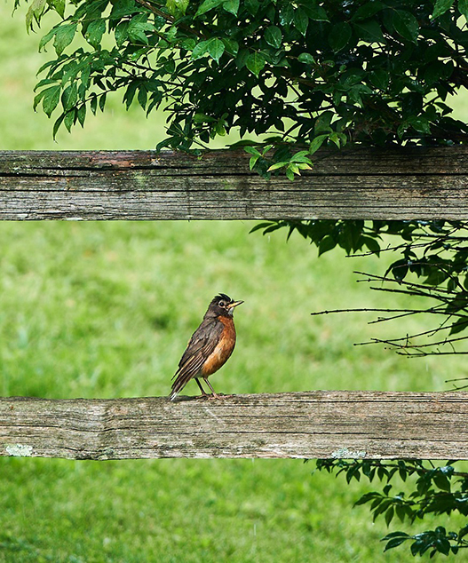
Apr 24 |
Comment |
Janet, nice sharp pic. I like the grass on the left going up as it fills the space with parallel lines to the bird. I find the white behind it blending into the bird, and distracting. You might see if you can darken that part. Fun. |
Apr 7th |
5 comments - 0 replies for Group 81
|
11 comments - 1 reply Total
|