|
| Group |
Round |
C/R |
Comment |
Date |
Image |
| 15 |
Feb 24 |
Reply |
Pei-Fan, thank you for your kind words. They come at a good time. Interesting, the ground does look like sand but it is actually a frozen lake with a crystalize ice layer. It was not sharp but Topaz fixed that issue. |
Feb 28th |
| 15 |
Feb 24 |
Reply |
Looks great. It pops. To me it looks so much better. I hope you think so too!!! |
Feb 27th |
| 15 |
Feb 24 |
Comment |
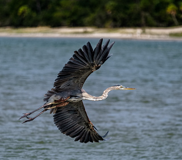
Kathy, nice shot, sharp, and wonderful colors. I like the darkened greens but the changes are a bit dark for me. I would do a between the two modes. I find the Heron a bit crunched, and I wonder if you have a shot that has it extended, exuding more power, as the feeling I get from it is a bit sad, which is ok, but I wonder if a bolder pose would be more appealing. |
Feb 12th |
| 15 |
Feb 24 |
Comment |
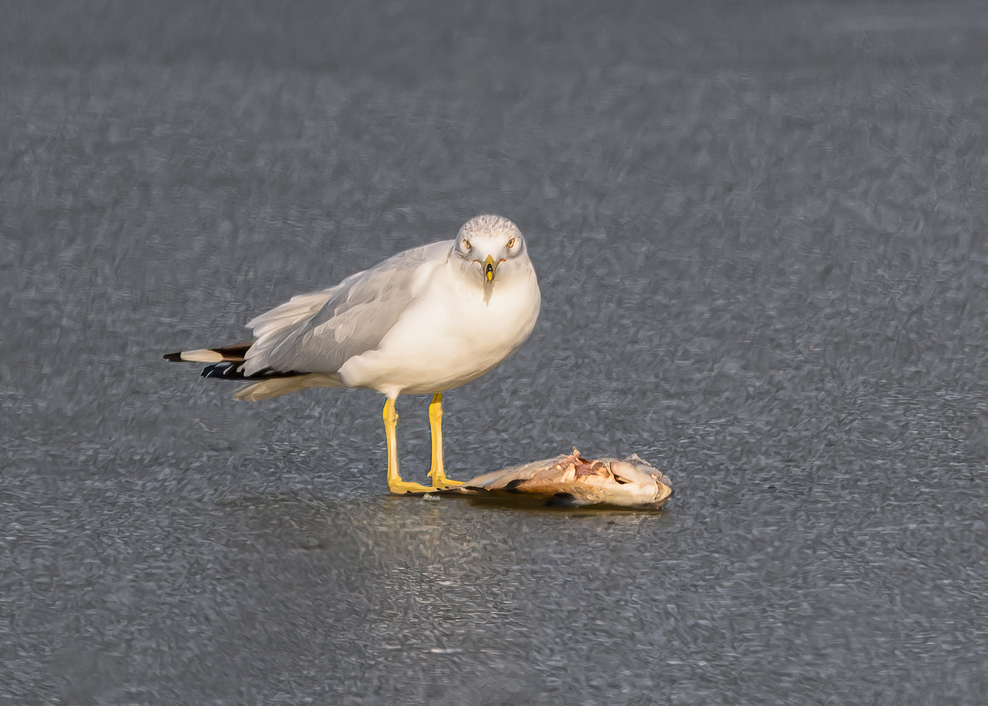
Sarita, well seen, and I agree with the comments above. I also suggest you add more contrast and even try some dehaze, see what happens. Some more clarity and lower the blacks. Nice framing and angle, and sharp it is. |
Feb 12th |
| 15 |
Feb 24 |
Comment |
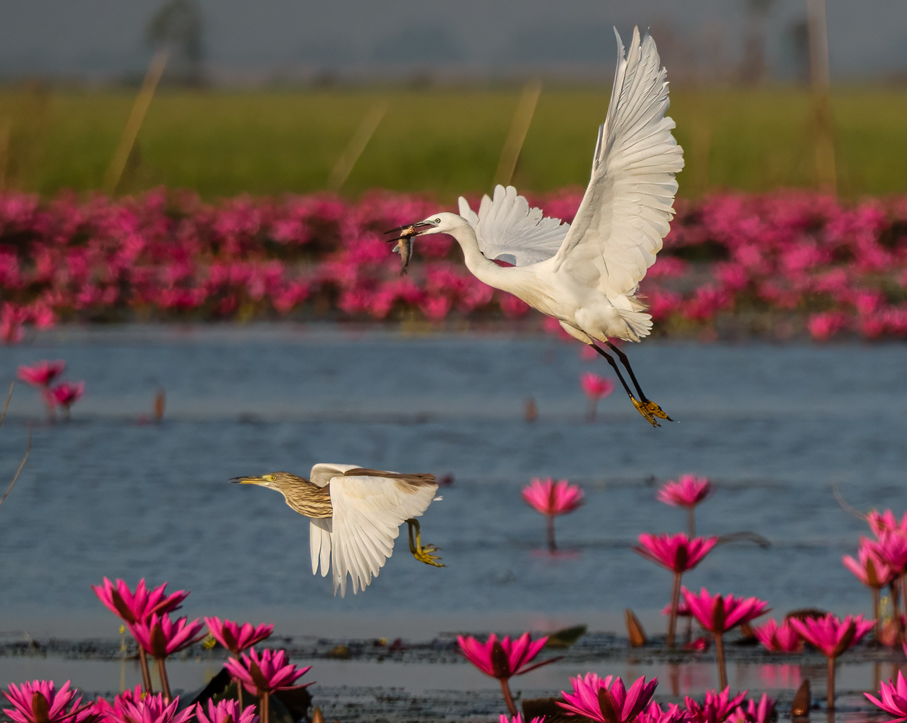
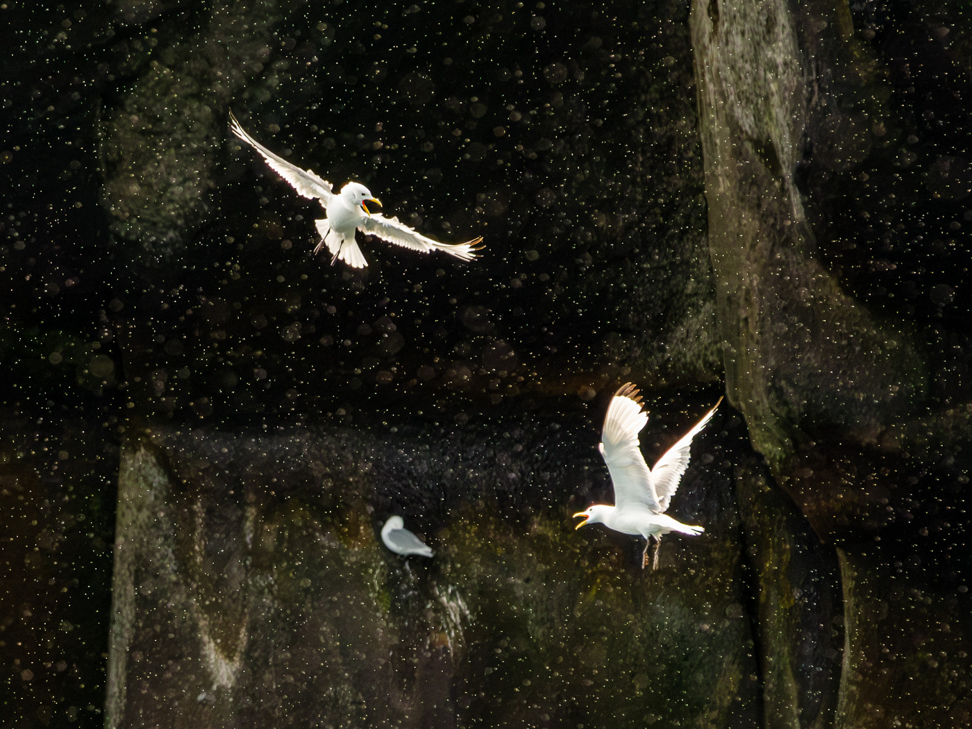
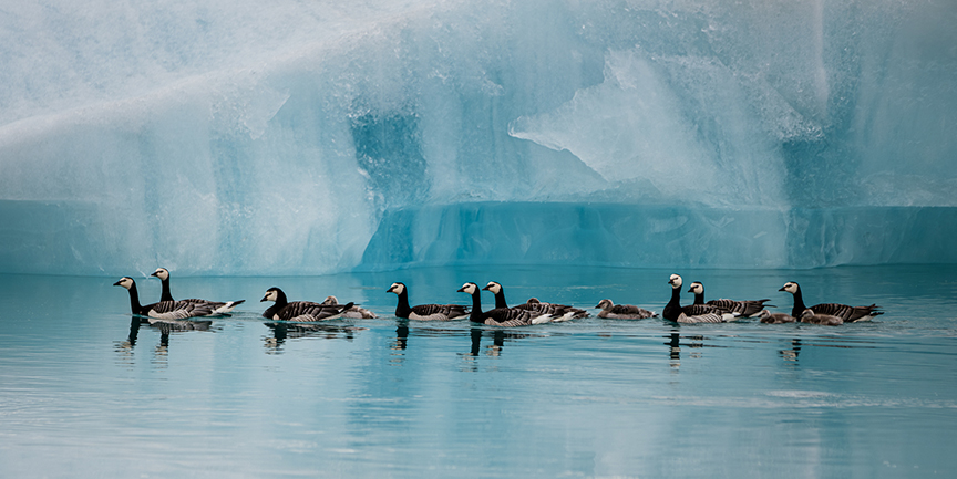
Pei-Fan Mu, you capture a wonderful scene, albeit there is a lot going on. Winds are beautiful. I wonder if the birds are oversharpened, not sure am I. The greens on the bottom and leaves above I find a bit bright. I would darken them per your request for suggestions. |
Feb 12th |
| 15 |
Feb 24 |
Comment |
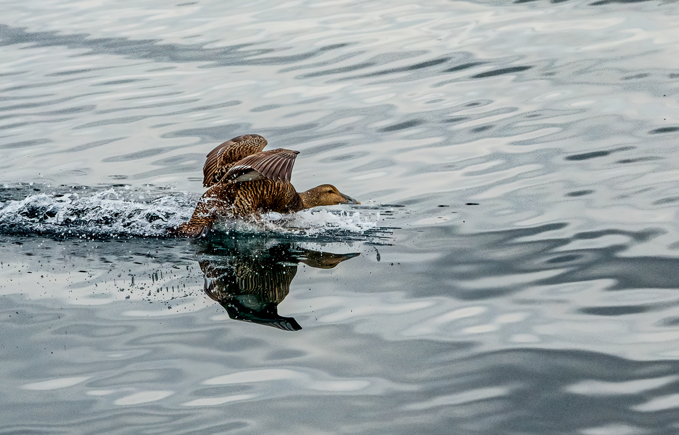
Mike, I like it. There is a gentleness to it. I like it as is. You could however try Topaz DeNoise or Lightroom Enhance, as there is much color noise. And I wonder if you flipped it if it would have even more appeal. |
Feb 12th |
| 15 |
Feb 24 |
Comment |
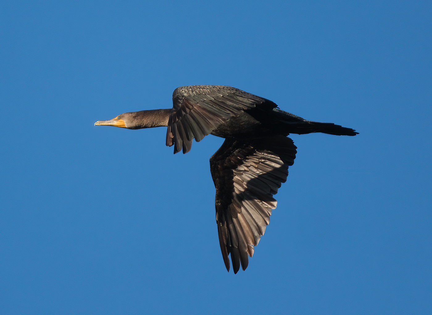
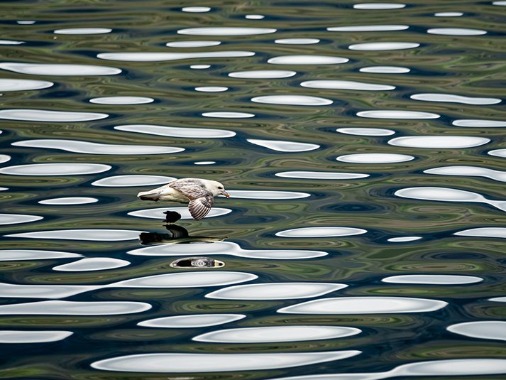
Jim, I like your framing, and I like that they are looking in the same direction. The water color is pleasing. As to the birds, I agree with what has already been said. |
Feb 12th |
5 comments - 2 replies for Group 15
|
| 81 |
Feb 24 |
Comment |
Angela, background is pleasing. Bottom right bark a bit distracting to me, but it is ok. A bright spot on left end of the branch, tone down. Birds are a bit soft, sharpen, but not much or they look crunchy. I like the poses, and you have them slightly looking in your direction. Catch lights in eyes. Good. Branch could be lightened as I find it overpowering in comparison to the birds. Well timed, well seen! |
Feb 12th |
| 81 |
Feb 24 |
Comment |
Kurt, nicely done, and you are getting great feedback. To add to it, I find the angle shooting down a bit static, and I suggest you try a level or lower shot next time, not from a standing looking down shot. Your shadows and reflections would take care of themselves by doing that. |
Feb 12th |
| 81 |
Feb 24 |
Comment |
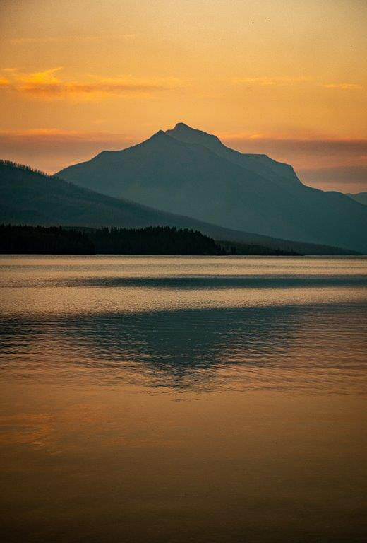
Jo-Ann, I like what Angela did, and I would take even more off the bottom, and some off the top. I like the mountain and cloud interaction. A pleasant scene. I would love to swim there. |
Feb 12th |
| 81 |
Feb 24 |
Comment |
Janet, I like the changes already suggested. The original needed some pop, more contrast, clarity, lower blacks, etc. The light was flat and that makes it hard. I am not a fan of birds at bird feeders, and that is me, not everyone. I find it a bit tight at the top too. It makes a good documentation of the bird, and I challenge you to get it in flight. |
Feb 12th |
4 comments - 0 replies for Group 81
|
9 comments - 2 replies Total
|