|
| Group |
Round |
C/R |
Comment |
Date |
Image |
| 15 |
Nov 23 |
Reply |
Jim, thank for your input. I do like the crop a lot, but I don't like to over sharpen birds, and this version does that, and it has hallows around the edges; thus, a mixed bag, but good suggestions. |
Nov 3rd |
| 15 |
Nov 23 |
Reply |
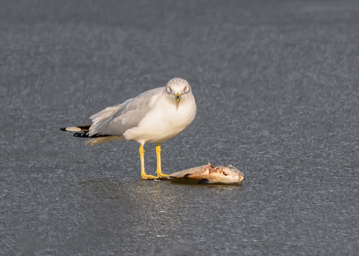
Sarita, I do like the new version. I would even take it ever so slightly down from the top. By the way, looking at it now, if you sharpened the bird, I suggest you not sharpen the water, and it would not compete with the bird and fish. If you are not entering into competition, then you could even soften the water, and get more separation too. |
Nov 2nd |
| 15 |
Nov 23 |
Comment |
Kathy, a wonderful shot, and good story. It feels a bit tight on the right especially, but you probably got rid of distractions. The neck gets a bit lost and you might be able to get more separation from contrast, clarity, or a bit dehaze. Sharp and beautiful. |
Nov 2nd |
| 15 |
Nov 23 |
Comment |
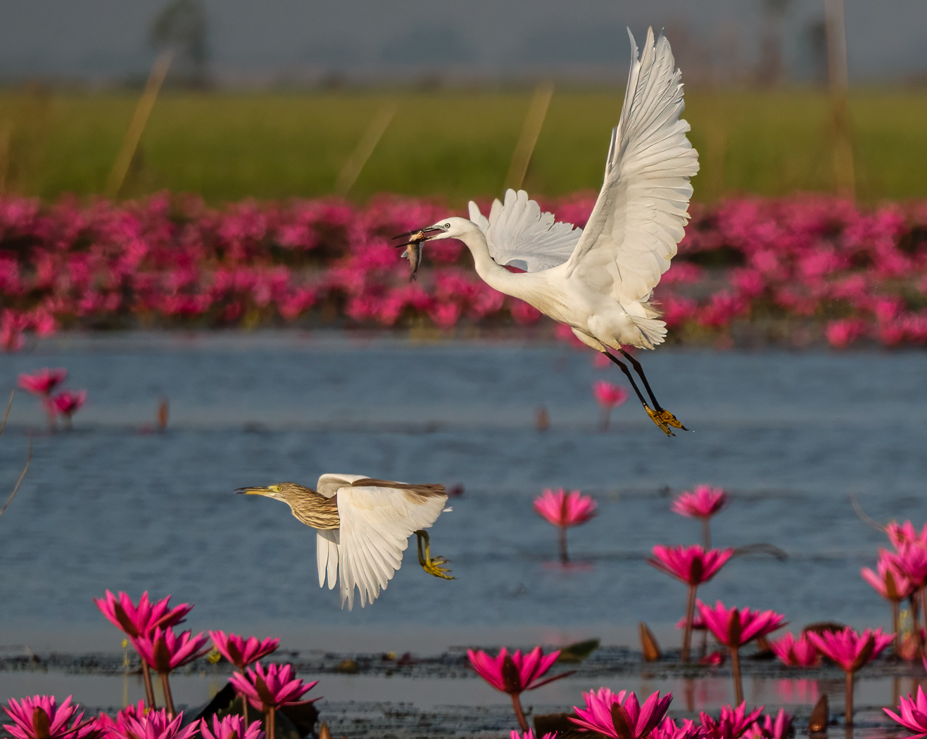
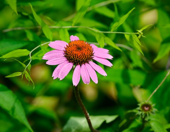
Sarita, I love these scenes, and your captured the capture quite well. I wish it were my shot! I think a bit more pop can be had, from increasing contrast or clarity. A bit more on top would help too. Sharp and beautiful. |
Nov 2nd |
| 15 |
Nov 23 |
Comment |
Mike, I love hawks. Beautiful. I find the metal a bit bright and you can tone that down, and you can also clone out the upper right or crop tighter, so as to get that wire out of the picture. You handled the harsh lighting well on the hawk. |
Nov 2nd |
| 15 |
Nov 23 |
Comment |
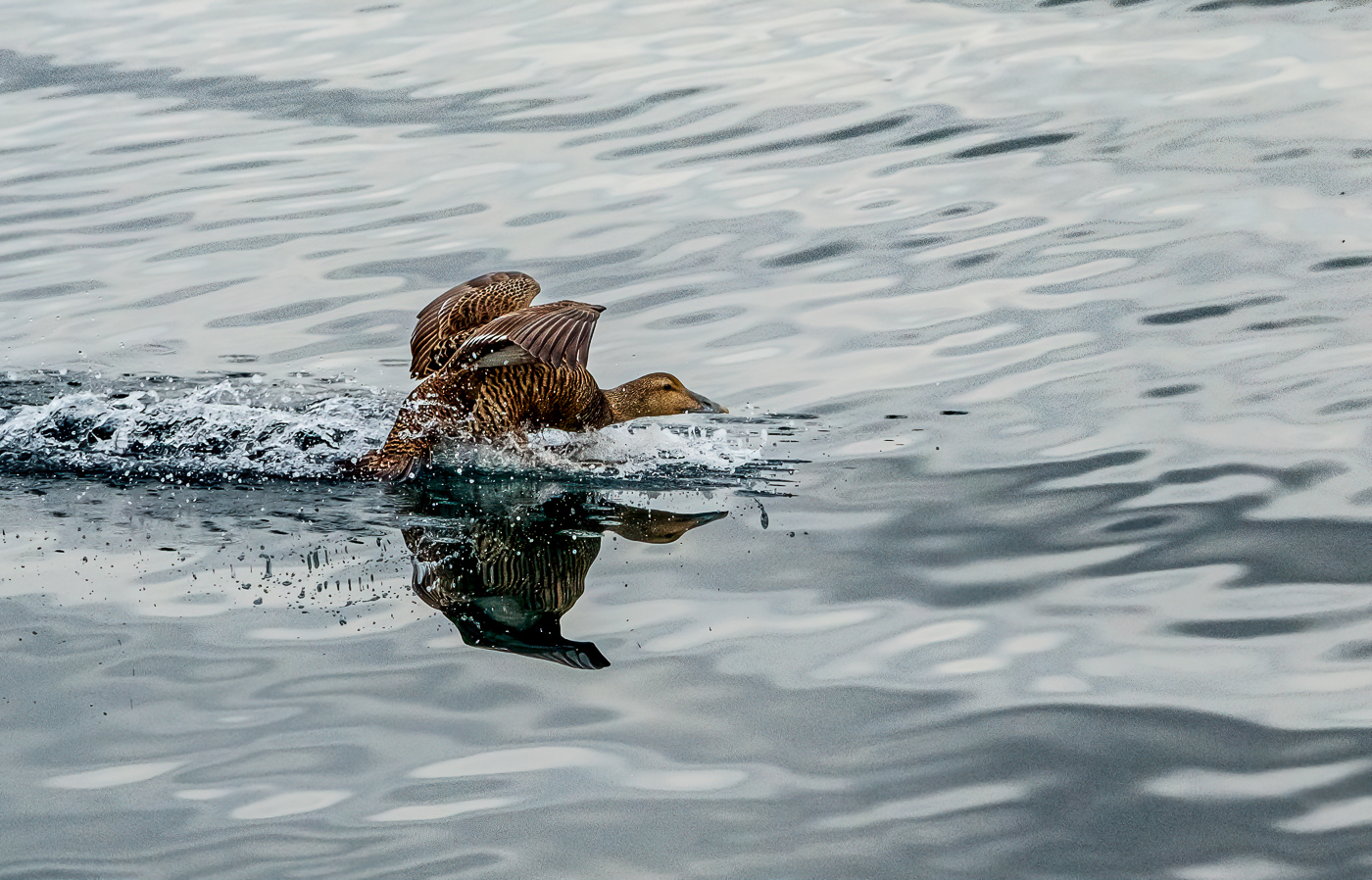
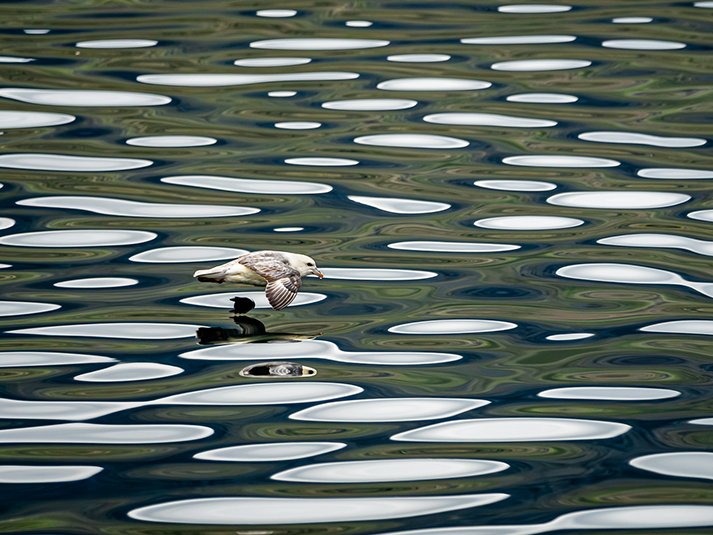
Jim, nice shot. I see why you sharpened it and took it to Topaz for DeNoise also. I like to use Subject sharpen and not sharpen the background, and I wonder what it would look like if you did that and had not sharpened the water. I like the crop. |
Nov 2nd |
| 15 |
Nov 23 |
Comment |
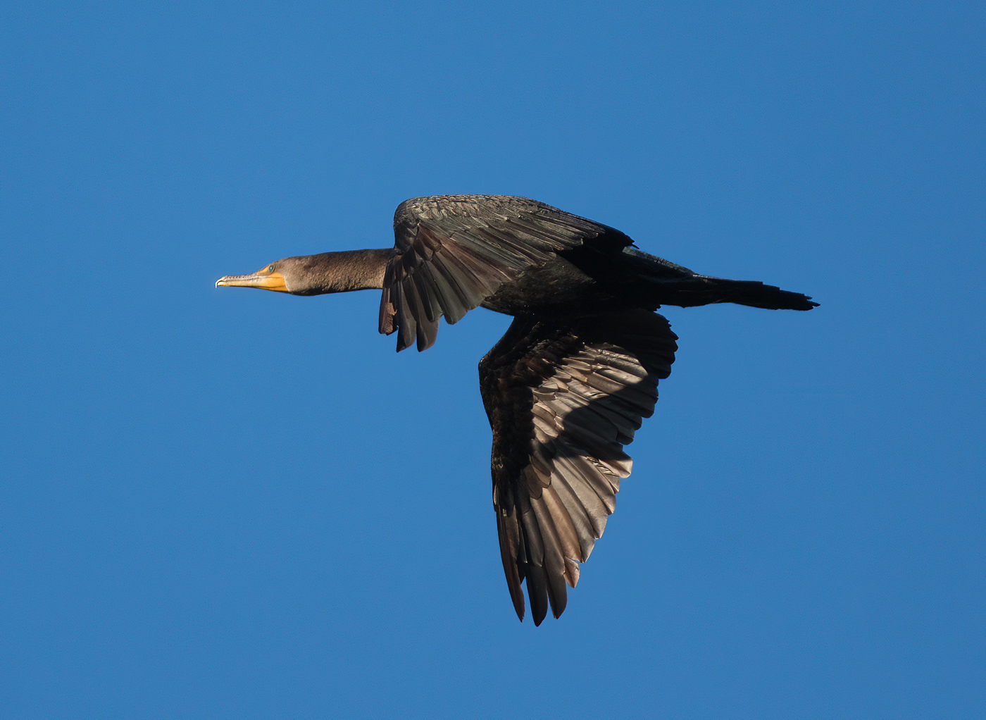
Dr Isaac, what a beautiful shot of a complex scene. What I love most, beyond the wonderful colors, and the eyes, is the tension seen in the adult's mouth from the baby's bill. That is awesome, and you got the eyes perfectly. I do not see what more you could do with the shot. |
Nov 2nd |
5 comments - 2 replies for Group 15
|
| 81 |
Nov 23 |
Comment |
Lance, that is so kind of you to comment on my shot. I will definitely check out Platon. I usually shoot telephoto, as that seems to be my best shots, but I have been expanding to wide angle too, and noticing I am going too wide for my general taste. What I took here is a good wide shot for me. Thank you again. Happy Holidays to you. |
Nov 26th |
| 81 |
Nov 23 |
Comment |
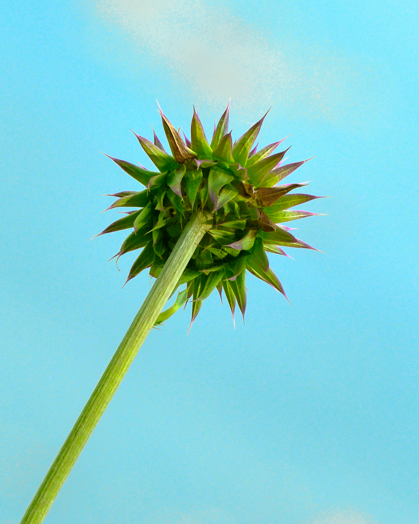
Angela, it is a beautiful arrangement. Asking for suggestions. I would brighten it up as it is dark to me. there is a lot of blank space upper left, and thus it feels off balance. It needs a bit more room on the bottom. Consider getting rid of the stuff on the upper right and crop down or add something else or add more to the left (but I do not find it all that appealing and adding more is not something I think would improve the shot.) |
Nov 5th |
| 81 |
Nov 23 |
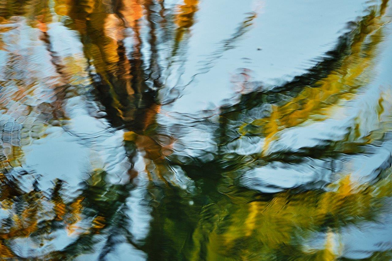
Comment |
Ralph, nice shot, nice scene. You brought out the colors. I like it, and I would consider cloning out the muck floating in the still water areas not part of the reflections. |
Nov 5th |
| 81 |
Nov 23 |
Comment |
Cheryl, a beautiful image for a beautiful baby. I like your post processing on the baby's face, and the blanket just below the skin is a bit blown out, and you can handle bringing back the tones and texture. I suggest flipping the image, and see how that looks. |
Nov 5th |
| 81 |
Nov 23 |
Comment |
Rose, such an interesting shot, and only by looking closely at the picture would I be able to tell there are two horses and riders. I like it just the way it is. It is interesting. |
Nov 5th |
| 81 |
Nov 23 |
Comment |
Welcome Jo-Ann. I like your thinking, but the processesed shot is not the same as the original shot. You can see on the processed among other things, there is more at the bottom, and the feather or whatever that is intersects the glass line but does not with the original shot. This may be why the processed shot is crooked, but for the very bottom. I am a fan of Topaz, but I find the image a bit hard to visualize, like on the skirt. I actually like the original shot better with some processing and no topaz. My thoughts. |
Nov 5th |
| 81 |
Nov 23 |
Comment |
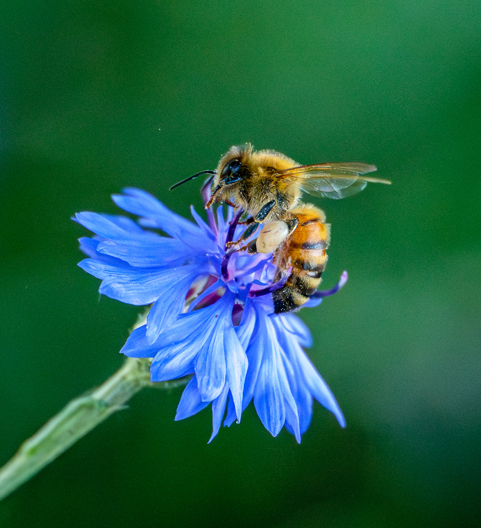
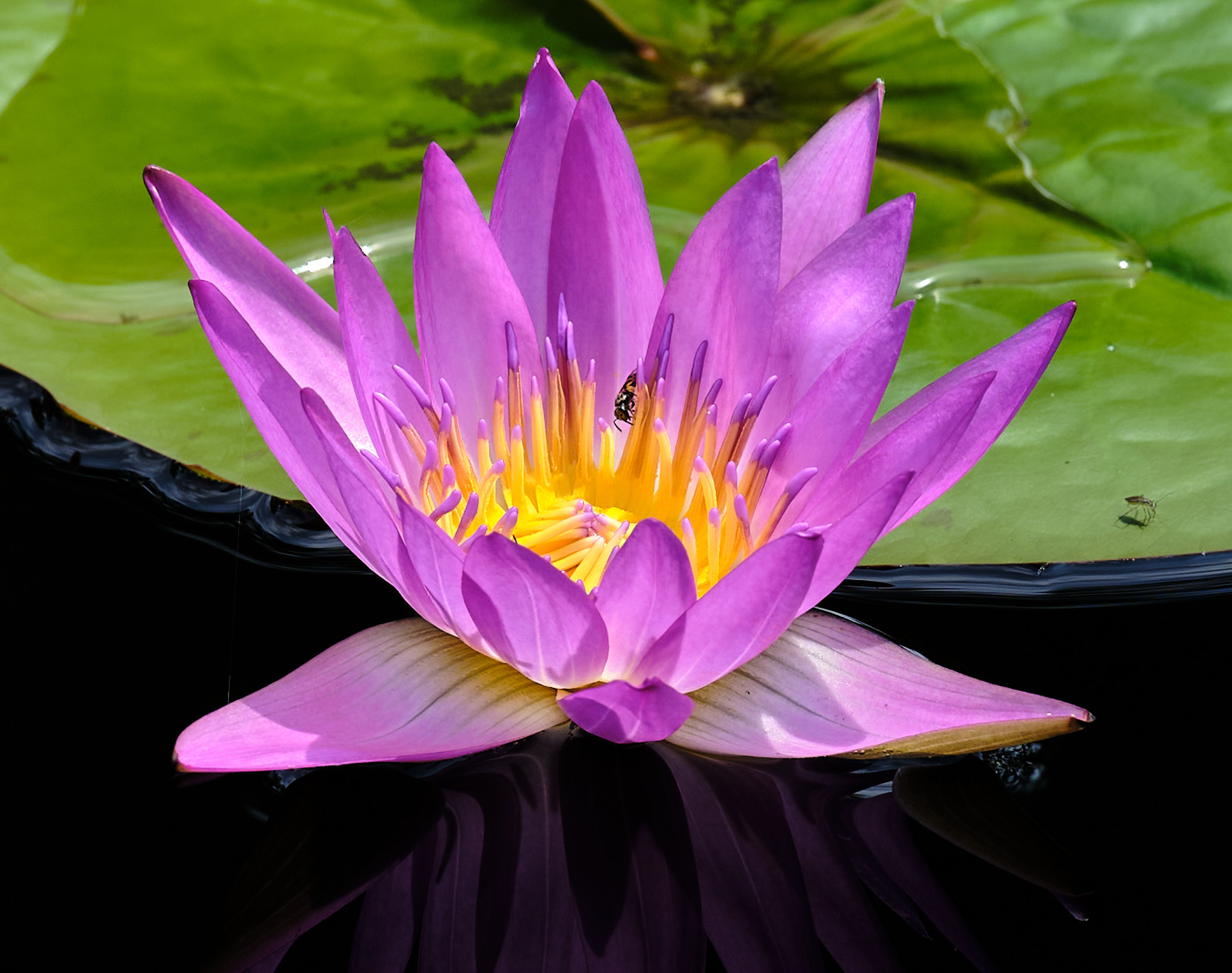
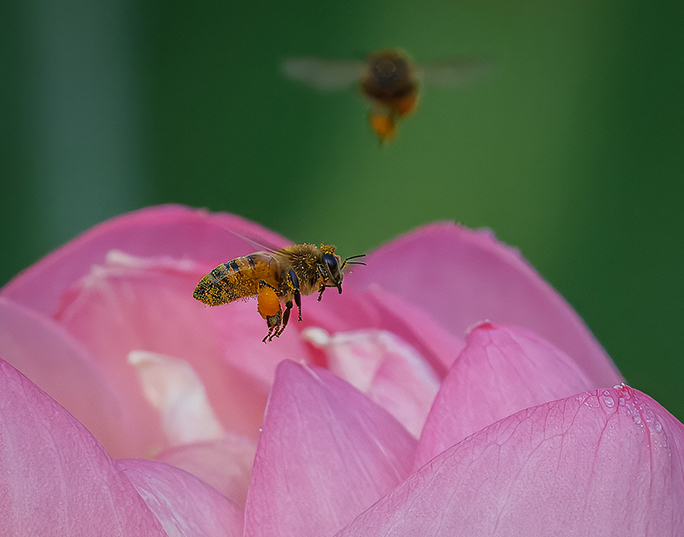
Janet, a beautiful shot, and I like your post processing. You brought out the bee. Colors look very good. I would take a brush and decrease the clarity and maybe the sharpness of the flower to the right of the bee as it competes with the bee. |
Nov 5th |
7 comments - 0 replies for Group 81
|
12 comments - 2 replies Total
|