|
| Group |
Round |
C/R |
Comment |
Date |
Image |
| 15 |
Jul 23 |
Reply |
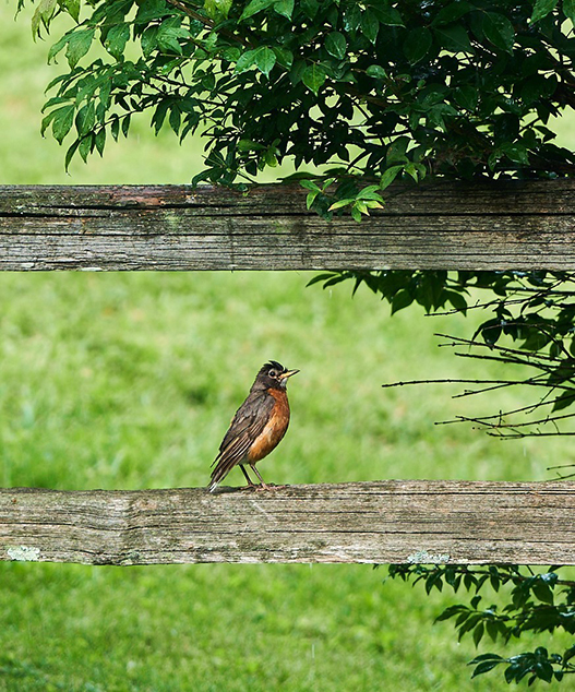
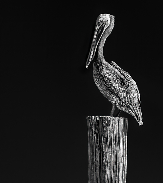
Dr Isaac, I could be wrong but I was seeing a bit softness in the very front of the beak, and I attributed it to motion blur, but maybe it is the color, or maybe just my eyesight and interpretation. |
Jul 24th |
| 15 |
Jul 23 |
Comment |
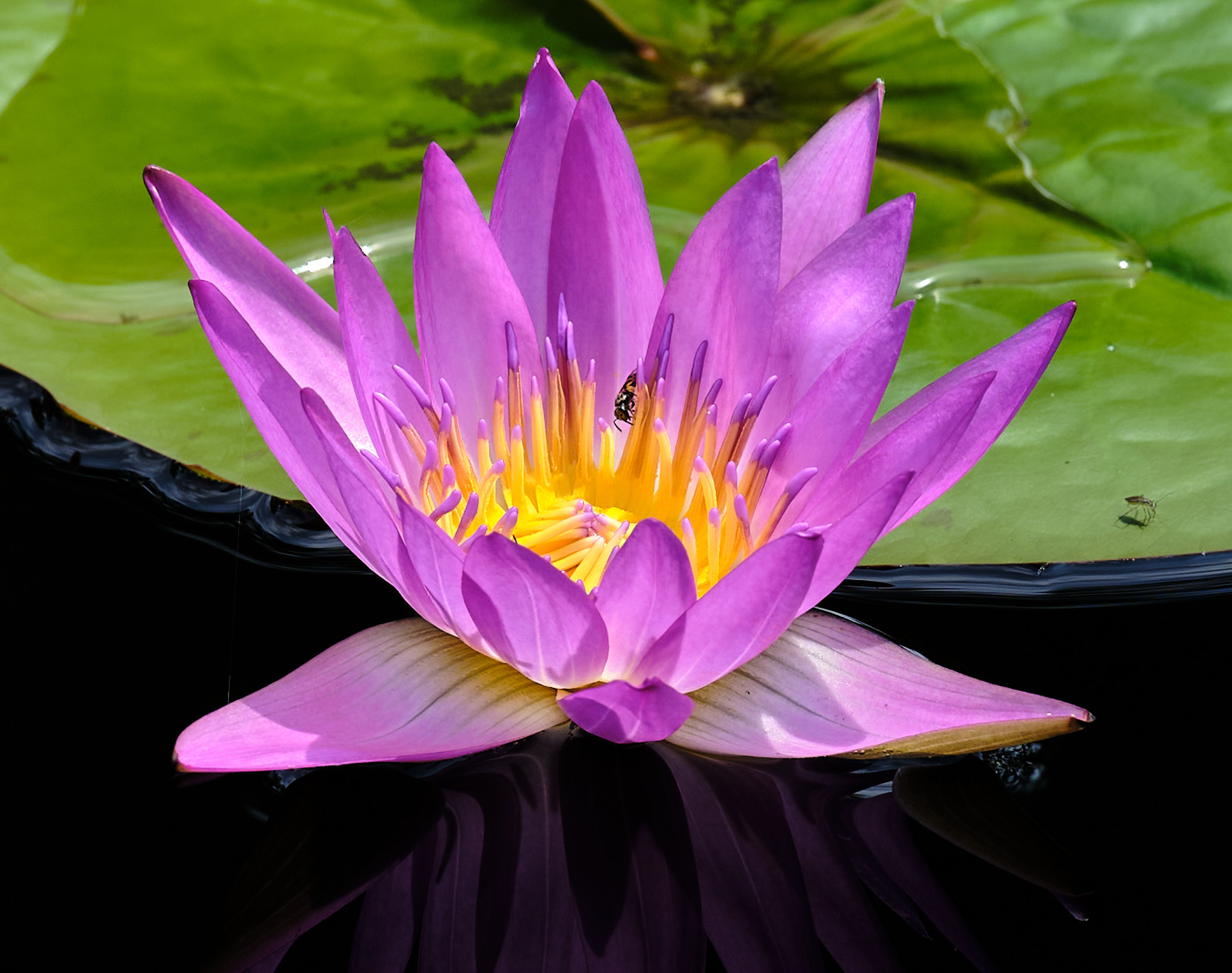
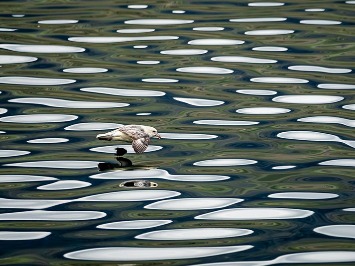
Kathy, you nailed the shot but the shutter speed is a bit low, and I suggest no less than 500th of a second, and the slight motion blur would have been eliminated. The water and color along with the reflection is wonderful. |
Jul 21st |
| 15 |
Jul 23 |
Comment |
Sarita, how cute is that!!! I like the way you present it. The duck on the right seems a bit soft, and you might be ablt to sharpen it. I find the left three a bit oversharp, and I would try to even out the sharpness. Love the colors too. |
Jul 21st |
| 15 |
Jul 23 |
Comment |
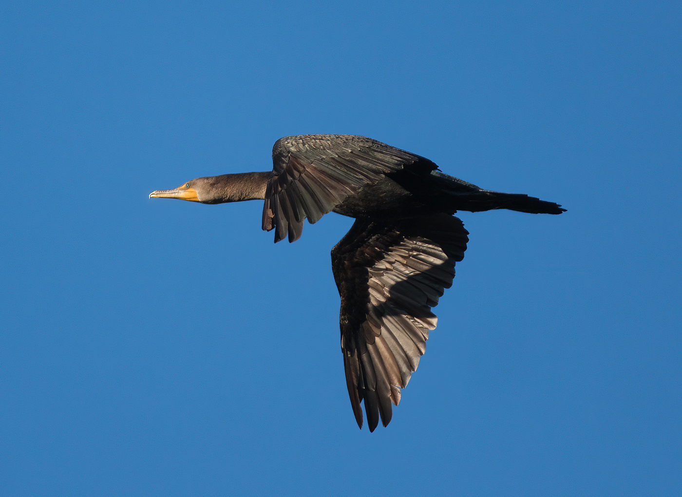
Linda, a nice capture and even better framing. The wing is bright without detail, and that is distracting, but you might see if there is detail to be brought out, or this could be an excellent picture to take to Topaz Impressionism. I am not sure they still support or sell Impressionism. If they do, I think you can make great art here for a wall hanging. |
Jul 21st |
| 15 |
Jul 23 |
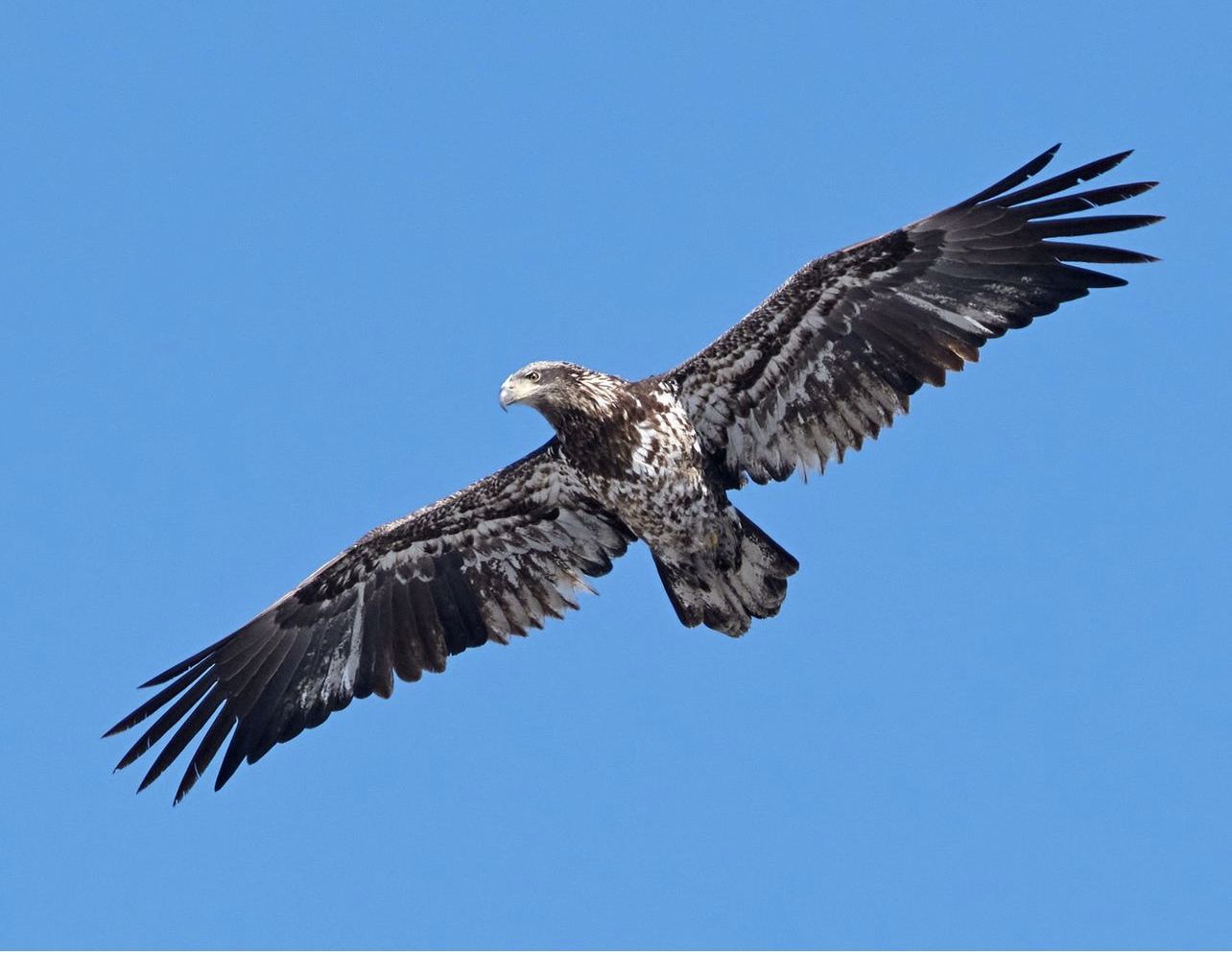
Comment |
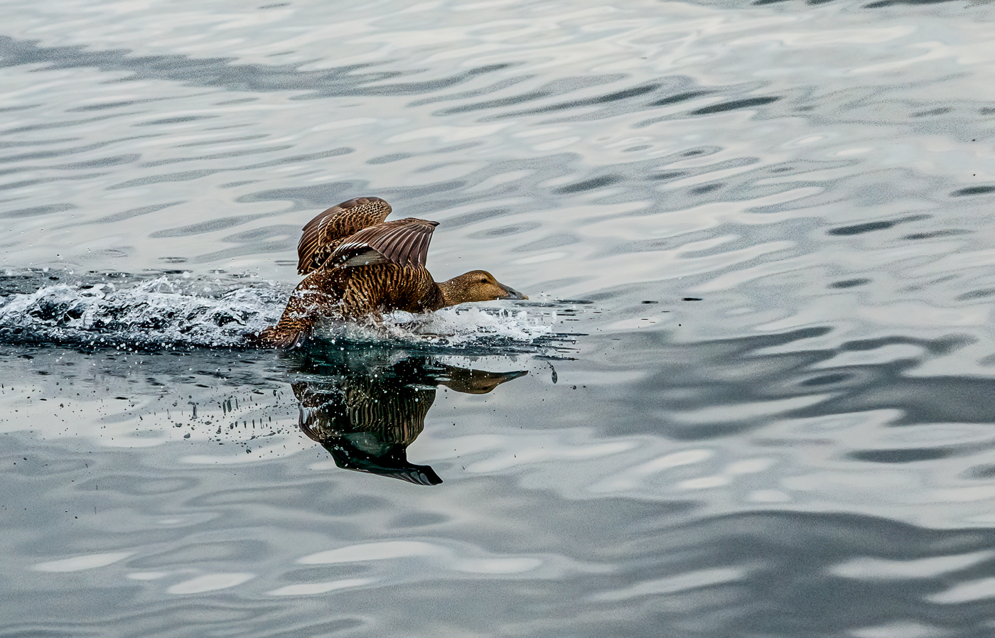
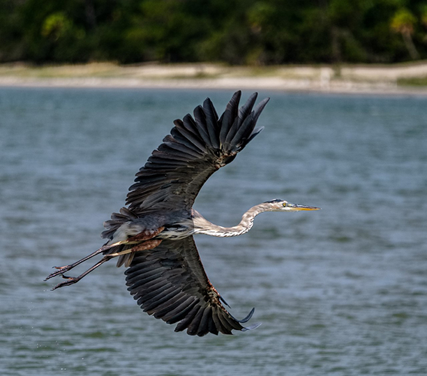
Mike, a beautiful shot with a wonderful gesture. The background is a bit too in focus for me, and it is hard to find that sweet spot for the f stop to get the entire bird in focus and the background supporting the subject by being soft and out of focus. Love the wings and the head is in a good position. |
Jul 21st |
| 15 |
Jul 23 |
Comment |
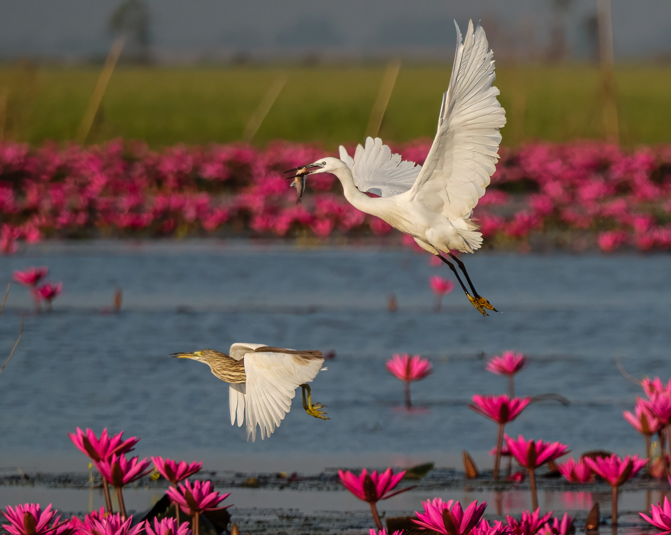
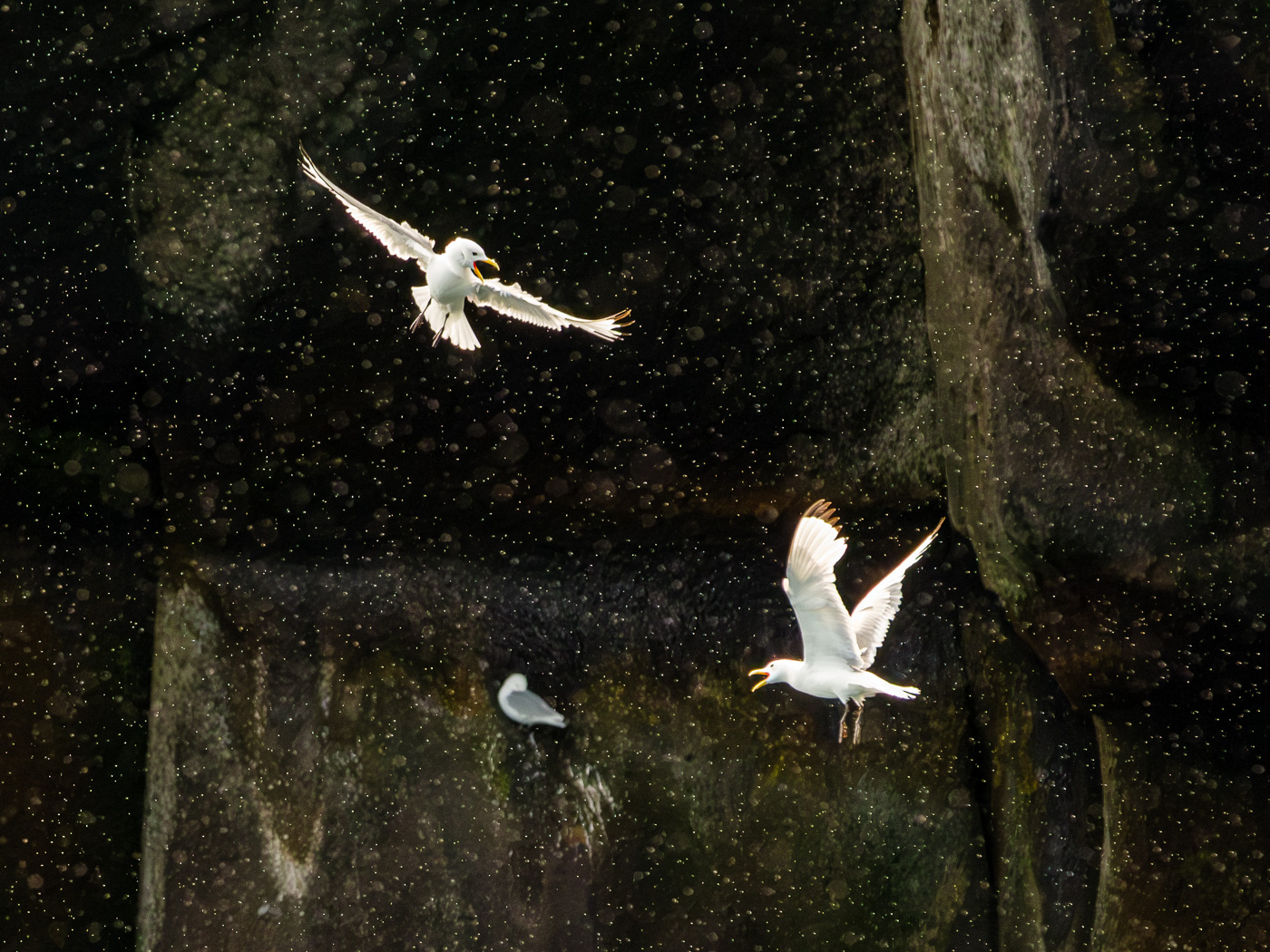
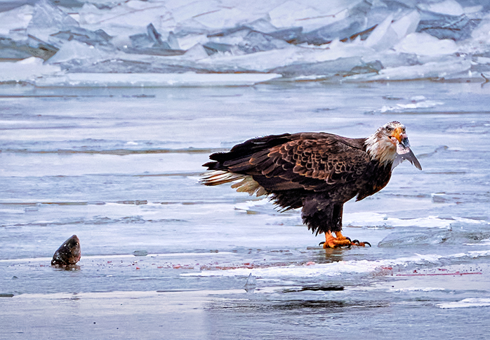
Jim, a special moment captured. Well seen. I like your crop, and I also agree about darkening the background. You got the eyes..............so important! |
Jul 21st |
| 15 |
Jul 23 |
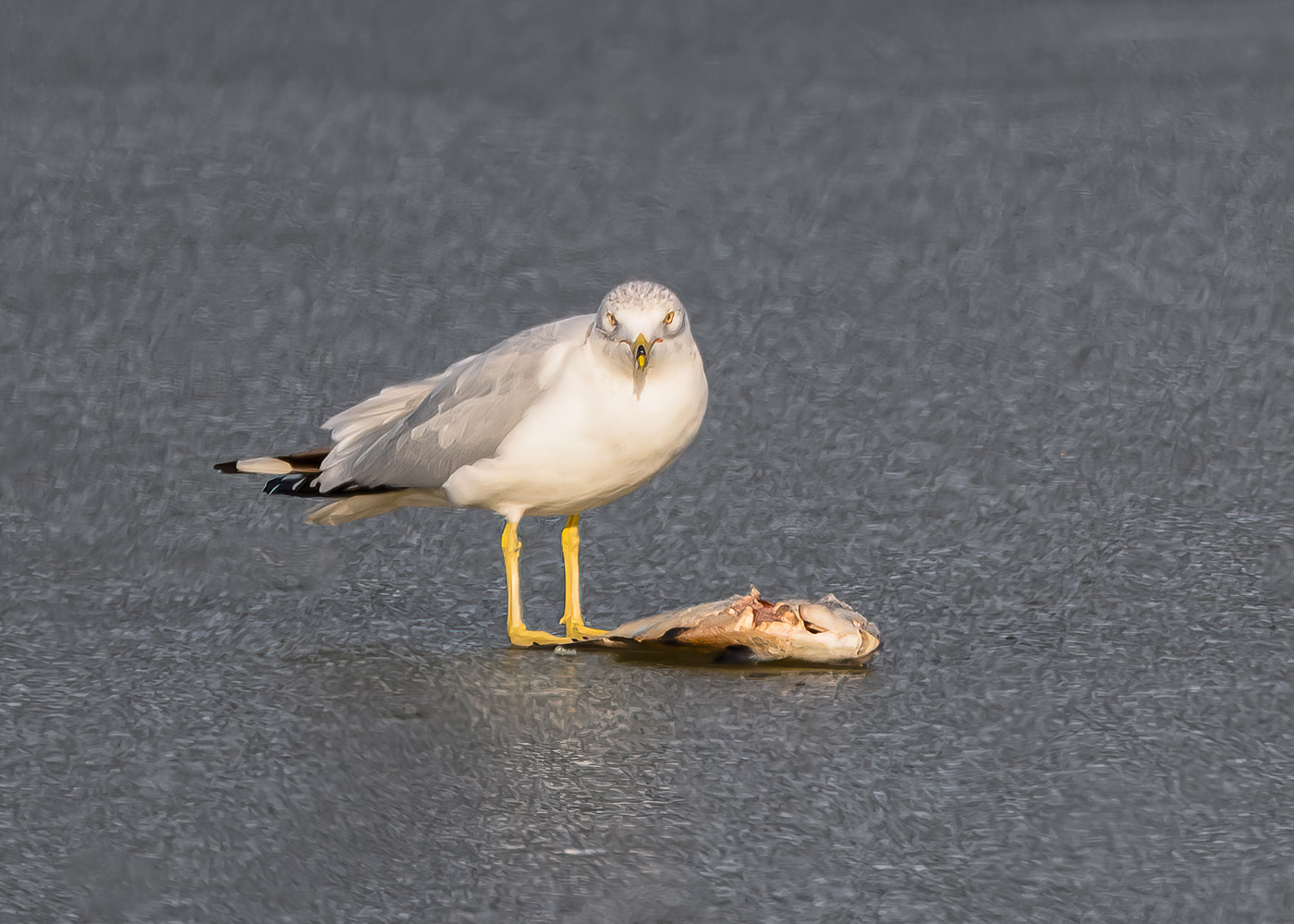
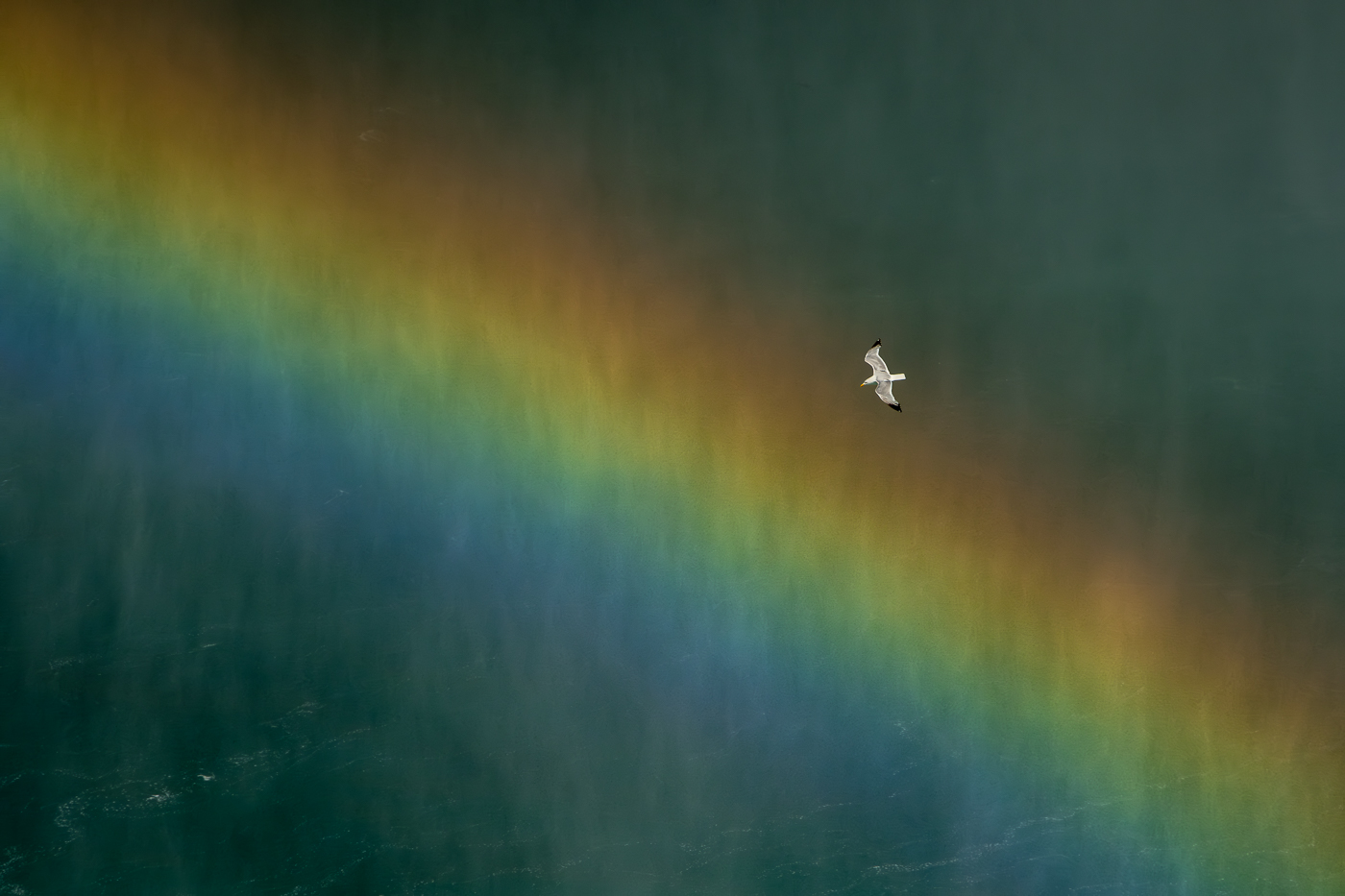
Comment |
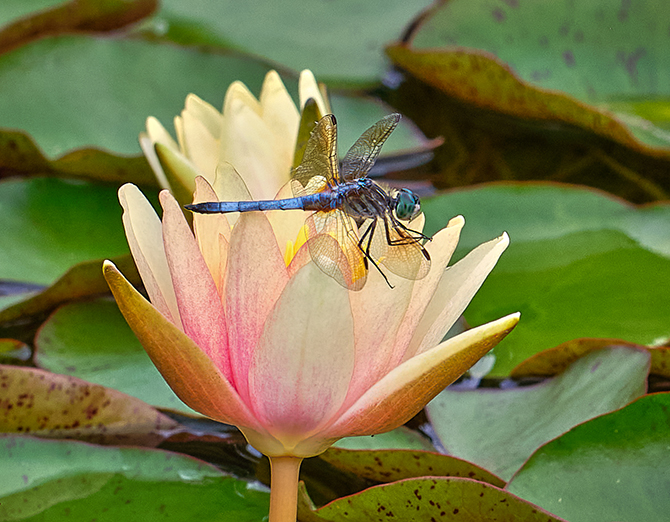
Dr Isaac, sharp and nice wings. I find the upper body a bit bright, no detail, and you might be able to take down the hightlights with a brush, and see if you like that. The colors are perfect. |
Jul 21st |
6 comments - 1 reply for Group 15
|
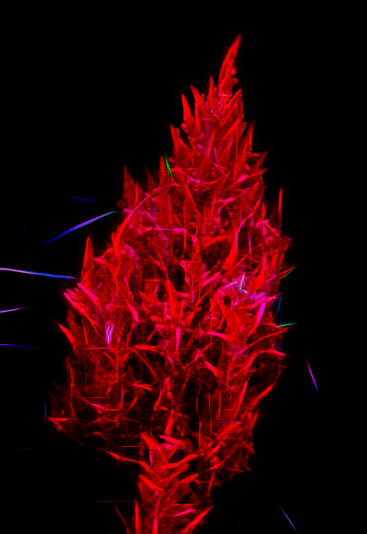
| 61 |
Jul 23 |
Comment |
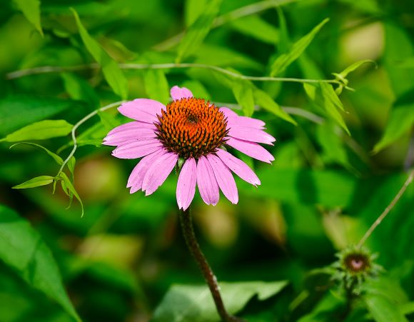
Hi, I like what you did and the rendering. I feel like it is a bit tight at the bottom and maybe a bit too much on top. You might take a look. beautiful, and tone down the bright spots on the back flowers. Very nice. |
Jul 21st |
| 61 |
Jul 23 |
Comment |
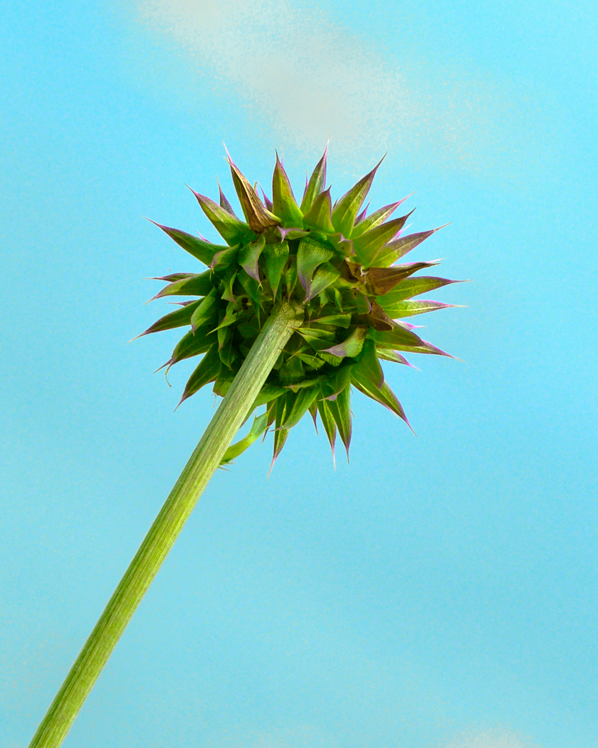
I really like the post processing. I too am confused how you would be able to sharpen the outer edges from the original shot. Neiter here nor there, you handled the sharpness and colors beautifully. I like how the stems bust out towards the viewer taking us to the seeds. |
Jul 21st |
| 61 |
Jul 23 |
Comment |
David, very creative. I love what you captured. I do find the back leaf a bit soft, especially in the bottom right. On the left it feels a bit tight, and you might add a bit of room to frame the picture. I wonder what it would look like if both layers were perfectly sharp throughout. |
Jul 21st |
| 61 |
Jul 23 |
Comment |
I like your shot, and agree with the prior suggestions. What I can add is when taking the shot, shoot for the bright spots so you retain detail that post processing gives you more possibilities of rendering the flower as you like. Check out exposure compensation on your camera for an effective solution. |
Jul 21st |
| 61 |
Jul 23 |
Comment |
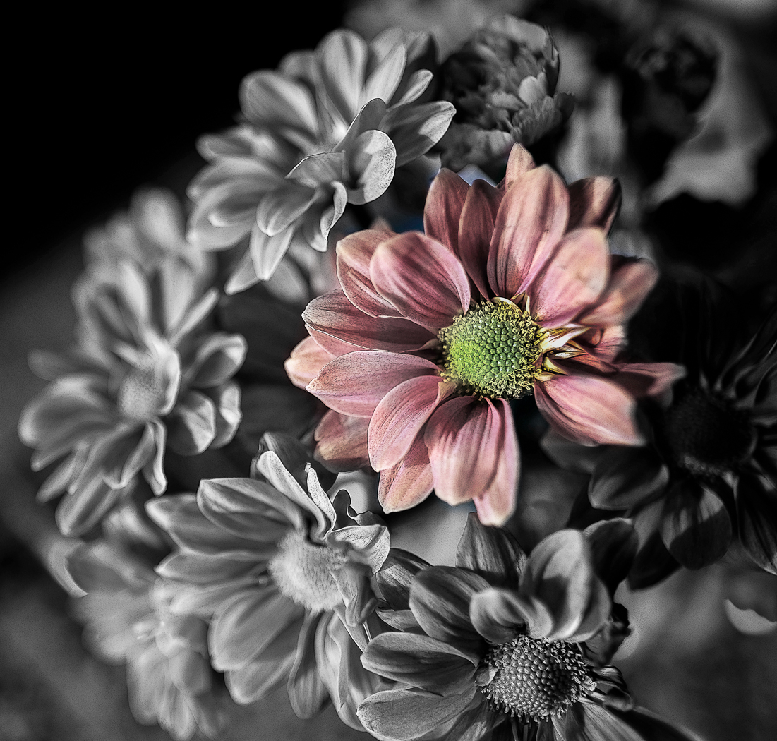
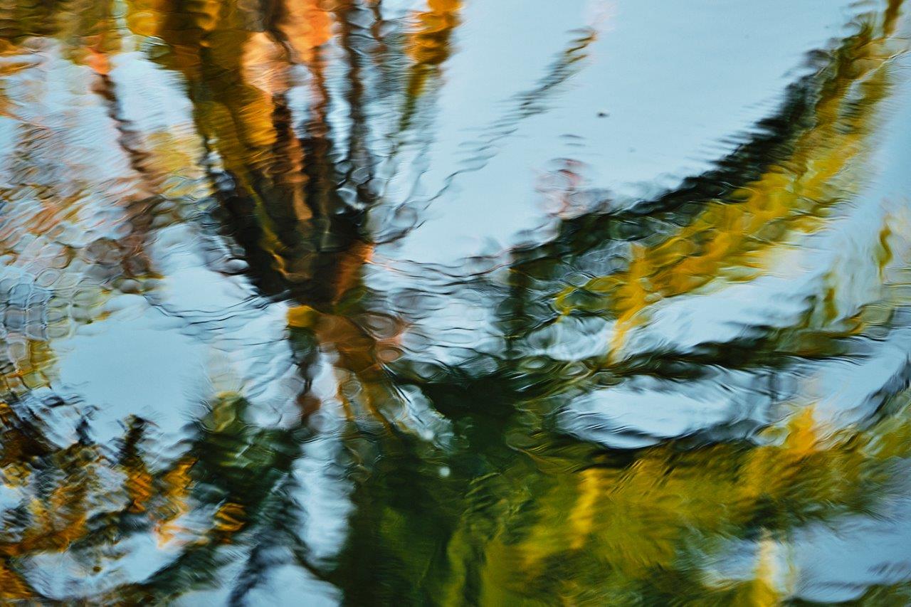
You saw an interesting subject and magnified the impact taking it to bnw. I like the light contrasts. There may be some bright spots in the upper areas, and it may be a bit dark below. You might consider cropping up some too to see how that looks. |
Jul 21st |
5 comments - 0 replies for Group 61
|
| 81 |
Jul 23 |
Comment |
Angela, I love what you shot and presented here. Good background rendering to white, and boarder keyline very nice touch. I am not sold on the stem outside the keyline, but it is creative. I suggest you could add just a hair of space on the inner bottom and right, as it feels ever so tight to me. A little off balance vertically as there is a fair amount of white negative space on top. Those are my finer points to an already awesome image. |
Jul 23rd |
| 81 |
Jul 23 |
Comment |
Ralph, the baby makes the shot. From ordinary to wonderful. It feels a bit tight at the top, and I would go back and add a bit to the top. And perhaps see if I could lighten the baby, making it the focal point. |
Jul 22nd |
| 81 |
Jul 23 |
Comment |
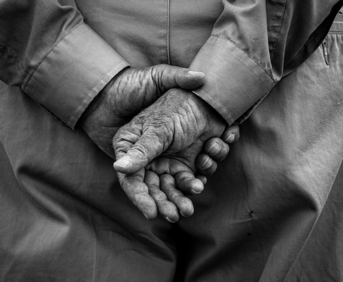
Cheryl, a most cherished photo. I too find the elbow at the face a bit distracting. And I dont think you need as much negative space at the top, and I would consider cropping down from the top. Skin tones beautiful. I also find the skin lines on the back distracting, but I am not a portrait photographer. I would see if I could tone those down, or clone to make smooth skin. |
Jul 22nd |
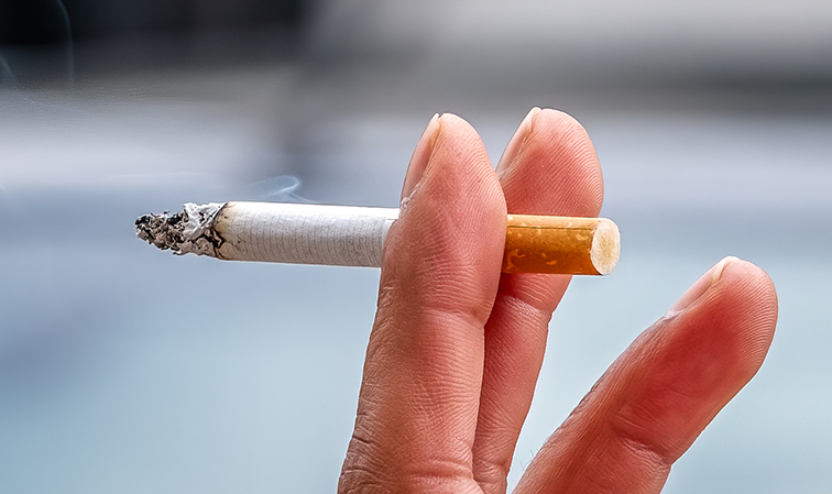
| 81 |
Jul 23 |
Comment |
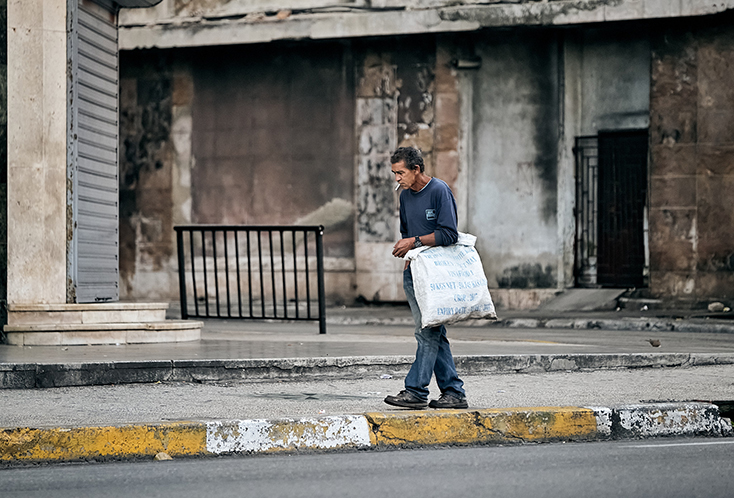
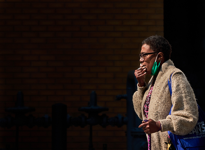
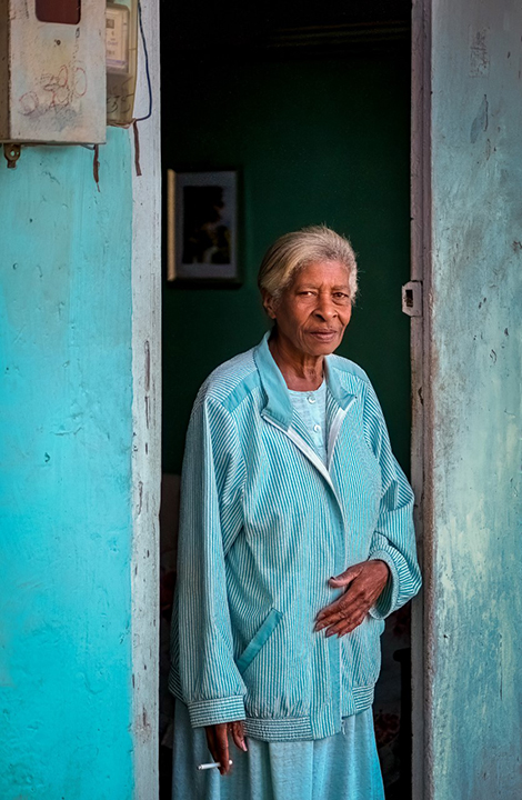
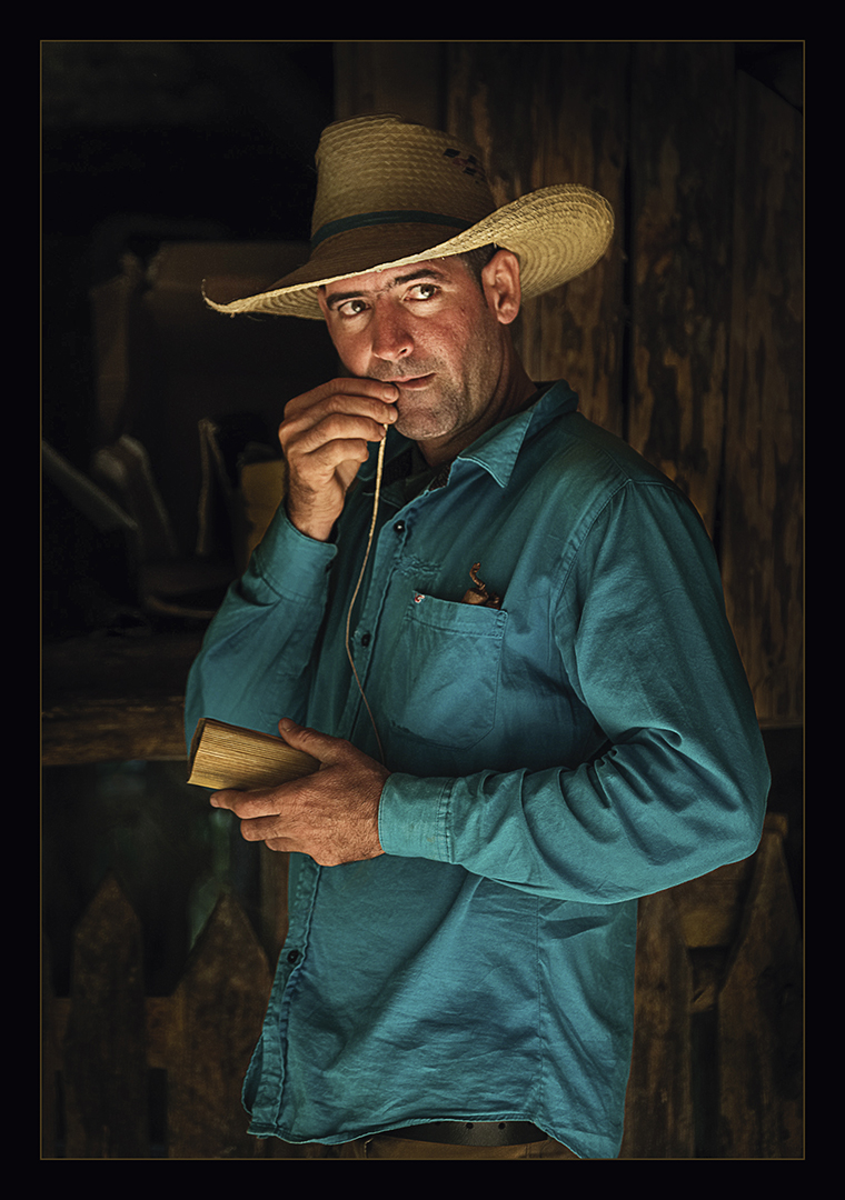
Rose, how fun. He is taking in that cigar without a hand on it. That I find interesting. Yes, I would crop up on it, and I like you took out the pole. Good job lightening his face. |
Jul 22nd |
| 81 |
Jul 23 |
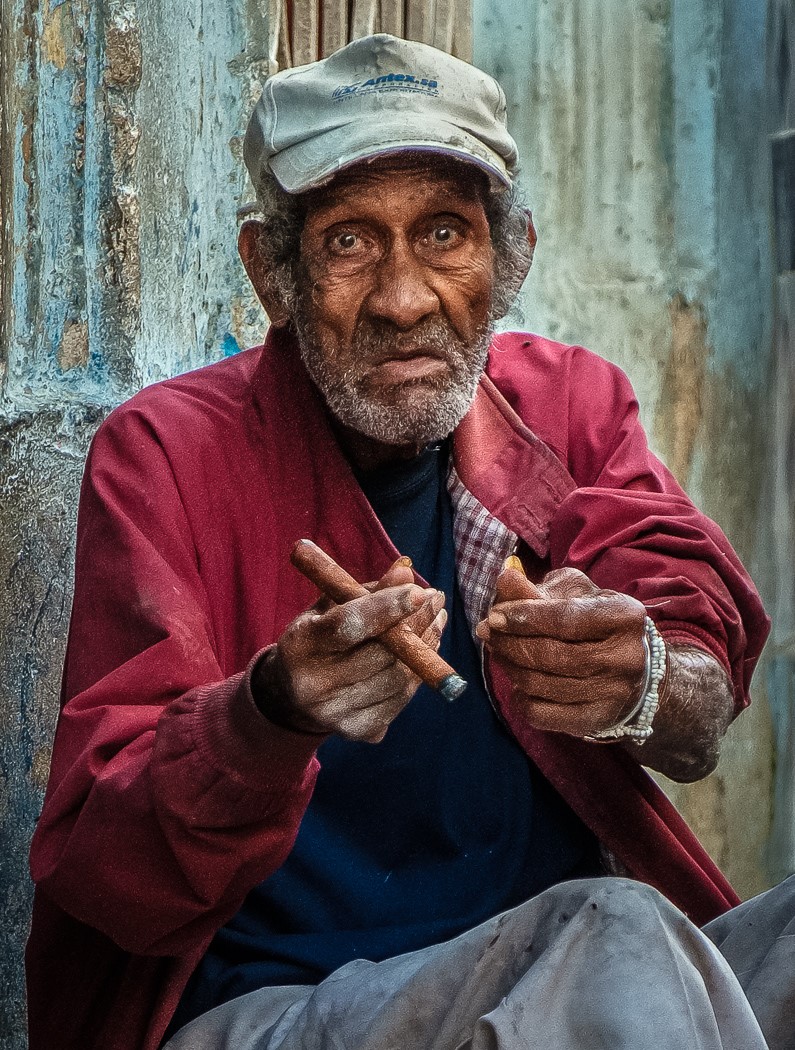
Comment |
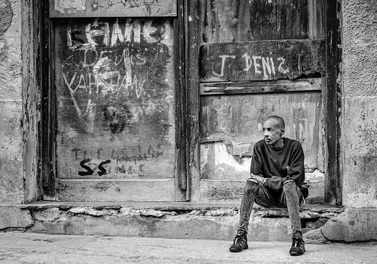
Mr. T, you captured his face, and I keep coming back to that. Very creative way to fill the space and make it scarier. I suggest you tone down the brightest parts as they were rendered better in the original. |
Jul 22nd |
| 81 |
Jul 23 |
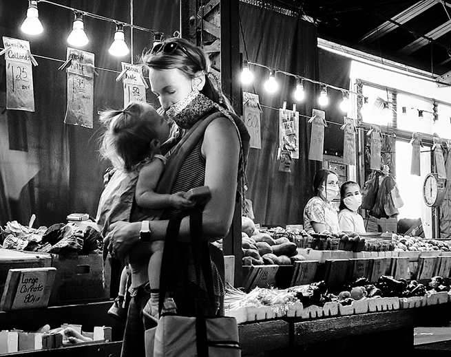
Comment |
Janet, it is so great you saw them and took their picture. Bravo. You were limited in what you could capture, and you have a good story. There are a few hot spots and you could use some more contrast and blur out the background a bit. It is usually nice to get their faces, but I think you got the best available. |
Jul 22nd |
6 comments - 0 replies for Group 81
|
17 comments - 1 reply Total
|