|
| Group |
Round |
C/R |
Comment |
Date |
Image |
| 61 |
Jun 23 |
Reply |
Ingrid, what a great idea. Much appreciated. |
Jun 23rd |
| 61 |
Jun 23 |
Reply |
Marti, great suggestion. |
Jun 23rd |
| 61 |
Jun 23 |
Comment |
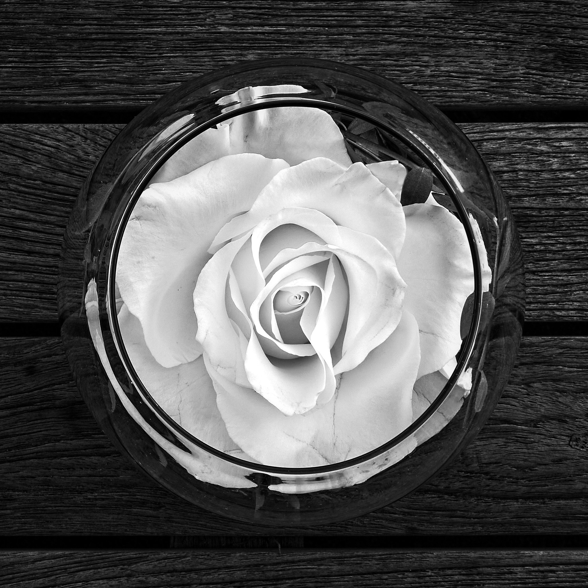
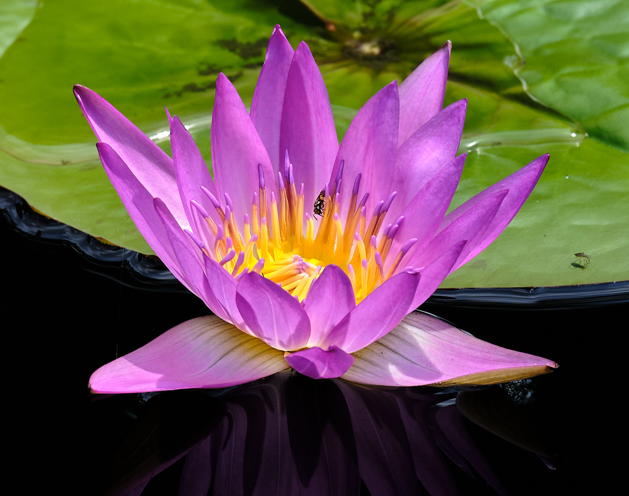
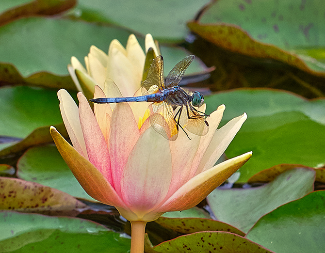
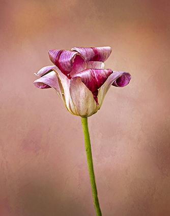
David, very beautiful. The post processing outstanding. I love the colors and the angle you took this shot. What I am not a fan of is a floating flower with a black background. It works here because you do not have a stem. And the background in the original while out of focus it is distracting, so good job to replace it. The subtleness of the petals and the colors are very appealing. Bravo! |
Jun 8th |
| 61 |
Jun 23 |
Comment |
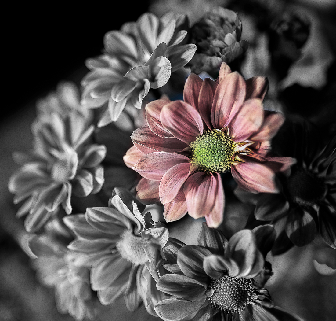
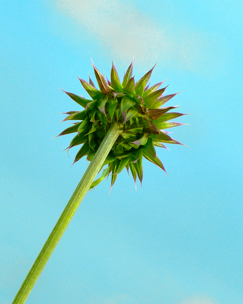
Ingrid, you are very creative. I like what you did, and the crop is effective. The colors outstanding. I like how the outer stamen support the center stamen. I find it with too much contrast making it appear crunchy. I like flowers to look soft and inviting. |
Jun 8th |
| 61 |
Jun 23 |
Reply |
Linda, you can see what I wrote, but you made the rose as I envisioned it. Good suggestion. |
Jun 8th |
| 61 |
Jun 23 |
Comment |
Marti, a very nice find. I like your framing. When I saw it I was struck by the contrast and it looked a bit "harsh." So I formulated in my mind that it would be wonderful if it was soft and gentle. When I looked to give feedback I saw Linda's versions. I saw in her first version what I was envisioning. She did in my opinion a wonderful job of your wonderful rose. Her background looks softer too and supports the rose. Very nice! |
Jun 8th |
| 61 |
Jun 23 |
Comment |
Linda, good eye. I must say I am of the same view as David. My first thought was it feels left heavy, and what David did helps that, and focuses us on the left. Usually, three subjects work better than two, a triangle for our eyes. It feels a bit tight at the top and the left as I previously said, and I would look to see if you have more you can add to the crop. The depth of the color is wonderful. |
Jun 8th |
| 61 |
Jun 23 |
Reply |
Thank you Linda, Marti, and David. All good points well taken. |
Jun 8th |
4 comments - 4 replies for Group 61
|
| 81 |
Jun 23 |
Reply |
Debasish, thank you for viewing my pic, and for your kind words. |
Jun 21st |
| 81 |
Jun 23 |
Comment |
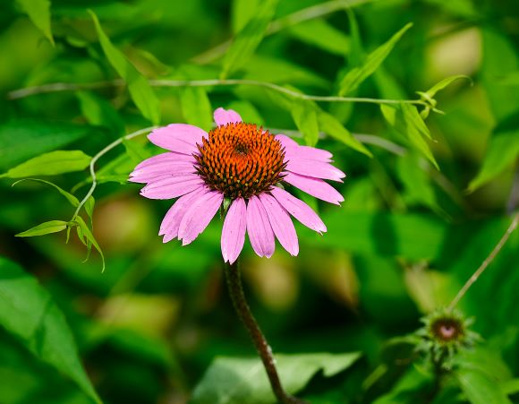
Angela, another majestic image. I think a vertical framing works better. I liked the original flower colors better. I find the colors blend with the background, but I do like the background replacement and the texture. I also find you lined up the flower with the original background in a good way and you could also use that background by creating even more separation by lowering the clarity and sharpness, etc. I like the angle you used, and how the front petal rolls over, and the outer ones in a tight roll. Attached is a vertical crop that I did quickly for view. |
Jun 8th |
 |
| 81 |
Jun 23 |
Reply |
Ralph, what you say is what I was wanting to convey. Thanks. He also missed a belt loop, but I chose to keep the hands the focal point as the missed belt loop was a bit high |
Jun 8th |
| 81 |
Jun 23 |
Comment |
Ralph, a beautiful eye handled well for a beautiful bird. Nice blur in the background. I would like to see the woodpecker doing something. Good editing as many people over sharpen birds, but not you. A few bright spots on the bird, and maybe they are just fine, or you might be able to tone them down, especially around the neck. |
Jun 7th |
| 81 |
Jun 23 |
Comment |
Cheryl, you did a good job on bringing down the brightness of her skin. Check the dynamic range of the blacks and whites, as it is a bit flat. Nice smile and hand and arm placement, but she feels a bit stiff. Asking her to relax her shoulders and arms I think will have her looking more natural, more relaxed. Maybe a bit more open next time, but beautiful eyes. Take about 1/2 off the top too, as we will focus more on her, and the extra top does not add to the photo. |
Jun 7th |
| 81 |
Jun 23 |
Comment |
Rose, how fun that is. Those horses are majestic. Hey, the major suggestion I make is to lower your f stop and have the background out of focus, as that creates separation and for me it would make the subject stand out even more. Nice to take out the people distractions. You can also consider cropping some on the left and get rid of the clock and create a nice effect with the windows. |
Jun 7th |
| 81 |
Jun 23 |
Comment |
Mr. T, the camel is sharp and has a good look towards you.
Next time you might want to check your background and not have the camels merging, and stepping around you might find a better background. It looks to be a fun day. |
Jun 7th |
| 81 |
Jun 23 |
Comment |
Janet, isn't it fun to come across these scenes. A couple of suggestions. See if you can tone down the whites as they are a bit bright. And to have the background out of focus would bring depth. That can be done with a smaller f stop, or in post bringing down the sharpness and clarity. It is kind of smiling at you. |
Jun 7th |
6 comments - 2 replies for Group 81
|
10 comments - 6 replies Total
|