|
| Group |
Round |
C/R |
Comment |
Date |
Image |
| 61 |
Mar 23 |
Reply |
Marti, I agree totally on the white spots. I am conflicted with the second bug as I like it, but you are right if I submitted for competition, so point well taken. |
Mar 21st |
| 61 |
Mar 23 |
Reply |
Thanks Ingrid. All your points are well taken. The reflection is really cool so I definitely want that to be seen. |
Mar 21st |
| 61 |
Mar 23 |
Comment |
Shirley, beautiful colors. I do find it seems to point downhill to the bottom left, and that causes me a bit discomfort. Brighten up the moth head so we can see it too. Something is going on with some petals as details lack, but I see what attracted you to shoot it. |
Mar 12th |
| 61 |
Mar 23 |
Comment |
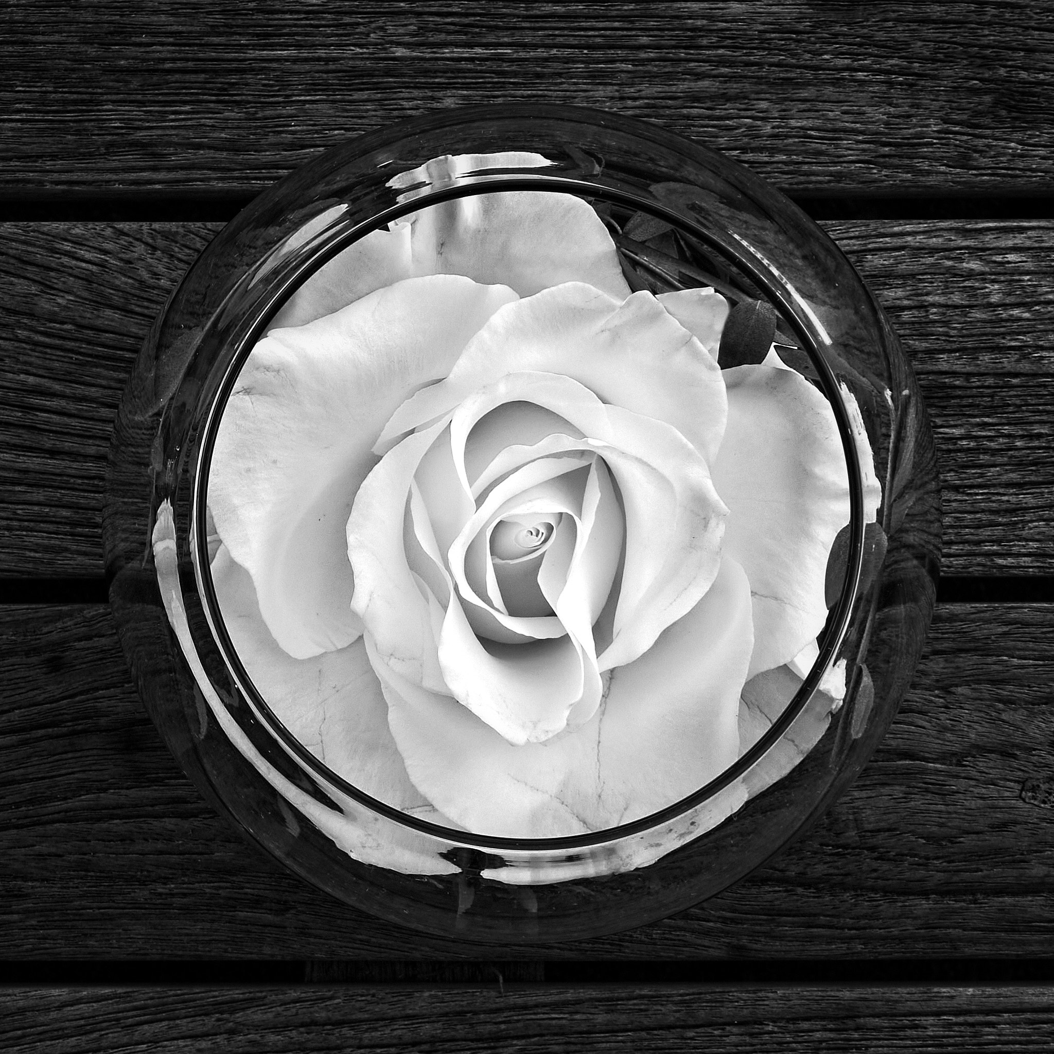
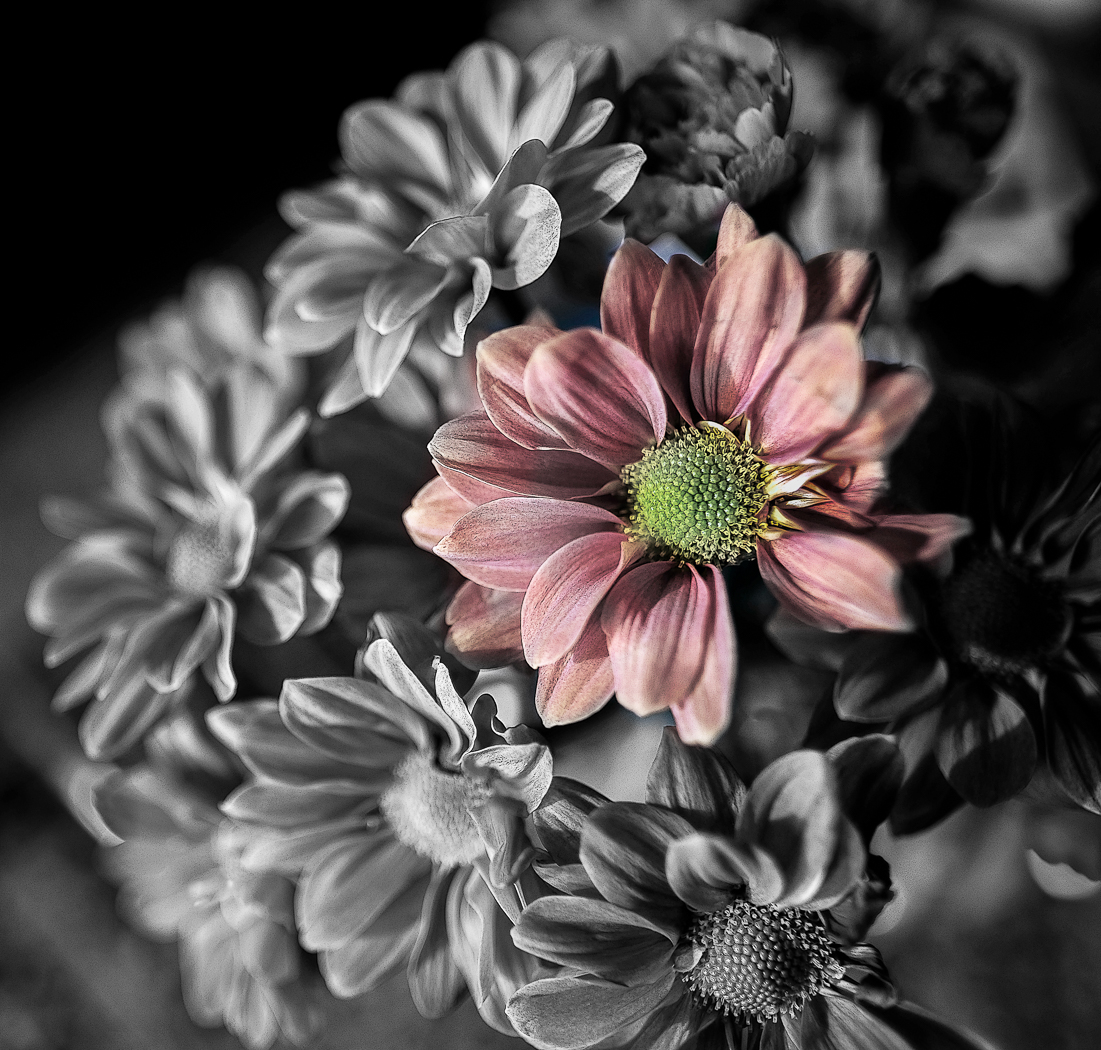
INgrid, a lovely image and bnw looks good here, and a bit more white I think would make it pop. Not sure if he skew changed it that much or if it is a different image, but nicely done. Maybe a bit more on top and give more space to the flower, and the tip of the leaf at the bottom tone down the brightness. |
Mar 12th |
| 61 |
Mar 23 |
Comment |
Linda, a beautiful shot. Sharp and nice colors. The background is quite bright for me and overpowers the flower. Maybe an off white would work better for me. I like the way it is shaped. |
Mar 12th |
| 61 |
Mar 23 |
Comment |
Gene, pretty flower, and you certainly handled the background. For me, I like gentleness in flowers, so sharpening is something I try not to overdo, so here it is a bit crunchy for me. Also, I like more stem, and the color of the original. Too bright for me in the processed shot. |
Mar 12th |
| 61 |
Mar 23 |
Reply |
David, I am happy to share ideas. Glad you liked it. Pretty shot.
|
Mar 12th |
| 61 |
Mar 23 |
Reply |
correct |
Mar 10th |
| 61 |
Mar 23 |
Reply |
David, I like what you did, a lot. And what about taking down the highlights on the upper part? As my eye still goes there too, distracting me from the beauty of the main subject. Let me know. |
Mar 10th |
| 61 |
Mar 23 |
Reply |
Thanks. Good ideas. I like to crop, as you are perhaps noticing from my submissions, and that is why I like the large files despite the medium I generally use is social media or computer rendering like here. |
Mar 10th |
| 61 |
Mar 23 |
Reply |
If you blur it, let me know what you think. I believe you will like it. |
Mar 10th |
| 61 |
Mar 23 |
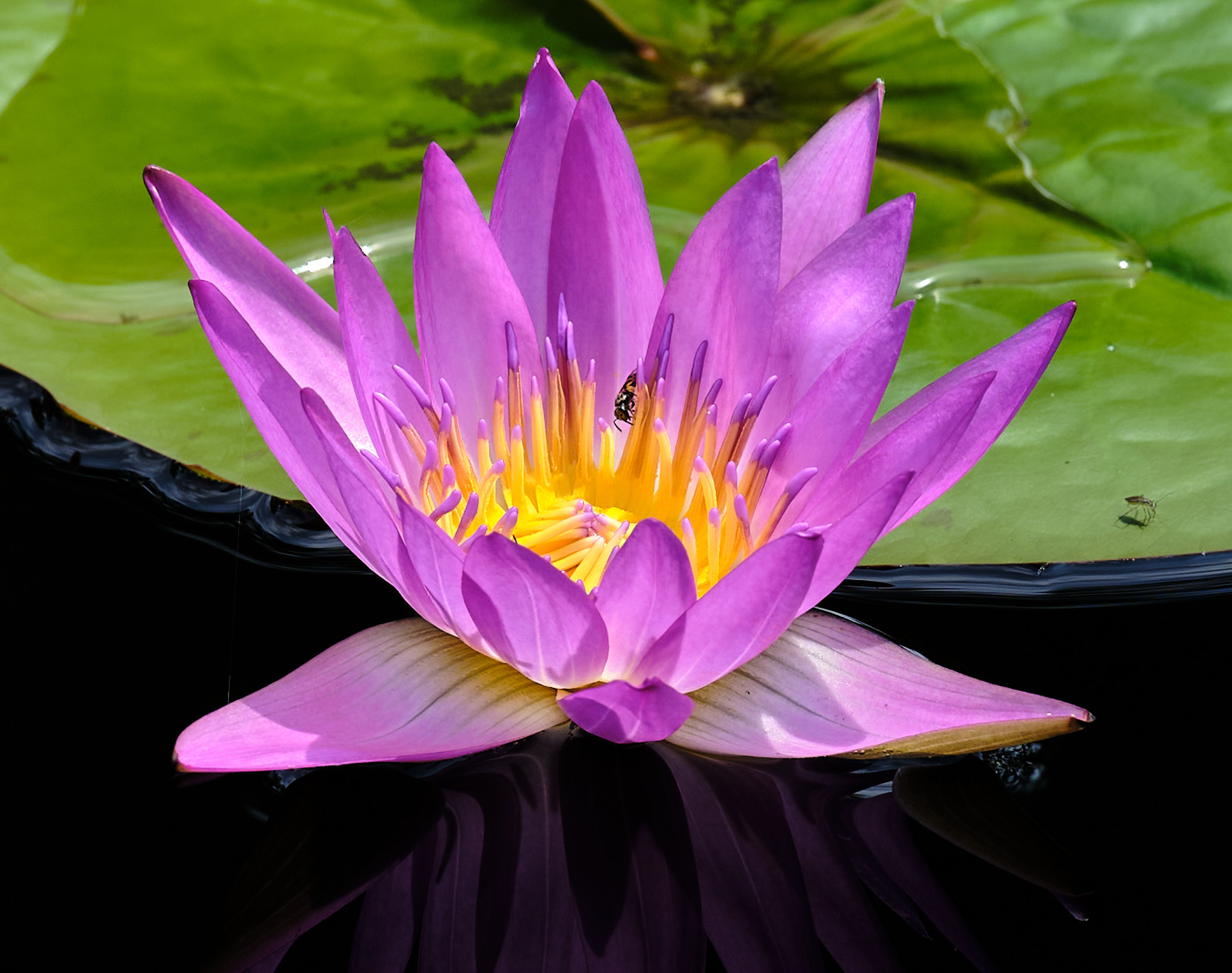
Comment |
Marti, I agree with David and find his rendition more successful for what you are capturing. Nice colors and background. There are a lot of shots looking down on flowers, ao here it is successful and at the same time maybe you can try some at a lower level and watch your backgrounds when doing so. |
Mar 10th |
| 61 |
Mar 23 |
Comment |
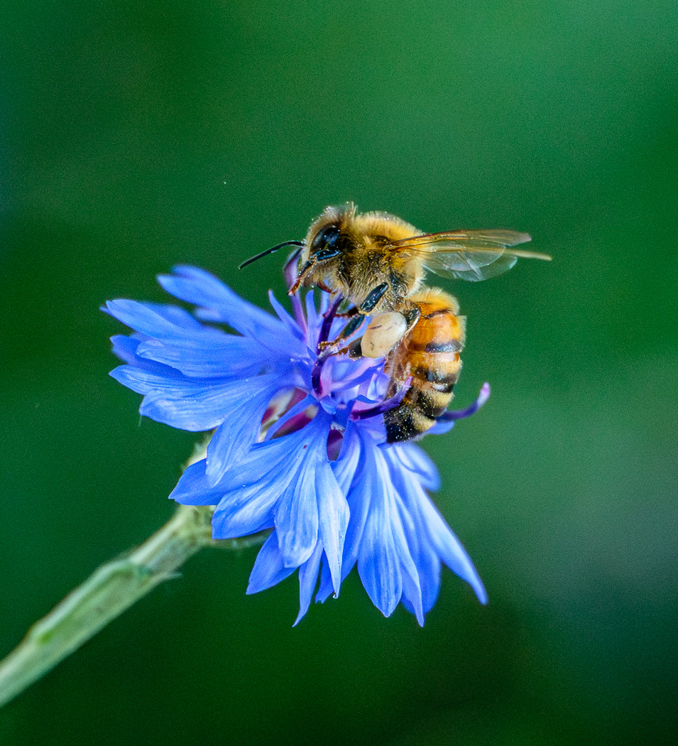
David, you amaze me with your detail, dignity in identification, and devotion to your craft. Bravo. Beautiful shot. The suggestions I make are to blur the pod on the left as it competes with the prime subject for me, the stamen and petals. And darken the bottom left. Beautiful shot. |
Mar 10th |
6 comments - 7 replies for Group 61
|
| 81 |
Mar 23 |
Comment |
Angela, a beautiful shot indeed, worthy to sell as a card or postcard. To that effect I suggest a vertical card size crop. But as is, it is very successful. I love the feeling it gives. The only thing that bothers me is the bottom of the stem of the second flower on the left as it floats out there. I suggest you bring it down in the grouping of the other stems. WOW! |
Mar 12th |
| 81 |
Mar 23 |
Comment |
Rose, there are many stories here. I find the vehicles to be too little of the pic, and nothing stands out to me of much interest in the back and foreground. I suggest you get close and find many shots. |
Mar 12th |
| 81 |
Mar 23 |
Comment |
Ralph, really fun and wonderful shot. I agree with all the comments above. I see Angela also brightened up the image, and I would brighten it even more, as well as use levels or black and white and bring out more pop, as it is a bit grey. You can also straighten out the goal posts to vertical as they lean a bit to the left. You are lucky to get as much of the goalies face as you did, and he is looking at the puck in the net. Ha. |
Mar 12th |
| 81 |
Mar 23 |
Comment |
Cheryl, I love this shot, and even more so after what you did with it. I find this a very successful shot. I just love it. I do see a white halo especially on the legs but that is from the processing. His left sleeve is a bit fuzzy. Both comments are minor compared to the shot, the eyes, posture, texture, lighting, balloons, framing, etc! |
Mar 12th |
| 81 |
Mar 23 |
Comment |
Mr. T, you have captured the spirit of the scene, and I feel that. I suggest you straighten it and crop off the right side and the cup and flame then support the picture. The essence remains without distraction. The flame is handled well, in exposure and placement. |
Mar 9th |
| 81 |
Mar 23 |
Comment |
Janet, got to love those Llamas. I like the expression, and your background blur. I personally would like to see a bit mor neck, putting the eyes in that 1/3 line. It glows, and that ia cool. |
Mar 9th |
6 comments - 0 replies for Group 81
|
12 comments - 7 replies Total
|