|
| Group |
Round |
C/R |
Comment |
Date |
Image |
| 61 |
Jan 23 |
Reply |
Yes Linda, you have it exactly correct. While I do not mind a "floating" flower I have heard many people downgrade the appeal for it kind of "floating" in a solid black background. A stem or showing a background is what is generally desired, by many people, not all, or at all times. Just good to know and make the choices you want. |
Jan 17th |
| 61 |
Jan 23 |
Reply |
Thanks Linda for your comments. We are alike for that type of emotional impact. I like them both, and do love the softness of the original. I am glad you like it, and appreciate your comments, as it gives me confidence to continue to let my heart lead. :) |
Jan 16th |
| 61 |
Jan 23 |
Reply |
Thank you all. I am glad you like it, and Linda you took my image and really made it so much better. I like what you did too, and it enhances my post processing creativity. For flowers I generally like a softness, a gentleness, and the comments and revised version looks great. |
Jan 11th |
| 61 |
Jan 23 |
Comment |
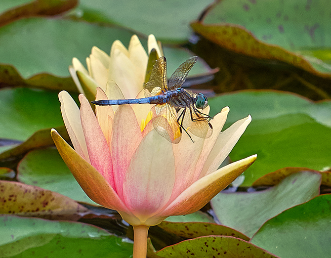
David, you did a great job processing this shot, and with a lensbaby of all things. I have one too, and dang it is hard to get a good shot, but when you get it, it is special. Here it did not work in the original, but my gosh, the post processing took this pic and made something very special. I love the colors, and the softness as I love that in flowers. The only thing I wish is that the top petals were a bit sharper, a tad. Seriously, a wonderful shot! |
Jan 7th |
| 61 |
Jan 23 |
Comment |
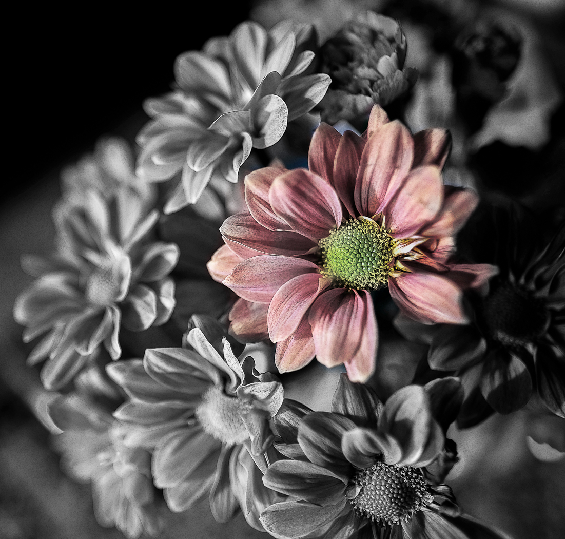
Marti, as with my shot, I really like you dove into the picture and found that beautiful image. You really brought out the colors. The sharpness and details feel a bit forced, and that is from the processing. Maybe look at this again and see if you like it with say 50% of the technique applied. That said, I really like what you did here. |
Jan 7th |
| 61 |
Jan 23 |
Comment |
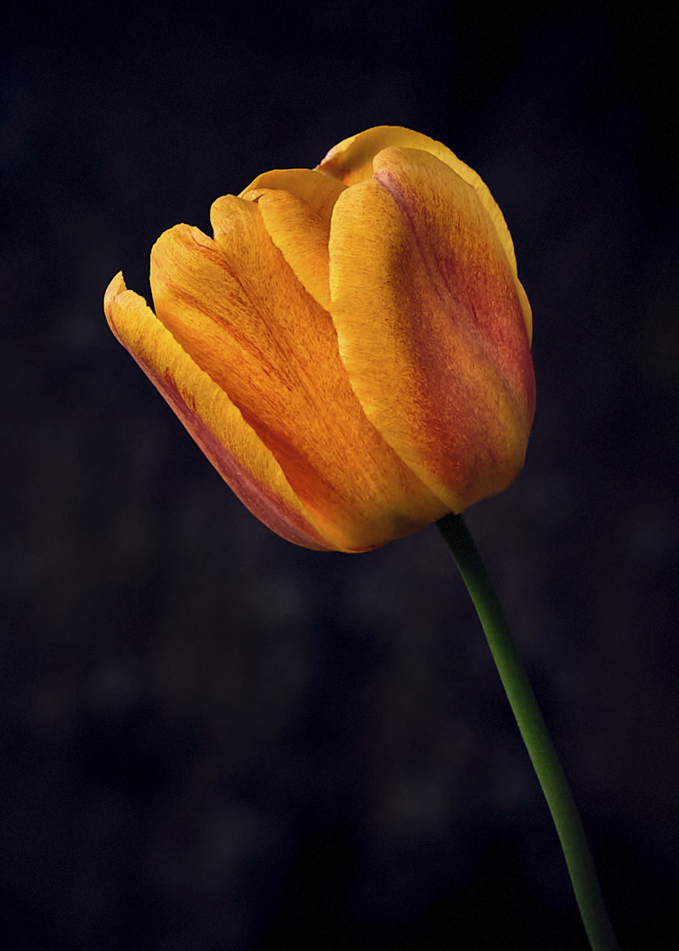
Ingrid, you found a great shape and took it from an appealing angle. I like how you brought out the yellow, and I find the shadows give it a realism that I like. Yea, the bright triangle you can darken without issue. I might even try to soften it a bit more, maybe by taking down the clarity, as I like softness in flowers, a gentleness, and maybe a bit brighter. Ove the shape. |
Jan 7th |
| 61 |
Jan 23 |
Comment |
Hi Shirley, the angle of this shot is very appealing, and the water droplets are always appealing, as they are here. I would like to see a bit more on the bottom as it feels a little tight, and it could be my computer screen, but I would brighten the white of the flowers to get them to really pop. Beautiful colors too. |
Jan 7th |
| 61 |
Jan 23 |
Comment |
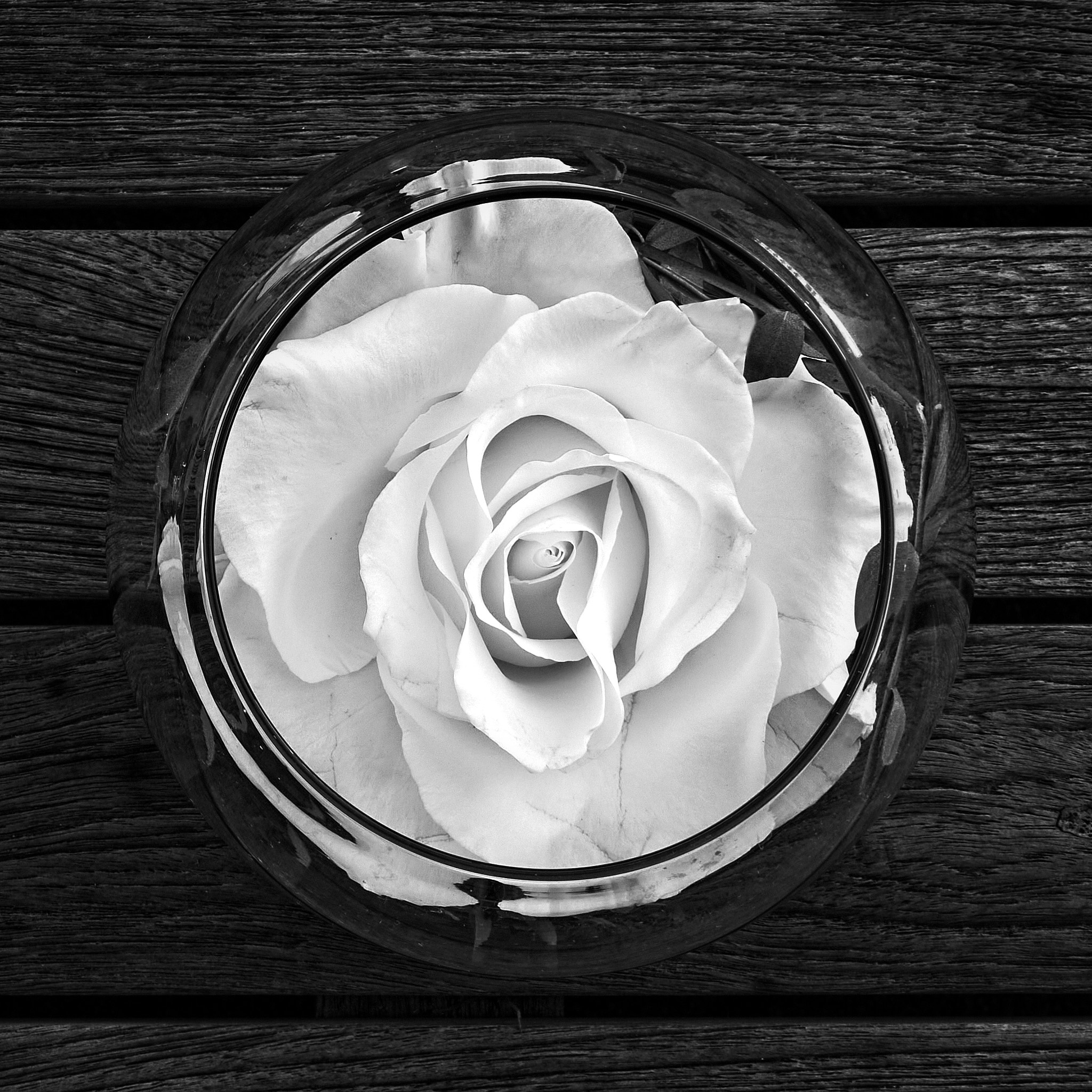
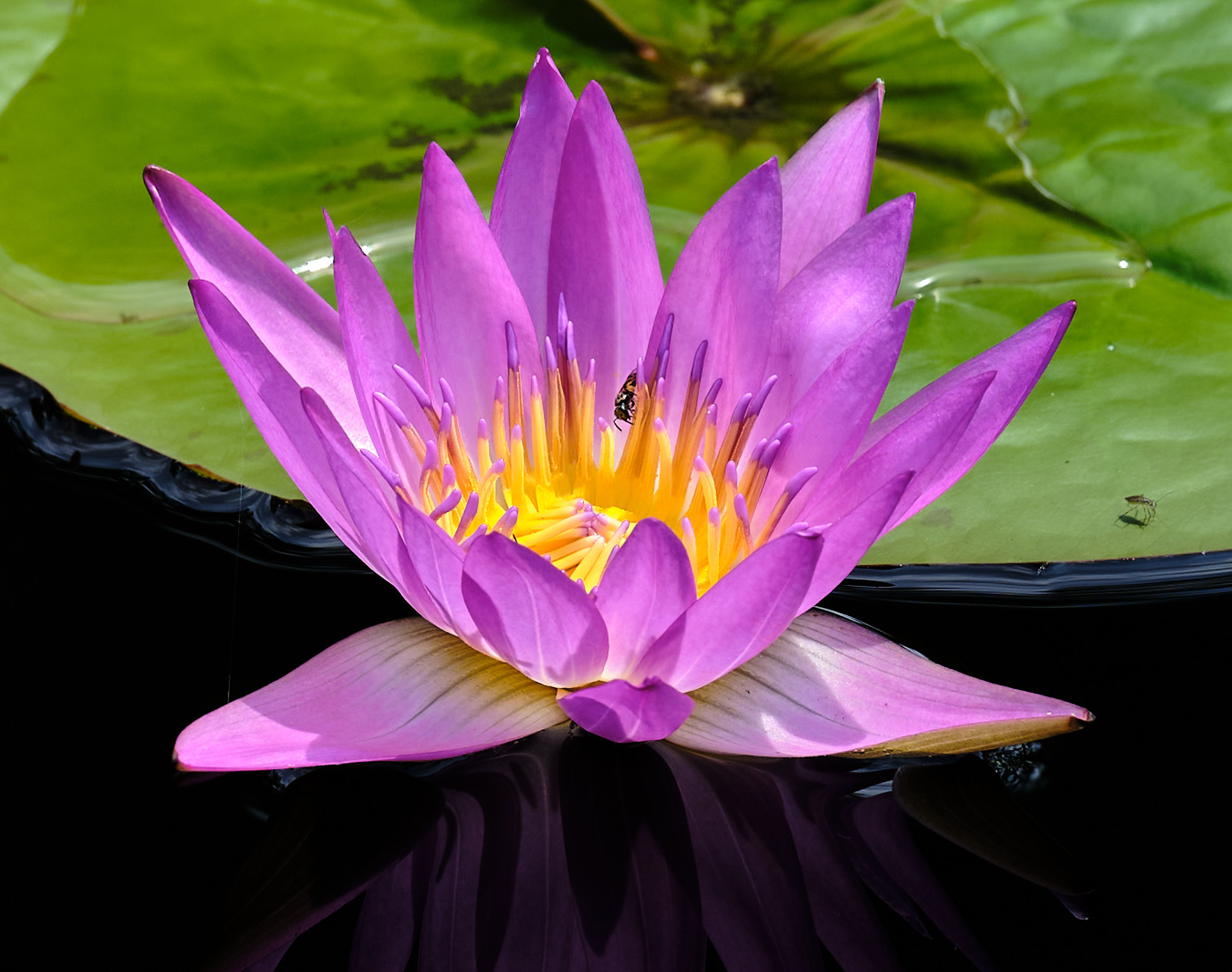
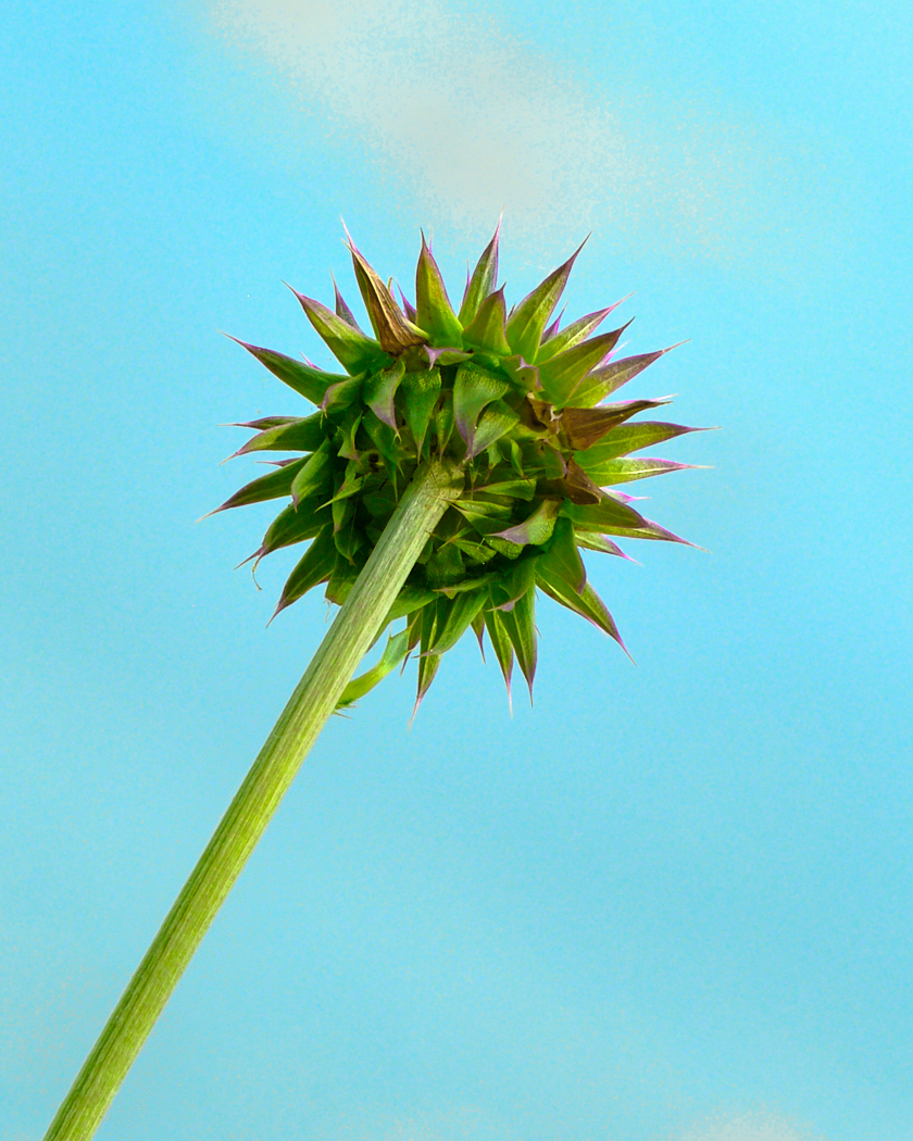
Linda, a beautiful flower, and you simplified it getting out a lot of distractions. I do like the white of the original, and I like the yellow too, and would go in between more toward the white of the original. While I do like how you handled the background, I am not a big fan of a floating flower on a black background without some detail. I really like the petal shapes. Maybe brighten it a bit. |
Jan 7th |
| 61 |
Jan 23 |
Reply |
Thanks Marti, as one of my passions is to see and find the beauty in all things, and to deepen my view to bring out that beauty. It is a journey for me in my life, and I have much to discover, internally and externally, with the external as a safe glimpse and challenge for the internal. |
Jan 7th |
5 comments - 4 replies for Group 61
|
| 81 |
Jan 23 |
Comment |
Angela, I like the lights and the angles. Again, very creative. The bright lights in the background I can live with as they are festive and bring out the brightness of the spirit of the season. That said, your main subject is a bit lost, as it is a bit dark for the scene, and I suggest bringing out it by lightening it in the upper left being the head and body, and for the very bright spots bringing those down. You may not need so much on the top, and I would play with a more horizontal view. Having fun are you! |
Jan 7th |
| 81 |
Jan 23 |
Comment |
Ralph, How creative is that! Your granddaughter I am sure loves it. You made great choices, and it is lovely. Given that, to refine it I would dampen the horse brightness and brighten her and add a tad more room at the top. Bring back the pole under the horse too. What a great fun smile! |
Jan 7th |
| 81 |
Jan 23 |
Comment |
Rose, you are very creative, and it is a beautiful shot. I suggest you tone down the handle as its brightness is pulling me in a bit. That said, after you submit it to Tim Horton for their advertising, make sure they pay you a well-deserved amount! |
Jan 7th |
| 81 |
Jan 23 |
Comment |
Mr. T,
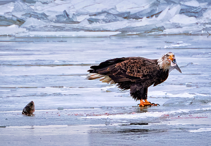
You see the scene. Hard conditions to bring out the details and contrasts. I actually like a color balance that is between the original and the one you present. I would consider cropping down and getting rid of some of the sky. More pop needed, maybe clarity, brighten, and add contrast. You have an opportunity to bring out some great colors. A nice shot that I think you can get it too look much better. |
Jan 7th |
| 81 |
Jan 23 |
Comment |
Janet, I like your thinking. Nicely seen and changing it that is appealing. There are a few spots to clone, and I find it would help to bring down the highlights on the bottom right feathers, thus emphasizing the head and face. I like the purple background, but actually like the green of the other background, and I would have cloned more of it in to replace the empty sky. AS bit more on the left. I like it. |
Jan 7th |
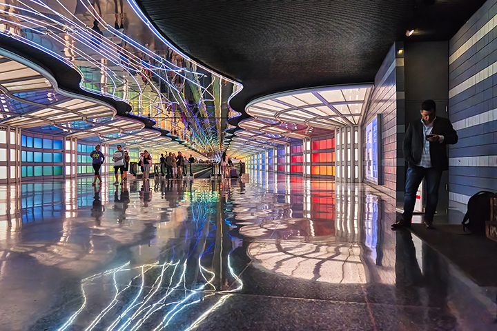
| 81 |
Jan 23 |
Reply |
Thank you Rose. I was told it is the United Airlines Concourse at O'Hare airport. I recall it as Terminal 2. I hope you get to see it. |
Jan 5th |
5 comments - 1 reply for Group 81
|
10 comments - 5 replies Total
|