|
| Group |
Round |
C/R |
Comment |
Date |
Image |
| 61 |
Nov 22 |
Reply |
Ingrid, I appreciate your comments. And I agree. The funny but sad part is I did change the blue, and maybe it is a male thing, but I am not good with colors for the most part, but when pointed out as you and David did, I usually see it. I see it here...........Ahhhhhhhhhhhhh. |
Nov 13th |
| 61 |
Nov 22 |
Comment |
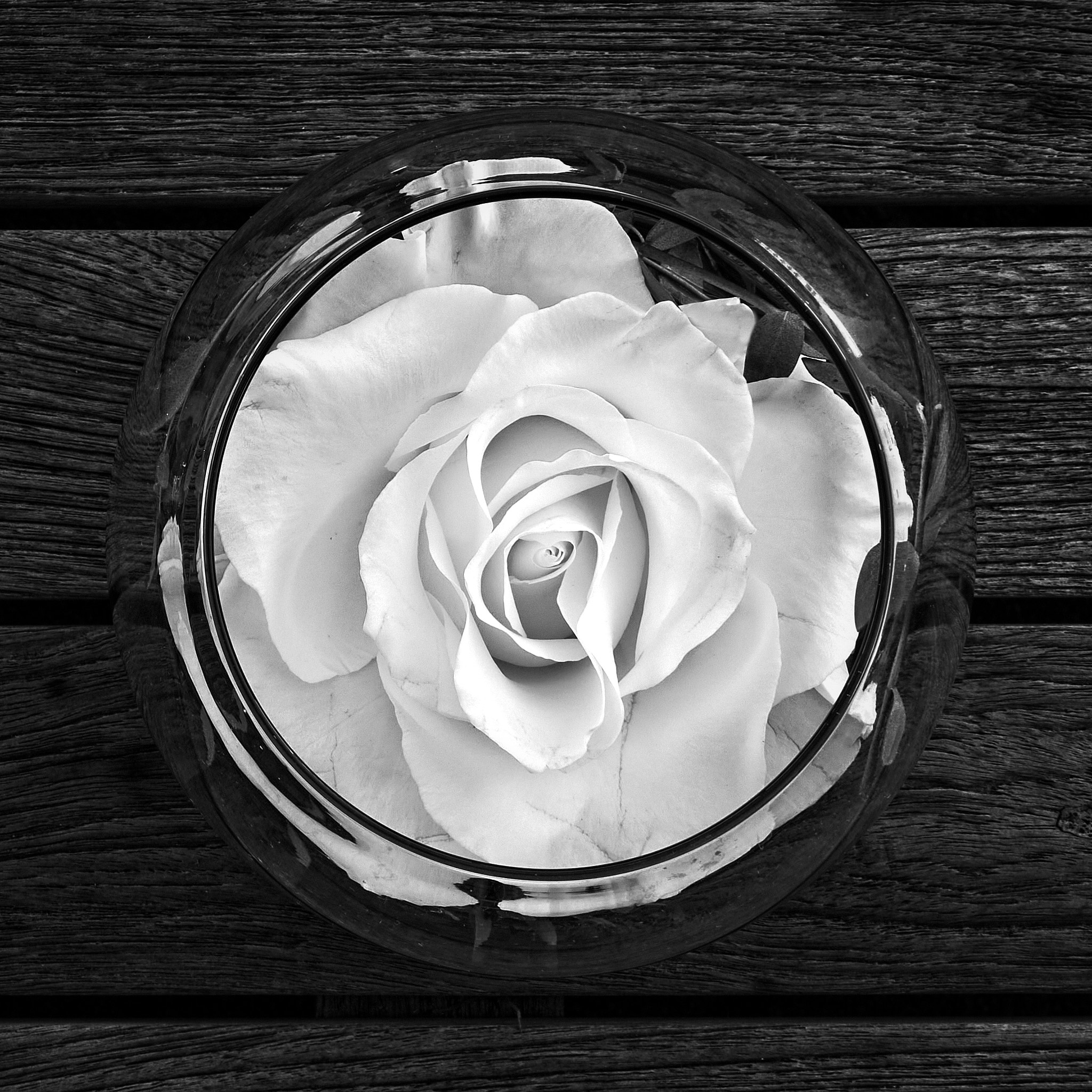
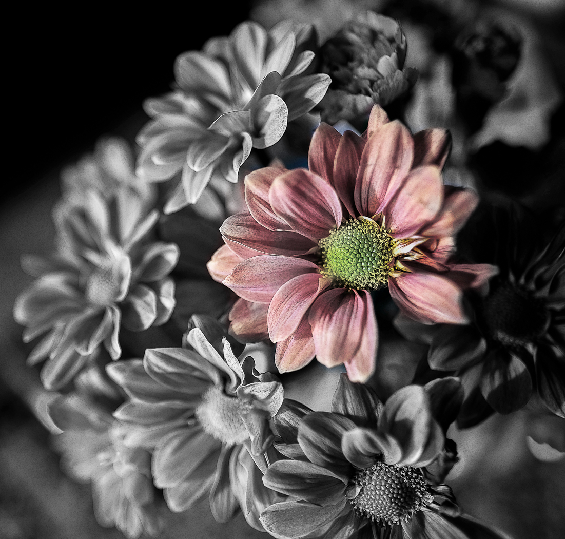
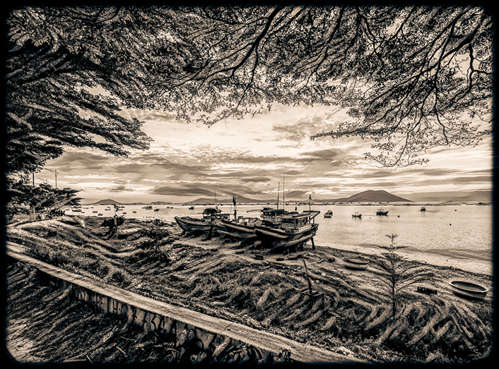
David, both versions are really nice. I am partial to the bnw, as you rendered it beautifully. I like the bnw too as my eye is drawn into the middle, and the color my eye goes all over the picture, beautiful as it is. The texture and the shadows are wonderful on the bnw. I think you know how I lean. |
Nov 13th |
| 61 |
Nov 22 |
Comment |
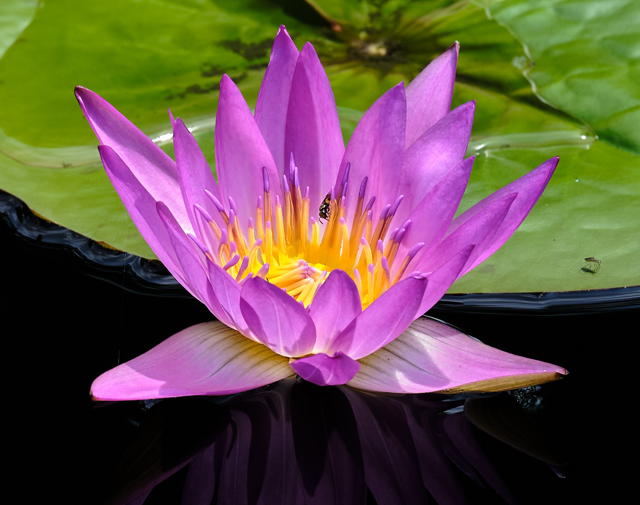
Ingrid, a lovely find and shot. I like the way you brought out the details and sharpness. Perhaps a bit smoothing out the image, taking down clarity would add appeal, as it looks a bit artificial. Really nice color. |
Nov 13th |
| 61 |
Nov 22 |
Comment |
Shirley, I like the original the best. I really like the water droplets on the original. I would concentrate on the original and the bottom flower. I like topaz but I would look at another rendering. |
Nov 13th |
| 61 |
Nov 22 |
Comment |
Martie, lovely. I like what you did, but it feels a bit heavy on the left and open on the right. Perhaps a bit over sharpened too, but that just may be the way it is. I suggest a wider crop and take a bit off the top and add a bit on the bottom too. |
Nov 13th |
| 61 |
Nov 22 |
Reply |
Ah, my apology. And sharp indeed. |
Nov 13th |
| 61 |
Nov 22 |
Comment |
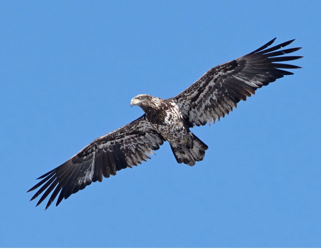
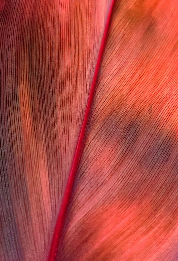
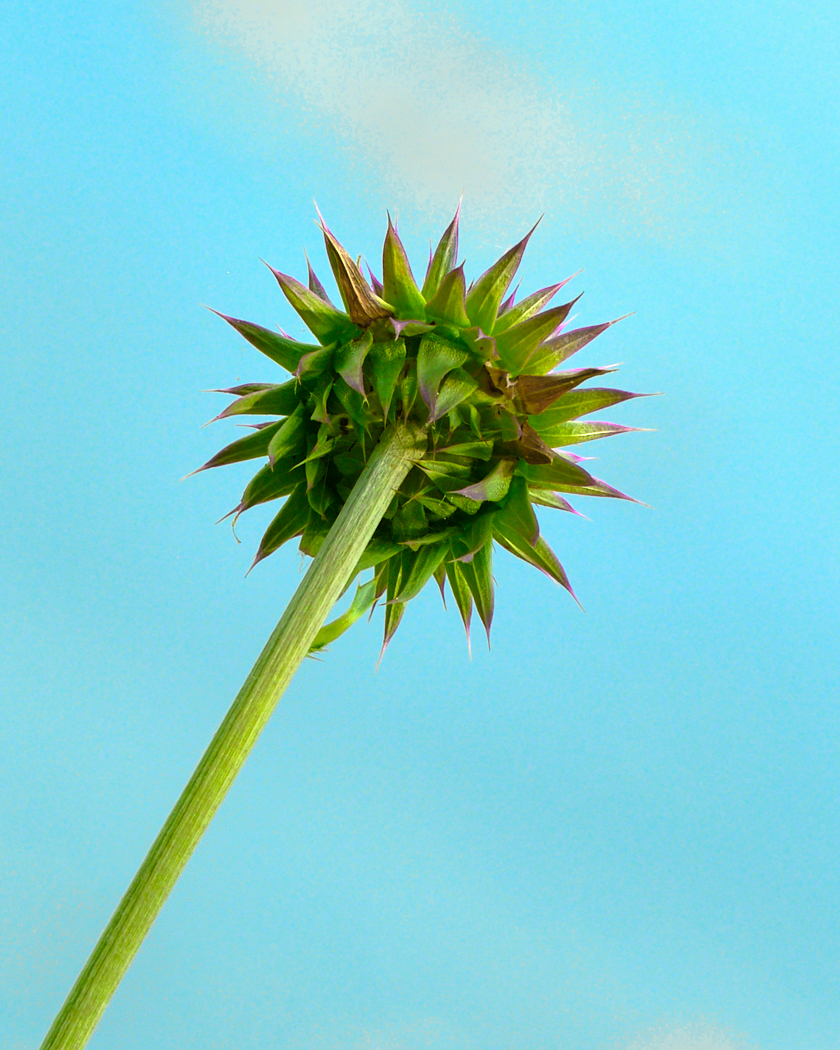
Linda, it is amazing how sharp this is. Crazy these iPhones.
I would darken the background, and an interesting composite you did. The bright pink on the right takes over, and the green on the stem could be darkened. Just some thoughts on a creative endevor.
|
Nov 9th |
| 61 |
Nov 22 |
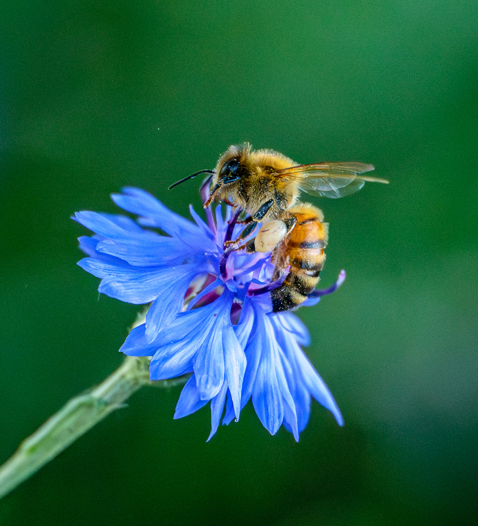
Comment |
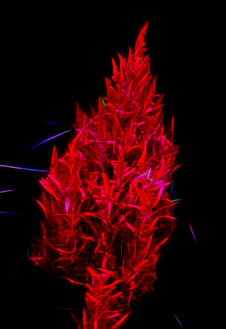
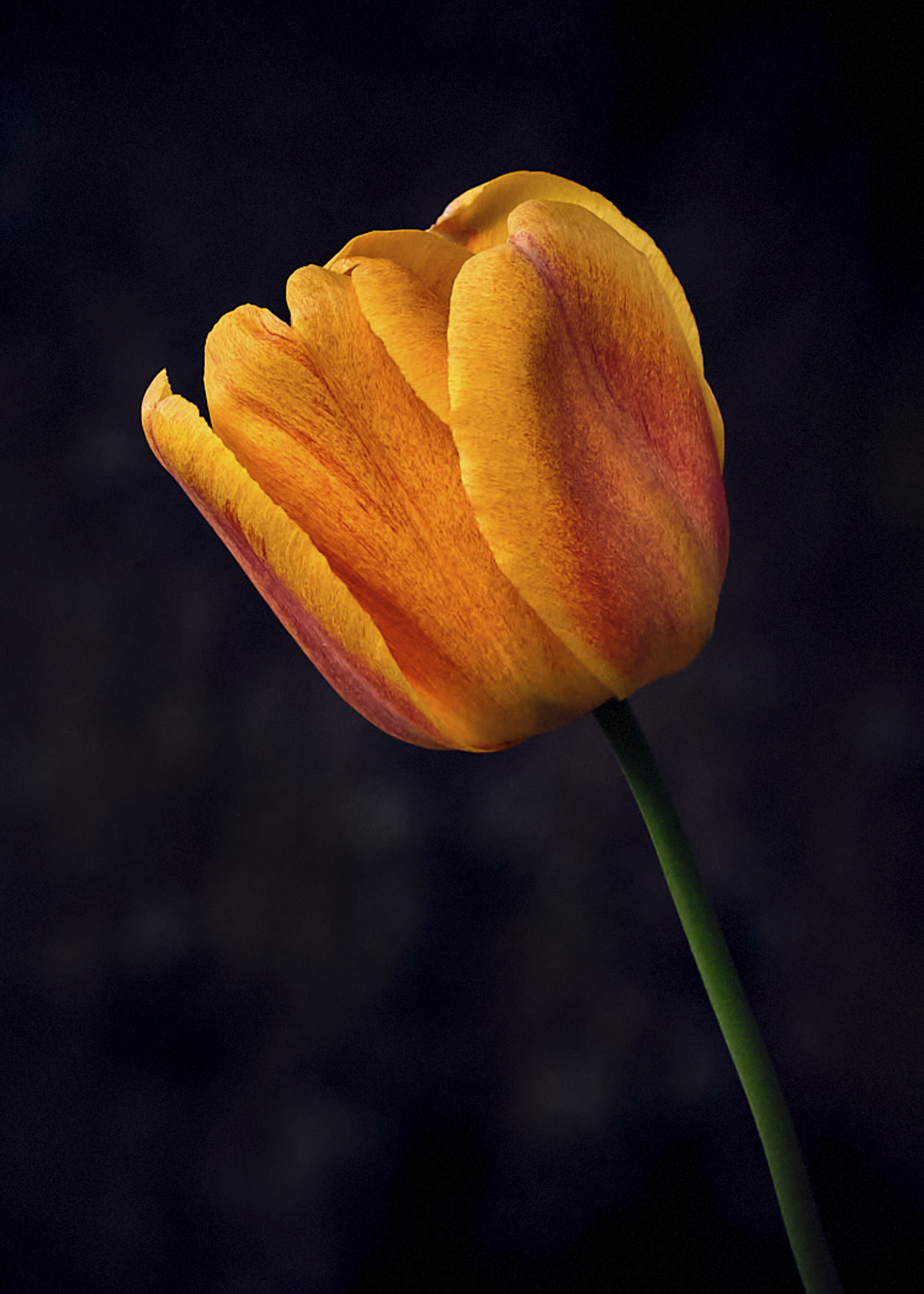
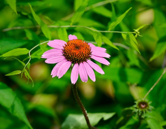
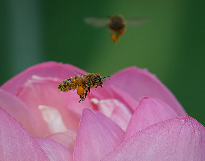
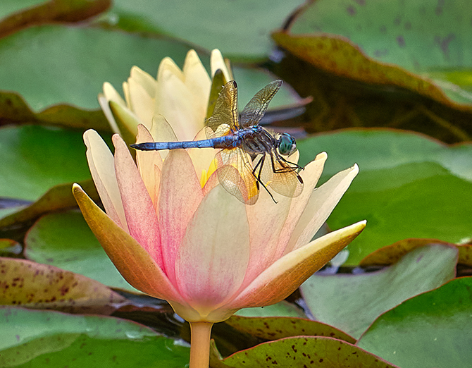
Gene, I really like these shots. I would have liked to see the stamen that is blocked by the right petal. I also suggest brightening up the stamen, and maybe darken the petals. I like the sharpness of the stamen. |
Nov 9th |
| 61 |
Nov 22 |
Reply |
David, I totally agree on your comment on the sky. I played with it and was never satisfied with it, but finally just left it as you see it. Angle I thought about too and tried what I did for comments, as I was not sure how I wanted the stem to first appear. Thank you much. |
Nov 9th |
6 comments - 3 replies for Group 61
|
| 81 |
Nov 22 |
Reply |
Bev, ha, good description! Thanks. |
Nov 21st |
| 81 |
Nov 22 |
Comment |
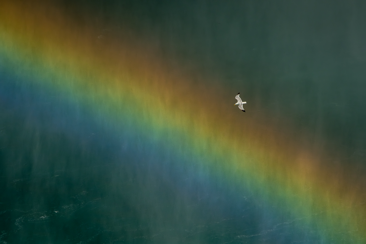
Angela,
Wonderful, and as you know it I will not concentrate on what a beautiful shot. Ok, the last five on the right and the seventh one seems to be up, or back, and I like symmetry in shots like this. All parallel at the top. The red and the pink in the middle need separation with another color between. Bottom right could use more reflection to fill in the black emptiness. Ok, that said a great creative shot! |
Nov 7th |
| 81 |
Nov 22 |
Comment |
Ralph, well done to get that shot. I like the crop. I wonder why the processed shot is kind of flat, as the original pops. I would go back to the original and bring up some shadows or brighten it but keep the contrast and saturation. Great timing. |
Nov 7th |
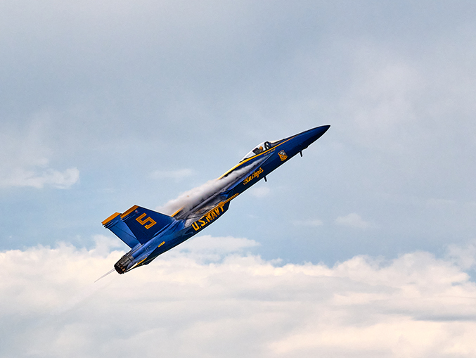
| 81 |
Nov 22 |
Comment |
Cheryl, a good capture of the scene, as you have critical sharpness and good separation in the overlaps. I like you flipped it and I would take some off the left and a bit off the bottom, as I think it would zero in on the jets, and the trails I find I am looking at too long, and you get rid of the small cloud in bottom right. Nice. |
Nov 7th |
| 81 |
Nov 22 |
Comment |
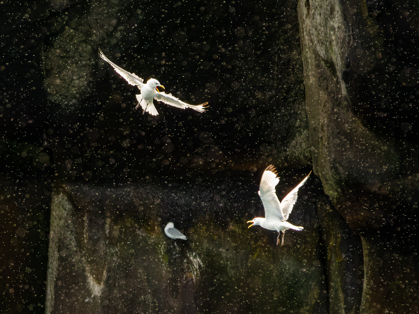
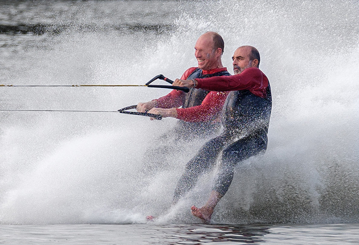
Rose, we shoot what we can get and with the limitations, i.e. where you were and the window, well done. Sharp for 100s. Surprising that sharp as they are moving. Colors are good. I would not crop off as much from the top but I see why you did, and I would consider a very tight crop of the facial fight if the picture holds up.
Well done for getting the shot. |
Nov 7th |
| 81 |
Nov 22 |
Comment |
Mr T, these are fun shots. To each his own, as I find it too orange, and thus unreal. I read the comments and I am clearly outnumbered as others love the color. You might also bring up the sharpness and contrast. That said, well done. |
Nov 7th |
| 81 |
Nov 22 |
Comment |
Janet, you made a number of great changes. Somehow though the hairs and head were softened, and I find the sharpness of that making it less compelling. I do like you took down the sharpness of the mouth. Brighten up the eyes as that is the reason for the shot. |
Nov 7th |
6 comments - 1 reply for Group 81
|
12 comments - 4 replies Total
|