|
| Group |
Round |
C/R |
Comment |
Date |
Image |
| 61 |
Oct 22 |
Comment |
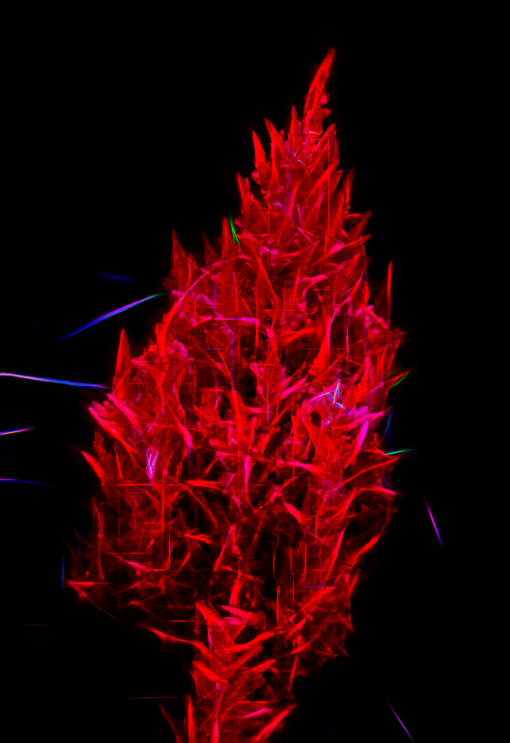
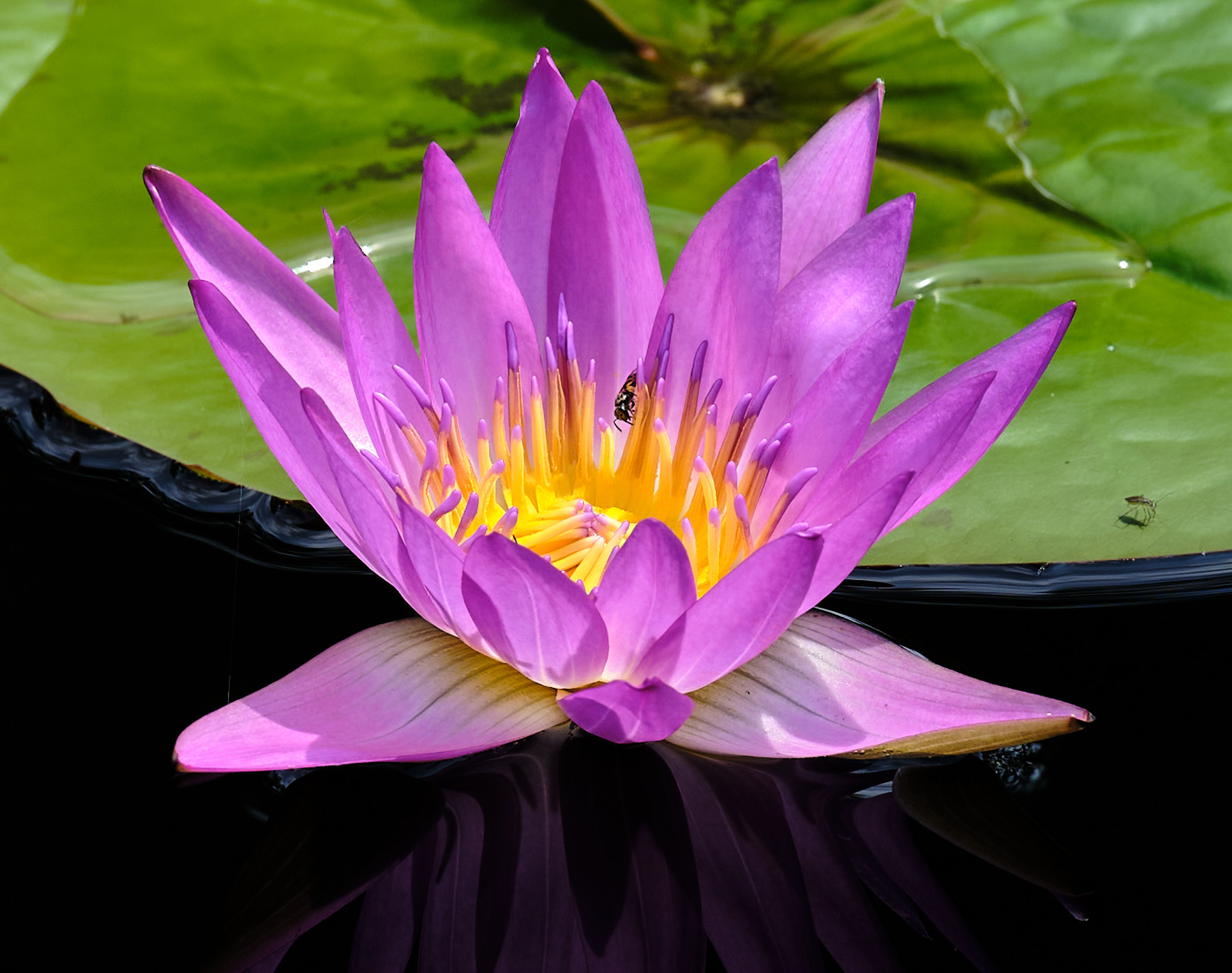
Shirley, thank for the opportunity to respond as I was going to respond to Marti too about what is an abstract photograph. I prefer abstraction that the subject is still recognized but not in the way we normally see it. I like abstraction out of camera, not as a technique post processing, but I do that too. While I understand the point, I will hold fast that this picture is an abstraction of reality. Here is an article supporting my position. https://mymodernmet.com/what-is-abstract-photography-definition/ |
Oct 4th |
| 61 |
Oct 22 |
Reply |
Bravo |
Oct 1st |
| 61 |
Oct 22 |
Reply |
It is dreamy to me without the spider. It all depends on what you what, and what to show. The spider takes it a bit away from abstract as the focus. If you want the spider, maybe tone it down and make it more ghostly, and then I think it could fit in quite nicely. |
Oct 1st |
| 61 |
Oct 22 |
Comment |
Ingrid, I really like your subject, and what you are doing here. I would probably crop out a bit to bring in a larger experience. I find the graininess a bit too much, and a bit harsh, personal preference. Colors are beautiful. |
Oct 1st |
| 61 |
Oct 22 |
Comment |
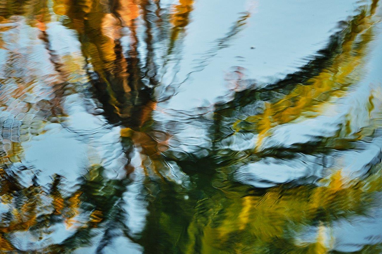
Shirley, I like what you are doing here. I do prefer the Original 2, but find it a bit harsh with especially with the bright whites. The original is not sharp, and doing an abstract from it is a good idea. I like the crop of Original 2. |
Oct 1st |
| 61 |
Oct 22 |
Comment |
Marti, OMG. This is beautiful. The dynamic range and pop are fantastic, as well as the final result, and I just love it. The brightness and colors are excellent. I keep looking at it. The only thing I suggest is to get the bottom and top equal distance from the edge. Bravo! |
Oct 1st |
| 61 |
Oct 22 |
Comment |
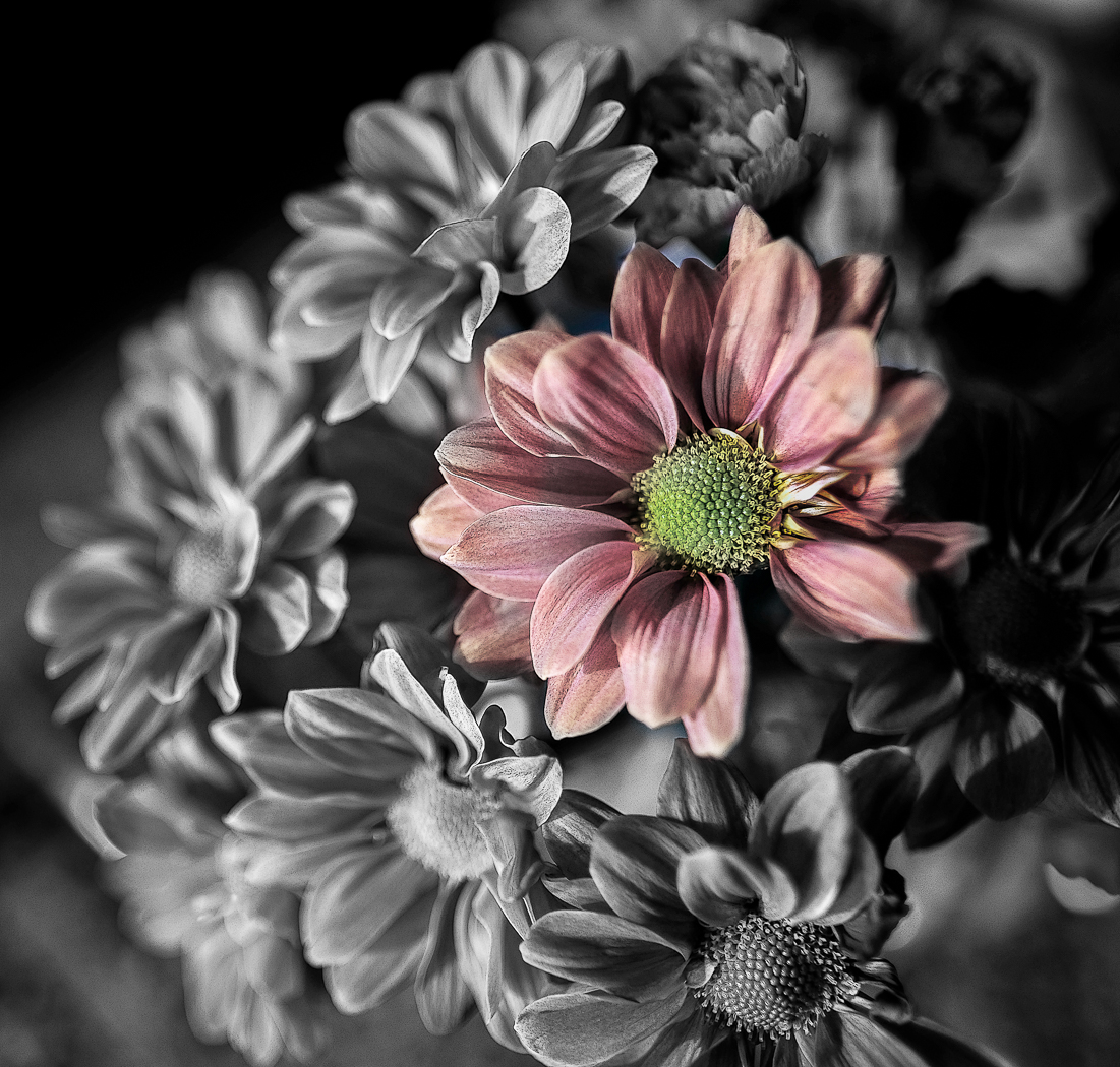
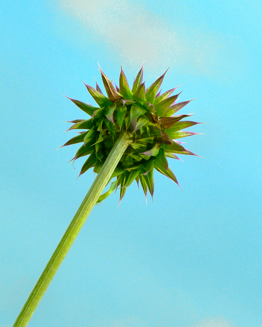
Linda, great eye. I love what you are doing here. I prefer a more diverse coloring in the pic, more along the original. Not quite an abstract, but getting there. I really like the wild grasses too. It feels a little tight at the top. I like the rectangular shape of the original and would see if I had a bit to add to the top. Fun! |
Oct 1st |
| 61 |
Oct 22 |
Comment |
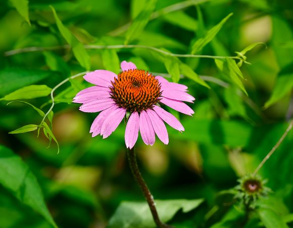
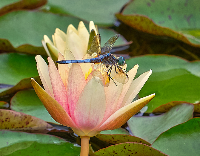
David, I love the alternative image without the spider. I love the creaminess and colors. I would consider darkening the upper and bottom left, or crop off some off a bit as well as from the bottom, but I don't know if that would ruin the mood. I find the spider too powerful and I then don't fully appreciate the lovely petals. Beautiful. |
Oct 1st |
| 61 |
Oct 22 |
Reply |
David, thank you for the feedback and this is good for me to hear, as you say well how abstracts are such a matter of personal appeal. Much appreciated, as I am seeking to further develop my style and what appeals to me. So much is "to thine own self be true" and that goes for you and for me, and for all, and I am working (or not) with that in my entire life. So, your feedback and perception are well taken. |
Oct 1st |
6 comments - 3 replies for Group 61
|
| 81 |
Oct 22 |
Comment |
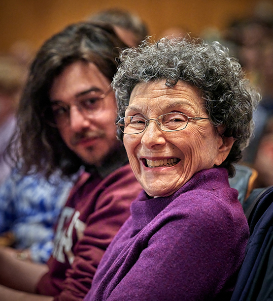
Cheryl, outstanding smiles and emotions. Good choice of cropping. The background is a bit too in focus for me, and it would pop with a much lower f stop. Colors are very good, and the affection is wonderfully captured. You chose just the right time. |
Oct 4th |
| 81 |
Oct 22 |
Comment |
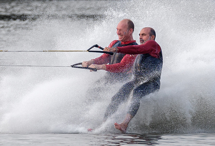
Ralph, a fun shot, and I love the eyes. Very interesting processing to make it pop and subdued, and you did a great job on the background. The crop is outstanding. I wish to see more of the eyes, esp. the back one, but that is a minor wish. Lovely. |
Oct 4th |
| 81 |
Oct 22 |
Comment |
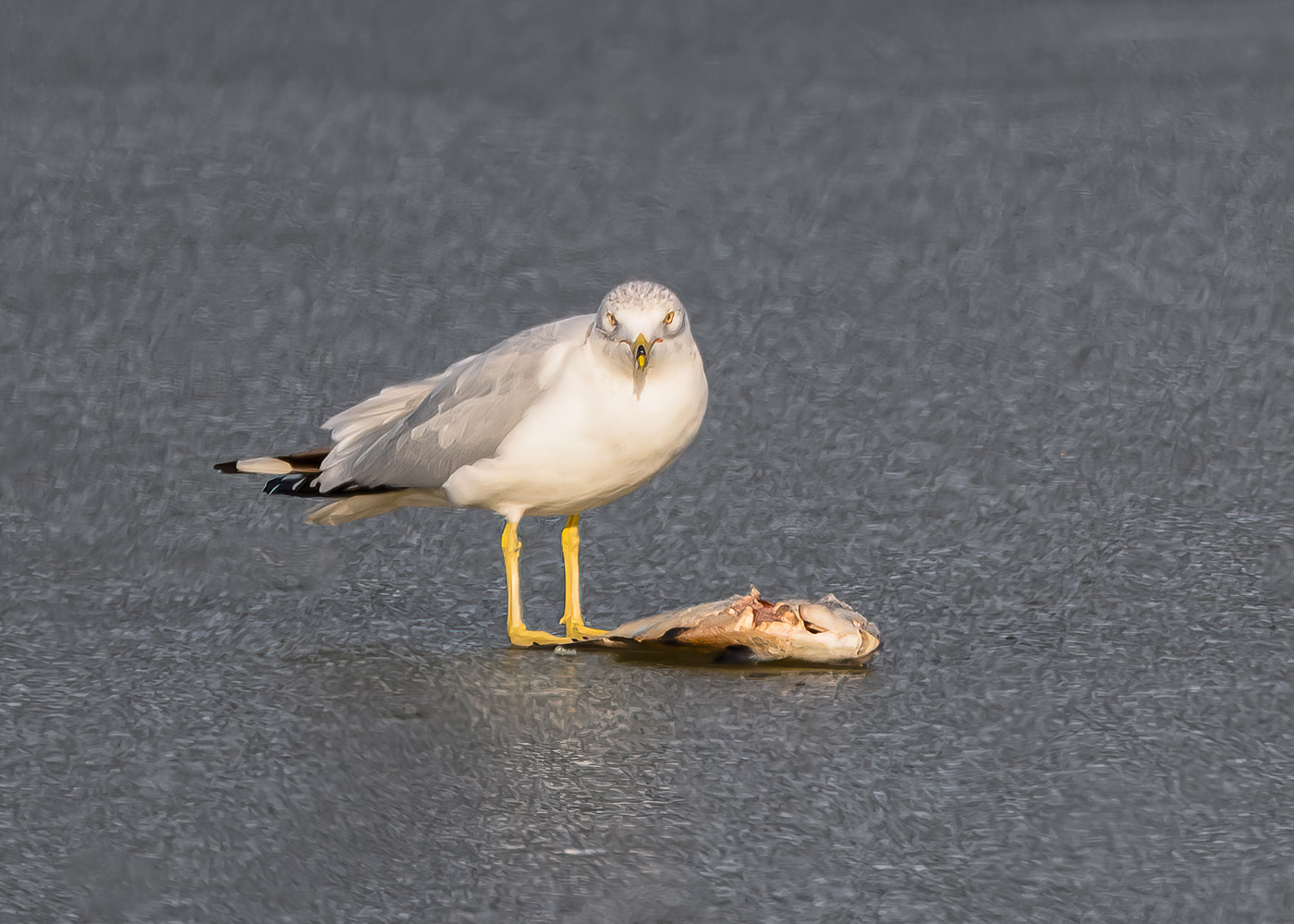
Angela, the colors are fantastic, as well as the scene. I do find the bottom right a distraction, and that could have been fixed upon taking the shot. Post processing is a bit more difficult, but taking down the clarity might help in that corner, or lightening it up, or cloning in more of the scene above it. I like the way you placed the apples, it has a flow. You did a nice job on the bright spots. |
Oct 4th |
| 81 |
Oct 22 |
Comment |
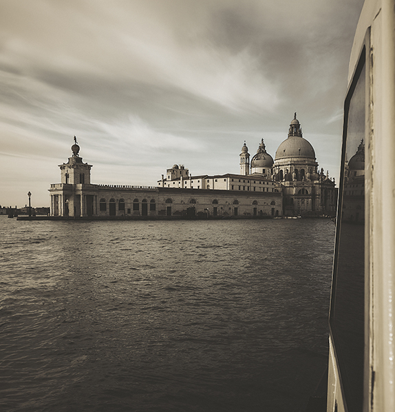
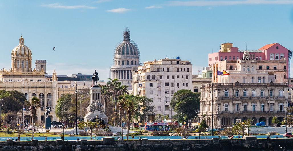
Rose, first thing I noticed was the beautiful colors. Complementary colors. Next I noticed your verticals were very straight, and the tower then also looks natural despite that it leans back. Looking further I would look to crop off the left, lose context I know, but the bottom right bush takes up so much space and I do not find it adding anything. If I were to crop,
I would look to do so at the peak of the middle building or more likely to the right of its peak. |
Oct 3rd |
| 81 |
Oct 22 |
Comment |
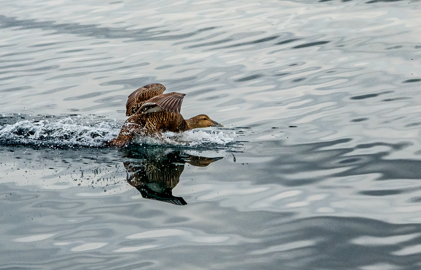
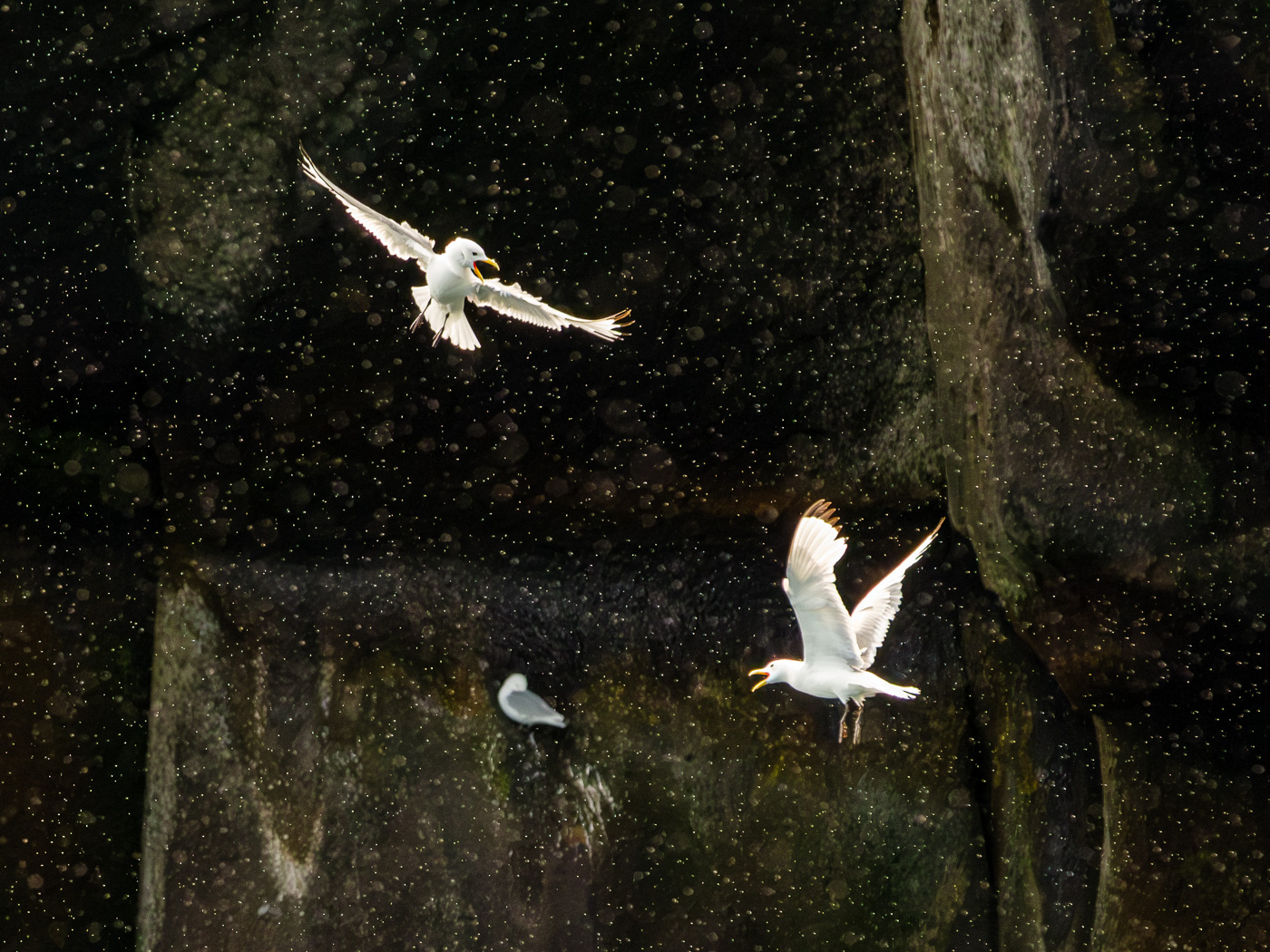
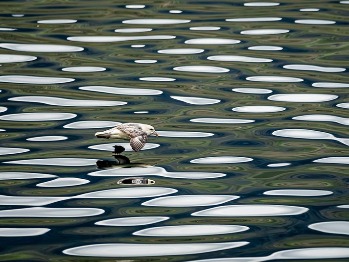
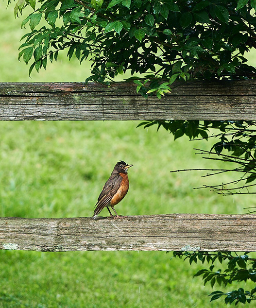
Janet, I like your shot and the sharpening of the duck, and you brought out a lot from a dull day, and more is there to brighten up as well as colors. Sharpening good on duck and water droplet. I would not have sharpened the water ripples as that then becomes a competition and eye distraction. Good catch. |
Oct 3rd |
| 81 |
Oct 22 |
Reply |
Angela, thank you for your feedback. I need to mull this over, to determine what I appreciate about this shot, and to be sure to render that.........:) |
Oct 1st |
5 comments - 1 reply for Group 81
|
11 comments - 4 replies Total
|