|
| Group |
Round |
C/R |
Comment |
Date |
Image |
| 61 |
Aug 22 |
Reply |
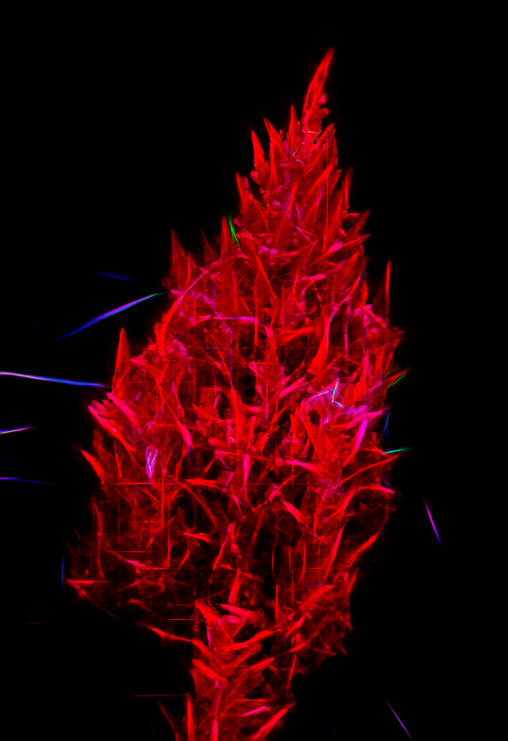
Thank you Linda and Marti, you both bring in good ideas and discussion. I will take another look as in this case it took someone else to see what I was not seeing, and yes, I would make a conscious choice that I had not before, but for the one bright stem on the left bottom that I left as is. |
Aug 7th |
| 61 |
Aug 22 |
Comment |
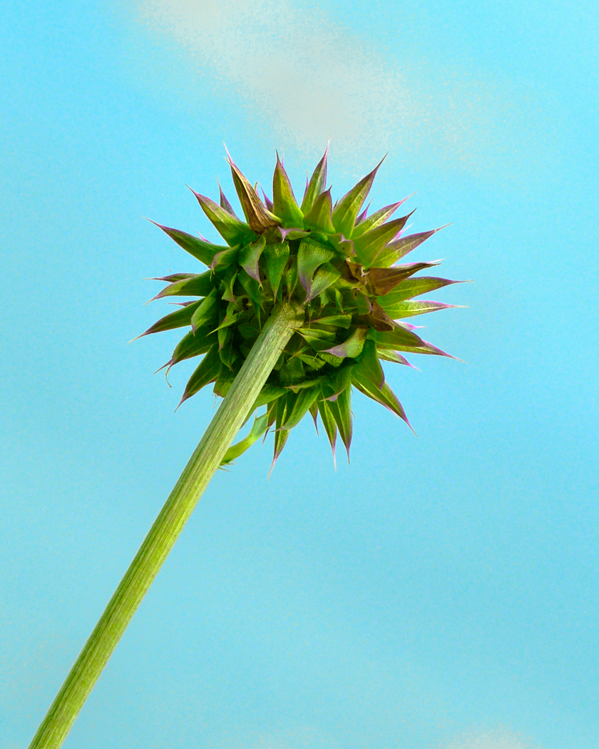
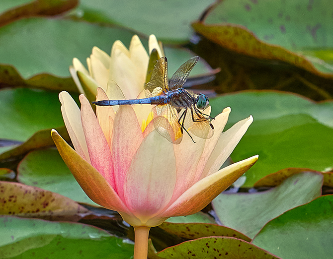
Hi Linda, I like your flower. I actually like the original better, as for me it has a gentleness that the processed shot does not have as much. The background of the original seems more grey, and I like that better. I like the angle of the stem and where you put the flower. Maybe take a tiny bit off the top of the shot. Sharp and lots of detail. Beautiful. |
Aug 3rd |
| 61 |
Aug 22 |
Comment |
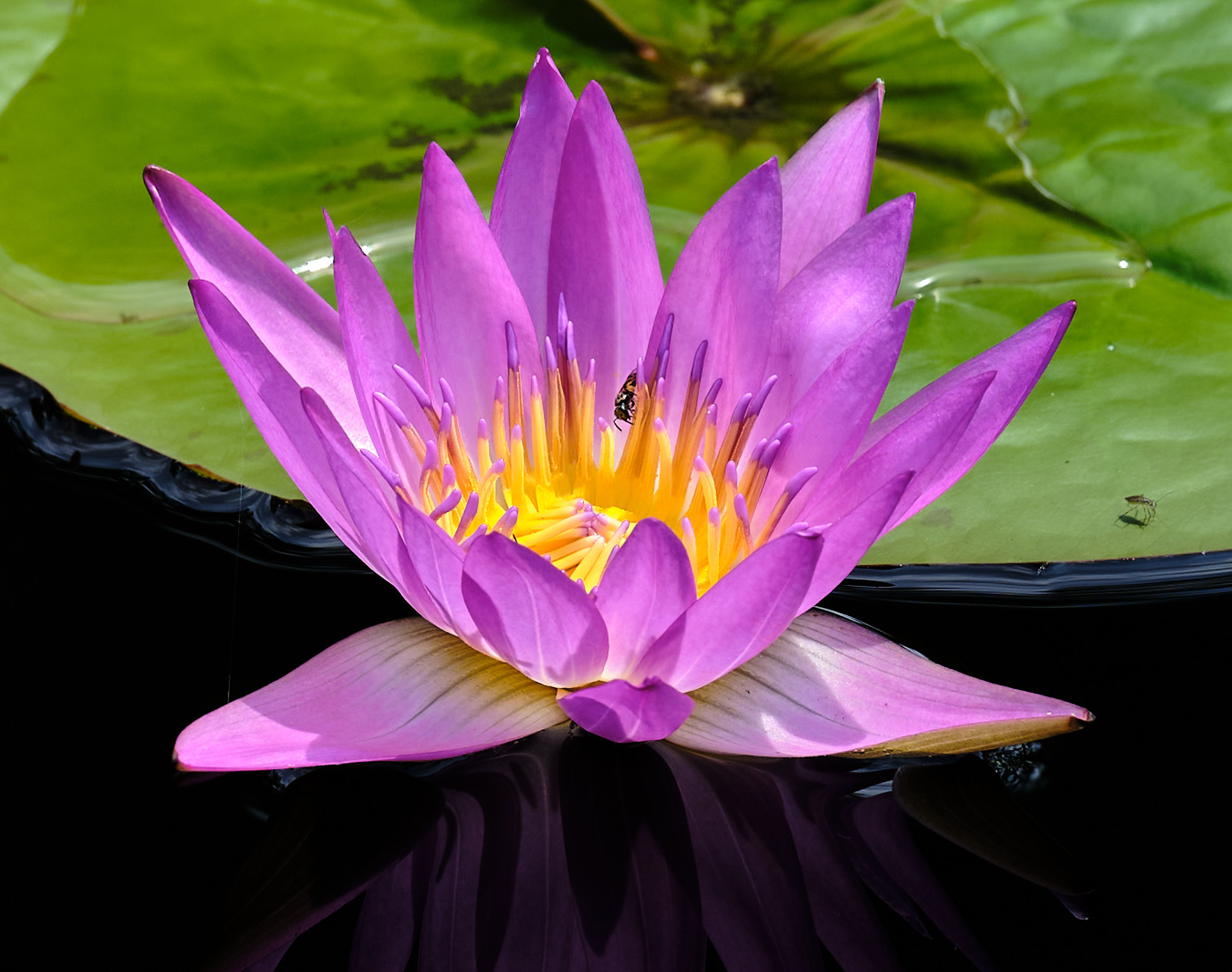
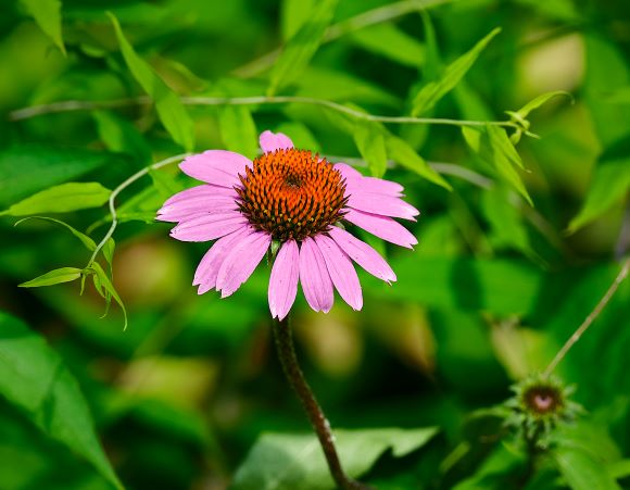
Ingrid, you did a lovely job bringing out the middle of the flower, and the sharpness holds me there. Nicely done on the background as the flower really pops. I do find the upper left a bit bright, drawing my eye. I like a natural look, and the background may be a tad too soft for my taste. Just a thought. And overall, you took a nice shot to an excellent shot.
|
Aug 3rd |
| 61 |
Aug 22 |
Comment |
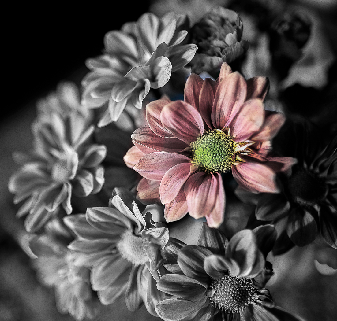
Marti, I like this image and the framing. David had a good idea, and it pops with the yellow center. I like a gentle flower look, so on a personal preference I find the technique less appealing than if it had a more gentle look. Either way the bottom right green leaf is strong, and I suggest darkening that one down and take clarity down on it, so it is subtle like the leaf on the left. Keep up the good work. |
Aug 3rd |
| 61 |
Aug 22 |
Comment |
Shirley, I like your framing and the water droplets. The sharpest part is the bottom left and some other spots, and I would love to see this image with that sharpness throughout. Nicely seen. |
Aug 3rd |
| 61 |
Aug 22 |
Comment |
Donna, the colors are attractive, and I feel your intrigue. Yes, focus is very important in a complex subject, and if you had one in focus as a subject, the rest would support it. I would see if you have another with a focal point. I like the original crop better too, as you have a really good triangle that gets me to look at the top blueberry. The crop you chose feels squished to me, so the original I find much more successful, and I would just crop in a bit on each side. |
Aug 2nd |
| 61 |
Aug 22 |
Comment |
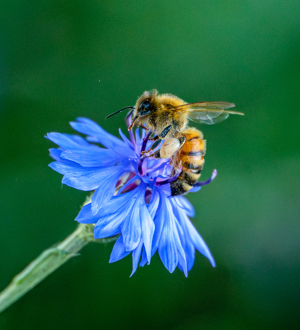
David, nicely seen, nicely edited. I like your choice of crop and turning. Lots of appealing twists and turns, and it works. Colors are so beautiful. There is a lot to digest, and I can look at this pic for a long time. Background color I like much, and you took away the distractions. I get a bit out of the shot looking at the out of focus upper part of the petals in the middle of the shot. Focus stacking perhaps a solution, but that could ruin the appeal of your shot. The Bettle is the subject that my eye keeps going to, and the rest turns around and around it. Cool. |
Aug 2nd |
| 61 |
Aug 22 |
Reply |
Thanks Marti, I try to get away from the odd rule of odds sometimes, and I was wondering if anyone would call me out on this one, and I wanted to hear the feedback. Nice. While I like the two as is, you make it a more compelling story and definitely have a main subject for the viewer to go to. This along with the other comments are in part why I was interested in this group. I am at work, and a meeting tonight, and I look forward to posting my comments soon. |
Aug 2nd |
6 comments - 2 replies for Group 61
|
| 81 |
Aug 22 |
Reply |
Me too, me too. I love seeing what is there that was not seen. Much appreciated. |
Aug 6th |
| 81 |
Aug 22 |
Comment |
Angela, you know what I like best of the color shot. It looks like fireworks. |
Aug 3rd |
| 81 |
Aug 22 |
Comment |
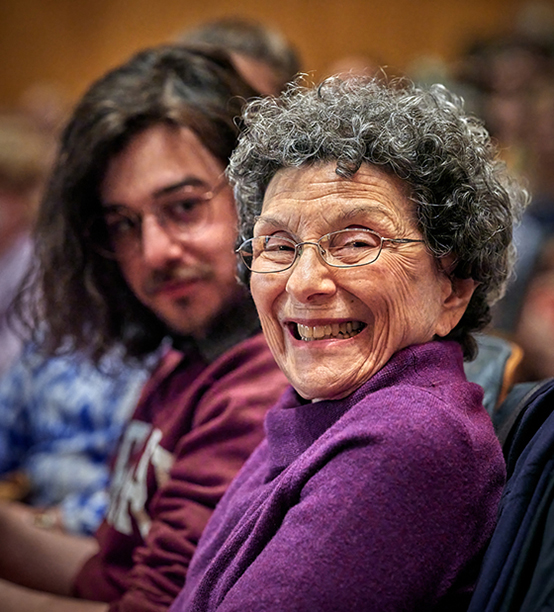
Cherle, what a cutie! I love the smile. I am not a portrait photographer, but I wonder if the catchlight - not much you could have done, but can do post, is to not have the catchlight into the dark pupils as it is a distraction to me. you can do a bit of cloning if you so wish. I also prefer, and do so here, a rectangular framing and you could add some of the area below the neck, see how that looks. Great expression. |
Aug 2nd |
| 81 |
Aug 22 |
Reply |
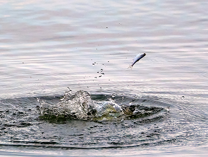
I was very lucky because if it was ever so slightly later we would miss its eye and head. |
Aug 2nd |
| 81 |
Aug 22 |
Reply |
This is the forum to ask, to take risk, to get feedback to the things we wonder about so we can refine our choosing. You did exactly what you were meant to do, and now you get refinement. |
Aug 2nd |
| 81 |
Aug 22 |
Reply |
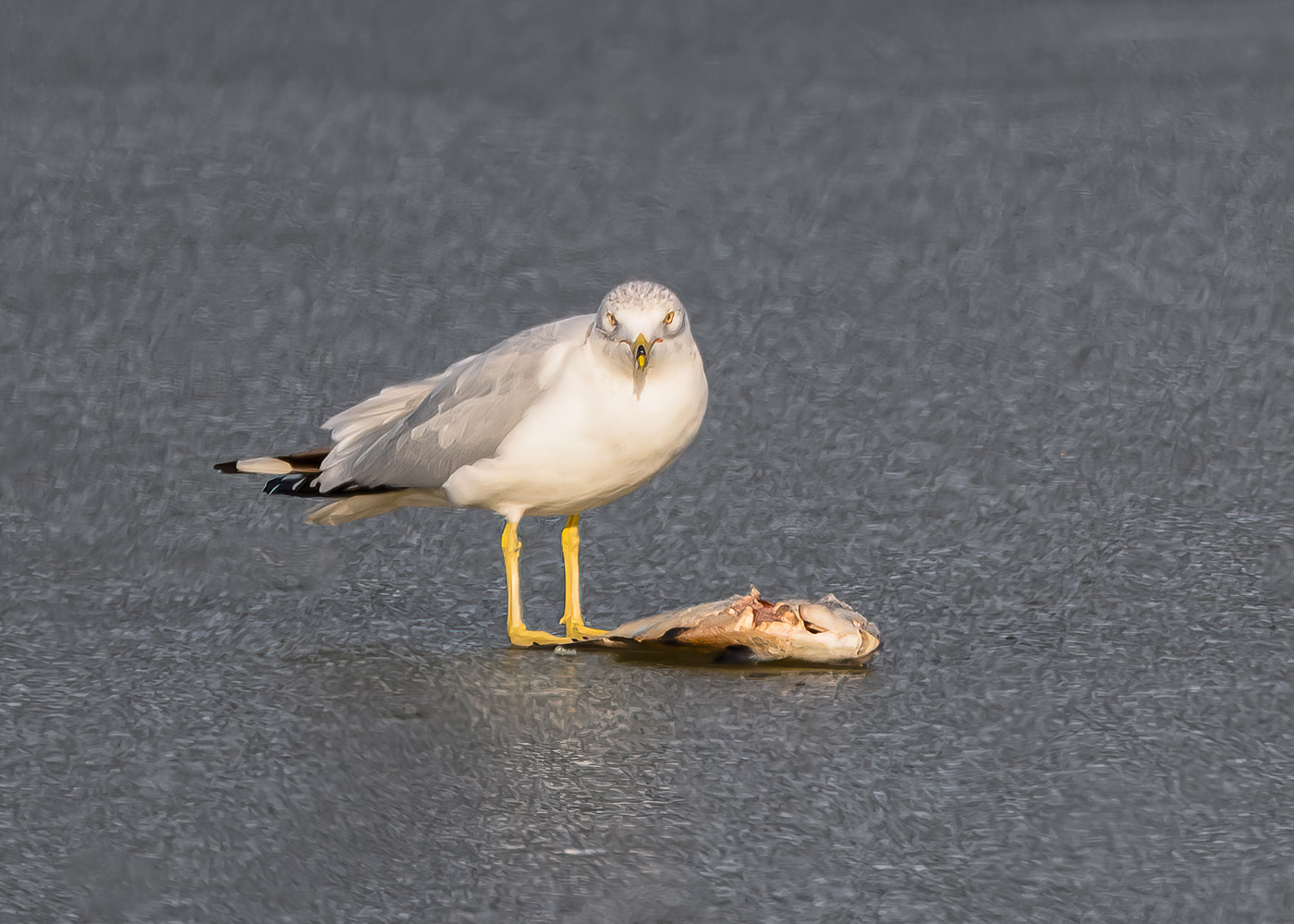
Thanks Angela for your comments. Much appreciated. You can actually see the bass on the right side of the large bubble, and although I saturated the color, etc, (it is greenish and you can see the dark stripes) it is still hard to see unfortunately. |
Aug 2nd |
| 81 |
Aug 22 |
Comment |
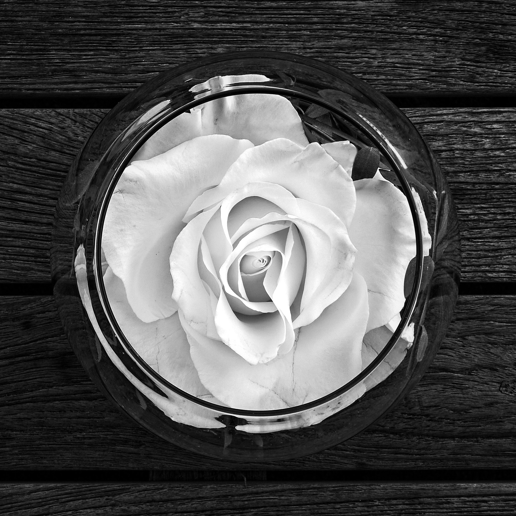
Angela, another creative shot, and I love your vision. Now on this pic, I overwhelmingly like the color version better. Hands down. The colors are beautiful, as well as the translucence of the vase. The bnw is blown out in the bottom left, and the rest gets muddled for me, and it looks flat. That said, I love the color version. The colors blend beautifully, and it has depth and definition. I suggest you take another shot at this bnw technique on another shot. Again, lovely color shot. |
Aug 2nd |
| 81 |
Aug 22 |
Comment |
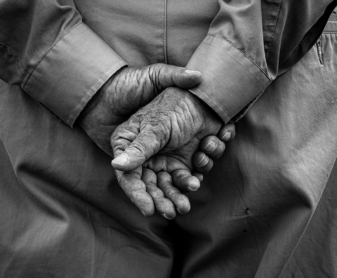
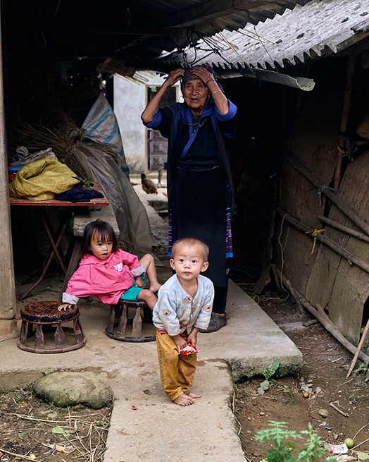
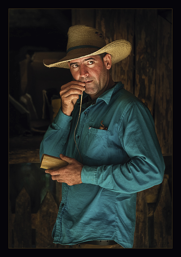
Donna, welcome. I like the way you got in on the hands and the task. Without explanation I would not know what he was doing. I would consider a bit more on the left, as it is a bit tight for me, but a good idea to get out the distractions. A bit bright. There may be more story there in the box under the hands. I see the string in bottom left and I would like to see more of that context. |
Aug 2nd |
| 81 |
Aug 22 |
Comment |
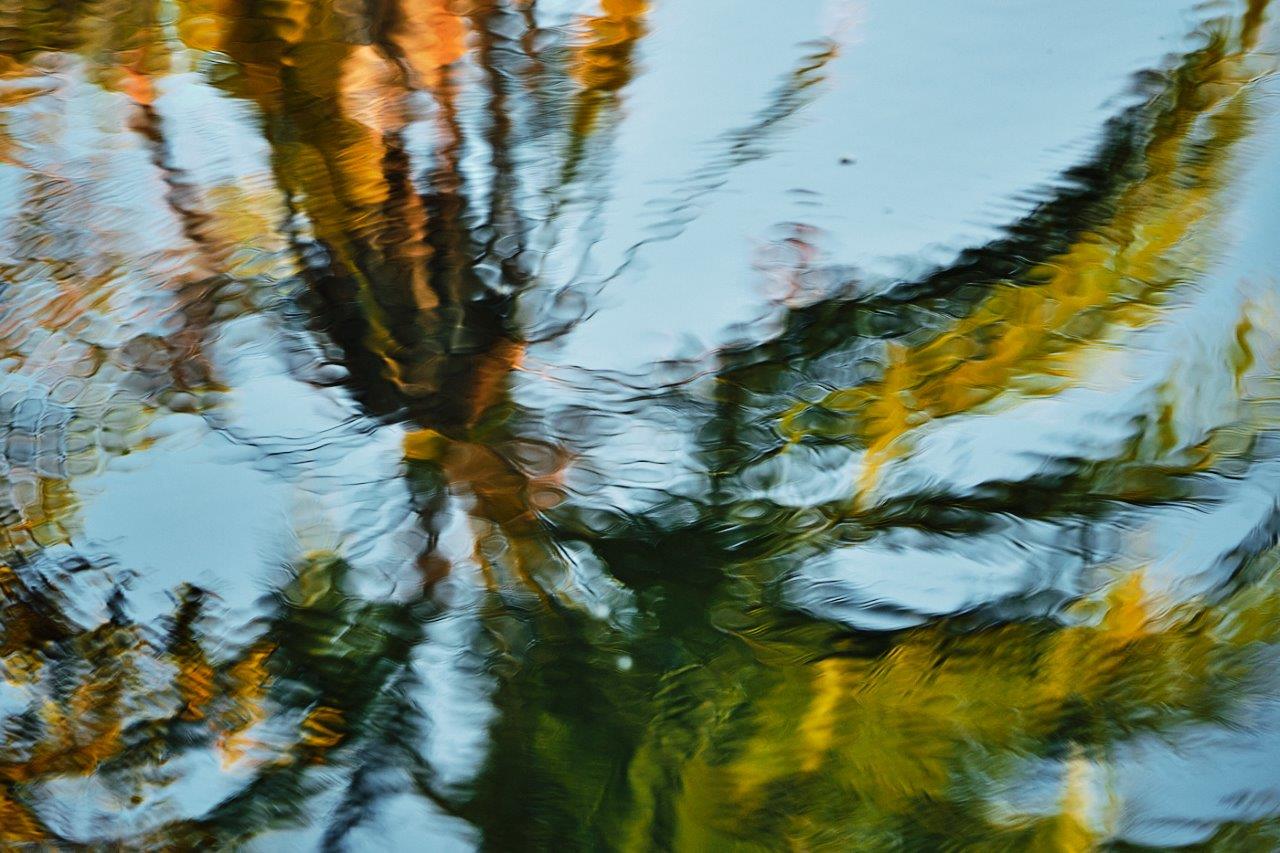
Hema, as you saw and know, a wonderful reflection. I would cut out the top down and even consider eliminating it. I think a bit of the shore gives context so I lean there, but for my taste there is too much especially in the upper left. |
Aug 2nd |
| 81 |
Aug 22 |
Comment |
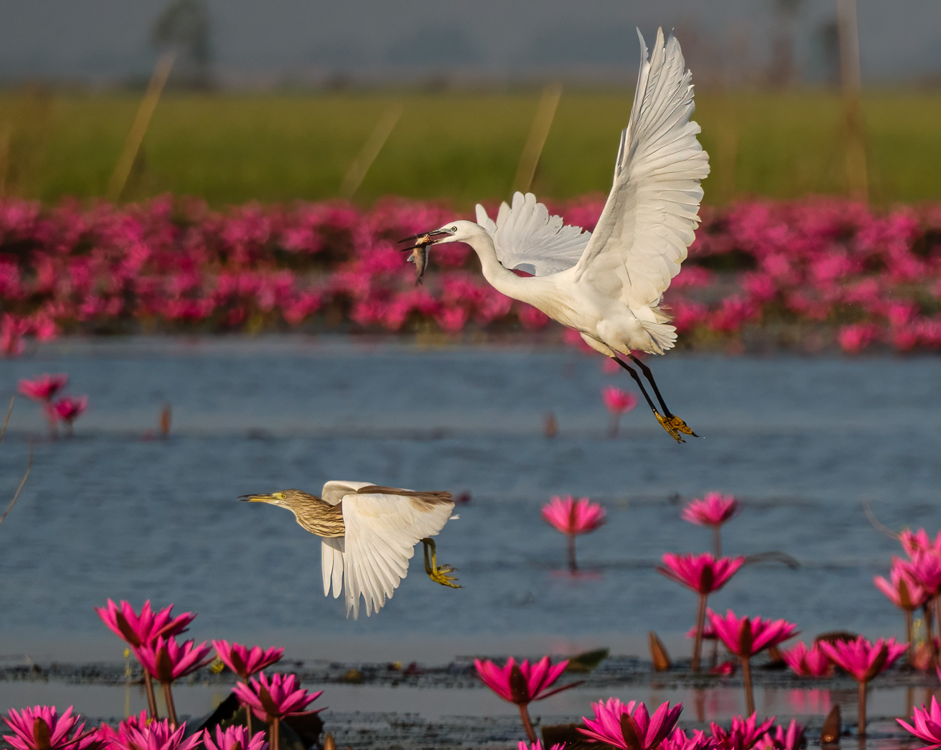
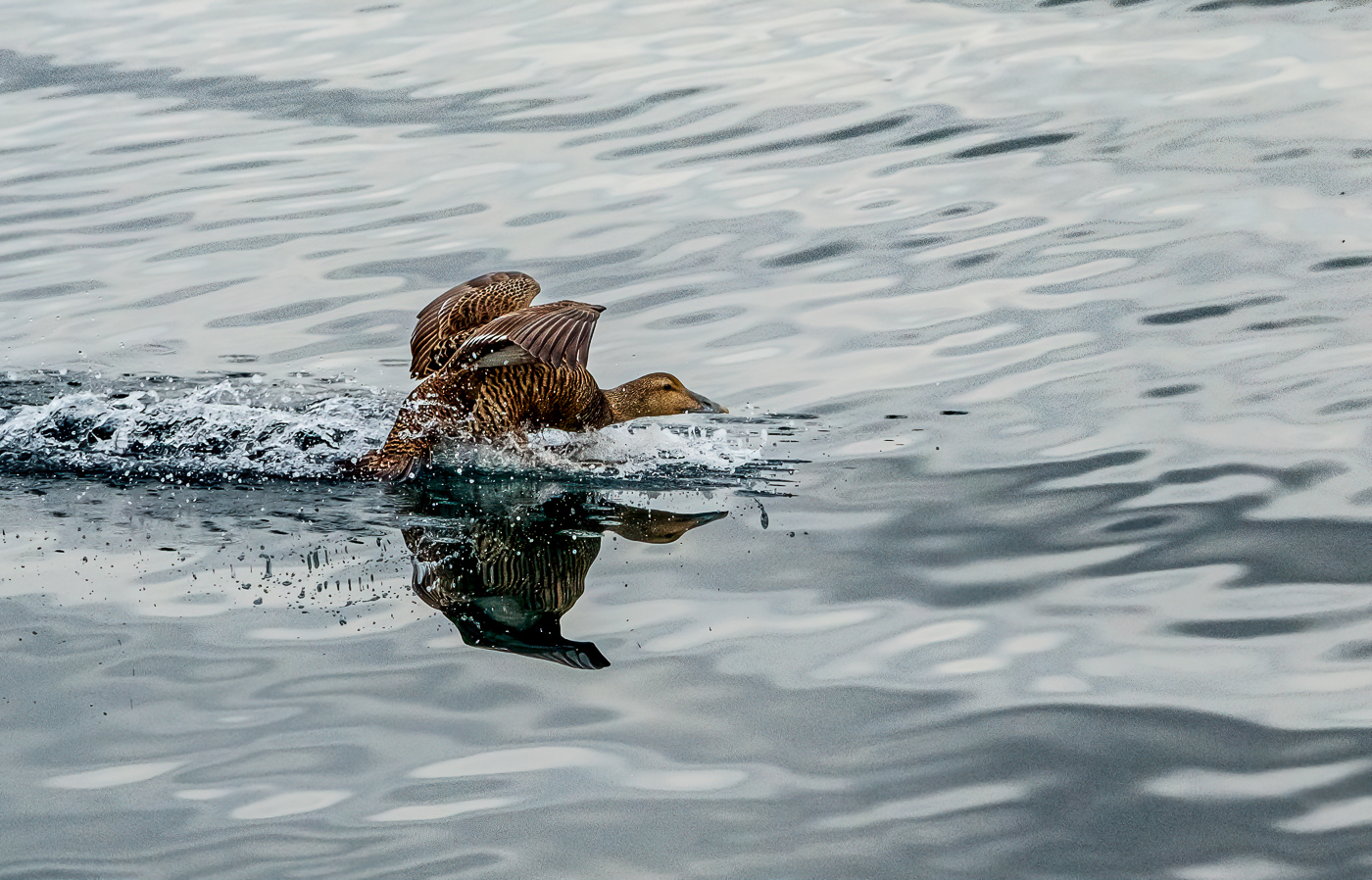
Janet, a lovely duck and wonderful colors and the sharpness is very appealing as well as the blurred out background. It feels peaceful. That said, I find a bit too much at the top, and I either cut out the legs or get the full legs and feet in my shot, depending on what I want to show. |
Aug 2nd |
6 comments - 4 replies for Group 81
|
12 comments - 6 replies Total
|