|
| Group |
Round |
C/R |
Comment |
Date |
Image |
| 81 |
Nov 21 |
Reply |
Thanks Stephen. I had a great time. I really got a deep appreciation for Van Gogh. Funny you commented just now, as last night I processed 20+ more pictures, and I am still in awe just looking at them. |
Nov 23rd |
| 81 |
Nov 21 |
Comment |
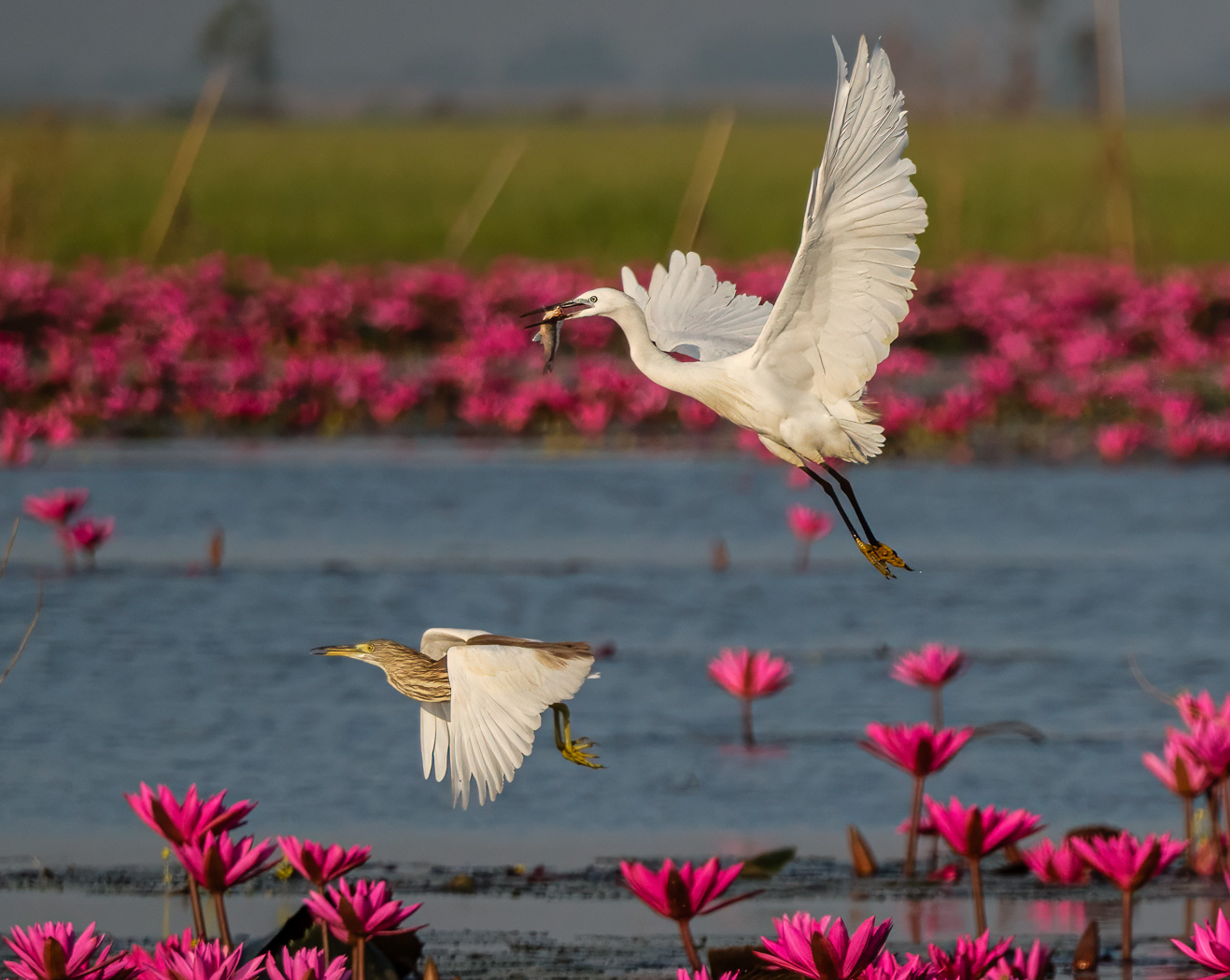
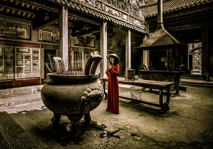
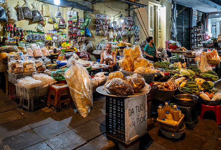
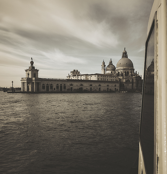
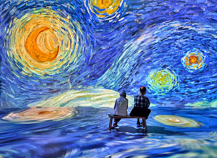
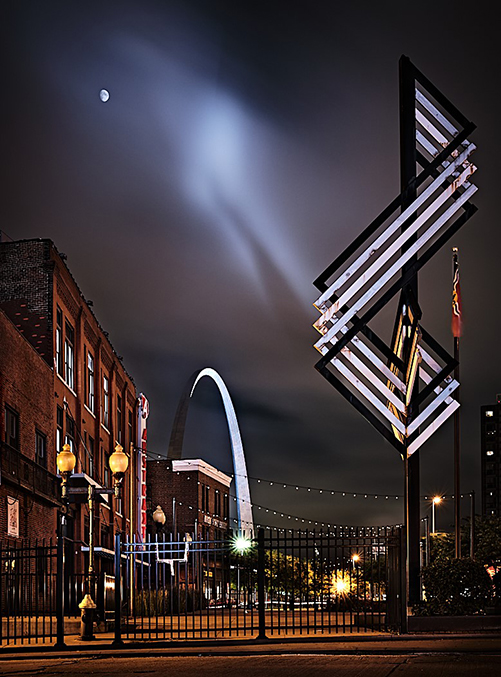
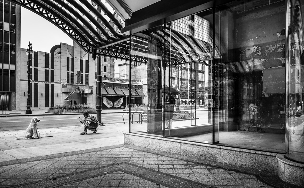
Hema, what an interesting place. I see why you liked it.
The two suggestions I have is to lighten the two standing on the left as I barely see them, and two see what you can do to the sky to bring out more drama as I bet there is more there to draw out. |
Nov 20th |
| 81 |
Nov 21 |
Comment |
Looks better. I would still darken the top spot in the helmet, and I would either clone the background or darken it even more. Since it has not identifiable shape, it it just distracting wondering what it is. you could also take it to photoshop and use content aware and get some more, the elbow, in your shot, and on the left too, if you were to find that desirable. Glad to see you working the pic. |
Nov 8th |
| 81 |
Nov 21 |
Reply |
Most welcome and definitely deserving. |
Nov 3rd |
| 81 |
Nov 21 |
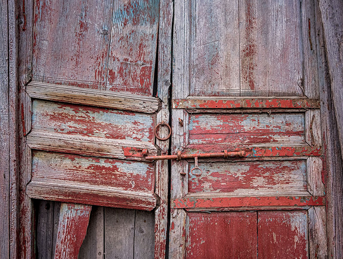
Comment |
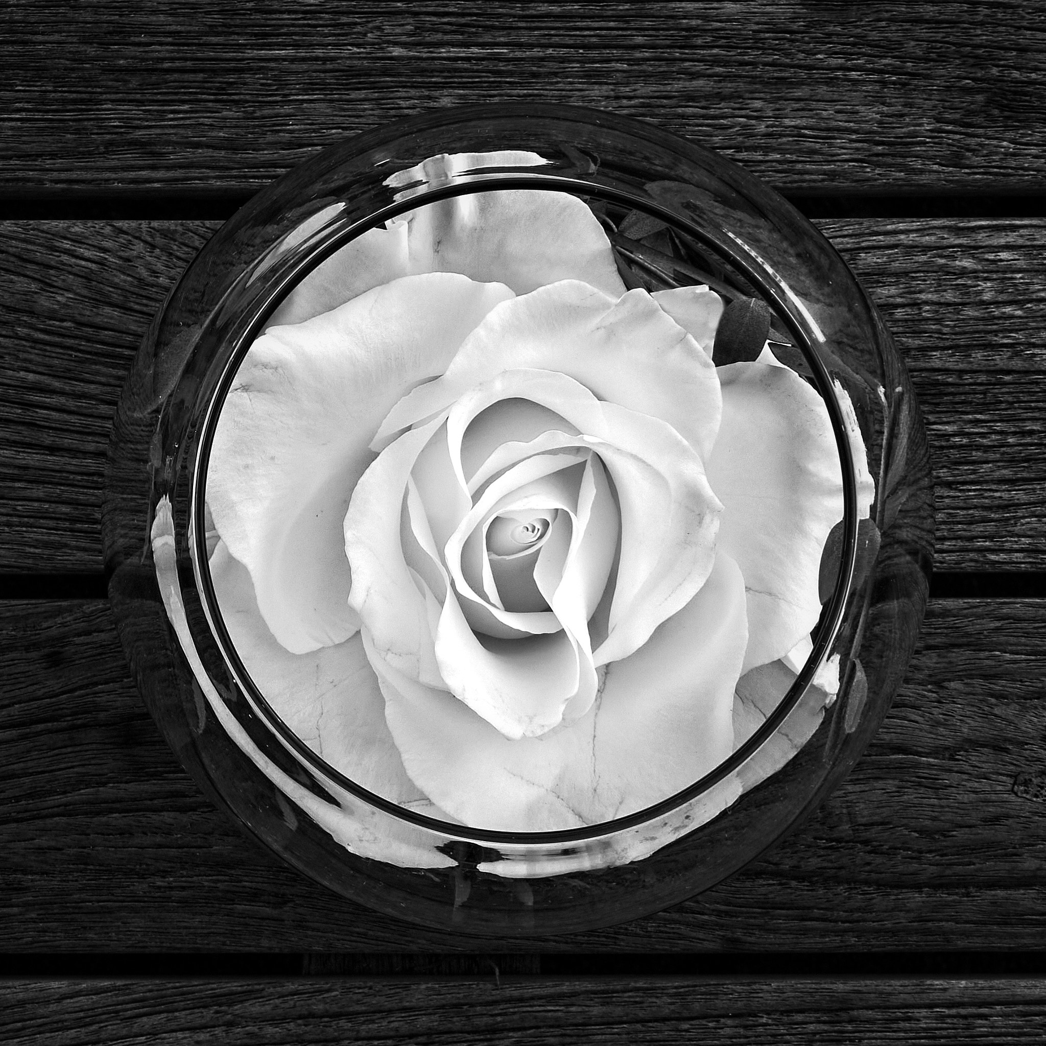
Janet, well done. Colors and lighting exceptional. Placement is outstanding. Two suggestions. Maybe more solid in the background as I find the horizontal and vertical on the right wood boards distracting (my opinion) and that can be blended in. Also, on the left of the left bell there are some light areas just on the edge and I do not know why. Since I do not know why, they look out of place and distracting. A strong image. Well done. |
Nov 2nd |
| 81 |
Nov 21 |
Comment |
Janet, I see you are having fun. Good choice to brighten your chicken and darken the background. I would do it even more, tone down the green and increase the red and make it more dramatic. The eye, most important, is in focus. I would want the rest of the head sharp, and parts are soft, in the white and upper red areas. Might try a larger depth of field if you agree. |
Nov 2nd |
| 81 |
Nov 21 |
Comment |
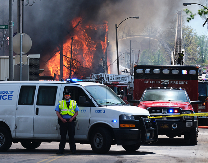
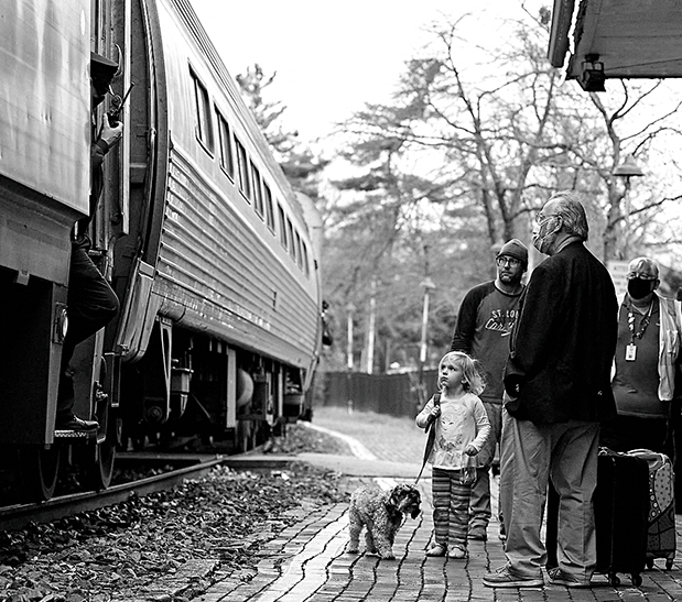
Noël, you got a good capture of this biker. sharp and you can see her exertion and determination. I personally would like to see other bikers and get a context, and see other bikers too. As for this biker alone, good job. I would lighten the upper left, and more importantly I suggest you darken a lot the three light holes in her helmet, two being the top of her head. I like that you cropped from the top. |
Nov 2nd |
| 81 |
Nov 21 |
Comment |
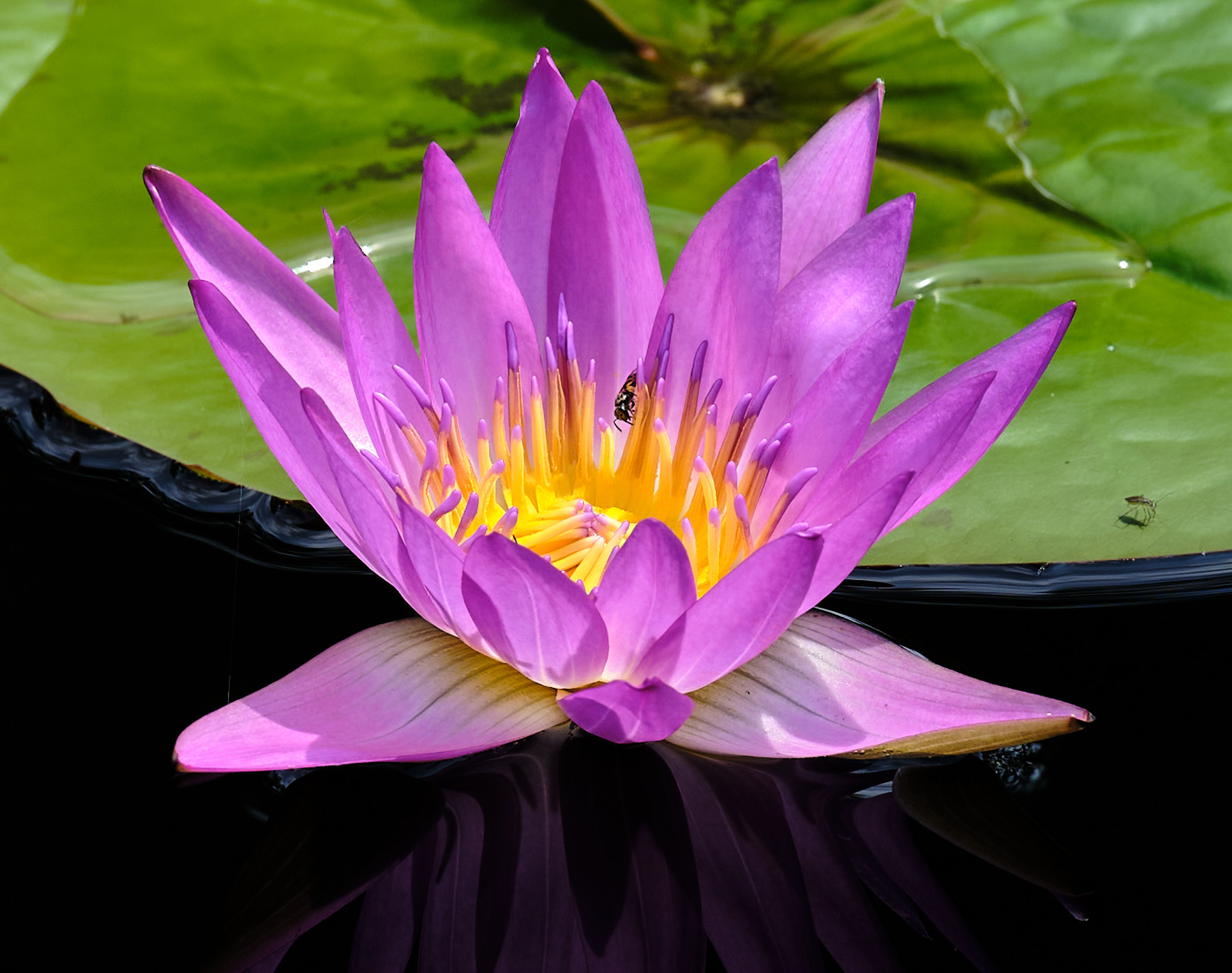
Ok,,,,,,,,Angela. I like what you did, and the focus stacking challenge. That is well done. Here are some distractions I find, more or less - the bright spot on the table left, the lack of some extra room on top, seems a little dark on my computer, and in the reflections of the copper are three somewhat subliminal scary faces - in order of most pronounced is the one on the right middle and kind of a Halloween Jason mask, then the face on the left looking left with its tongue sticking out looking like a fish head, and then to the middle of the middle rungs looking like the face of a dog seeing one eye and a large black nose - and even a fourth picture at the top of a large nose facing to the left with an eye and two large buck teeth. I also see a cow on the middle right to the right of the dog face. The long and short of it is that people see reflections and have judgments and even if they do not see it consciously, it affects how they feel about the subject. So, with reflections be sure to show what you want and intend to show. Seems a little empty on the left on the table, so maybe some more fruit. Ok, love the composition otherwise. Tone are all within a short range, so maybe bring that out and get the eye to gravitate to your subject. I like the background. |
Nov 2nd |
| 81 |
Nov 21 |
Reply |
Angela, I did lighten them up, but not more, and as you pointed out, but yes, I wanted to keep them as observers of the subject that I wanted highlighted, being the "painting." It was a great experience to see this show. |
Nov 2nd |
6 comments - 3 replies for Group 81
|
6 comments - 3 replies Total
|