|
| Group |
Round |
C/R |
Comment |
Date |
Image |
| 81 |
Apr 19 |
Reply |
Thx Brent, much appreciated. |
Apr 22nd |
| 81 |
Apr 19 |
Reply |
not sure you got this stephen, so i send again, but no need to comment. Randall Gusdorfi dabble, but still work, work about 75 hours a week, down from pre-camera days. Hard for me to do anyting but dabble. I had looked at a few in the last few minutes, including your, was going to comment but got pulled to work. fun shot you had, was going to ask if you used a bnw techique on you pic, but did not have enought time to really look at it closely, or extend conversation. now i know where to find you when i get a better opportunity.......:) Posted: 04/05/2019 11:43:25 |
Apr 5th |
| 81 |
Apr 19 |
Reply |
Thx. I am more and more going to bnw for more images, so it is nice reinforcement from you to keep exploring bnw, and keep color for those where is works better. |
Apr 5th |
| 81 |
Apr 19 |
Reply |
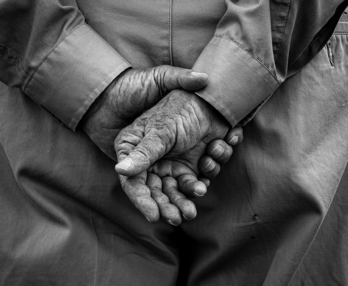
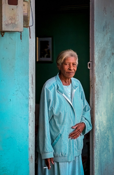
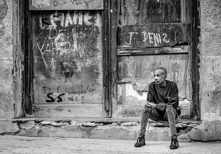
Thanks Stephen from Group 32. I appreciate your comment and exploring the bnw. I tried it too, and liked the colors of the original, the blues and the greys, grey on his hands, and the red jacket. it is at 1000 iso and about 20% of the original picture, so the color does show noise even with noise reduction. the bnw handled the noise better. what do you prefer? |
Apr 5th |
| 81 |
Apr 19 |
Comment |
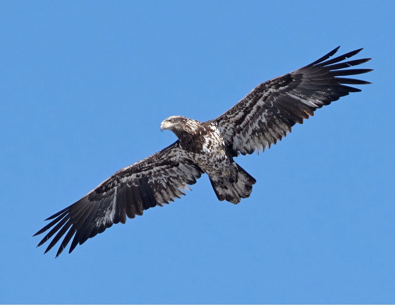
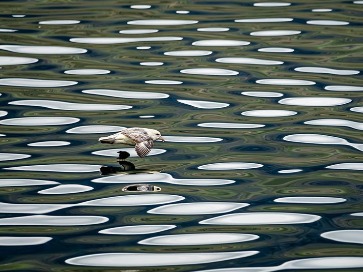
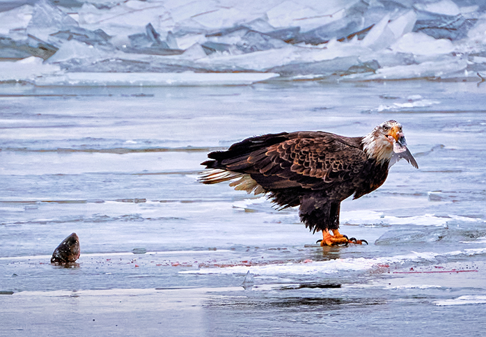
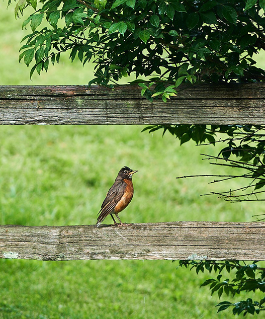
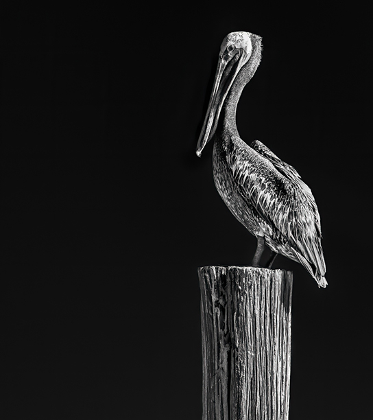
Cheryl, I like it, a lot to like. like the pose, the leg positioning between the tree protrusions is lovely. I like the gesture of the claws holding onto the tree, that is outstanding. you might consider cropping in from the left some, and from the bottom, then you get i think a more appealing view, and tighter in on the bird, as you have great detail. i suggest you bring down the highlights on the legs, just above the legs, and in the neck area, as i bet there are wonderful textures and details to be brought out. the rest of the image is wonderful and i have no further suggestions you might explore. |
Apr 4th |
| 81 |
Apr 19 |
Reply |
:) |
Apr 3rd |
| 81 |
Apr 19 |
Comment |
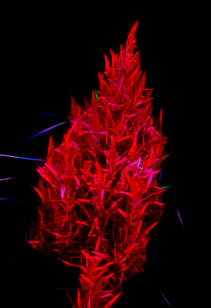
Sandy, what a cool wonderful scene, with great contrast of curves and colors. I like the variation that you creatively rendered. You might want to look at decreasing the highlights on the left leaves, which are beautiful in and of themselves, because they take my eye away from the beautiful mushrooms at the base of the tree, and those are what i find most fascinating, and maybe even bringing out more texture and light by increasing the shadows on those mushrooms, albeit you might need to increase the contrast at the same time just on those mushrooms to not loose, but enhance the details. Nicely seen, well worth taking and sharing. |
Apr 3rd |
| 81 |
Apr 19 |
Comment |
Angela, innovative and creative. I like the red color on the tip of the pin, most pronounced on the right two. color placement is appealing. and I like the right two where the pin hits the plastic as I see the convex depth of the plastic. I would like to see them tack sharp, or the shadow more pronounced, as i was not quite sure if it was a sharpness issue, or a deliberate shadow. given it was a deliberate shadow effect, as the image is sharp, you might want to make that more deliberate looking another time, see how that might look. i like the use and effect of the polarizing filter. |
Apr 3rd |
3 comments - 5 replies for Group 81
|
3 comments - 5 replies Total
|