|
| Group |
Round |
C/R |
Comment |
Date |
Image |
| 67 |
Dec 24 |
Reply |
Thanks so much for the comment, and for all comments and suggestions this year. Happy New Year to you!! |
Dec 31st |
| 67 |
Dec 24 |
Reply |
Thanks so much for the comment, and for all comments and suggestions this year. Happy New Year to you!! |
Dec 31st |
| 67 |
Dec 24 |
Reply |
Thanks so much for the comment, and for all comments and suggestions this year. Happy New Year to you!! |
Dec 31st |
| 67 |
Dec 24 |
Reply |
Thanks so much for the comment, and for all comments and suggestions this year. You are a terrific group leader. Happy New Year to you!! |
Dec 31st |
| 67 |
Dec 24 |
Reply |
Thanks so much for the comment, and for all comments and suggestions this year. Happy New Year to you!! |
Dec 31st |
| 67 |
Dec 24 |
Reply |
Thanks so much for the comment, and for all comments and suggestions this year. Happy New Year to you!! |
Dec 31st |
| 67 |
Dec 24 |
Reply |
Looks good! |
Dec 25th |
| 67 |
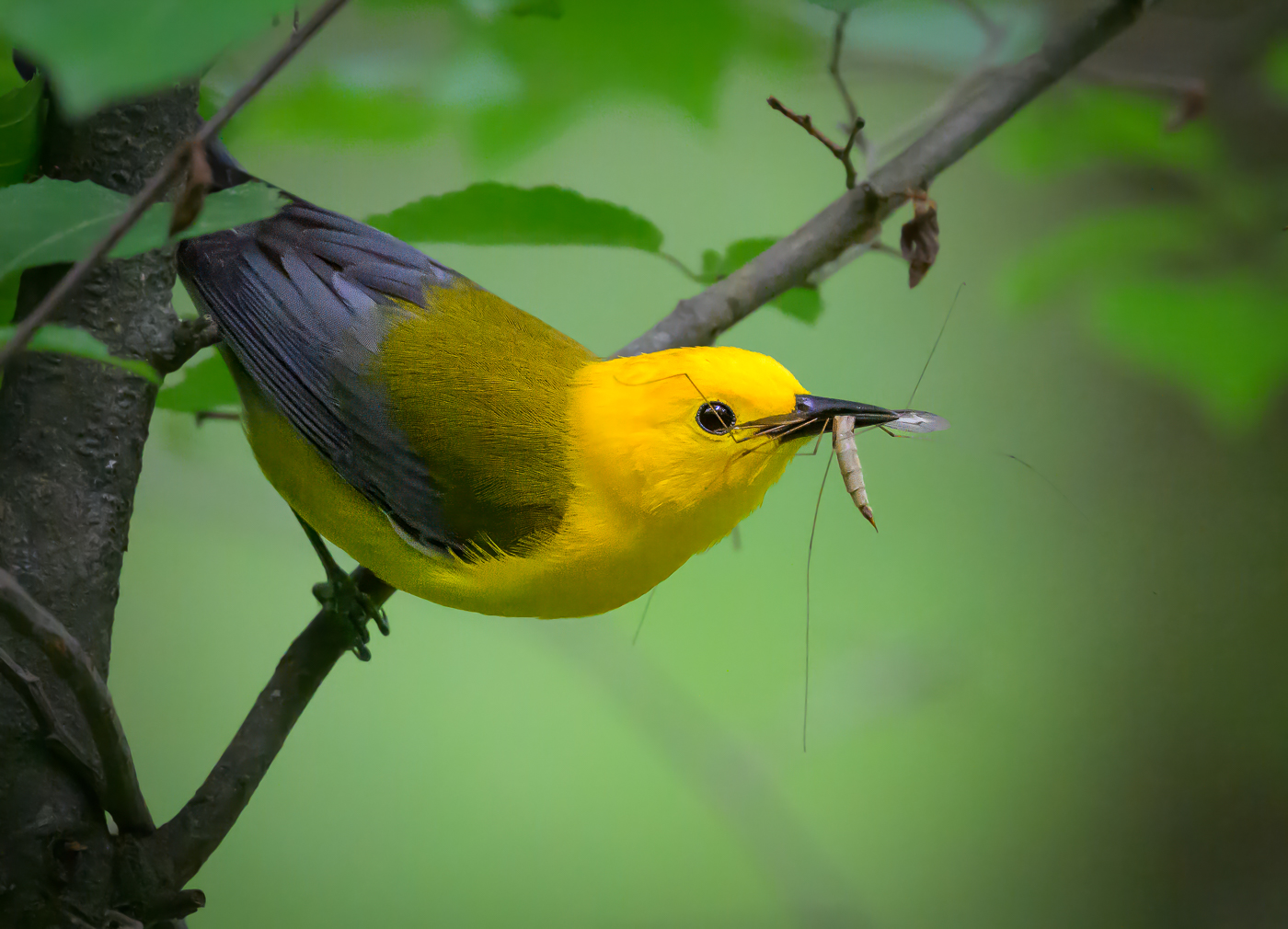
Dec 24 |
Comment |
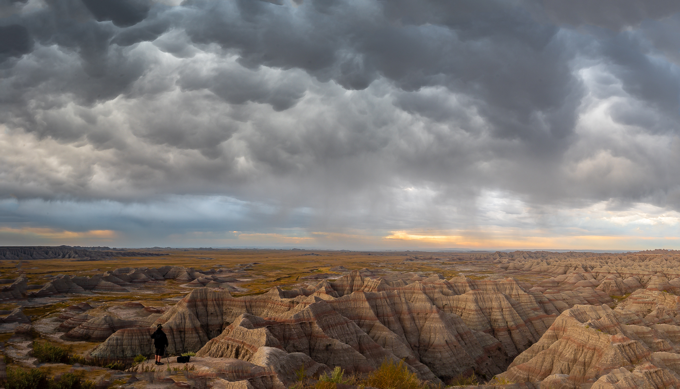
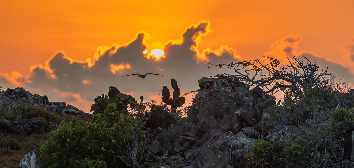
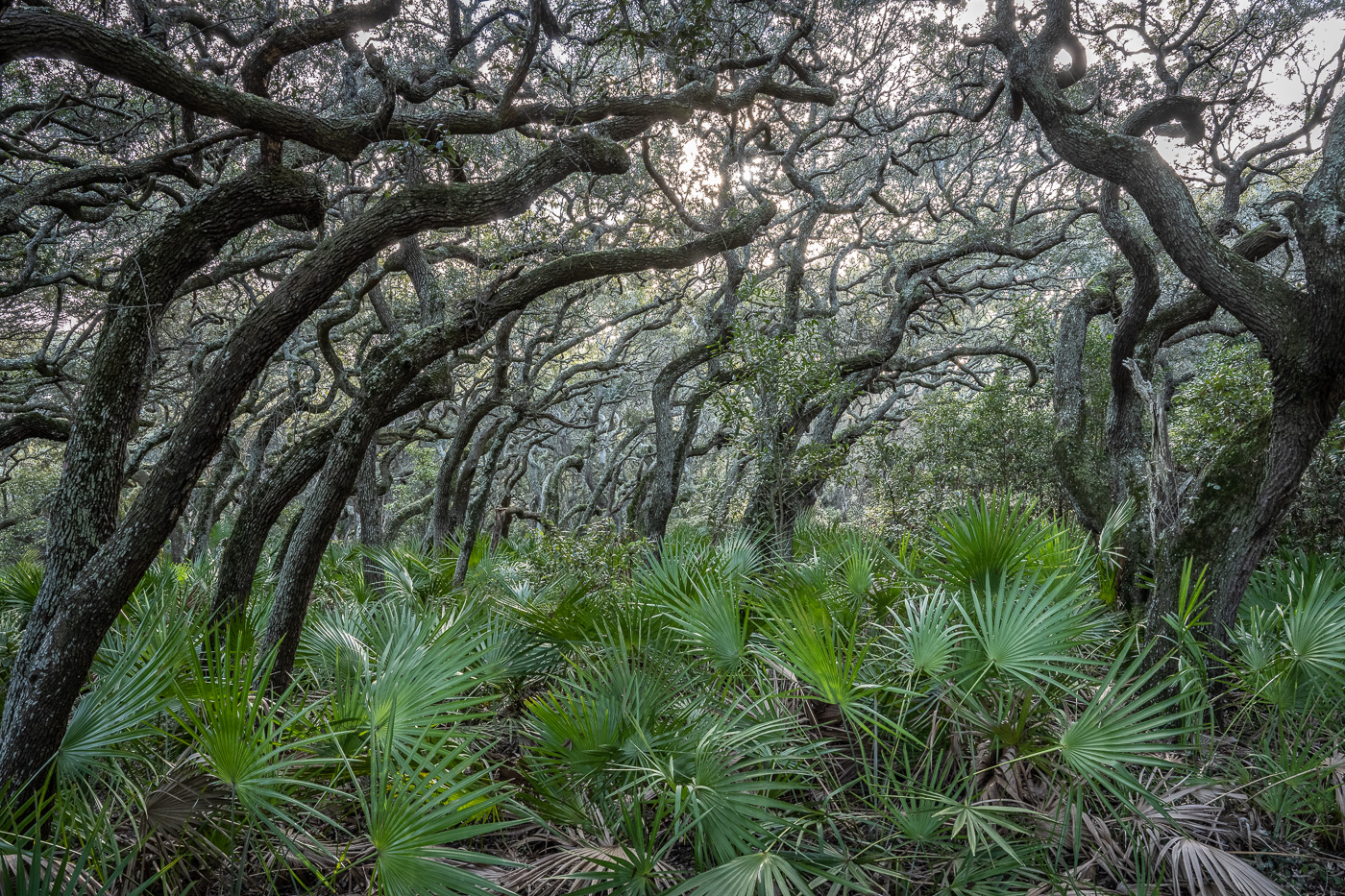
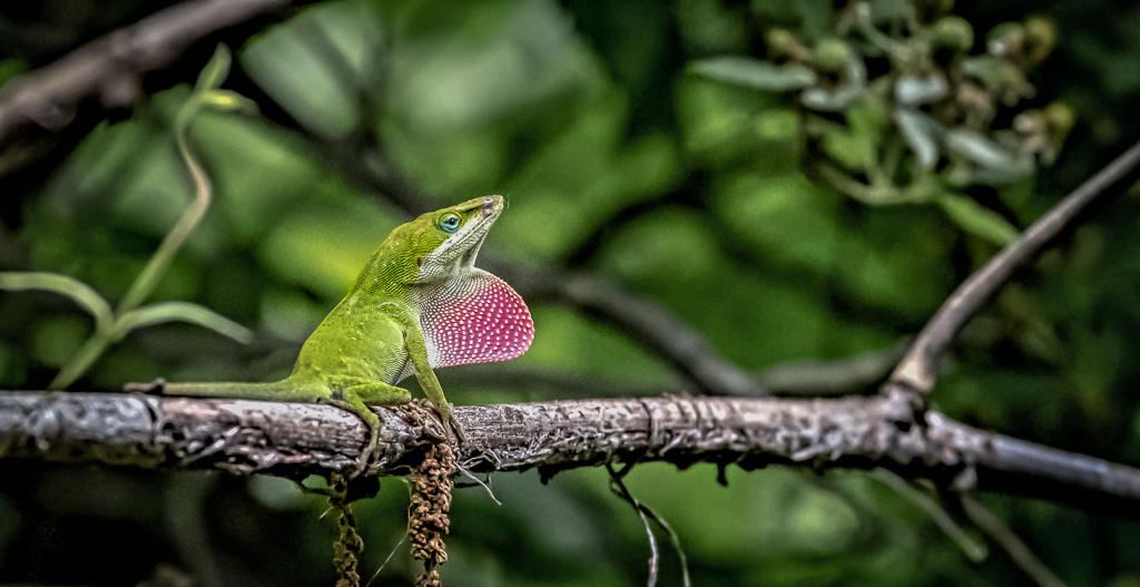
Wonderful shot. Just my preference but I like the original image better, with no crop, because it captures the environment and provides some perspective. Good job! |
Dec 22nd |
| 67 |
Dec 24 |
Comment |
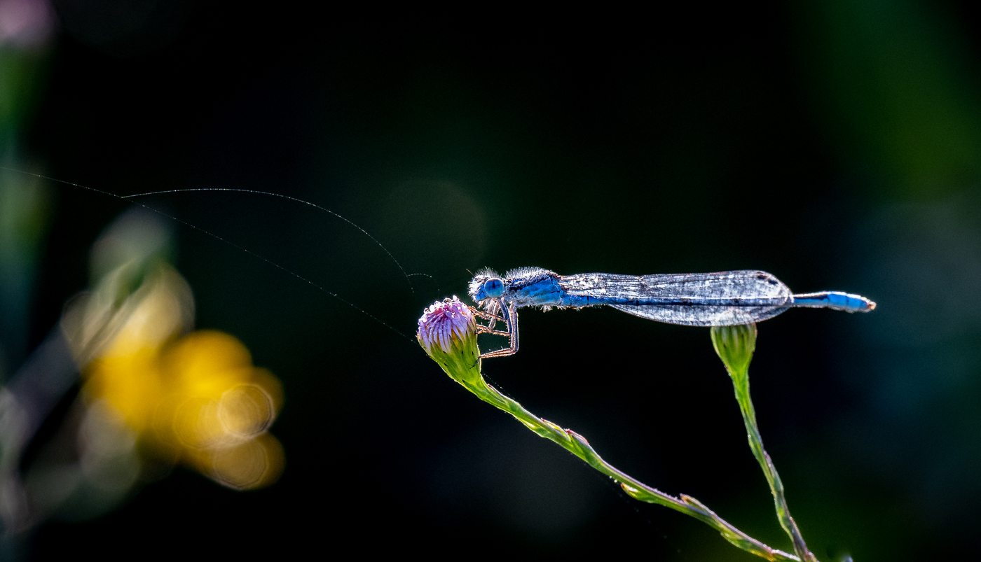
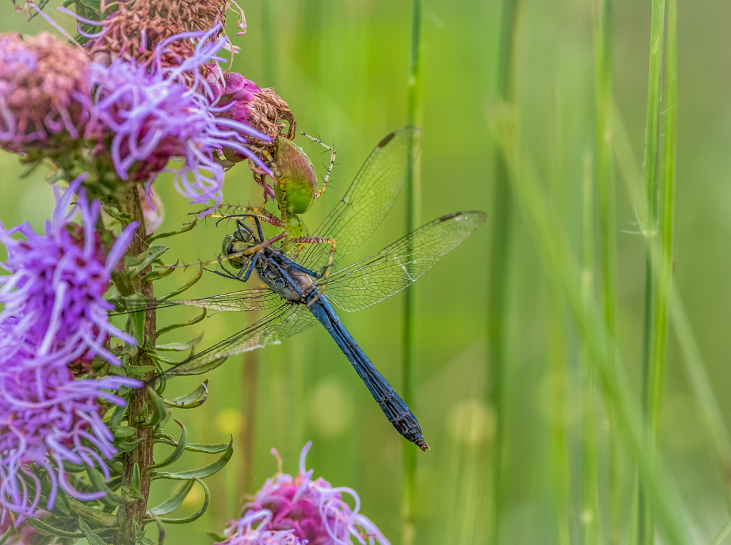
A very interesting image with the hummingbird and bee. I actually like the original image better, as far as formatting goes. IMO, having the branches and flower buds (or whatever) in the image provides an environmental perspective and better balances the distance between bird and bee. Just get rid of that little orange thing at the bottom of the image. Nice shot! |
Dec 22nd |
| 67 |
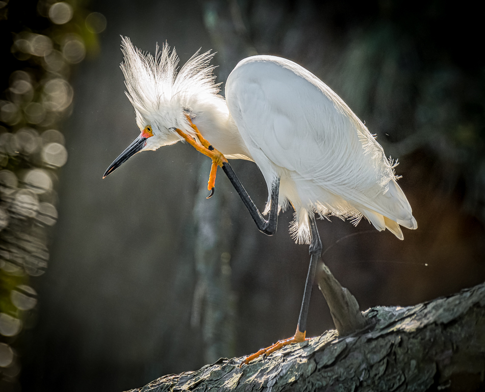
Dec 24 |
Comment |
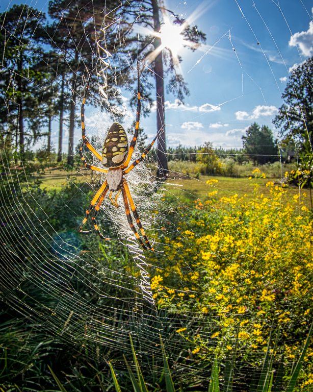
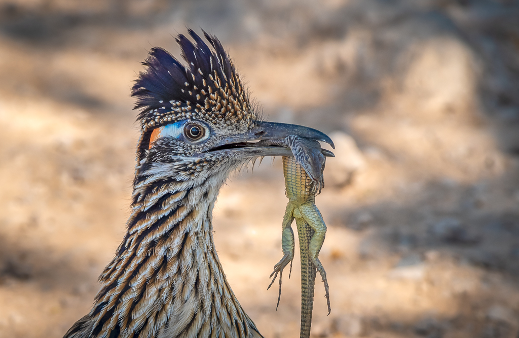
Great reflection and that's one beautiful bird. The only thing I noticed is that the bird looks a little crowded in the image. Maybe open up a little on the left and a lot on the right. And there's a small hockey stick looking light colored branch at the top that could be removed. A really nice shot! |
Dec 22nd |
| 67 |
Dec 24 |
Comment |
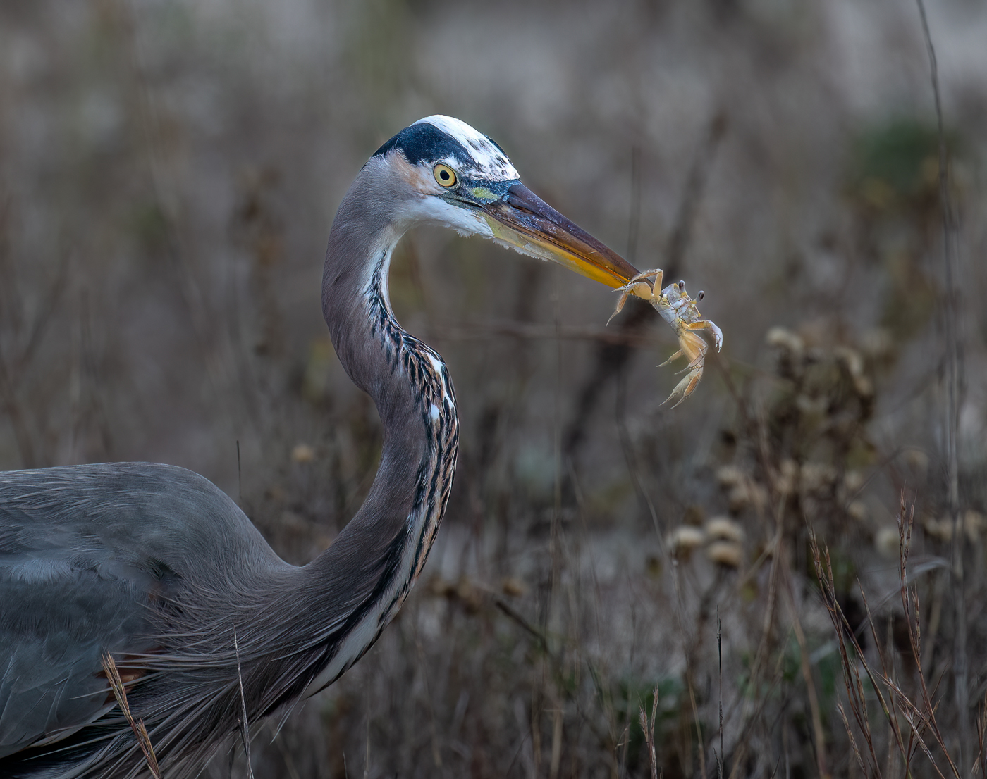
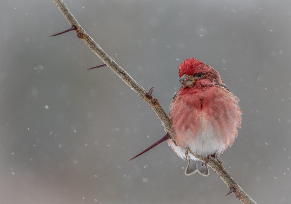
IMO the bird is great. Sharp where it needs to be, well lit and great action. But this month I'm thinking about backgrounds and how to make them appear more natural in the image while still getting good separation from the subject. Same issue as with Susan's image. Perfect subject but the background appears to be too dark - or something. I'm probably off-base here but just something I'm pondering. |
Dec 22nd |
| 67 |
Dec 24 |
Comment |
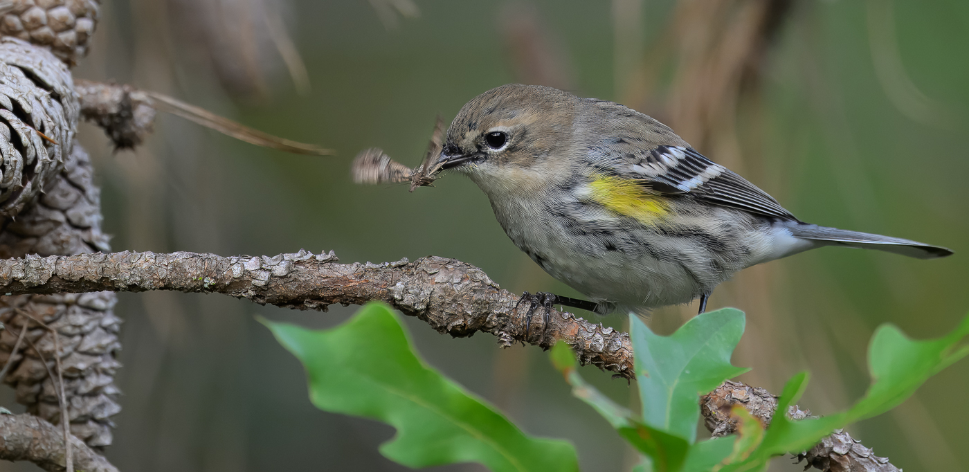
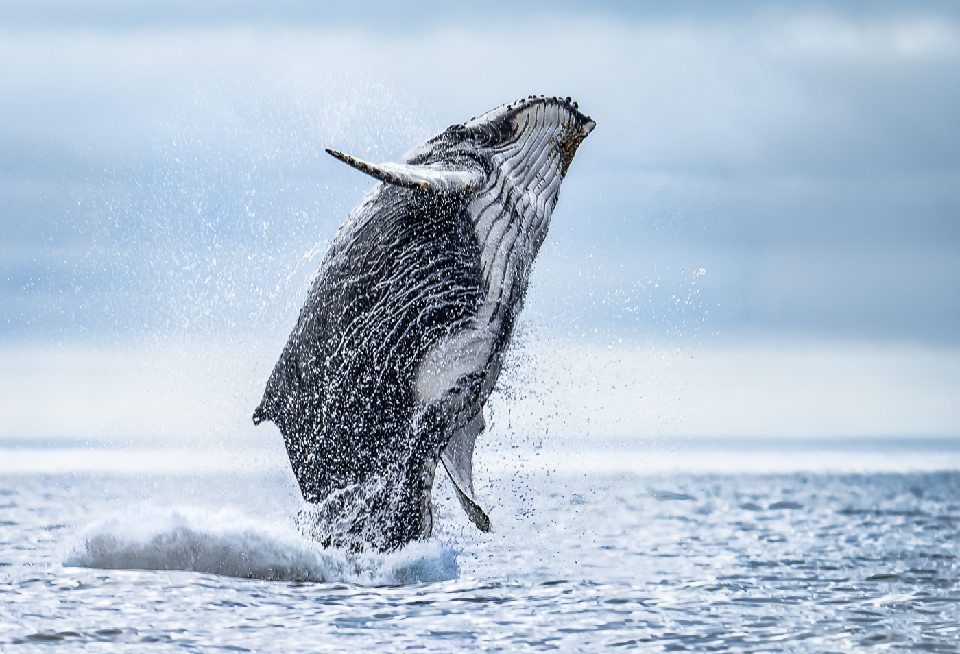
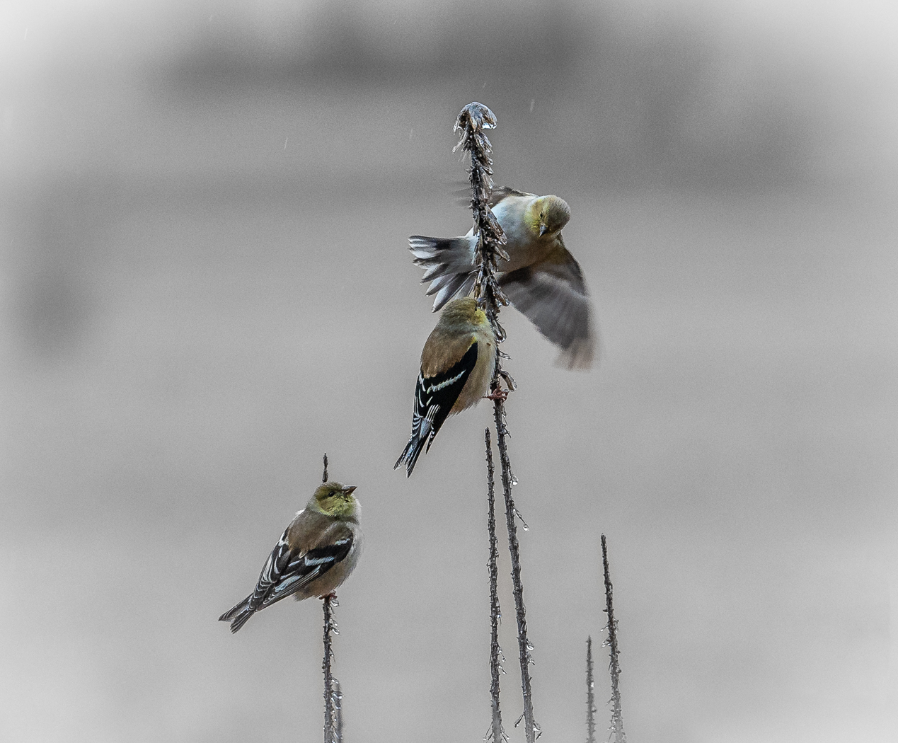
Yeah, you caught the perfect moment. All good IMO. Thanks for mentioning your technique. |
Dec 22nd |
| 67 |
Dec 24 |
Comment |
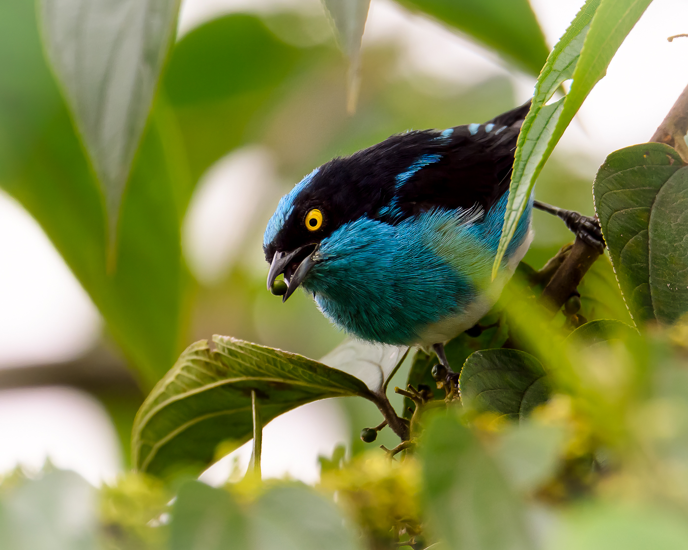
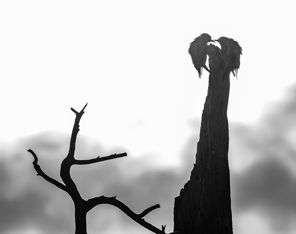
Sorry to be late with comments this month. I must say that John Wilson's granddaughter is a lovely shade of blue, clearly focused and appears to be looking straight at me. There's one thing that bothers me, and it's true for so many of my processed images. The subject looks over-processed and the background just doesn't seem to fit. It's as if the bird's image is projected in front of a screen. This makes the entire image looks unnatural. Anyone else have this problem, probably arising out the ease with which we can use masking and processing the subject and background separately. Not saying I don't like this image - I do. |
Dec 22nd |
| 67 |
Dec 24 |
Comment |
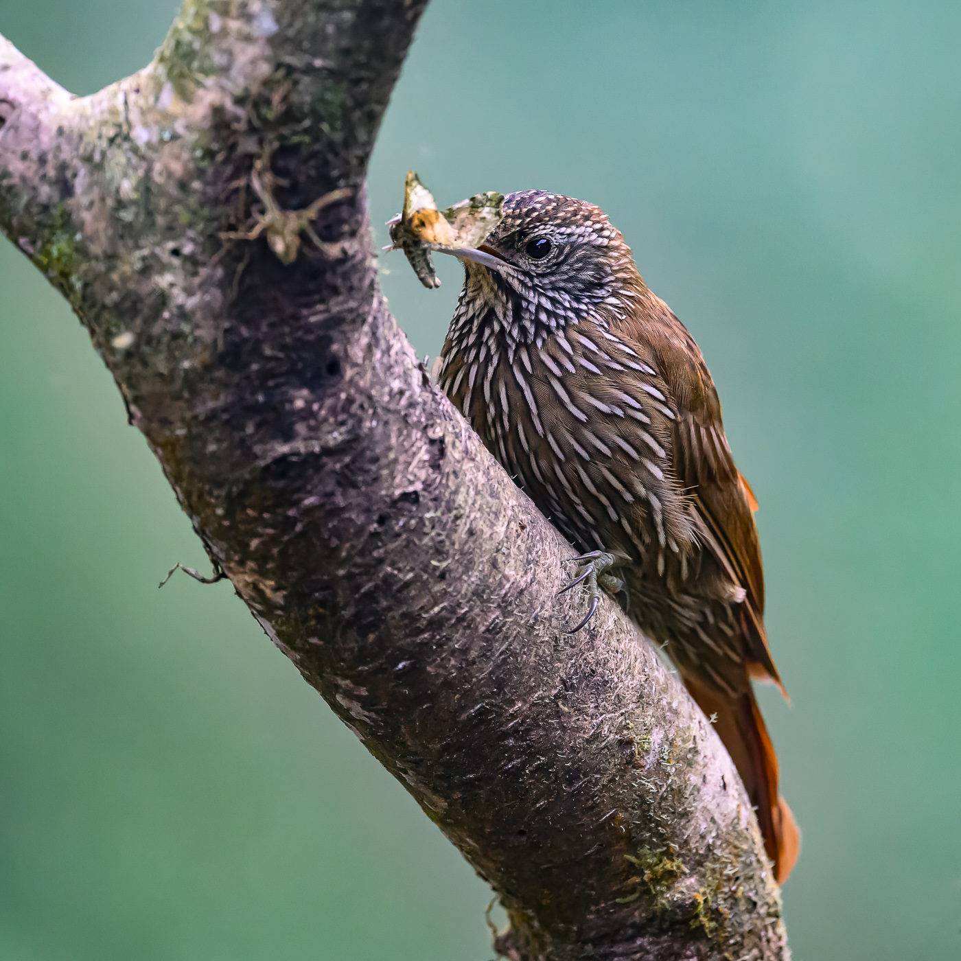
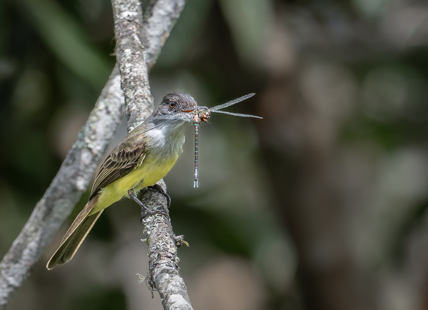
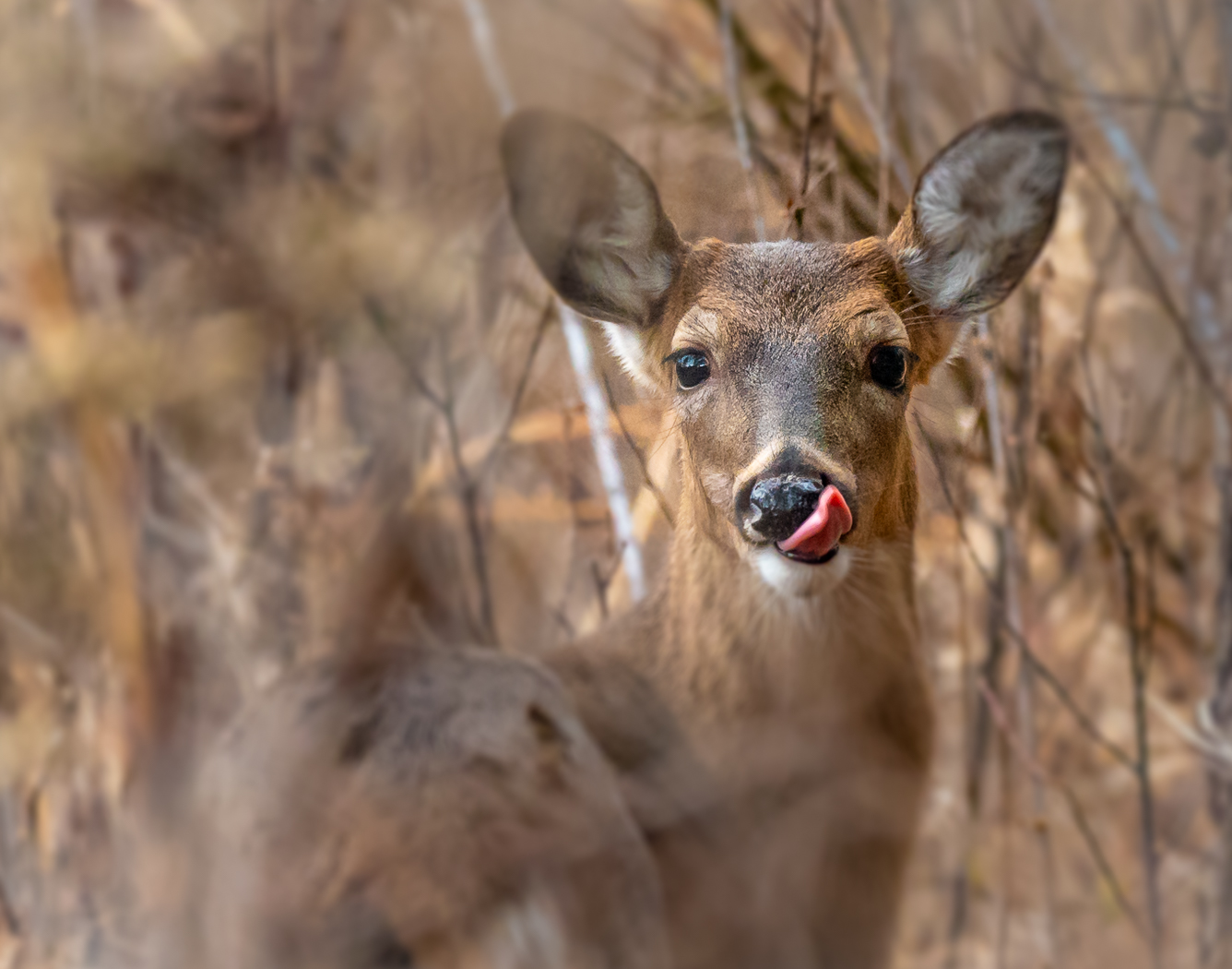
Forgot to mention that I used Lightroom's removal tool to get rid of some limbs and vines. Also camera settings: 400mm; f4.5; 1/640; ISO 1000. |
Dec 3rd |
7 comments - 7 replies for Group 67
|
7 comments - 7 replies Total
|