|
| Group |
Round |
C/R |
Comment |
Date |
Image |
| 67 |
Jan 24 |
Reply |
I really like what you've done. Thanks. We have had problems with local regulations. It was a couple of years after we moved to our place in a small southern town and began conversion from all-mowed to almost no-mowed. September and the place nearly glowed from the blooms of native wild sunflowers and goldenrod. The City Guy came by and told us, "You gotta mow down them weeds." Turned out there was a city ordinance requiring that all property in the city be mowed. We ended up going before the City Council, explaining what we were doing, and showing our management plan and certifications from conservations groups. The city worked with us to change the ordinance to exclude properties like ours. After all, the ordinance was aimed at abandoned lots which are plentiful in our town. |
Jan 24th |
| 67 |
Jan 24 |
Reply |
Good suggestions. And you can't fool me - you're no newbie. I've seen your pictures. |
Jan 17th |
| 67 |
Jan 24 |
Comment |
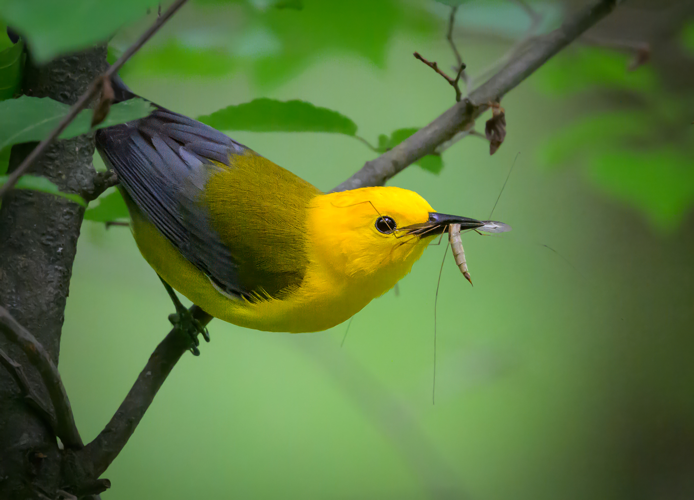
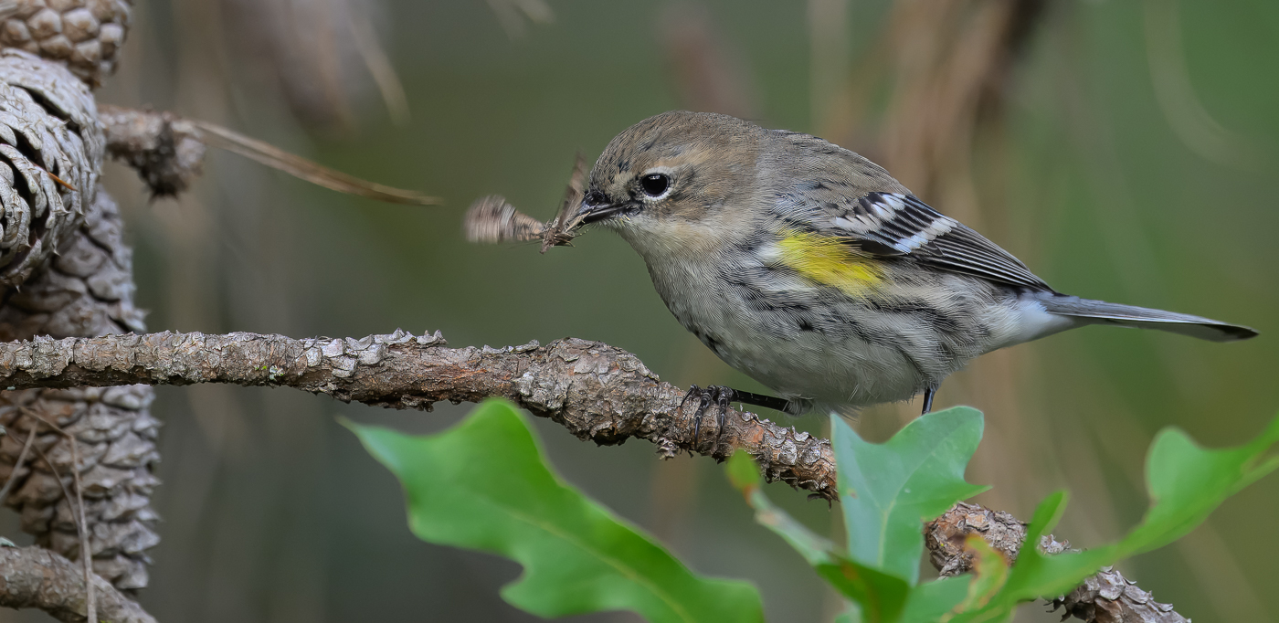
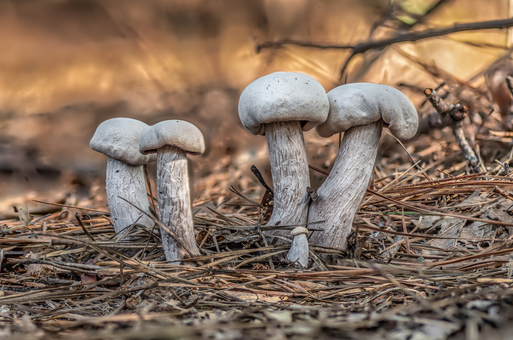
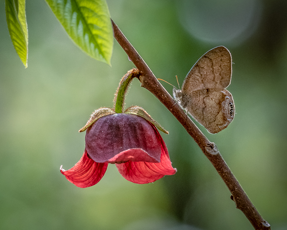
Thanks to all for the great comments. When I was a young whippersnapper (in my sixties) I focused on "filling the frame". As I have matured I now like to include as much of the subject's environment as I can get away with. So I looked at a crop that included the entire cluster of cones, but that distracted from the bird and the moth was hard to see. So I compromised on that. I agree that was not the best decision. However, the green oak leaves look just fine to me. But I would decrease saturation and sharpness a little. |
Jan 17th |
| 67 |
Jan 24 |
Comment |
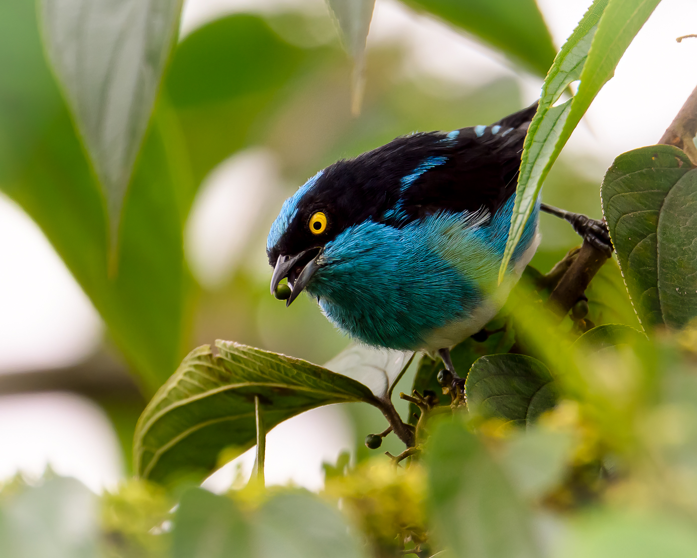
Wow, this really works. The section of blue separating the brown and yellow adds much interest. In fact the image would be pretty boring without it. Everything good IMO. |
Jan 17th |
| 67 |
Jan 24 |
Comment |
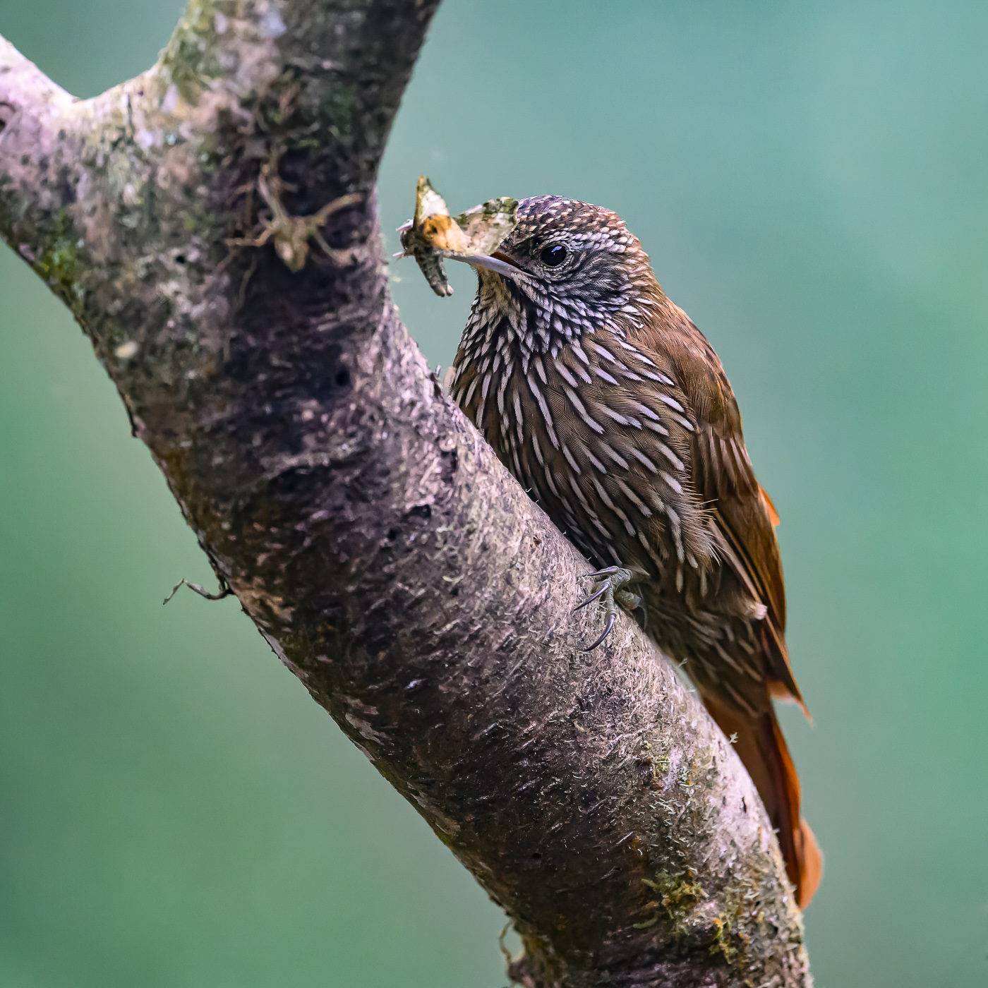
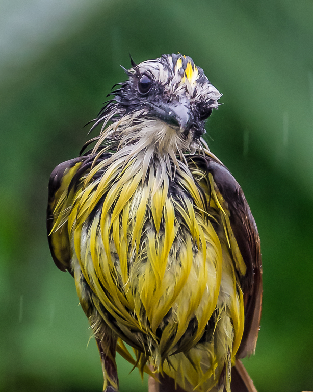
The bird is sharp and an interesting pose. The background might could be improved by blurring it even more. I find those "ripples" in the brown part distracting. I don't have a technical reason, but feel the bird needs more focus in the composition. I would try a dark vignette (not too much). Oh no! I can feel the stones coming through my computer screen. |
Jan 17th |
| 67 |
Jan 24 |
Comment |
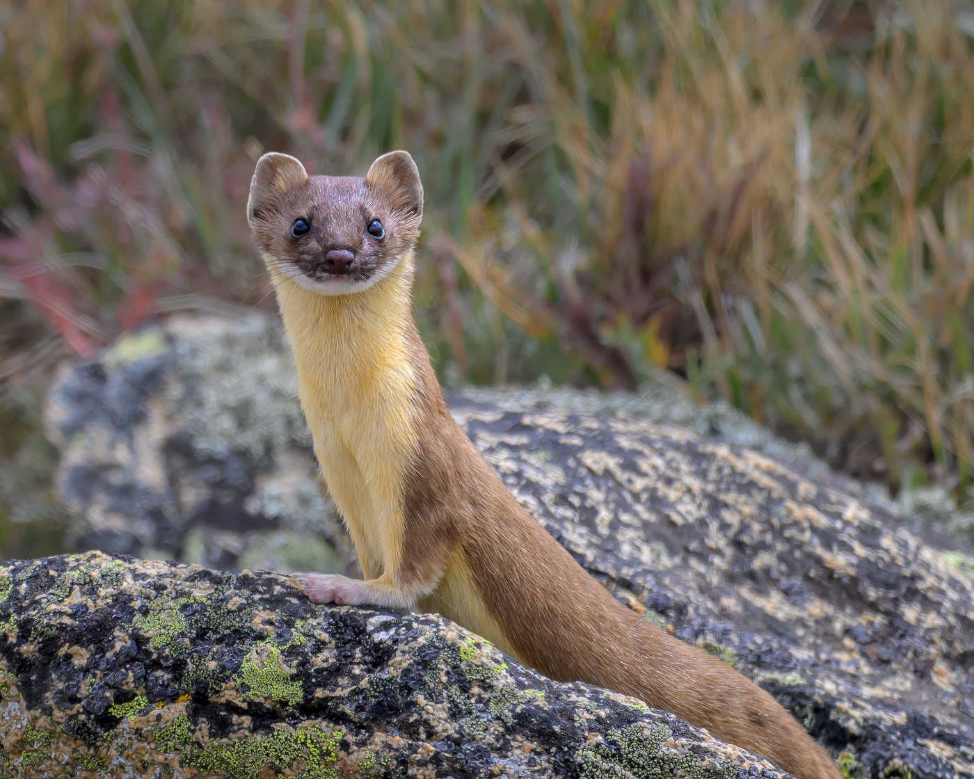
Hey Rich, great job on processing this one to bring out the colors of the fox. As for cropping the image looks a little crowded to me. So I would open it up some, both on left and right, and deal with the background consequences as described in other comments. Thanks! |
Jan 17th |
| 67 |
Jan 24 |
Comment |
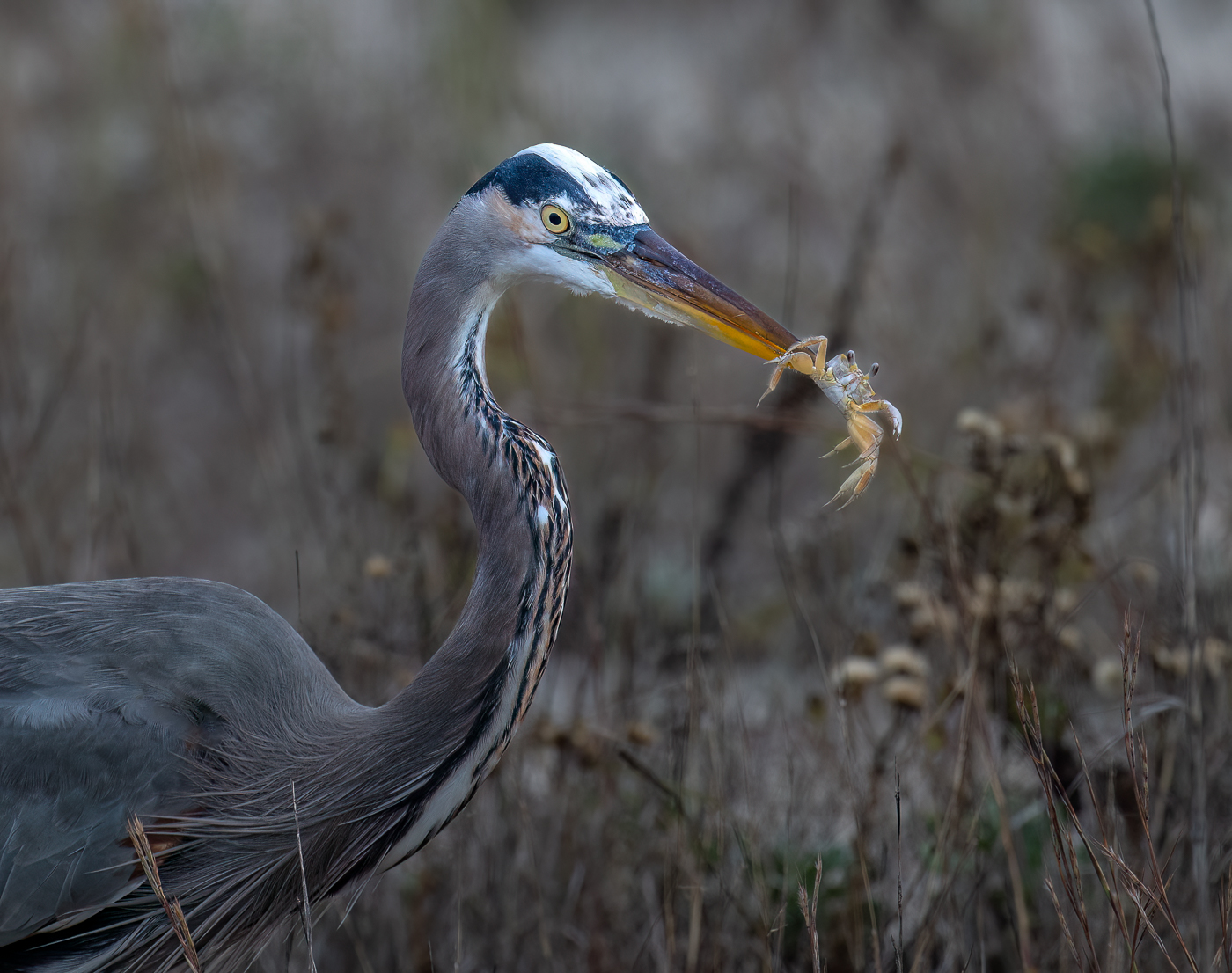
I went out and bought a platypod after one of your posts several months ago (your commission check is in the mail). Used it a lot for streams and waterfalls in the Smoky Mountains. I am not concerned about the "reed". In fact I like it and prefer to think of it as an alien sea creature making a peace offering to the bird. "Take me to your leader." |
Jan 17th |
| 67 |
Jan 24 |
Comment |
This image makes me want to bundle up and head for Antarctica. Wonderful balance with the penguins on the right and the lines of that blue-ice iceberg leading to the pinnacle. I see you increased clarity and that's good. I wonder what a little dehazing (Lightroom) would do). |
Jan 17th |
| 67 |
Jan 24 |
Comment |
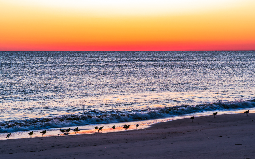
Hi Susan, nice photo. Bird looks reasonably in focus and well exposed. I think the inclusion of the pelicans in the foreground does not help the image. Would be less busy (and just better looking IMO) to crop them out but keep the flamingos in the foreground. This would make the image more panorama-like (or "landscapey" to use a technical term). I would even crop to allow a little more space in front of the bird. Thanks. |
Jan 17th |
7 comments - 2 replies for Group 67
|
7 comments - 2 replies Total
|