|
| Group |
Round |
C/R |
Comment |
Date |
Image |
| 67 |
Jan 21 |
Comment |
Here's another version of the image, maybe improved a little. |
Jan 24th |
 |
| 67 |
Jan 21 |
Comment |
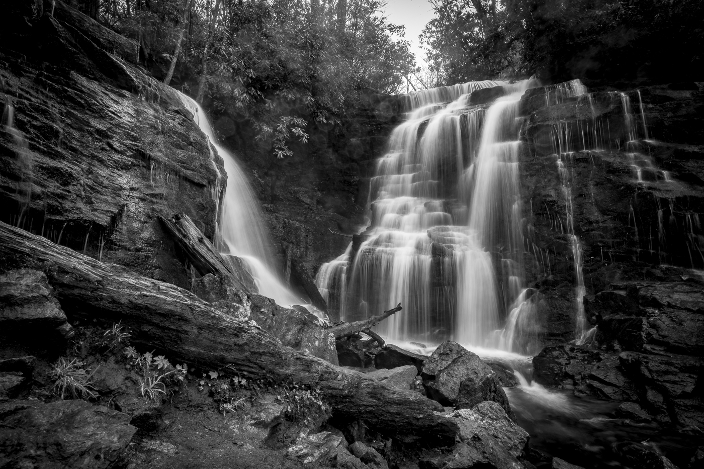
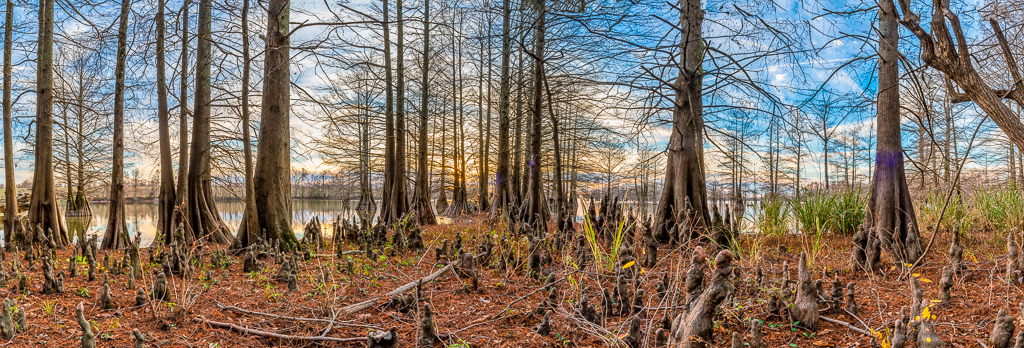
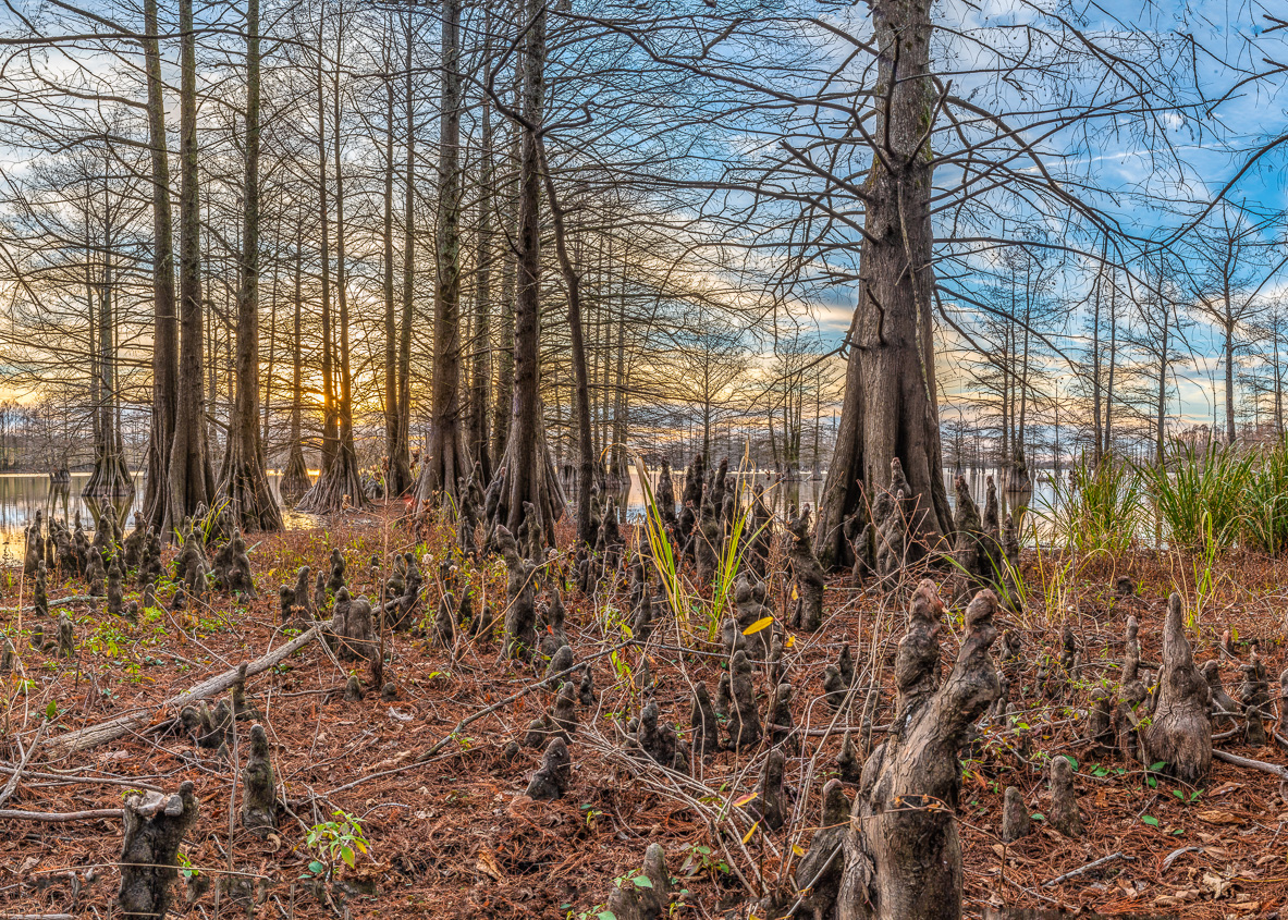
Thanks to everyone for the comments. Very helpful. I tried to get rid of the purple boundary paint but couldn't do it in Lightroom. As for the subject, maybe the easiest thing for me to do is to change it. How about "Tangle of cypress knees and trees on a boundary line". Has a nice ring to it. Joking. |
Jan 24th |
| 67 |
Jan 21 |
Comment |
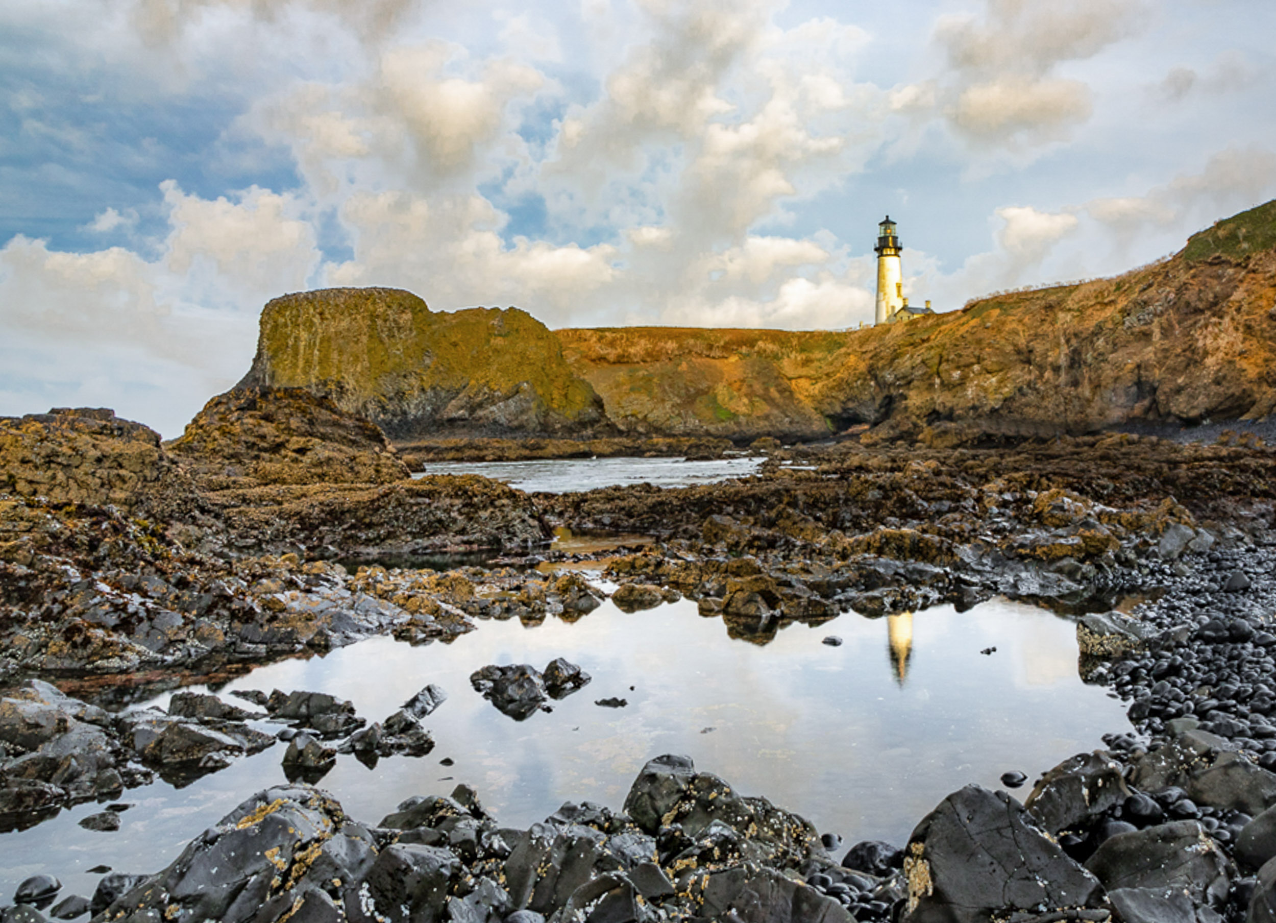
Hi David. Thanks for posting this image of a great subject. I must live up to my reputation as the "cropaholic" of the group. Therefore I suggest cropping as shown in the attached image. I think this brings better balance to the image and emphasizes the subject a little more. Also, the lighthouse leans a little to the left, so I straightened it up some. It's a good image as-is, just as suggestion or two. |
Jan 8th |
 |
| 67 |
Jan 21 |
Comment |
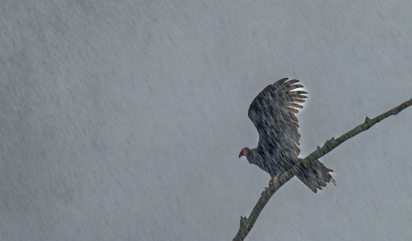
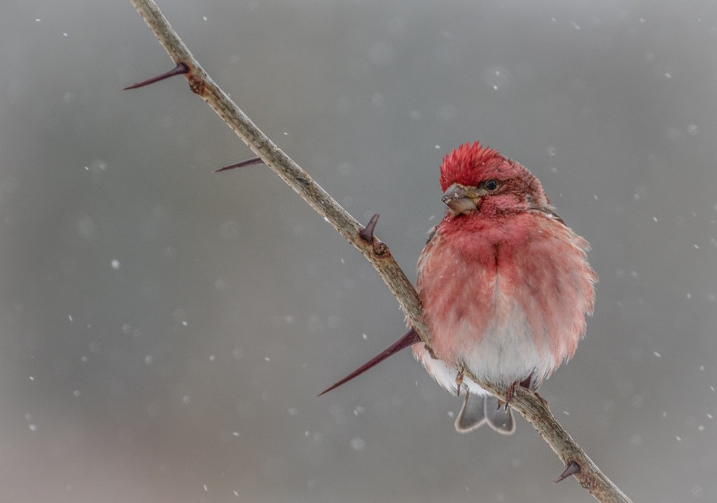
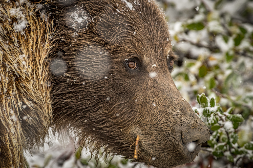
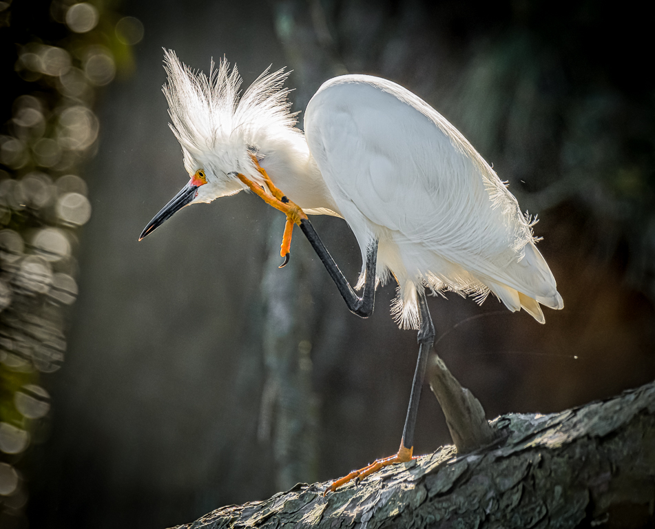
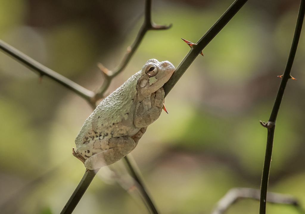
Hi Bud. Thanks for posting this image of an eagle in such a wonderful pose. I think the subject needs a little more space. You didn't mention if you cropped the original, but if you can I would try giving the bird a little more space on the left and more on the right. |
Jan 8th |
| 67 |
Jan 21 |
Comment |
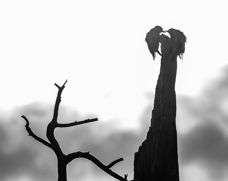
Hi Richard. I love the "feel" of this image. Viewing it has a calming effect. Softening up the image in post processing worked wonders. Good job, IMO. |
Jan 8th |
| 67 |
Jan 21 |
Comment |
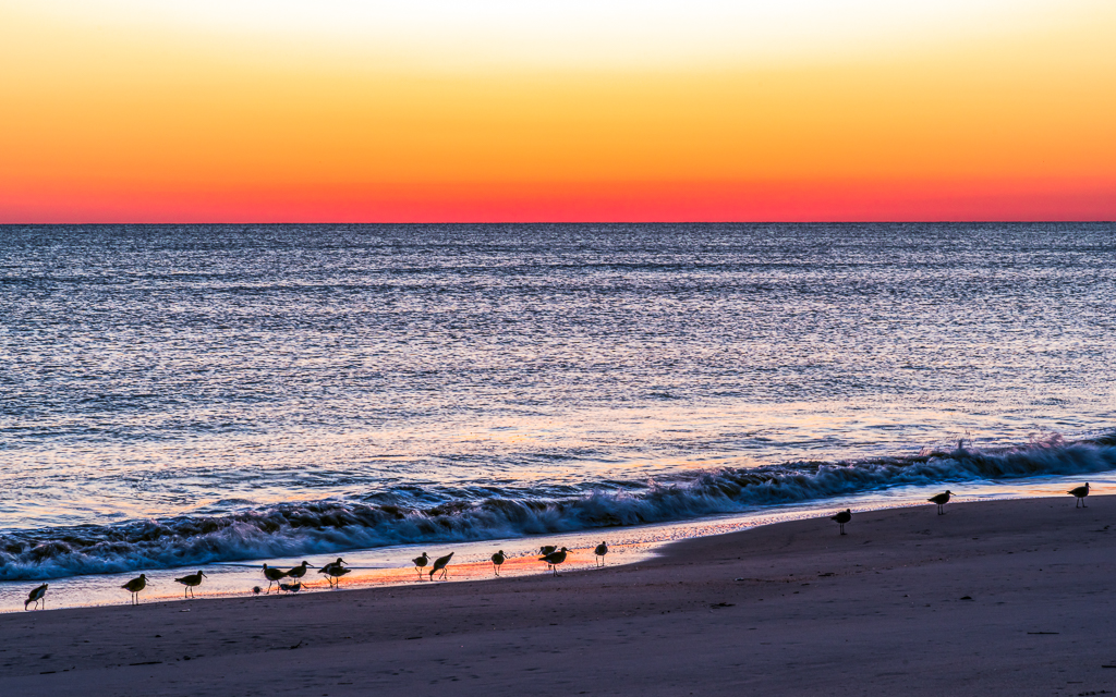
Hi Larry. Masterfully done, as usual. I like Todd's crop on this with one big exception. I would try cropping the top to the point where only about half the big dark cloud in the upper left corner remains. I would crop very little, if any, off the sand at the bottom to achieve better balance to the image. |
Jan 8th |
| 67 |
Jan 21 |
Comment |
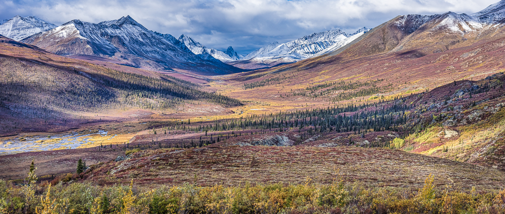
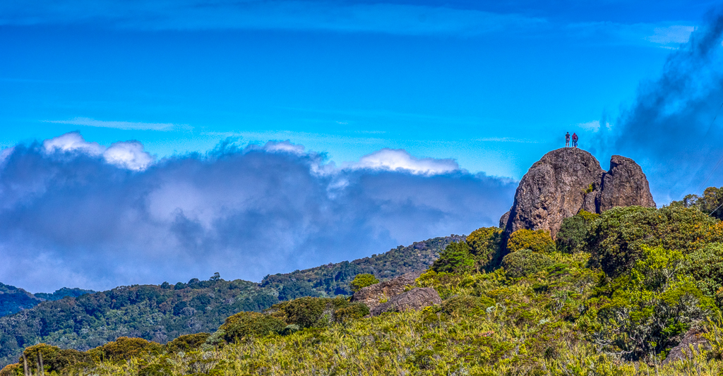
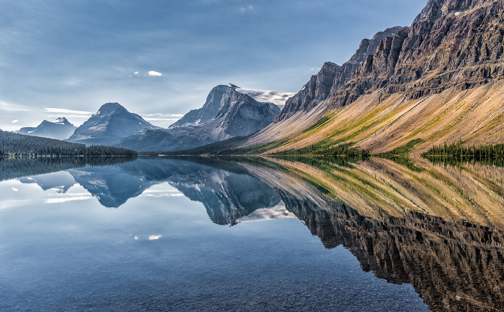
What a beautiful scene! I would try a couple of things on this image. De-haze the mountain and sky so it looks a little more like the reflection, which is very clear. Crop the left side to the point where the forest intersects with the ridge line, and take small crops on the top and bottom to balance the sky and reflection. You might try backing off the brightness of the highlights in the forest so it matches the level in the reflection. Thanks. |
Jan 8th |
| 67 |
Jan 21 |
Reply |
Hi Bud. It was actually eight photos merged for this image. I shot the series twice and mistakenly counted both sets of images. I definitely bumped up the saturation and must agree it's a little over-done. Thanks so much for the comments. |
Jan 8th |
| 67 |
Jan 21 |
Reply |
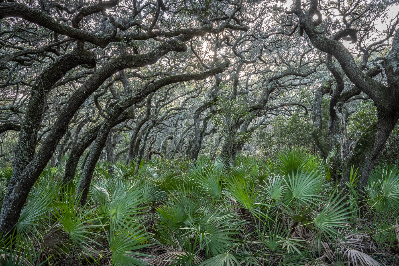
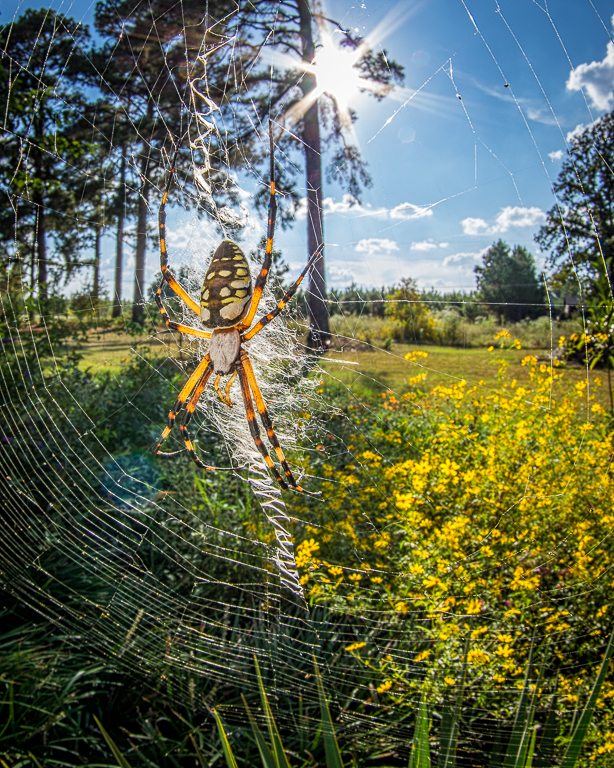
Hi Todd, thanks for the comments. That purple on some of the trees is actually paint used for boundary line marking. In Arkansas that particular color indicates the land is posted. I've always liked to include stuff around the edges of landscape photos to create a (sort of) frame, but have received several comments from the group about that. Maybe I should reconsider that. |
Jan 8th |
7 comments - 2 replies for Group 67
|
7 comments - 2 replies Total
|