|
| Group |
Round |
C/R |
Comment |
Date |
Image |
| 67 |
Sep 19 |
Comment |
Thanks to everyone for the comments. I learn so much from them. I just wish I knew enough to provide equally good comments for others. |
Sep 30th |
| 67 |
Sep 19 |
Reply |
Thank you. I was hesitant to admit it but I like the sparkles in the background. Darkening them reduces the distraction, as you said. And I wonder about flipping the image horizontally. I tend to look at images left to right, so that might further reduce the distraction. Hmmmm. Thinking about that! Good comments. |
Sep 23rd |
| 67 |
Sep 19 |
Comment |
Pretty flamingos all in a row! I would definitely crop out most of the sky. In addition to eliminating a lot of dead space, it would further emphasize the linear effect of the birds in a row. I think the pink is over-saturated and would back it off a little. Then I would try for a "painterly" look. I can see this one in a long frame leading down a hallway. |
Sep 21st |
| 67 |
Sep 19 |
Comment |
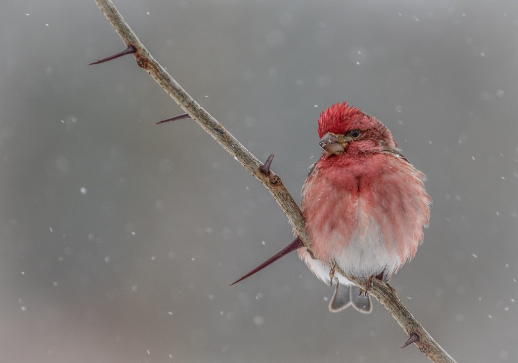
A bright feel-good picture! Has color and a cute little bird. Cropping is good with the rule of thirds and space in front of the bird, etc. The bird is not a perfect specimen, but that's the way they look a lot of the time, and a profile shot is fine with me. BUT you should not tell us about the lawn chair, sweet tea etc. Tell us you bushwacked for miles through the wilderness, broke your leg (compound fracture) but still got the shot before dragging yourself back to civilization (joking). |
Sep 21st |
| 67 |
Sep 19 |
Comment |
Amazing. That's all I can say. Thanks for all the technical info on this one. |
Sep 21st |
| 67 |
Sep 19 |
Comment |
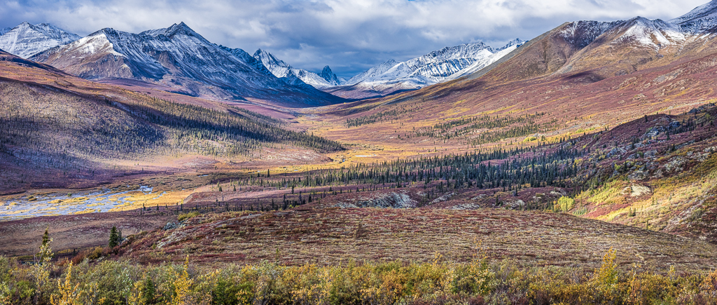
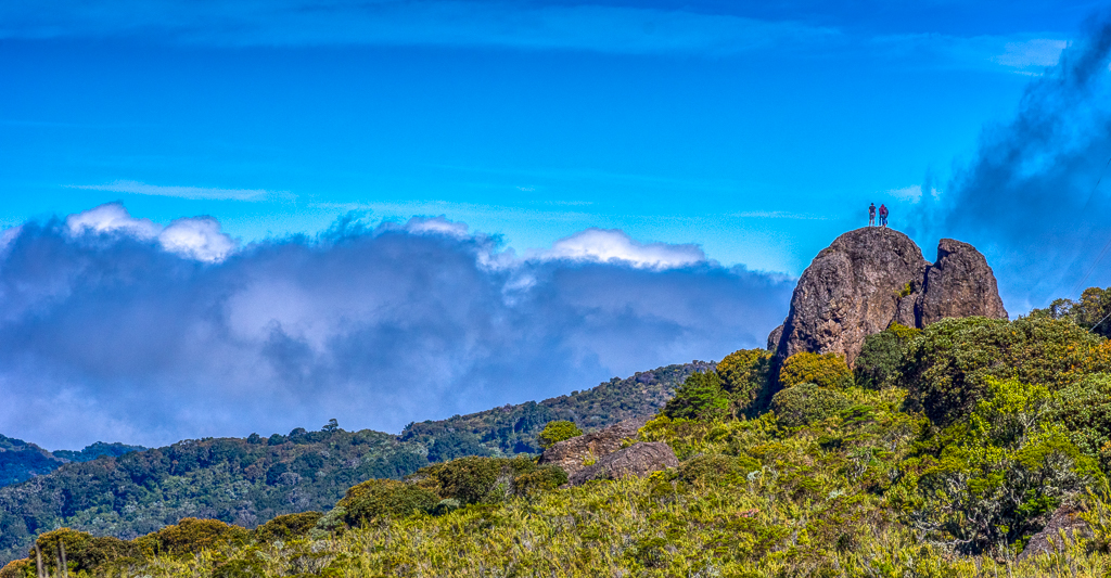
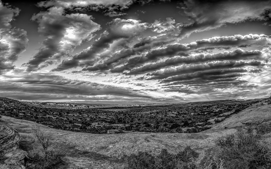
Your image dramatically conveys wide open spaces and isolation. In my opinion this is definitely an image made for black and white. Contrasty clouds taking up the "negative space". Maybe just a little cropping to make the house a larger part of the image. Well done! |
Sep 21st |
| 67 |
Sep 19 |
Comment |
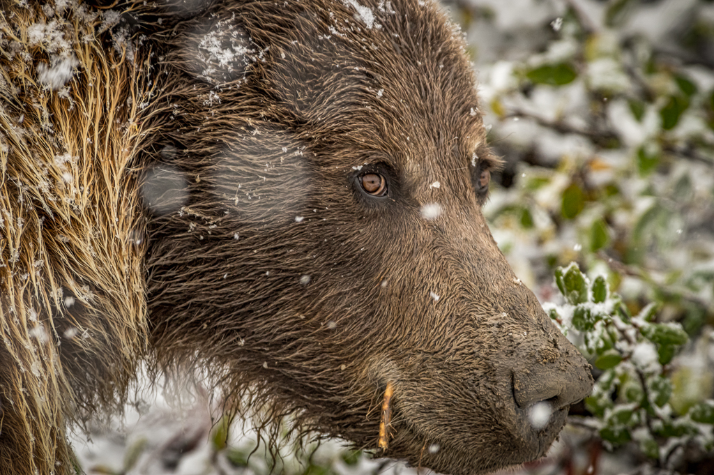
I like the face of the wolf, the black and white format. In my opinion the cropping-to-square that Larry did improves it by further focusing on the face and nearly eliminating the leg (or whatever it is) behind the wolf's right ear. I would lighten the eyes more if you can. I like the lighter image - no more darkening. A nice nice nice image!! |
Sep 21st |
| 67 |
Sep 19 |
Reply |
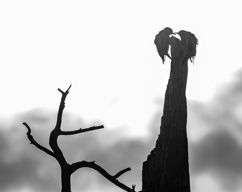
You have answered a question in my mind about masking the snag. Would the masking be obvious or would it appear to be out-of focus behind the bird's leg? Or is it even needed? I agree that it's not needed. A valuable observation. Thanks |
Sep 8th |
| 67 |
Sep 19 |
Reply |
Thanks for the input. Are you saying it would be better to leave the snag as in the original, rather than trying to mask it? Is it the masking itself that creates the distraction?
|
Sep 6th |
6 comments - 3 replies for Group 67
|
6 comments - 3 replies Total
|