|
| Group |
Round |
C/R |
Comment |
Date |
Image |
| 7 |
Oct 24 |
Comment |
Love it!! |
Oct 7th |
1 comment - 0 replies for Group 7
|
| 20 |
Oct 24 |
Reply |
Many thanks for your kind comment!! Here is the link. Just a tip when you place the single line marquee tool onto your image try and make sure that is doesn't go through any of your white BG as it spoils the stretch!!
https://www.youtube.com/watch?v=wxMIZNDBnvk |
Oct 7th |
| 20 |
Oct 24 |
Comment |
What a great idea and your grandson seems to be really enjoying himself!!
I think the three positions he is in works very well as does the mono treatment.
I have had a little play and used generative fill to get rid of the "wheel thing" on the right. See what you think? |
Oct 2nd |
 |
| 20 |
Oct 24 |
Comment |
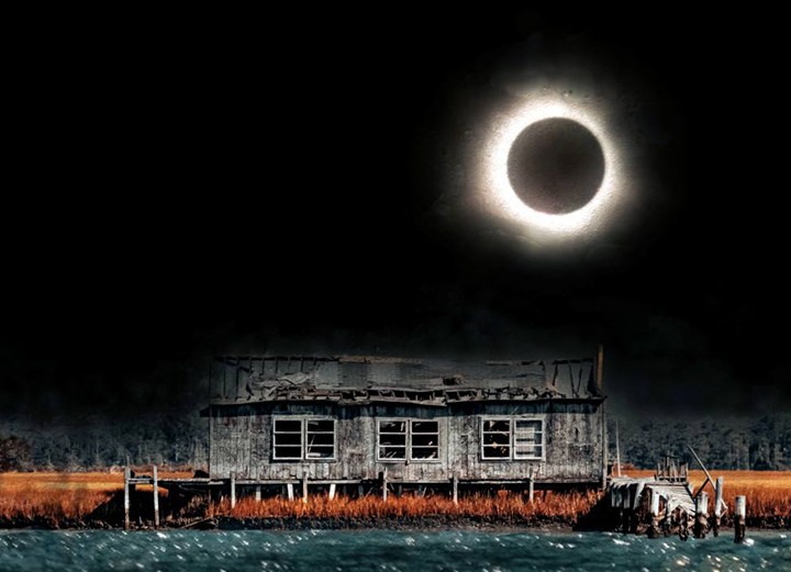
I do not think I would like to be there in the dark!! Really spooky!!
Your post processing has really brought out all the texture in the building. The water now seems to have reflections from the moon.
Id wonder whether a small crop would be better? I have cropped and put the moon on a third and slightly reduced the opacity of the reds. See what you think. Only my opinion!! |
Oct 2nd |
 |
2 comments - 1 reply for Group 20
|
| 75 |
Oct 24 |
Comment |
They look as if they are standing ready for their photo to be taken!! Well done. |
Oct 7th |
1 comment - 0 replies for Group 75
|
| 81 |
Oct 24 |
Comment |
A lovely portrait of the lady. I like the crop you have done as it emphasises her and she stands out. Her red har makes it!!
I think the BG could be blurred a bit more? Not too sure what has happened in the top left corner. Her hat seems to have "bled" and a strange patch right in the corner. |
Oct 9th |
| 81 |
Oct 24 |
Reply |
I think perhaps a little less blur but good idea!! |
Oct 7th |
| 81 |
Oct 24 |
Reply |
Thanks Tom. Certainly makes the eagle stand out. |
Oct 7th |
| 81 |
Oct 24 |
Comment |
Looks to be a very interesting place to visit!
You have done well to get all the stairs in and also coping with the dark. As you say the lady looking up adds to the image and also gives a sense of scale.
I do wonder whether the shadows could have been lifted a bit more to show more detail in the stairs especially at the base?
Well done. |
Oct 7th |
| 81 |
Oct 24 |
Comment |
Great shot and changing it to black and white was the right choice. You have managed to bring out a lot of detail in the sky and texture in the mountains. You did well with the crop but I agrre I think you could have taken just a little more off the base to exclude the tops of the trees just showing in the center.
Well done. |
Oct 7th |
| 81 |
Oct 24 |
Comment |
What interesting shapes. You have taken the image at the right time and still getting some blue in the sky. The top of the building seems to be reflecting the same colour of the sky. Glad you lightened the trees in the foreground as they give some reference of scale of the building. The reflected lights from the bridge really make a show!!
Only niggle I have is the star on the right side. I have no doubt you left it in on purpose but it keeps drawing my eye!!
Well done.
|
Oct 2nd |
| 81 |
Oct 24 |
Comment |
They look very contented!! Strange one has horns pointing down and the other going up!!
I like the post processing you have done and the almost square crop. Turning the BG mono really makes them stand out.
Bit of a shame you have slightly "clipped" the top hump of the nearest cow with the border.
Well done. |
Oct 2nd |
5 comments - 2 replies for Group 81
|
9 comments - 3 replies Total
|