|
| Group |
Round |
C/R |
Comment |
Date |
Image |
| 18 |
Jan 24 |
Comment |
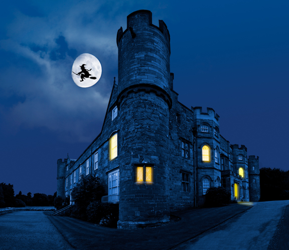
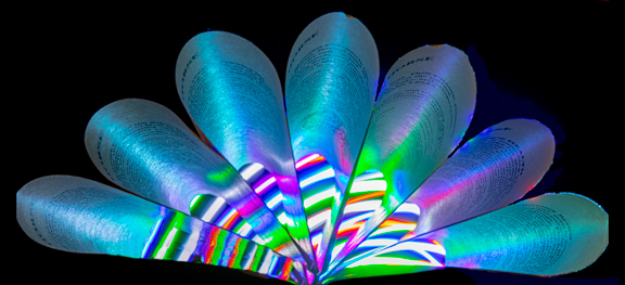
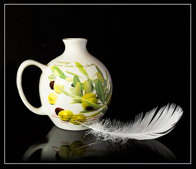
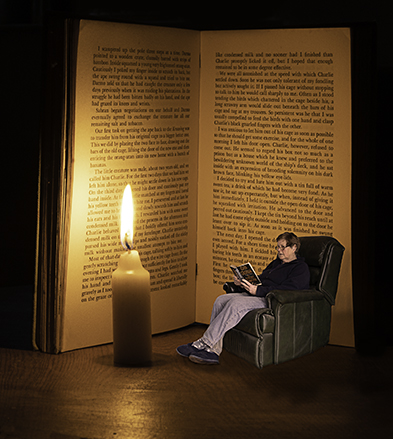
Great and unusual idea, well done!! |
Jan 10th |
| 18 |
Jan 24 |
Comment |
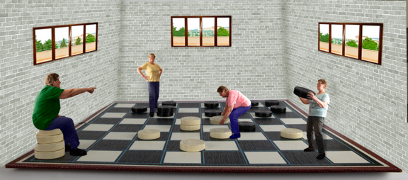
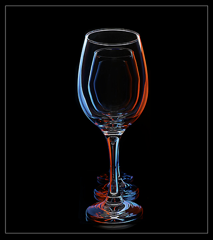
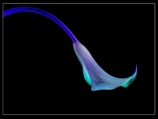
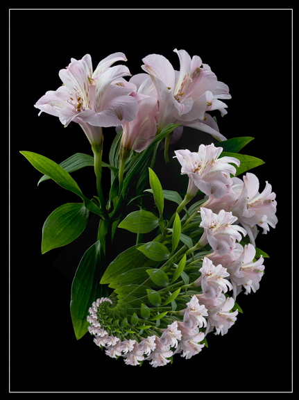
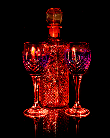
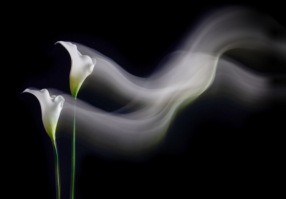
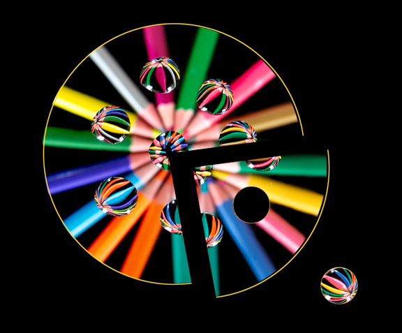
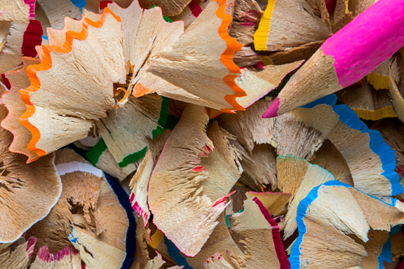
Very clever and love the colours. A lovely abstract image, |
Jan 5th |
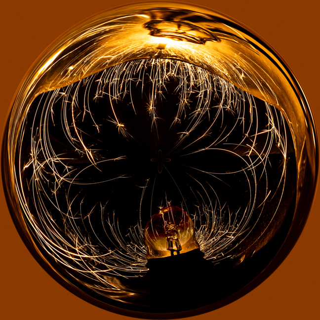
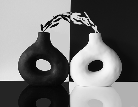
| 18 |
Jan 24 |
Comment |
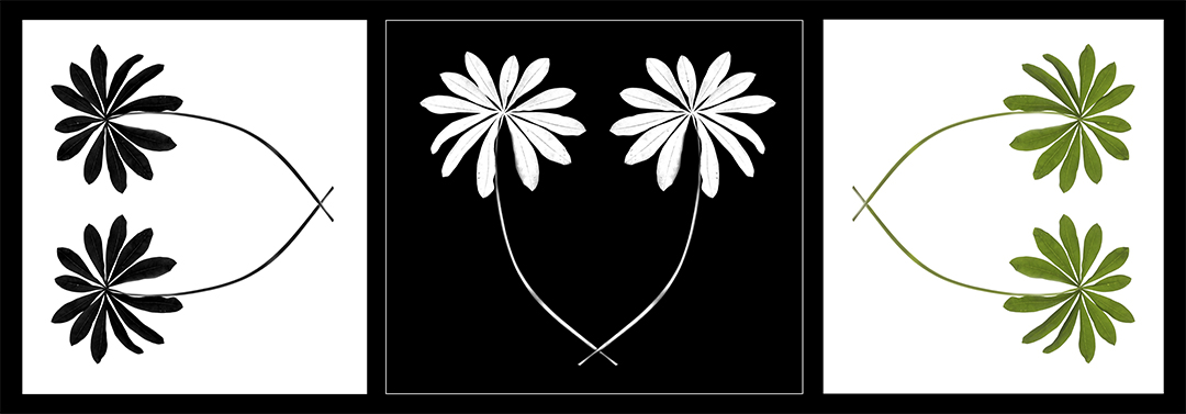
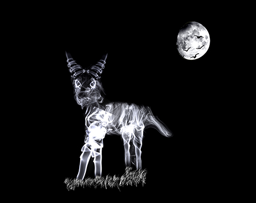
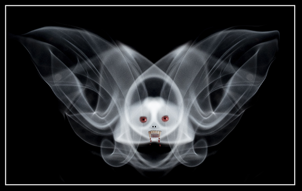
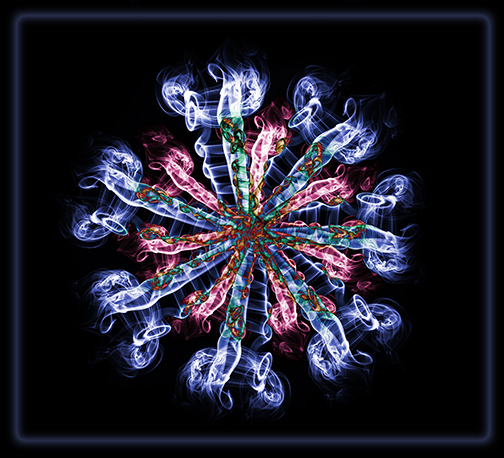
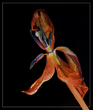
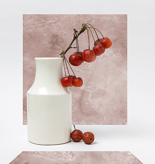
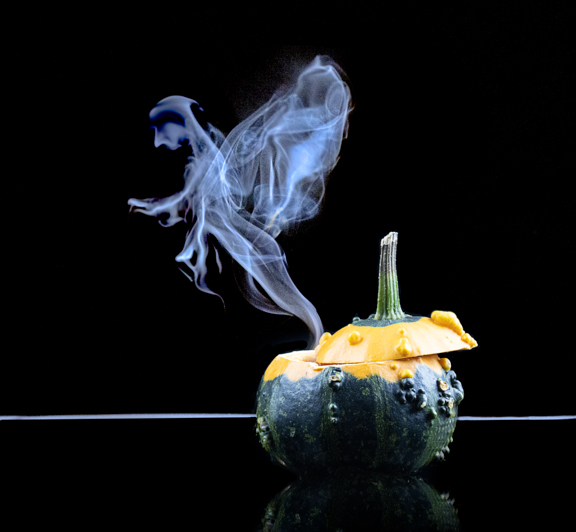
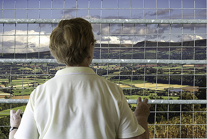
Changing the greens to red has made the image all come together in my opinion! Looks like a painting and the post processing has made it into a more interesting image. |
Jan 5th |
3 comments - 0 replies for Group 18
|
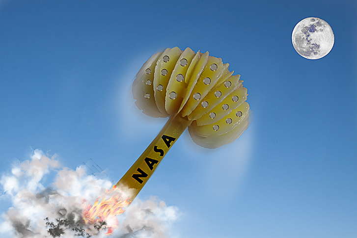
| 20 |
Jan 24 |
Reply |
I think ikf you are going to do that then, as Fran says, you need to saturate the colours more. Good and different idea though!! |
Jan 11th |
| 20 |
Jan 24 |
Reply |
Might give that a go, thanks!! |
Jan 10th |
| 20 |
Jan 24 |
Reply |
Thanks, Deborah!! |
Jan 8th |
| 20 |
Jan 24 |
Comment |
I found this definition of creative on Google..
"relating to or involving the use of the imagination or original ideas to create something."change unleashes people's creative energy"
Not much help but I think altered reality is about right.
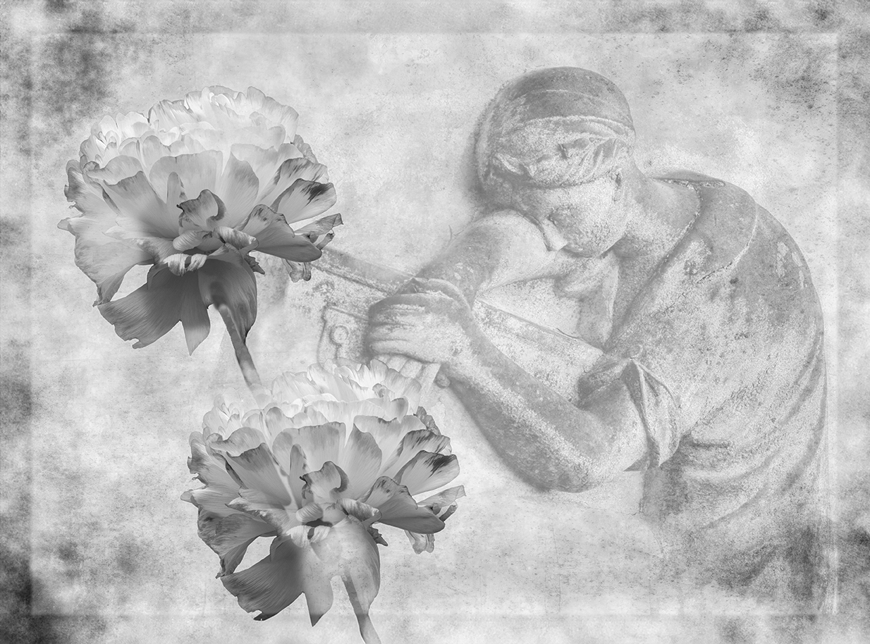
Really like how you have processed your image and given it an "olde world feel". I think I may have taken out the white ring the weaver has on their left wrist? |
Jan 5th |
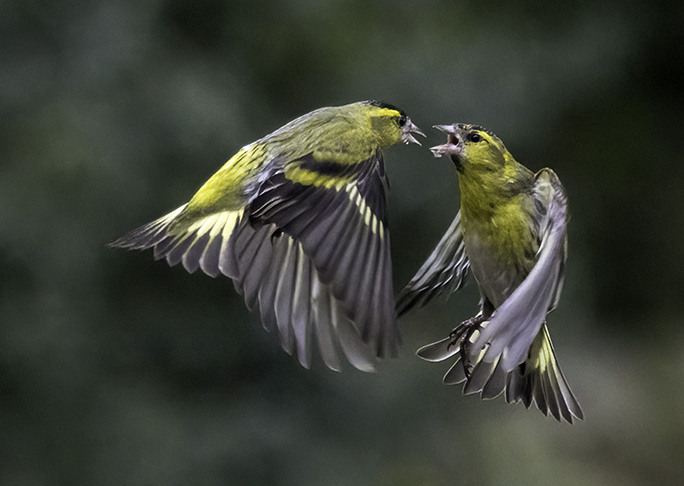
| 20 |
Jan 24 |
Comment |
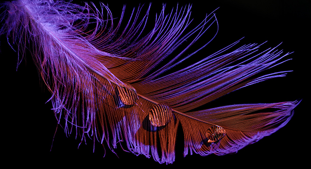
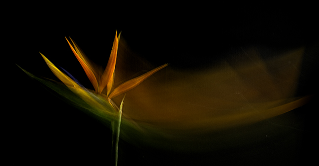
Lovely and very poetic!! I would like to know how you got the light rays? They really seem to make the bird stand out.
Just wonder whether his head could be made a bit lighter?
|
Jan 5th |
| 20 |
Jan 24 |
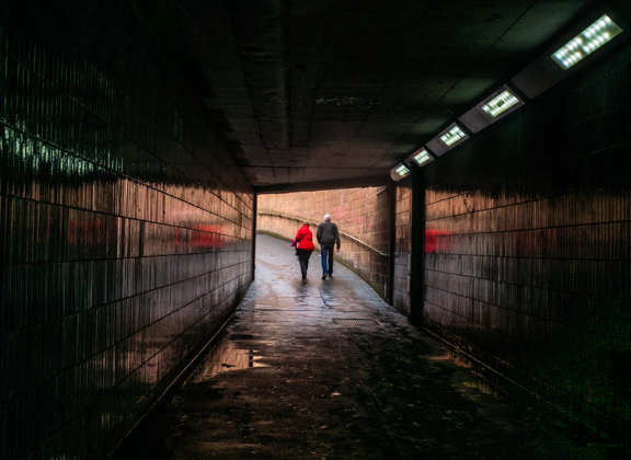
Comment |
I think you have combined the three images really well. I like that everything is desaturated except for the car. This has helped make the scene colder as you wanted.
Only thing I would suggest is to tidy up the left hand side of the tunnel where you have got part of a tree blurring onto the edge?
Well done and welcome to the group.
|
Jan 5th |
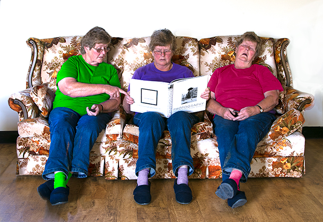
| 20 |
Jan 24 |
Comment |
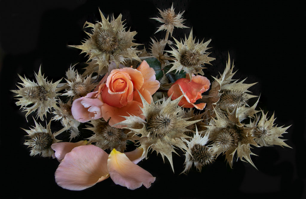
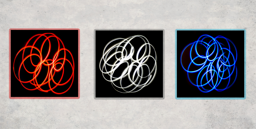
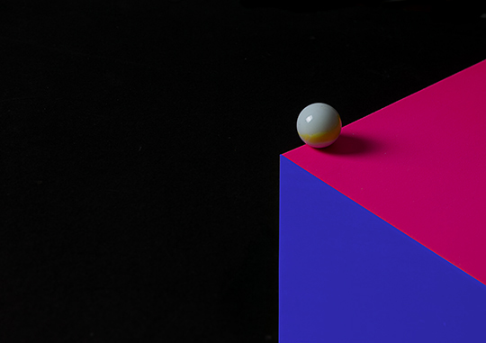
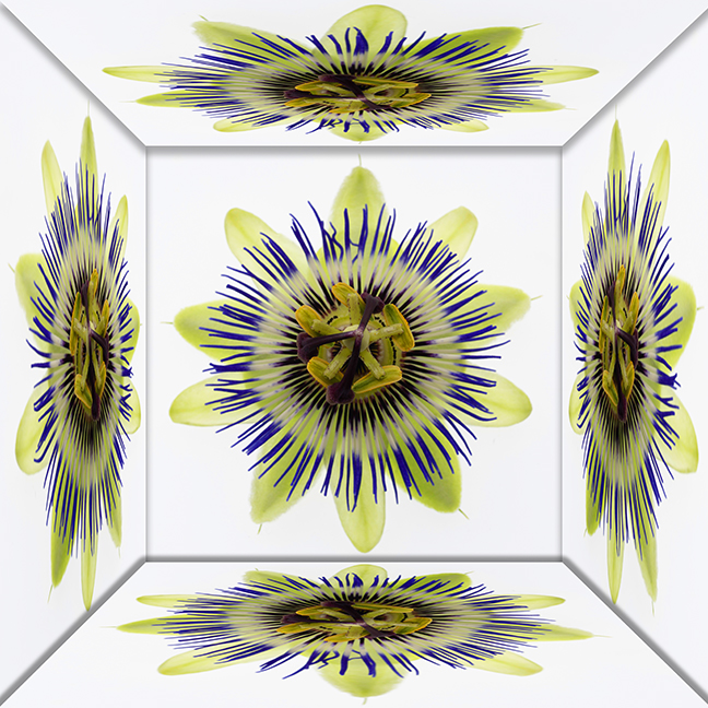
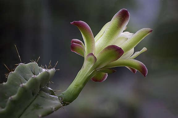
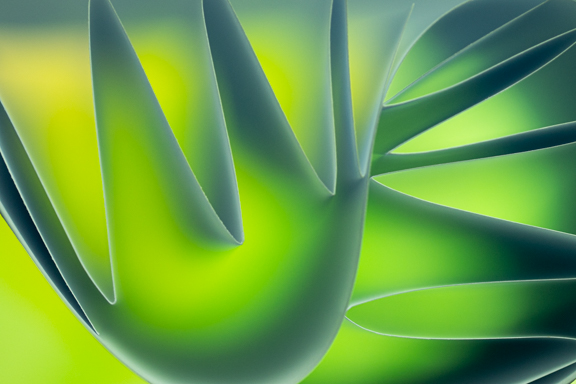
Looks like a piece of modern art and it really pops out at you!!. I like the composition and the BG blends in well. Clever use of the spherize tool to round the flowers and make them look more 3D. Never thought of doing that!!
Well done. |
Jan 5th |
4 comments - 3 replies for Group 20
|
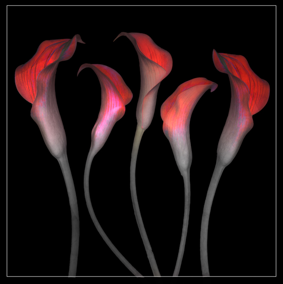
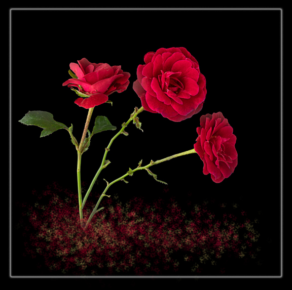
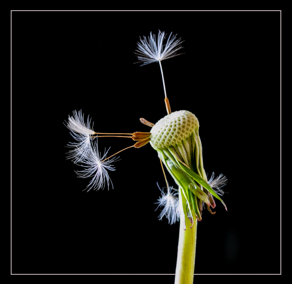
| 61 |
Jan 24 |
Comment |
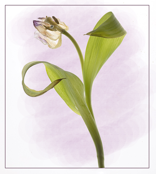
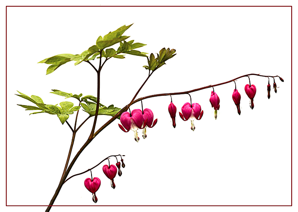
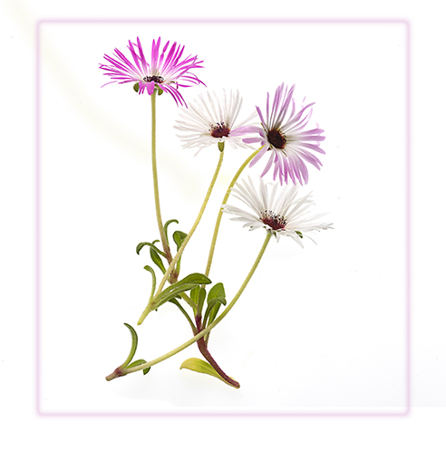
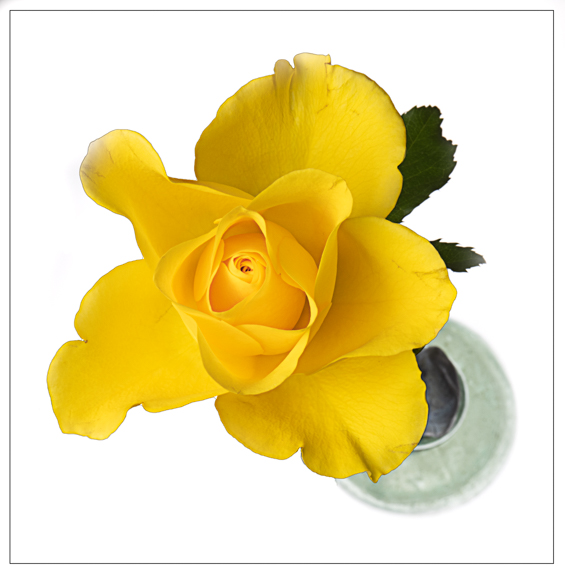
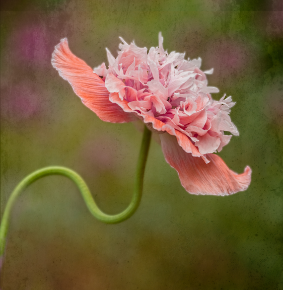
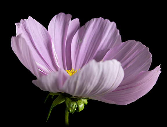
Beautiful and the BG and border makes the flower really stand out. |
Jan 10th |
1 comment - 0 replies for Group 61
|
| 81 |
Jan 24 |
Reply |
Rose, changing BG is not something I can do but will ask the webmaster.
I reckon answer will be to be aware of the BG and put border that will stand out. Will let you know!! |
Jan 6th |
| 81 |
Jan 24 |
Comment |
Looks a lovely place to have a holiday!! Lovely smiles from your daughter and grand daughter. They look very happy.
I think I prefer the colouring in the original image as it appears more natural. Perhaps lighten the shadows on their faces a bit? |
Jan 5th |
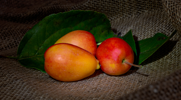
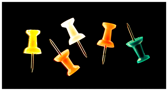
| 81 |
Jan 24 |
Comment |
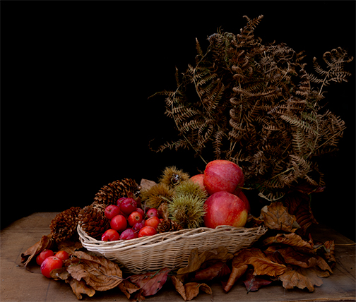
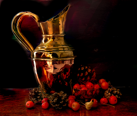
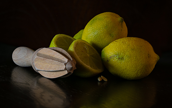
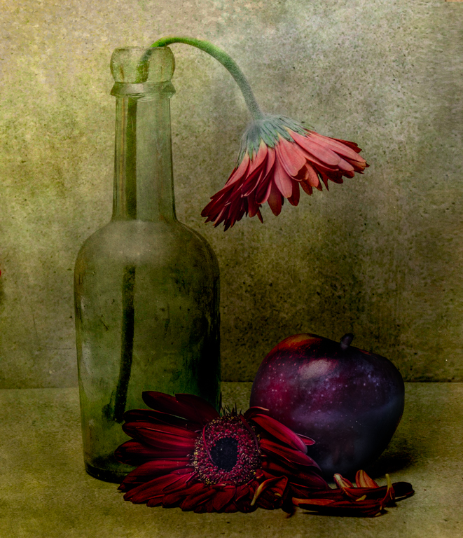
Great subject and I really like your base. Pears have been well placed with the two outer ones looking in.
All nicely lit and sharp.
Probably my eyes but it seems to be slanting forward?
Well done. |
Jan 2nd |
| 81 |
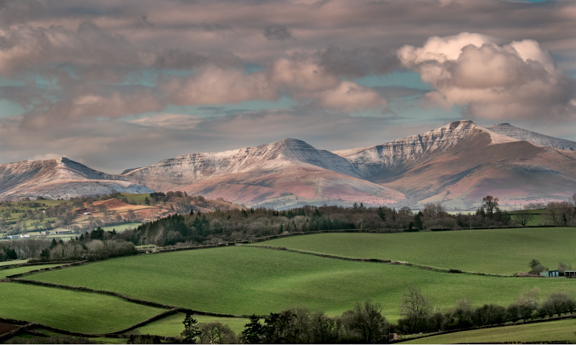
Jan 24 |
Comment |
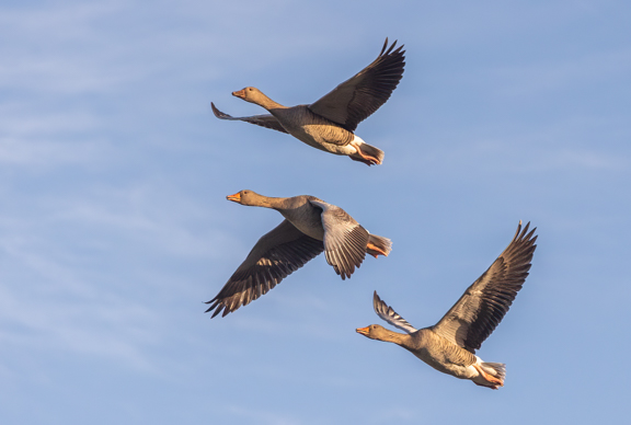
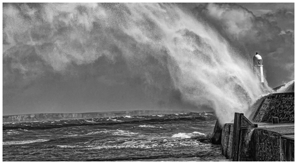
That looks rather cold there!!! I had a look and I think these are Barnacle Geese? Youngsters swimming with them.
Other than cropping in a tad more at the base I think you have done a great job here. Exposure seems to be spot on and I would imaging that the colouring in the glacier (?) is true.
|
Jan 2nd |
| 81 |
Jan 24 |
Comment |
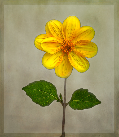
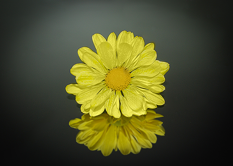
Well done Kurt, this is the type of photography I do!
You have made a good crop and I like the "halo" you have made at the back of the flower which makes it stand out well from the background.
For me I find the flower itself too bright and think a lower flash setting may have been better but that may have been what you wanted when taking the image.
I have had a little play with the image. I took it into ACR and made a mask over the main flower then pulled the highlight slider right over to the left this helped to get rid of the over bright areas. Back in PS using a colour from the image I painted the flower to get more colour in to it. I also put a slight gaussian blur on the reflection. I finished with using the high pass filter to sharpen the image slightly. My apologies if I have changed the image too much away from what you wanted!! |
Jan 2nd |
 |
| 81 |
Jan 24 |
Comment |
Old style farming!! Well done for spotting something a bit different!
I like what you have done post processing. It has given the image a real gritty appearance in keeping with the old style farming. The vignette helps centre the eye on the subject.
Well done.
|
Jan 1st |
| 81 |
Jan 24 |
Comment |
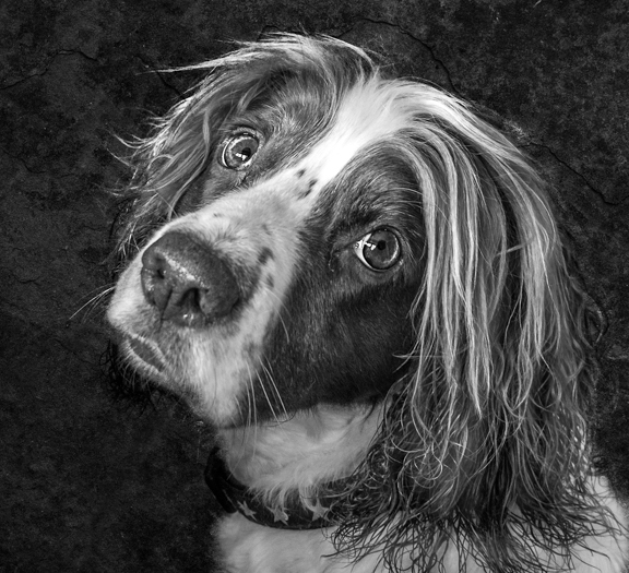
What a great shot of the little cutie!!
Lovely direct gaze at the camera and all really sharp. Good choice to extend the right side and make him more central.
Well done!! |
Jan 1st |
6 comments - 1 reply for Group 81
|
14 comments - 4 replies Total
|