|
| Group |
Round |
C/R |
Comment |
Date |
Image |
| 18 |
Sep 22 |
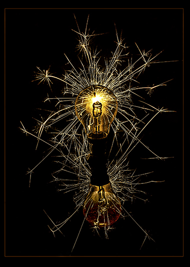
Comment |
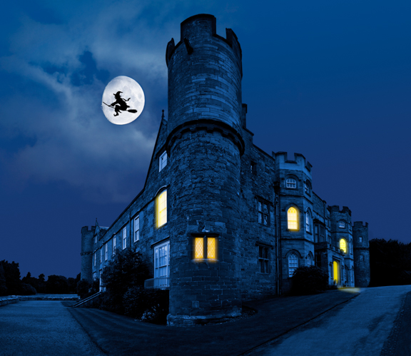
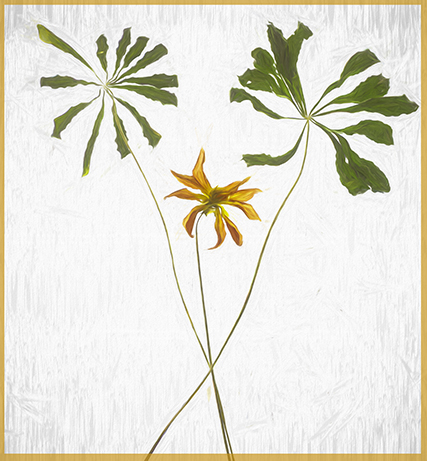
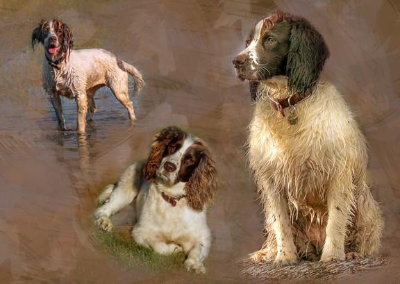
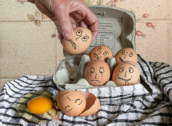
Looks almost like a painting.
Well done on the award!! |
Sep 11th |
1 comment - 0 replies for Group 18
|
| 20 |
Sep 22 |
Reply |
Ok thanks. yes will give it a try. |
Sep 17th |
| 20 |
Sep 22 |
Reply |
Thanks!! |
Sep 11th |
| 20 |
Sep 22 |
Reply |
Ham, Thanks |
Sep 9th |
| 20 |
Sep 22 |
Comment |
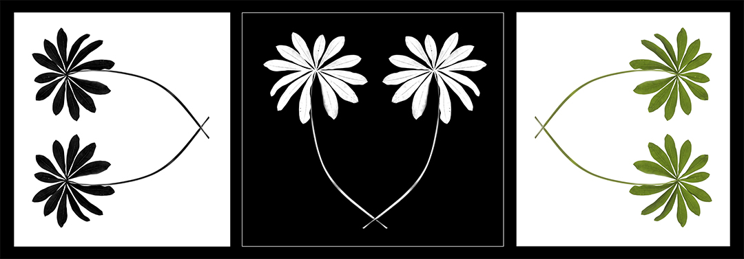
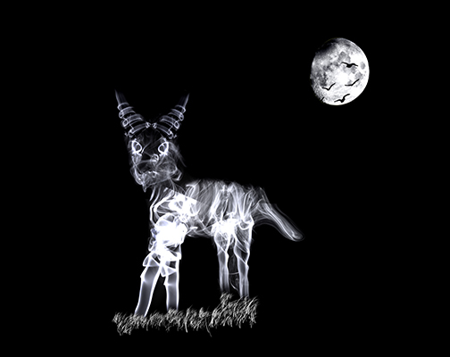
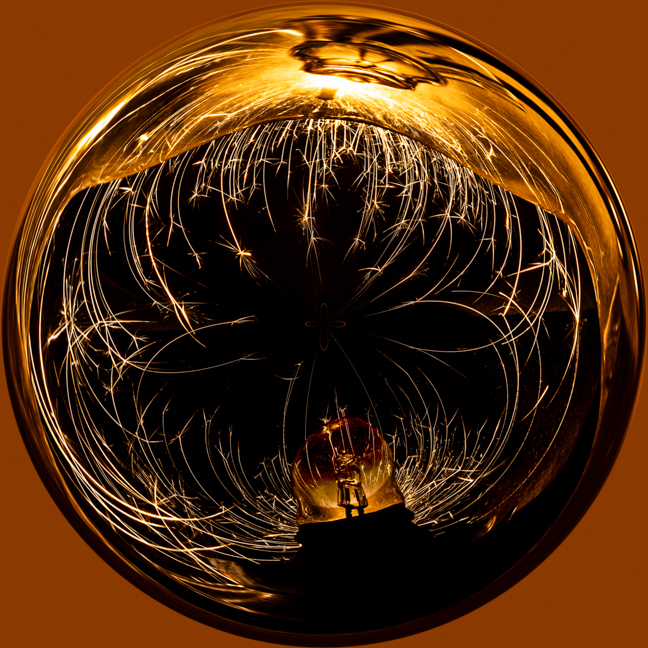
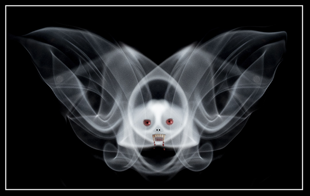
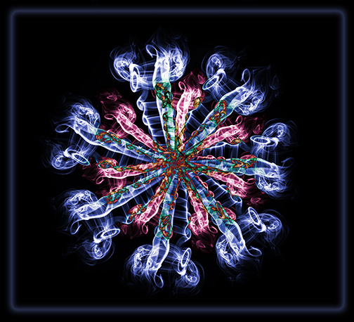
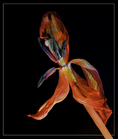
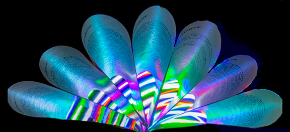
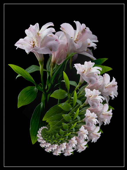
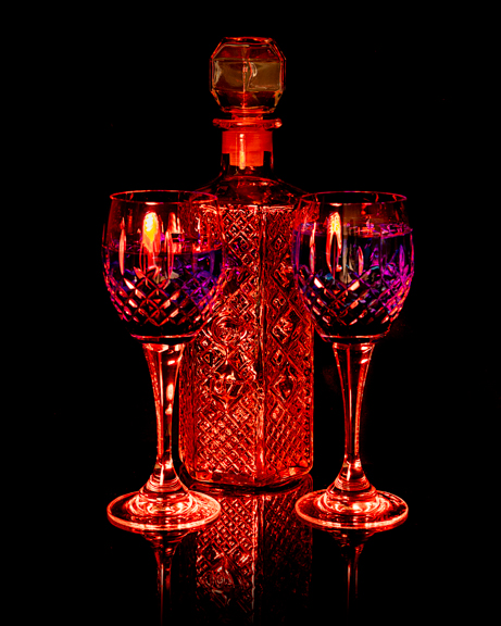
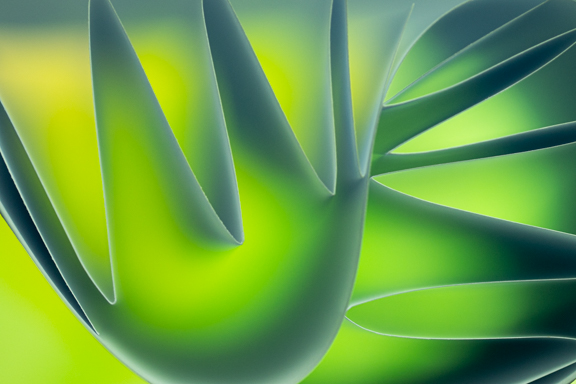
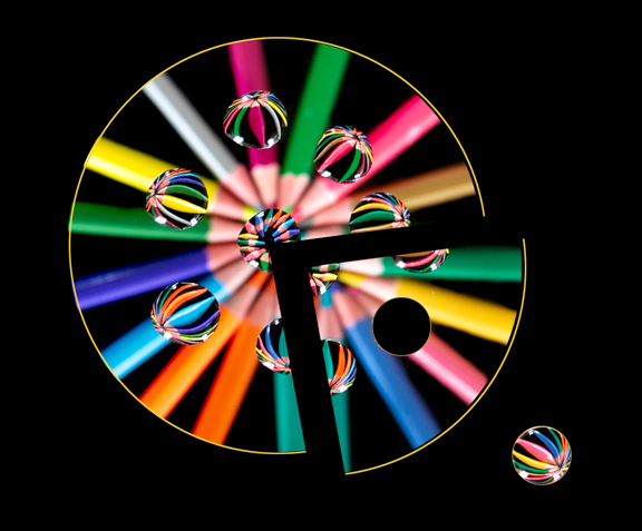
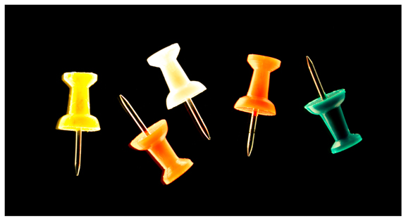
I have tried this twirl effect on a few of my images and it is fun to use.
I think you have "twirled" the subject just enough to create an interesting abstract image but not so much that you are unable to identify what the original is.I like the black background and the subtle keyline you have added.
Well done. |
Sep 8th |
| 20 |
Sep 22 |
Comment |
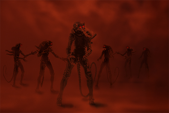
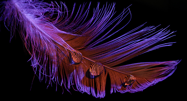
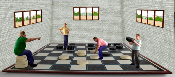
Where do you get these ideas from??!! I wish I had your imagination and know how to do these things!!
The whole image has been very well merged together and creates a lot of atmosphere and the "lizard" looks very menacing!. The lights have been done very well and look realistic.
The only little thing that doesn't seem right to me is the size of the girl in pink on the right hand side. She seems a bit too large. I know she helps create depth but I just feel she is a tad too large.
Well done. |
Sep 8th |
| 20 |
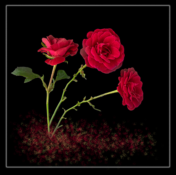
Sep 22 |
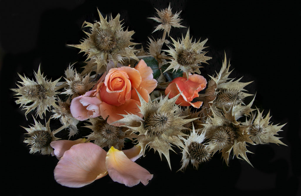
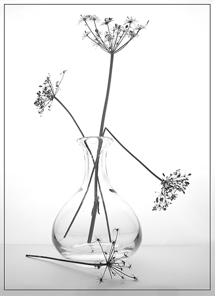
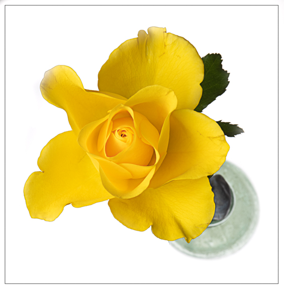
Comment |
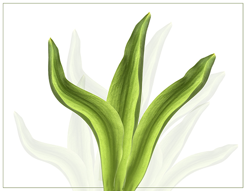
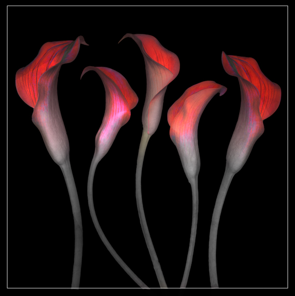
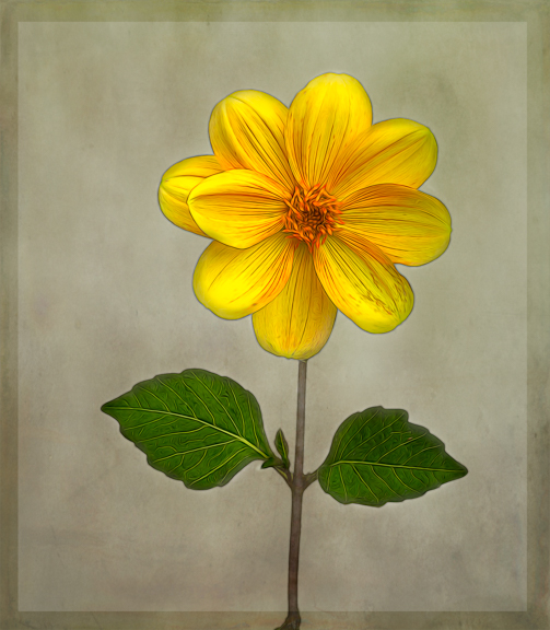
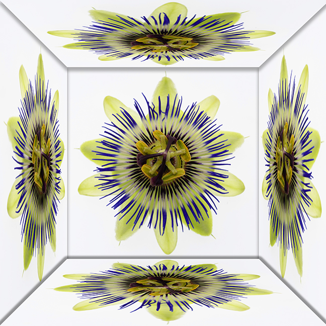
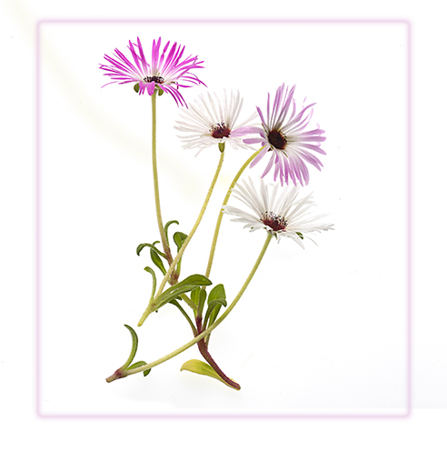
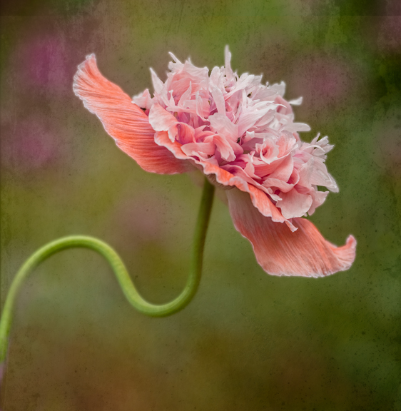
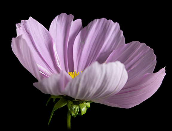
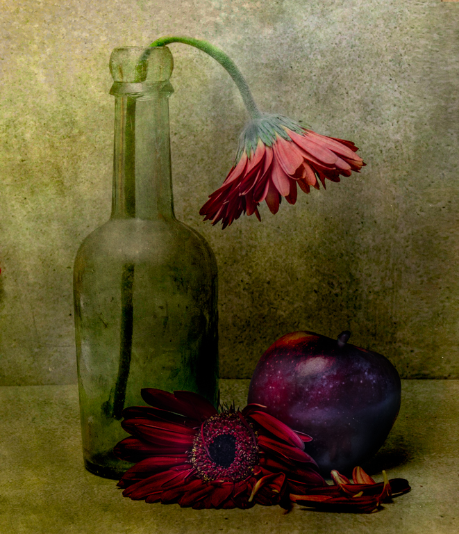
Well composed and I love the colour palette especially the tones in the background. What you have done post processing has really made the flowers pop. Elevates the image.
Think I would have got rid of the green at the bottom left corner as that is a bit distracting.
Well done. |
Sep 8th |
| 20 |
Sep 22 |
Comment |
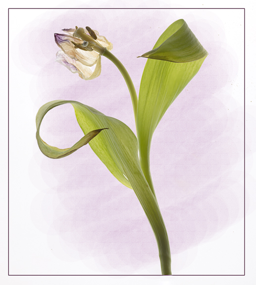
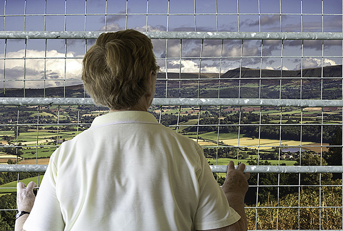
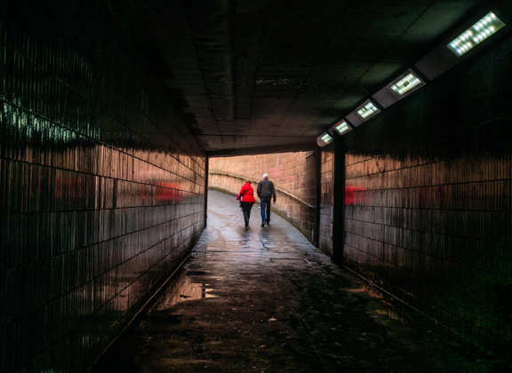
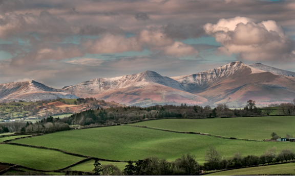
Looks a great place for photography. Image gives a lovely sense of space and freedom.
It does look a bit of three parts to me though.Not too sure but I do wonder whether your wife on the viewing deck should be larger in the frame as there seems a bit too much negative space directly behind them?
A very good idea and well done.
|
Sep 8th |
| 20 |
Sep 22 |
Comment |
Ham,
What a great shot and the rendition to B&W is beautiful!! So much detail.
Can find no fault!!!
Well done. |
Sep 8th |
5 comments - 3 replies for Group 20
|
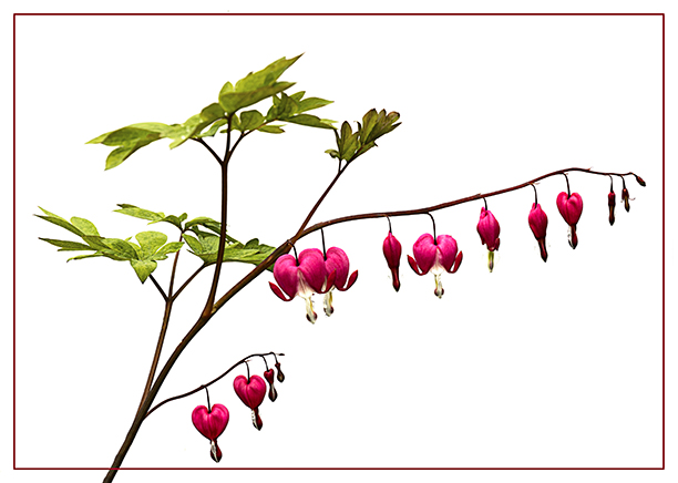
| 24 |
Sep 22 |
Comment |
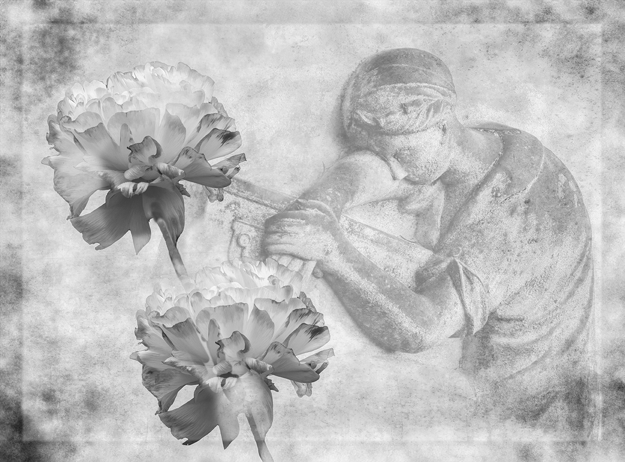
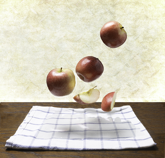
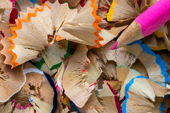
Love the linen effect on the image. Works really well and would make a lovely card? |
Sep 11th |
1 comment - 0 replies for Group 24
|
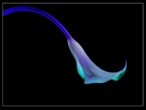
| 29 |
Sep 22 |
Comment |
Very effective and very unusual!! Love it!! |
Sep 11th |
1 comment - 0 replies for Group 29
|
| 34 |
Sep 22 |
Comment |
Wow!! Absolutely beautiful!! |
Sep 11th |
1 comment - 0 replies for Group 34
|
| 50 |
Sep 22 |
Comment |
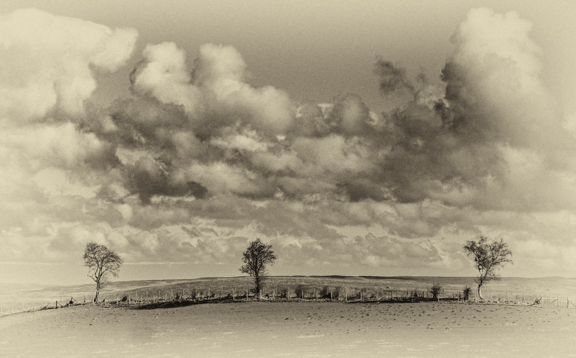
Great layout and composition. B&W works really well. Not too sure about top right where seems to be bit of a lightish area?
Well done. |
Sep 11th |
1 comment - 0 replies for Group 50
|
| 81 |
Sep 22 |
Reply |
Thanks Ian. Kept me occupied for awhile!! |
Sep 11th |
| 81 |
Sep 22 |
Comment |
A lovely image any newly married couple would be glad to have in their album!!
Everything is lovely and sharp and good eye contact from the bride. Well posed.
There is a lovely lot of detail in her veil, bodice and bouquet but I think her skirt is a bit blown out? Hard to get exposure right with so much white. Well done. |
Sep 3rd |
| 81 |
Sep 22 |
Comment |
Great shot of the penguins which shows their environment well and gives the impression as to how cold it probably was!!
You have managed to bring out a lot of detail in the background which seems to bring it nearer. THere is also plenty of detail in the penguins themselves and the rocks they are on.
I wonder if you have over sharpened the image as there is a halo round all of the birds?
Good image!! |
Sep 1st |
| 81 |
Sep 22 |
Comment |
Once again you have managed to get a really sharp image from a shot taken quite a distance away. I have zoomed right in and it is tack sharp.
You have mmanaged to get the sky a natural colour blue and the blue plane stands out well against it.
Other than possibly cropping in even tighter I think it is a good image!!
|
Sep 1st |
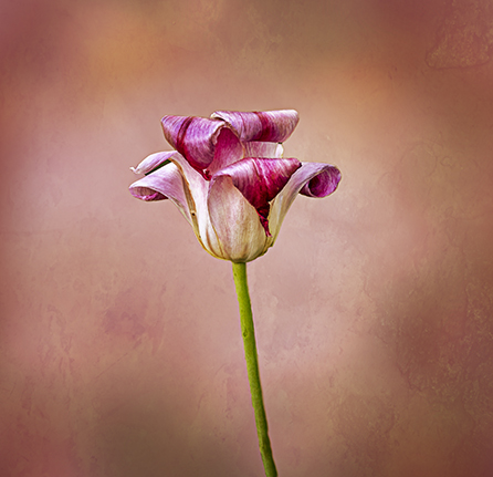
| 81 |
Sep 22 |
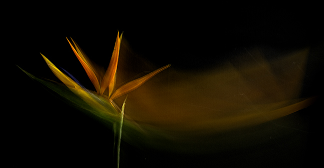
Comment |
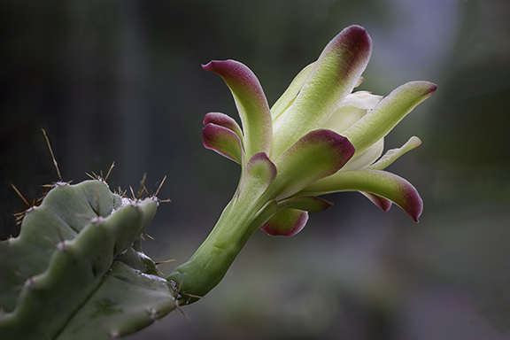
No chance of growing bananas in the UK!!!
What a glorious colour the "flower" (?) is!! The image seems to be nice and sharp. Perhaps you could have lightened it a little as is seems a bit dark.
THe background is a bit busy and I wonder if you could have blurred it a bit so it isn't quite so distracting?
Well done. |
Sep 1st |
| 81 |
Sep 22 |
Comment |
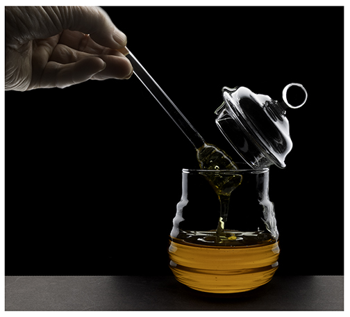
A well spotted image.I like the way the reflection is picking up the yellow flowers in the background and is placed right in the middle of the yellow. As you say the colours do compliment each other.
I wonder whether you might have been better using a smaller aperture to get a slightly bigger depth of field as the droplet is not sharp which is a shame.
The black "band" across the top right and the light patch bottom right are a bit distracting but having tried myself I do not know how else you could have cropped the image.
Well done.
|
Sep 1st |
5 comments - 1 reply for Group 81
|
15 comments - 4 replies Total
|