|
| Group |
Round |
C/R |
Comment |
Date |
Image |
| 3 |
Aug 22 |
Comment |
What a great idea and very well done!! |
Aug 2nd |
1 comment - 0 replies for Group 3
|
| 20 |
Aug 22 |
Reply |
Many thanks for your kind comments and agree about the dark line!! |
Aug 11th |
| 20 |
Aug 22 |
Comment |
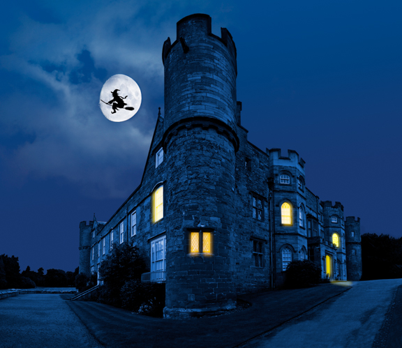
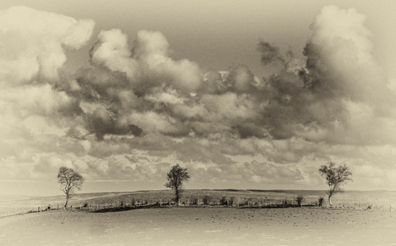
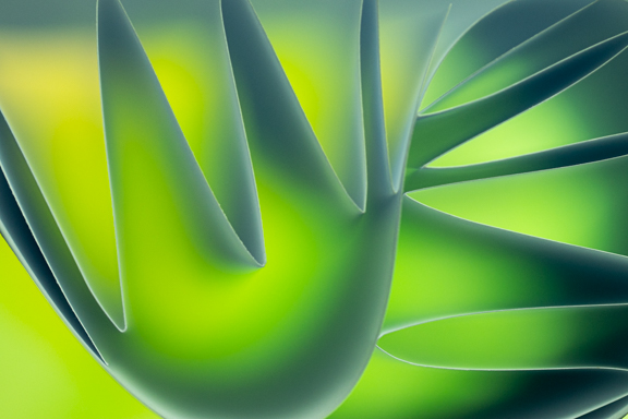
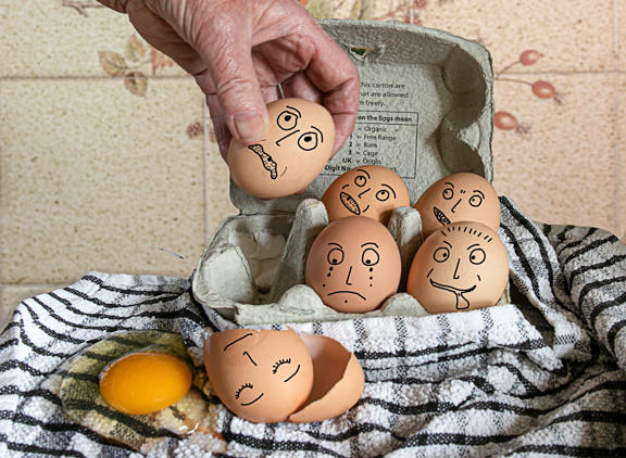
Looks a great place to visit for taking images.
Glad you shot it in portrait which helps to give the image depth. I like the texture you have used but think I would have slightly lowered it's opacity as, for me, it is a bit too prominent.I agree about the haloing that Fred spotted which could be easily got rid of.
Also, in my opinion, I think the colours are a bit too saturated so the image doesn't look natural?
Well done!! |
Aug 5th |
| 20 |
Aug 22 |
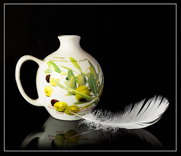
Comment |
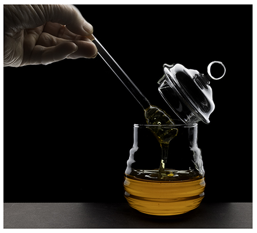
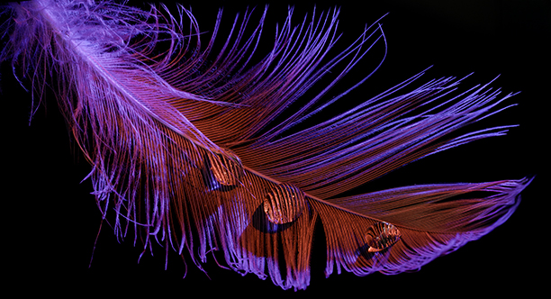
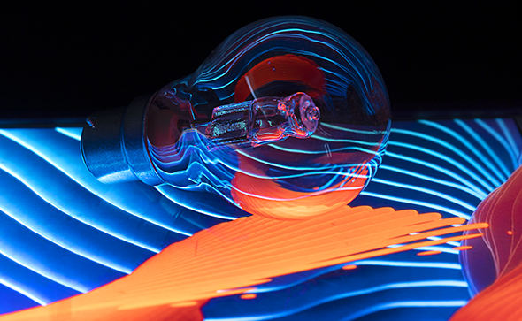
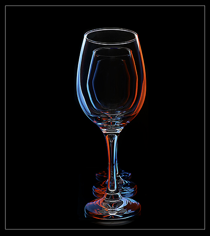
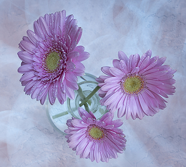
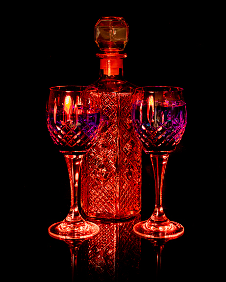
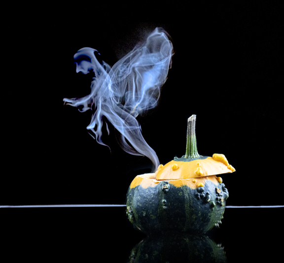
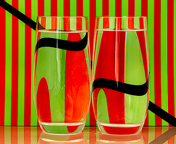
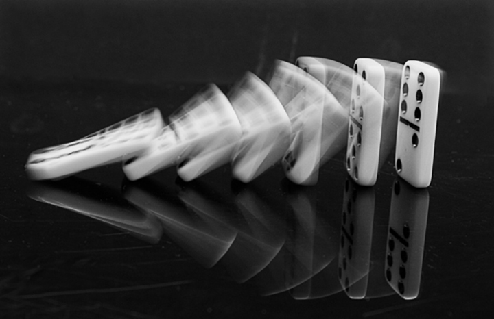
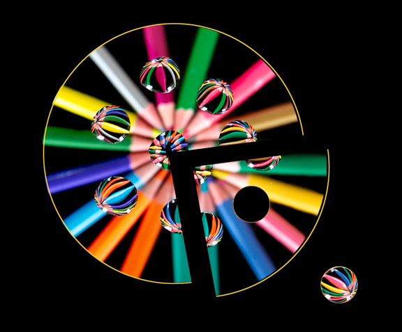
Very effective image and love the colouration. Never heard of Karo syrup.Have done images of waterdrops with something colourful beneath the glass in the past. I think it would not be so effective if it was all sharp but that is my opinion!!
Well done. |
Aug 5th |
| 20 |
Aug 22 |
Reply |
Thanks for that and I agree with your comments! |
Aug 5th |
| 20 |
Aug 22 |
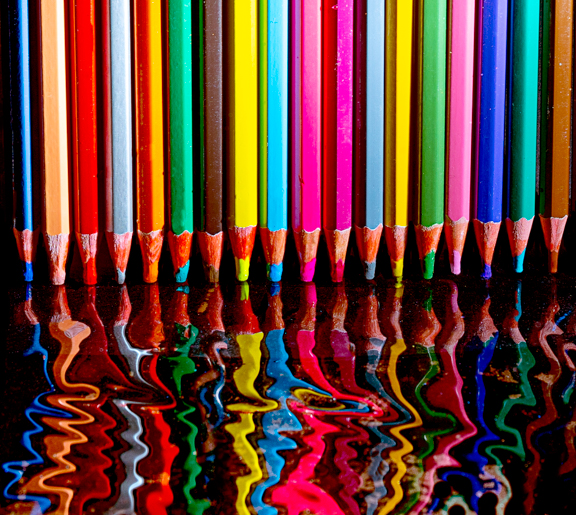
Comment |
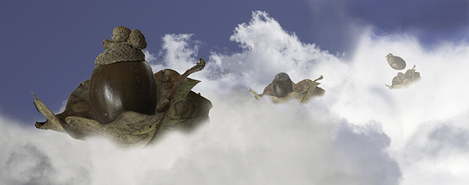
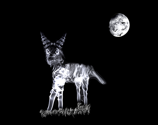
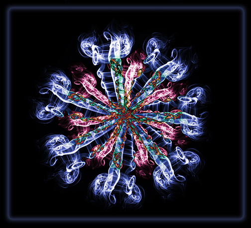
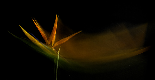
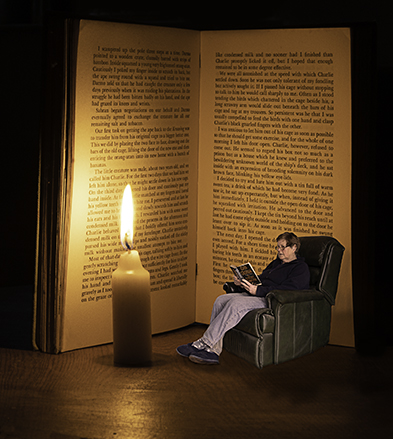
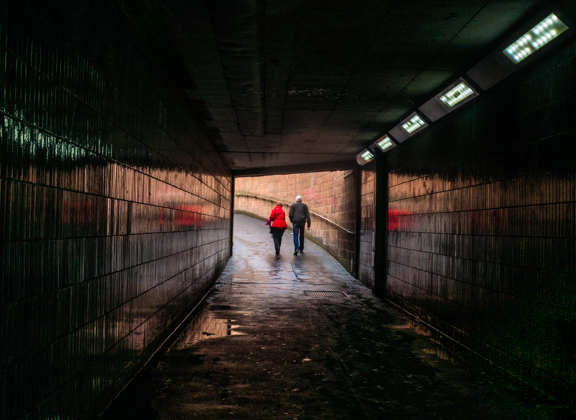
Love it!!! Wish I had your imagination!! We had a talk at my camera club from a chap who takes images of outer space and the colours and shapes etc were breath taking!!! (So was the cost of his kit!!)
Really like what you have done. Glad that the bridge is not exactly in the middle. Lots to look at, well done!!
|
Aug 2nd |
| 20 |
Aug 22 |
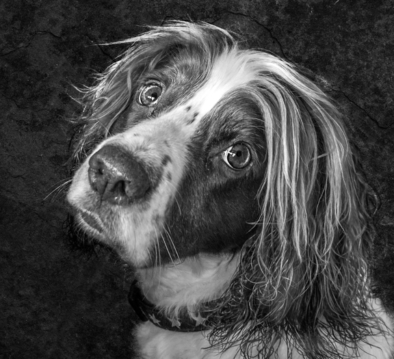
Comment |
He looks so sad!!! Obviously has had a hard life.
A lovely portrait well taken. Everything is lovely and sharp and you could count all his whiskers!! You have done well with toning/blurring the background. So glad you didn't trash it as well worth keeping.
Only slight niggle is that I find the colour a bit too saturated and perhaps could be toned down a tad?
|
Aug 2nd |
| 20 |
Aug 22 |
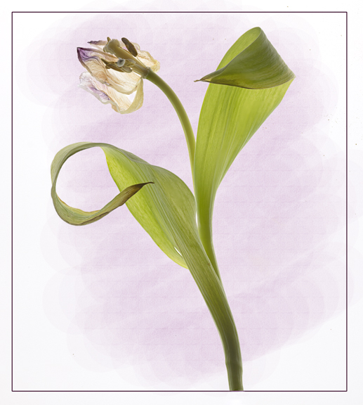
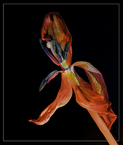
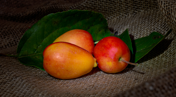
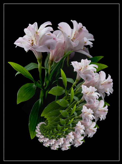
Comment |
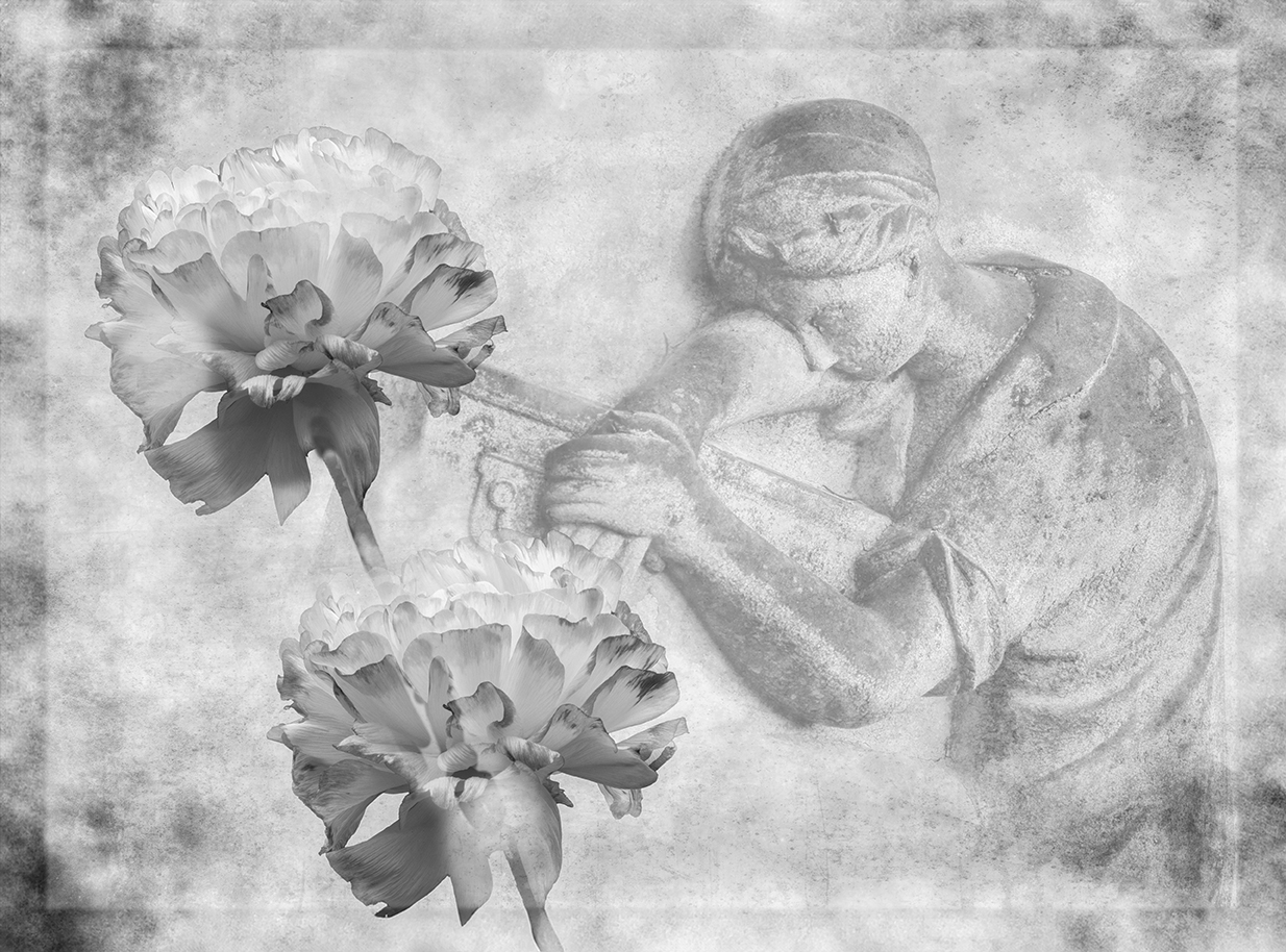
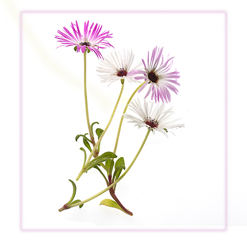
I think you have done well and made an image lovely and painterly. I like the crop and that you have faded the background so it doesn't compete with the subjects. I think it was also a good idea to tone down the red tulip a little as that was competing with the main subject.
Only small thing that, once noticed, kept my eye and that was at the base of the image you have some small areas of white. Perhaps these could be easily cloned out?
Well done. |
Aug 2nd |
5 comments - 2 replies for Group 20
|
| 21 |
Aug 22 |
Comment |
Very different and very effective!! Well done!! |
Aug 6th |
1 comment - 0 replies for Group 21
|
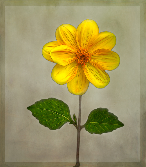
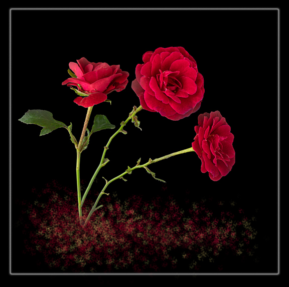
| 27 |
Aug 22 |
Comment |
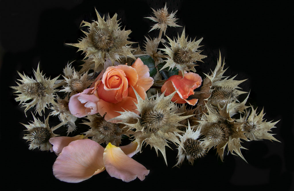
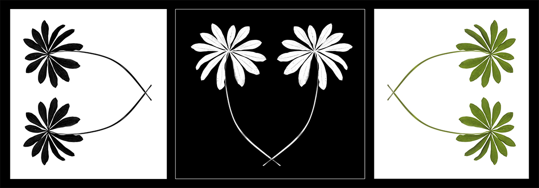
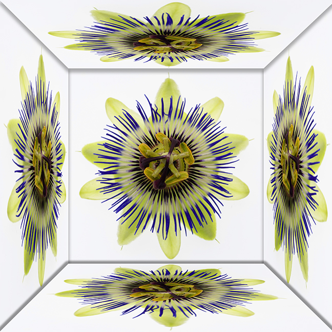
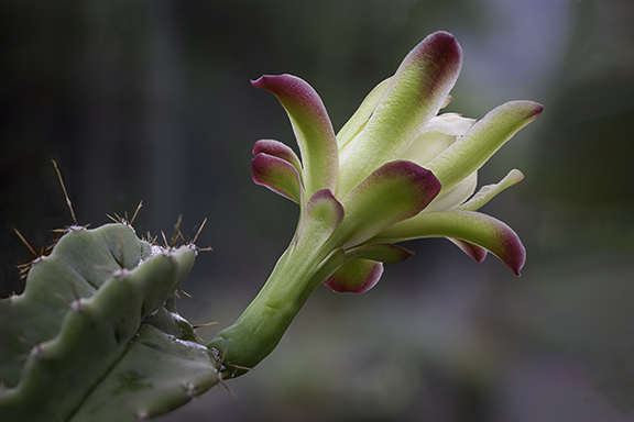
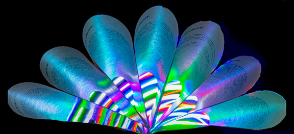
Great image well done!! Like the idea of enlarging some petals and using them as the background! Must try that.
Pin sharp, well done!! |
Aug 2nd |
1 comment - 0 replies for Group 27
|
| 30 |
Aug 22 |
Comment |
Such a simple idea but making a great image!! Will have to give it a go!! |
Aug 2nd |
1 comment - 0 replies for Group 30
|
| 77 |
Aug 22 |
Comment |
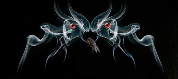
A lovely image and I am glad you flipped it as it works so much better that way. I hadn't noticed the bug till I looked at the title.
Love the post processing and a great image, well done. |
Aug 1st |
1 comment - 0 replies for Group 77
|
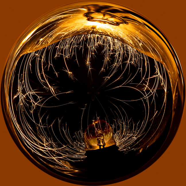
| 81 |
Aug 22 |
Reply |
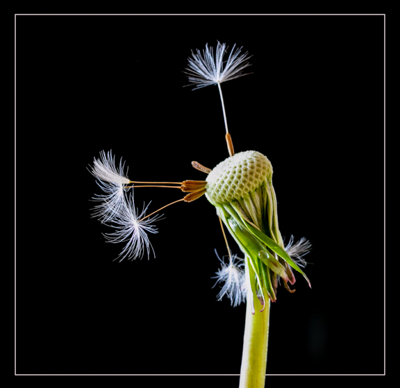
It seems all prefer the colour version!! So do I now!!
Agree about the fireworks. Did consider colouring each seed head differently but thought I would lose the will to live half way through!!! |
Aug 6th |
| 81 |
Aug 22 |
Reply |
Thanks and I totally agree with your comments. I had decided on the mono but nearly changed my mind when I got the original colour version to upload. Should have gone with the coloured version!!! |
Aug 2nd |
| 81 |
Aug 22 |
Comment |
What a cracking image!! The baby has a lovely expression and from the original I take it that he/she is covering their modesty!!!
I like the mono and feel that if you had used a stronger coloured background it may have detracted from the baby.
Great image, well done!! |
Aug 2nd |
| 81 |
Aug 22 |
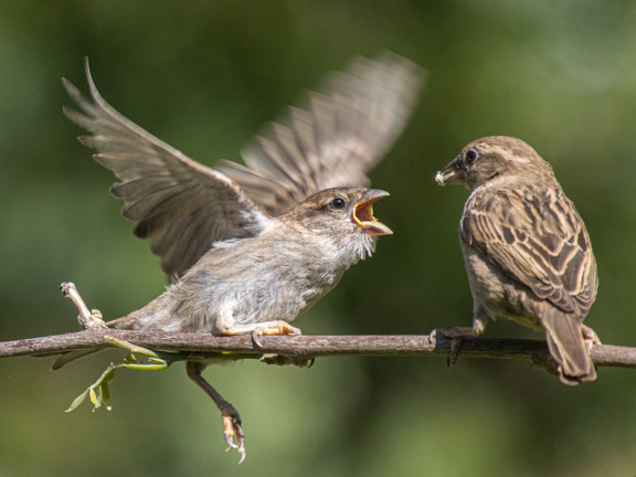
Comment |
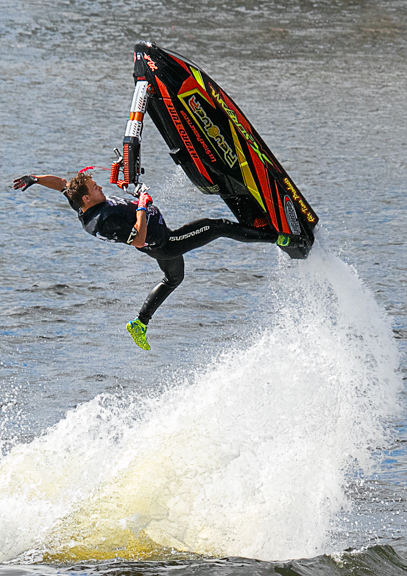
Anmazing how much detail you have managed to pull out from the original image. You seemed to be quite a distance away from the action. One off chance to get a shot like that so well done for being ready!!!
I like the muted colour of the water in the upper half of the image. Lovely lot of detail in the water from where the Bass presumably leapt to try and catch the Minnow.
Shame you couldn't include all the circle of disturbance in the water but if you did then the fish would have been too near to the side so I understand why you have cropped as you have done so.
Great image, well caught!! |
Aug 2nd |
| 81 |
Aug 22 |
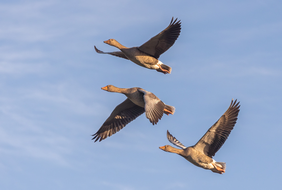
Comment |
Lovely subtle lighting on the ripples with plenty of detail. The top of the image has much more interest whereas lower down it gets quite dark and I think could be cropped off a little.
For me I think it would have more interest if there was a reflection in the water rather than just ripples which would give the image a more sense of place. |
Aug 1st |
| 81 |
Aug 22 |
Comment |
A lovely sharp image of this duck having a doze. I was glad you were able to get rid of the other ducks feathers that were at the edge of the image. Background is nice and blurred.
I know she is dozing but I think it would have been a lot better if she had opened her eye and checked you out!! Also it might have been better to have feet in the image as well?
Well spotted and well done. |
Aug 1st |
| 81 |
Aug 22 |
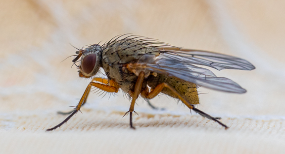
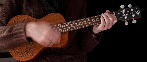
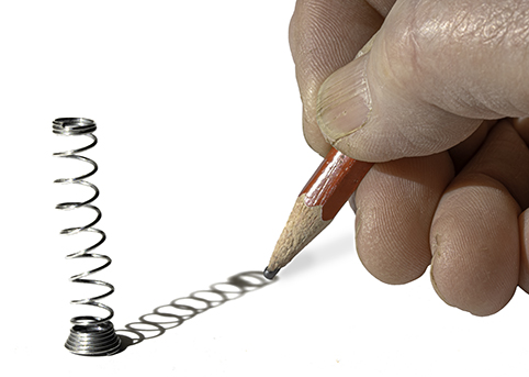
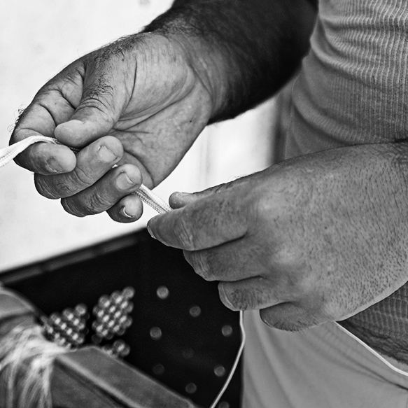
Comment |
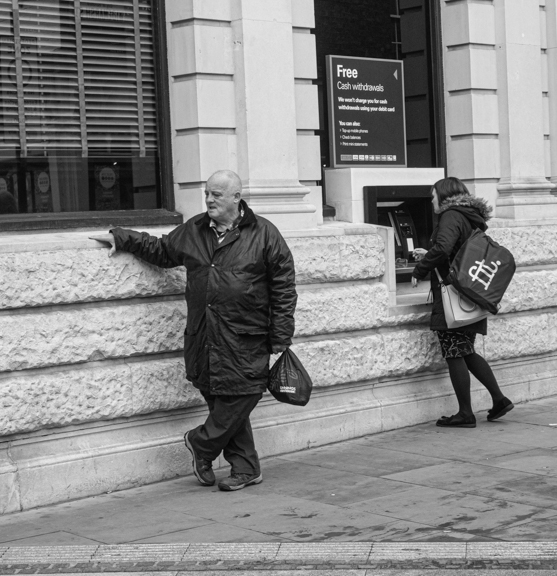
Well spotted and a good idea to crop right into his hands. It is all lovely and sharp and you can even see the hairs on his fingers!!!
For me I think it is all a bit bright and the colours are distracting from the subject. I have done a quick conversion to mono as I think it brings out more detail. See what you think? |
Aug 1st |
 |
5 comments - 2 replies for Group 81
|
| 84 |
Aug 22 |
Comment |
Brilliant!! |
Jul 8th |
1 comment - 0 replies for Group 84
|
16 comments - 4 replies Total
|