|
| Group |
Round |
C/R |
Comment |
Date |
Image |
| 10 |
Nov 21 |
Comment |
A well executed and unusual still life. Pin sharp where needed, well done. |
Nov 10th |
1 comment - 0 replies for Group 10
|
| 81 |
Nov 21 |
Comment |
Noel has re submittd his image having used LR masking to remove BG. Unable to change from the original image so having to do it via a comment . |
Nov 8th |
 |
| 81 |
Nov 21 |
Reply |
Thanks for the advice re using a white fill card.
I was trying to produce a low light image and have failed it would seem!!! I actually had black foam board on the right hand side to stop any light coming in from that side!! I keep seeing these images where there is only very little light and that falls onto the main subject with the rest in shadow and I was trying to emulate that. Any advice would be readily received!! |
Nov 6th |
| 81 |
Nov 21 |
Comment |
What a fabulous place to visit. The craftmanship in the detail is unbelievable!!
I like the way you have framed the image and it is sharp from back to front.Just enough detail in the sky to stop it being too bland.
I think I would have cloned out the chap in the green jumper who is standing on the right hand side as once you see him he is distracting. The other two people are blended in due to their dark clothing. Also, perhaps, clone out the overhang on the building at the top left as it "breaks" the frame.
Great image otherwise. |
Nov 6th |
| 81 |
Nov 21 |
Reply |
Thanks, Randy. The scary face you can see is probably mine!!!
Take your point about the reflections and must admit I haven't looked that closely at them. I was more concerned that no parts of the brass jug were burnt out and I had to tone the highlights down a bit. Agree with your comments about the empty left side and needing more room at the top. As ever a good critique, thanks. |
Nov 3rd |
| 81 |
Nov 21 |
Comment |
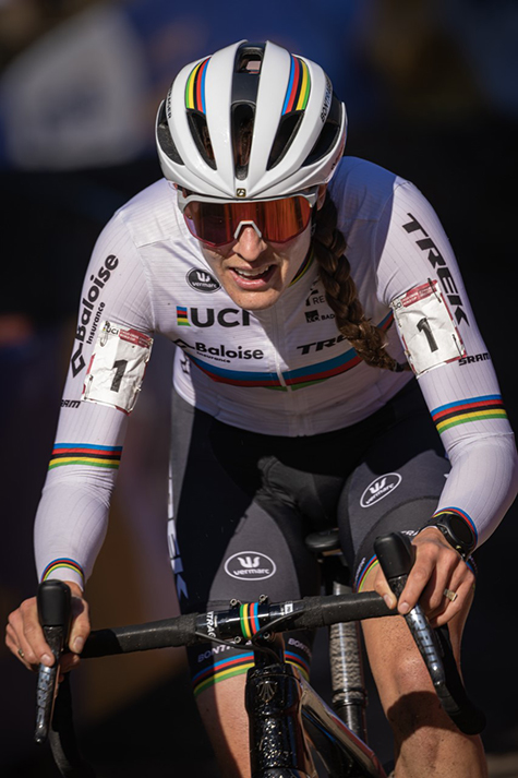
Great action shot of the cyclist.
Lovely and sharp and background nicely blurred. Really captured the look of concentration on her face.
I think it would be good to try and tone down the light area top left of the image as it is draws the eye away from the main subject.
Well done. |
Nov 2nd |
| 81 |
Nov 21 |
Comment |
Not too sure about it being dreams!! Seems more like a nightmare to me!!!
Well spotted and a good composition with the couple just about on the thirds. The crop has made the image a lot more interesting and the colours are very vibrant. I was going to suggest using levels to lighten the shadows on the couple but then think they might start to compete with the background so best left?
Well done. |
Nov 2nd |
| 81 |
Nov 21 |
Comment |
Definitely looking like a Dinosaur!!! Cannot really be called pretty!!
Lovely and sharp and shows up all the textures in her feathers and face details. Not easy to get a sharp image as they are usually on the move all the time, so well done.
I think I might have blurred the BG even more and toned it down slightly as it seems to be competing with the subject especially at the top right of the image. |
Nov 1st |
| 81 |
Nov 21 |
Comment |
A really pleasing image showing a lot of texture and the lighting is great something I am very poor at though do keep trying. Whatever you have done to get the background is very clever and I like the double borders as well.
Cannot find anything negative about the image at all, well done. |
Nov 1st |
6 comments - 2 replies for Group 81
|
7 comments - 2 replies Total
|