|
| Group |
Round |
C/R |
Comment |
Date |
Image |
| 10 |
Oct 20 |
Comment |
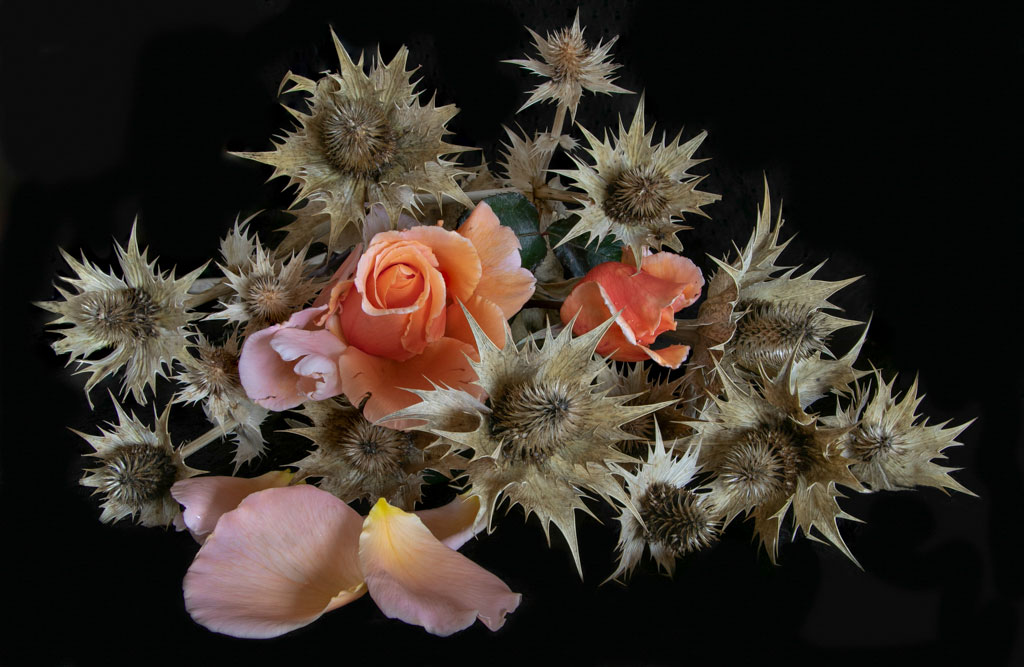
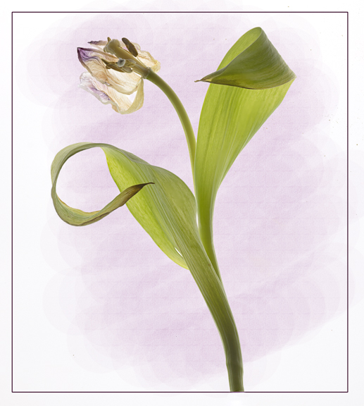
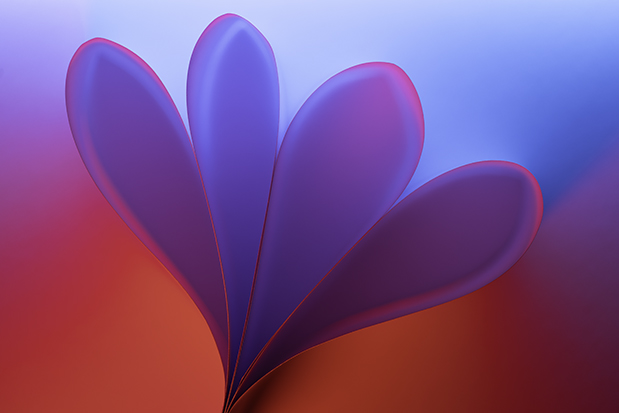
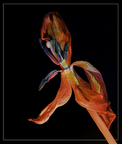
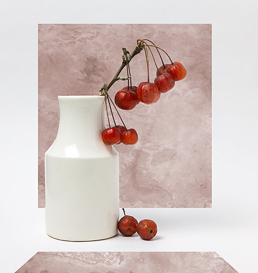
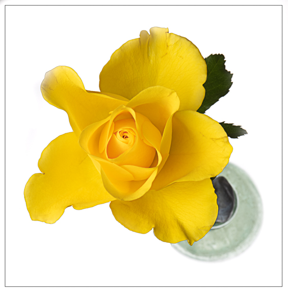
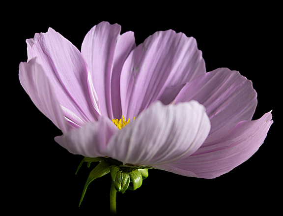
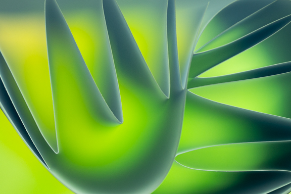
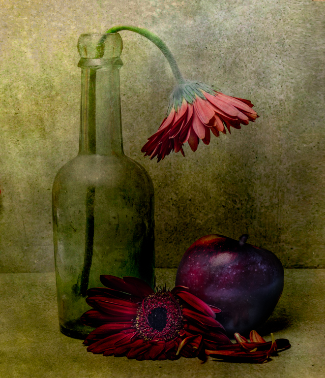
Lovely image and I like the way you have chosen a colour from the flower for the vignette which makes the flower stand out.
Well done!! |
Oct 13th |
1 comment - 0 replies for Group 10
|
| 18 |
Oct 20 |
Comment |
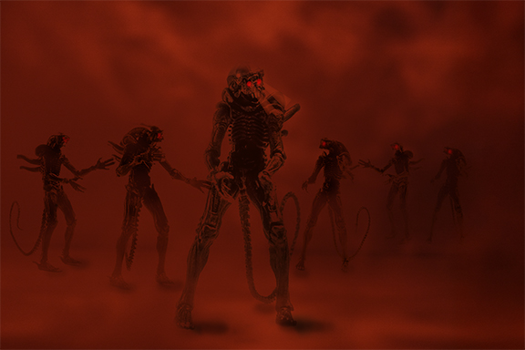
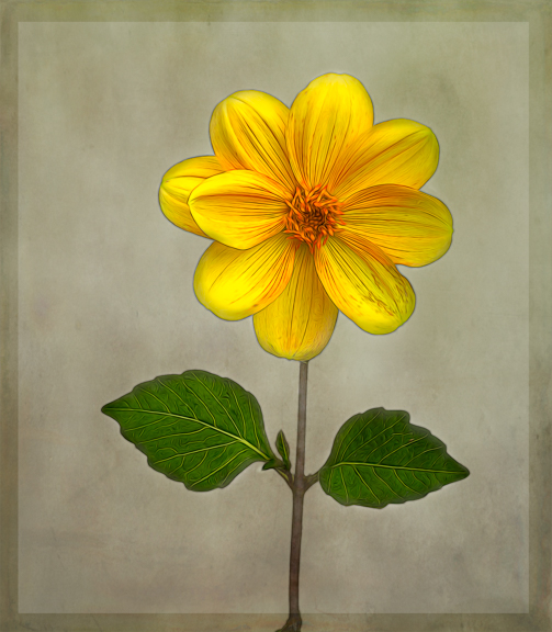
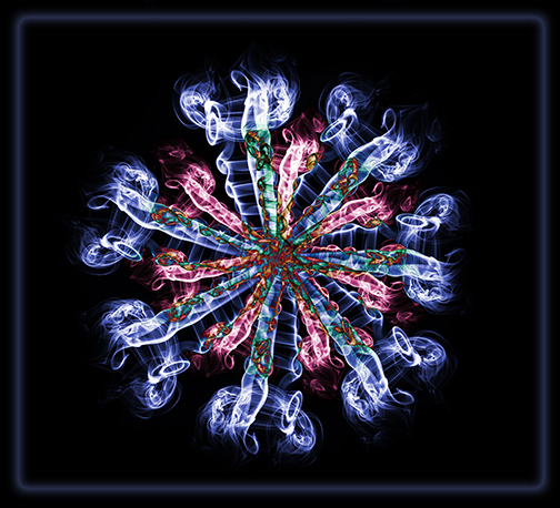
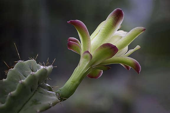
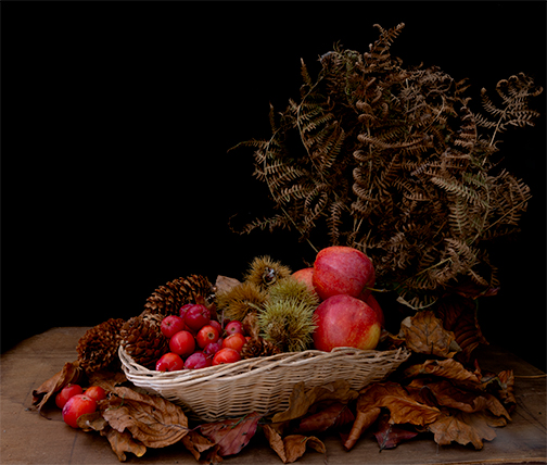
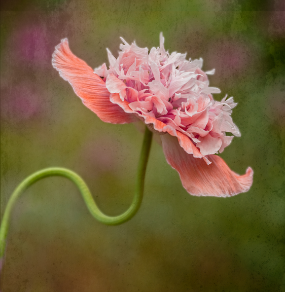
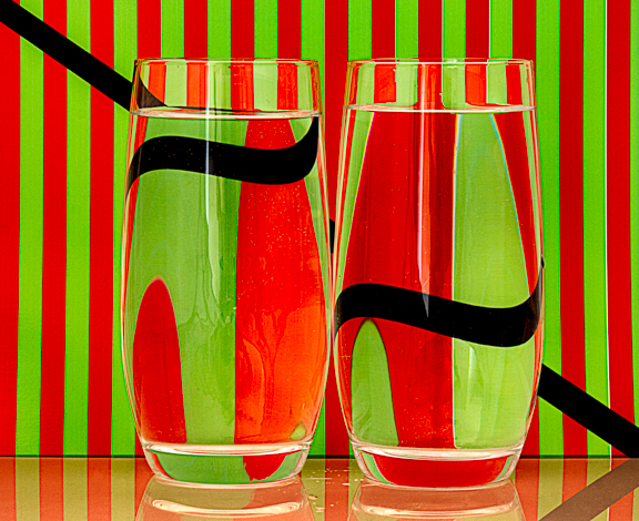
Turned a quite dull image into a blaze of colour!! Great image with plenty for your eye to follow!! |
Oct 3rd |
1 comment - 0 replies for Group 18
|
| 81 |
Oct 20 |
Comment |
What a pretty young lady and a great portrait as usual from you!! Her eyes are really sharp and a nice direct contact with the camera. You did well to tone down the highlights that were in the original image as they were distracting.
I do wonder whether a small crop on the left side would improve the image? I also find the tree in the background a bit eye catching even though it is nicely blurred which is a shame. Perhaps just stepping to the left and the model turning slightly this could have been avoided?
Even so it is a lovely portrait, well done. |
Oct 9th |
| 81 |
Oct 20 |
Comment |
I think this is a well composed image. Like all the different colour layers. It appears to be nice and sharp front to back. Your post processing has been done well and certainly improved the initial image bringing out all the detail and colours.
I do wonder whether there is either a bit too much sky or too much foreground? Have tried both but cannot make up my mind so probably right as it is!! It is a pity that the boat just appearing on the left hand side wasn't a bit further into the image and perhaps waiting just a short while would have improved the image and given more interest? |
Oct 7th |
| 81 |
Oct 20 |
Reply |
I must give fall colours a go if the rain would stop at the moment!!!! |
Oct 5th |
| 81 |
Oct 20 |
Reply |
Thanks for that. Yes agree about the top flower. Will look to add a bit at the top. |
Oct 5th |
| 81 |
Oct 20 |
Reply |
No, they were done together and then married with the original image. |
Oct 5th |
| 81 |
Oct 20 |
Comment |
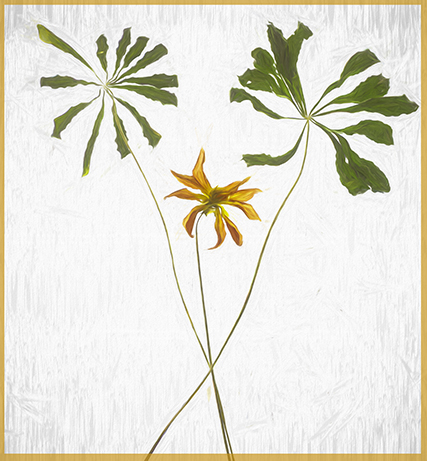
Lovely well positioned and lit image of the snail. Really like the way the light is accentuating the coils at top of the plant. That area seems to be the sharpest as I find that the snail itself is a bit soft? I like the background which makes the plant really stand out. I find the light area at the top a bit distracting though. |
Oct 5th |
| 81 |
Oct 20 |
Comment |
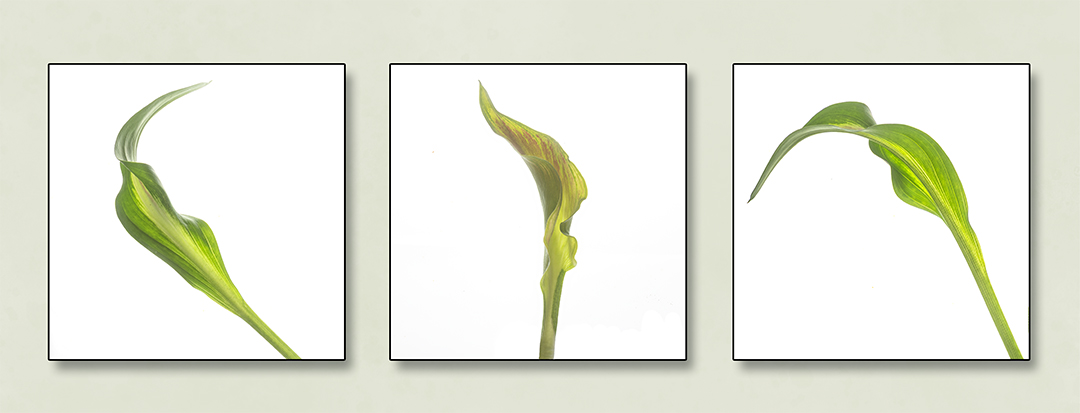
Well done for giving such a detailed description of what you have done for this image. Thank you!!
I like the way you have managed to isolate these leaves and really popped the colours. The final portrait view works well. I use high pass a lot but usually just for sharpening so interesting to see you using it to enhance the colours. Something I will try in the future!!
The only downside, I find, to the image is that it seems a bit soft. The sharpest part is the tip of the lowest leaf and where it's stem joins. This may be intentional I do not know? With the lovely colours you have around a slow shutter speed image to get blurred colours would be good!!! Great image though and I love the colours, well done. |
Oct 4th |
| 81 |
Oct 20 |
Comment |
You have captured a loving moment between mum and daughter. Love it!! The look on the faces of the other two girls really add to the moment as they seem to be wondering what on earth you are doing!!! I like the positioning of the mum. Usually told you have to have people looking/walking into the image but I think the opposite works well this time!! It is all lovely and sharp and exposure, mainly, has been well handled. I have enjoyed looking at all the notices showing what veg/fruit is for sale and it's price!!
The only slight criticism I have is the doorway on the right is blown out? I know how hard it is in a scene like this to get exposure correct all over but wonder if you have enough detail in raw to bring some back there? Or crop it out? Having now seen the original the cropping is spot on!!
Great shot, well done. |
Oct 3rd |
| 81 |
Oct 20 |
Comment |
Well done for trying out a new programme. I have heard of Luminar 4 but never looked at it. Might do now!!
Lovely shot of the fox and he seems nice and sharp and you have managed to dampen down the highlights that he had on his upper body in the original image.
I am sorry to say that I prefer the background in the original as I find that the sky is competing with the fox for attention!! It seems too bright and my eye goes straight there and away from the fox. The programme has done very well in coping with his fur though. Perhaps try and darken the highlights in the sky a tad? |
Oct 1st |
6 comments - 3 replies for Group 81
|
8 comments - 3 replies Total
|