|
| Group |
Round |
C/R |
Comment |
Date |
Image |
| 36 |
Apr 26 |
Reply |
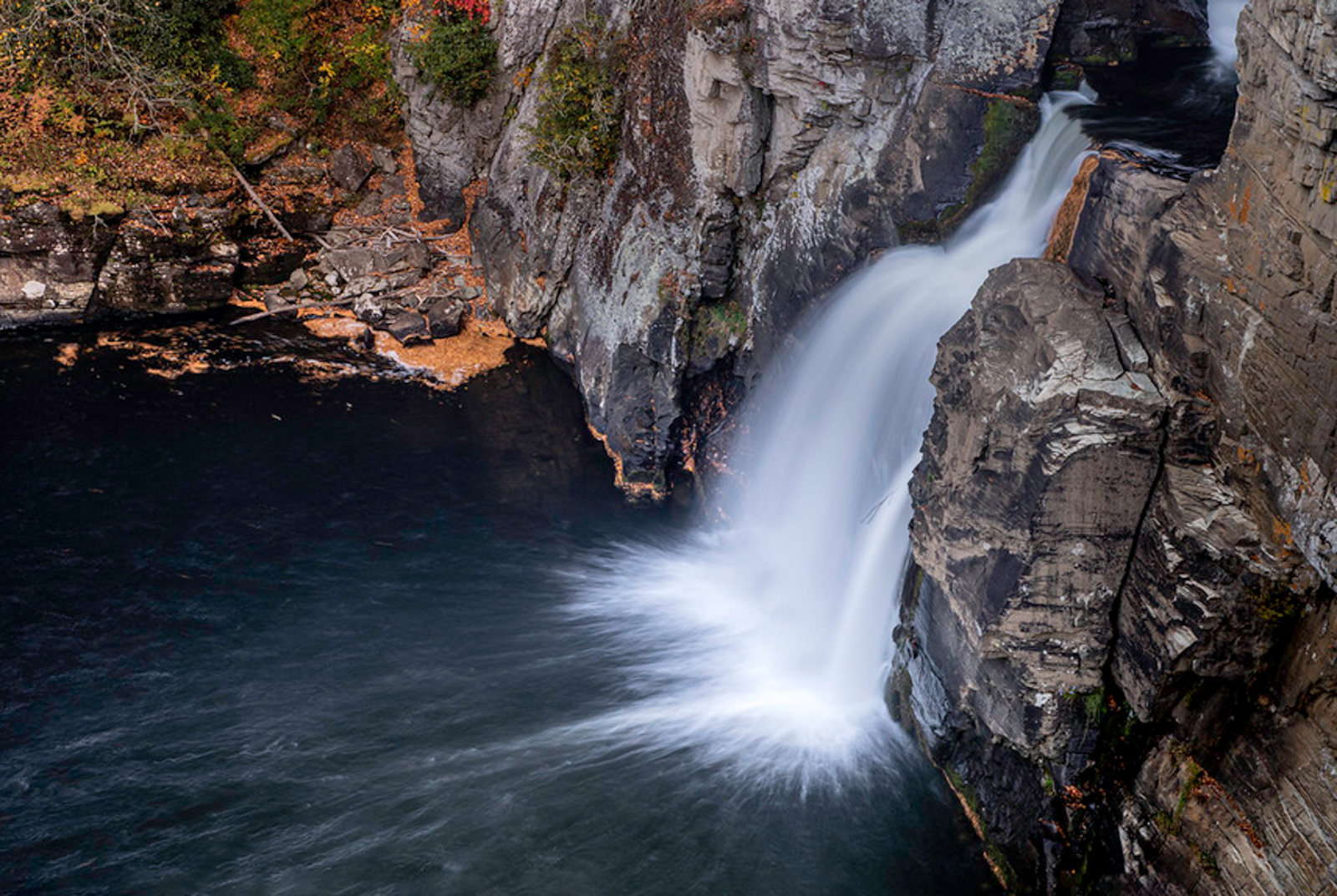
Thanks for your thoughts. This entire shot turned out to be an unfortunate experiment. The whole intent was about just capturing the spray. I choose this angle because it let me separate the most spray from the rocks. Remembering that all I wanted was the spray, I tried several longer and shorter exposures but this was the best spray (an it is not that good) If I used the longer exposure the spray just turned into long silky water. generally I like a 1.6 to 3 seconds for the exposure but it depends on the amount of water flowing over the falls. I like to leave space in the splash pool for the water to flow into and if possible to show the flow on the water after it hits the splash pool. I like the image below better. |
Apr 13th |
 |
| 36 |
Apr 26 |
Comment |
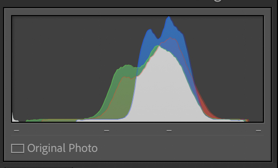
The canyon offers quite an array of interpretation possibilities that it is always interesting to see how other interpret it.This artistic approach offers some different looks for sure. My first impression was that the image was overexposed, as the potential vivid colors seem washed out. Then I looked at the histogram (see attached image) and you will see that all the tones of the image are in the mid-tone range. This results in an image, lacking in contrast and appearing flat. If you spread out the tonal range the image will have more punch to it. How much you spread those tones is, of course, your choice. It is all about what mood you want to create--you are the maker. |
Apr 5th |
 |
| 36 |
Apr 26 |
Reply |
Pretty good analysis of the image. It starts with getting the compelling subject. Then trying to make everything else compliment the subject. For me the mist makes it a lot harder to do. Next time I find a misty falls, I'll try again. Thanks for your thoughts. |
Apr 5th |
| 36 |
Apr 26 |
Reply |
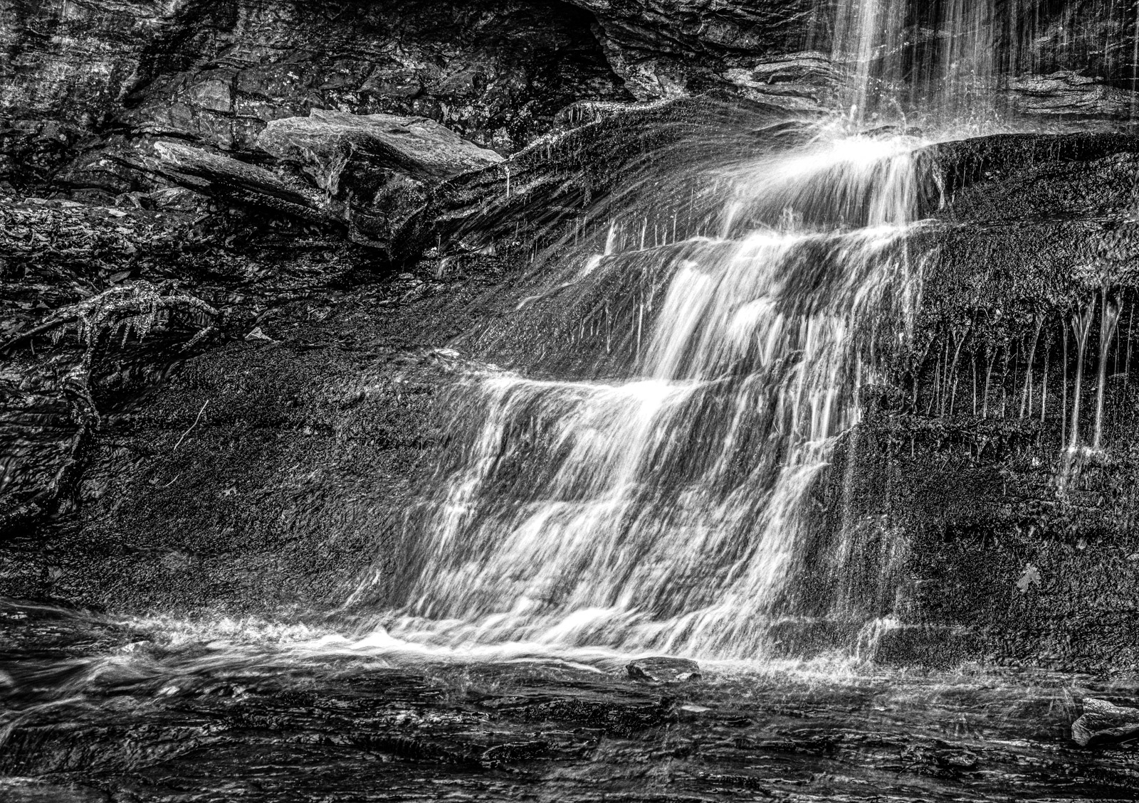
OK Michael. I gave it a try in monochrome. Like to know what you think now. There was a lot or orange like mud in the lower area. Look ed it came the washouts on the sides.
Yes, that is moss under the water on the rocks. Does the monochrome maintain the look of the spray in the water that I was trying to capture? I think it just looks like noise. |
Apr 5th |
 |
| 36 |
Apr 26 |
Comment |
Thanks Barbara. I'm not going to let a bit of cold prevent me from getting a photo. I was hoping for ice, but no luck. There is a bit on thew left side clinging to a branch. I wondered about cropping the bottom but I felt I needed someplace for the water to fall. There was not enough water to make a real splash pool. I was hoping the spray of the water would show up better against the green moss. I know what my intent was, but I'm not sure the image really shows my intent. |
Apr 4th |
| 36 |
Apr 26 |
Comment |
I guess you can't drive a large SUV down that street. I like the camera angle as it makes the street really feel narrow (maybe cozy?) a feeling that the vertical camera position accentuates. The different building styles and colors add a cheery feeling to the scene and I'm glad you kept the shadows to a minimum as the extra light keeps the scene cheerful. I'm hoping that foreground cat is not related to the goddess Bastet. |
Apr 4th |
| 36 |
Apr 26 |
Comment |
As a long time backpacker I see this as a campsite to dream of. That green tent on the left looks like one I used to have. The colorful tents really make this scene unique and the various layers between the foreground and the distant peaks create interesting depth and scale. This is certainly a "room with a view."
I get the idea of the wide angle lens being used increase the "hilly" look. But for me the amount of lean the tress on the right have make the scene feel fake. Ultra wide or not, I wish I could have slept in this campsite. (just not under those trees on the right. |
Apr 4th |
| 36 |
Apr 26 |
Comment |
What a lovely little scene. The building with its natural roof is quite unique. The stone walls with the wooden window frames and the living roof offer lots of opportunity to dis[play textures. I think the camera angle is about perfect. If you were lower the fence posts would block the windows. There is such a variety blooming flowers that I wish you had brought out those colors in post to provide some life to the scene. To me it seems a a bit soft, almost misty but it is too late in the day for that foggy mist top show.
I just had an after thought. The left side has several partial building showing. I'm wondering if you physically moving to the right and thus hiding those buildings behind the subject cottage would make the cottage a stronger subject if it stood alone? |
Apr 4th |
| 36 |
Apr 26 |
Comment |
I'm a great fan of lighthouses and this is not an exception.
In spite of the warm colors in the sky, this images makes me feel cold. This has to be the result of the blues and whites that run throughout the image. These are chilling colors and their contrast in this soft and moody image just works for me. These feelings only are magnified when the image is enlarged. I like the space between the rail of the walkway and the horizon and I like that the light of the lighthouse is placed in the bright pink area of the sky to seemingly light the beacon. |
Apr 2nd |
| 36 |
Apr 26 |
Comment |
Hi Barb
Reading your write up made me perk up with joy and frustration at the same time. Like you state as you walk through the forest you ae always looking for that unique play of light, the angles of trees, that certain something that foretells that special something. I have tried this approach hundreds of times I'm sure. A single golden tree alone in a lush green pine forest. A red bud tree in bloom against a green backdrop of spring oaks. It looks great in the forest, even in the camera viewfinder (just tried a while dogwood against a bare tree forest) and it just never works out. This image makes me feel I'm standing in your shoes looking at this scene. The resulting image just never measures up to my expectations.
In your image the Analogous Colors create a perfect color palette, the image is technically strong with great sharpness and accurate exposure and the composition centers the subject, which be color, is well separated from the background. Yet for me something still seems to be missing. So, this month I'm asking, practically begging, for you to explain to be what I'm missing. I'm totally at a loss. The image just doesn't seem to have the impact I'm dreaming of and hoping for. I'm looking forward for your explanation because this never seems to work for me. HELP!
|
Apr 2nd |
7 comments - 3 replies for Group 36
|
| 67 |
Apr 26 |
Reply |
Thanks Butch. There were a lot of water drops clinging to the duckweed in the background. I thought about making the water at the top darker to match the lower left corner, but then the gator looked too bright. I could crop the bright area in the upper right corner but then the scene feels cramped and crowded. I could not add to the foreground as there were lily pads and pink flowers, which is why I didn't use a lower camera angle. This was taken with a 500mm focal length. |
Apr 4th |
| 67 |
Apr 26 |
Reply |
Thanks Butch. Just calling 'em as I see "em. When an image has that "it", what every that is, it just sings. This one is an opera! |
Apr 2nd |
| 67 |
Apr 26 |
Comment |
Well, you certainly came home with an impactful image from your trip to Florida! As a high key image this is about as good as it gets. The whites are white and the blacks are black that that creates about as much contrast as you can get. There is excellent sharpness throughout and the image retains acceptable detail in the feathers. Technically this is excellent. With this ultimately being an extremely minimalistic and high key image it is well within the world of fine art. This the final crop becomes a maker's choice. If you like the square, so be it. To me the image feel unbalanced and sort of "clunky". If you placed the bird in the center then the square feels more comfortable. If you are going to position the bird on the left, perhaps the 5x7 format may be more comfortable. |
Apr 2nd |
| 67 |
Apr 26 |
Comment |
Bud
I feel you have captures a "decisive moment" in the take-off by having the wings raised and the slight rise in the bodies of the geese that are lifting off. The general lack of clutter and the simple color palette add to image strength. You selected a good shutter speed and the subjects are quite sharp. I can only wish that the pair taking off were completely separated from the rest of the geese, but that is just wish full thinking and certainly not your fault.
As moderator of a PSA Nature group I do need to make a comment about Lightroom's suggested workflow. PSA Nature images have absolute rules in regard to processing. Much of the new AI features that Lightroom now features are not acceptable for nature images. Without going into a lengthy discussion let me offer this simple test to determine if what you are using is legal. Disconnect your computer from the internet and then do your editing. This is disable the AI features that are not allowed for PSA Nature editing. |
Apr 2nd |
| 67 |
Apr 26 |
Comment |
First, this is a visually stunning image. Panning the camera and keeping the important parts of the subject sharp and crisp is difficult while maintaining adequate blur. You have done this quite well. This may well be the best image I've seen from you. The conversion to monochrome was a wonderful choice as the absence of color brings out the structure and form of the image. I appreciate the rising diagonal of the zebra's body as it makes the motion feel stronger and a creates a feeling of drama. The clean background is just a nice bonus. This might be a good candidate for entry not only as a Nature image, but as a monochrome image as well although you might strengthen the whites if it is entered in monchrome. |
Apr 2nd |
| 67 |
Apr 26 |
Comment |
The composition is effective and the "march to the sea" is certainly a classic penguin image but for me, aside from your technical skills, it is the colors and the sharpness that make this image impressive. This image feels like Antarctica and I'm cold. The blues of the sea and the whites of the ice contrast well and are the two colors that most strongly demonstrate cold. This sharpness of the penguins also works well with these colors and imparts a feeling of "crisp" cold. The background may be a bit busy but this is still a powerful image. |
Apr 2nd |
| 67 |
Apr 26 |
Comment |
There is much to love about this image but for a moment I would skip the camera work and highly compliment the behind the scenes editing work. The editing shows exceptional skills and even greater insight that results in an exceptional end product. In the various courses I teach I try to impress upn student to "use" light for more than just obtaining an exposure. This image is a master class in demonstrating that skill. I find the cohesive, and limited, color palette greatly intensifies the overall impact of the image. The image seems to be soft and mystical and the softness produces a feeling of serenity that drives the image. I think it is interesting that in the original the mare seems to be the more visually dominate of the two horses, but the editing and color palette along with the backlighting, has made the foal the focal point. Those warm colors and the rim lighting really are wonderful. For me the rusty colors you have brought out in the upper trees and added to the water compliment the foal and hold this image together and give it impact. It lacks the drama of some of you other horse image display with their intense action, but I could look at this all day, and come back and enjoy it again tomorrow. |
Apr 2nd |
| 67 |
Apr 26 |
Comment |
Gregg
I feel you have captured a strong image with powerful action and a great deal of drama. PSA would consider it a level three image showing interaction between members of the same species. I like the composition and can tolerate the annoying branch at the top because this is Nature and nature is not always perfect. However if this were mine and I was not going to enter it into competition I can truthfully say that branch would have been removed long ago. My regret is that there is not more light on the face of the baboon on the right, but this is not your fault and it is what it is. The image is still impressive. Butch did a good job of bringing that face to life with his edit.
I'm really quite impressed with the quality of the blur you achieved with the background shooting at f9. You must have been fairly close to the subjects and the background was clearly some distance away.
There has been much discussion about the lens you and David have. But from this example, the quality is quite good. Modern cameras have improved enough that now it is possible to raise ISO levels to the 1600 level you required and still retain image quality. The only real problem with that lens is that as the light declines, on the edges of the day, it gets harder to shoot at high shutter speeds. As I age I find it harder to carry my old, and very trust worthy, Nikon 600mm f5.6 prime lens into the field but I do love that f5.6 aperture . |
Apr 2nd |
6 comments - 2 replies for Group 67
|
13 comments - 5 replies Total
|


