|
| Group |
Round |
C/R |
Comment |
Date |
Image |
| 36 |
Sep 25 |
Reply |
Hi Barbara
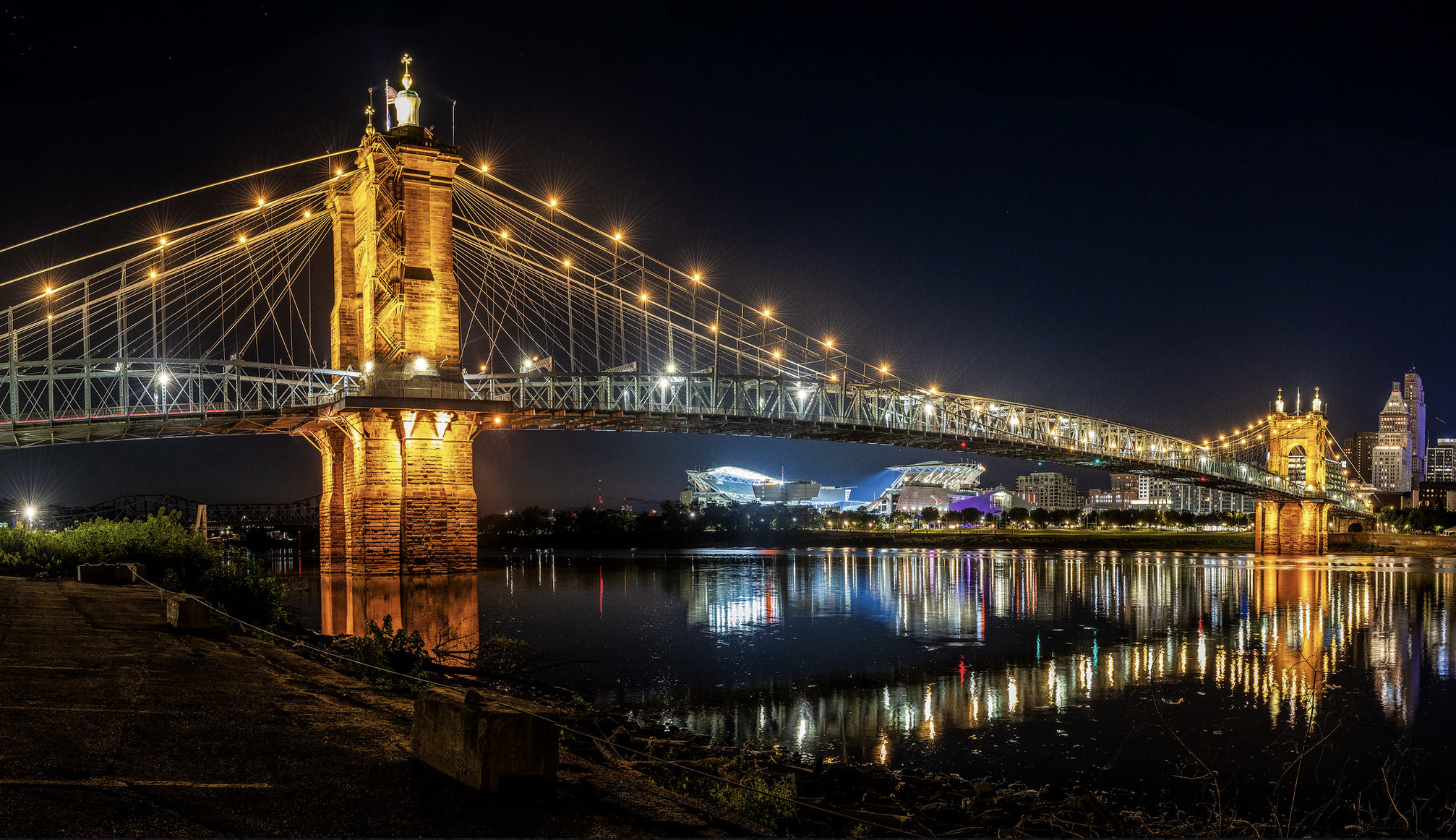
I assume you meant the Roebling Bridge. Here it is with the Cincinnati Bengals' stadium being framed by the bridge. That is one long bridge at 1057 feet in the main span. |
Sep 16th |
 |
| 36 |
Sep 25 |
Reply |
Darn! I straightened that building in Photoshop and then brought it back into Lightroom. Later when I resized it to post I resized the image BEFORE sending to Photoshop. I posted the wrong image!! Just another senior moment. :-( |
Sep 11th |
| 36 |
Sep 25 |
Comment |
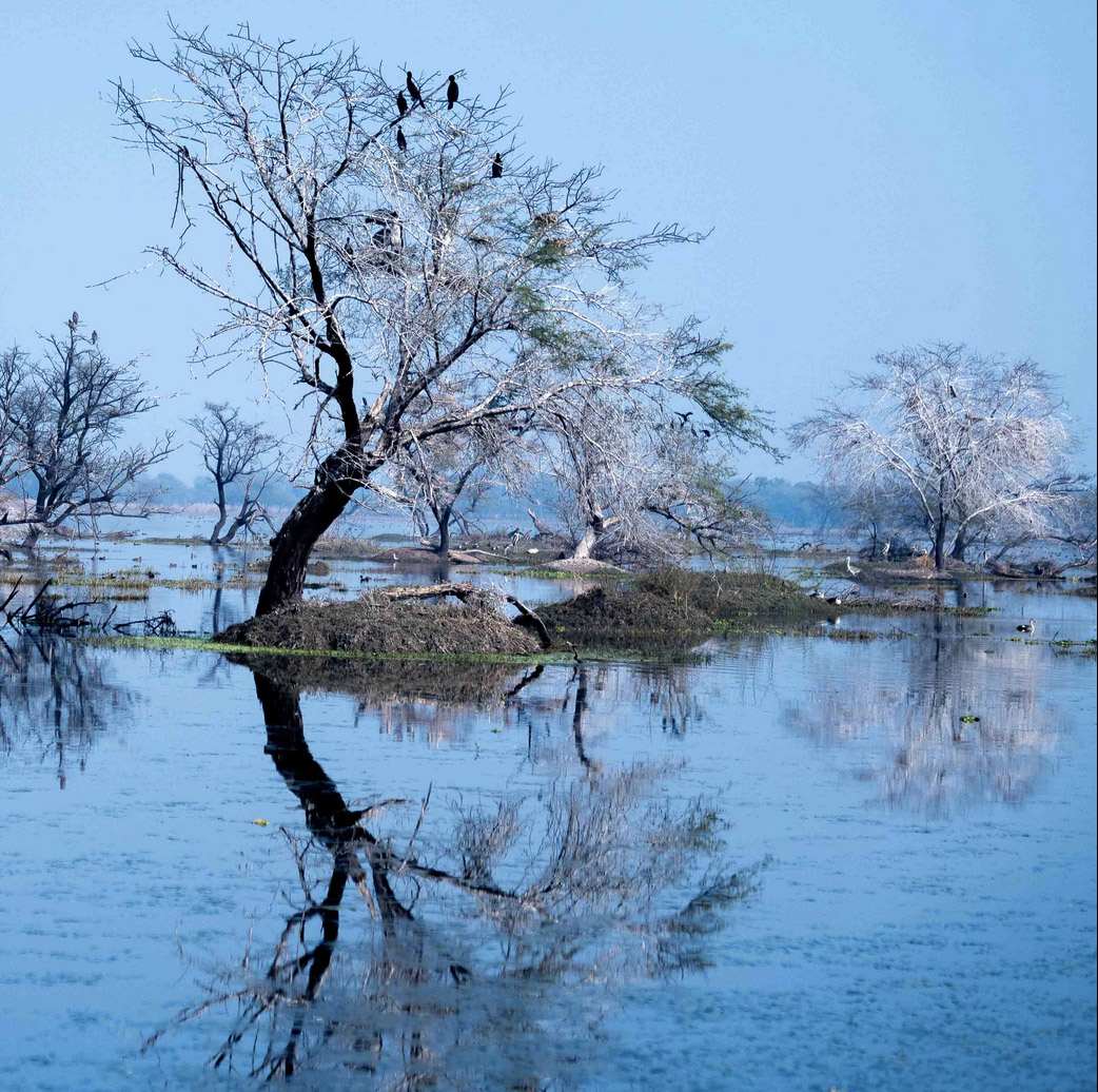
We have the same problem during out nesting season here in South Florida when the larger birds like the storks and egret nest in the mangroves. Like your birds they turn the mangroves white with their fecal matter and provide a delightful aroma as well.
When I first saw the image and before reading the description I thought this reminded me of some Japanese flowering trees. I like the graceful bend of the tree and the color combination of the white and blue.
Personally I think this would be a stronger image cropped as a square and eliminating the tree on the left. The image just feels busy. Cropped as a square and if some space were added at the top and bottom so the tree would not be so cramped I think this would be quite pretty. My crop suggestion is below: |
Sep 10th |
 |
| 36 |
Sep 25 |
Comment |
I'm sure this was a beautiful sight while you were hiking over a bridge(?) and the colors and exposure are well handled. If had asked AI would have been happy to rent you a boat so yuou could get closer to the buildings. They really look interesting but they ae just too far away for me to really enjoy the uniqueness of the structures. I know this was taken with a cell phone, but would it be possible to crop some of the foreground water and show more of the buildings? |
Sep 10th |
| 36 |
Sep 25 |
Reply |
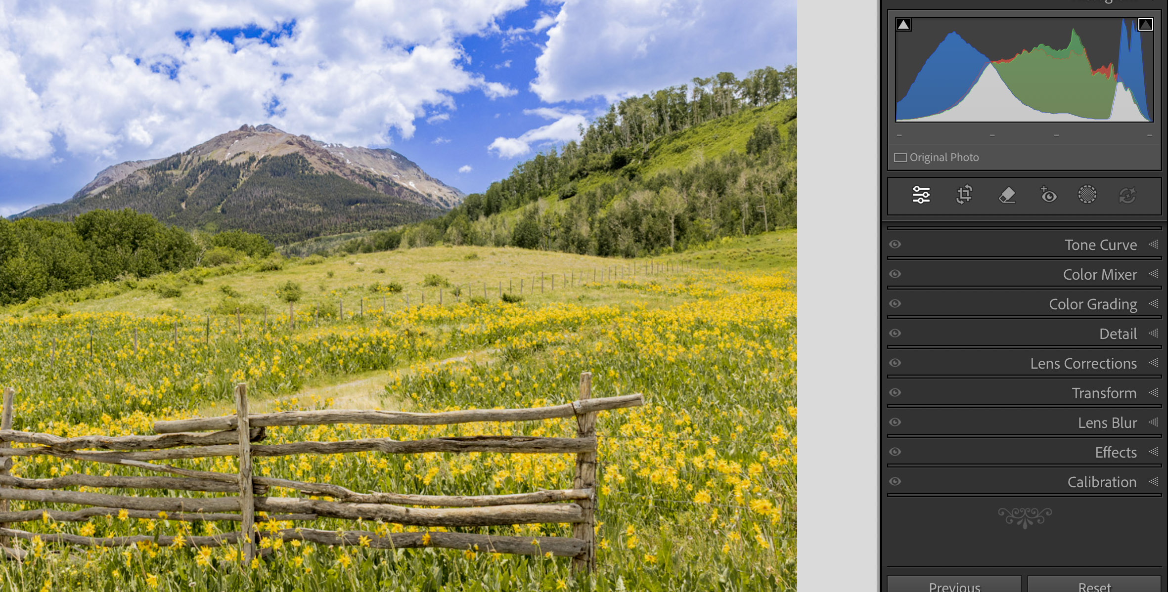
I think there is a lack of sharpness in the Mule Ear flowers but I do not think that is due to the sharpness of the lens or focus. I'm pretty sure it is caused by the bright flowers being so over expose (or close to being over exposed) that the detail has been washed out and likely cannot be recovered--I tried)
Not top be judgemental but you probably didn't check your histogram while in the field, something I generally do not do as much as I should either. If you had checked you would have seen the lack of the dark tones and then could have fixed in in the field by reshooting. My guess is that you have the brightness setting in the camera's replay mode set incorrectly and thus the image looked better in camera.
Strong horizontal lines (like the fence) create visual blocks and help to prevent the viewer's eye from moving through the scene. In this case, I feel the fence creates an unbalanced image. There is a potential leading line behind the fence that could be used (with some reframing) to create a more dynamic image.at take
I do like the camera angle that takes advantage of the floral foreground.
|
Sep 10th |
| 36 |
Sep 25 |
Reply |
So, other than grabbing my sunglasses, I first thing I did was introduce and lower range of the tonal scale by moving it to the left. As you can see from the new image and scale below this immediately adds some life and realism to the image. I also moved the high end of the scale slightly to the left so help reduce the highlights. I think I would reduce them even a bit more. |
Sep 10th |
 |
| 36 |
Sep 25 |
Comment |
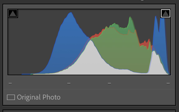
The first thing I thought when I saw this image was "where are my sunglasses?" I loaded this image into Lightroom and, as I expected, you technically did jot overexpose it but you did bunch all the tones up on the right side and basically eliminated the dark tones. Ansel Adams would NOT be happy. Basically all the shadows are gone and the entire image looks washed out. See Histogram below. As you can see the dark tones--those that should be on the left are completely gone. |
Sep 10th |
 |
| 36 |
Sep 25 |
Comment |
This image brings back memories of a trip I took to Yellowstone and the Tetons nearly 35 years ago. I distinctly remember seeing this type of composition (large trees filling the foreground) as a popular trend of the times. Back then I thought of it as some sort of photographic framing and so I thought that if the pros were doing it, it must be a wonderful idea. Many of the images I remember from those by gone times did not have the foreground detail shown here by the tree roots (I know this because I just went through an old scrap book and looked at some postcards I bought back then).
For me this feels quite unbalanced. The right side is so bright and draws attention. While the alpen glow is on the peaks it sort of feels like an after thought and thus I think the composition is weaker, I do like the detail of the roots in the foreground and that reminds me I have not taken enough images showing that detail (something I just vowed to do on my next excursion to the forests).
|
Sep 7th |
| 36 |
Sep 25 |
Comment |
This image brings together two of my favorite photographic elements: the blue hour and moonlight. I find the blue hours to be mystical and dramatic while the moonlight spills over the distant peaks to light the scene. While I usually abhor black holes, such as the area on the right in this case it adds balance and shapes the drama of the scene by guiding pointing the eye to the shadowy mountains on the left.
That thought makes me wonder if this would look more dramatic flipped. After all, there are no sign boards to tell anyone you did it, :-) |
Sep 7th |
| 36 |
Sep 25 |
Comment |
Nothing is ever wrong about showing a MW photo. I just enjoy seeing them. This particular one is interesting in that the MW is vertical, usually you just see the arch. I like the vertical format as it draws greater attention to the MW itself. The title also works for this shot as after reading it I can actually see the two trees holding hands (branches) twirling across the sand---really a cleaver touch. For me the moon also works as it is because it adds visual weight to the composition. |
Sep 7th |
6 comments - 4 replies for Group 36
|
| 67 |
Sep 25 |
Reply |
No harm, no foul. It is a pretty cool landscape. |
Sep 13th |
| 67 |
Sep 25 |
Reply |
Never been a big fan of flipping (feels like I'm cheating). However, in wild life no one can really tell. So on occasion sometimes I'll just go ahead and keep my mouth shut.
With this image I saw the possibility almost immediately.
Little things to matter--like the direction of that horn. :-) |
Sep 13th |
| 67 |
Sep 25 |
Comment |
There is always something positive about simplicity. When an image has few elements each existing element takes on great importance and generates greater intensity and impact.
Green is the most restful color for the human eye and is the universal color associated with nature. These are positive qualities. The composition is clean and simple and you have what I believe is the perfect crop. As Scott suggests, I would lighten the dark area in the lower right corner.
|
Sep 10th |
| 67 |
Sep 25 |
Reply |
Hi Scott
I've noticed your really gravitate to standard image sizes. 4x6, 8x10 and so forth. I used to think this way until people started buying my images in large sizes and they were having them custom framed. That was when I started cropping for the impact I felt and either including or excluding little things on the edges.
I use the rule of thirds as just a "suggestion" and never worry a lot about exactly hitting those 4 junction points. Close counts for me in photos, horseshoes and atom bombs.
I like your crop but for me the little guy is too close to the edge. But now we are back to that maker's choice thing. I can read your rationale and fully agree. |
Sep 8th |
| 67 |
Sep 25 |
Reply |
Thanks Bud. I agree with you advice about being "flexible" but keep that in mind until you see my photo for next month.
:-) |
Sep 8th |
| 67 |
Sep 25 |
Reply |
Butch
I love your comment about when judging you stat with the title. When I judge clubs I ALWAYS start with the title---I've been fooled to many times not to. :-)
Personally I struggle with titles and so my cop out is to let the image do the talking. The old saying "A picture is worth a 1000 words" comes to mind and you only get about 30 characters for a title and I'm stuck. Thanks for the chuckle.
|
Sep 8th |
| 67 |
Sep 25 |
Comment |
First, I love bears! Anything from Teddy Bears to Black, Brown, Sun anything. It it is a bear I'm all in.
The title shifted my my excitement into high gear, and then I saw the image. The setting is classic with snow capped mountains, rolling clouds, pine forest, mountain meadows and finally bears. For me reducing the bears to a mere corner of the image belies the title. I really want to fall in love with the tender moment but between the vastness of the environment and the short focal length used the capture the image I feel cheated.
You did everything right, the exposure is fine, the sharpness is perfect, the moment is spot on and the bears are too small.
If you want the environment to be key and the bears just serve as place holders, that is a maker's choice. Call it a "day in the mountains" and put a frame around it and hang it.
As has been noted this is just not a bear photo and judging from the 100mm focal length you were safe enough. But how I wish you had used a 400mm lens.
|
Sep 8th |
| 67 |
Sep 25 |
Comment |
Being the purist that I am, I will pretend I didn't read anything about moving parts of the image.
I find this to be technically strong. The animals in the background are dark and small and I can't tell if they are "critically sharp" or just "adequately sharp" and thus for me they are just fine. I feel the image is quite static and that weakens it. The bright part is the skull's face and having it on the right sort of locks my eye on the right on the right side and I miss some of the story. Now since the animals are not wearing identifying lettered signs my suggestion is to flip the image.
Since I read from left to right my eye enters the scene from the left and immediately rests upon the skull, now in the lower left. At this point to pointing horn leads me to the background animals who are now facing me in a confrontational manner. This manes me pause at take more note of their presence. Thus in my opinion the image feels stronger.
I think it is most fortunate that you came upon all these elements so nicely grouped and composed. All in all an excellent discovery and a fine capture. Well done. |
Sep 6th |
| 67 |
Sep 25 |
Comment |
To be sandy or not to be sandy--that is the question!
For me it is an emphatic NO! I vote to get rid of the say. For me the oryx should be the star of the show and the addition of the bright sky just draws me away from the subject. Their is enough of the environment to still see dunes.. By all standards it is still a portrait but the fact that this species is seldom seen adds some interest. Thanks for sharing.
BTW, ifyou entered this in my DD Laandscape group #36 they would tell you to keep the sky and maye get rid of the oryx. Context is everything! :-) |
Sep 6th |
| 67 |
Sep 25 |
Comment |
Like Bud said, I've spent years chasing the elusive Red Fox. no luck. I've got grey foxes in abundance but no red. The result is just plain jealousy!
I do not like animal portraits as they are a dime a dozen and while this is basically a portrait I really like it. This is because of the little things. In wildlife images the eyes really matter. These eyes are quite expressive. That is one plus. I like the body stance,it feels tense and the angle of the fox coming up hill adds a bit of story. But the best part is that raised front foot. Even thought the image is static, that food foretells action. There is real tension is shown in the hind leg under the belly. As it looks flexed the fox seems ready to bolt
For me it is those little things that make a successful image. I would like to see a bit more space in front (on the right) so the fox has a place to bolt to. And I'm not thrilled with subject places in the exact center. Even a little bit of appropriate space makes a huge difference. |
Sep 3rd |
| 67 |
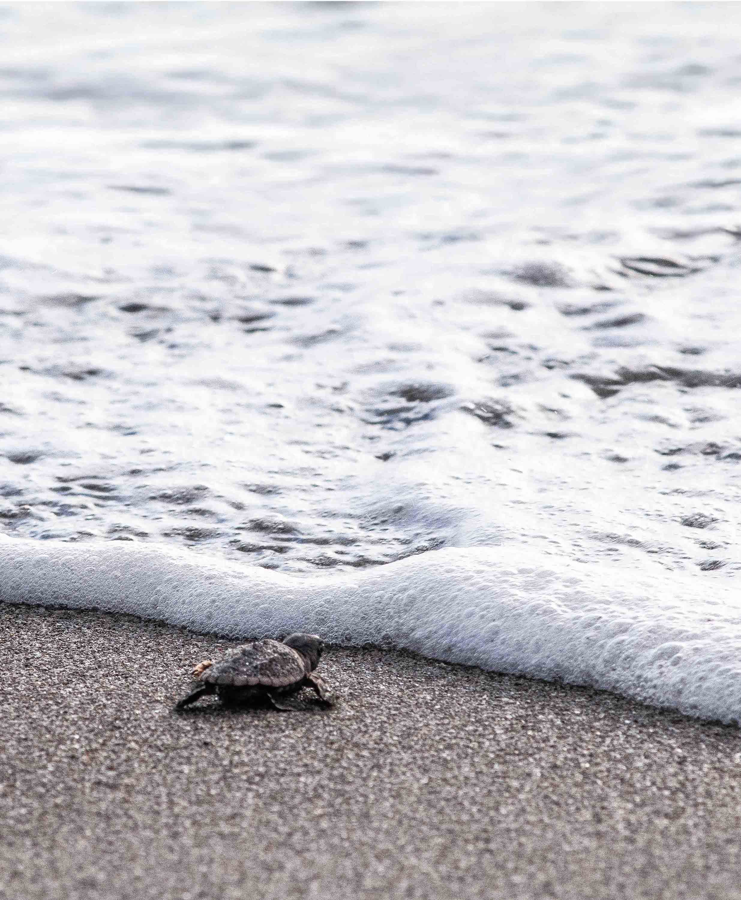
Sep 25 |
Reply |
Just now looking at the vertical I feel if there was more sea on the right side it might me better. But if I keep increasing the sea, the turtle keeps getting small in the image and he is small enough as it is. I have no clue what to do.
I do agree that if there was a time for a butt shot---this is it. |
Sep 3rd |
| 67 |
Sep 25 |
Reply |
Scott
Don't know about your area but in Florida we have a society of turtle watchers and those folks are out on the beaches every morning and evening. They tag each nest and they have estimates of hatch dates. If you make friends with the workers who tag the nest you can get pretty accurate hatch dates from them. That is how I was able to witnessed the hatching two years ago but this year it was just dumb luck.
I thought about the vertical format but to me it just seems the ocean feels more vast when shown horizontal. See attached. I guess it is just a maker's choice. I do understand your point of view and kind of like vertical |
Sep 3rd |
 |
5 comments - 7 replies for Group 67
|
11 comments - 11 replies Total
|


