|
| Group |
Round |
C/R |
Comment |
Date |
Image |
| 36 |
Jun 23 |
Reply |
Hi Bill
Can't take credit for the stitching. Lightroom did that. Just make sure you provide enough of an overlap so the program has something to work with. Pirates huh? Funny, I actually thought of an Aztec temple. |
Jun 19th |
| 36 |
Jun 23 |
Reply |
Hi Diane
Actually there is no road, there is water running down those steps and over the rocks in the center. Getting the focus right really helped with the clarity. I worked on using texture to bring out the detail in the rocks.
Good luck with your stitching... |
Jun 19th |
| 36 |
Jun 23 |
Reply |
Thanks Arne
Guess I'll take you advice instead of Michael's as you are the cheaper option. ;-)
I toned down the far right section before I showed the image to the club.
|
Jun 14th |
| 36 |
Jun 23 |
Reply |
Natural Yellow skies are rare. I've only seen three that I can remember and I've found that people do not believe them.
Shoot directly at the sky early in the morning often burns out the sky. For a shot like this you might try doing a blended image. Take two shots, one for the foreground and one for the sky--layering in PS should be easy. Your RAW adjustments are producing a bit of a halo on the horizon. I've attached a yellow sky from my files as an example of a yellow sky in nature. It is rare. You could try getting a slight angle and using a polarizer to lose some of the white sky thing. |
Jun 12th |
 |
| 36 |
Jun 23 |
Comment |
The first thin I thought about when this opened was Frank Lloyd Wright's house Falling Waters because of the manner in which this is built into the scenery. I like the way the building seems to just float and hang over the scene. I also like the use of the three layers and the strong leading line coming from the left. A nicely seen image. |
Jun 12th |
| 36 |
Jun 23 |
Comment |
When ever I look at an image the first thing I think of is a commanding powerful subject. I think you want the subject to be the rocks but the sky is the brightest thing in the scene and draws me away from the rocks. I am not a big fan of having little slivers of sky along the top edge of a scene. Either it is important enough to include, or it isn't. If it is, than it needs to be larger, In this shot I would eliminate it because it takes away from the rocks. |
Jun 12th |
| 36 |
Jun 23 |
Comment |
I'm so glad to know someone else stops when driving to take picture. I have a bumper sticker that my son gave me a couple of years ago that says: "I brake for Photos". Sounds like you could use one also.
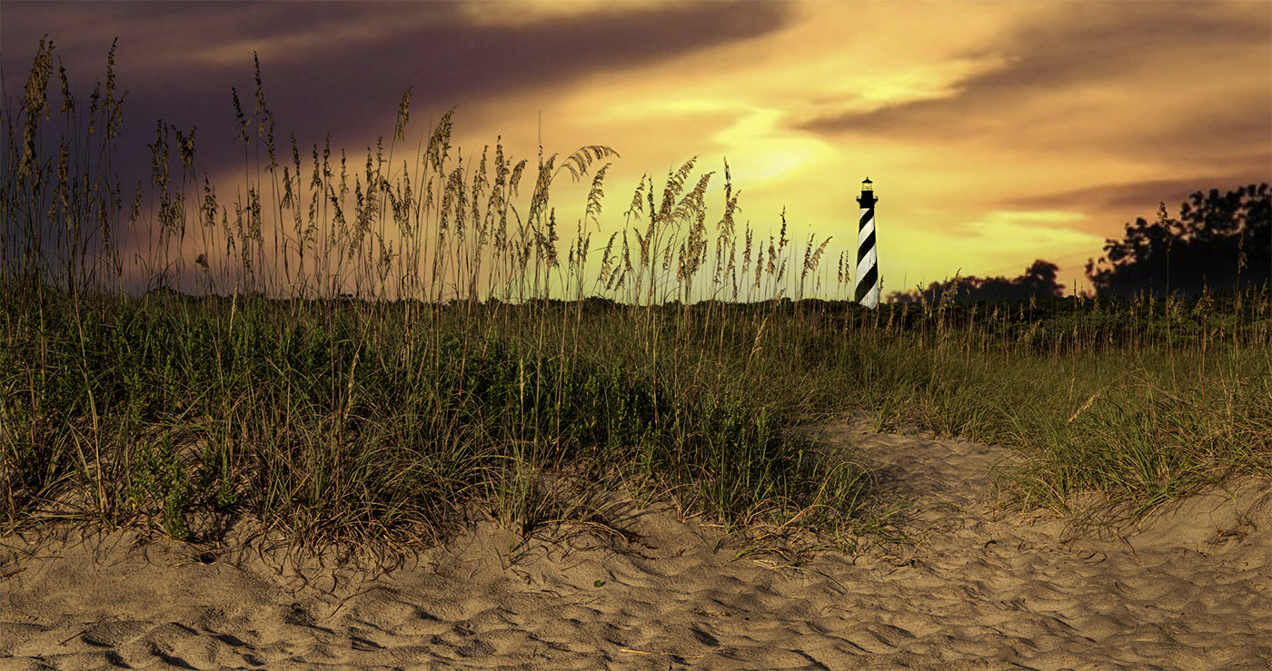
Mountain scenes like this are quite common in the Smokies. I like your two attempts at adding some originality; first by creating a pano as this format tends to add a feeling of vastness to the image and second by creating an eye catching subject by using the lit houses. It was probably good that you added the second house as it increases the size of the "subject" that you properly placed according to the rule of thirds. While I like the lights they somehow feel out of place---maybe artificial? They whole scene seems a bit to much like daylight so maybe the lights are out of place?
|
Jun 12th |
| 36 |
Jun 23 |
Reply |
Thanks Barbara
I did, and they did. My wife and I had a lovely dinner at the club last night, reserved seating, valet parking included. The display faces a main road but I drove to the entry gate and asked the guard if I could park just outside the gate while I took pictures. I presented him with my card and he said just to "Knock yourself out." I was there for about 45 minutes. I have some other shots that maybe I'll post from next month. Never hurts to ask
|
Jun 10th |
| 36 |
Jun 23 |
Comment |
First I am so glad you kept that bright spot that is almost visible in the upper left corner out of the scene. I seldom find a sky that can carry an image on its own, but this one is close. The blues and the orange (the more correct compliment of blue) bring this to life and even more so with the reflection. Together they almost produce leading lines to the vessel and I love they way they seem to flow into curves. In the end the star of the show is the white boat. I feel it is the contrast between the blues and the orange and the white boat that make this work. That white boat just jumps out as the viewer while the black spots on the right bring visual balance to the scene. |
Jun 4th |
| 36 |
Jun 23 |
Comment |
Just so you know...I have Apple TV and from my computer I am able to project my screen to my 60" TV screen. I like viewing my images on that screen. I took a moment and projected this image on the screen in my darkened room last night. Simply WOW! With the image that large it feels like one is right there drifting in a small boat approaching the landing near the falls. The mist and the lush greens create and enchanting scene. I want to put on my rain jacket. While Adi suggested warming this up I like the cooler feeling. I feel there is more mood in the gloom. It is amazing how much that little white of the falls stands out in the full scene. I very much like this. |
Jun 4th |
| 36 |
Jun 23 |
Comment |
Very Nice (especially since you remained on the outside. While this is a fine old building I feel your composition really goes along way toward bringing to life. Your choice of putting the building on an angle and featuring the more interesting vine covered corner in the forefront was a good one. The diffused light from the cloud cover also works quite well in your favor. The sharpness of the image also brings this to life. You should go back and try it again on October 31. |
Jun 4th |
| 36 |
Jun 23 |
Reply |
Thanks Adi
I take no credit for the stitching----that is all Adobe's doing. Lightroom does a really great job so much easier now than years ago when I had to do it by hand. |
Jun 4th |
| 36 |
Jun 23 |
Reply |
Thanks Michael
You are absolutely correct. I turn the lights down on those trees on the right. I missed that. I have an appointment with the marketing director for the club on Wednesday. They have bought some of my images before. I posted one back in August of 2020. Thanks for your help. If they buy it consider a check for your consulting services will be in the mail. |
Jun 4th |
6 comments - 7 replies for Group 36
|
| 67 |
Jun 23 |
Reply |
Thanks Cindy. The wing position did cause some shadow problems and was a bit noisy. I didn't like what the denoise created and I tried several times with different settings and still didn't get anything good.
The only sky issue I have is that sharpening created a black halo line on the left edge of the raised wing.
I also like this wing position. |
Jun 21st |
| 67 |
Jun 23 |
Comment |
First thing I noted was the large spot in the sky on the original. When I switched to edited version that spot is still visible. I would suggest cleaning that up.
I like the peeking appearance of the mountain coming through the clouds, that part was well seen and captured.
I feel in your conversion that you have lost the range of tones. There is no detail in the mountains. Perhaps increasing contrast and adjusting the white and black points would put somelife into this image.
|
Jun 11th |
| 67 |
Jun 23 |
Comment |
Nicely done. I noted the complimentary colors of the blue sky and the yellows in the flower---even that little bit makes it easier on the eyes. The image is sharp. I think your choice of settings is right on. ISO 800 is certainly not too much for these modern cameras and the result passes the visual test as I do not see enough noise to be worth mentioning. I've come to expect technical excellence from you and this does not disappoint.
At first I thought this was a Flicker but then realized it lacked the reds. If I would suggest anything it would be to maybe crop this as a vertical moving in a bit from the left. But maybe since this is a big crop already itmight be best left alone.
Either way, it is a fine image. |
Jun 11th |
| 67 |
Jun 23 |
Comment |
I feel Michael is spot on when he mentions the change in crop. Getting rid of the "stuff" in the upper corner is good and since you are going for a pano look anyway cropping the bank water from the top is perfect. The real problem with the contrast issue I feel starts with the over exposure of the body of the adult swan. There is simply no information in those pixels making up the swan. Notice that when you tried to make adjustments the body just became a sort of "funky" gray and that even when you lowered contrast you still gained absolutely no body detail. I know you are shooting in bright light and your camera cannot handle the dynamic range between the brightest white and the darkest black so have have to make adjustments in the field with your camera settings. You should have your highlight warning setting turned on so you can avoid this issue. At least with Highlight warning turned on you would know that there are overexposed areas so you could fix them. I would suggest taking a test shot first. then when you see the problem you can make the adjustment before you take the final image.
The composition for this scene works quite well and I like the intimate feel that is presented. |
Jun 11th |
| 67 |
Jun 23 |
Comment |
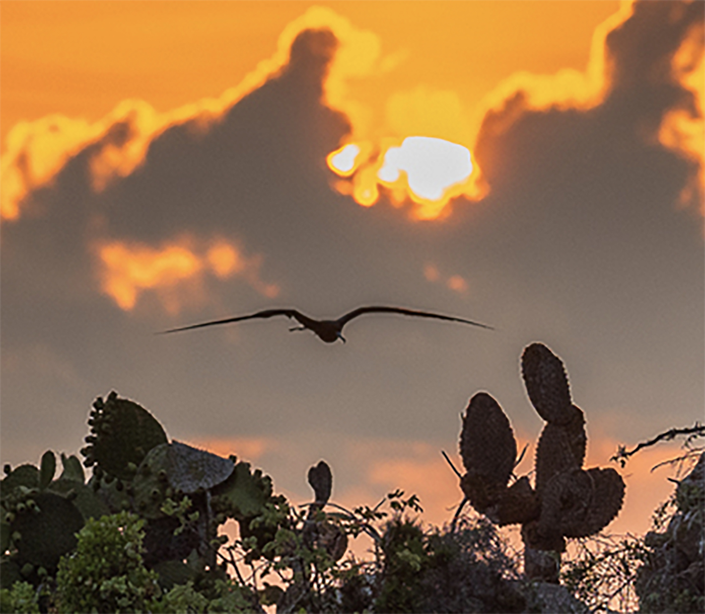
I'm sure it is wonderful to take home a sunrise image from the Galapagos. But for me I keep asking exactly what is the subject? The frigate bird is a grand touch, but he is almost lost with all the other elements of the scene. For that it the issue, there are many elements within the scene that could make an amazing shot, but when jumbled together nothing seems to take command. I hate huge crops (just because I love pixels and the more there are the happier I am) but for me I'd go for a something like what is below.
I'm a fan of using long telephoto lenses for landscapes especially when the compression capabilities of the lens are used. So I liike images when this is put to use. |
Jun 11th |
 |
| 67 |
Jun 23 |
Reply |
Susan
This is a discussion forum. We are here to learn so questions and answers are what this is all about. Don't worry all is good. For sure your crop in the above image is really way too deep and will magnify errors. Camera movement is a major cause of a loss of sharpness. You have introduced three types of movement. Bird movement,camera following the bird and you not holding the camera rock steady. That is why shutter speed is your best friend. Using a monopod with gimbal head is second. long focal lengths also magnify even little bits of motion. |
Jun 10th |
| 67 |
Jun 23 |
Comment |
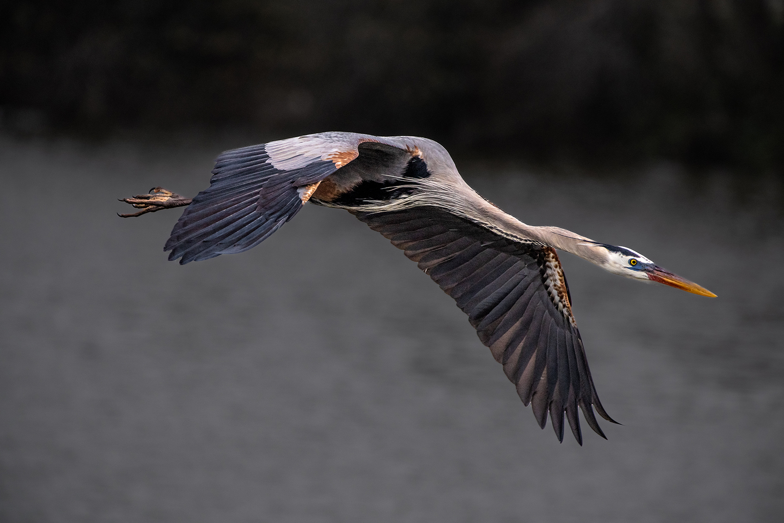
Hi Susan
This is an Great Blue Heron I took in 2022. It won a PSA Bronze in a Nature Competition. This is considered really sharp but not over sharp. Shot with my Nikon D850 with NIKKOR 200-400 F4 lens with a 1.4 tc--focal length 500mm
ISO 800, F5.6, 1/2500 camera on monopod. Bird was tracked and panned on the flyby. Image was in fairly low light. There is some noise in the shadow areas but not visible unless you enlarge and pixel-peek. The image is 7500x5000 pixels and there is only a slight crop from the original 8100x5100 pixels in the full frame. Note the detail on the bill, the neck feathers and the legs. This is about as good as it gets.
I did not remove all the noise because noise removal will soften and image and I desired sharpness. I removed what is considered to be visual noise. Could I have removed more noise? For sure. But it was not necessary. Apparently the judges agreed. You will never get this degree of sharpness if you severely crop an image. The fact that I tracked and panned the flight of the bird as it flew toward my position meant that my focus was really locked on--my focus point was the bird's eye. The camera was set to a group of 9 focus points which help to maintain tracking. I shifted the focus point to the right side of my viewing frame. Most people keep their focus point in the center of the frame and this will mean that they will crop the image for composition purposes. I do not want to lose those pixels.
Any questions, please ask. |
Jun 10th |
 |
| 67 |
Jun 23 |
Reply |
OK Susan
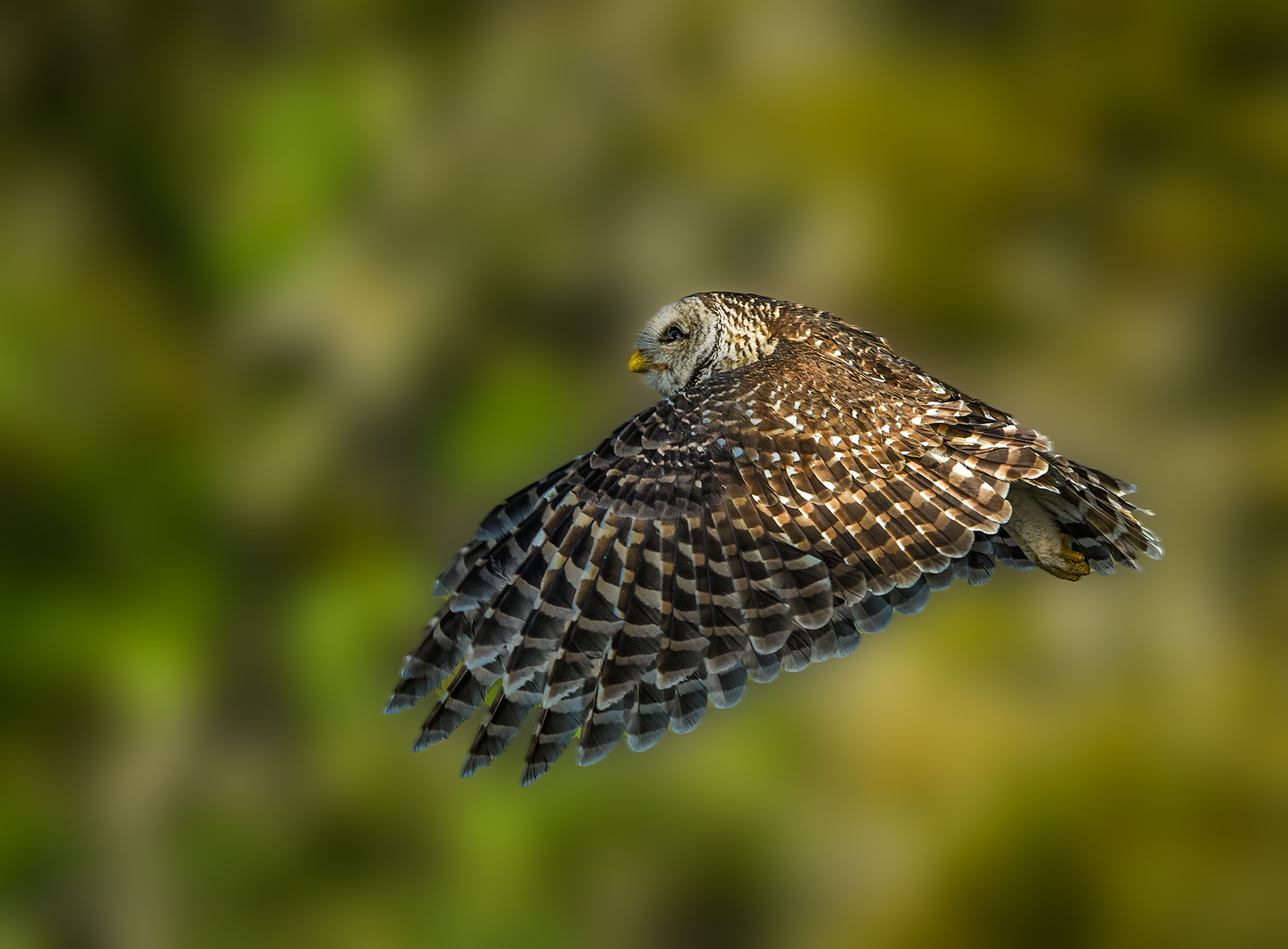
Here is a sharp owl. Note the fine hairs on his face,the detail in the neck feathers, the talons and the small wing feathers. This was shot with my D850, 200-400 f4 Nikon lens at 400mm. ISO 800, f6.3 shutter speed 1/2500 camera mounted on a monopod while in a boat. There are 8100 pixels horizontally in the camera frame, I cropped this to 7800 pixels so almost all of the pixels were used. This is how you get a sharp image. There was minimal sharpening done in Lightroom (not the new Lightroom.) |
Jun 10th |
 |
| 67 |
Jun 23 |
Reply |
Agreed he is doing nothing but having the eye is a plus. Still he is not sharp top start with. What was you shutter speed and ISO, how much did you crop?
No one likes to hear it because everyone thinks sharpening can save the image, but if you are cropping more than 30% of a full frame image you are going to be in trouble. That is a fact. Give me a minute for grab one of my sharp images so you can see the difference. |
Jun 10th |
| 67 |
Jun 23 |
Reply |
Hi Susan
I know where stick marsh is. I can see where it might be good grounds for Snail Kites. I do not get there very often just because of the driving distance there and back---a bit far for one day. Climate change is raising water levels here is south Florida. The whole state slopes to the south so we have the greatest impact from rising waters. Everything south of the Port Saint Lucie cross state canal is having trouble. South Florida is actually an island.
OK, here is some clarity for a "newbie" trying to learn. Generally you are right, ONE of the TELLS of over sharpening is the white halo. What sharpening actually does is add a thin black line to the edge which actually does not sharpen the image but visually defines it. Thus it tricks your eye into thinking it is sharp. Advanced programs like Topaz and many others have refined their programs to identify more than outside edge lines (like a bird silhouette) and now they add that thin black line to inside edges as well (now think feathers, eyes and so forth.) Adding these lines, especially if there are lots of edges receiving this line produces an image that begins to look crisp, almost plastic. I think the new Lightroom over process the large feathers on the tops of the wings and this lead to Michael's "fake" comment to which I agree.
If the image has to be greatly enlarged to see a problem then the viewer has gone too far. If you enlarge any image enough you will see all kinds of issues. Remember the entire image is made up of tiny little squares so there will be problems if you over enlarge. The Lightroom program did add that black line on the front edge of the wing.
The image you adding does carry the tell tale white line, but it is not as bad as other images I have seen. But the image itself is not critically sharp to begin with and no amount of sharpening is going to save it.
Hope this helps. |
Jun 10th |
| 67 |
Jun 23 |
Reply |
Really? Where were you when you saw these birds? They used to be in abundance in south Florida but not any more.
Thanks for commenting. |
Jun 10th |
| 67 |
Jun 23 |
Reply |
Thanks Michael
That was my thought as well. I was not really impressed with the new software but thought I would seek other opinions. For the record, the sky is compliments of Mother Nature and the Kite who chose to fly into that spot. I've never used Luminar is it a full editing program (stand alone, non destructive) or some sort of add on? |
Jun 10th |
5 comments - 7 replies for Group 67
|
11 comments - 14 replies Total
|


