|
| Group |
Round |
C/R |
Comment |
Date |
Image |
| 36 |
May 23 |
Reply |
Thank you Bill
The stitching was really easy. I started with a general edit on a image from the center and then copied those edits to all the images. After that Lightroom did all the work. When shooting I overlapped each shot by 1/3 so there would be plenty of overlap for the software to match up. Shooting vertical also helped so I would have enough image at both the top and the bottom to get the rectangle shape. When you first merge there is some curving on the two sides. Making the final local edits took a long time. |
May 17th |
| 36 |
May 23 |
Reply |
Thanks Barbara. I agree that the sky added a great deal. Finding the right spot to take a pano was hard because the entire scene would have to be interesting. I had to remember that people would view the whole thing, but they would also get closer and view only a 6 foot section. It was like having to set up pictures inside a picture. Just a different kind of challenge. |
May 17th |
| 36 |
May 23 |
Reply |
Correct, this is 6 vertical images taken from right to left and with enough overlap to make the panorama possible. |
May 9th |
| 36 |
May 23 |
Comment |
Good grief, you put a great deal of work into this image and your efforts were rewarded. I like the framing created by the rigging lights plus the lights on the dock and the golden light makes the queen look a bit regal. I do wish that single bright light on the right edge were not present as it keeps drawing me away from the queen.
A very well planned and assembled image. |
May 9th |
| 36 |
May 23 |
Comment |
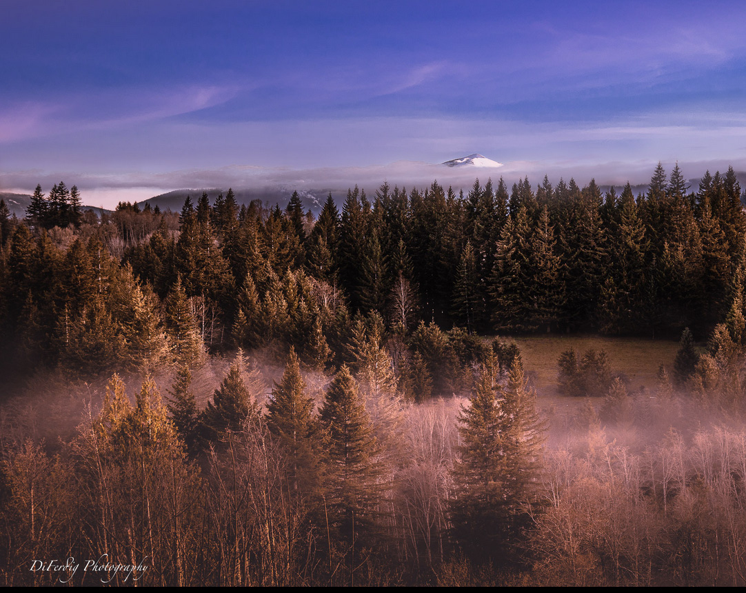
I find this to be a most calming and natural feeling image. I like the early morning fog and the soft golden/orange light of the new day. I can feel myself walking into the scene and being at one with the environment. The blues of the sky and the orange/yellow of the foreground work well as to create complimentary color palette. I believe your edits work and this does not feel over done. However I feel cropping out the buildings on the right would make a big difference. This is such an inviting nature scene that the hand of man comes across as a harsh intrusion. (See suggested crop below) There is a pleasing diagonal line stemming from the bright trees on the left to the mountain peak in the center that works well. I do with there was more of the mountain peak, it just seems so small. I'm wondering if that could be addressed in post? |
May 9th |
 |
| 36 |
May 23 |
Comment |
I've been told many times (often by fellow judges) that a sky cannot carry an image. Most of the time I agree but I think this is a bit different. I would argue that the subject remains remains the lighthouse, even though it is nearly a silhouette, and this image reaches of level of a minimalist composition with a very limited color palette. My support for this is the tones of the sky are nicely reflected in the foreground waters. Additionally the pastel colors of blue and orange are the true complimentary colors and are themselves pleasing. I feel the two diagonals formed in the blue sky on the right point toward the lighthouse. I like this very much.
If you could have taken a second shots with a longer shutter speed to flatten the foreground water and then used layers to replace the rippled water foreground of the original with the flat water of the second image it may have elevated this image even more. |
May 9th |
| 36 |
May 23 |
Reply |
Thanks Michael. I agree about the reflection being a bit bright. I did it intentionally since the water is such a large area I was afraid it might make the wall seem too dark. I actually showed both versions to the client and they opted for the brighter one. |
May 7th |
| 36 |
May 23 |
Reply |
Thanks Arne. This was a huge project but the client is happy and I'm being well compensated. |
May 7th |
| 36 |
May 23 |
Comment |
Capturing popular monuments like this free from people is most difficult but you have done a nice job of handling this. While looking at this I was struck by the way color and contrast brought out, what to me, is a strong double subject. The surrounding dark tones make the build a clear choice for the subject, BUT the white light striking statue of Lincoln sets the President off as an eye catching subject as well. The more I look the more attracted I am the Lincoln.
As a side note, I've photographed this building several times but none of my photos feature that green tint- I find that interesting.
|
May 6th |
| 36 |
May 23 |
Comment |
The thing about B/W is that once the color is removed the eye is drawn to structure and texture. In addition the light is soft and there are no hotspots. Altogether you have a great deal working for you. I also think that the bare trees with their vertical lines match nicely with the vertical lines of the barn. You also have a pair of strong diagonals in the roof lines that work to separate the subject from the background. I don't think those lines would be as strong if this were in color. I can see where you may think this is just a shot of record, and it does have that kind of fill the frame feel but in my opinion the use of the art elements of line, texture and contrast make this something special. You also did a nice job of processing this to bring out the details. |
May 6th |
5 comments - 5 replies for Group 36
|
| 58 |
May 23 |
Comment |
A classic comparison. i love these timeless images. Just remember the old vehicle utilized horsepower, but so does the new vehicle. |
May 4th |
1 comment - 0 replies for Group 58
|
| 67 |
May 23 |
Reply |
Richard, you are so right. Like you I study my subjects and know their diet, habits and the nuances of their lifestyle. Thus we can get shots that nature experts will note and appreciate while novices will miss these details. We get shots that please us because se know exactly what to look for. I wish you many more years of capturing shots like this. In PSA competitions I am always amazed how little some of the judges know about nature. It is always a great pleasure to work with the judges that are nature pros. I really wish there were more of them.
When we spend hours waiting for the shot sitting in a canoe of hiding in a blind the rewards are just wonderful. Keep shooting. |
May 18th |
| 67 |
May 23 |
Comment |
I DID go back to get the tripod. It just seemed prudent to wait a bit and I knew he would not eat it.
As for the eye -- I wanted the eye to be hidden. That is what makes the story and it shows how the gator hides to fool his prey. In regard to the duckweed floating in the water---that is just the way the everglades look this time of year That stuff can carpet the swamps for miles. Nature does not have to be perfect, but I can see your point, maybe it is a distraction. Check out the image below and you can see how thick the duckweed can get. It is not a great image I just keep it to show the duckweed. It is not a good nature shot. When the water is covered like in this image that is when it is really dangerous because the gators are present but the water is not clear and you really can't see them when they are submerged. This is a good time to stay home and eat popcorn. |
May 13th |
 |
| 67 |
May 23 |
Comment |
I've been coming back to this and the other images submitted this month and giving them a second look.
The thought that has been running through my mind constantly is this image is just not exciting and I've been trying to figure out why. I think I have come to the conclusion that it is two things. First there is the softness of the bird and the washed out detail. But I think the biggest thing is all that foliage. Michael says he likes more space and there is something to be said for creating the environmental portrait, but all those ordinary green leaves are just boring. There is a lot of them and they are not adding interest. There are no lines, patterns just greenery. I guess what I'm saying is that background and foreground matter and they must compliment the subject, not overwhelm it. Any thoughts? |
May 12th |
| 67 |
May 23 |
Reply |
How right you are. We have them everywhere. Once I had one in my pool. And you are right if you see them they usually leave. I also agree this is all about the story. I think Bud's comment is great. Say he had to look hard to find the gator--that was exactly the point. I also agree that gators never look good straight on---you need that angle. Thanks for the comments.
|
May 10th |
| 67 |
May 23 |
Reply |
Thanks for your thoughts Cindy. I agree that experience really pays off her. Studying your subjects not only is good for safety but understanding their behavior yields better shots. I'm really glad that you liked the framing I wanted the viewer to feel uneasy.
This photo almost made it to my trash bin just because of that eye issue. I thought that f8 would have provided enough DOF. What saved the image was I remembered Michael Nichols, a National Geographic photographer had a cover photo of a partly blurred Indian Elephant charging him. He said the elephant nearly attacked him but turned aside as he ducked behind a tree. He said sometimes the story is more important that a perfect technically sound image. Here I felt that the proximity of the gator, and what I felt was a clear story was more important. So I kept the shot. As for working with my model, I don't think he was too happy with the fee I was willing to pay. |
May 9th |
| 67 |
May 23 |
Reply |
I don't mean to sound "preachy" but many beginning photographers do not pay attention to composition. They are quite worried about capturing the all important subject. Photography is sort of like serving a gourmet meal. You can't serve a classic meal on a paper plate. You have to consider the background just as much as the subject.
I would suggest that you consider the PSA online course Image Evaluation. It is only 6 lessons spread over 12 weeks (a bit more time if you need it) and will really help you understand what makes a good image and how to prepare to obtain one. |
May 5th |
| 67 |
May 23 |
Reply |
Hey, how come this bird is facing the wrong way? :-) |
May 4th |
| 67 |
May 23 |
Comment |
The introduction of all the AI technology seems to have everyone going back to the archives and revisiting old images that just didn't quite make the grade and trying to breathe new life into them.
I've been switching screens now for at least 10 minutes between the original and the new updated submission trying to see what has happened with the passage of years. When I look at the original the whole thing about breeding plumage is the long fine feathers. These have to be captured pin sharp in the original file and then they can be enhanced in the new technology. Try as I might I just can't fine that fine detail in the original and quite possibly this is why you chose to revisit the image with the new AI in your processing arsenal. At least to my eye there does not seem to be enough edge for AI to firmly grab onto to get it sharp. This may be due to the feathers being white to start with plus the fact that the original may be a bit on the overexposed side. I would suggest getting an image of a green heron, a great blue or a tricolor and trying the AI software on those because even it they are a bit soft the variety of colors will help provide some edges that the software may be able to grab onto.
Pictorially the scene is quite stunning with all the contrasting colors and the fluffy nature of the plumage adds a layer of interest. Bringing down the exposure a bit will certainly add pop to the image.
By the way, I've tried several experiments with the new Lightroom and do not feel that it is the magic bullet to cure all the flaws in old images. It is an improvement but not a cure-all. You might want to checkout Matt K on you tube as he has some good videos on this. But look carefully at the quality of the image he is working on before he applies the AI technology. He is making good images better, not make poor images good. |
May 4th |
| 67 |
May 23 |
Comment |
This is a fine environmental portrait that may be a bit long on environment and a bit short on bird. I find the composition pleasing and the exposure to be adequate. It appears that nothing is truly sharp in the image and that becomes a weakness. I will bet that this was taken hand held and holding a 4.2 pound monster lens at 500mm and a shutter speed of only 1/400 is likely the cause of the softness. When photographing birds fast shutters are your best friend. Since your ISO was only 500 this could have been raised to obtain a faster shutter. I would recommend a shutter of at least 1/1000 and more if possible.
I agree with Michael that I would have not softened the background especially since it appears doing so also softened the bird as it looks sharper in the original. Just because the current software makes it possible to select the background does not mean if should be done. |
May 4th |
| 67 |
May 23 |
Comment |
I have long been a proponent of the art of "cropping with your feet" but I have never heard it referred to as having "telephoto feet" a phrase I rather like.
This is a nice moody owl shot as it shows the bird where it really lives, in a world of gloom and shadows. The bird's natural coloring speaks of living in a world of mottled light and the tonal range of the background perfectly shows this. Altogether it creates a beautiful setting. If anything,the background could be just a touch darker to better sell the natural environment.
The dynamic range of the D500 coupled with a fast prime lens for sharpness are the perfect tools to make this capture. The high ISO is handled quite well resulting in fine image.
If anything were to be changed I would like to see just a bit more space just to the right and below the tail feathers to keep the owl from being crammed into the frame.
I'll look forward to seeing yummy owl upchuck in future images. |
May 4th |
| 67 |
May 23 |
Comment |
I feel this is an excellent and well composed and processed image. While there are no clouds (you don't need them) the pick blush as has been noted adds just a hint of interest to the sky so that it is not void of detail. The best part here is the sharpness and the perfectly frozen wings. The raised position adds a bit or (pending) motion to the scene which is pleasing. Personally I would not add and space anywhere. I really like the subtle diagonal rising from the lower right and onward to the bird. At first I thought of cropping some from the bottom but that would ruin the diagonal that adds real strength to the image so just leave it as is. It is a nice tropic scene capped by a dramatic bird about to take flight. |
May 4th |
| 67 |
May 23 |
Comment |
Even though I am definitely NOT a male snowy I can certainly recognize the beauty of the female of the species. i will note that the young lady in question went a bit heavy handed (or heavy winged--is that possible) in the use of her rouge pot. But I'm sure she thinks she is lovely (an ornithologist would disagree). If the day featured decent light as you say then the settings are not back. The whites are not blown out (that is the most important part) and the overall exposure seems fine. Your 280 ISO is low enough to retain quality and as you note noise is that a factor as there are really no dark areas to worry about. Shooting at f4 with a prime is do-able since the bird is in a profile position with wings folded and is thus not a "deep" subject. The high shutter speed is never a problem with birds becasue of their natural movement. You can never have too fast of a shutter.
My issue is with the composition. For what you have in the original image you have cropped it to the best possible composition and I do not mind seeing the bird in the center as it is nicely framed by the contrasting leaves. There is adequate space at both the top and on the left side. The issue is the bottom of the frame. The bird is all squeezed together and with her body pushed against the bottom of the frame it feel like something is missing and she is crammed into the frame. A bit of green below her would complete the framing. Additionally the breeding plumage includes the feathers on the top of the head and the neck as well as the tail and all that is crushed together and we miss out on seeing it.
Since this young lady is truly tall and graceful and looks her best when she extends her neck to its full length and points her bill skyward I feel you would have had a better breeding plumage image if you had captured that extended neck position. For the image you have this is the best you could show and it looks quite nice. |
May 4th |
| 67 |
May 23 |
Comment |
At first glance this looks lovely--kudos. Then I looked at the original and I came up with a question? They aren't the same image are they?? In the original the bird's head is facing more to the left and not as much toward the camera as is shown in the submitted version and the dragonfly wings are displayed differently. This doesn't really matter in this forum but if it was submitted in a competition it would be disqualified. The only reason I noticed was because I do not know this this species and when I looked at the original I noted the top of the head was darker--looking more "dusky" than in the displayed image.
Now just looking at the displayed image this is really quite nice. It has a strong nature story (bird and prey). The bird is sharp, but not over sharp and as a subject it is well separated from the background. The background is soft (out of focus) and has only been darkened a little bit so that it still looks natural. If I wanted to nit-pic I would note that there are a few bright areas on the right in the background but they are not so bad that they distract. Thus this is a truly exceptional image and well not. Nice job. |
May 4th |
| 67 |
May 23 |
Reply |
Very Clever. Well done! |
May 3rd |
| 67 |
May 23 |
Reply |
This shot makes me think of the PSA about not harming any wildlife while taking pictures I keep thinking---WHAT ABOUT WILDLIFE HARMING ME!!! |
May 2nd |
| 67 |
May 23 |
Reply |
Glad I was able to make it back to show this one. I'm not worried in my kayak even the bigger ones have never approached and I don't chase them. But sitting on the ground is more problematic. The floating foliage that the wind was moving was why I left. The water is really clear, and not too deep and I can see bottom---and I keep looking. I also watch the birds they will tell me when a gator is around. This was a lucky shot, hand held and in a controlled hurry. I didn't want to up set this guy. I've been shooting the everglades for decades I actually trained with naturalists and learned from them. For years I volunteered to go out with them and photograph their work and then gave them the images. In turn they gave me knowledge. I still go out with a few of them a several times a year but they are getting older and so am I so we aren't as active as we used to be. It has been some great times. The biggest take away from the experience has been-- don't be afraid to give away pictures and time. It pays off in the end. |
May 2nd |
8 comments - 8 replies for Group 67
|
| 72 |
May 23 |
Comment |
A fine classic portrait of a walrus. I like the detail you brought out in the processing especially the tones in the tusks. |
May 4th |
1 comment - 0 replies for Group 72
|
15 comments - 13 replies Total
|


