|
| Group |
Round |
C/R |
Comment |
Date |
Image |
| 36 |
Feb 23 |
Reply |
Larry Treadwell Larry Treadwell
Interesting you should phrase you comment that way because that is exactly what happened. That sunstar materialized in seconds and lit up everything and then was gone in about 90 seconds. Made for a quite hectic few seconds.
Thanks for commenting. |
Feb 24th |
| 36 |
Feb 23 |
Reply |
Thanks Bill. So glad you liked those bricks when I arrive in the predawn dark I knew I wanted those bricks to be light for my foreground. d I feel they make the image work and without them it would be just another image of a building. |
Feb 19th |
| 36 |
Feb 23 |
Comment |
I do love these golden light type of images especially when the composition includes the elements of art and design. I particularly like the repeating triangle shapes created by the mountian, the trees and the repeating lines of the clouds, mountain and foreground.
I do feel that some of the blank sky at the top could be cropped and some of the flat land on the left side as well.
You might try some dodging and burning to brighten the lit part of the mountain and to darken some of the shadows at the bottom just to add some drama. But if you decide to do this make the adjustments very subtle. |
Feb 19th |
| 36 |
Feb 23 |
Comment |
Finding unusual photographic opportunities while racing down a highway seems to present those AHA moments. My wife and those who venture out on photography outings with me have learned what when I say hang on it means there will be a quick stop coming. Depending on the type of road it may be just a quick stop, or I may be getting out and running to get the right shot. But this is just me.
This is well seen and the rainbow and accompanying rain makes for an interesting image. The image has a strong minimalistic feeling to it which I really like. For me there are two issues. Before I even read your description I thought there was something inhibiting the clarity of the sky, smudged lens maybe? Now I know it was the window. Even if you were not going to stop, what about lowering the window to get a clearer shot? Second, since the image is so minimal then every little thing stands out. My suggestion would be to use a linear gradient to include the road across the bottom of the image and then reduce the exposure of the foreground, and perhaps even additionally lower the highlights or the whites to make the foreground less obtrusive and distracting.
|
Feb 15th |
| 36 |
Feb 23 |
Reply |
Thanks Barbara. Rest assured both the items you mention were carefully planned (starburst and reflection) It was supposed to be a clear sky, I got lucky with the clouds.
The trees are just what they are I had no choices in the matter. I really did not have much choice as to where I positioned myself. Moving to the left or right and I would lose the starburst.
One guy shot with a drone, but said he lost the starburst because the angle was not right.
With the crowd that showed up I was glad I got there early premium spots on the pavement were hard to come by. d I waited over an hour in the cold for the event to take place. In case you don't realize can you tell I really wanted this shot? Drove 700 miles to get there! |
Feb 6th |
| 36 |
Feb 23 |
Reply |
This is an annual event and there were 30 or so photographers who showed up. I was the first to arrive to stake out the spot I wanted. Marked the street with a chalk "X" because we had to more when a car drove down the street. Almost all the photographers took their shots standing either hand holding or with tripods. Three got down on the pavement with me. I used my Platypod with the tilt screen on the D850 so I could sit, rather than lay flat. Most people zoomed in to get a closer shot of the bu8lding while I opted for the pavers to create a mood and get the shadows on the stones. |
Feb 6th |
| 36 |
Feb 23 |
Reply |
Thanks. I spent a great deal of time researching this and then using photopills as a guide I went there the day before to plan out a composition because I knew there would not be time that morning, I had only a 2 minute window whe3n the sun appeared in the archway to get my shot. |
Feb 6th |
| 36 |
Feb 23 |
Comment |
I kind of like the "ghostly" people in the foreground to go with the old building. Sort of feels like the past is alive. With my historian background I do enjoy seeing the old building photographed with respect to their age. I do like the composition, including the stop lights, as it adds a bit to the overall framing.
Is it my monitor, or could this image perhaps be sharpened up just a bit? |
Feb 6th |
| 36 |
Feb 23 |
Comment |
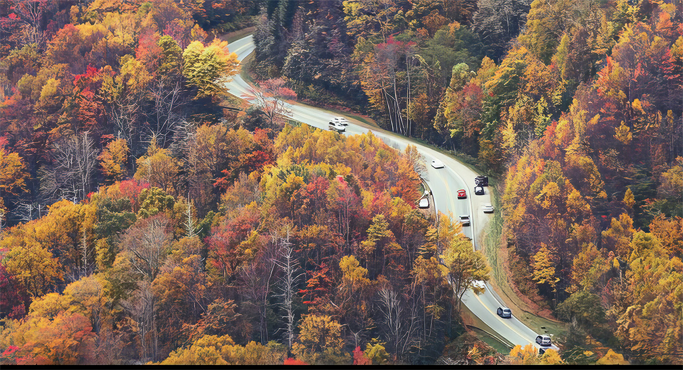
A quite interesting view of an area I've never seen in the fall. I an quite amazed at the number of cars on the road. I think the vertical format is perfect for this shot and I really like the parking area at the top, as it makes a difference look to the image than just a road way. I love fall scenes and this one is unique.
Just had a final thought---what about the radical crop below to keep the image more inline with the "winging road" theme?
However for me I really wish the was more of a connection between the two ends of the roadway. I just do not feel there is enough to carry the story line. I also noted the shutter speed and the overall softness of the leaves . I do not know if it is the older technology or the so shutter but I would very much like to see the trees be a bit sharper. Still, it may be they we are just spoiled with modern gear.
|
Feb 6th |
 |
| 36 |
Feb 23 |
Reply |
I just noticed that you did not include the shutter speed. Do you know what it was? |
Feb 2nd |
| 36 |
Feb 23 |
Comment |
A nice attempt to do something a bit different with the lighthouse. The idea of using the beacon to "light the stars" worked quite well. Sadly this is another of those lighthouses that stands in the middle of nowhere and thus makes composition more difficult. Still the image does convey the feeling of alone in the universe and that adds to the story line. Like Michael's image this lighthouse seems to tilt to the left even though your image is level. Strange how they all seem to have this tilt. Just wondering if you tried to use the walkways in any of your images as leading lines.
For me the lighthouse seems a bit noisy as does the sky, did you try any denoise techniques to clear this up--I know the ISO level is quite high. I would also suggest cropping inward from the left as the large clump of trees somehow makes the lighthouse feel smaller. |
Feb 2nd |
| 36 |
Feb 23 |
Comment |
As a photographer who has spent more time than I can count trying to photograph this style of lighthouse I feel you have done quite well under the conditions you were forced to deal with. These lighthouse are often in quite barren settings and given their height compositions are problematic. To your credit you found some interesting side lighting that adds a bit of drama. I really like the vertical format as with the addition of the sorry tree serves to draw the eye upward. The narrow crop brings out the height By excluding everything other than a place for the lighthouse to stand and a hint of the sea the image has a sort of simplistic feeling and of course has no distractions. I also note you have the same problem I find with this style of lighthouse. Somehow they always seem to look like they are not straight. This reminds me of the lighthouses on the outer banks they stand lonely in stark surroundings and are challenging to capture. This is simple in its own way striking. I like it.
|
Feb 2nd |
6 comments - 6 replies for Group 36
|
| 67 |
Feb 23 |
Reply |
Thanks David. I know PSA won't like the wire, but I like it as part of the story of how these son dogs have adapted to our world. I always try to focus on the eyes. |
Feb 17th |
| 67 |
Feb 23 |
Reply |
Thanks for the idea. I considered you crop idea and decided to apply it. It will take some getting used to but I think you are right. I get lots of shot by concealing myself in brush and being positioned up wind from my intended subject and then just sit and wait. I try to get sources of water behind me and hope they will drift toward it. I have lots of patience. |
Feb 17th |
| 67 |
Feb 23 |
Reply |
Hi Bud. I figured folks would want to know the results of the hunt that is why I included it. This was captured in Great Smoky Mountain NP and the fence is to keep the horses for the trail rides confined. Since there are so many tourists roaming about there are no barbs on the wire. I don't pop up as quick as I used to but I will get down to get the shot I want. I'm just stubborn. |
Feb 17th |
| 67 |
Feb 23 |
Comment |
Well you are certainly setting the the bar high for your future images. This one is quite excellent.
For the record the color blue (especially in the sky) is infamous for producing noise, even on a bright day. This is because of two factors. first area of solid color (skies) produce the appearance of noise because of jpeg compression and second a blue sky can often be close to or outside of the range or gamut of the standard sRGB and Adobe RGB color spaces - the result of this is that the red color channel will be quite dark and noisy. This can be removed using third party software.
I really like the composition mostly because of the extended wing leading to the right. This positioning fills three of the four fixation points withing the rule of thirds format.
As Bud noted PSA rules would be happier if the eagle had a large fat fish in its talons, but regardless this is a wonderful action shot.
The only suggestion I have to offer is that you might consider using exposure compensation the avoid the over exposure of the eagle's head. Those white heads are really hard to capture without burning. Personally I just reduce the exposure so that my eagle images are slightly under exposed and that seems to solve the problem but using exposure compensation works just as well.
You are more than welcome to come to Florida right now (that is where I live). It is certainly warmer here and we have an abundance of birds. |
Feb 16th |
| 67 |
Feb 23 |
Comment |
Strange image. You would think I would look at the baby first---but the menacing eyes are what draws me in. Perhaps because of the angle of the baby's head. It might also be because mom is facing the camera and the baby is looking away and the composition is center weighted. But with the eyes this had impact and it is sharp. I do wish the animal on the left was interacting in some way or facing more toward the camera.
You do bring up an interesting point about darkening the background. It is something that has been discussed in my judges meetings. When you darken the background you change the light. The apes are being pretty much front lit and they are bright, but the background directly behind them is dark. This is impossible with natural light as the light does not fall off that fast. I do not think local judges will notice or care, but international judges will likely find this faked lighting to be an issue---at least that is what we have been discussing. The rules say it has to look natural and that seems to be the sticking point. I know this darkening technique is very popular right not because with the newest versions of Lightroom and Photoshop it is easy to do but the question is, "should it be done"?
Still this is an image I would love to have taken. Nice shot. |
Feb 6th |
| 67 |
Feb 23 |
Comment |
You have a sharp eye to see the rainbow colors that inspired the shot. Sometimes these more intimate aspects of the scene can create exceptional images. After seeing the original I can certainly see you you opted for the vertical crop. The very dense "black holes" on the right side leave little choice.
With the resulting tight crop I feel like this has become more of an abstract image than a waterfall. Personally, I wish there was more of the falls showing either below or to the left so as to have a greater falls feeling to the image. Still, as an abstract it is an interesting composition.
Just for the record which falls is this? |
Feb 3rd |
| 67 |
Feb 23 |
Reply |
I will yield my "doe" thought to the experienced eye of the hunter. So now it is a young buck.
But we can agree it is a fine image of a deer. :-) |
Feb 3rd |
| 67 |
Feb 23 |
Comment |
I'll provide a more through review later but in regards to your two questions Yes the black line at the top is a major distraction. If you carefully line up the top crop so it just barely touches the bottom of the black on the right you still have about enough space on the top. As to the duck on the far left you are certainly better off without him/her. |
Feb 2nd |
| 67 |
Feb 23 |
Comment |
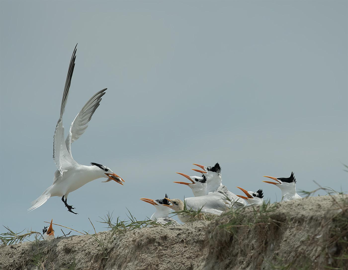
I feel this is an excellent nature story as it is not often that you get to see that many chicks competing for food. All the orange bills lend a great deal of impact to the scene (that color is arresting and holds the eye). In my opinion the composition almost works. I think you should have kept more space at the bottom so that the little guy on the far left would not be forced out of the scene. He really needs some apace below him. I feel the composition is well balanced with the adult looming so large (lifted wings help) and adds visual weight to balance the chicks on the right. The little guy on the left does not count. I also feel that running this through a third party sharpening program would help as the entire flock of birds seems a bit soft. Do you know where you focus point was positioned. That might be part of the problem. You also might have considered increasing the aperture as you didn't need 1/6000 shutter and could have used a bit more DOF. I agree about leaving the sky as in the original. I put this in Lightroom and used my magic settings to sharpen it up a bit. :-) |
Feb 2nd |
 |
| 67 |
Feb 23 |
Comment |
I must begin by stating that I greatly favor images that you a limited color/tone palette. In doing so the viewer does not get overwhelmed by the presence of colors and can more readily focus on the subject. In this instance you have used the camera's aperture to separate the subject and make it stand out. That little bit of pink tongue, along with the sharpness of the eye on the left, is what makes the image pop. d You have even included a solid (although not strong) story line with the doe hiding in the brush. This is an interesting and well crafted nature image. |
Feb 2nd |
6 comments - 4 replies for Group 67
|
12 comments - 10 replies Total
|


