|
| Group |
Round |
C/R |
Comment |
Date |
Image |
| 36 |
Oct 22 |
Reply |
This image seems to be sharper. |
Oct 8th |
| 36 |
Oct 22 |
Reply |
I know tripods are a pain. But mine goes everywhere with me. I use it as a walking stick rather than carry hiking poles. It does not have to be a carbonfiber tripod, as long as you can carry it. I recently got a Platypod. It is not tall but it can be attached to anything with straps. Look it up on the web so you can understand how it works. I use Photopills to check my DOF settings. This is an app you put on your phone. It does lots of neat things. It will show you exactly where the sun will rise or set which helps for composing images.
I know you titled your image Wild Goose Island, but the island was so insignificant that it hardly mattered. I think that is why you image did not have the WOW factor you were looking for. You really didn't have a strong, clear subject that could easily be identified by a viewer and was separated from the background. |
Oct 8th |
| 36 |
Oct 22 |
Reply |
I loved those rain clouds. I saw them from a distance and was racing to get to the lake before they moved behind the trees. There were moving from left to right so I almost missed them. I will dim the glow on the lake. Thanks. |
Oct 8th |
| 36 |
Oct 22 |
Reply |
Thanks for the pair of suggestions. I thought that the shadow area of the trees and their reflection on the water would keep the eye moving to the brighter area of the scene. Still I'll try that gradient you suggest. I actually didn't brighten the area in the lake, but I will go back and make it a bit dimmer.
I like shooting in bad weather. When ever there is snow, rain or other storm conditions I head out to see what I can fine. I firmly believe bad weather makes good pictures. But you can be sure I will not get out when the danger level gets to high. :-) |
Oct 8th |
| 36 |
Oct 22 |
Reply |
Thanks, I missed that bright area in the lake. I'll reduce that bright area. |
Oct 8th |
| 36 |
Oct 22 |
Reply |
Actually I do not think this image is really sharp. It might be the sample size but I think this is soft. |
Oct 8th |
| 36 |
Oct 22 |
Comment |
I agree with many of the others about the general lack of sharpness. To me it looks like the hyperfocus point was missed and that may account for the softness in the background. However I would strongly suggest the use of a tripod for landscapes. The scene is not going to move you have the time to set up a tripod. While everyone thinks they can hand hold slower shutter speeds far too often soft landscapes. Do you have a carbon fiber tripod, they weigh less when you have to carry them on the trail. I feel in your quest for the WOW that you may have pushed the saturation too far and thus have lost the natural color feel to the image. A couple of issues that may have impacted the WOW factor are the distant mountain in the center is a bit over exposed and because it is so bright it immediately draws the eye. The second is that the best landscapes have a strong focal point that the viewer can easily locate. In this you have a beautiful scene but no focal point. Compose for a focal point and then make all the other elements in the image guide the viewer to the all important focal point.
Always remember that shutter speed is your friend. Modern cameras and lenses are made to produce razor sharp images. If that is lacking the image suffers. Modern camera can handle higher ISO levels so do not be afraid to bump the ISO higher. Note that cameras have so many pixels that they will show any flaw in technique. But that is why I like tripods and when possible faster shutters. |
Oct 8th |
| 36 |
Oct 22 |
Comment |
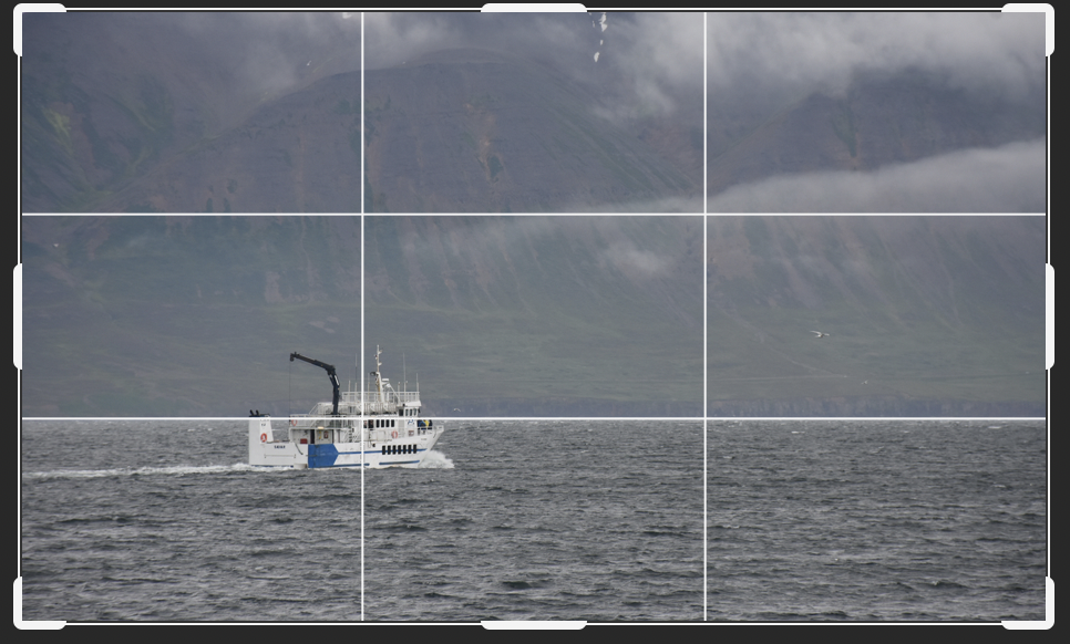
I think, as others have said, that the editing really adds a great deal to this image. If possible maybe even increasing the visibility of the clouds could be better.
For me the bright area of the sky in the upper left corner is a distraction. My suggestion would be to change the crop as in the attached. This also places the boat on the lower right fixation point according to the rule of thirds. |
Oct 8th |
 |
| 36 |
Oct 22 |
Comment |
The Blue Ridge is such fertile grounds for photography. This is a creative and well thought out image. I like the gaps you left in the star trails providing a different look. I think the tail lights also add a nice touch. You used the leading lines of the road, tail lights and the stars to great advantage. While this is a very simple foreground your photographic eye certainly made the most of it. If possible I would love to know the ISO for the foreground and the stars. |
Oct 8th |
| 36 |
Oct 22 |
Reply |
Thanks Michael
Bravery was not necessary The storm was slow moving and I've been wet before. I won't go out if the winds are going to be above 35 mph. That is when the stop running school buses. I didn't darken the sky---hurricane clouds often have the really dark bands mixed with lighter one. I will lower the brightness factor in the lake. Thanks for catching that. |
Oct 6th |
| 36 |
Oct 22 |
Comment |
For me this is all about textures and repeating shapes. To hep with the repeating shapes i might have included those round button in the lower right corner to enhance the round shaped in the upper right sections. I think the soft light serves quite3 well to bring out the textures in the rock. Finally the "s" curved line adds tranquility to the whole scene and provides a strong leading line to bring the viewer into the image. |
Oct 2nd |
| 36 |
Oct 22 |
Comment |
Glad you got your box of paint brushes out for this one. It feels so very much like a painting. There are many things I like about the look of this. For me there is a strong feeling of cohesiveness with the soft look and feel of the front lawn, the softness of the blurred clouds and even the manner in which you have taken the sharp edge off the foliage. what this leaves is a crisp feeling building (even thought it is not razor sharp) that has impact generated both by contrast and color. I like the way the clouds that drift to the right almost look like a royal pennant rippling from the spire on top of the castle.
I know it cannot be helped, but I wish there was a tree on the left to balance the one on the right. That would really add a strong visual frame and balance to the scene.
You certainly spent a great deal of time on this, it shows and was worth the effort. I've missed seeing your excellent editing skills recently. This makes up for it. Well Done! |
Oct 2nd |
5 comments - 7 replies for Group 36
|
| 67 |
Oct 22 |
Reply |
I do like your idea of a mess. Keep it up! :-) |
Oct 28th |
| 67 |
Oct 22 |
Reply |
Thanks Michael. Part of the nature story is about how creatures camouflage themselves in their environment. This is a perfect example. I did lighten the shadows a bit. Should I have opened them more? |
Oct 28th |
| 67 |
Oct 22 |
Reply |
Thanks Frank. I kept the tree stump just to show scale. This little guy literally melts into the sand in a second.. He just fades away. I hoped this would show how well the crab blends into his surroundings. |
Oct 28th |
| 67 |
Oct 22 |
Reply |
Thanks Cindy. When taking this the intent was just to capture the crab, no deep thinking on my part. On the computer I love the textures and the repeating oval shapes you mention, but capturing those shapes was pure luck. I had more tree trunk, but when cropped I kept this amount because I wanted to show the scale of the crab. |
Oct 28th |
| 67 |
Oct 22 |
Comment |
Sorry for the delay in making my comment. I've been traveling and many of the places I stayed did not have dependable internet connections.
First---what a wonderful seasonable image. With Halloween right around the corner this is perfect. I fully agree the bright branches had to go, they are a major distraction. I think the feeling of night comes across well, at least at first glance. The casual viewer will buy into this completely. However, to really "sell" the image I would suggest the following. At issue is the light. The owl is sitting outside with the light seemingly coming from the left. Perhaps making the left side of the bird slightly brighter, and then losing the rim light on the right side of the bird would make it a bit more realistic. You also might consider giving the high lights, just a tinge of blue to increase the feel of moonlight. Still, with this crop you image certainly sets the stage for the time of year. |
Oct 28th |
| 67 |
Oct 22 |
Comment |
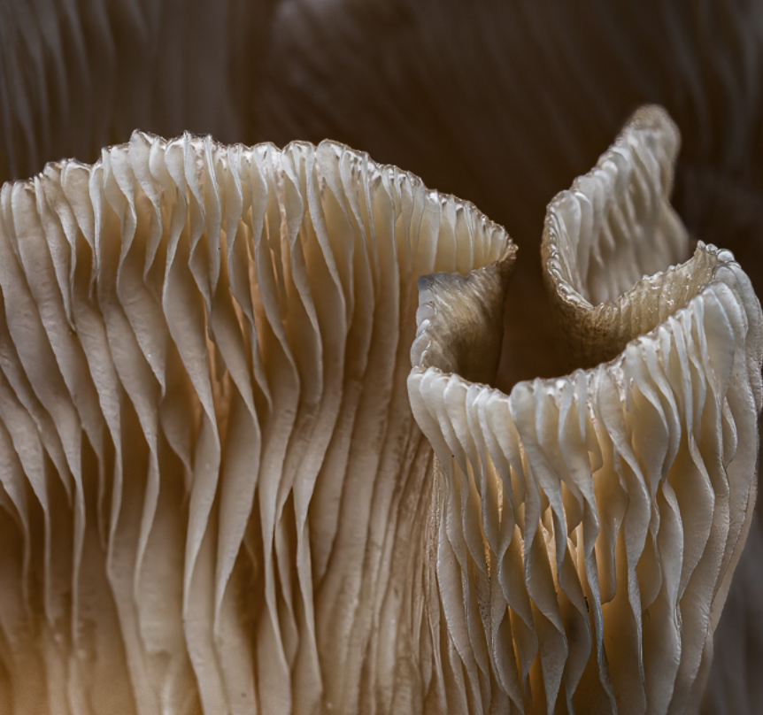
This can be an interesting abstract type image. I think trying to keep it simple and avoid distractions will help give it more interest. I like Cindy's crop or as an alternative my crop below. Both try to make the image clean and simple. Personally I do like the sharpness of the fungus rather than to soften it, but that may end up being a maker's choice. I absolutely do not like the extra piece in the lower left corner. |
Oct 18th |
 |
| 67 |
Oct 22 |
Comment |
Attention all those who review this image!!! Michael has earned several merit badges and awards for his efforts in capturing this image. Sir Edmund Hillary would proudly pin the medal on Michael. The slide down to the falls is difficult enough, and I'm certain that Michael was worried he was not going to make it back up at some point. It is a real Smoky Mountain Adventure. I'm certain Michael's recounting of the adventure will be more harrowing as the years go by! :-)
You were certainly there on the right day. The flow is quite full and you did a great job of framing and capturing the might of the falls. I think your settings were about perfect for the flow and the light. I'm a bit surprised to see that the "third" falls on the right didn't have more water since it was spring.I think your image on the Treadwell scale easily deserves a 10. My only suggestion would be to crop down a bit from the top to eliminate some of that bright eye catching area just above the head of the central falls.
You also did a fine job of processsing this. I'm not a fan of vignettes but that is a maker's choice.
Just to encourage you to go back you should know that When the falls is heavy with water and there is a lot of mist and some afternoon light there is a double rainbow that forms in the pocket between the falls on the left and the one in the middle. Now you have a reason to go back. :-)
|
Oct 3rd |
| 67 |
Oct 22 |
Reply |
I think your "tweaks" worked pretty well. The eye is much more visible now and that helps. |
Oct 2nd |
| 67 |
Oct 22 |
Comment |
This is a really nice catch. Snowies are great subjects since they are always fiesty. I use a camera with lots of pixels so I always back off a bit the the composition just in case they do something like this just to avoid that clipping thing. Still this image has lots of action and you did a really nice job not blowing out the whites.
In wildlife images capturing the eye is most important. You might try opening the shadows on the lower birds face and enhancing the eye just bit to bring it out more. Generally having bright areas on the edges of an image is not desirable. To that end you might tone down that area in the upper left corner.
I also like and note that you achieved your goal of obtaining some dramatic light. The fact that the light is a bit warm is even better. The lighting is well done. |
Oct 2nd |
| 67 |
Oct 22 |
Reply |
Thanks Isaac. I'd rather be lucky than good! :-) |
Oct 1st |
| 67 |
Oct 22 |
Reply |
Awesome capture! Right place and right time. That is a large bull gator for sure! |
Oct 1st |
4 comments - 7 replies for Group 67
|
9 comments - 14 replies Total
|


