|
| Group |
Round |
C/R |
Comment |
Date |
Image |
| 36 |
Jun 22 |
Comment |
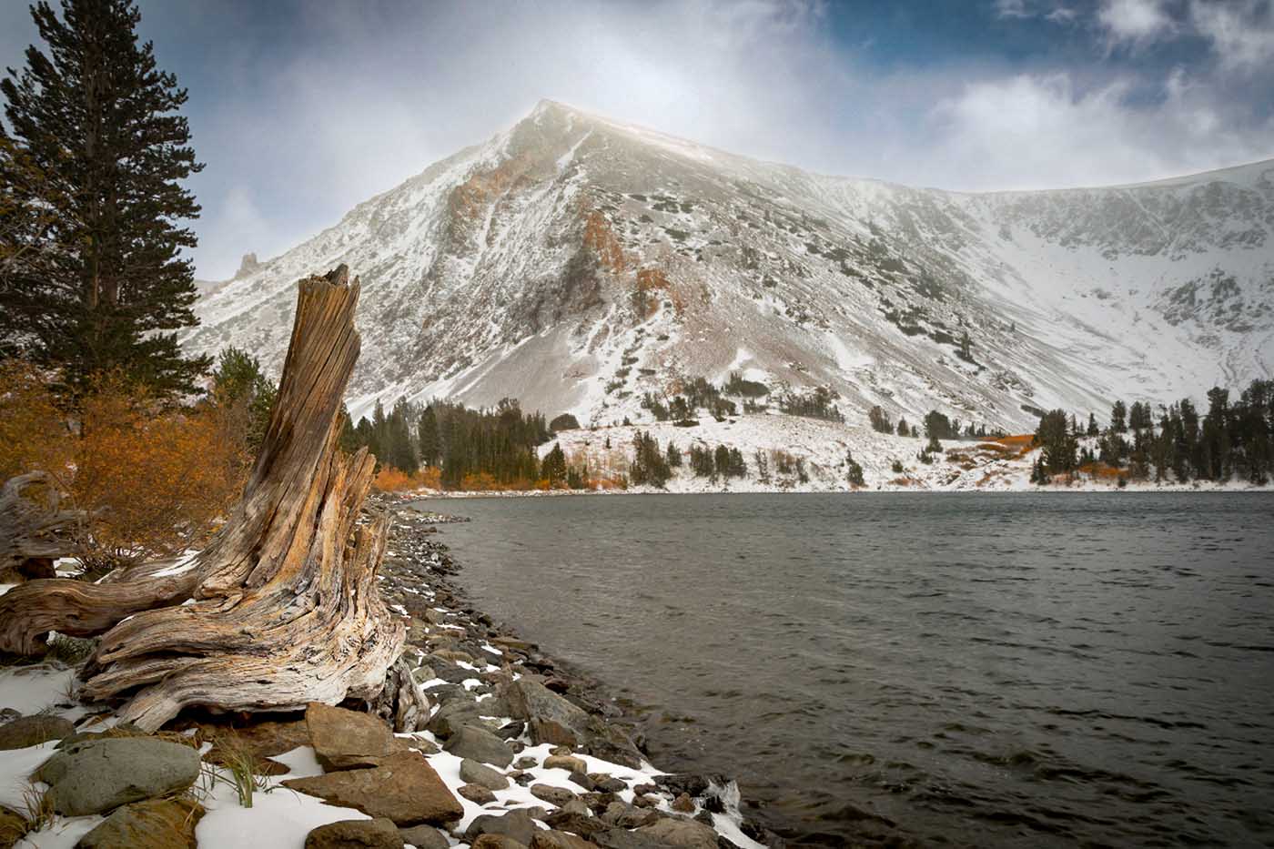
This is a scene that brings back memories of old hiking trips through the mountains.
Based on the title I thought you wanted the subject to be the tree but I felt the tree blended into the background. So I made a few quick edits. I lightened the tree to make it stand out a bit, and darkened the bright earth at the base of the big tree. The I selected the sky, added some dehaze, and contrast and a tinge of blue. All this I thought brought the tree into more prominence. At f16 I would ahve thought that the camera would be at infinity and thus the trees would be a bit sharper.
The part that I can't figure out is why the trees at the base of the mountain are so blurred. |
Jun 14th |
 |
| 36 |
Jun 22 |
Reply |
Thanks for commenting Richard. That is the exact problem I had. Everything I worked to get in the frame depended on the wide image as I shot it. Glad to see someone agrees with me. :-) |
Jun 13th |
| 36 |
Jun 22 |
Reply |
Thanks Barbara. After seeing the wide view, the square does feel tight. I've tried cropping from the right and keeping the left but then the boardwalk begins to look odd. It is the strange diagonal in it. You are Arne may just be right and the crop from the right could be where I end up.But even a big crop from the right, still leaves the lighthouse in the middle. So much to consider. Thanks for your help, all the contributions made here are giving me something to think about. |
Jun 13th |
| 36 |
Jun 22 |
Reply |
Thanks Arne. I was likewise drawn to those warm and cooler colors as they, as you noted are complimentary. I thought they added something original. I am sort of leaning to a crop that gets rid of the building on the far right. They really are not helping and is likely were I will end up. |
Jun 13th |
| 36 |
Jun 22 |
Reply |
Michael, first regarding my "commitment" to photography. I've always been a careful planner and have been accused my my camera club of just being too slow. What really made the difference was that I got involved with PSA's education division and have participated in writing 2 courses and then teaching those courses along with a third course. The courses are Image Evaluation, Image Critique and the third is Creating Images for PSA Competitions. In trying to teach PSA members how to go about planning and capturing an image and seeing how little of this was actually applied to students creating images it made me look for different ways help them and this lead to inspecting my technique as well. All this self inspection has lead me to examine my own technique and thus create better images. For the record,students who take these courses and complete them are making remarkable strides in improving their own images. I strongly recommend that EVERY PSA member should look into taking at least one of these courses. There is currently about a have dozen of really dedicated and talents instructors helping student to improve their work.
Actually capturing those tones on the building was done by adjusting exposure (I tried to get them to show)and they were not created in post. Cropping this was a really challenge, I tried moving the light house to the left or to the right but as you noted the walkway became a problem. That was why I created the square crop. In that I did reduce the brightness of the sky as you suggested.
In the end, I'm still not satisfied. |
Jun 13th |
| 36 |
Jun 22 |
Comment |
When I first saw this image I thought of Halloween and figured you were a couple of months early. From your description I knew this was taken fairly late at night and thus that bright area is the moon. It looks like you tried to dim it a bit but all you succeeded in doing was making it look grey and so it looks a bit fake. Regardless, the brightness of the moon weakens the overall look of the image. More on the moon later. You do not indicate if the building was light painted or it it was manipulated in post. The amount of light on the building, especially the area under the overhang, makes everything look quite unnatural. As Arne suggested some type of dodging and mostly burning might be applied to produce a more natural appearance You could utilize some of Lightrooms new masks especially, using the subtract feature, to more accurately work on subtle light shading. I do like the general conversion to monochrome. Finally, i know the moon is a problem as it has wiped out several attempts at shooting the Milky Way for me this summer. I would suggest shooting a separate exposure for the moon and then blending the two images together. |
Jun 13th |
| 36 |
Jun 22 |
Comment |
|
Jun 4th |
 |
| 36 |
Jun 22 |
Reply |
I'm sitting through a tropic depression and all day rain so I played around a bit with your image.
Added a linear gradient to the foreground to darked and add contrast
Selected sky and added denoise, dehaze decreased exposure
Added brush to the water and reduced whites and adjusted denoise. |
Jun 4th |
| 36 |
Jun 22 |
Comment |
Thanks for the tour of Bergen. Turning this into monochrome really increases the impact of the image. The walkway not only makes a good leading line but adds some intrigue to the scene.
May I suggest that you finish removing the branches in the upper left corner.
I see you darkened the sky a bit, but I wonder if the two pools of water could be dimmed a bit as well. They seem unnaturally bright tome. But that is a maker's choice. |
Jun 4th |
| 36 |
Jun 22 |
Comment |
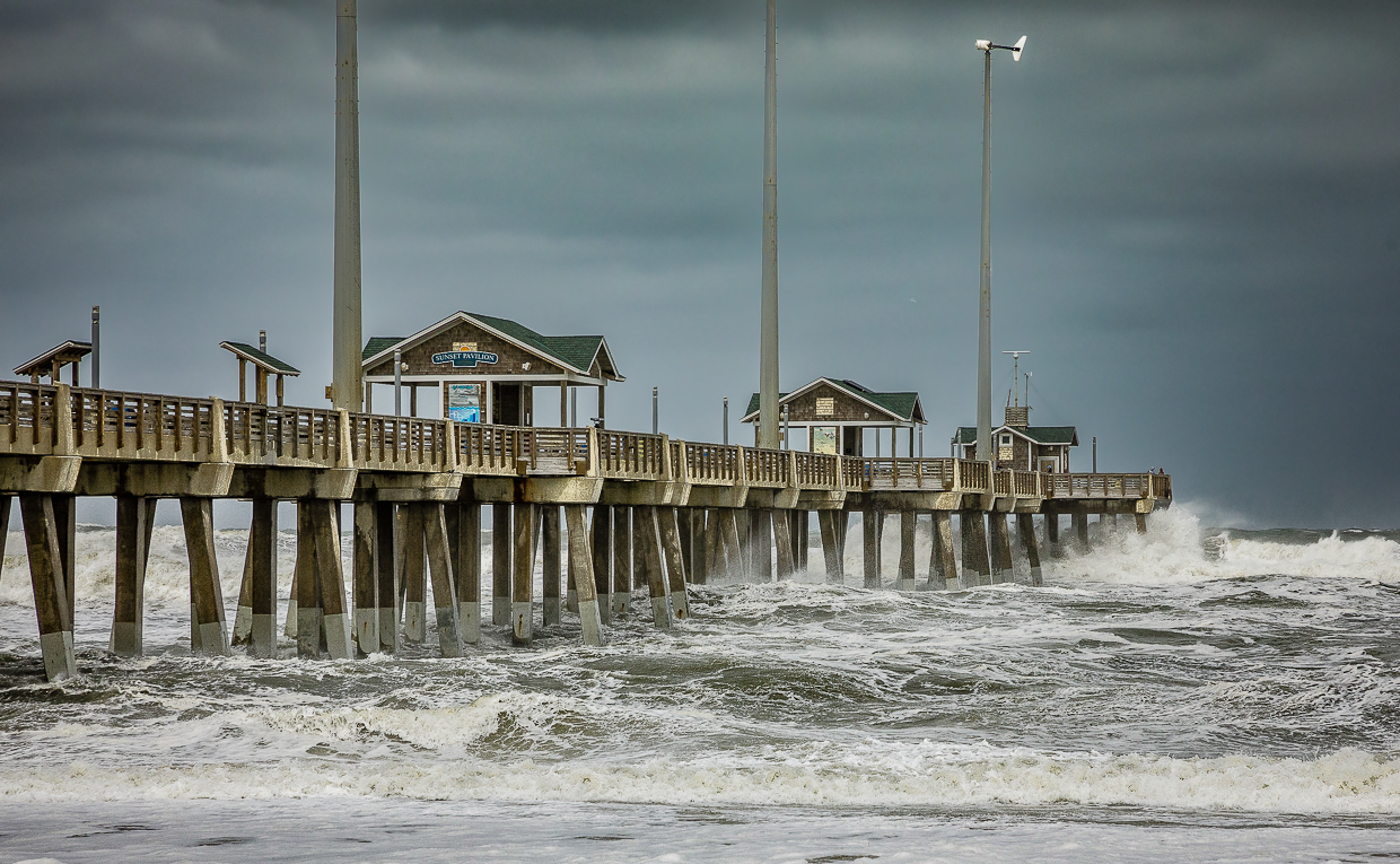
I'll start by offering a quick comment about camera gear. I life about 40 minutes from the Florida Atlantic coast and spend a lot of time photographing piers, rocks and the like during bad weather, I even get out before hurricanes get to violent to get some waves and storm shots. Bad weather makes good photos. To this end I have Lenscoat raincoat for my camera and I purchased a UV filter for my lens. The filter protects against flying sand the raincoat solves the water problem. You can use a trashbag and rubber bands instead of the raincoat. This lets me get out in awful weather and not worry about my gear.
I really like this type of shot with waves crashing and a boiling seas so I think this is a great shot. To me this looks to be a bit hot on the exposure. My first question is did you use a polarizer as the water seems to have some glare on the surface. I wonder if the water could be slightly darkened?
Finally, and this is not your fault, those chopped off light poles seem annoying.
I'll have to see about visiting this pier.
|
Jun 4th |
| 36 |
Jun 22 |
Reply |
I really like the tall building on the left with the black curved lines on the side. It is a rather unusual look for a building. So I'm wondering if a composition could be build using that building as a center piece. Just a thought. |
Jun 2nd |
| 36 |
Jun 22 |
Comment |
First welcome to the group, glad to have you her.e. This is a fine image to use as your introduction. This is something I rarely see---the idea of duotone. It was quite popular some years ago but is seldom used today. One thing I always look for in images is someone attempting that appears original---this does exactly that. Your choice of the two does I feel is excellent because the blue and yellow are complimentary colors and create a pleasing look. I would like to know just how long your shutter was open to get that movement in the clouds. I think it adds a great deal to the overall impact of the image.
You mention the hot spots in the image and I agree that those two burned areas detract from the image appeal. Since you clearly shot this on a tripod why not shoot this as multiple exposures? The hots spots are on the bridge area so taking a second exposure designed to properly expose the bridge and then combine them in Photoshop would be a simple solution. After combining the two images then apply the duotone. You certainly have the Photoshop skills to manage this.
I feel your composition works well with the dark building in the center. The lighter buildings act well as a frame to bring the eye to the center. Here the contrasts you have built into the scene work quite well. I also like the columns of light in the water, they work as a nice compliment to the blurred clouds at the top of the image. Additionally the horizontal blurred water lines in the center of the image mirror the movement of the clouds.
I think you have a really strong and interesting image. |
Jun 2nd |
6 comments - 6 replies for Group 36
|
| 67 |
Jun 22 |
Comment |
First I do not ind the seemingly down hill slope of the image. To me it looks like it is sloping downward toward the water and the birds are walking the water edge looking for a meal. I feel it adds to the story.. But what do I know? :-)
I feel like this a strong capture, well composed and exposed. My only issue is the lack of sharpness of the plumage. After reading your description this is clearly the result of the elevated ISO to 8000. This is a fine image, but not one that would likely do well in a competition because when viewed they would not know abut the elevated ISO and just assume it lacks sharpness.
Personally I wish there was just a bit of detail in the large black head area,
|
Jun 16th |
| 67 |
Jun 22 |
Comment |
This is certainly an impactful image. The sharpness of the image and the bright subjects that contrast with the background creates some drama. I especially like the talons and the eyes. It might be a small thing but the red in the eyes is quite captivating.
This feels to me like it is a major crop and that is impacting the resolution and appearance of the birds.
While all the above are strong positives there is a notable lack of detail in the feathers making the birds seem a bit plastic.
I must confess that my first thought upon seeing this image was that this was a combination of two images of a single bird approaching and landing on the branch.
In the end, this is stunning of a bird I've never seen. |
Jun 16th |
| 67 |
Jun 22 |
Reply |
Thanks Michael. Yes, I have a series of locations that i visit throughout the year Each one is filed in my notebook as to location what types of subjects, best time of day, year and weather for visiting.
Yes this was a very fleeting mat ray of light moment that ray of light was gone in seconds. When the light vanished ---so did the bird.
When I walk unknown trails, I frequently have my camera mounted on the tripod with settings dialed in and the camera turned on. I walk with the tripod legs extended and slung over my shoulder. I can tip it toward the ground and have the legs spread in seconds. Sometimes if I've seen my quarry I move the tripod so it is positioned in front me and held with two hands so all I need do is lower it a couple of inches to the ground and start shooting. It takes some practice but I don't miss many shots. My photography got a lot better when I started doing this. |
Jun 6th |
| 67 |
Jun 22 |
Reply |
This was taken at a rookery on the fringe of a shopping center. This is about as gator safe as you can get in Florida. I've been to this area multiple times for several years, never seen a gator.
Thanks for looking, glad you liked the image. |
Jun 6th |
| 67 |
Jun 22 |
Comment |
Well it looks like your outdoor studio is quite popular. If you get enough clients maybe you can raise your rates and then purchase new camera gear. :-)
Your crop certainly works and you have a nice image. Like Michael I noticed the noise in the original. You clearly tried to reduce this in the processing but then you introduced a second problem ( lack of sharpness) which you then addresses separately. The result is quite "crunchy" looking birds. You have to be very selective in sharpening so that it does not get over done. With birds sitting on a branch you can easily get the shutter down to 1/1000 and that would allow for bringing down the ISO where the source of you problem exists.
I would also offer a second option. Try going to Home Depot and getting a high wattage DAYLIGHT lightblub. Then get one of those cheap worklight bulb holder, the one with the small metal hood. Then take the light and clamp it to a tree branch. If need be use an extension cord. Leave the lamp on and turn it off by unplugging it. The light will not have to be real close to the perch but it will add a bit of fill light that will help light the scene.e birds are
If that branch the birds are sitting on was placed there by you, try adjusting it to give it a bit of diagonal. It will add a bit of dynamics to the scene and be a better composition.
Just my nit picking 2 cents worth. Keep working on those studio shots.
|
Jun 4th |
| 67 |
Jun 22 |
Reply |
I do see all the things you mention. But maybe the DOF make some of this harder to see and requires more effort to see it. Viewers also do not like to work to see the image. |
Jun 3rd |
| 67 |
Jun 22 |
Comment |
If you intent was to capture a "brooding" sky then you achieved your goal. Your final crop is also appropriate as it eliminates the extra sky at the top that does the image no favors. Based on you being on a moving boat I can understand the need for a faster shutter and clearly the dark conditions required the elevated ISO. What I cannot understand is the need for f14. You do not specify what lens you were using but it hardly matters. No matter what lens you used you were certainly shooting at infinity. While some of the water might have been closer, the mountains and the sky certainly were not. You could have easily brought the aperture down to f8 and thus reduced the ISO level considerably and have captured a higher quality image. Shooting landscapes at ISO 2500 is rarely a good idea especially in low light conditions. The elevated ISO has left the landscape void of details. |
Jun 2nd |
| 67 |
Jun 22 |
Comment |
Hope you enjoyed your rental time with the 800mm lens. I went that route several years ago, just to get it out of my system, but I decided if it came to making a purchase I'd settle for the 600mm instead. I will assume you used this on a tripod. I'd be interested in hearing your thoughts on using the lens.
If you original is uncropped then you did quite well in framing and capturing a sharp eagle image. I do hope you were able to get some shots of the banking and turning toward your lens.
I shot a lot of eagles here in Florida (we have over 600 registered active nests in the state) and I hate shooting them on bright days. Getting the bald head without burning the whites is quite difficult. It looks like you have enough detail so you might try using an adjustment brush to bring down those highlights just a bit more. You might also try adding a bit of yellow to the beak. I do like the feather detail that the 800 provided for you.
Your sky replacement worked pretty well and there seems to be no tell tale color fringes showing between the feathers. Personally I prefer the blue sky because the bird is strongly lit by bright sunlight. The dense cloud cover in the sky you choose would indicate softer light and thus the bird should not be so bright--especially the head area. I feel you may have been better served using one of the blue skies with a scattering of white clouds----then the brightness of the clouds and the eagle would be a better match.
In the end, you still have a great full frame image of an eagle in flight from your adventure with the 800m lens. I'm sure yu have stories to tell. |
Jun 2nd |
| 67 |
Jun 22 |
Comment |
This is an image that has a great deal of impact based on color. The blues and yellows, being complimentary, are pleasing. I also feel you used your lighting system to great advantage as the entire image has even lighting throughout which is often hard to achieve when shooting macro. However, for me, this image has an issue with the subject. The angle from which the fly is captured really makes the fly somewhat difficult to identify. Usually the beauty of macro is in seeing the details of the small subject that we are not used to seeing in real life. Here I'm left with a head on shot that does not deliver the detail I expect. Note this is just my opinion based on what I expect from macro. Other I;'m sure will find this much more interesting. For me this carries more of a feeling of the abstract and creative art than it does nature. Please remember I am a naturalist at heart and as such I look for realism in images. |
Jun 2nd |
6 comments - 3 replies for Group 67
|
12 comments - 9 replies Total
|


