|
| Group |
Round |
C/R |
Comment |
Date |
Image |
| 29 |
May 22 |
Comment |
Almost as if there was a fire on the distant shore and reflecting in the sky. I like this quite a bit.
|
May 1st |
1 comment - 0 replies for Group 29
|
| 36 |
May 22 |
Reply |
See my reply to Arne's post and the attached image. |
May 17th |
| 36 |
May 22 |
Reply |
See my reply to Arne's post and the attached image. |
May 17th |
| 36 |
May 22 |
Reply |
see my reply to Arne's post |
May 17th |
| 36 |
May 22 |
Reply |
I've taken the majority of suggestions from the group and redone the lighthouse. This took a bit of Photoshop magic but I've completed the shoreline with waves on the right completing the leading line. I also patched in the waves where the beam from the light burned them out and extended thew ave line completely across the bottom edge. I also darkened the distant rock on the breakwater as requested. Did this all work out to better the image??
Arne. Thanks for your compliment. In answer I do believe you are correct. I do believe taking the time to get the details correct does matter. And yes, this often means taking fewer total images but getting better ones.
I have been working a team of photographers on writing and now teaching a PSA course in creating images for competition. I trying to practice what I have been preaching and in my one work,I have seen a great improvement in my images (the part that matters) and also in the quality of my scores in actual competition. |
May 17th |
 |
| 36 |
May 22 |
Comment |
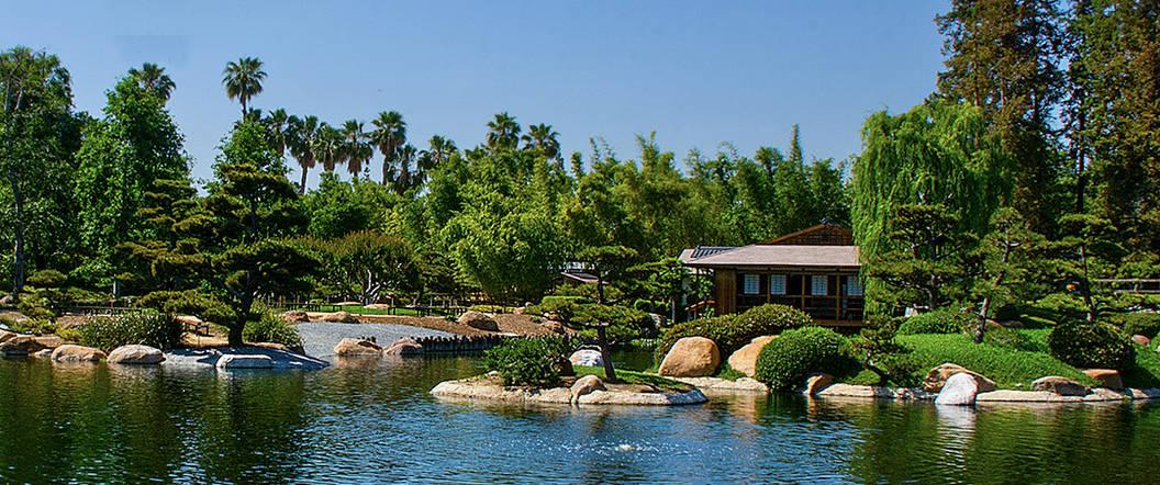
I feel you have ended up with an excellent shot of the gardens. However, as long as you are cropping so much of the image I'd go even further. My first suggestion is about the overall composition. We have so many rules of photography ingrained into our heads they we feel the need to use them. In this case, framing (the over hanging branch) leading lines (the beach in the lower right) and foreground (water plants) that we lose sight of what we are really ta ing a photo of. I'd suggest before shooting ask yourself exactly what drew you to this scene? What are you really taking a picture of? In this case, it is the gardens. So use your zoom lens to capture what you are really trying to photograph and get that shot of the gardens. I don't feel you need all that sky or water in the front. I've included an option to bring out the garden for your consideration. But the finalchoice is yours--it is your picture. |
May 11th |
 |
| 36 |
May 22 |
Comment |
Welcome to the sky pollution era of photography. I see you have captured one of the ring of communication satellites. I get the same one based on it position to the core quite frequently. It is only going to get worse.
You did a nice job of getting pinpoint stars and that always look nice in the photo. You choice of shutter speed was perfect. I also like your two shot approach to getting a finished photo. Often in the dark areas getting a foreground is hard and shooting your foreground before dark is a great idea. Michael's "artistic brushing" idea works well. One suggestion in using it. Before you start brushing take the exposure slider and make the entire image black. Then slowly increase the exposure. Watch for areas where the light begins to appear. then use the brush to play in these areas. Remember your eyes will see light places in the dark that the camera will not. So you really are not cheating just exposing what your eyes actually saw. |
May 11th |
| 36 |
May 22 |
Comment |
I very much enjoy images where the make uses a variety of photo techniques to guide the viewer. You have certainly done this with a wide variety of leading lines, post, wires, pathways, buildings and clouds. This is a well thought composition. The conversion to B/W is also a good choice and it eliminates the distraction of color and forces the eye to look at shapes and lines. Additionally, the B/W adds strength to the subject (an old POW camp) This reinforces the terror and dread that one should feel when looking at this type of subject and adds a connect to the war itself and most images from WWII were done in B/W
One of the things I have most enjoyed about your images over many months has been your skills at processing. I like how you think through the image and use light and shadow to move the eye through the frame. In this area, this image does not disappoint. Well Done!
|
May 10th |
| 36 |
May 22 |
Reply |
I also thought the horizon sags to the right so I put the image in lightroom where I could better test it. The water is level but the higher tree line on the left creates a seeming optical illusian. |
May 9th |
| 36 |
May 22 |
Reply |
Thanks for your thoughts on this image. The light in the lighthouse is a 1500 watt halogen blub this has a yellow bulb but casts a blueish light. (at least according to the literature I read at the lighthouse) With that b right light being aim low at the shoreline it completely blows out the waves. Most light houses do not have an angled beam--the light is either level as it revolves or it just flashes with only a minimal beam being cast. Interesting thought about making the sea brighter. |
May 5th |
| 36 |
May 22 |
Reply |
Thanks for your thoughts on this image. I did remove on lit structure to the right of the building but decided to leave the darkened structure (Light keepers residence) Think I'll go back and remove that building now. As for the water and missing waves. I would have to build the waves in Photoshop because the light on its sweep facing me absolutely blows them out. Neither a long or short exposure made any difference. As the beam comes toward me it is angled low. |
May 2nd |
| 36 |
May 22 |
Comment |
Oh Baby it is cold outside!! This image is positively chilling. The cold blue tones really bring out the wintry feel. I like the leading lines of the pier, the flow of the ice and the distant tree line all lead out to the open sea and take the viewer deep into the scene. I am a fan of minimalism and this has that simple, clean feeling that adds to the chilly, icy cold.
There is not really much I would change other than removing that hint of warmth in the sky on the left. Without that little pink blush the below zero feel would make the viewer reach for a warm coat and hat. |
May 1st |
4 comments - 7 replies for Group 36
|
| 67 |
May 22 |
Reply |
Hope you enjoy the Platypod. I'll have to contact them for a commission. :-) |
May 16th |
| 67 |
May 22 |
Comment |
Since the consensus seems to be that the background should be desaturated I have taken the advice of the many and done so. If I go any further everything just becomes muddy and looks quite unnatural. Hope you all like this. Let me know if you would. |
May 16th |
 |
| 67 |
May 22 |
Reply |
May the Nikon force be with you |
May 13th |
 |
| 67 |
May 22 |
Comment |
Your intent was to show the action of the water and to lead the viewer to the bright area in the distance. This image does exactly that. While the front area is quite bright and is the3 first thing that draws the eye, the water is interesting due to the amount of detail that you captured. The bright water at the bottom is continued by bright water along the left side that creates a fine leading "S" shaped line lets the eye drift toward the back of the scene. and finally settle on the golden light in the distance. The shaded area kept the light soft and adds to the tranquil feeling of the scene. You do not need more trees in the background, the size of the tree trunks tells the viewer that there are big trees back there so there is no need to show them and thus your image rightfully keeps all the attention on the river.
Nice work. |
May 9th |
| 67 |
May 22 |
Reply |
NO! Having more of the trees will just take attention away from the river where the action is. It looks really good just like it is. |
May 9th |
| 67 |
May 22 |
Comment |
Getting classic action shots like this really enhance image quality. This one with the raised talons really helps to tell the story of the image. The fact that the shutter speed was so high enabled you to stop the fast action. Good thing it was left over from the day before. You might consider selecting the upper bird and increasing the exposure a bit. An osprey's chest is quite bright and it would add some drama to the image to have both combatants equally bright. |
May 9th |
| 67 |
May 22 |
Comment |
I think you have done an admirable job of creating an outdoor studio for your model. Clearly they and you are enjoying your time. Just curious---in feet, about how far away are you from the young lady model?
I'm working on a set up for nuthatches along the same lines.
The post work you did adds a great deal and make this scene just come alive. Would it be possible to raise the aperture just a bit? The bird does look a bit soft or maybe even apply just a bit of selective sharpening to the bird?
I hope I get to see more images from your studio. This is a really nice one. One final question---will you switch to ice tea as the weather warms up? |
May 9th |
| 67 |
May 22 |
Comment |
Wishing you had posted the exposure settings but regardless it is a very nice image. Close intimate images always have the ability draw attention and when you can add the cute factor you get a winner.
The only suggestions I have are that you might tone down the bright areas. There is one in the upper left and an even brighter one in the lower right. Since you have already cropped a great deal (at least that is how I interpret your comments then crop a bit more from the bottom. Both of these moves will serve to draw more attention to you subject because then it will remain as the only bright area and together with those eyes you will have a real winner. See the attached for my suggestions. Still, as the maker the choice is all up to you. |
May 9th |
 |
| 67 |
May 22 |
Comment |
Welcome to the group---glad to have you with us.
I'm a poor person to as which is the better image. At heart I am a naturalist/realist and am not really a fan of changing skies and the like. When you first sent this to me and I prepared it for posting the first image I opened was the original. I think the bird stands out from the background and makes a bold statement as the subject. I like the blurred background as it is sijple, offers no distractions and sets off the subject quite well. The little bit of grass at the bottom is so minimal as to not bother me at all and just makes the image and environmental study. If I were to do anything it might be to try sharpening the bird in something like Topaz but not to over do it so that the bird becomes "crispy". Even though I'm a c onfirmed naturalist, I do like the catch light in the eye.
|
May 9th |
| 67 |
May 22 |
Comment |
Glad to see someone else hikes through inclement weather to get to remote site for photos. Well done!! I'm also glad to see someone else using the Platypod to get low angle images. Another well done! This however, does beg an question---did you bring your tripod or just carry the platypod?
Some times Mother Nature just throws obstacles in the path of intrepid photographers---you got the log. On a positive note--it will be there for years so you get the satisfaction other photographers will have to deal with it. :-)
I agree however, that is is just best to give in and work with it. I'm not sure I see it as a leading line as much as I see it as a frame. To that end may I suggest using the crop on the attachment I've provided. To my mind this does two things. The bright area in the upper left corner draws the eye away from the subject so by cropping from the left you emphasize the frame aspect of the log and eliminate most or the eye catching bright area as well.
Your treatment of the falls itself is really nicely done. The water has just enough detail to make it feel transparent and sort of mystical.
Did you use some sort of treatment when processing this image? To me this just feels sort of flat and lacks some contrast. I'm wondering if this is something you elected to do or if there is another reason for this appearance.
I still think the image is well worth the 4 mile stroll.
|
May 9th |
 |
7 comments - 3 replies for Group 67
|
12 comments - 10 replies Total
|


