|
| Group |
Round |
C/R |
Comment |
Date |
Image |
| 36 |
Apr 22 |
Reply |
Thanks Bill. I'm spending more time planning and thinking about shots than I used to and I think it is paying off. Shots like this are easy----I just follow the light.
That rim light on the lighthouse is probably from a spot light that is behind the lighthouse. There a lot of stray lights from buildings and boardwalks that were a real pain to work around. Anyway, I will check out my original and see if I can solve the issue. Thanks |
Apr 17th |
| 36 |
Apr 22 |
Reply |
Thanks for commenting. I can clean of those spots in the woods easily enough. Not sure about the halo. OI know there is a fishing community and a series of piers back in that direction. I'll have to check my original. Thanks for the heads up. |
Apr 17th |
| 36 |
Apr 22 |
Comment |
I like seeing images of forest pathways such as this--they just make me want to wander forever down those unknown trails. Compositionly I like your angle which makes the trees so much more majestic. I agree with Michael that the "barrier" log at the end of the trail does create a visual block, but this would be easy to remove. However, for me, the bigger issue is what you did to the sky. I will agree that what you did makes the sky look better, but the blue color cast that was added to the bare tree branches makes the image look fake and altered. For me that is a game changer. Skies are most difficult to adjust and those fine bare branches are very hard to fix and make them look correct. |
Apr 8th |
| 36 |
Apr 22 |
Comment |
What could be better than a Scandinavian troll in the forest!! Well seen. This sort of image can really work on the imagination and that is a good thing. I feel like your lighting makes the image so much more believable.
For me the moodyness of the image is a bit spoiled by the bright blue in the lower right corner. My eye just won't let go of that areas. Perhaps finding a way to darken that area will put more attention back on the troll where is belongs.
Regardless, I still want to meet this troll. He (?) is awesome. |
Apr 6th |
| 36 |
Apr 22 |
Reply |
Thanks for your thoughts Michael. My composition was inte3nded to create that visual balance using the house and the light to balance the tower. I'm also glad you liked the stars. To push my story of day turning to night I didn't want too many stars and actually spotted out one that was too bright.
I tried to work a blend to get the actually light to shot but at least to my eye and what my skills in PS allowed me to do it just looked fake. I will have a photo net month where I got the light thing to work out. |
Apr 6th |
| 36 |
Apr 22 |
Reply |
Richard
As you noted this was not on the planning board. In fact I was shooting something else when I saw this sunlight materializing and then scurried to capture it. I am quite partial to these night and day type of images. I'm pleased you were able to see and read my intended story. I worked the exposure to get the pinwheel around the light. I've got a better shot for a June.
Thanks for commenting. |
Apr 6th |
| 36 |
Apr 22 |
Reply |
Thanks Barbara
Had the actual weather matched the forecast weather I would have been very busy all night. My plans included placing the north star over the top of the lighthouse and then doing a long star exposure creating a vortex look. I was also planning on some trails creating partial circles on just the top of the tower. I was counting on a full arch of the MW and then waiting for it to turn more vertical and line it up with the vertical tower. I would have also used the rising moon to light some of the buildings. I do have some shots of the beacon when it is not over exposed---they are best captured at twilight or just before dawn. I had planned on overlaying some of the "correctly exposed" light images but they really looked so fake I removed the layer and kept this.
Usually I have enough shooting ideas in my notebook to keep me busy all night.
I'll have another 9image for next month that may vbe more to your liking (at least light wise) |
Apr 6th |
| 36 |
Apr 22 |
Comment |
I have read about these "ghosts" but never seen them. The "revised" image here really does create the "ghostly" effect and is both quite starting and impactive. I like the fact that you chose to use only a couple of the statues and not the entire series.
I think the best part is that you did not just show the original art but used your creative abilities to make your own art.
Well done. |
Apr 4th |
| 36 |
Apr 22 |
Comment |
I really love the colors of these coastal homes on the Outer Banks. I like that each one of them is different. The feel is much like the Art Deco area here in Miami near South Beach.
The fact that the sea seems to be an unnatural color ( it is vibrant) really makes this look like a piece of fine art and not just a photograph. This is a nice job of taking an ordinary scene and turning it into something special.
My only "wish" is that there would be some space between the buildings and the edge of the frame---but I know that in this instance it was impossible. |
Apr 4th |
| 36 |
Apr 22 |
Reply |
This is really a very impactful image. Wish if could have been taken at a lower ISO but since it was a quick grab shot I fully understand. I've added my preferred crop and would suggest that spot out the two birds behind the boat. The large flock in the sun add a great deal to the shot but I feel the ones in the back are so small they could almost be dust spots. Best to keep the final image as clean as possible. |
Apr 2nd |
 |
| 36 |
Apr 22 |
Comment |
Quick, before anyone sees it---crop off the foreground and just leave the water. Shhhhh! Don't tell anyone. :-) |
Apr 1st |
5 comments - 6 replies for Group 36
|
| 67 |
Apr 22 |
Comment |
This is a nicely balanced image. The two cormorants really add a lot. However I feel what makes this work is the clean and neutral background. That makes the subject pop and in that the spoonie is in the red color family it draws the eye. I wonder of you could increase the color so the spoonie is not so washed out. If he had some saturation it would be really eye catching.
|
Apr 19th |
| 67 |
Apr 22 |
Reply |
Thanks Michael.
This is the time of year to get the Great Blues and the Tricolors. The breeding plumage is really special. Good exposure and fast shutters are key. |
Apr 19th |
| 67 |
Apr 22 |
Reply |
Thanks David. I was working on keeping it simple and making the subject pop. Keep the background clean and the colors and sharpness did the rest. |
Apr 19th |
| 67 |
Apr 22 |
Reply |
Thanks Bud
I liked this fairly clean background. I thought the bird popped out nicely. |
Apr 18th |
| 67 |
Apr 22 |
Reply |
Thanks Richard
I have lots of images with the neck separated from the wings. I chose this, simply because I didn't have anything like this. Maybe next month. . . :-) |
Apr 18th |
| 67 |
Apr 22 |
Reply |
Richard
I saw that petal, but solved the problem by cropping it out of the image. :-) |
Apr 9th |
| 67 |
Apr 22 |
Reply |
David. This is the type of shot that I would immediately shoot twice. Once at a faster shutter speed and then immediately dial things down and shoot the longer shutter speed. If I was o n site I would fist shoot the one I thought would be best, but then immediately switch and do the other. I may never see something like this again so I want to get as much as possible.
You are correct, it would be a completely different type of shot. I would certainly try the longer shot because the water in the background on the left is so faint that the longer exposure might make it more prominent .
This is a good example of impact created by the use of color. |
Apr 5th |
| 67 |
Apr 22 |
Comment |
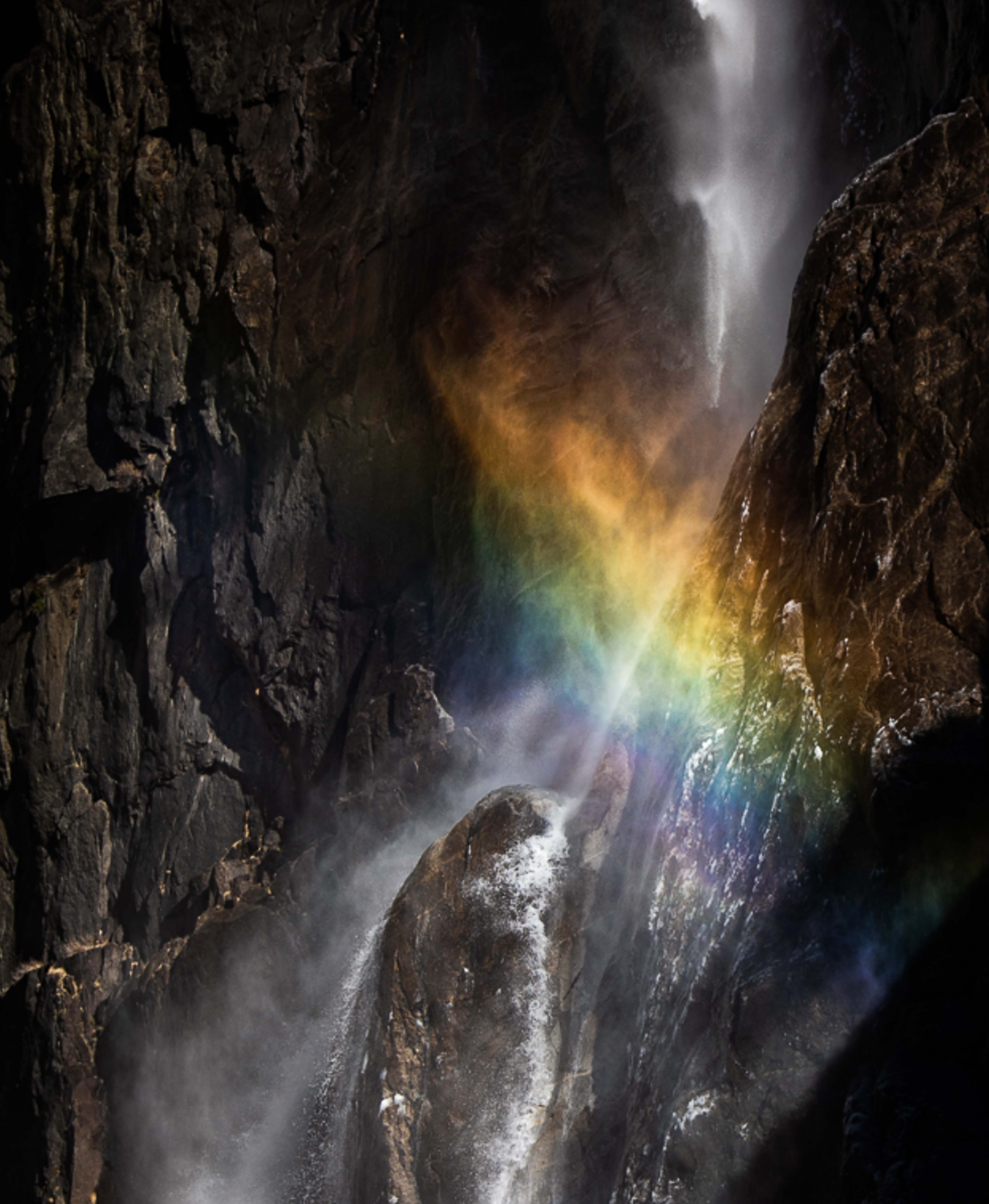
Yes, this image has some impactive punch to it. The gow of the rainbow against the dark rocks is what creates the drama.At fist look I felt that the original packed more punch and so I took some time to look at both in Lightroom.
I've attached a copy with some quick edits to try and increase the drama. I did this creating greater contrast and also using some dehaze. I also played with the whites where some (in the lower area) were rather flat.
I offer my edits for your consideration. I don't claim them to be better,just different. |
Apr 4th |
 |
| 67 |
Apr 22 |
Comment |
Just a quick note to the makers of the Bee images this month. On both of your images I commented that the image demonstrated a strong nature storyline and that made the image a a fine Nature image. PSA nature standards require that to receive a high score a nature image MUST have a strong story line. Both Bee images fulfill this requirement. I stating this to show why the bee images would get a higher PSA Nature score than my bird image shown here. My bird is a nice image of a bird in flight---but it is just a bird in flight and there is really no visible story line. Thus it is a markedly lesser image. |
Apr 4th |
| 67 |
Apr 22 |
Comment |
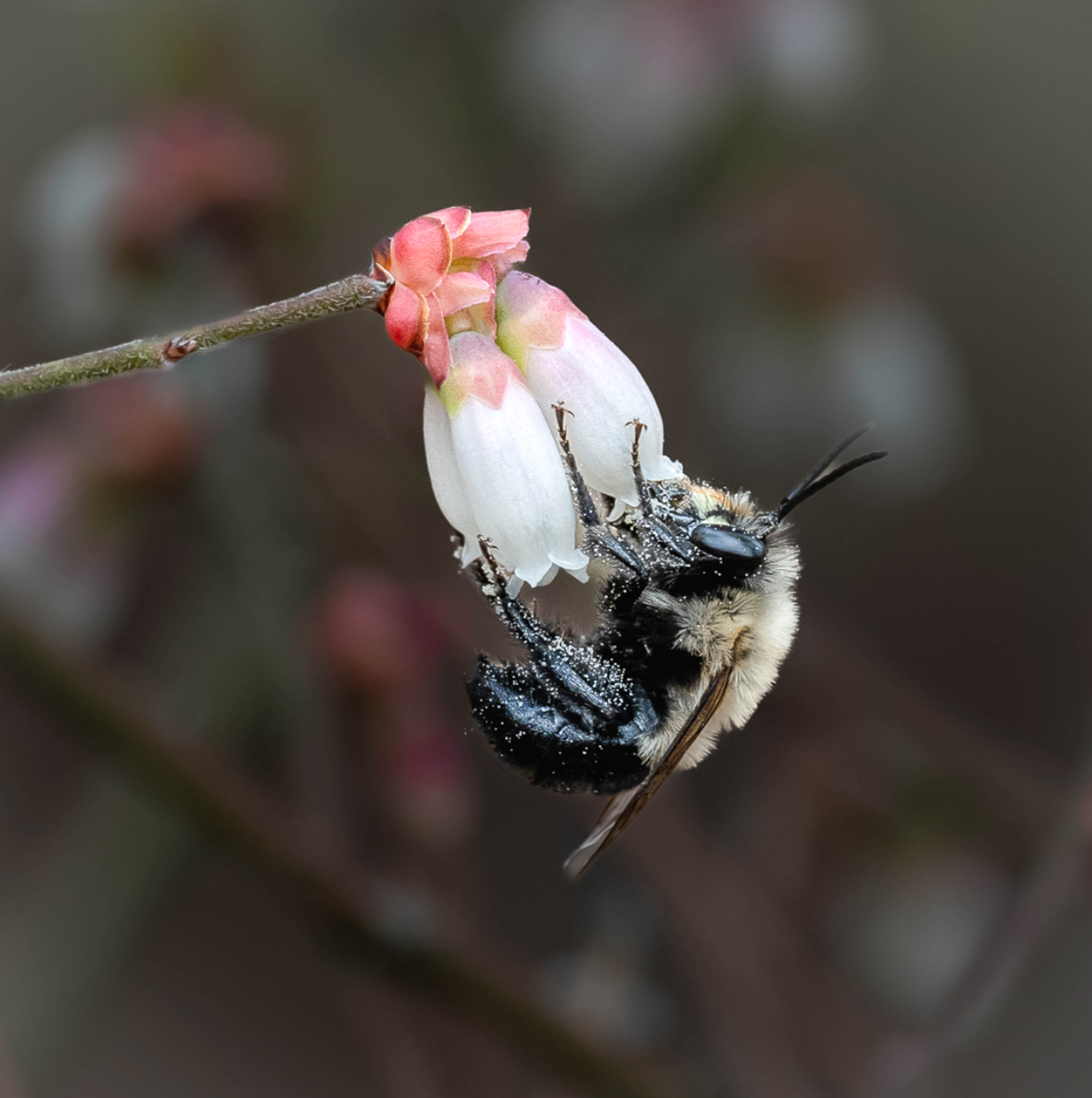
I think you have a strong image featuring a bee coated in pollen. This would pass for a strong Nature image with an excellent story line. For me it looks like you may have sharpened the image a bit much. The white flowers in the foreground appear to have a bit of "crisp"over cooked appearance. I am also offering a slightly different crop to help keep the eye focused on the subject--the bee. Fir me there seems to be a great deal of white at the top and the bit of black in the upper corner is a distraction. I also tried to remove that shadow area in the lower right to help keep the image clean and reduced the large white petal in the lower left for the same reason.
This is a good nature image. |
Apr 4th |
 |
| 67 |
Apr 22 |
Comment |
This is a very nice nature photo because it contains a strong nature story. It is beautifully sharp where it needs to be and for the most part the background is nicely muted. This would be an over the top image if you have been able to get all those bright spots out of the background and thus have completely neutral background. As shown it is a lovely image and you did the best possible with what you had to work with.
After thinking a great deal about your background I did some playing around to see if I could change the impact. In my attachment I reduced the exposure of the background and also reduced the background highlights to dim those white areas. Then I slightly increased the exposure of the subject so as to create more contrast against the darker background.
I don't know if it is any better than your original but it is different.
You still have a well done image. |
Apr 4th |
 |
5 comments - 6 replies for Group 67
|
10 comments - 12 replies Total
|


