|
| Group |
Round |
C/R |
Comment |
Date |
Image |
| 7 |
Feb 21 |
Comment |
I really like the "feel" of the water on the plant and the color of the flower is complimented by the background adding much drama and power to the frame.
But for me this lacks sharpness. I need to see more than just a couple of sharp water drops. I need part of the flower to hold the water drops. I would humbly suggest using a higher aperture setting to obtain great depth of field with damaging the background.
Any thought on this? |
Feb 9th |
| 7 |
Feb 21 |
Comment |
Hi
I just dropped by to catch the pending storm. I feel you have an excellent idea and perspective to making this capture. i enjoy the progression from the rugged beach to the crashing waves and to finally the threatening sky.
Having been in this situation myself, I can feel the excitement you are going through trying to make this capture. I feel the image needs an anchor point. It is sort of like looking at the Grand Canyon and pointing your camera at the scene. How can you miss? This is the same idea. The image needs something for me to attach to. I keep looking everywhere to find a place for the eye to fix upon. I want to feel your vision, but I want you to show me what makes this scene gripping. If it is the sky, show me more sky and show me that special cloud that is dynamic. If it is the waves crashing , then take me to the crash and make me feel crushing power from the sea. I want you to tell me where to look and what to feel. Any thoughts??? |
Feb 9th |
2 comments - 0 replies for Group 7
|
| 10 |
Feb 21 |
Comment |
You have a great title and an image to match. Very clever. This type of creative work is becoming a more common in modern photography and I really like how you created and composed the scene.
The only flaw is the halo appearing on the dark rocks on the far left. That is a tell tale sign of manipulation and degrades the image. If you could make an adjustment there it would match the stellar work you did blending the hand with the sea. Just my 2 cents worth. |
Feb 9th |
1 comment - 0 replies for Group 10
|
| 11 |
Feb 21 |
Comment |
I really enjoy your composition and the strength of the lines that guide the eye through the frame.
The conversion for me lack impact. I feel the abundance of greys makes the image feel "muddy" and would prefer to see some truer blacks to produce shadow and add depth. Perhaps more of an Ansel Adams zone approach to the conversion. |
Feb 9th |
1 comment - 0 replies for Group 11
|
| 14 |
Feb 21 |
Comment |
Tom
You did a nice job of blending these images but I'm going to agree with John about opening the shadows. As originally shown the eye drifts to the sunset and almost ignores the city. Opening the shadows will allow the eye to roam through the image.
Since the eye travels to the light and the bright would you consider cropping some of those white areas from the upper sky? They do draw the eye from the rest of the scene, |
Feb 5th |
1 comment - 0 replies for Group 14
|
| 15 |
Feb 21 |
Reply |
Hi Joan
I was not suggesting that the 4th wind turbine HAD to be cropped it was just a a suggestion. Quite often when I shoot landscapes with a wide angle lens I will then switch to a telephoto and try to capture several parts of the scene and turn them into images of their own. I do this because mentally something drew me to the scene. Sometimes I think I know what drew me in, but sometimes I wonder so i take multiple compositions. In this scene I can see an image of the 4 windmills, I can see an image of 3 and I can see an image of 1 (the single as a horizontal, and a vertical). This type of simplistic image offers many possibilities and I don't want to skip the one I may end up liking the best. The comment was offered as just something to think about. |
Feb 26th |
| 15 |
Feb 21 |
Comment |
Very interesting. In my opinion this has a great deal of Impact. The stark white blades contrasted with the dark tones in the rest of the frame certainly
draw the eye and due to their placement in the frame the eye is prevented from moving.
Just a passing thought, have you considered cropping the turbine on the right completely out and positioning the remaining three as per the rule of thirds? Then you would also incorporate the rule of odds thus adding more strength to the image. Any thoughts??
|
Feb 5th |
1 comment - 1 reply for Group 15
|
| 18 |
Feb 21 |
Comment |
What an impactful, original and well composed image.
I feel right there, I can feel the sweat and an adrenaline rush as I struggle to overtake the leaders. I don't ind the lack of space between between the handlebars and the other bikes, I feel like I'm gaining on them. Your co0mpositionhas shown me the opening I need to overtake the leaders, I hope there is time before the finish. . .
All your processing choices paid off.
If you have not entered this is a competition I wish you would. This is absolutely gripping. |
Feb 9th |
1 comment - 0 replies for Group 18
|
| 20 |
Feb 21 |
Comment |
A very powerful and dynamic image. This is well done, but I could do without the "dust" in front of the lead image.
I might be my eye, probably is, but I have the feeling that the racer is going up hill. The wall is fine, but not the racer. Can you slightly rotate his layer to level the field?
What do you think? |
Feb 9th |
1 comment - 0 replies for Group 20
|
| 27 |
Feb 21 |
Reply |
I firmly believe that the maker is always right. Pardon me. |
Feb 9th |
| 27 |
Feb 21 |
Comment |
As so many others have noted there is such a thing is reality level and visual level. Since you viewer was not present at the capture all they know is what they see. It is generally preferred to make an image visually level so the your viewer feel comfortable. |
Feb 9th |
1 comment - 1 reply for Group 27
|
| 28 |
Feb 21 |
Comment |
Your efforts were well rewarded. I like this composition. Might I suggest increasing the whites of the sky area an make the stars more visible? Doing so may also make the image feel colder. |
Feb 9th |
1 comment - 0 replies for Group 28
|
| 36 |
Feb 21 |
Reply |
Glad you liked the results of my edit.
I used the temperature slider under the White balance, but you could also use the COLOR GRADING panel and play with the adjustment for highlights |
Feb 22nd |
| 36 |
Feb 21 |
Comment |
Since Michael has already covered the sky issue, I won't go into that aspect of that e image. I will note that a polarizer is almost a must for good landscape photos.e
You have used the concept of creative composition quite well and the strong leading lines lead to your subject. All this is quite good. The fact that you have limited the amount of sky in the frame is also a positive.
In my opinion, the foreground is so massive that it makes the rock formation at the top feel like an after thought. While the light on the formation is quite nice I do not think it is enough to pull the eye upward quickly enough.
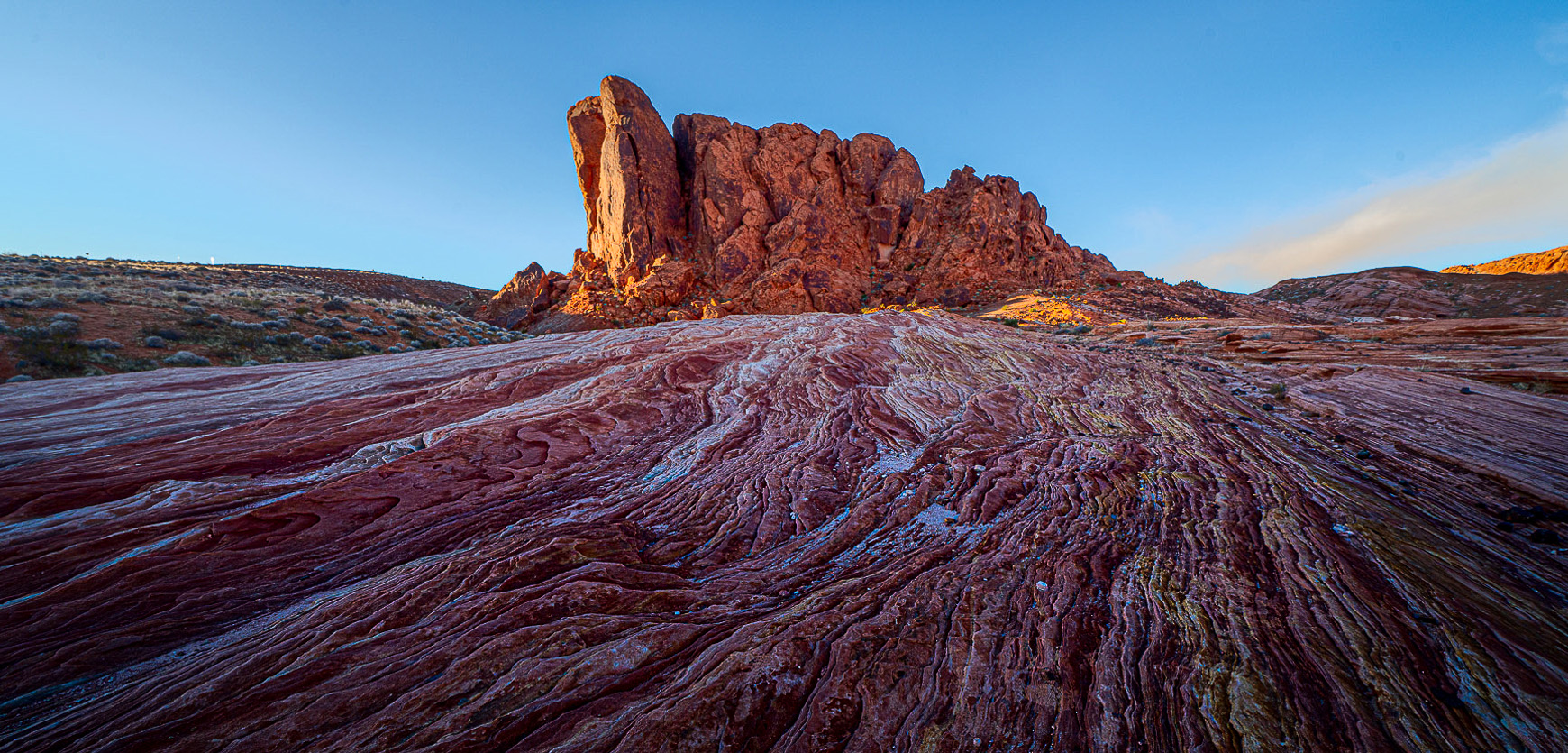
I did a bit of editing to try and make the rock formation at the top garner more attention. First, using Lightroom, I added a GND filter to the bottom. Here I increased the blacks and brought down the exposure. I then used the adjustment brush on the rock formation to increase the blacks to add detail, increased exposure and added some yellow to add to the glow on the rocks. Finally I cropped some rock off the bottom to reduce the mass of the foreground while still maintaining the lines. I thought that this made the rock formation at the top a bit more dominate since I thought that is what you wanted viewers to see. Shadows are part of the natural world and eliminating them creates a feeling of surrealism that I don't think always works. The finished image looks a bit ragged but I'm working on a very small file. |
Feb 21st |
 |
| 36 |
Feb 21 |
Reply |
You did a great job with that. I like what you did to the river bank. |
Feb 14th |
| 36 |
Feb 21 |
Reply |
Go for it-----photographing the MW is really worth the effort.I like the idea of reducing the contrast on the old pier posts. I tried to sharpen and raise the contrast be cause the posts are covered with algae (very high humidity in Florida and the dang stuff grows on everything) and they looked so soft with the water that they appeared to be out of focus (so said a judge). But I'll work on your idea.
The problem with photographing the MW in Florida is the only really dark areas are on the coast facing the Gulf Of Mexico and foregrounds are hard to come by. The black areas are the empty sea.
I often do light painting with flashlights. I'll post some later.
Thanks for the reduced contrast idea. |
Feb 14th |
| 36 |
Feb 21 |
Comment |
|
Feb 14th |
| 36 |
Feb 21 |
Reply |
Great catch Arne
I noticed that purple cast as well. I was wondering if something could be done with that. You did it. :-) |
Feb 14th |
| 36 |
Feb 21 |
Reply |
Hi Bill
Those are my standard Milky Way settings. Some nights are darker than others and that ISO gets bumped up, but most of the time I can work with 1600.
The bigger problem is the shutter. I just about always use a 24mm lens or very close and with that 13 seconds is about all I can run without those trails. Even at 13 I got a bit of oblong in the upper left corner. If you can shoot with a 14-16 mm lens you can use a longer shutter. Likewise if you shoot with a faster lens that is around f2 or even faster but still in the ultra wide angle family. Trouble thee is it gets really expansive to have a lens like that.
There is a dark skies website and if you use that you might find some suitable locations that you can get to.
Good Luck--- |
Feb 10th |
| 36 |
Feb 21 |
Reply |
Thanks for commenting. Shooting the Milky Way seems to always entail, staying out really late, or leaving home in the late night hours to get to the location and getting up even earlier than the usual sunrise times. It is not so bad if you are camping but otherwise you are really just dead tired the next day. It gets tough to shoot drive to the glades for a midnight shot, stay for sunrise (after all I'm already there) then the birds wake up and I should shoot them, while I'm there--- Then should I stay for sunset and before you know it--it becomes a 24 hour affair.
But I really do love shooting the Milky Way :-) |
Feb 10th |
| 36 |
Feb 21 |
Reply |
You are right Michael. The light does not match. I've looked over the new Photoshop tool for sky replacement but for me it seems to have too many issues when the skyline is not basically smooth. Add a few trees, flowers and the like and you can see the flaws. I also see a light of lighting issues and the angles just do not match very often.
It is a neat idea, but I think I'll be trying to get it right in the camera for a while longer.
But that is just my opinion. |
Feb 10th |
| 36 |
Feb 21 |
Comment |
Personally I like this view of the castle much more than the precious image you showed. This image has much greater impact and drama because of the angle of capture. I feel like the dark windows create a face that dare me to even approach the fortress. From this view I will respectfully withdrawn. The image is certainly compelling.
I have so many questions regarding the sky replacement. First, the sky you chose is a good match in tone for the dark castle. My judge's eye sees several issues. First I would be interested knowing the pixel density of both the castle and the sky. The sky seems to have a bit of noise running throughout. The castle appears to be at the 300 count, but the sky seems to be lesser. Do you know the actual pixels per inch of the sky? Then as I look at the image the right side of the castle has the evil telltale halo that gives away the fact that the sky has been replaced.
Even with these issues, the image is still quite powerful and dramatic. I assume you have framed it.
|
Feb 9th |
| 36 |
Feb 21 |
Reply |
:-) |
Feb 6th |
| 36 |
Feb 21 |
Comment |
I partly agree with Michael. If you want the stumps to be the stars of the show then getting closer to the main stump would be desirable.
I like the limited amount of sky as it helps to draw more attention to the stump and the river makes a wonderful leading line to move me to the stump.
For me, however, the stump seems to get lost in the scene. I think because it is light and the bank it is sitting on is likewise light that impact is lost. I played around in Lightroom a bit to try to draw more attention to the stump.
Do you feel the stump blends in too much? I'm struggling tryng to get a feel for this one. |
Feb 6th |
| 36 |
Feb 21 |
Comment |
Composition, composition, composition. I really like how you brought so many strong elements into this composition.
To me this falls has both a feeling of meandering and yet power and this contrasting appearance I feel adds to the image. I also noticed the lack of camera data and wonder if the settings have anything to do with the feeling of softness throughout the image.
Personally, I prefer the more "green" tones to the warmer tones you created. Some how, at least to my eye, I think the scene is too warm.
I would be interested in knowing why you included that foreground boulder, I sort of prefer the scene without it. |
Feb 6th |
| 36 |
Feb 21 |
Comment |
This image has a great deal of instant impact. That alpen glow is hard to beat when you want to attract the viewer's attention. I also like how you have a bleed in color in the middle of the frame as it creates more depth. I also think the simplicity of the scene draws more attention to the glow.
The only suggestion I can think of would be to slightly darken the foreground rocks. They are so "in your face" that I feel they compete with the high peaks for attention. Maybe toning them down would reduce that affect. Any thoughts on that? |
Feb 6th |
| 36 |
Feb 21 |
Reply |
Michael
I generally try to use a shutter speed of 10-13 seconds for my Milky Way images. If it runs longer the movement of the stars starts to make them turn into oblongs. I found your comment about the number of stars really interesting. When I processed this I actually tried to bring out more stars because that is what I saw that night---just a sea of stars. The stars were so bright I could read by their light. In the color version, fewer stars show. Now I'll go back and try to reduce them in the B/W version. I always struggle with the core of the MW trying to decide just how bright to make it. Here it stands out more in the color version.
With this shot I was wracking my brain trying to figure out how to get the birds in the image because seeing them flying into the MW was beyond belief. However short of some Photoshop Trickery, I still have no idea how to do it.
Thanks for the suggestion.
I'm still searching for a better MW shot (I've got about 40) but every one seems to have some sort of a flaw.
Here is a link to a shot I really like---but the trees on the left annoy me.
https://reminisces.smugmug.com/RockyMountainNP/Rocky-by-Starlight/i-NWJ9QcN/A |
Feb 6th |
6 comments - 9 replies for Group 36
|
| 38 |
Feb 21 |
Comment |
Hi Art
First I am glad to see that someone else stalks the boardwalk at Wakodahatchee carrying Nikon's excellent 200-400 f4 lens. Maybe we will meet at Waco sometime and our lenses can talk to each other about their photographers. :-). I've had mine for years and still marvel at the clarity, sharpness and contrast it produces, I would not trade it for anything. The results speak for themselves. Hope you love yours as much as I do.
This is a very creative and well put together image. It just carries the look and feel of Fine Art. Was this hand held or taken from a tripod with gimbal head? |
Feb 1st |
1 comment - 0 replies for Group 38
|
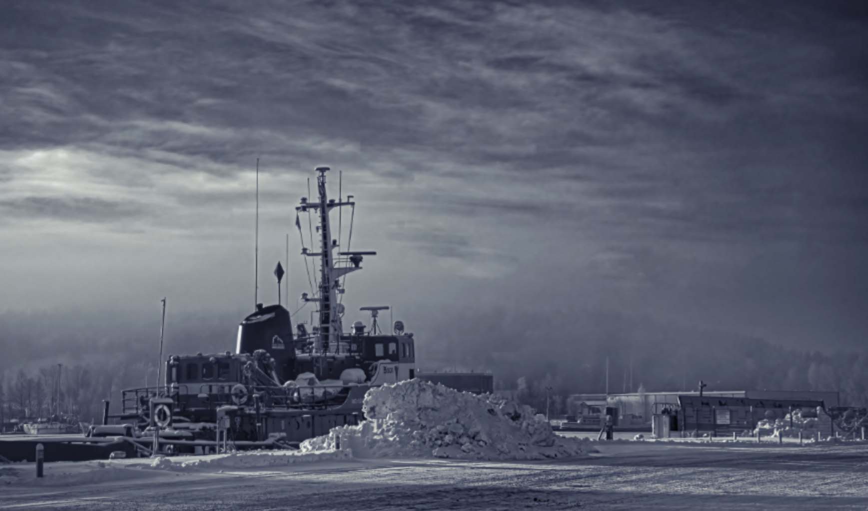
| 47 |
Feb 21 |
Reply |
Kristi
Being primarily a nature/landscape photographer the trees and the mist appeal to me but unfortunately the eye of the viewer is really not attracted to them. Since so much of the image is a light color the eye picks up the boat (and the ugly snow)
However the best part of your comments is that you have come to realize that "nobody else" will see what you saw. It is great that you are looking critically at your image. Often the intent of the photographer does not translate to the viewer. This concept is what the first lesson of your course actually begins to address. If you want to use this image for the first lesson, go for it. we can have some lovely discussions with it. Your choice. |
Feb 6th |
| 47 |
Feb 21 |
Comment |
An interesting interpretation of the monotone concept. By keeping a touch of blue you have increased the presentation of cold (blue is a cool color) and thus increased your intended impact in the overall image. I feel you did a good job in presenting your goal although personally i would prefer the boat to be a bit sharper--doing so would bring out more of a biting cold feel.
I have always been a fan of reducing clutter and cleaning up an image. In my opinion you have two distracting elements that weaken the impact of the image. One is the car on the left, that is pinched against the left edge and the other is the rail on the right that only leads the eye out of the image. Thus I would offer the attached crop as a solution that still retains the foreground space you mentioned wanting to preserve. I would be interested in your thoughts about the crop, afterall, it is your vision and image. |
Feb 3rd |
 |
1 comment - 1 reply for Group 47
|
| 49 |
Feb 21 |
Comment |
Hi Khalid
Was just browsing thumbnails and came across you quite colorful image. The beautiful tint imparted to the water by the setting sun is certainly an eye catcher. Your composition, placing the father and son on the right side fixation points works quite well.
I have always tried to find strong story lines in images and while there is an intimate story of a father and a son I noted in your write up about the war torn country and couldn't help but wonder that since you mentioned it why you didn't include that concept in the image? I would think that a father and son, enjoying a peaceful yet intimate moment on a beach with the devastation of war behind them would be an extremely strong story line. To this end (and I realize you didn't include your ISO setting) I noted that your aperture was wide open at f2.8 but your shutter speed was a very fast 1/1600. By reducing the shutter speed you could have increased the aperture and thus included some of the structures in the background and perhaps added them to the story line.
This is not a critique of your image, rather I am trying to understand your intent so that I can better understand the story line of your image. Since it is your image, how you want it to look is all that matters, I'm just interested in the story. I would appreciate knowing your thoughts on the subject. Thanks |
Feb 4th |
1 comment - 0 replies for Group 49
|
| 67 |
Feb 21 |
Reply |
Do you use the noise reduction tool globally or do you use it as a brush and just put it where you need it?
I'll often brush just the sky for example and ignore areas where it does not show. |
Feb 27th |
| 67 |
Feb 21 |
Reply |
The crawl was never intended, I thought it would be a quick shot and be done, but he didn't fly off, so i kept trying to do something different or better and one creep lead to another and another. . .
What for next month's shot. :-) |
Feb 26th |
| 67 |
Feb 21 |
Comment |
Well, I intended it to be a quick grab---it evolved into a long creep. :-)
Yes the original is a bit sharper but I could probably add a touch of sharpness. I was much more concerned about what the background was going to look like. I think you will see why, next month. ( I hope) |
Feb 17th |
| 67 |
Feb 21 |
Reply |
Thanks Jason.
I was planning on going to the seashore later that week and knew I wanted to work with backgrounds. This little guy gave me a change to practice with an f2.8 lens. I used the same technique with some shore birds when I shot with my 200-400 with the 1.4 tc. Maybe I'll post one of those shots next month.
This was all about creating a perfect background. It came out pretty good. (but I had a good model) |
Feb 10th |
| 67 |
Feb 21 |
Reply |
I not sure about the always right thing. Just ask my wife! :-)
However the image looks much better without the blurred trees.
|
Feb 10th |
| 67 |
Feb 21 |
Comment |
Snow capped majestic peaks, framed by a forest of evergreens dusted with snow is certainly a formula for a beautiful image. The stunned brightness of the mountains contrasted with the forest create some impact, the story of wintery cold is quite evident and while these are strong positives the drive by shot lacks a feeling of orginality that I feel handicaps the image. I realize the conditions were against you but the result is still the same. For me the inclusion of the blurred foreground trees is the most disturbing part. I really hate suggesting the following but if this were mine, I would clone those out so that the eye does not linger on them.
In the end---what a bunch of wimps, not wanted to brave a "slight" chill in the air to capture an image! Where is the dedication??? :-)
|
Feb 9th |
| 67 |
Feb 21 |
Comment |
Glorious skies such as this coupled with wide open space and a composition that holds the elements together always make for pleasing images. The vastness and solitude presented in scenes such as this create a longing to be part of such a scene. It is something I find so lacking in my Florida landscapes.
The things I might suggest is that you could eliminate that bright sunspot in the otherwise colorful sky. That is the brightest part of the image and simply draws the eye away from the rest of the scene. I have come to recognize that you greatly prefer to handhold your rig, but even doing so you could apply a GND filter to control the brightness in the sky. The filter can be mounted onto the lens. The other thought I have would be to bring down the shutter speed. I do not see great movement in the frame and by reducing the shutter speed you could use a higher aperture and have more depth of field which would result in a greater portion of the image being sharp. There is a great deal of detail I would really like to see in this image. |
Feb 9th |
| 67 |
Feb 21 |
Comment |
If you are looking for easy editing tips try looking of either Steve Perry, or Matt Kloskowski on you tube. Both have a number of excellent videos that are easy to follow on various editing tips. |
Feb 6th |
| 67 |
Feb 21 |
Reply |
Hey Bud, I never said I had an easy time getting back up! :-) As for getting close to the bird I moved only inches at a time, only using my feet to push forward with. Very little upper body movement. Between my hat and camera my face never showed. I often use this technique when working with shore birds, I generally can get quite close and after laying there for 30 minutes or more they will frequently come to me. Last year I had sandhill cranes actually standing next to me. It just takes patience. Sometimes they fly off but better than half the time I get at least one good shot. |
Feb 5th |
| 67 |
Feb 21 |
Comment |
I love the beauty of cedar waxwings, so elegant. Like you I rarely can get close to them so i am quite interested in your image. First I think that flipping the image actually works well. facing to the left the berry becomes more dominate and adds strength to the image. The cropped composition sets off the bird quite nicely as well.
I do have several questions. First on the bird's breast there seems to be multiple cloned (?) yellowish areas. At a 1/500 they should not be motion blur so I'm wondering what caused them? I'm also wondering about the lack of detail in the bird's breast, it just looks so smooth. While part of this might be due to the ISO I'm wondering what produced this effect?
|
Feb 4th |
| 67 |
Feb 21 |
Comment |
You have presented an interesting silhouette type image with lots of leading lines that point out the birds.
While the image has true blacks and true whited I am a bit perplexed. The branch on the right is where the true blacks reside, but that portion of the image is very much over processed (note the halo in white that outlines the branch) while the tree trunk on the right is mostly shown in muddy grey. It almost looks like you processed the image to bet your blacks and then tried to reduce the shadows on the birds and bring them back.
Personally I would go with the full silhouette and create contrast. But that is just me, and what do I know?
As I told you earlier, I'm the other nut who goes to RMNP and photographs small birds on sticks--- mine were just bluebirds and grey jays. :-) |
Feb 3rd |
| 67 |
Feb 21 |
Reply |
I purposely shot this at f2.8. This was done strictly as an experiment to see how much I could blur a full daylight background using a telephoto lens at f2.8. Normally I would shoot birds at f8 or more to get them entirely sharp, but in this case that was not my goal. This was about achieving the greatest amount of out of focus area as possible.
When this was originally taken there was some foreground sand that was out of focus. I cropped that from the presented image as leaving it created a "donut" appearance with a very blurred foreground, a bird with a sharp head and an out of focus background. The in focus sand is on an equal plane with the bird and is thus in focus. The total range of material that is in focus (according to Nikon's lens specification chart with the lens set at f2.8 and a subject at minimum focus distance is 3.87 inches. The lens was focused on the bird's eye. Note that I used the lens at its minimum focus distance as I was only 11 feet from the bird which is as close as that lens will focus. Had I positioned myself at 13 feet from the bird and used the same settings my DOF would have increased to 6.37 inches but I chose the 11 foot distance to see what the effect would be on the background at f2.8 |
Feb 3rd |
| 67 |
Feb 21 |
Comment |
This is a most interesting image if the viewer is willing to accept the fine art approach. I feel the composition is quite effective and the title is appropriate. The High Key feel adds a lot of drama to the over all image.
I do feel that the B/W conversion needs some punch to it. A good B/W should have true black and true whites and this, at least for me has too many grey tones that produces a semi muddy feel. B/W conversion is an art unto itself. I think you have something pretty amazing here if you work on that conversion. |
Feb 1st |
| 67 |
Feb 21 |
Comment |
Hi David.
At first glance you have a beautiful winter scene that with the blue tones in the landscape brings to mind the mind numbing cold that I remember from a trip I took to Glacier some years ago. I like the composition and the use of leading lines that work exactly like you describe. However, for me that is where this winter scene begins to fall apart.
Since you are relatively new to the group let me start by saying that I have been judging photo competitions both in the US and abroad for a number of years and my comments which follow, stem from my judging background.
Sky replacement is rapidly growing trend and we are seeing more and more images where this is being employed. This has become so extreme that many contests in the international level are now requiring that the original RAW file be submitted in order for the image to receive an award. If competition or gallery exhibition (other than as "fine art") are in your plans for this image I do not think the image will be accepted. If the image is for your personal enjoyment then print it, put a frame on it and hang it with pride. It is beautiful.
Now what do I see when I view the image? There are several "tells" that tip me off. First, the position of the light source is high enough that some of that color should be reflecting onto the ground. The foreground blues don't work with the "punch" delivered by the colors of the sky, (I also think they look a bit over saturated). When I look at the sky and see the light reflected into the unfrozen water I would expect to see some of the color in the reflection, it is not there. When I look at the tree tops (especially the bare trees) they have multiple color tones that should not be there. The light across the image simply appears surreal.
There is a simple fix you can work with in the field that will same most of your skies. May I suggest that you obtain at least a 3 stop Graduated Neutral Density filter and use it religiously. Personally I have a set of GND filters that include a 1,2 and 3 stop filter. This allows me to have an effective range covering from 1 to 6 stops if I combine the filters. I use a GND filter on 90% of my landscape scenes if the sky is included. You can bet a bracket that will attach to your lens to hold the filters if necessary. I most commonly use the 3 stop filter alone and it that is the case I will hand hold it in front of the lens and actually move it during the exposure to soften the effect.
I played with your image in Lghtroom and found that converting it to B/W and adding contrast to the sky worked pretty well. See the attached for an idea. It would work better with a larger image size. |
Feb 1st |
 |
8 comments - 6 replies for Group 67
|
| 89 |
Feb 21 |
Comment |
I feel this is a very stunning image that brings back visions of yesteryear and the "old west". The stormy sky is impressive. The black and white conversion enhances this feeling although for my tastes it feels a bit over processed, but that is the choice of the maker and it you like that effect then it is perfect.
The subject here is clearly the cowboy and not nature. The image certainly would not be suitable for a PSA Nature competition and I would question if this is a suitable image even for Nature Plus. In Nature Plus the hand of man may be acceptable as a bird on a fence post or even a tiny building on the horizon that is not the subject. This is probably a bit much. |
Feb 5th |
1 comment - 0 replies for Group 89
|
28 comments - 18 replies Total
|


