|
| Group |
Round |
C/R |
Comment |
Date |
Image |
| 2 |
Jan 21 |
Comment |
Mabry Mill is a wonderfully scenic location and you were lucky enough to get there with the laurel in bloom. I know where you were standing, but there were no bushes there on any of my last three trips. I wish they had been there.
While I enjoy your image I feel you may have too much of a good thing. The bright reds arrest my eye as it tries to move through the image and I therefore think the flowers take something away from the mill. |
Jan 9th |
1 comment - 0 replies for Group 2
|
| 14 |
Jan 21 |
Comment |
You did a very impressive job in your editing. The detail that you brought out really makes the image work. |
Jan 9th |
| 14 |
Jan 21 |
Comment |
You did a very impressive job in your editing. The detail that you brought out really makes the image work. |
Jan 9th |
2 comments - 0 replies for Group 14
|
| 17 |
Jan 21 |
Comment |
I fear you were the guy standing right in front of me!
Actually we were there at vastly different times but just about the same spot. I was alone on the rocks for sunset, but the temperature was a chilly 25 degrees.
You captured an iconic setting quite well and the lack of clouds are not worth worrying about since there is good color in the sky as is. I like your composition and the reflected light on the rocks. This is well done.
If I would suggest anything it would have been to move the lighthouse slightly to the left so it would not seem so crowded and near the edge of the frame.
|
Jan 11th |
1 comment - 0 replies for Group 17
|
| 19 |
Jan 21 |
Comment |
You have captured a lovely scene. The subdued light made this a perfect shot for a cellphone as you had no harsh shadows to deal with. I would suggest that you crop off tree on the far right I feel it would improve the composition. |
Jan 11th |
1 comment - 0 replies for Group 19
|
| 25 |
Jan 21 |
Comment |
I feel you have a beautiful setting and lovely sky. Your composition works to show off the setting. I would suggest that you crop off some of the reeds at the bottom. While you need a foreground, you don't need quite that much because the reeds are really not that interesting. |
Jan 11th |
1 comment - 0 replies for Group 25
|
| 26 |
Jan 21 |
Comment |
You have a beautiful scene and the use of the GND filter worked magic in balancing the light. I feel Bob Benson edit helped to create more interest on the right side.
This is a fine image. |
Jan 9th |
1 comment - 0 replies for Group 26
|
| 27 |
Jan 21 |
Comment |
I was quite taken by this image as I was scrolling through the Current Images thumbnails and decided to drop by for a closer look. You have a clever idea and I think it is mostly carried out quite well.
I would offer one suggestion to make it a bit more believable. I would clone out the single orange and two red lights found on the white rim of the jar. The image shows the lights in the jar and flowing out of the top. Those three lights should be inside the jar and not outside on the rim. Just a thought.
|
Jan 11th |
1 comment - 0 replies for Group 27
|
| 32 |
Jan 21 |
Comment |
I always enjoy seeing High Key images. In my opinion that are not done often enough. This one is a special treat. I feel Tom's comments cover my feelings about this image. |
Jan 11th |
| 32 |
Jan 21 |
Comment |
I well appreciate the difficulties in trying to capture images such as this. There is not much you can do on location in these situations beyond what you have already done. Long ago I ran into this situation and my remedy was to purchase fast glass. My first acquisition was a 50mm f1.4 lens. At the time I spent about $60 to get it but now it sells for just over $100. I'm certain other camera manufacturers have something similiar. It is small, and lightweight (I can carry it in a pocket) and I find it useful in museums night clubs and a variety of other low light situations. I have since acquired a Nikon 105mm f2.8 which provides a bit more reach and is just slightly slower at f2.8. Having one of these (or both) is a lifesaver in the field. |
Jan 11th |
2 comments - 0 replies for Group 32
|
| 36 |
Jan 21 |
Comment |
Bill
You certainly have lovely light on the mountains. To that is where the interest is. I've never been a fan of roof tops, they just look unnatural. I know you have cropped a lot of this image but I would still crop a bit of the sky as well. I might suggest running a bit of noise reduction through the sky area. |
Jan 14th |
| 36 |
Jan 21 |
Comment |
Michael was kind enough to send another image of the Weber house as I requested. I've posted it in the panel on the right. It really sets the scene showing the house in its environment. I like the second version. Thanks Michael. |
Jan 4th |
| 36 |
Jan 21 |
Reply |
Hi Arne
I agree. This process turned out much better than the image. I wondered what others would say about it. The pier "hangs" because of junk that was along the shore and against the pier. I had not thought about the lamp reflections being a distraction but now that you mention it, I can agree. I didn't need the ND filters because is was really dark and no extra light hitting anything, Had I taken and additional shot, I would have needed the filters because it was getting brighter. Because of the long exposure and the long exposure noise reduction process this took over 6 minutes so the light was increasing.
I just have not been out shooting much with the covid and didn't have a lot of images to pick from this month. But it has been good to hear the opinions of others.
Thanks. |
Jan 3rd |
| 36 |
Jan 21 |
Reply |
Would you care to post one of the other images of this building? I'd love to see it settled in its environment. If you want you can send it to me and I can add it in the space for other images under the original. |
Jan 2nd |
| 36 |
Jan 21 |
Comment |
This seems to be a clear cut case of I came, I saw and I conquered! You came upon a great scene and you sim0lly got everything right.
I agree that the shadow make a creative and dramatic frame. Like Michael I would swear that it is titled to the left. For me it is not the the dark column on the left, it is the cluster of the bright formation on the right. Still it is likely an optical illusion.
My only suggestion would be to either give a bit more breathing space above the formation on the far right ,or crop down and eliminate the whole blue notch in the right corner. |
Jan 2nd |
| 36 |
Jan 21 |
Comment |
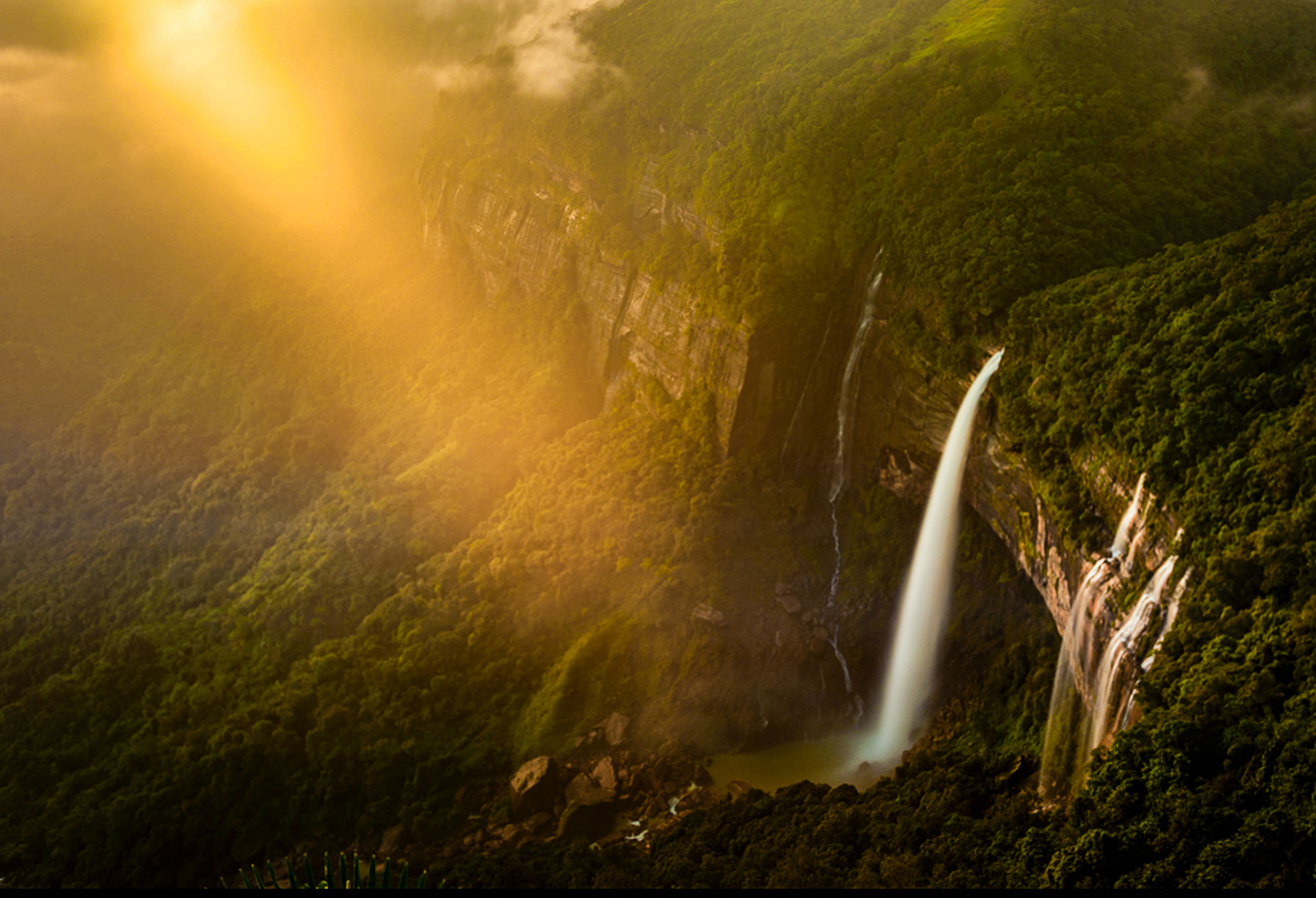
I've always been of the opinion to look both in front of your and behind you when you get sunrises or sunset opportunities and to NEVER leave the scene until it is truly completely over. You were fortunate and thus able to capture a once in a lifetime image. The power and drama of the scene are undeniable. I like the composition and the angle of the light but I feel torn while viewing the scene.
The falls is impressive but the sunbeam overpowers the falls because it is the brightest part of the scene. Thus I offer several suggestions.
To keep the eye on the stars of the scene, the light beam and the falls, I would clone out the yellow spot at the bottom so as not to lose the vegetation on the bottom edge that is needed to enclose the frame, then I would crop the bright area from the top of the frame. I do not feel the little bit of sky adds to the composition. I would also crap just a bit from the left to let the sunbeam slash into the scene from the corner and and thus hit the left fixation points better. Like Michael suggested it would have been better to shoot at a higher aperture to sharpen up the image. Since that was not done I added clarity and texture to add some punch to the landscape. Then I dimmed the intensity of the sunbeam so that the falls became more of the star and not a secondary visual element.
There is nothing wrong with your grand image, it depends on how you want to show the scene. Exactly what is your intent. The sunbeam or the falls, or something entirely different. The image can stand as it is. My suggestions are just that, mine. As the maker, your decision is all that matters.
I've attached by crop for demo purposes only. |
Jan 2nd |
 |
| 36 |
Jan 21 |
Comment |
There is a great deal to like about this image. The sky is powerful and most dramatic. The approaching storm is something that the eye cannot let go of. Then there is an amazing building that speaks of antiquity and the continued downward slope of the structure culminating with the right hand building falling down draws the eye across the image. The question for me becomes exactly what was YOUR intent in capturing the image? I say this because I feel there are two things going on here. I love the building itself and your fill the frame composition lets me enjoy the structure in its entirety. However, while doing this I'm struck by two issues. First that bright circular cloud on the right competes with the building for my attention. Second, the building seems to have an unearthly glow. I get the Golden Hours yellow glow thing, but this just seems to be a bit unnatural.
A second approach to this image is the placement of the building in the scene. If you are trying to show the struggle of the building enduring the forces of nature then I feel the building is crammed into the scene and needs room to live. I want to enjoy the power of that sky and feel the scene live.
Therein is the issue. Just what was YOUR intent? The image works either way. I want to know just want you want me to see and feel. Either way,the image is impactful. |
Jan 2nd |
| 36 |
Jan 21 |
Comment |
Richard
Thanks for keeping an eye on me. With the pandemic this past year I have not been getting out as much as I used to. Some of the opportunities I have to shoot do not yield the best results. I use the opportunities to experiment and try different things (like the crazy long exposure time). As for the photo, it is a pleasant memory of a relaxing moment. Hopefully, the coming year will yield better results. |
Jan 2nd |
6 comments - 2 replies for Group 36
|
| 48 |
Jan 21 |
Comment |
I love the lofty presentation of the church and the textures you were able to bring out. I agree with Stephen regarding the soaring feeling of the church created by your camera angle. However I feel you negate much of this with the row of tree branches across the top of the frame. There is virtually no other greenery in the scene and they limbs just suddenly appearing to float across the sky, to me take away from the beauty of the church itself. |
Jan 9th |
1 comment - 0 replies for Group 48
|
| 67 |
Jan 21 |
Reply |
When you focus a lens the sharpest point in the images is the actual point at which the lens was focused. In this case the trees in the reflection. The basis of
Hyperfocal Distance is the idea of ACCEPTABLE SHARPNESS. Most people just assume that when using Hyperfocal techniques that is the lens is focused at infinity and infinity is half way through the image that the distance will be in perfect focus. This is not the case. As you retreat into the frame you reach what is called ACCEPTABLE Focus and beyond that things do get a little bit softer. Hyperfocal tables are based on how the photo looks as an 8x10 enlargement. As such, although your image using Hyperfocal Distance may be acceptably sharp for small prints, you may find it incredibly unsatisfactory for larger prints, particularly at the extreme edges of your depth of field. You also have to factor in that the image we are seeing has been drastically reduced in size and clarity and therefore what may have been minor imperfections on the 8x10 print will be magnified in the smaller resolution image. |
Jan 26th |
| 67 |
Jan 21 |
Reply |
David you have a good idea here. Getting really close might require a focal length of between 12-16mm. The will make the foreground really dominate. |
Jan 10th |
| 67 |
Jan 21 |
Reply |
Todd. To my eye it looks like the focal point was the water. If so that might account for the softness to the mountain due to shooting at f8, the hyperfocal length of focus might let the mountain fall just outside the useful range. Generally an fstop of f13-16 is best.
It is still a beautiful image but I look for little things that catch my eye and always wonder. |
Jan 10th |
| 67 |
Jan 21 |
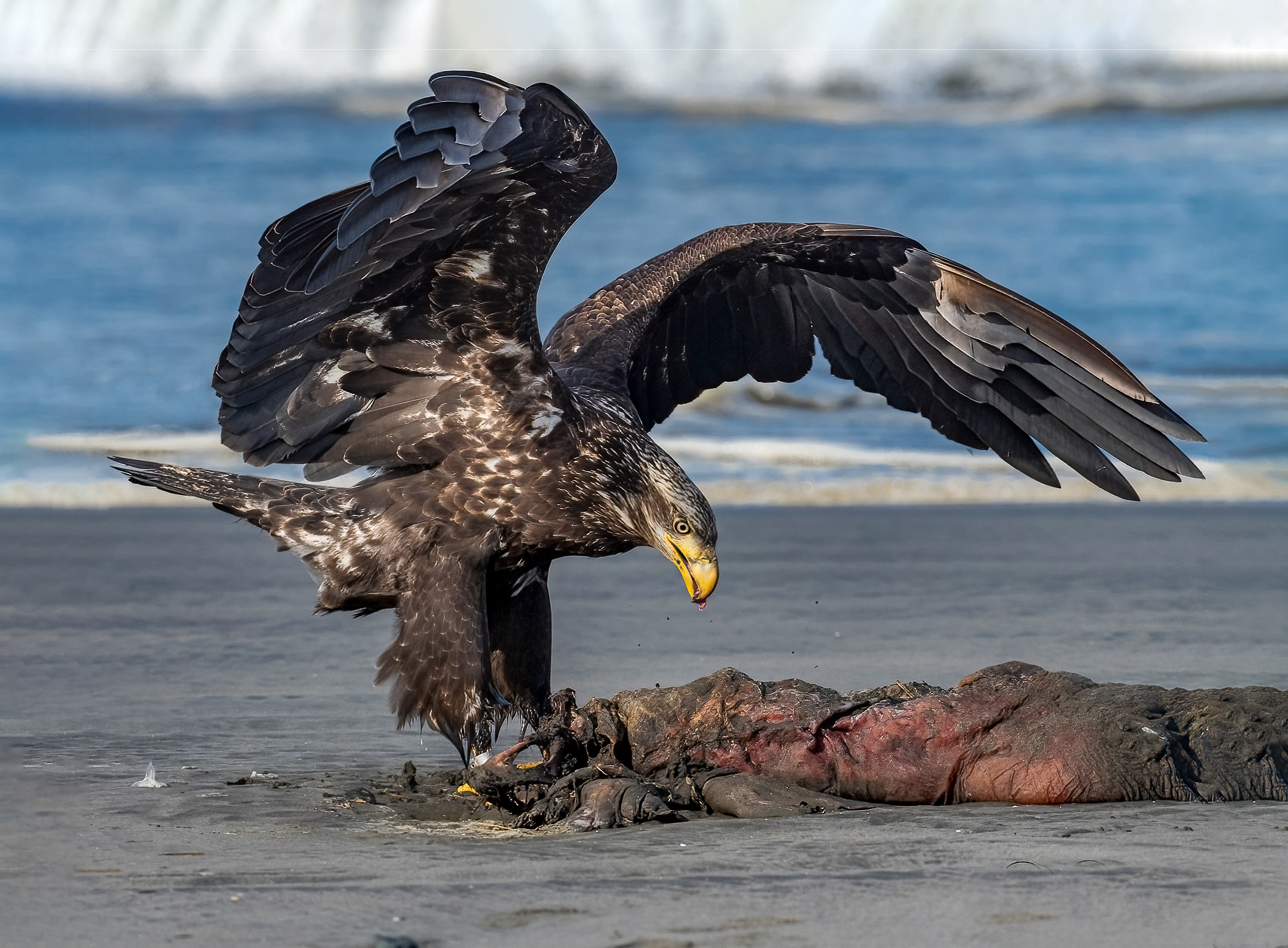
Comment |
Great job Bud!!
Hey Everyone, Bud did a bit of Photoshop surgery and added some space around the eagle so that the bird would not be so cramped into the frame. He said the trick was using Content Aware Fill and it looks good. I'm placing the image Bud sent me below so you can see his surgical skills. |
Jan 9th |
 |
| 67 |
Jan 21 |
Comment |
So sorry for your loss. I can imagine what that must feel like. I once thought I lost everything from a special photo shoot, because of a damaged disk, but I sent it to Sandisk and they recovered 90% of it for me.
When I saw the sharpness of the image I knew you were close and I was pretty certain there was not a lot of cropping. As a judge I see so many images that are over cropped and end up looking so very bad. I wish people would not crop so much. Reading your description and looking at the file really showed off your camera skills and knowledge. Those detail really make a difference in images.
This eagle is really exceptional. The only possible glitch is the fake camera sensor dirt you mention. recognize it I would hope a judge would recognize it for what it is and not deduct from your score.
BTW. I use Smugmug for my web site because they give me unlimited storage. I even have my RAW files for my best shots stored on the site where the public can't see them.
Just a thought... |
Jan 8th |
| 67 |
Jan 21 |
Comment |
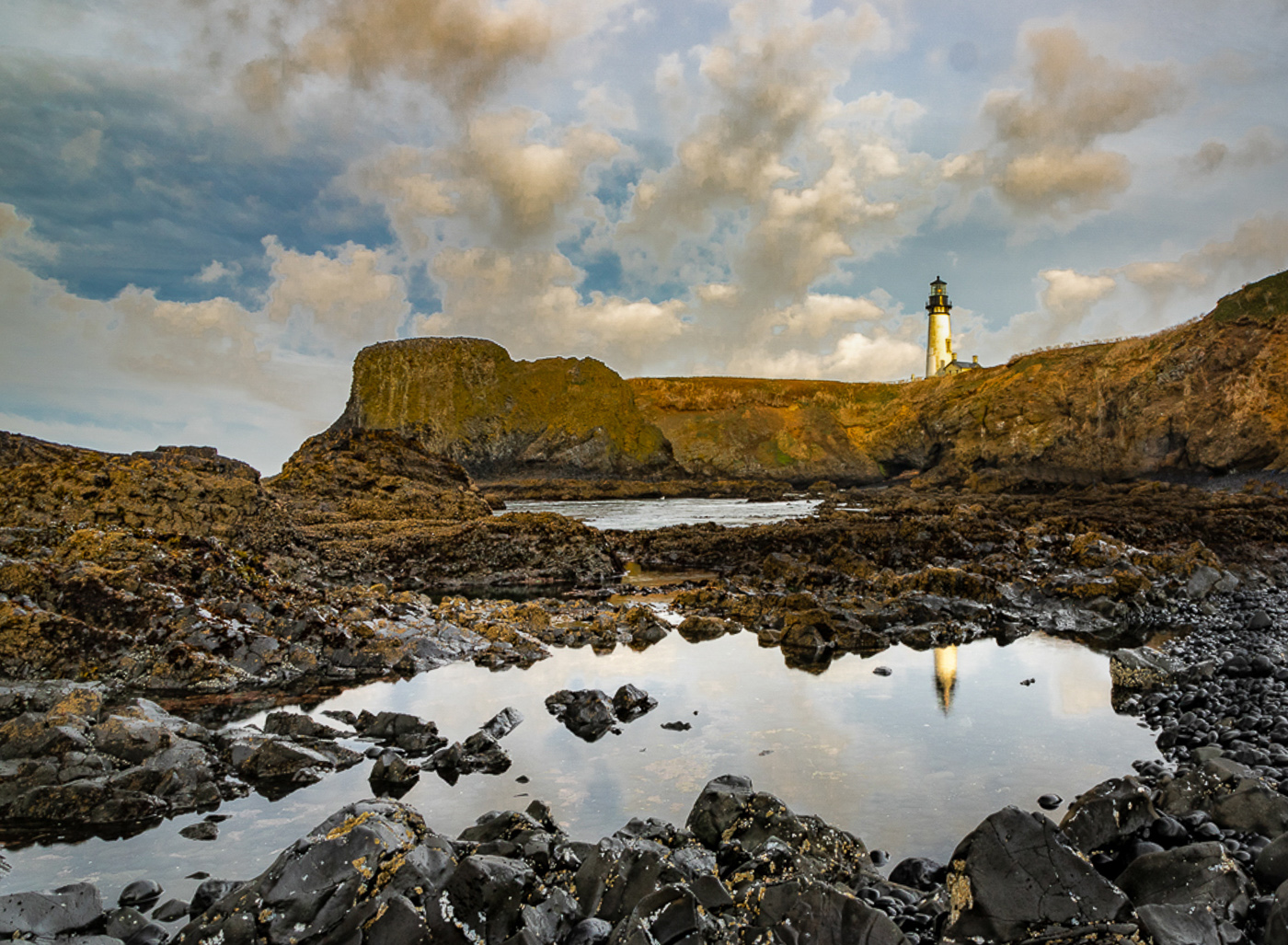
Like everyone else, I really enjoy this scene. The rising angle of the pool makes a nice leading line as does the line of rocks in the water. For me the pool and the lighthouse should be the stars of the show.
That said, the eye is always drawn to the lightest and brightest part of the image and in this case,that is the sky. Additionally there is some great textures and detail in those clouds. My suggestion would be to bring down the exposure in the sky to force the eye back to the pool and the lighthouse and to show off the clouds. I feel the sky is right at the edge of almost being over exposed. Checkmy attached edit. |
Jan 8th |
 |
| 67 |
Jan 21 |
Comment |
First, as everyone has noted your post work is excellent. Would you care to tell what adjustments you made to bring out the dreamy affect? The basic composition is well put together. But more than anything else the simplicity of the scene is really what makes this work.
I think you 20mm lens works well to create the feeling of space and/or vastness. However I'm wondering if cropping about a third of the water at the bottom might make this stronger? The sky is amazing and has a great deal of interest, but since the lower part of the water is just empty, maybe less ends of being more. I know that moves the horizon to the center, but it does create the feeling of thirds. Your foreground will be empty water (just not as much), the colored water and stumps in the mid area and the sky at the top.
. |
Jan 8th |
| 67 |
Jan 21 |
Comment |
Nice image and congrats on your technical choices, your skills made this shot special.
You had everything working in your favor. First there is the exceptional D850 (and all those pixels). You had enough light to get a fast shutter speed (shooting wildlife shutter speed is your best friend) and you pumped up the aperture and that allowed for the DOF to capture both wings with sharpness. The other factor, that you allude to, is that using the cars as a blind I'm betting you were able to get quite close to the bird and thus did not crop a great deal. Plus you used the car as a tripod to keep the camera steady. It might be your first image in the DD group, but you are certainly showing off some camera skills. Well done.
Care to tell me just how close you actually were??
I do hope that you have a little bit of extra space left on the original file. As mentioned it feels a little tight. I wish there was just a bit of space left, right and top. If you tried to put this in a frame I fear the wing tips might touch the matte or frame edge. |
Jan 8th |
| 67 |
Jan 21 |
Comment |
Like the others I really like this image and I do feel the reflection makes all the difference especially when you got to use such wonderful light.
I see you used a variety of shutter speeds and aperture settings. I'd trying to figure out why the mountain is not as sharp as the reflection. Thus I will be quite interested in see the shot at 1/200 to see if the issue is wind matched to your slower shutter speed. The other thing I'm wondering is where your focus point was located. Do you happen to know? I'm guessing it was in the center, but if you happen to know, I'd be interested. |
Jan 8th |
| 67 |
Jan 21 |
Comment |
I really like this view. Here in Florida we have these same cypress forests and they are quite majestic. Like the others I wondered about the purple, now I know. I have always been a advocate of keeping an image clean. Personally I would crop both edges. You have so many powerful vertical lines that the intruder on the right stands out as being odd. So I would crop that. I also would crop the first tree on the left It just feels crowded. I do like the water as it separates the trees from the background and makes them stand out.
Also,since it has been mentioned, watch that saturation. In a nature photo the goal is to maintain the natural look and not over do it.
Your image makes me wantto go visit my local cypress forest. |
Jan 8th |
| 67 |
Jan 21 |
Reply |
Michael
Your suggestion about cropping the top and the dark cloud works well with my thought about the bright spot in the upper right. But cropping the top we get both. :-)
I do agree with you about the sand beach and not cropping that area. |
Jan 8th |
| 67 |
Jan 21 |
Reply |
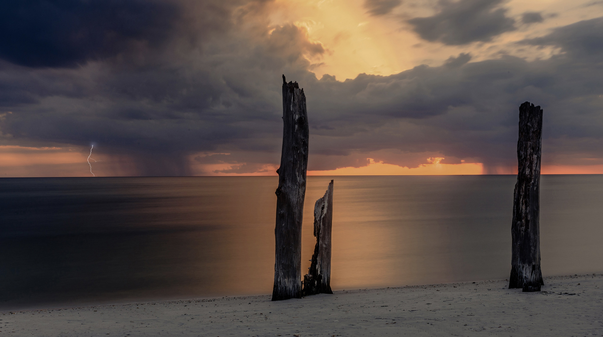
Thanks Todd
I appreciate the the crop effort. I could live without the second stump, but I don't like cropping that much of the beach off. It makes there remaining part look like an error-- at least in my opinion.
I thought the ND filter by flattening the sea made the violence of the sky seem more pronounced.
|
Jan 8th |
| 67 |
Jan 21 |
Reply |
Thanks Bud. I've long had an admiration for the mythological gods and frequently connect to them in my titles. Your mention of Zeus, brought a smile for sure. Like you I think the sky and the second storm adds a great deal to this image. I can also see your tale of Zeus.
Anyway, after reading the comments I've cropped some off the top because I do not like to bright white spot in the upper right corner. Meanwhile, I'll watch out for more thunderbolts. |
Jan 8th |
 |
| 67 |
Jan 21 |
Reply |
Thanks Stephen
The purpose of the DD groups is to improve everyone's photography. Therefore if my photos and write-ups help in any way I'm pleased. Thanks for looking.
|
Jan 8th |
7 comments - 7 replies for Group 67
|
| 78 |
Jan 21 |
Comment |
Hi Jason
I think you have captured an image that perfectly fits your title. The sheer simplicity of the image is one of the things that gives it appeal. Effectively you are using a minimalist approach and there is much to be said for this type of photography.
You have nicely placed the two main subject on the appropriate crash points thus creating a pleasing composition. What are your thoughts on this matter? I'd love to hear your opinion.
My suggestion for improvement is slightly radical but please consider my rational for doing so. In any image the eye of the viewer is automatically drawn to the lightest and the brightest part of the frame. In your original image this is the white cow at the top. When you consider that the cow is also out of focus my suggestion is to clone the cow out of the frame--as per my edited photo attached. When you have a simple a image such as this it is best to remove as many distractions as possible. |
Jan 26th |
 |
| 78 |
Jan 21 |
Comment |
WOW! JUST PLAIN WOW!
Capturing a stunning street scene is an art. It requires an ability to see beyond reality and look into the scene.
I feel your crop is perfect. Introducing either of the bright elements from the sides would ruin the feel of the image as the eye would be drawn to the bright areas and away from the "real" image.
The use of red (an arresting color) fixes the eye on the entire image. Now the man's "bright" arms and his torso's triangular shape draw attention. His legs create a second triangle (a triangle within a triangle) that helps stablize the eye. The white signs above the hydrant openings along with vertical pipes lead the eye to these areas. You need these whites to help the eye separate the hydrants from the background. Street scenes can have minor flaws, they help add reality, thus the mentioned black spot between the man's legs is not a problem.
I just finished serving as a judge for a Salon competition and I'm positive this image would have made the award round. |
Jan 26th |
| 78 |
Jan 21 |
Comment |
Your extremely limited color pallet and the use of an Analogous color scheme (colors that are next to each other on the color wheel) match well and create a serene and comfortable design. Analogous color schemes are often found in nature and are harmonious and pleasing to the eye.
It is the use of this artistic element that makes this image simply soar. Your processing skills here are exceptional. I feel the position of the deer at the top of the frame is acceptable because there is an internal frame of black running across the top that keeps the deer inside the frame.
If you wanted to do a correction/adjustment I would suggest removing (a crop might work) the green plant leaves hanging in from the left edge.
This is a well constructed image. |
Jan 26th |
| 78 |
Jan 21 |
Comment |
I'm afraid I'm going to agree with Terry. The image looks better with the dead vine removed. (Nice catch Terry!)
I don't think that any of the leaves need to be "toned down" there are several that meet the brightness of the top most leaves. The use of the red and green color pallet is what makes this image soar---Those complimentary colors have tremendous eye appeal and create impact.
I'm going to hope you shot this image in RAW. Being a real nit-picker you have several pieces of wood with slightly overexposed "whiteish" highlights. I'm certain that those over exposed highlights could be recovered.
This image is really appealing and should do well in competition with a few minor corrections. You really have an exceptional shot here.
|
Jan 26th |
4 comments - 0 replies for Group 78
|
| 94 |
Jan 21 |
Reply |
You are more than welcome. Any time I can help, feel free to ask. |
Jan 23rd |
| 94 |
Jan 21 |
Comment |
Hi Peter
Sherry asked me to drop by and offer a comment regarding the "Hand of Man" in your photo. I've copied the PSA definition and will place it below and while here I will offer my perspective as a PSA photo judge for Salons and Exhibitions as well.
I can readily comment on your sawed off stump because the mater actually came up in a competition I judged last fall. Simply put the image was rejected. In the description of the rule below note the section on Barn Owls where the is mention of some allowance. In your image the stump serves as a perch or possible feeding station and is clearly a major portion of the image. Therefore the rejection.
If I may I'll offer my opinion of the image as a competition judge. If you have any questions about anything I saw, please feel free to contact me and I'll be more than happy to discuss it with you either here on the discussion of via email if you prefer.
I see a relatively high quality image but I would not advance it beyond the first round of the competition. I admire the balanced composition and the beautiful handling of the background and how it displays the subjects. The color pallet works quite well in your favor. The complimentary colors of blue and yellow generally score quite well in competition and your use of only analogous colors (the browns) to fill the frame is a pleasing and positive touch. What works against you (other than the stump---for this review I am assuming the stump to be naturally broken) are the following. First is the required nature story. There is a basic feeding story (I note what looks like seeds on the top of the stump but neither bird is actively feedings. Having prey in the beak is a major plus, as is you have a bird on a big stick. There is also a lack of interaction between the two birds or versus an invasive species. Having some sort of interaction ups the score. However, the most damaging factor is that the bird on the left lacks "critical" sharpness. I will refer to your camera settings where I see two causes for the lack of sharpness. The first is the shutter speed, listed at 1/400. You are shooting small birds and have filled the frame these little guys twitch like crazy (more so than a larger bird) and thus the need for a faster shutter speed. I would suggest close to 1/1000 or above. The second issue is the aperture. Shooting at f5.6 you have a shallow DOF and both birds are NOT on the same plane. The angle of the bird on the left indicates that it is partially in front of the second bird and its tail extends behind as well. Observe the tail feathers on the left bird and note they are not crisp. I realize that you are working in low light (the ISO, shutter and aperture are all indicators) but you are also shooting a d850 and high quality prime lens. I will suggest that you could raise that ISO as the D850 can handle higher setting quite well.
I know I'm being picky, but in major competition the competition is tremendous. Little details make a major difference. In a shot like this sharpness is critical. Your background is quite "creamy" so it was not terribly close to your subjects, you do have some latitude in increasing your fstop and still keeping a soft background. I do applaud your use of tripod and gimbal head. Your kit is excellent, a little fine tuning and you will be in the ball game for awards. The PSA standards are below.
I hope this helps.
PSA Standards
Joint PSA FIAP definition
Nature Photography is restricted to the use of the photographic process to depict all branches of natural history, except anthropology and archeology, in such a fashion that a well-informed person will be able to identify the subject material and certify its honest presentation.
The story telling value of a photograph must be weighed more than the pictorial quality while maintaining high technical quality.
Human elements must not be present, except where those human elements are integral parts of the nature story such as nature subjects, like barn owls or storks, adapted to an environment modified by humans, or where those human elements are in situations depicting natural forces, like hurricanes or tidal waves.
Scientific bands, scientific tags or radio collars on wild animals are permissible.
Photographs of human created hybrid plants, cultivated plants, feral animals, domestic animals, or mounted specimens are ineligible, as is any form of manipulation that alters the truth of the photographic statement.
No techniques that add, relocate, replace, or remove pictorial elements except by cropping are permitted.
Techniques that enhance the presentation of the photograph without changing the nature story or the pictorial content, or without altering the content of the original scene, are permitted including HDR, focus stacking and dodging/burning.
Techniques that remove elements added by the camera, such as dust spots, digital noise, and film scratches, are allowed.
Stitched images are not permitted
Color images can be converted to greyscale monochrome.
Infrared images, either direct-captures or derivations, are not allowed.
Images entered in Nature sections meeting the Nature Photography Definition above can have landscapes, geologic formations, weather phenomena, and extant organisms as the primary subject matter. This includes images taken with subjects in controlled conditions, such as zoos, game farms, botanical gardens, aquariums and any enclosure where the subjects are totally dependent on man for food.
Wildlife��
Where exhibitions or competitions have a Wildlife section or are giving a Wildlife medal the following applies:
Images entered in Wildlife sections meeting the Nature Photography Definition above are further defined as one or more extant zoological or botanical organisms free and unrestrained in a natural or adopted habitat.
Landscapes, geologic formations, photographs of zoo or game farm animals, or of any extant zoological or botanical species taken under controlled conditions are not eligible in Wildlife sections.
Wildlife is not limited to mammals, birds and insects. Marine subjects and botanical subjects (including fungi and algae) taken in the wild are suitable wildlife subjects, as are carcasses of extant species.
|
Jan 11th |
1 comment - 1 reply for Group 94
|
29 comments - 10 replies Total
|


