|
| Group |
Round |
C/R |
Comment |
Date |
Image |
| 3 |
Oct 20 |
Comment |
Very nice shot.
I checked out your website and I love the image of the man paddling the canoe! That is excellent. |
Oct 11th |
| 3 |
Oct 20 |
Comment |
A very interesting shot. I love to see horse and rider in motion on a beach or in the surf. I think Isaac create a great edit. |
Oct 10th |
2 comments - 0 replies for Group 3
|
| 5 |
Oct 20 |
Reply |
Looks good to me, but do you like it? |
Oct 13th |
| 5 |
Oct 20 |
Comment |
Beautiful, just beautiful. I love the feeling of nostalgia that just flows from the image. I even think that the on the vanishing man is perfect.
If I may suggest two minor adjustments just for the sake of cleaning up the image. At the top you might crop down to eliminate the dark area above the arch and then on the left edge crop in just enough to remove the partial wall that shows in the top left corner. Both crops will just leave clean lines all the way around the image. |
Oct 10th |
1 comment - 1 reply for Group 5
|
| 16 |
Oct 20 |
Comment |
I'm a sucker for photos of a fox. Love the animal. You did well to get this close with a 400mm lens. Bogdan note the excessive noise---you could easily fix the background noise using the brush in LIghroom. It looks like the fox is stalking so I'm guessing the4 shutter speed was probably fast enough----but I'll bet camera movement while you were holding the camera and lens was the bigger problem. Camera movement was likely enhanced by you low angle (which was a perfect choice for the composition).
Nice job. |
Oct 11th |
| 16 |
Oct 20 |
Comment |
Hi Bogdan
A very inviting scene, I really love the moss and the leaves to add an extra bit of color. |
Oct 11th |
2 comments - 0 replies for Group 16
|
| 17 |
Oct 20 |
Comment |
I think you have a great capture with this image. The duck is tack sharp, love the feet out front for the landing and the splash is just extra icing for the cake. Great image.
If you are planning on putting this in a competition may I suggest cropping from the left into more square format. As it is the duck is dead center and that creates a more static feeling image. Cropping from the left will move the bird out of the center giving the appearance of space to move into. Also, (I'm speaking as a photo judge) there is a burned white where the wing joins the body. You might tone that down a bit.
This should do well in a composition. Congrats!!!! |
Oct 11th |
1 comment - 0 replies for Group 17
|
| 23 |
Oct 20 |
Comment |
I love the image---as I'm sure most photographers would.
The composition is well seen.
May I suggest that you would have a much stronger image if you back off the saturation and the processing just a bit. You have created halos around the photographers and that is a sure sign of over processing |
Oct 11th |
1 comment - 0 replies for Group 23
|
| 32 |
Oct 20 |
Comment |
Somehow I feel like I have seen this before, like I know this cowboy. Any way, my only corrective thought is that the large bright rectangle in the upper right corner might be selected and then toned down. It is light and bright and draws the eye away from the subject...
Your gun belt fix up came out pretty darn well. |
Oct 13th |
| 32 |
Oct 20 |
Comment |
In general almost anything that has repeating patterns or lines will create an interesting image. ropes and chains are great examples |
Oct 13th |
| 32 |
Oct 20 |
Reply |
Did you ever consider taking the Image Evaluation course offered for free by the PSA? It is located under education on the PSA website. The course teaches how to evaluate your own images and to also see what others will see in your images. |
Oct 13th |
| 32 |
Oct 20 |
Comment |
What a glorious bit of to bring back great memories of an older and more simple times. Count me in with those who do prefer that there is no eye contact. That would be a very different image.
Black and White was a perfect choice.
|
Oct 11th |
3 comments - 1 reply for Group 32
|
| 33 |
Oct 20 |
Comment |
I think the best compliment I can offer is that I would love to walk down that trail and sit on the bench. Your image speaks to the imagination and the heart. There is nostalgic impact in this scene. |
Oct 11th |
1 comment - 0 replies for Group 33
|
| 36 |
Oct 20 |
Reply |
Sorry, here is the crop. |
Oct 15th |
 |
| 36 |
Oct 20 |
Reply |
Have you been to Barcelona to see any of his other works? |
Oct 15th |
| 36 |
Oct 20 |
Comment |
Thank you for dropping by and commenting. After photographing this building (which I found by accident) I learned about the architect's fondness for birds. I've been told about the top dome opening and its winglike appearance. Sadly, I live almost 4 hours from the building and since the wings are only opened on a random schedule, I've never seen them open. Maybe some day. . .
|
Oct 15th |
| 36 |
Oct 20 |
Comment |
Please keep us informed on Greg's progress. I hope all comes out OK as soon as possible.
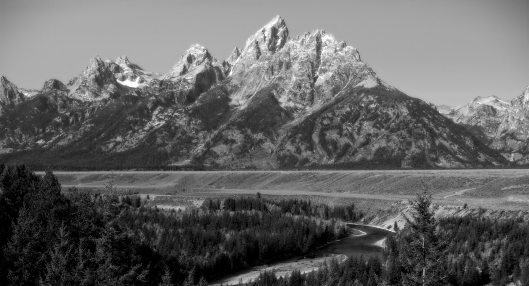
I'm not terribly bothered the the amount of sky at the top especially since the sky is just blank. I don't feel you need a lot of blank empty sky. However, I feel you may have a bit too much forest at the bottom. I've attached a sample crop that turned the river into a stronger leading line, see if you like that any better. As others have mentioned this is about creating contrast---lots of it. Think about getting some true blacks and some true whites. I feel the image could also use the sharpening. Rugged scenes like this, at least to me, cry to be really sharp. |
Oct 12th |
| 36 |
Oct 20 |
Comment |
This is a lovely fall scene. If reminds me of a similar bridge I photographed in Bath, Vermont a couple of years ago. As Michael suggested you should try to use some Photoshop Editing tools to adjust the distortion on the bridge. Your polarizer really made the fall colors pop and that adds a great deal to the image. I think I would crop from the right just about all of the darkest part of the foreground rock. It would make the image square but it would eliminate the dark mostly uncolored rock and also draw more attention to the pretty rocks in the water on the left. |
Oct 12th |
| 36 |
Oct 20 |
Reply |
Thanks Bill. That is exactly the effect I wanted it to have. The starship materializing on earth after its journey from space.
Really glad it worked out as planned. |
Oct 11th |
| 36 |
Oct 20 |
Comment |
Bill
My first thought was to start cloning out the crowd, but then I read about your competition rules so you can't do that. One thought is to get a 10 stop ND filter. When I was in San Antonio two years ago I used the filter and the resulting long shutter ( over a minute) and removed an entire crowd of passing people. I did the same thing in Washington D.C. at the Jefferson Memorial near sunset and removed over a hundred tourists.
As for this image, I looked at the distant mountains and noted sunlight on them. I also can see a bit of sunlight on the castle tower and on some of the lower walls. I would try to dodge the main tower, and add a bit of yellow to warm it up and also lighten, just a bit the lower walls as well It will make the castle pop from the background just a bit and draw some attention to it as well. Do it lightly. Like Arne, I'm a big fan of dodging and burning, always have been. |
Oct 9th |
| 36 |
Oct 20 |
Reply |
Funny, reading your comment reminded me of my private rule for most scenes I shoot. I try to shoot a 360 degree series just in case I didn't see something that I should have. I also shoot from "normal height" and from a low angle. Finally if possible I try to get above the subject and shoot down on it. All because, I might not ever get to go back... |
Oct 9th |
| 36 |
Oct 20 |
Reply |
Interesting comment. I just thought the main tower had that curve as a natural thing I've seen some of those old building that just are not straight. |
Oct 9th |
| 36 |
Oct 20 |
Comment |
I like the feel of the diagonal line of the vanishing tracks. My eye runs right down the tracks to infinity. Then the diagonal line of the building building to the massive tower in the right foreground bring me right back. I agree about the blue truck being removed along with the purple sign on the left. However, I would go a bit further and remove the second purple sign in the middle of the frame and perhaps even clone out the red barricade next to the sign. Red is such an arresting color that it is a distraction in the overall color scheme of this image. |
Oct 9th |
| 36 |
Oct 20 |
Comment |
There are two things i this image that instantly appealed to me. The first is the mystical, dreamlike feel of the image and the second is the compositional triangles. Those triangles draw the eye into the distance (the vanishing point) and that creates mystery. As has been mentioned,I like how the fog becomes a strong subject in itself. I like your crop and the manner in which the bridge seems to be fading away. When I enlarge it, I can actually feel the fog.
It may be my eyes playing tricks but does the tower have a slight tilt to the right??? |
Oct 9th |
| 36 |
Oct 20 |
Comment |
Michael
There are some great spots along the Foothills Parkway outside of Townsend for photos. My favorite is the first turnout on the left side (south) that has a double entrance (one at each end). The view in the valley is really special at sunrise. I usually shoot it vertical.
I love the sky in this image and tome that is where the story is. Those clouds have a great deal of character and colors. Your color enhancing trick paid off well. Personally, I would prefer to see the shadows of the foreground opened a bit. As it stands my eye wants to see what is there (when it gets through with the clouds) but it is just a bit dark. |
Oct 9th |
| 36 |
Oct 20 |
Reply |
Thanks for the compliment. Arne's been a big help and inspiration. I liked the greyish bubble because it brought out some greys. The bubble is actually a sail and it opens to let light in. When open it looks like a bunch of vertical wings.
You folks are going to get me into a bunch of competitions with your suggestions. :-) |
Oct 9th |
| 36 |
Oct 20 |
Reply |
Thank you Richard. I love being out with a camera in bad weather, I have found that usually good things happen under those conditions. I wanted this to be BLACK to enhance the feeling of aliens arriving from space. As i stood there the building just seemed to be floating in the utter blackness.
The small gator 4' was no bother, but his bigger brother was keeping an eye on me. :-) |
Oct 9th |
| 36 |
Oct 20 |
Reply |
Thank you Ian I appreciate your comment.
Based on the feedback here I may get around to entering it in future competitions. |
Oct 9th |
| 36 |
Oct 20 |
Reply |
As always, thanks for the encouragement. Although I think the structure itself lend to the impact of the image. A good subject always is a plus. I worked quite a bit on getting a full tonal range.
When you say to open the shadows are you referring to the bubble on the top of the building? I wondered if I should brighten those. In the end I didn't because they were not directly lit in reality and I assumed the architect didn't want them to be bright I know that in a photo, the choice is mine. That said, if the bubble is what you are suggesting I open up. I'll have a go at it. |
Oct 4th |
| 36 |
Oct 20 |
Reply |
Thanks for encouragement for entries in future competitions. You and others in this are setting me up for entering future competitions. I appreciate your efforts.
The night I took this photo was rainy with a blanket of flat grey clouds. No stars, no texture just flat grey. That is the reason I made the sky black. If I lightened it I just got grey. I looked at this building and had the feeling that it was either floating or was a descending spacecraft so I kept the sky black to add to the feeling that it was entering our world from space. At least I had a reason for doing it the way I did. |
Oct 4th |
| 36 |
Oct 20 |
Reply |
Thanks Stephen. I do have some images taken while walking the "hallway" that surrounds the building under the beams They make some interesting abstracts. Maybe I'll post some in the future... |
Oct 4th |
| 36 |
Oct 20 |
Reply |
My thanks to you for dropping by again. I've found photography to be a cruel mistress who is very demanding of my time and efforts (especially attention to detail). I used to strive to "get it right in the camera" but found that my demanding mistress still wanted more. And thus post work became as important as camera work. I won't just post an image each month. I want to post something my mistress will be proud of. She inspires me. And, for the record, so do people like you. |
Oct 4th |
7 comments - 12 replies for Group 36
|
| 37 |
Oct 20 |
Comment |
I sort of like the girl in the frame as she gives the eye someplace to rest. To me she looks a bit soft and perhaps a more crisp image of the girl would help. However, the lines throughout the image are wonderful.
You might remove the stray line floating in the sky between the girl and the pier rail on the left. It would be a quick touch up in PS. |
Oct 15th |
1 comment - 0 replies for Group 37
|
| 39 |
Oct 20 |
Comment |
This is a strong composition with the balance between the tree on the left and the tower on the right.
I also like the contrast between the structure and the waterway.
You have lots of interesting contrasts to make this a good image. |
Oct 13th |
| 39 |
Oct 20 |
Comment |
Jerry. This month I am sort of tuned in to architecture and buildings with line. While browsing the current images you photo stood out. I really like the strong lines that you emphasize as they make for a dramatic image. You might consider cropping the man on the far right.
If you get a chance check out group 36 and but B/W building there. You might find it interesting. |
Oct 13th |
| 39 |
Oct 20 |
Comment |
I love old stone churches and this is no exception. This may be (probably is) a personal bias but I like the color image better. The reason is the church stands out from the trees which make a beautiful background. Perhaps it you carefuly dodged the church to lighten (brighten) it just a bit the process might create some separation from the background and give the church some pop. That would be my first suggestion but perhaps, after brightening the church you might darken the trees. I am not talking about extremes, just slight adjustments. |
Oct 13th |
3 comments - 0 replies for Group 39
|
| 45 |
Oct 20 |
Comment |
A very nice rendition of an iconic style country scene. It contains all the perfect elements.
|
Oct 14th |
1 comment - 0 replies for Group 45
|
| 62 |
Oct 20 |
Comment |
Bob, I feel you have seen and captured a most interesting image with a composition that works quite well. The repeating arches and the strong leading lines of the flooring and masonry all work quite well. The strong, off camera directional light adds drama as well.
That said, LuAnn's edit with its increased contrast and introduction of shadows produced a bit of drama. The shadows help to sell the feeling of a by gone age.
While I have been a fan of flipping images I do not feel it works well here. This is an historical monument and someone who knows their history will spot a flip immediately. Having been to this site several times the flipped image just felt awkward. Flipping works when the image is not something recognizable.
|
Oct 12th |
| 62 |
Oct 20 |
Comment |
The Stillness of the Grave.
I think you have created an image with a wonderful storyline. Clearly the old ship has gone the graveyard and the long process of decay is well underway. However, you long exposure has rendered the sea flat and dead as well--a perfect compliment to the dead ship. Finally, the nonde sky, shown in ashen greys is void of life . I feel everything fits together and a perfect story is told.
This could only be told as a B/W---good choice.
This was worth the trip. Well executed. |
Oct 12th |
| 62 |
Oct 20 |
Comment |
The photographer who wants is work noticed has only to photograph the world in a way that the average person never sees it. In this case using a 4 minute exposure has created a scene that the naked eye cannot see and with it you have instant impact. I think the sky is beautiful. The left to right flow of the clouds works well with the lines of the bridge. This is quite well done. |
Oct 12th |
| 62 |
Oct 20 |
Comment |
I think you have made much out of little. Something ordinary has become beautiful. Long ago at some workshop I was told to crop with a chain saw, not a paring knife. I am referring to to the tip clipped off the show. Saving the entire shoe tip I think is necessary. |
Oct 12th |
| 62 |
Oct 20 |
Comment |
Sorry for the mix up. When posting Bob's description there was some sort of error and the wrong description was posted. I think I have fixed it now.
Such is what happens when you bring in a substitute to fill in for a pro. :-(
Larry |
Oct 5th |
5 comments - 0 replies for Group 62
|
| 64 |
Oct 20 |
Reply |
Speaking as a photography judge, consider that anything in the image at draws the eye away from the subject, just might need to be eliminated.
Good Luck. |
Oct 13th |
| 64 |
Oct 20 |
Comment |
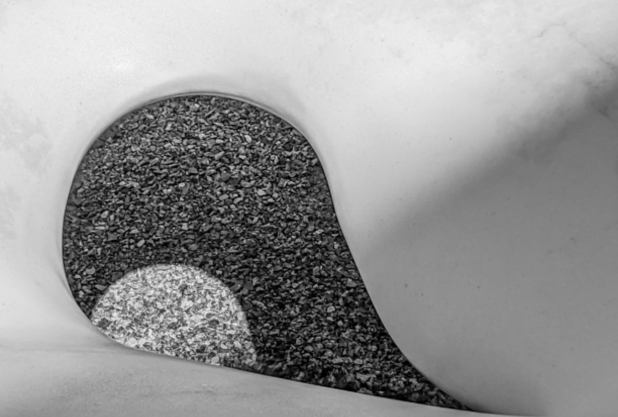
I really like the repeating curves and the contrasts between the black and the whites. However for me there is just too much white. I also found the black upper left corner just awkward Perhaps if you cropped it square and just concentrated on the shapes in the lower left it would produce a stronger image. I'm attaching a sample crop for your consideration. Or, you can just reject it completely. It is your image... |
Oct 13th |
 |
1 comment - 1 reply for Group 64
|
| 67 |
Oct 20 |
Reply |
Todd
The reason for the ND and polarizer all came down to the light. When I shoot waterfalls (and for that matter almost all my landscape photos). The polarizer is just part of the lens. I ALWAYS use it. My polarizer is from Breakthrough Technologies it is super duper thin so it prevents vignetting even when used as part of a filter stack. It is also almost clear, it is advertised as blocking less than one stop of light. Most other brands block 1.5 to 2 stops of light. Now for the ND filter issue. If you note the picture the falls itself is actually in full sunlight. There is no shade on that wall of white water and it is therefore very bright. The rest of the scene is much more covered with shade. Also note, that even with a 6 stop ND filter the exposure time was only 1 second. Also note that I did not turn the water of the falls into "milk". You can still see plenty of detail in the water and the rocks behind the water. Had a wanted a more milky look to the water, I could have added a 3 stop GND filter which would leave the foreground exposed as is but would allow me to use only a 6 second exposure. That would have made the water more milky but still would not have been enough to really turn this particular falls into the real thick white water look. This was not a grab a shot and leave kind of shoot. I was at the falls for close to three hours working the scene from different angles and a multitude of different exposures at each scene.
Note: If I had shot this scene on a heavy overcast day (my preference for shooting waterfalls) the foreground would really have been a problem because it would have really been in deep dark shadows. |
Oct 31st |
| 67 |
Oct 20 |
Reply |
Thank you for commenting. |
Oct 30th |
| 67 |
Oct 20 |
Reply |
Thanks Richard.
I mulled a bit of a crop from the right, but I didn't like the way it made the image feel square. I also felt cropping from the right made the rocks in the foreground feel crowded and I liked the little bit of green next to them to create some space. |
Oct 30th |
| 67 |
Oct 20 |
Reply |
Thank you Michael.
This is a falls that I really like so the walk is a pleasure (other than that one staircase). I've found that basic rule of thirds stuff works well with most falls and this is no exception. You may get to see another shot of this falls soon. |
Oct 30th |
| 67 |
Oct 20 |
Reply |
Thanks for commenting, it is appreciated.
That large diagonal log, is a bit more Photoshop surgery than I would do in such an image. This was entered in a competition where such doctoring of an image were not allowed.
I do see your point and perhaps it would be something to consider at a later time.
Larry |
Oct 30th |
| 67 |
Oct 20 |
Comment |
'Todd The scene is magnificent and I feel you found a perfect composition. Shooting from a observation platform is generally a good choice. That said, I always find a way to walk off the beaten path looking for something everyone else does not have. Did you do any bushwhacking??? As for this image, first I think it is a bit dark. Almost looks like it was taken in moonlight. The other thing seems to be that the image is just soft. I noted it is only 139KB and that is pretty small. You are allowed up to anything under 1MB so this could be a larger file. Shooting at 24mm you should reach infinity under 20 feet from the lens so this should be a lot sharper. If you wanted that 1/125 second shutter then raise that ISO to 400 your camera should handle that fine and increase the aperture to 8 it would be closer to a sweet spot on a lens. |
Oct 12th |
| 67 |
Oct 20 |
Comment |
Jason
Over all you have a pretty good image. The best parts are the attitude of the snowy and the sharpness of the eye. I would add some contrast to the white feathers. There is a lot of drama in the water drops and the fish. Nice shot. |
Oct 9th |
| 67 |
Oct 20 |
Comment |
Michael
I tried to do some of my B/W magic but the image lacks the pixels to work with. I would suggest that you take the B/W image, increase the blue channel and red channel. This will darken the sky. Then increase the contrast using a brush and selectively increase the blacks and the whites.
I would crop about half of the foreground out and also crop the tree on the left.
Remember B/W is about increasing contrast----usually a lot and bringing out the blacks and the whites. |
Oct 9th |
| 67 |
Oct 20 |
Comment |
This is really a dramatic image. You have a peak action shot with lots of drama. I agree that the flip worked well.
I feel there is a bit of blown highlights in the right bird's tail. I would also brush in a bit of contrast to the birds as it would bring out more detail in the feathers.
|
Oct 9th |
| 67 |
Oct 20 |
Reply |
Thanks Isaac. This was a tough shot because of all the heavy shade in the foreground. I used a 6 stop GND filter and still had to do some dodging in the shadows. It is a cool place to sit and take it all in. |
Oct 9th |
4 comments - 6 replies for Group 67
|
| 72 |
Oct 20 |
Comment |
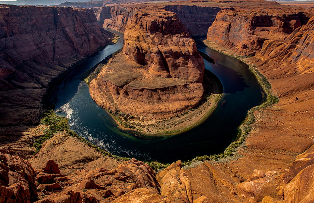
You have a great shot to check off your bucket list. To me it seems a bit hot. May I suggest first cropping off the sky from the top and then bring down the highlights and increase the blacks to add some shadows and reduce the impact of the harsh light.
Wish I had this shot.
I did some editing, Lots of dodge and burn in selected areas. Hope you like it. |
Oct 9th |
 |
1 comment - 0 replies for Group 72
|
| 84 |
Oct 20 |
Comment |
I thought the title and the opening stills plus transitions made for a catchy beginning. I immediately noticed the shake starting with the gazebo at around 1:00. I'll be interested to see how this avoids shake in the next video.
The scenes were you panned around an area like the bench scene and the little water fall scene created a feeling of intimacy that worked well when juxtaposed with other scenes of sweeping vistas. I fish close-up also worked well as a change of pace.
The fountain at 3:55 has excellent composition as did the scene beginning at 5:15 and of course the closing beginning at 5:48. The composition of these three scenes were my favorite parts of the video.
The use of the natural sound of the water laid over the music worked quite well.
I did not feel it was too long.
There is only one scene that has people walking around and that is near the end. Since the rest of the video was void of people this stood out. I thought that either purposefully including more people strolling and enjoying the gardens or leaving them out altogether would have worked better.
You are lucky to have these gardens close by. |
Sep 24th |
| 84 |
Oct 20 |
Comment |
Thank you for showing something I have never seen. The theme was interesting and you used appropriate music to set the scene.
I found the opening with title to be awkward the back and forth between the man and the woman seemed too busy and complex.
Much of what you shot was done in harsh midday light, the most unflattering of all lighting conditions. This resulted in bright, beautiful colors slapping me in the face rather than enchanting me as you promised in your write up about "most beautiful people in the world." The real killer for me was the constant zoom in and zoom out for every image change. It became repetitive and after a while boring.
The images that I will remember were the ones with mood. The light at 3:08 and 4:11 was moody and enchanting and quite excellent.
At 4:34 the shot through the camel's legs greatly revived my interest. Here the zoom worked well. At 5:31 the camel face close up was a pleasant change and quite interesting.
When photographing animals butt shots (even in the background) are not interesting to look at, and when
there are several in a row...
The food shots were interesting but since I have never had the pleasure of eating any of it I would have loved to see some real close-ups.
The sunset shots starting at 7:26 were a nice change of pace.
At 7:33 shot through the camel's legs was a interesting scene.
Throughout the presentation you would zoom in and out on the same individual or individuals several times in succession and this becomes annoying. The constant zoom in and zoom out on different people leaves the viewer feeling that the person is not really special. That you are just showing a lot of different people and that is fine. But when you zoom in and out on the same individual (or at the end on two men) several times in a row I get the feeling that this person or persons is special. But since the images are changing rapidly I never get the time to really look ans see what is important about this person or persons.
Too much of the same thing causes the viewer to lose interest. I strongly suggest that you use different camera angles and more than one type of transition to help maintain interest.
Also remember that photography is always about the light. The better use you make of light the better the presentation will be.
I really enjoyed the music and seeing the people, just not the repetition. |
Sep 24th |
| 84 |
Oct 20 |
Comment |
Oh my, there is much to like in this video. Title was effective. But the uptempo fast forward really gave a great feel of the action of getting this event set up. The shot of the father kneeling and holding his son added a powerful feel of emotion, fun and let me feel connected. (A great personal touch) The shot of the shot of the flame filling the envelop was really well done. As with the father and son the mother with the little girl worked better.
The overall shot at 1:54 really showed off the event quite well.
At 2:06 your low angle shot looking up atthe balloon is excellent. At 2:13 the shot of the balloon from below, then you cut to a photographer taking a similar shot and then having the sequence end with the close up of the little boy's face is all well done.
Your ending shot is a perfect closer.
What I really enjoyed about the video was the multiple angles and intimate moments you created to make the viewer feel like they were at the event. These angles broke up the documentary feel and added excitement. The effort you put in capturing these shots was well rewarded with an excellent video.
I also the music fit the theme.
This video was a great deal of fun to watch. |
Sep 23rd |
| 84 |
Oct 20 |
Comment |
I have been reading about the impact of climate change on places like Bangladesh and recently learned that 1/3 of the country was flooded this year. Thus I was immediately engaged with your topic as I wanted to see what was happening.
The first thing I noticed was the opening title was in black and the 2020 ended up being merged into the background of the image. Later you switch to white and that worked much better. I also would have preferred the opening title to be a bit larger.
As Rajani noted, I felt the music was a bit to up beat. It seemed to me to be more fitting for a pleasant tour rather than a documentary covering a disaster.
While I enjoyed the images you showed I greatly wished that you would have included a few more close up views. At the 1:09 and 1:16 time markers you did have a few semi closeups that made the video more powerful.
For me, when filmed from far away I felt I lost the connection to the devastation that had taken place.
I did enjoy seeing just how much flooding took place. |
Sep 23rd |
4 comments - 0 replies for Group 84
|
38 comments - 21 replies Total
|


