|
| Group |
Round |
C/R |
Comment |
Date |
Image |
| 3 |
Aug 20 |
Comment |
Your images clearly shows a high level of photographic skills. Your composition is lovely and your manipulation of the background to provide separation from the subject worked quite nicely.
You mention entering this in a contest. I think this is beautiful enough to enter without the painterly effect. You could use an adjustment brush to paint the background to eliminate any noise that may show.
Of course it is your image and if you like that effect, then by all means retain it.
I just feel this image speaks well for itself. |
Aug 19th |
| 3 |
Aug 20 |
Comment |
Hummers are always a challenge. You opted for the easy solution of increasing he shutter speed to stop the motion and this enabled you to make the capture.
In doing so you ended up with an extremely grainy image due to the shadows and the high ISO. Hummers are best captured in good light and as you mention tht this birds returns I strongly suggest that you try to get a shpt when the light is better.
The alternative, as suggested, is to use a flash or flashes
I would also suggest cropping as much of the foliage as possible since so much of it is blurred and therefore distracting. |
Aug 19th |
2 comments - 0 replies for Group 3
|
| 4 |
Aug 20 |
Reply |
Issac's edits were excellent but your original is nothing to be ashamed of. You managed a good camera angle and kept the distractions in the background to a minimum. Even if you just lightened the swan's head just a bit you would have more than an acceptable image. |
Aug 17th |
| 4 |
Aug 20 |
Comment |
Really nice work Vella. Your post work did a great job of saving what could have been a poor image and making it into a fine photograph. |
Aug 3rd |
1 comment - 1 reply for Group 4
|
| 7 |
Aug 20 |
Reply |
I'll be looking forward to seeing the results.
|
Aug 9th |
| 7 |
Aug 20 |
Comment |
WOW. This is a very dramatic image.
Glad you managed to live through the experience--the sea can be very unpredictable. I would like to know how yu managed to protect your camera in the dangerous conditions.o
This is a much different Milky Way image that is what makes it unique. I really like the framing and the strong leading line of the water.
Personally I prefer it without the sun but that is a personal preference and either one is quite stunning.
I know you are submitting this in a General Category and thus it becomes fine art and you can do as you please in processing. But I think you could have an exceptional image if processed to look more natural and it could be then submitted in a nature/ travel competition as well.
What ever you d with it---it is an excellent shot.
I do feel you have quite a bit of noise in the Milky Way and the sky ---but that could be fixed in post work.
|
Aug 3rd |
1 comment - 1 reply for Group 7
|
| 16 |
Aug 20 |
Reply |
You are most kind. |
Aug 5th |
| 16 |
Aug 20 |
Comment |
You certainly found a great location for images. Working with all the sunlight and water often creates highlights that are a bit too hit. I would suggest bringing them down. Generally my work flow in Lightroom begins with adjusting both the white and black points and then highlights. So do will put a bit of punch back into your images.
I think your composition works quite well. You might also consider adjusting some contrast (especially for the sky).
Did you consider a polarizer? It may also help with those highlights. |
Aug 5th |
| 16 |
Aug 20 |
Comment |
Hi Terry
I really enjoyed seeing your image last night at the Coral Springs CC competition. Today, when i got to see the original I was amazed at how much work you did to create this masterpiece. At any rate, the image is quite impressive and you certainly learned a skill at the webinar. |
Aug 5th |
2 comments - 1 reply for Group 16
|
| 23 |
Aug 20 |
Comment |
With what they went through to pose for this image it is no wonder that they liked it. You did a great job of including all the elements that made it both a challenge and a great memory. That is the job of a wedding photographer.
Having done more than my share of weddings over the years I commend you for your efforts and for creating this wonderful memory for your clients.
My only question, how large of a print did they purchase??
|
Aug 5th |
1 comment - 0 replies for Group 23
|
| 24 |
Aug 20 |
Reply |
Jim
I think you did a good job with your adjustments. Well done. |
Aug 4th |
| 24 |
Aug 20 |
Comment |
This is a really classic buffalo in winter photo. It actually just makes one feel cold to look at it. Additionally you did a good job in keeping the snow white.
It looks like you have chosen to display the entire full frame image. However I feel that using the fully frame keeps the buffalo in the center and creates a very stagnant feeling image. Have you considered cropping some space from the right and thus moving the buffalo slightly to visual right and thus placing him on one of the standard fixation points?
I also wonder if you might be able to lighten the face and thus provide a bit of detail and prevent the face from becoming a black hole?
It is your picture, I'm just offering some suggestions. |
Aug 3rd |
1 comment - 1 reply for Group 24
|
| 32 |
Aug 20 |
Comment |
As photographer any tie you find yourself at an event that potentially has historical implications capturing an image is a must. Even if it is only a photo that has meaning to you it is important to capture such a shot.
Afterwards, with time to reflect, you may find things within the image that you missed at the time of capture that continue to tell the story.
As has been noted by others the monument, the young faces and the emotional face in the foreground all contribute.
Sometimes, as a photographer,we capture these pieces in our image without even knowing it. We do so because we have photographic training that shows even when we take "grab shots" |
Aug 19th |
1 comment - 0 replies for Group 32
|
| 36 |
Aug 20 |
Reply |
Thanks for dropping by to comment. I really appreciate it. There are lots of things to photograph at this location. I'd like to go back and try again. Hope to see you are the Coral Springs Club meeting one day soon. |
Aug 30th |
| 36 |
Aug 20 |
Reply |
Thanks for commenting. It is interesting to me to find out how others view my images. |
Aug 16th |
| 36 |
Aug 20 |
Reply |
Thanks for the efforts Arne but I do not see the conversion photo you mentioned. Could you perhaps attach it again?
Thanks. |
Aug 15th |
| 36 |
Aug 20 |
Reply |
I did add some clarity in Lightroom, but I like your suggestion of adding texture--It may help with those stones. Between your suggestions on the dodge and burn and those of Arne I can see I have a bit of work to do. Thanks for the suggestions. |
Aug 14th |
| 36 |
Aug 20 |
Reply |
Thanks for the suggestions.
I've tried all sorts of versions to straighten the image but they all look a bit off when I reflect on them. This has been driving me nuts. I do think you have a good point about the trees. I'll give that a try also.
|
Aug 14th |
| 36 |
Aug 20 |
Reply |
I have not tried the sharpening technique you mentioned but I'll. Do you happen to know which youtube video you watched? I would appreciate the name of it or the maker if you happen to know it. |
Aug 14th |
| 36 |
Aug 20 |
Reply |
Thanks for adding to the story line.
As you recognized there is a real problem with this image and getting it straight. Even with all the suggestions everyone has provided I still fell like each one I have There just may be some optical illusion in play here. |
Aug 14th |
| 36 |
Aug 20 |
Reply |
After studying your image for this month I understand your comment on the dodging and burning. I have spent some time trying to achieve the same impact you created. I appreciate the suggestion. |
Aug 14th |
| 36 |
Aug 20 |
Comment |
Each month you provide a clinic on the art of B/W photography.
Over the past months I am learning the art of dodge and burn from studying your images.
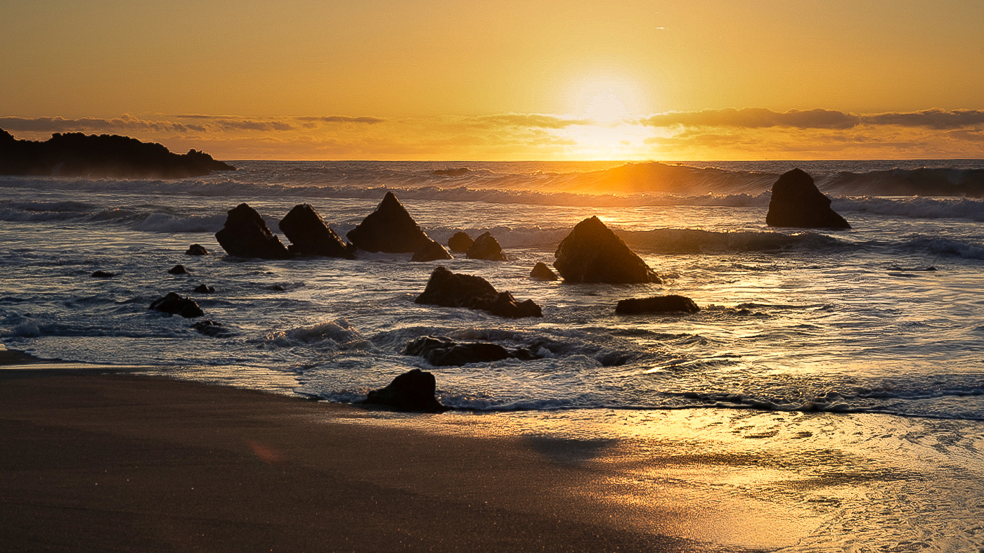
The different between the the color and the B/W is the introduction of life. What you did has made the rocks come to life. The original is flat but the highlights you added make all the difference. For me the sun adds a great deal. I think it is because you kept it quite subtle so that it looks like it is still deep in the cloud cover. I also feel the placement work to your advantage. Clearly the center tall rock is the subject and placing your sun just slightly to the right of the rock help to hold my eye on the large rock.
Thanks for the lesson. |
Aug 14th |
| 36 |
Aug 20 |
Comment |
You have a presented a quite striking image of a Pacific Sunset. You certainly found a interesting location with the sea swept boulders providing visual interest. Your choice of composition works quite well as you positioned the sun on the upper right fixation point and have also placed the section of the sea highlighted by the sunlight in the lower right fixation point. It is often a good idea to think of a photo in thirds. In this case you have drama, created by the sun, in the upper section, and have used the boulders to provide interest in the center. Finally, you have the texture of the sea and sand in the lower portion of the image thus creatively connections all three sections. You also positioned the horizon above the center of the image a good compositional move.
I started by straightening your horizon as it appears to sink to the left. I am assuming that it is the sunset that drew you to this scene and that the sunset and its highlights on the water are the intended star of the show. I feel that you most likely used matrix metering metering as you have evenly exposed the entire scene. As your meter tried to average the entire scene it left the sky slightly over exposed and seemingly washed out. In my vision of this image, I wanted to show the colors in your sky so using Lightroom I added a gradient at the top. Here I brought down the highlights and then slightly lowered the exposure to bring out some color throughout the sky. I did crop some of the sky since it was a large empty area ( partly washed out). This raised the horizon a bit further from the center of the image and also eliminated the blank area. I also used the adjustment brush in Lightroom to bring down the highlights on the sea in the lower right corner. The added some contrast to the water and played a bit with the black and white points to increase drama in the water. I also used an additional adjustment brush to open the highlights in the water in the area surrounded by the boulders. This added a bit of interest to the center of the image and avoided having a large dark area. Finally I added a bit of warmth to the entire image.
The total process was to present you with some options as to how the image could be adjusted. If you like any of them please feel free to apply as you feel necessary. If any of these changes adversely impact what was your original vision for the image feel free to reject my adjustments. In the end, its about how you want the image to look. If you have any questions, please ask.
I have attached my adjusted version so you can see the results.
I'm others will offer some thoughts of their own.
|
Aug 6th |
 |
| 36 |
Aug 20 |
Comment |
Welcome to DD Group #36
The purpose of the DD Groups is to create a dialogue between the maker of an image and the other members of the group. As the maker you present the image and explain what your vision was and how you went about achieving your goal. If you want advice on how accomplish particular things all you need do is ask and the group members will offer their ideas. Since it is your image, you get to accept or reject the suggestions. Everyone will see different things and thus you will get lots of ideas and techniques that may be applied to your current image or future ones. If you have any questions, just ask. I'm sure you will get lots of responses.
|
Aug 6th |
| 36 |
Aug 20 |
Reply |
Hey,it is really hot down here in Florida as well. I always take my cube cooler with several bottle of Gatorade and water so I can afford to share if necessary. I'm really happy with the little stars peeking between the tree branches. They were hard t see in live view, but the long exposure built them up just enough. |
Aug 2nd |
| 36 |
Aug 20 |
Reply |
Thanks for looking Stuart and I do appreciate you stopping by. The straightening issue just never seems to die with this image. I know it always cries for adjustment but to me it never seems right no matter how many times it is adjusted.
This is not too far from where you are located--it is part of Heron Bay in Parkland Florida. |
Aug 2nd |
| 36 |
Aug 20 |
Comment |
Lots of layers add lots of depth to the over all image. I will echo Richard in that one seldom sees both falls in the same composition. I like the sharpness and detail in the cliffs. This is one HDR image that does not have that fake HDR look to it---I would not have noticed it you had not mentioned it. You handled the white well and nothing appears t e blown out ( a fault of many HDR images)
My only wish (too late for a suggestion) is that you had zoomed out to maybe 50mm thus moving the lower falls just a bit to the right and away from the edge where it looks a bit squeezed into the frame. Placing both falls on fixation points (lower left and upper right) would make for a more dramatic image.
I'm generally not a fan of mid day images but this one works quite nicely.
Did you use a polarizer or is that sky the result of the HDR process?
|
Aug 2nd |
| 36 |
Aug 20 |
Comment |
Bill
I just finished judging a local travel photo contest and there were about a dozen photos of the Golden Gate Bridge in the contest. I ended up awarding an Honorable Mention to a photo taken from this side of the bridge because the other images were almost all the same shot taken from the other side at water level with the curve of the shoreline. I'm telling you this because this is a MUCH better shot than the one that got the award. Much better by far. It is crisp and sharp the light and the colors all work quite well together. Your post work paid odd and this lots quite nice. Personally, I wish there was just a tiny bit more space at the bottom as the rocks to the left of the green bushes and the road to the right of the same bushes loos a bit awkward. Both rocks and road feel like they are mistakes. Compositionally it would be better if the large tower were a bit more to the right but this is a very minor issue. The bigger issue to me is the vertical cables at the road level of the large tower. My issue may be due to the size of the image but there seems to be a pink blush to the sky between the cables that appears to be a bit unnatural. As the cables sag toward the far tower the entire sky seems tinted. This sets off a red flag that there could be a processing issue. (overdone??) Again this could be due to the size of the image and if viewed in a large format it might just be the cables themselves and thus be a non issue. You might consider slightly reducing the brightness of the large white columns on the left as they somewhat arrest the movement of the viewer's eye. Note they are the brightest things in the entire image and s that what you want me to look at?
Over all this is a quite compelling image and well done. In my view this would get a nudge toward round two and would certainly not be dropped early. In round two it would depend on the competition and quality of the other images.
Everything else about the image seems fine and a like the blur to the sky as it adds a feeling of technical mastery to the image.
Let us know what happens in the competition.
Glad you got your ride back a long walk in the rain may have been a real bummer. |
Aug 2nd |
| 36 |
Aug 20 |
Comment |
I can certainly see why you like this image. The sunset has one of those just magical moments to it and that warm glow is something that just can't be duplicated. I feel the diagonal slope, anchored by the bare branches on the left makes for a strong composition. The almost patriotic sky with the red white and blue adds an extra touch the scene.
While I liked the image at the first viewing it just felt something was odd. It finally came to me that it was the snow. It feels like you enhanced the colors just a bit---nothing wrong with that-as that really makes the scene pop. However for me I didn't like the red tint to the snow. I loaded the image in Lightroom and using the adjustment changed the white balance of the snow so that it appears white. This may be a very personal preference so if you prefer the pink tint to the snow I totally get it. I've attached my edit. Curious about your thoughts.
|
Aug 2nd |
 |
| 36 |
Aug 20 |
Comment |
First I like the sort of minimalistic effect created by the general shortness of the color scale. It almost begins to feel like a monochrome. The soft low light brings out lots of textures in the foreground that also adds to the image. I find it quite interesting how you have used the arrowhead shaped grey area to ac as a strong leading line pointing directly to the "Isolated farm" and the inclusion of the wheel tracks in the lower right helps to balance the image. I feel the crop into a pan format works quite well for this barren image. I think the single most leasing aspect of the entire image is the simplicity of it. While Mother Nature did most of the heavy lifting for this image, it was your composition that makes this work.
I realize I'm picking at nits but if I were to print this I would crop just a smidge from the top to eliminate the dark greys on the edge.
Overall, this is about my favorite shot of Palouse.
|
Aug 2nd |
| 36 |
Aug 20 |
Reply |
Thanks, I'll look into that next time. I often try the level in Lightroom, but I'll try the grid (in Photoshop?) next time. |
Aug 1st |
| 36 |
Aug 20 |
Reply |
Thanks so much for stopping by so early in the month! I appreciate you taking the time to make some adjustments.
You have no idea how I have struggled with the horizon line in this photo. The building does not have straight sides, there is not a single darn tree that grows straight, I shot this on a bit of an angle so the falls slope due to camera angle. UGH!!!! Every time I make an adjustment it looks right. When I look at your "fix" it looks really good. Thanks.
I also like your adjustment in the shadows.
Thanks again for your input. |
Aug 1st |
7 comments - 12 replies for Group 36
|
| 37 |
Aug 20 |
Comment |
Photography is all about light. I find that few images displayed on this forum really make use of light. I this fine image you certainly used the light to tell the story, create a mood and move the eye through the image. The lit brush in the foreground makes the foreground an important element of the image the highlights on the left side ridge turn the ridge into a powerful leading line and the well timed exposure made use of the rising sun and the backlight effect.
Well done. |
Aug 5th |
| 37 |
Aug 20 |
Comment |
It is a pleasure to see an image taken by someone who knows exactly how to capture an image such as this.
When I first opened the image is was impressive but when I looked at the technical data it revealed your skill set. Have the fast shutter to keep it sharp and the mid range aperture to guarantee DOF was the right thing to do. Allowing the high ISO to guarantee the other settings made this work. Well done.
I would like to know the lens used, just our of idle curiosity. |
Aug 5th |
2 comments - 0 replies for Group 37
|
| 41 |
Aug 20 |
Comment |
This is a most different take on startrails. The novelty of it is quite clever. The rising moon did you a great favor by lighting the mountains. First I think you did a great job of extracting that moth---legs and all.
As a hiker and backpacker I have done more than my share of this type of scene and you image makes me feel like I am there with you. Good job.
On the other hand I'm really glad I was not there. I don't know where you were, but if the moths get that large I do not want to be there!!! The darn thing is so large it is bending the tree!!!
Seriously, to me that is the problem. The scene just seems fake. It is well constructed, I just feel it is unreal. That may be why you have that unsatisfied feeling. |
Aug 4th |
1 comment - 0 replies for Group 41
|
| 42 |
Aug 20 |
Comment |
Hi Heather
Let me welcome you to the digital dialogue forum. From the comments posted here you seem to have fallen into to a group that has some clear expertise. You should enjoy working with this group.
I read your description explaining how you took the shot. However you neglected to tell us what your aperture was. Shooting with a 100mm macro lens will give you a very shallow DOF unless you are shooting at a high aperture. That may account for the softness of the rose. You might check your paperwork that came with the lens or do an online search to learn what DOF you have with different apertures.
Good luck with your shooting. (be sure to show the group some of your teddy bear images) :-) |
Aug 5th |
1 comment - 0 replies for Group 42
|
| 59 |
Aug 20 |
Comment |
Basically I agree with Diane. You have a sharp action image but it lacks drama and impact. Perhaps it is the nearly mirror images of the two players that takes away the feeling of struggle. The competitors just come across as too smooth.
As Diane alludes a lower angle often increases drama But I think the only thing to add punch to this is if you had the players coming at you.
You just seem to have gotten a bad break. You appear to have done everything right, those darn players just did not cooperate. You did a fine job. |
Aug 4th |
| 59 |
Aug 20 |
Comment |
As a sports photographer nailing that perfect image is a real challenge in sports that are fast moving and confined to tight areas. you have expertly captured the Battle for the Ball and that message comes across well.
Your slightly high camera angle may be your worst enemy here because your angle included those two players at the top in the background. Sadly they are sharp enough they they are seen and thus when you crop their heads the image looks awkward.
However for me the fact that you do not have the faces of either of the two players battling for the ball is the deal breaker. When I shot college sports it I did not get the faces they simply would not use the shot.
You have a top action shot, sharp, well exposed just lacking a face. Any thoughts on this? |
Aug 4th |
| 59 |
Aug 20 |
Comment |
You have got to love that 400mm f2.8 lens. The background is superb and really brings out the subjects. You caught peak action and that foot driving directly toward the camera certainly carries power. You technical skills clearly show, especially with your camera angle. You clearly know that speed is your friend and the 1/3200 contributed to the complete sharpness.
I also like the angle of the light, the strong side light brought out shadows and textures that add to the image.
This is superb! |
Aug 4th |
| 59 |
Aug 20 |
Comment |
As a former sports photographer shooting for several local colleges I think this is a great shot. Depending on how it is to be used--I would crop even more. Perhaps just above the knees. That flying elbow, the look on the face of the player getting hit and the intensity of the eyes of the player in the dark jersey makes this powerful. If the deep crop can be made without losing quality then by all means go for it.
Most of my editors really liked several tights shots with drama and I think this one would qualify. |
Aug 4th |
4 comments - 0 replies for Group 59
|
| 60 |
Aug 20 |
Reply |
Hi Lance
You are absolutely correct. Those blurred tips do impart the feeling of motion/action and can enhance an image. Paraphrasing Shakespeare "to blur or not to blur, that is the question." Both techniques are useful, depending on what the photographer is trying to show. It is all about mastering skills to create an image.
|
Aug 12th |
| 60 |
Aug 20 |
Reply |
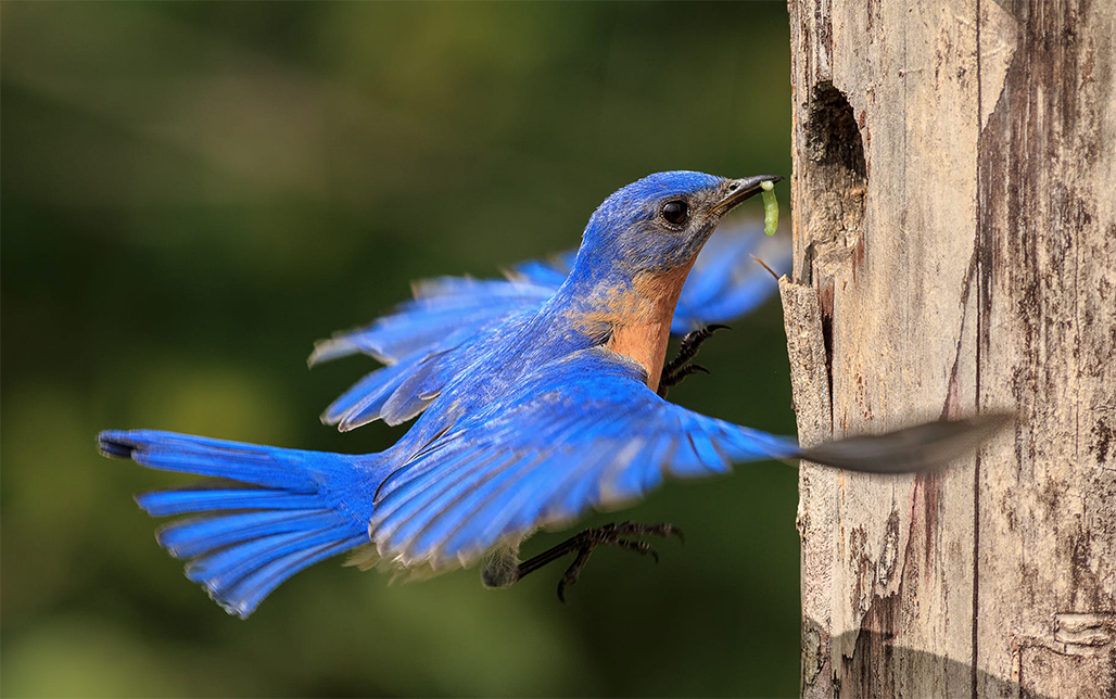
Here is an example of how this shooting system works in reverse. In this case the bird constantly returned to the birdhouse. I focused on the house, backed up a half step so that my focus point was in front of the birdhouse and fired of a burst when the bird returned. This was single point focus, 1/2500 @ f8. I should have used f11 to get the wing tips.
The camera was mounted on a tripod and I used a cable release because the scene didn't change, I just had to wait until the bird came back. |
Aug 11th |
 |
| 60 |
Aug 20 |
Reply |
Hi Jane
Since you asked here goes. You have two choices. first you should be using back button focus and your shutter button should not be connected to focus--it should be dedicated completely to shutter activation. You will need a fast shutter speed at least 1/2000 since at take off the wings will be beating quite fast since this is a small bird. Use an aperture of at least f8. Focus on the birdhouse hole. Then back up about a half step. This will move your focus point to about a 12-16 inches in front of the hole. This when the bird burst out of the hole he will move into the focus and therefore be quite sharp.
The other option is to use the same camera settings as outlined above but switch to dynamic group using either 9 or 21 focus points and continuous focus.
Good Luck. |
Aug 11th |
| 60 |
Aug 20 |
Comment |
Hi Bernie
You have a good shot of the bird in flight. It takes lots of practice to get this type of flight shot just right. As several have noted your focus is just a bit off. I'll bet your bird was sitting inside the house and you were focused on the head that you could see peaking out. The when he launched you started shooting.
If you can tell be how many focus points you had active and what focus mode you were using I can give you some pointers on how to make this type of shot come out a bit better. If you are interested, I'll be glad to help. |
Aug 5th |
1 comment - 3 replies for Group 60
|
| 67 |
Aug 20 |
Reply |
Thanks for looking and commenting.
Please check back next month---things got a bit better. But that is all I'm saying until September. :-) |
Aug 18th |
| 67 |
Aug 20 |
Comment |
You were most fortunate to capture the eagle eating his meal. For this being almost a "grab" shot you managed good exposure and composition. Using the D850 and the Nikkor 200-500mm you should not have a problem adding the tc1.4 and still obtaining quality sharpness. I have been studying your image and rereading the write-up for several days trying to figure out why the lack of sharpness.
I have come up with several possibilities. First you mention you used car support. If the vehicle's motor was still running then all the vibration of the running engine will transfer to the vehicle frame. If that is the case then your 1/1600 would not be enough to stop the action. That D850 has so many pixels that it will show up any errors made by the user. My suggestion would be drastically increase the shutter speed. I've found that when I first started using my D850 for action shots that a fster shutter paid big dividends. That D850 handles high ISO levels so it you would need to boost the ISO even to 1000 in good light it should not be a problem.
Holding that big rig that you use I think you will find that fast shutter speeds will make a big difference.
Were you using either of the group dynamic modes for focus? Either the 9 or the 21 would also help with camera movement.
Just a few ideas.
By the way, just how big is that hawk? I have never heard of the species before. |
Aug 14th |
| 67 |
Aug 20 |
Reply |
Thanks Stephen
I adopted a philosophy about wildlife photography years ago and have never forsaken it. No fleeting image is worth harming the animal. Sometimes it is hard to follow,but this case as a no brainer.
In this case I think the cross breeding accounts for why I never saw the male around the nest. Only the female. Poor gal really had to work to build a nest and raise a family on her own. she didn't need any disruptions. |
Aug 11th |
| 67 |
Aug 20 |
Reply |
Hi Todd
I'm not a great fan the the Audubon "watchdogs". Ran in to a pair of them 2 years ago at an Eagle nest. They didn't what anyone within over a 1/4 mile but they parked their vehicle in the only shade in the area--the shade provided by the tree the eagles were nesting in!!
Yes the two photos are different---the main photo is my rare bird and the "original" is just a shot I happened to have of Normal GBH. I put it there just so folks could see the difference between normal and the rare bird.
You will just have to wait until next month. :-) |
Aug 10th |
| 67 |
Aug 20 |
Reply |
Thanks for looking. Fortunately the GBH flies pretty slowly and this bird has a head that is predominately white while the normal GBH has the blue head. The real luck was in being able to reach the nest. These birds really don't hunt vary far from their nest so I was able to watch where it landed and then slowly drift up to the site.
I'd rather be lucky than good when in the field.
|
Aug 5th |
| 67 |
Aug 20 |
Comment |
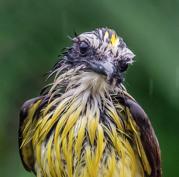
The very wet bird looks sooooooo pathetic that it is almost endearing. Even the tilt to the head adds to sad appearance.
What you display is sharp and crisp with a generally pleasing background so the image has curb appeal for sure.
However when I view the original I do understand the crop as you are trying to clean up the clutter. As displayed you might clone out the white/grey patch in the upper left because its brightness detracts from the final image.
Usually with birds it is best to crop tight (in this case eliminate the legs) rather than chop them off mid leg. The rule (which can be broken) suggests that even if the feet do not show you should include the space where they should be. In this case it is why the bird feels chopped off. Generally in nature photography is is best to eliminate man made elements like the square cut beam the birds are sitting on.
I think you did a great job in turning a messy original into a satisfactory finished product. Cropping even tighter would have made it still better. I'd be interesting in knowing how you feel about the tighter crop. |
Aug 4th |
 |
| 67 |
Aug 20 |
Comment |
The swan is such a majestic creature that they generally look lovely in photos. In this case, even with the generally poor conditions you did manage to obtain a pretty solid image. This image has a very static feeling largely because of the centered position of the subject. I would suggest that moving the swan to the left would help improve the composition. The majority of the image is shown in subdued tones and colors and thus the very bright foliage in the background becomes competitive with swan. Those bright yellow and greens I feel are quite distractions. You could either clone them out (which would be preferable or even crop the ones on the left while you move the swan to the left or darken and desaturate them.
It would have been nice to get the mated pair---but that, it seems, was not to be.
I noted you mentioned that your camera raingear is not the best--- please let me highly recommend the rain gear from Lenscoat. I keep it in a pocket in my camera bag so it is always with me. Even on good days when I'm in my canoe or kayak the gear is always on my camera. You should check them out and be aware that they have numerous sales throughout the year so you should never have to pay for shipping.
|
Aug 4th |
| 67 |
Aug 20 |
Comment |
There is a great deal to like about this image. You have created a beautiful seamless background that sets off the subject in the best possible way. The image is sharp showing your technical mastery. You even caught a catch light in the eye. That 1/1600 was a great choice. You also have excellent light that is soft and flattering-- it really makes this image work.
The suggestion I would make is to wait for the bird to be in a better position. Note that the bird is nearly the color and tone of the background and because of the thistles in front of the bird it is hidden from view. One of the hard things about photographing birds is getting them clear from their busy environments. Imagine how much more beautiful this would be if the bird was framed and not hidden by the thistles? |
Aug 2nd |
| 67 |
Aug 20 |
Comment |
This ends up being quite a dramatic image. The body posture and the big open mouth adds a great deal of drama to the image. The subdued light really makes this image pop. For shooting at ISO 1250 it is remarkably sharp but that largely speaks to the fact that you nailed the exposure and didn't have to play with shadows. (that is a big well done)
All in all this is a superbly crafted image.
You also recognized the issue of the soft tail of the bird caused by the f4 aperture. Your extremely high shutter speed greatly contributed to your sharp image. Shutter speed is your best friend to obtain sharpness. You easily could have dropped shutter speed to 1/1600 and thus raised the aperture to f5.6 or 6.3 which may have been enough to save that tail.
The best part is that you recognized this short coming. You actually got the front wing without blue and only lost a bit on the right wing---that is dept of field loss.
I've been doing some virtual lectures to various camera clubs during this confinement period. I just finished a program on obtaining maximum sharpness in images. It will be posted online after the 17th of the month. I can send you a link to it if you are interested.
|
Aug 2nd |
| 67 |
Aug 20 |
Reply |
Thanks Isaac. I was just lucky and happened to see it fly by. Then even more lucky to have been able to follow it to the nesting site. This is certainly not a work of art---just a documentary that says ---I saw you!!! But I' glad I got it. |
Aug 2nd |
| 67 |
Aug 20 |
Reply |
Thanks Jason. This is a most unusual bird. The big visual differences and the colorization on the head the the shoulder patches. I added an original image that is a photo of a normal pair of GBH for comparison. I think the differences are quite noticeable. |
Aug 2nd |
5 comments - 6 replies for Group 67
|
| 83 |
Aug 20 |
Comment |
A photographer that challenges and engages his audience is a true master of the art. I am somewhat familiar with the philosophy of Wabi Sabi and feel that you have done a masterful job. This image imparts the feeling that you are looking into the soul of nature. You are able to isolate and see the inner being, the true nature of what it. For those willing to be open and look, there is a spiritual aura to your work.
Well seen and executed. |
Aug 12th |
1 comment - 0 replies for Group 83
|
| 84 |
Aug 20 |
Comment |
Doing this videos now for the third time I'm starting to feel like Cisco and Ebert. I sit down, load these on to my 60' TV, get my note pads and pens and hold the remote in hand so I can pause, repeat and advance a scene. I do these at night so I have a private screening room and then type my notes the next day. This is a real production. I do enjoy it. I've even bought a book on reviewing movies to try to gain some perspective. You have opened a whole new world of photography for me. I feel good about judging an individual photo ( judge several major competitions each year) but I worry about doing these videos justice. |
Jul 12th |
| 84 |
Aug 20 |
Comment |
The first thing I noticed was the green titles that for me blended in to the background and were hard to read. One of the things that most annoyed me was the amount of burned out rocks that mostly appeared on the right side. It is for this reason that I usually film my water scenes on overcast days or when the light has faded. The final portion of your viewer lacks these burned rocks and is much more enjoyable. I really like the way you hold a scene to let the viewer take it all in. Your panning and or zooming and advancing the drone works well in getting me to the scene you want to show and then you let me enjoy it. This is something I commented on in the other reviews. I like the way you handled the camera movement at 1:59 but not the little adjustments after the final scene was composed. (Although that may be a drone issue in holding it steady) @ the 2:30 mark the scene is beautiful and really holds my interest but note that there is no burnout on the right. I also liked how as the scene became serene the music slowed in tempo to match, this is well done. The final portion where you lifted the camera angle to frame the final scene felt quite elegant and you also allowed enough time for me to enjoy the moment.
I liked how the whole video fit together---the continuous flow from start to finish was comfortable. The video lacked the sudden changes that feel awkward. I really felt that I was walking along and enjoying the trip. This has a more professional feel to it. |
Jul 12th |
| 84 |
Aug 20 |
Comment |
Hi Dick
I've now finished my reviews of your group and again it was enjoyable. I averaged 30 to 40 minutes with each review and one took over 90 minutes. I hope I did not sound too harsh as I pointed out a number of things most of which are relatively minor, but in a long video they pile up. The videos were enjoyable and the group seems to be doing well. As I'm not a video person myself I hope I'm pointing out the right things and my comments are fair. I'm looking forward to September. |
Jul 12th |
| 84 |
Aug 20 |
Comment |
First this is a most powerful dramatic and captivating video. I watched it 3 times and even thought it was long I did not mind the length. I frequently backed up and rewatched scenes. The choice of music truly sets the mood and adds to the drama. The only part I really objected to was the sudden speed up @ :29 showing the drive to the location. That speed destroyed the mood. I feel the speed of your panning in the opening description needs to be slowed down---I never got to see the scene. Remember I'm trying to read and look at a location I have never seen and want to soak it all up (sorry, bad pun). The scene and the camera work @ 1:50 is most impressive the ending with the foreground rocks creates a power feeling (maybe my favorite part) When you show the two boats at the dock I found that as yu started with the left boat, moved to the right and then back to the left and so on was awkward. I would have preferred to have you film one, finish it and then move to the other. You seem to do this sort of thing quite often and it makes me feel like I missed something or you are filling time. For me, if you show it once, don't repeat it. I will assume much of this was shot handheld and the jerky feeling takes away from the majesty of the scene. Is a tripod feasible for some of these scenes. I realize you were on a boat and and the boat may bob but would that be better than jerky handheld shots? I don't know---you are the video man. The first vertical shots showing the large falls really helped to let me feel the size of the falls. Overlaying the music with the roar of the falls adding a real feeling of drama. Throughout much of the video I truly felt as if I were along for the ride. @ 4:16 the sunset was a show stopper. Here you held the camera position long enough to let me enjoy and feel the moment. Well done. @ 4:50 it became quite jerky and I lost the mood and the feeling. I love the sound, but not the camera movement. The very slow zoom @ 5:42 was effective. The very blue segment of the boat sailing toward the falls @ 6:19 created a mood I will not soon forget. The sound of the thunder and rain along with the flash of lightning made me feel the moment and surrounded me with the environment. This touched my inner being. It was at 7:01 this point my photographic bias took over. The moment shows a dramatic falls on the left of the screen but you include a large section of small falls in the lower left corner. Since the eye of the viewer is drawn to light and bright I could not help but to look at those small falls in the right corner and felt like I was missing the beauty on the left. Another camera faux pas that crept in occasionally was that as you panned you picked up pieces of boat rails that intruded on the scene. I would be happier if they were not there. While the vertical views of the large falls near the opening worked visually I do not feel the vertical shots later in the video worked as well. At 10:19 the dark boat with the falls in the background is a superior scene. The textures and colors of the boat really show off the scale of the locale. This is a great scene---what I did not like was how the camera action bobbed vertically and cut of the lower portion of the boat several times. This destroyed the mood. Leave the boat some water to float in. The scene at 10:43 is awesome.
While I may sound like I am highlighting a lot of negatives please know that with was a very enjoyable video. You created an experience and a mood that is unforgetable. Much of what I point out is in reality minor.
Thanks for creating this. It is impressive. May I ask what camera was used to film this, and how did you keep it dry. I use a lenscoat raincoat for my Nikon D810 and D850 would that have been adequate? |
Jul 12th |
| 84 |
Aug 20 |
Comment |
I really liked the choice of music. It had a very progressive feel to it while being a bit jaunty and made me feel that there was more to come----it had a good tour feeling to it.
The opening with the spinning spiral that morphed into the jet engine was an excellent lead in. The camera work was excellent.
For me most of the film felt like a drive by. It felt very repetitive. I felt that a shot of luggage being loaded on the conveyor belts or a plane being pushed back, perhaps a take off, a food service truck rising to the plan door more of a variety rather than just an endless series of planes would provide more interest.
At 3:15 the plane with the blurred props was a great choice. At3:20 the orange sunset was a beautiful scene. Then at 3:37 the series of night shots were a excellent change of pace and added interest. The landing taken from the cockpit (of your helicopter?) added a feel of being part of the airport.
As a side bar, I was amazed at the fact that so many of the planes were basically white. Most of our are varied colors.
The video was lively,offered some interesting scenes but for me was just to repetitive. Still it was an interesting tour of some of the behind the scenes actitivies. |
Jul 12th |
| 84 |
Aug 20 |
Comment |
Hi Peter
Thank you for my tour of Switzerland. I found much of this video quite charming and enjoyable and felt you captured the "feel" of the country quite well. The music was appropriate--just lively enough to keep things moving and matched the tempo of the scenes. The lighting was even throughout, exposure worked well. The titles were nicely created and easy to read and more important, not overbearing. I'm not sure the opening scene (sheep) was the perfect state setter, but then I've never been to the country and don't know if this really is the best opening or not. Perhaps something that outsiders would better identify with would work better---just my opinion. The opening sequence was wonderful--especially the large projected white figures walking---very eye catching and interesting.(@:17 secs) The zooms and the camera angles worked quite well until the :54 second mark. Beginning with Schossli-Worth you zooming became problematic for me. Let me explain. You would zoom either in or out to a subject and my eye followed the zoom. Then when you reached the end of the zoom just when I was ready to look at the subject you immediately cut tothe next scene. I felt cheated. I wanted to see what you had so beautifully led me to but you cut away too fast. This continued through the rest of the video. The zooming was much better at the Rhine Falls. The zoom to the frescos
was a real tease---I was all set to enjoy a good look and you cut away. :-( The sound overlay of the rushing water at 1:29 was very effective. The ride on the cogwheel was excellent---especially to over the shoulder of the man at the window and the train descended. I really felt like I was right there with him. Moments later on the train ride the cows in the field went by so fast they were annoying. For me, either do a slow motion and eliminate the scene---it ruined the mood of the video. The great floral clock was amazing---- just give me a few second so actually see it. without moving the camera. Earlier the scenes with the stone lion were well handled. The drinking fountains at the end were really interesting---I really enjoyed them. This really was an enjoyable video and while I pointed out a number of things there was much more good than bad in this video. I watched it three times and spent a half hour writing this review. Many of your camera angles were well done and you mostly picked scenes that showed variety and were interesting.
My final suggestions are don't rush the viewer, let them enjoy the sights---most will probably never see these sights and you are providing them with wonders to enjoy. Selfishly, I would have liked to see a night scene or two---especially at the end.
Thanks for doing this, it was not too long---it held my interest and was enjoyable.
I'll look forward to the September video. |
Jul 11th |
6 comments - 0 replies for Group 84
|
37 comments - 25 replies Total
|


