|
| Group |
Round |
C/R |
Comment |
Date |
Image |
| 2 |
Jun 20 |
Comment |
Don't be disappointed. The clouds/fog really make this image something unique. Everyone has this shot in perfect weather. Only YOU have this wonderful scene. I would frame this beauty long before i would even consider one in perfect clear weather.
Well seen and captured. |
Jun 4th |
1 comment - 0 replies for Group 2
|
| 3 |
Jun 20 |
Reply |
I certainly do not mean to hi-jack your post but I'm placing a link to one of my photos of this bridge just so you can see a different look. It probably won't show up as a link--but you could copy and past it should you be interested.
https://reminisces.smugmug.com/America-the-Beautiful/Lighthouses-in-Florida/Cities-in-Florida/Bridges-of-Tampa/i-Sv6h3FM/A |
Jun 8th |
| 3 |
Jun 20 |
Comment |
I would bet that this is the Pinellas Bayway Bridge in Tampa Florida. I've photographed it several times. It really is this beautiful from underneath. |
Jun 7th |
| 3 |
Jun 20 |
Comment |
Nice job. I've photographed this bridge in the past. It certainly allows for some dramatic images. Were you sitting on the concrete trying to poke your lens through the rails of the fence when you took this?
Great job!
Just for fun, try changing the white balance and see how you can change the mood of the image. |
Jun 4th |
2 comments - 1 reply for Group 3
|
| 4 |
Jun 20 |
Comment |
This a a really fine capture. You got perfect wing positions and a really good composition. Better yet----EVERYTHING is sharp are clear. This is an excellent action shot.
Just a thought---If I was going to enter this in a competition I would crop a bit off the reflection. As a rule reflections should either be there or not be there and this is "almost" there which sort of breaks the rule. I crop a bit from the bottom just to make it look like it is not supposed to be there. |
Jun 7th |
| 4 |
Jun 20 |
Comment |
Glad you managed to not get cut off. Just before the lock down I got trapped on a spit of land as the tide came in. I spent a non-delightful 8 hours waiting for a chance to get out. But I got some great photos.
I love lighthouses and this photo is quite dramatic the stark white of the building plays well against the dark sky and the rugged rocks and you used a perfect composition to display the image.
May I suggest that you try to lighten or brighten the water just to create some separation between the water and the rocks since they appear to blend together and get lost. |
Jun 4th |
2 comments - 0 replies for Group 4
|
| 5 |
Jun 20 |
Reply |
Thanks but no thanks. With the Pandemic, my wife is around full time---can't get involoved with another woman at this time. :-) |
Jun 10th |
| 5 |
Jun 20 |
Comment |
I certainly like this one much more than the original this one has character and mood. I think you handled the zoom effect quite well. It is hard to do and yet make the image look acceptable. Nice Work. |
Jun 4th |
| 5 |
Jun 20 |
Comment |
Clever and dramatic. Smoke photography an be fun.
I like the feeling of an upcoming Kiss. Can't get that thought out of my head. But then, I've been locked up fora long time. :-0 |
Jun 4th |
2 comments - 1 reply for Group 5
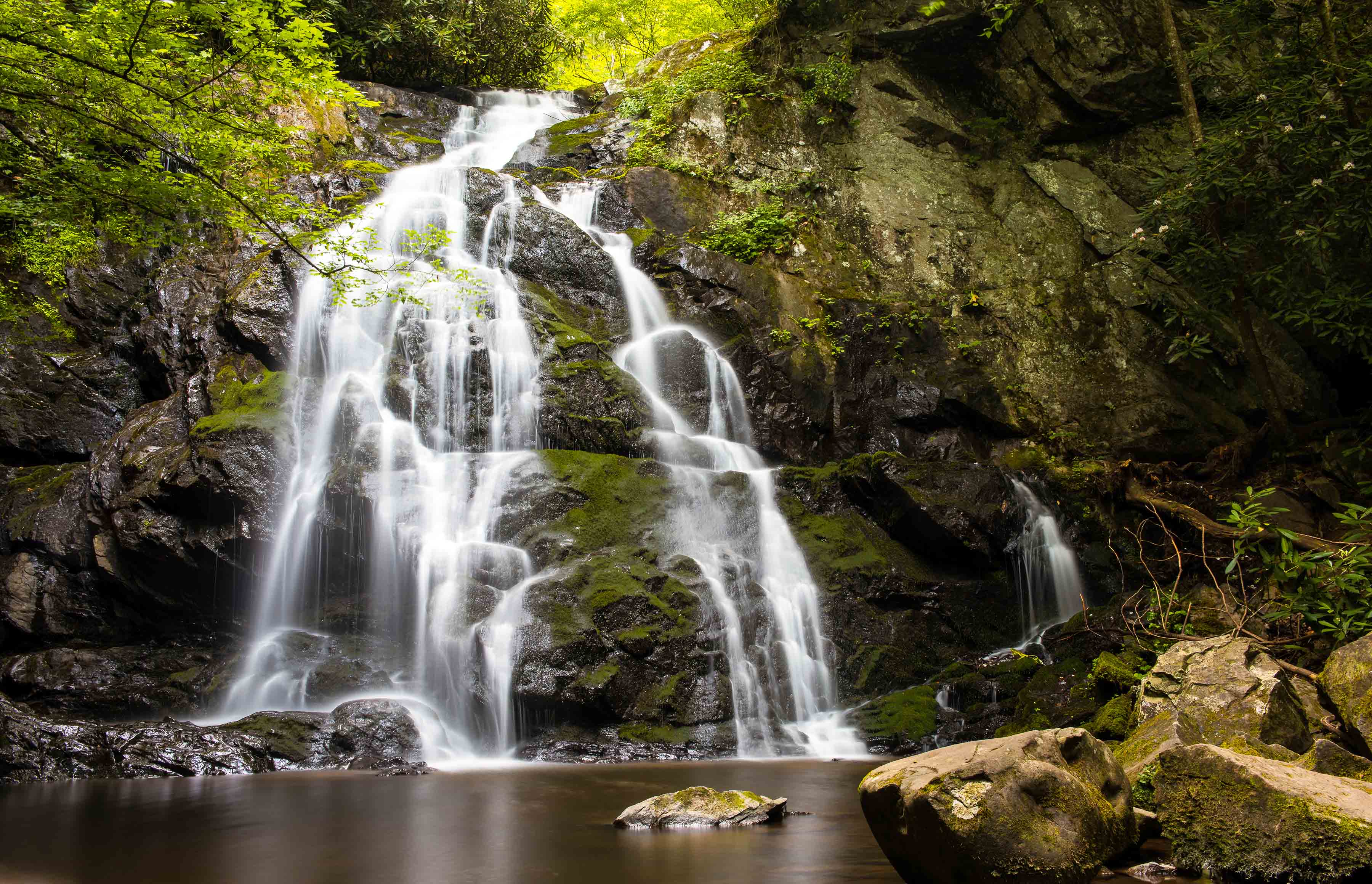
|
| 8 |
Jun 20 |
Comment |
Few photographers in the forum really make use of the light.
YOU DID and this is a great shot. The direction of the light, the shadows, the quality of the light are all superb. This is truly beautiful. Well done. |
Jun 7th |
1 comment - 0 replies for Group 8
|
| 11 |
Jun 20 |
Comment |
This is a fine image of the juniper. I'm sure old Ansel would approve. Making this a B/W really enhances the textures in the gnarled wood. Your exposure on this made all the difference. This is well done. |
Jun 7th |
1 comment - 0 replies for Group 11
|
| 15 |
Jun 20 |
Comment |
Well, we both visited the same shack in the same year! Love this shot. The vivid colors make this really stand out. With the blues and the yellow to guide the eye of the viewer this has instant impact. Blue and Yellow and Complementary colors --these types of color automatically add real pop to an image. You made them work quite well. |
Jun 7th |
1 comment - 0 replies for Group 15
|
| 16 |
Jun 20 |
Comment |
This is really lovely. It is quite dramatic. I sort of agree with Bunny that some of the white at the bottom ought to be cropped. The water is bright and there is too much of it and that takes away from the wonderful ice covered branch. If I could suggest one change---that can't be done, I would have liked to see just a bit of separation between the bottom of the icy branch and the blurred white water. Getting this branch with those browns and greys of the cascade would have been really magical.
I still wish this was mne. It is a fine shot. |
Jun 7th |
1 comment - 0 replies for Group 16
|
| 24 |
Jun 20 |
Comment |
This is perfect. Well, all most. What you need is the 19th century covered wagon and mule team coming through the valley. This is like a walk back in time. Your edits make this work. I love it |
Jun 4th |
1 comment - 0 replies for Group 24
|
| 25 |
Jun 20 |
Reply |
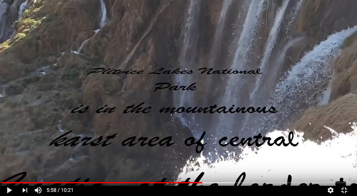
Focus Stacking is not in Photoshop versions that old. Sorry
Here is a video that explains it. Watch it for future reference. |
Jun 17th |
| 25 |
Jun 20 |
Reply |
I've been using Photoshop. I stacked 47 images in about 10 minutes from start to finish. |
Jun 17th |
| 25 |
Jun 20 |
Reply |
I know about his sale. I'm a big fan of his videos.
Thanks |
Jun 13th |
| 25 |
Jun 20 |
Comment |
I noticed that you didn't include your camera settings. Your Teddy looks a bit soft---like your depth of field is too shallow. Increasing your aperture will make Teddy look his very best. I'd try shooting at at least f13 |
Jun 13th |
| 25 |
Jun 20 |
Comment |
In answer to your question when making adjusts with the sliders you will get those halos if your adjusts go too far. You have to make very slight changes. One way to make it a bit easier is to first adjust the white and black points so that there is no clipping. That will give you a bit more latitude to work with.
If this is a bit too confusing, drop me a note and I'll provide a more detailed set of directions. It is no bother and I'll be glad to do it. |
Jun 13th |
| 25 |
Jun 20 |
Comment |
This is a very nice image of an orchid. Adding the water drops adds a great deal of interest to the image and your diagonal composition is a great decision.
Like you I've been photographing a lit of flowers while on lockdown using that same macro lens. I have not been satisfied with the DOF so I've been teaching my self focus stacking. Generally about 15-20 shots on a single orchid but they come out really sharp. Have you ever tried the focus stacking approach? If not, you should give it a try. |
Jun 13th |
| 25 |
Jun 20 |
Comment |
I think your replacement background worked quite well. Is this one you made or is it some sort of preset or filter effect?
Either way it is a great complement to the image. |
Jun 13th |
4 comments - 3 replies for Group 25
|
| 28 |
Jun 20 |
Reply |
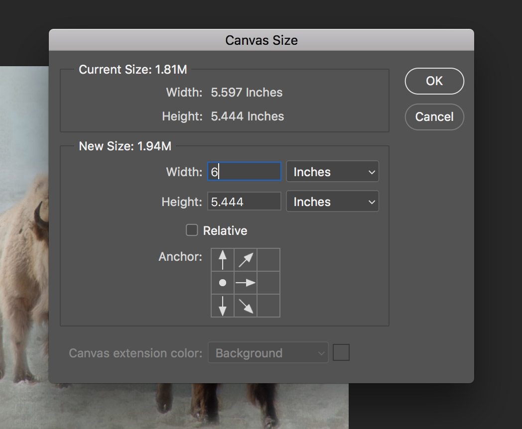
Sorry, I forgot to attach the written instructions. Her they are:
Here is the step by step to enlarge the photo
I am using Photoshop 2020 the current version.
1. Open the photo in Photoshop.
2. Make a duplicate layer
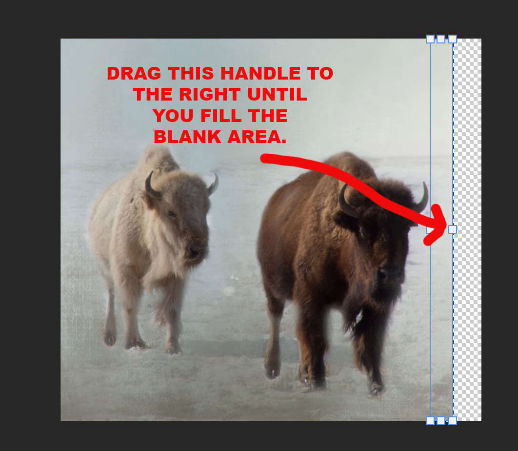
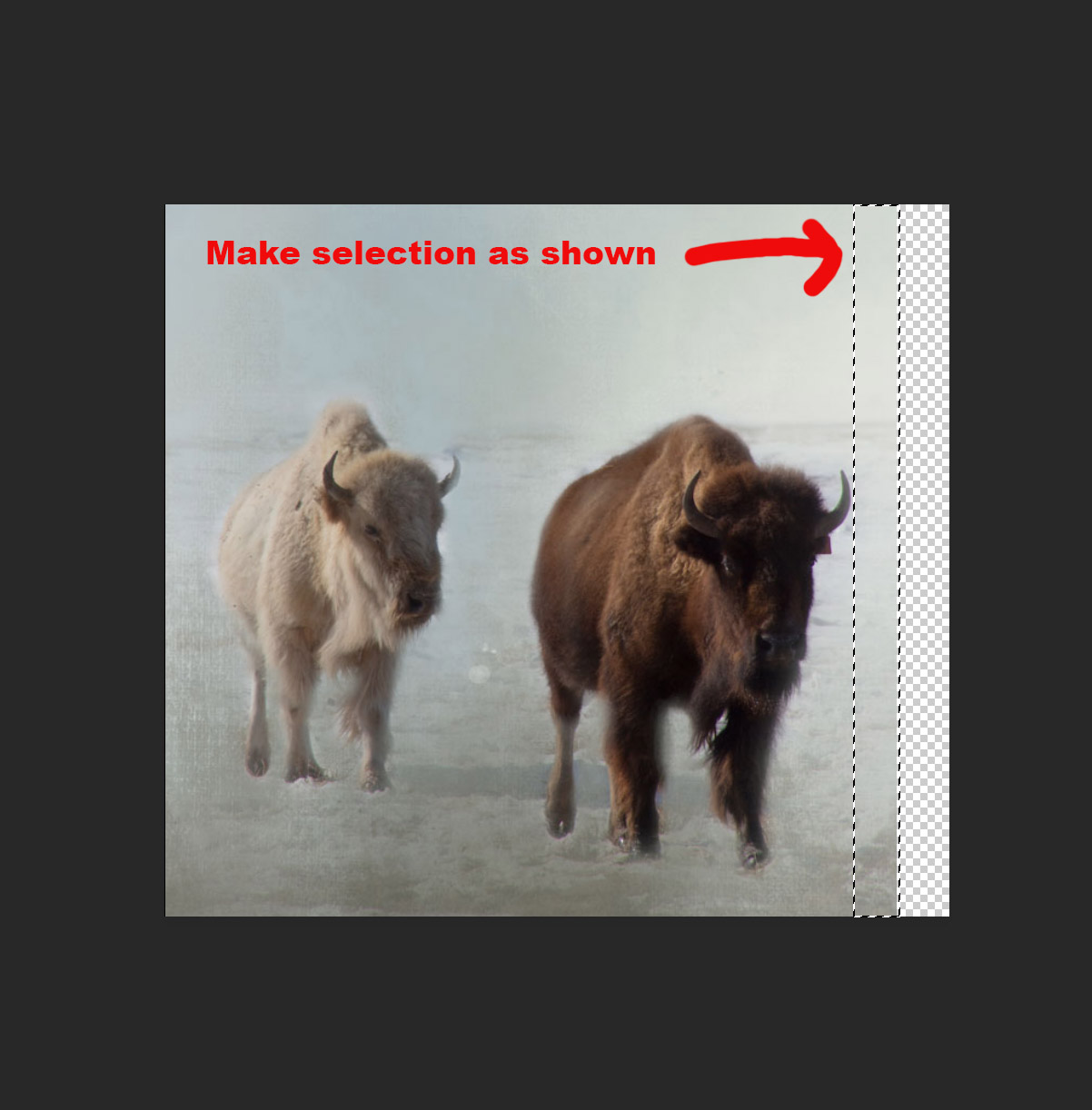
3. Click on Image>Canvas Size. In the pop up screen adjust the arrows to look as shown in image 1 that is attached. Then where is states image width increase the size on the right by ½ inch. Then click OK
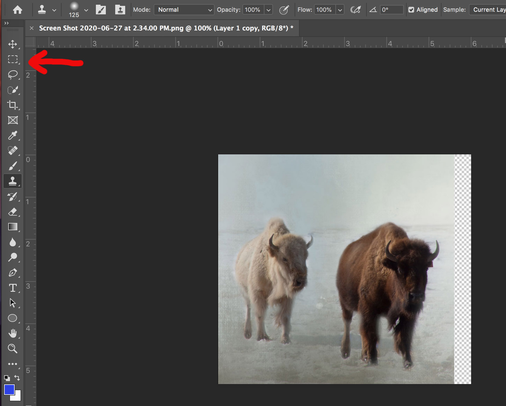
4. Use the rectangular tool (see image 2) to make a selection as shown in image 3.
5. Then click Edit>Content Aware Scale and using the handle indicated by the arrow in image 4 drag the selection to the right to fill the screen Click OK
|
Jun 27th |
| 28 |
Jun 20 |
Reply |
|
Jun 27th |
 |
| 28 |
Jun 20 |
Reply |
|
Jun 27th |
 |
| 28 |
Jun 20 |
Reply |
|
Jun 27th |
 |
| 28 |
Jun 20 |
Reply |
Here are the instructions as you requested. Good Luck
I used extra replies to include the rest of the instructional photos. |
Jun 27th |
 |
| 28 |
Jun 20 |
Reply |
Please feel free to use as you please. I have no copyright attached to it. :-) |
Jun 14th |
| 28 |
Jun 20 |
Comment |
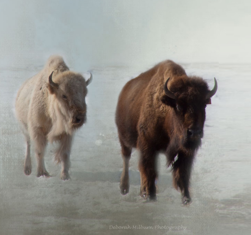
Buffalo in the snow---what is not to like?! Wish I had a shot of these Big Shaggies.
While your exposure is spot on, may I suggest a composition that eliminate the vast amount of empty sky? The subjects are buffalo and the extra sky takes away from their impact. I have taken the liberty of doing a sample crop to show what I'm referring to. While I was doing that I felt that the lead buffalo looked a bit cramped in the composition so I added some space for him to walk into. It is simple thing to do using Photoshop, Edit>Content Aware Scale.. If you don't know how to do this---drop me I note and I'll be happy to provide step by step directions. It is your image and if you prefer your original then that is the way it should be. The photographer is always right. I would appreciate knowing what you think of my minor changes. |
Jun 14th |
 |
| 28 |
Jun 20 |
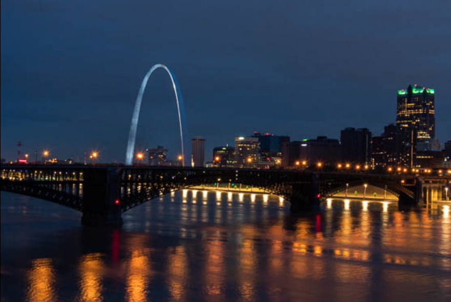
Comment |
Having been to St. Louis many times and been up the arch I do envy your your night ti me image. The view is quite stunning and I love the reflections you have in the river.
May I suggest a rather severe crop? I really hate to crop large amounts from an image but I feel you may have a more dramatic image by getting rid of the extra blank areas. However, it is your image and if you like it better with the greater amounts of sky and water then by all means---you are correct is keeping that view. I would be interested in knowing what you think of my crop. |
Jun 14th |
 |
2 comments - 6 replies for Group 28
|
| 32 |
Jun 20 |
Comment |
Candid Wedding photos---I know them well having shot way more than my share of weddings.
I do like the B/W conversion for this and while the bride and her dress are the stars--I would bring down the highlights of the dress just a bit. I would certainly crop some of that fan on the right. It is so large that it takes attention away from the bride. |
Jun 7th |
1 comment - 0 replies for Group 32
|
| 33 |
Jun 20 |
Comment |
You wait in the cold certainly paid off. The light fog and what looks like frost really adds detail and interest to the scene. I also like the curve of the fence that shows there is a bend in the road and it makes me want to know what is around the bend. That sense of anticipation really adds to the image. |
Jun 4th |
1 comment - 0 replies for Group 33
|
| 36 |
Jun 20 |
Reply |
Thanks for commenting. I was disappointed at first, but this has become a favorite image. For me it just has that "feeling" to it. |
Jun 28th |
| 36 |
Jun 20 |
Reply |
I often try things in the field. Doing panos of 5-7 images shot in vertical position so as to get better detail. I focus stack landscapes, experiment with shutter speeds as long as 10 minutes and as you saw here play with camera angle (overshooting) and try to use depth of field to advantage. I am also, always looking for ways to use light to create impact in am image. Using light creatively really excites me. I just refuse to take a midday photo while standing there hand holding my camera. :-) |
Jun 18th |
| 36 |
Jun 20 |
Reply |
Thanks for the suggestion. Others have mentioned this and I have played with it several times. Just been to busy to post the remake. :-( |
Jun 18th |
| 36 |
Jun 20 |
Reply |
Thank you George.
I appreciate the thought. |
Jun 13th |
| 36 |
Jun 20 |
Comment |
Le
As I mentioned in the post I sent you yesterday I sincerely wish you were staying with this group. As you can see from the outpouring of comments from the rest of the group they feel the same way. None of us submit perfect images. We are all just trying to get better and the others in this group offer great suggestions without malice. This just feels like an extended family and you are a part of it. We will be less whole without you. What ever you finally decide, I will support your decision, but should you leave, I shall miss you greatly. |
Jun 13th |
| 36 |
Jun 20 |
Reply |
I really like this explanation---it says a great deal about the image and your thought process. Thanks for the inside peek. |
Jun 13th |
| 36 |
Jun 20 |
Reply |
Arne
I was really hoping that you would give this a try in B/W. Thanks for trying it.
I actually teach hyperfocus techniques at workshops on a regular basis and carry a cord with knots tied on it to show the exact near point for several of my lenses. For this image I chose not to use the hyperfocal technique--just thought I would try something different.
As I noted above---one of your images was the inspiration for this shot---so thanks very much. I have gained a great deal from you over the past several months. |
Jun 13th |
| 36 |
Jun 20 |
Reply |
Thanks for the suggestion. Must have missed that tool. I didn't even know it existed. :-(
I'll have to look it up. |
Jun 12th |
| 36 |
Jun 20 |
Reply |
Thanks for the suggestion. |
Jun 12th |
| 36 |
Jun 20 |
Reply |
With Arne's Photoshop skills those would take about 5 minutes to remove. |
Jun 12th |
| 36 |
Jun 20 |
Comment |
The subdued overall feel of the image make the artistic reddish face really pop with impact. The addition of the person standing in the refection give an added sense of meaning to the image that I thing works quite well.. Although it is not your fault I wish the sky was more a steely grey than to white. There is a person (partly) on the left edge in a red coat that could be easily cloned out.
There is sort of a rule about reflections that says either include the whole thing, or crop is severely. I only mention this because on both sides you have reflections that are only missing their heads. You cant crop more because then you would crop the head of the star. I wonder if making the corners a bit darker would make the reflections harder to see and solve the problem.
This is an unusual and stunning image. |
Jun 12th |
| 36 |
Jun 20 |
Comment |
Thanks for the compliment. I struggled working up a composition with those rocks and it was hard because half the time they were under water. I have long been an advocate of using light to craft my compositions. Which is probably why I prefer the Golden hours when light is directional. But I think light is the most important part of my images. I don't think I have ever framed and hung an image of my own that was taken during the middle portion of the day.
I have wondered about the horizon my self. I checked LIghtroom and the box for lens correction has been checked, if I uncheck it the horizon gets worse. I don't have any other ideas unless I use Photoshop and play with perspective, but then it will also impact the foreground rocks. Maybe it is a result of my overshooting and tilting the lens downward? If you have any ideas I'm wide open. |
Jun 12th |
| 36 |
Jun 20 |
Reply |
Thanks for the comment.
I like playing around to get something different.
But I have to credit Arne for the idea of fading off into infinity. This beach is about 4 hours from home, but I can get to a beach in 20 minutes and a rocky cove along a beach in just about an hour. Like you I am really ready to get out to one of them soon. |
Jun 9th |
| 36 |
Jun 20 |
Reply |
Hey Bill, thanks for commenting. For the record I also have a wireless remote that I use for doing startrails and really long exposures of several minutes because my remote has a tier built into it. But I really prefer the cable release because I don't have to program it---and I'm so lazy!
I love pushing my camera to do new things. It is what keeps the fun in my photography. Long exposures, even of 1 minute create things the human eye does not see and I enjoy playing with that concept. I do agree thought that I miss my mornings alone on the beach I'll be glad to get back there again. After my little surgery in early July, I'll get back to the everglades. I miss those mosquitoes when I shoot the Milky Way. |
Jun 8th |
| 36 |
Jun 20 |
Reply |
Thanks Stephen. As I noted this was inspired by Arne, but I added a wrinkle to it. No sense in not trying something new. I like trying some experiments.
Actually it is no different than photographing a bird on a branch and intentionally blurring the background to bring more attention to the bird. This just brought the attention tothe foreground rocks and since there was nothing in the background except France (across the pond) it didn't matter if it was out of focus.
It is good to know that this one worked out.
Thanks again. |
Jun 5th |
| 36 |
Jun 20 |
Comment |
You certainly made the most out of the crop. Using the pano format brings all the attention directly onto the boulders. The B/W conversion also brings more attention to the shapes and it certainly improved the look of the sky. Your processing work also brought out more texture in the rocks which adds interest to the over all i mage. |
Jun 3rd |
| 36 |
Jun 20 |
Comment |
Your processing work make this into a much more interesting image. Not having been to Iceland this is an inviting scene but for me it needs a "hero". I like the look, but I do not see it as a photo that carries great initial impact. The distant mountain does carry the majesty of Kirkjufel nor is there another landmark to provide the impact.
What you have is a beautiful scene and the reality is that your processing skills turned it into a image with visual appeal. Sometimes as photographers we aren't always lucky enough to find the magical scene. But someone who know how to handle a camera can turn it into a worthwhile image.
Unless you want the river/lake on the right to be the subject, you might consider cropping some of it off. It is the bright spot that draws the eye. |
Jun 3rd |
| 36 |
Jun 20 |
Reply |
When I finished I thought the contrast looked a bit heavy. It is hard working on these tiny images. Sorry for overdoing it.
|
Jun 3rd |
| 36 |
Jun 20 |
Comment |
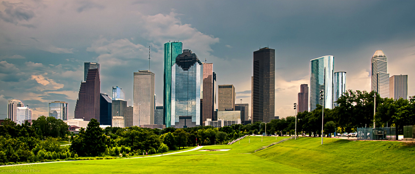
This is a good composition for the skyline and I really like the pano look to it. the buildings are clearly the stars of the show. But for me the image lacks impact and the light is flat and dull. It is almost as if the building are receding into the sky. Maybe if this was shot with directional light at either daybreak or dusk that would impart some life to the image.
I played with exposure, contrast and maybe brought a bit of life to the image. What do you think of these edits? |
Jun 2nd |
 |
| 36 |
Jun 20 |
Comment |
Some how this reminds me of an old movie--Close Encounters of a Third Kind.
The sky carries a foreboding aura that almost seems frightening---it the end of the world coming??? I like the vignette effect as it really draw attention to the distance.
The manner in which the lower foreground in the center is dark and then gradually brightens as it moves into the distance is what puts this over the top. It feel like moving into a tunnel. If I was to make any change I might crop just a bit off the top. It would move the horizon out of the center but more importantly the crop draws more attention to the glow in the distance.
You are still the B/W master. |
Jun 2nd |
| 36 |
Jun 20 |
Comment |
Just a note---
This image is inspired by Arne's March image. I know his was B/W and mine is color but I could not make a B/W conversion that looked good. Probably because I don't have enough skill. If anyone wants to lay with it have a go with my blessings. |
Jun 2nd |
| 36 |
Jun 20 |
Comment |
Le
I think this is a fine image that just needs a few tweaks. Richard has a good crop that I thinks works. In the original thee is a bright spot of water on the left edge that to me is a distraction and Richard's crop removes it. I might reduce the white sky a bit from the top The colors look a bit washed out on my monitor. Maybe a bit of exposure adjustment and a bit of selective brushing of either clarity or texture on the red rocks may give it a bit more punch. the foreground rocks look eally great--if you could match that to the red rocks you would have a great image. |
Jun 2nd |
9 comments - 13 replies for Group 36
|
| 49 |
Jun 20 |
Comment |
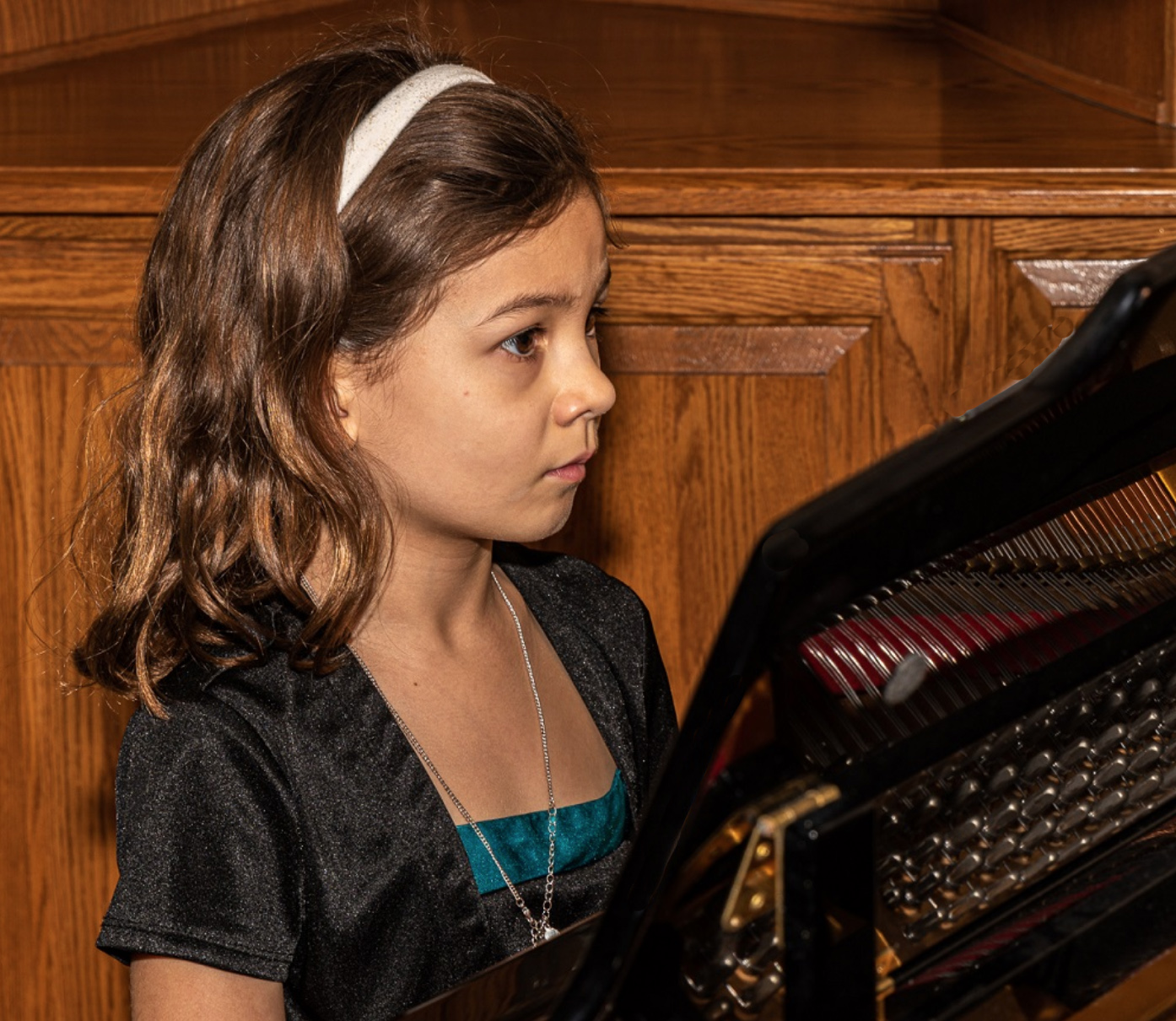
The granddaughter is precious and looks so serious. It is her eyes that make this a impactful image.
May I suggest the the next time you remove that white piece is sheet music. The eye is drawn to the brightest part of the i mage and in this case it is the white piece of paper. It that is not in the image all the attention will be focused on your granddaughter and that is where you want everyone to look.
I took the liberty of cropping a bright spot in the right corner out and removing the sheet music. What do you think? Does thismake it look a bit better? |
Jun 13th |
 |
| 49 |
Jun 20 |
Comment |
I like the way you created a vanishing point. However I'd crop those blue lights on the far right. They create a distraction from the main image. |
Jun 13th |
| 49 |
Jun 20 |
Comment |
May I suggest when adjusting a photo in Snapseed tap on the tools setting and look for the rotate option. Using that tool you can adjust that sloping horizon line. As it is all the water is going to run out of your picture to the right. Getting horizons straight is not always possible on the location, but it is real easy in Snapseed. It is the first thing people will see so it pays to take a moment to make the adjustment.
Glad you are able to get back to the beach... Mine is still closed. :-( |
Jun 13th |
3 comments - 0 replies for Group 49
|
| 60 |
Jun 20 |
Comment |
While the composition is strong and the manner in which in muted the leaves adds pop to the over all image. For me blown highlights are always a turnoff. The blown out portions on the yellow leaves is particularly disturbing because the yellow leaves are the brightest part and they immediately draw the eye. Personally I would clone out the white tips on the ends of the blue flower parts because they also draw the eye. Finally I would suggest decreasing the exposure on the main body of the flower as it looks a bit washed out. This could be a quite stunning image of a difficult subject, the problem is "the devil is in the details!" |
Jun 28th |
| 60 |
Jun 20 |
Reply |
I forgot to mention---you did a good job of handling the highlights without blowing them out. |
Jun 28th |
| 60 |
Jun 20 |
Comment |
The contrast between the black background and the bright brass creates an immediate visual impact. The diagonal twist adds a feeling of power and strength. Together they create the feeling of an abstract that makes the viewer have to commit to figuring out what the image is all about. This draws the viewer in and keeps them involved.
You did a fine job of creating something from nothing |
Jun 28th |
2 comments - 1 reply for Group 60
|
| 67 |
Jun 20 |
Reply |
Thanks, I appreciate you stopping by and commenting. Drop by next month and get the down stream view of the basin. :-) |
Jun 27th |
| 67 |
Jun 20 |
Reply |
Thanks Michael
They don't look this washed out on my monitor. But you are right---I liked how they set off the falls. I'll have to check my monitor calibrations for the brightness.
I appreciate your comment. You guys keep me on my toes. |
Jun 16th |
| 67 |
Jun 20 |
Reply |
At least i got an image on this trip. I walked seven miles to get to a falls and a huge tree had fallen and I couldn't even see the falls.
But thanks, this is a favored falls and it photographs really well. |
Jun 13th |
| 67 |
Jun 20 |
Reply |
Good eye, I missed that. However I do agree that removing that out of focus branch would improve the image. |
Jun 12th |
| 67 |
Jun 20 |
Reply |
Hi Todd
I thought about changing the crop to move the sun either left or right and out of the center. Now I see I should have done it.
Good job!
|
Jun 10th |
| 67 |
Jun 20 |
Reply |
I think you are right about the flowers. I have worked on them a great deal and I am still not satisfied. You just may have the right idea.
Thanks. |
Jun 10th |
| 67 |
Jun 20 |
Reply |
Anything I can do to help is my pleasure. I try to look at each image as if I were judging it in a competition.
Two thoughts 1. always make sure your subject is the star of the scene. Light is always the key--so make sure light emphasizes the subject.
2. anything that takes attention away from the subject has to be removed.
You have a good image, just a few tweaks. :-)
|
Jun 10th |
| 67 |
Jun 20 |
Comment |
I love your comment about the mundane shot and yu are so right. Patience pays off with a better shot and it certainly helps keep the trash can empty. I am also glad to see you are using the tripod----it does make a difference.
I think your crop works and it does hep get rid of the blank sky. I do like the frame that it creates. Looks like you made great choices with the camera settings and the high ISO was handled well by the D500. The f8 setting provided enough DOf to keep both birds in focus and that really help to make the photo work. The image looks pretty good for such a deep crop. Well done capturing these two.
The only things I would change are to bring down the highlights on the birds and then open the shadows on the male target the right eye to put just a bit on light on it so it is not a black hole. |
Jun 9th |
| 67 |
Jun 20 |
Comment |
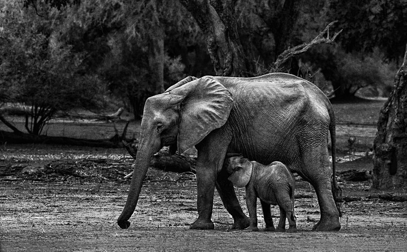
This is a really nice intimate scene and so see this live must be quite thrilling. I feel that the stars of the show have to be mom and her calf. While I do understand the concept of getting the environmental "feel" for the image I think that you just have too much environment. I also feel that the elephants are a bit squeezed into the frame. There for a did a bit of Photoshop Magic to "adjust" things just a bit. First I cropped the scene to take away some of the unnecessary environment both above and to the left of the elephants. Then using both Edit>Content Aware Scale and finally the healing brush I added some space beneath the elephants to that they don't look quite so crowded at the bottom of the frame. Then using a bit of dodge and burn techniques I brightened the elephants to help them stand out and the did a bit of extra work to bring up the all important eye of the mother elephant so that it shows a bit more. Finally, just for fun I dodged a few shadows in the upper left corner just because I felt like it. Almost forgot---I also added a touch of texture to the bodies of the elephants. All in all, about 10 minutes of work.
Hope I didn't ruin your image. That Content Aware Scale tool is pretty powerful when you figure out how to use it.
The image looks a bit grainy, but I was working with a tiny file not the original. |
Jun 8th |
 |
| 67 |
Jun 20 |
Comment |
You got a great shot of the valley at sunrise. I'm going to guess that you shot these vertically???? You said you wanted to get the sunstar and you did manage to catch that quite well. You can greatly increase the impact of the sunstar by closing down the lens even more. Shooting at f16 usually makes the star really pop.
I feel the sun and the valley are the stars of the show so I would crop at least 1/2 of that blank sky that is doing you no favors. |
Jun 7th |
| 67 |
Jun 20 |
Comment |
Images of Death Valley are all about light and shadows and textures. In this i mage there are strong shadows in the foreground create a frame as do the distant hills. This leaves the center of the image to excite the viewer. In the center there are solid leading and diagonal lines that highlight the hollows and slopes. The image clearly carries the feel of this desolate area.
I would have liked to see just a bit ( I truly mean just a little bit) more sky, as it is the sky fells like a mistake. |
Jun 4th |
| 67 |
Jun 20 |
Comment |
On first glance the image has eye appeal. The golden color of the reeds stand out and easily attract the eye. The image is well framed and exposed and i like the position of the horizon line.
Next we get into the creative aspects of the image. At this point we get to the mantra that the maker is always right. It is their image and how they see it in their creative mind's eye is the golden rule. Based upon that assessment the image works quite well. It has immediate eye appeal, it is presented well, the technical aspects more than adequately demonstrate the maker's creative concept, the use of color works well and the quality of the light makes the image come alive.
If this were displayed in any category other than Nature I would quickly score it a 10. It is that unique and different (read that refreshing). For me (my nature bias leans toward realism) the image feels awkward in the Nature category. |
Jun 4th |
| 67 |
Jun 20 |
Comment |
What an impactive and interesting image! I always look for how light is used in an image and your soft diffused light works wonders here--well done. The soft background magically sets off the insect and the flower. The colors red and green are known as complementary colors. This type of color matching always provide visual impact and this is well demonstrated in your image. The very strong diagonal line created by the branch brings drama to what otherwise would be an very ordinary still life.
Everything works quite well in this charming image image except for that whiteish blob in the right corner. Without that this would be simply exceptional. You could remove it with a bit of work in Photoshop using the healing brush and content aware fill. |
Jun 3rd |
6 comments - 7 replies for Group 67
|
| 83 |
Jun 20 |
Comment |
Street photography is a most unique genre as one can specialist in faces or get into special types of activities. When i first saw this I was reminded of Philippe Halsman and his famous "Jump" book.
Since you are clearly pretty skilled in your craft you might think of creating a series of photos centered around a particular type of activity. It could become an on going activity and over time you just may have something quite unique.
As for this image If I were to place it in a series I think I would prefer the the full version with the foreground. For just a single image then I like the crop version because I can get closer to the performer.
Either way is it a wonderful image and your conversion to B/W was a perfect choice.
|
Jun 5th |
1 comment - 0 replies for Group 83
|
| 84 |
Jun 20 |
Reply |
I just went back and watched the video again. I did a screen capture that shows where the waterfall is badly over exposed. Note the lower lower right corner.
Hope this helps.
I still think the video is excellent. :-) |
May 14th |
 |
| 84 |
Jun 20 |
Reply |
I have now reviewer all the videos submitted for the month. I am really enjoying this. You can count on me making a return visit in July.
|
May 14th |
| 84 |
Jun 20 |
Comment |
Thank you for a trip to a city and business that i will never see live. The tour through the factor was first, colorful and almost exciting. However while in the factory I felt the music was a bit too loud. I would have liked to hear the sounds of the looms as that would add atmosphere. While you have many images of the weavers there are two types of images that are missing. I would have liked to see some close up shots of their hands in motion and some images of the weavers other than their back. Faces and eye tell so much of a story, i felt that I was missing something by not seeing them. even having just one weaver's face and a smile or serious concentration would have made a difference. If you could not get the full face, perhaps a profile??
One photographic note: The factory was so colorful and vibrant that when towards the end your camera angle included a background out side of the factory that was overexposed I felt that ruined the scene.
I did enjoy the video and I found myself wanting to see more. The indoor colors were magical and exciting and that is the feeling I will take away from the video.
The use of light in the cover image is just amazing. |
May 14th |
| 84 |
Jun 20 |
Comment |
Thank you for posting this video. I looks like a great deal of thought and work was put into creating this film.
I really liked the drive through tour as it felt like I was on a journey to arrive at first the towns and the the natural parks. The progression was a fine idea. Some of the angles and the compositions used in the town scenes were excellent. I really liked the night street scenes.
I think the sound track worked quite well until the end. The dramatic, almost militaristic sound in the beginning worked with the message you delivered. The chirping birds worked well in the natural scenes. However the beautiful scenes at the lake at the end I felt needed a musical background. Something soft and dream like would have been perfect. As it is I just felt abandoned.
The color of the text really annoyed me. The black text blended into too many of the scenes especially after the ride along the country roads. I found that I had to chose to either watch the film or read the text. I ended up having to watch the video twice to catch it all. Note: I did not mind watching it twice---it is a fine video but I feel that I should not HAVE to watch it twice. There is a difference. I feel a different color text would have helped. The scenes at Lake Bled at the end were excellent. They made me want to go to the lake immediately. You were clearly there many times to capture all the different moods.
One photographic note----you photographed some beautiful falls and most of the images were very stunning. However there is a scene where you have a large area of completely over exposed white water in the lower right corner. This over exposed water ruin the entire feel of that scene.
You also have a shot of a castle, taken through an archway that is an incredible photo---that is very well seen, by you and well captured.
Much of the borders on outstanding,with a few corrections, that I see as minor, this could be professional.
I'm looking forward to July. |
May 14th |
| 84 |
Jun 20 |
Comment |
I can almost smell the hay and sawdust.
I really liked the opening "getting ready images" and having the horse add his voice to this opening was a classic move---a big plus for that. I love the title "Playing on Horseback" it shows imagination and is clever.
My one complaint with the video comes from the title itself. Immediately after the tile you have the bronc rider---definitely playing on horse back. Through out the video you have lots of various types of bronc riding and some barrel racing all of which fits the title. I personally feel the roping and the steer wrestling detracts from the feel created at the beginning. But that is just my opinion.
I enjoyed the closeups because that is where the viewer feels like they are part of the event.
Overall you certainly caught the flavor of the American Rodeo and I'm glad I stopped by to see the show. |
May 3rd |
| 84 |
Jun 20 |
Comment |
OK---let's get this settled right from the top.
This would be a infinitely BETTER video if it featured the Big Blue band from Michigan! Now I feel better.
I love marching bands and consider it a great loss that they are not shown on television at halftime. I'm old enough to remember when they were on TV.
I love the title screen and I enjoyed the photo collage at the beginning as it really sets up the band and what they are.
Once the program begins it is disappointing that it is freestyle---I love the formations-- but that is not your fault. I liked the unique-feel of the band members on skates and showing them sliding through the presentation added a neat element. I felt this really captured the feel and spirit of the night and provided something that few will get to see. Since you had no control over the lighting I feel you did well with the exposures.
It is too bad you couldn't have gotten some closeups of the skaters to transition from the fall band still at the beginning to the indoor skates that was this presentation.
I'll be looking forward to the July video..... |
May 3rd |
4 comments - 2 replies for Group 84
|
| 89 |
Jun 20 |
Comment |
I have a fondness for images that are intentionally created as either high key or low key and this one fits the bill quite well. I think having that piece of felt handy to create this image was a brilliant idea. The three flowers, using the rule of odds make a nice composition and I like having the larger one on the far left. The little touch of green really stands out and add quite a bit to the feel of the image and I'm glad it is included. That 105 macro is a wickedly sharp lens and you made the most of it with this image.
If I were to suggest anything, it would be to add just a bit of space to the right edge as it feel a bit cramped. |
Jun 12th |
| 89 |
Jun 20 |
Comment |
This feels very much like a digital version of Monet's Water Lilies. I love Monet's work and brings back find memories. The three dominate flowers complete the rule of odds and I feel they make the image work quite well. I took the liberty of recropping the image and removed some partial lily leaves at the bottom and on the left edge. It may just be my monitor but the large flower look to be a bit over exposed that I feel detracts from their beauty. While it may be your intent and if so it is your image so you did the right thing, but I wish more of the lily pads were in focus. I realize the nature of a 100 macro lens set at f4 creates the shallow depth of field and if that is how you want it, then I agree. Of course you would have needed a tripod to get a slower shutter speed to allow for a higher aperture setting.
Several years ago I captured a photo of a baby stilt walking on lily pads and because of the sunlight I got those same white spots all over the surface of the water. While I couldn't do anything about fixing it in an image submitted in a nature category for PSA (darn rules) I spent over an hour and a half spotting each of them out so I could sell the image. Now I am very aware of them. Those little white spots for me are annoying. |
Jun 12th |
| 89 |
Jun 20 |
Comment |
Hi Gary
Yes, I am from Florida---Fort Lauderdale I have been up to your area for several photo shoot, so maybe when all this virus stuff calms down we could meet somewhere for a photo shoot. I did post a photo from St. Augustine Beach in Group #36 that you might find interesting. I'm sure you have been to the Alligator Farm. Have you shot Florida Polytechnical University on I-4? The place is amazing at night (day time also) Shooting a zoom lens wide open (yours was when you factor in the tc1.4) may potentially be an issue. All tc degrade an image somewhat. I regularly put a tc1.4 on my 400mm lens but never when the light starts to fail.
Any way you look at it, this is a great image.
After reading you comment I took your image and really enlarged it in Lightroom and it looks sharper there than here. It may just have been a monitor issue. Sorry. Aperture does impact DOF and may have some impact on contrast but as long as the image is well exposed there should not be any problem with color. I've shot my long 400mm f 4 lens wide open and never had any issues with colors. Exposure seems to matter more than anything else. I do generally still make minor adjustments in saturation and or vibrance.
|
Jun 7th |
| 89 |
Jun 20 |
Reply |
You are right. Like Bristow said, this is a fantastic stage but it needs an actor. I sort of made reference to this when I mentioned that if the trees had been bigger...
An all scenic image works quite often if there is just something in the scene to catch the eye. The boat would not work since this is a nature scene, but you have the right idea. Maybe a breaching whale???? |
Jun 7th |
| 89 |
Jun 20 |
Reply |
Absolutely. This crop changes everything. And all those cute little toes look just great!! :-) |
Jun 7th |
| 89 |
Jun 20 |
Comment |
OK for all the folks who don't like the flowers because they draw attention away from the falls this is just for you. |
Jun 6th |
 |
| 89 |
Jun 20 |
Reply |
Hmmm... Maybe I just goofed. I waded across the splash pool just to put those flowers into the picture. Maybe I should not have bothers and just left them out. Seems several folks agree with you. |
Jun 6th |
| 89 |
Jun 20 |
Reply |
I appreciate the feedback.I based my straightening off the fall of the water. The backof the splash pool has a bend in it that makes the horizon look crooked. I've found this happens quite often in nature. I usually try to straighten an image by using either falling water, ot the vertical lines of trees. There are no trees here to work with so I used the water.
My camera position was only slightly more than 3 feet from the flowers (This is a 24-70mm lens not the 14-24 which I do not have). At a shallow aperture like f11 I could not get the background and the flowers in focus and I never have been very successful at focus stacking falling water so I had to use the higher f stop. |
Jun 5th |
| 89 |
Jun 20 |
Reply |
I like the darkened flowers. Originally they were a very pale pink which made them look over exposed and washed out. I worked to get some color in them but you got a bit more.
Your crop is just about what I ended up with when I shot this vertical. My original shot was horizontal but I took a second one vertical. |
Jun 5th |
| 89 |
Jun 20 |
Reply |
Thanks for the feedback. Since this is almost full frame I won't be able to bring back anymore of the foreground rock. But I can crop a bit from the left. |
Jun 5th |
| 89 |
Jun 20 |
Reply |
Thanks very much for the kind remarks. When I look at this image I see the flowers in the right corner and the falls as a continuous curved line leading into and upward throughout the entire image. So for me that curved line lets the subject start on the right fixation points and flow into the frame.
That might not be fully acceptable, but it works for the way I see it.
Thanks again. |
Jun 5th |
| 89 |
Jun 20 |
Reply |
Tage
I have a couple of articles you may want to read if you are interested in photographing birds in flight. You can find one of them by going to Group 67 ( I am also the admin for that group) and click on select another round then select the month of April. I posted a bird in flight shot that month with detailed instructions as to how I did not. I have another article that I can find if you want to read that as well. Just let me know. |
Jun 5th |
| 89 |
Jun 20 |
Comment |
This is a most striking image. At first glance it fairly leaps off the screen and captivates the viewer. Part of this dramatic presence can be attributed to your technical skills. The extremely low ISO maintained top quality (as shown in the fine details) Your DOF kept the visible part of the body in focus. Yes there is a tiny bit of blur on the belly but no one will notice, unless they read this review, because the face and the eye are extremely sharp. The use of the slow shutter speed is compensated for by the addition of the flash, which is well handled as not harsh high lights are visible. Your technical skills are quite evident. You also chose a perfect location for the capture as you have sufficient space behind the subject to allow for a perfectly seamless background which contributes to the impact of the image. The basic composition is flawless with the creature placed on the left fixation points and facing into the image. Note: Most PSA judges will encourage you to flip this image so the animal is looking toward the left but I do not feel this is a major issue. As long as the subject looks into the frame and not out of it I do not have a problem with the composition. Your processing is not overdone, as there are no artifacts along the edges of the lizard. The curved body position of the lizard creates a sense of movement, and impending motion that adds drama and action to the image. All of this makes for a superior image.
However, in my opinion there are several flaws that I feel detract from making this a top image. First, and this is largely a choice for the maker, I feel that you could crop some off the tops. The images feels awkward due to the large negative space in the upper left corner and then spreading across the rest of the top. While the corner space is necessary because of the position of the animal the extra weight extending across the top edge is not. The major flaw is where you have cut body parts of the lizard. On the left edge only the tips of the claws have been cropped. If you are going to crop the rule says to crop with a chain saw and not just clip. The missing tips are annoying. Second on the bottom edge the lizard's foot if missing. Here is the accepted thought on this type of issue. And by the way, this works for reflections in water as well. In an image such as this, if the foot is hidden, in this case by a left and your crop, then you should include the space where the foot would normally be. Thus there should be about a half inch more space at the bottom of the image. This would create the illusion that the foot is present.
I grant these are little things, but as they say, "the devil is in the details". This could be a truly superior image with just a few minor tweaks. As it is, you have a fine image.
|
Jun 5th |
| 89 |
Jun 20 |
Reply |
No problem with the English. As long as we can speak Photography. :-) |
Jun 4th |
| 89 |
Jun 20 |
Reply |
I try to be through on a review. You folks put a lot into your photo, you deserve to have a review that is helpful and not just critical. Anything in my reviews is open to discussion--that is the way we learn. My thought are just that, my thoughts. I can be wrong. |
Jun 4th |
| 89 |
Jun 20 |
Reply |
My guess is that they are burrowing owls. We have them here in Florida and I love to photograph them. Especially when the young are just starting to get out and about. |
Jun 4th |
| 89 |
Jun 20 |
Comment |
For the record your camera settings were ISO 100, aperture 6.3 and shutter speed was 1/200. If you process in Lightroom the settings are revealed when you are in the develop mode.
The settings reveal that you had adequate probably open shade light on the meercat and a background recessed at some distance that was cast in fairly dark shadows. There are nearly ideal conditions for this type of photograph.
Thee are several excellent features to be found in this image. The placement of the meercat on the left side fixation points is ideal and having the animal looking into the image works as well. The diagonal angle of the animal's back imparts a feeling of action and power to the image. The angle of the head and the apparent focused attention of the animal provide a feeling of impending action which adds to the concept of a nature story. The use of analogous (harmonious) given a image a comfortable feel that works well for nature subjects. In fact, colorwise, you could not have picked anything better. This type of open shade soft light brings out the textures of the animal's coat in an ideal fashion. The image is adequately sharp although I would use an adjustment brush to add a touch of sharpness to the face. While you have lots of fine hairs that are crisp, I feel the face itself is a bit soft. This may be due to the wide open setting of the lens and also to the possibility that the tc1.4 may degrade the image slightly. The sharpness issue is not major and is within the realm of adequate. The back ground is superb in that it is beautifully neutral and only contains one flaw. The eye of the viewer is drawn to subconsciously always drawn to the brightest part of the image. This that off-white blotch of color just above the meercat's head becomes a distraction. If that was not there the image would be perfect.
Few photographers actually pay enough attention to background and these sadly results in distractions that creep into images. For example, if you slightly to the right, and lower the camera position the head of the meercat will end up completely blocking that white area. This is not to say that this is a poor image. It is a very good image, but attention to details will pay dividends.
Just a thought. Your camera will tolerate much high ISO settings than you used. While I understand that low ISO setting ensure better image quality your ISO is only 100. Shooting wildlife at low shutter speeds, while it worked this time, is never a good idea. A slight increase in ISO even to 320, would allow for a faster shutter in the range of 1/400. Just something to think about
Manual shooting was a great choice for this image.
|
Jun 4th |
| 89 |
Jun 20 |
Comment |
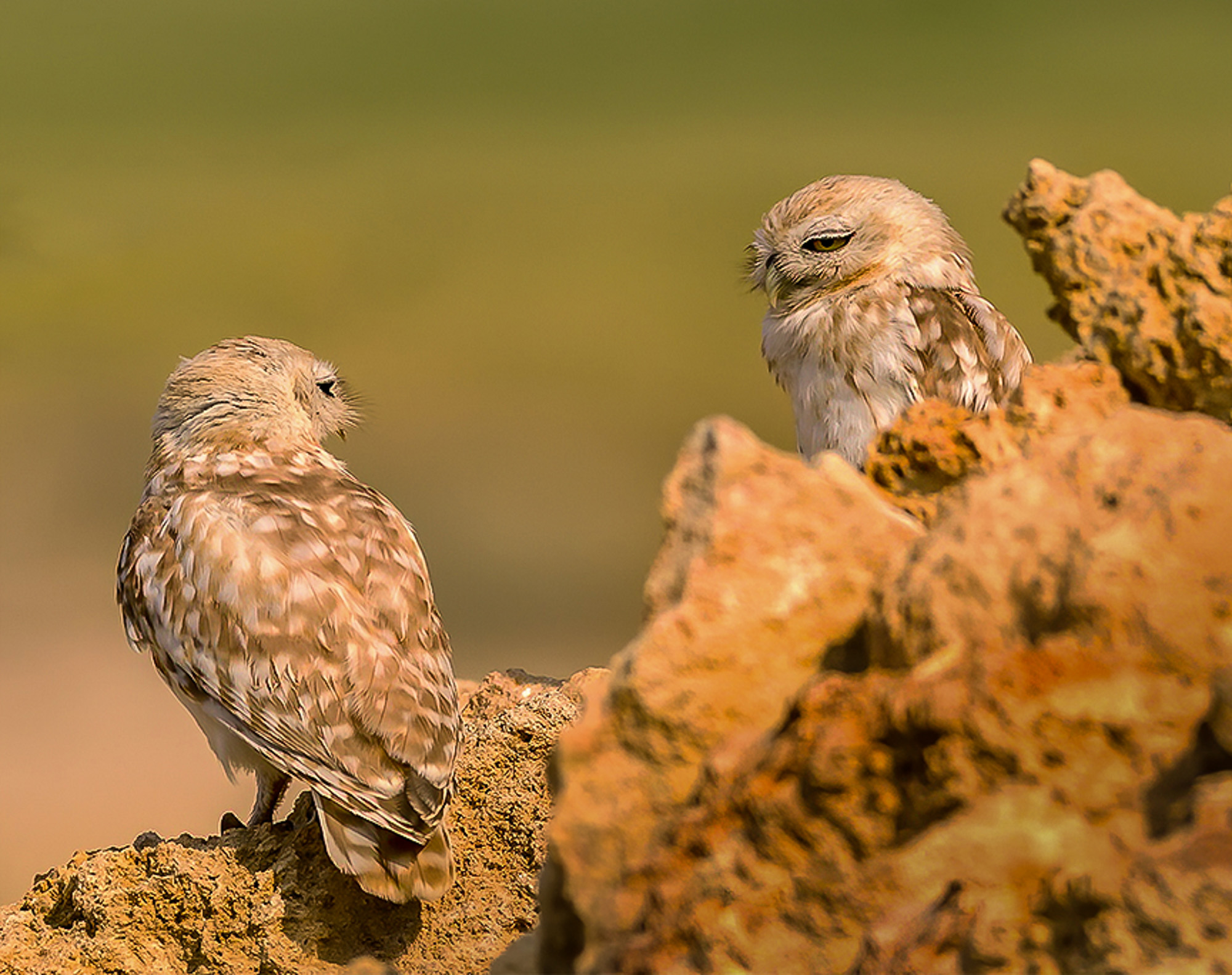
Even at first glance this image has a strong positive impact upon the viewer. The use of the analogous ¬ colors green and yellow are quite harmonious and create a well balanced and "comfortable" image. Analogous colors are generally the best colors to use with nature images. For the record, photographically, green is the best color to use behind birds and you scored well with this. The technical aspects of the image feature some very strong positives. First the background is absolutely seamless with no distractions. Such a background makes the subject pop from the background and makes it easier on the eye of the viewer. Your selections of camera settings both made the background possible and perfectly captured the subject in complete sharpness. The owls and the rock the one on the left sits upon are as sharp as possible. Even the fine hairs of their faces are sharp. The aperture of f8 provided you with enough DOF to capture both owls with outstanding sharpness. The selection of a quite fast shutter speed is responsible for this sharp image The greatest drawback to the image is the large out of focus rock in the lower right corner. Because it is both bright, and very soft, it immediately draws the eye of the viewer away from the subjects and this weakens the image considerably. Sadly, from this camera angle this rock issue cannot be solved. Judging by the harsh shadow and its position directly below the left owl's tail this photo was taken during the middle of the day. Mid day light is the most unflattering light for wildlife. You did well to keep from blowing out the highlights. The composition places the owls on a diagonal (the strongest positions) and this adds drama to the image. Additionally, since they are looking at each other it creates a feeling of intimacy that always creates an emotional connection between the viewer and the subject. The image as posted is a bit on the hot side and this has reduced the colors significantly. It also makes the out of focus rock on the right even brighter. Since the eye is drawn to the bright areas this just makes the rock even more of a distraction. I took the liberty of doing some edits on the image. First I brought down the exposure which helped to resaturate the colors. I also used Lightroom's gradient filter diagonally up from the lower right corner darken the out of focus rock to reduce its shock to the eye. I also used noise reduction applied locally with a brush on the background as your sharpening techniques (mentioned below) brought up some noise. When ever you have these seamless beautiful background even a little bit of noise shows so it is best to brush it out. ¬ I also cropped part of the upper image out. If you notice the original has a somewhat grey band across the top edge. This band ruins the seamless beauty of the background and only adds a distraction. Removing it cleans up the back ground and removes distractions. One final bit of caution. Nature images must look and feel natural. You do not mention what work you did not processing the image but the rock upon which the bird on the left sits clearly shows over sharpening. This over sharpening process creates telltale artifacts that are a dead give-away. If you slightly enlarge the image you will easily be able to see a white rim on the leg of the left bird that also extends upward along the left side of the bird's body. The lower wing feathers on the left side of the bird also exhibit the signs of over sharpening. Over sharpening and too much contrast generally cause the effect. You have to use these tools carefully to avoid the artifacts.
Note that these are only my opinions and I have been known to be wrong frequently. As the maker of the image you are always right. I am eager to hear your thoughts on my comments. If you have any questions I'll be happy to provide answers as best I can.
Oh yes, in wildlife images getting the eye of the subject sharp is mandatory. You captured the eye of both birds and that is a huge positive. Animals with soft eyes or positioned so that the eye is not visible are always scored low.
|
Jun 1st |
 |
| 89 |
Jun 20 |
Comment |
Since I'm new to this group let me start with one of the cardinal rules of photography. No matter what the image or subject may be, the subconscious eye of the viewer is always drawn to the brightest and generally sharpest part of the image. This is something that the viewer has no control over it just happens. Try it when you look at images as see for yourself.
So now let's examine this image. The initial impact of the image upon me is the drama of the sky and then the reflection in the water. They almost become competing subjects. My eye seems to bounce from top to bottom. I feel that the drama of the sky creates a strong and compelling story and I would bet that those clouds drew you to photograph this scene. The scene has numerous leading lines such as the clouds in the reflection the leading shore line on the left (including the bright part of the bank) and also the gentle curve of the blue water on the right. This curve adds serenity to the scene. All of these elements are strong positive points that make the image work.
Since the sky is the bright center piece my next consideration is what part of the sky am I drawn to? Since the clouds are slightly stormy and partly dark I fell the large patch of bright blue in the upper left pulls me in, but blue sky is so boring-it is the clouds that carry the punch. Thus I would suggest cropping off that large patch as this would bring attention to the clouds. The technical aspects of the capture appear to be well handled. You have no hot spots in the clouds with blown highlights which demonstrates both care and skill on your part. Another good thing. I suggest you carefully check your horizon line. The right side is higher than the left---not by much but it look like it is. For the record this is always a deal breaker in competition. I always check the horizon in my camera viewfinder and also check when processing with a guide line. I've been penalized on an image one time too many---I was a slow learner. The use of Light is something that drives up scores. In this case the light is well removed from the Golden Hours and you have even mid day light which can be quite harsh. In this case the heavy clouds break up the harsh light and they save the scene. You picked the right time to make this capture. You did a good job of using the fixation points for emphasis by placing the two trees on the left fixation points and that grounds the image quite well. (use of rule of thirds) A good rule of thumb for an image with a reflection is that the reflection should be darker than the item that is being reflected. This you managed well. The lower portion is slightly darker than the sky. This brings me to the horizon, which is dangerously placed near the center of the image. The problem was by cropping off the bright blue section of the sky it moved the horizon more to the center. The weight of the trees on the left help to off set this, but not enough. In the crop I've attached I wanted to crop more from the bottom, but didn't. You have to decide how much emphasis you want on the reflection or the sky---or you could just balance both evenly. Rules are made to be broken, and it is your image. I also removed two little blips of foliage one from the right and one from the left edges since they were not adding anything to the image. (check the original to see). Images that tell a story are always stronger. There is a story line here with the building storm and the clouds carry that story. If the image has a flaw it is the lack of a focused subject. The clouds are the subject but they are spread across the upper half of the image and this lets the eye roam. This can work but it is up to either the maker or the viewer to say if it does work. If, for example, those two trees were larger in the frame they could become the heroic stalwarts standing against the storm and would make the image stronger.
OK, I've tried to cover everything which is much more than is necessary from anyone. If folks picked one or two elements to discuss that would be great. However I just wanted to provide food for thought.
Most importantly this is your image---and you are always right. If you like things the way they are then that is how they should be. These are just my opinions, and I've been know to be wrong quite often. I would love to hear your thoughts regarding what I've put forth. It is all about the discussion.
|
Jun 1st |
 |
| 89 |
Jun 20 |
Comment |
Please note I really over did this review. I would never expect anyone to write something this through. As you folks review an image if you just pick one positive point and one suggestion for improvement that is more than enough. I just tried to cover all the points in the scoring guidelines I sent you so you would see how each element could be reviewed.
If anyone has any questions on this review, please ask. I'll be happy to explain anything you want to know. |
Jun 1st |
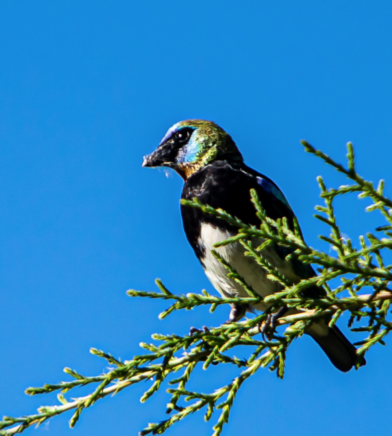
| 89 |
Jun 20 |
Comment |
This image of the tanager certainly has an instantaneous impact. Placed against a clear blue sky the eye of the viewer has no where to go other than to the bird and its perch. The composition is well thought out and shows recognition of the rule of thirds by placing the bird on the left fixation points. I know the PSA will award bonus points for having the subject facing from right to left. PSA often recommends flipping the image, if possible, to achieve this. Personally, as long as the subject looks INTO the frame I am satisfied, but this is a personal preference. From your write up I am able to discern an element of story telling in that the bird appears to have something in its beak. Nature images a generally best when they rise above a simple portrait of some critter. Activity beyond normal is encouraged in a nature type image. The more dramatic the activity the better the image is the general rule. This image is captured during the middle of the day and as a result there are telltale signs of the harsh light. The direction of the light (coming from left to right) has slightly overexposed the bird's breast and rendered a black hole on the birds shoulder that is slightly turned away from the light and there is some burn on the green branches. I feel your original crop includes a great deal of wasted space on the left side. All of that blank sky lacks interest (clouds would help break it up) and is adding nothing to the image and thus could be removed. I took the liberty of recropping the frame. This crop accentuates the diagonal nature of the branch. Diagonal lines add power and drama to an image and since the subject is static the diagonal helps add a feeling of impending action (maybe a take off?). Note that I cropped some from the bottom to prevent the low hanging branches from hanging in space (all the branches touch the bottom of the frame). The two colors that are most often found in successful images are blue and yellow. These colors are complementary. Complementary colors add impact to any image. This image has abundant blues, but there is a hint of yellow that the subconscious eye understands. This is the reason the image almost slaps the viewer in the face. If the image had action, it would explode from the frame. I feel the greatest drawback to the image lies in the area of technical skills. The eye of the viewer is always drawn to the brightest portion of the image and to the sharpest. Modern camera manufacturers go to great lengths to produce lens and camera that are capable of capturing tack sharp images. Anything less, disappoints the viewer. The camera and the lens, even with the 1.4 TC is capable of sharp images so this leaves the onus on technique and set up. You did not include camera settings in your write up which makes it harder to pinpoint the problem. Thus I am going to take a shotgun approach to analyzing the issue. First the best wildlife images are usually taken from a tripod. I know camera can be handheld using fast shutter speeds, but the best images usually come from tripod mounted cameras. There is truly nothing tack sharp in the image and everything seems to be equally unsharp. Thus I do not believe the issue has to do with aperture although I would like to know what the aperture was. This leaves either camera movement or shutter speed. Little birds, such as this tanager, are very twitchy and require extremely fast shutter speeds to make sharp captures. A shutter of at least 1/1000 even up to 1/3200 are probably best. You had really bright light, so a fast shutter was possible. Even with a fast shutter motion blue is possible. Since everything is equally soft, motion blur is a strong possibility in an image such as this. Would you care to share your shutter speed for academic purposes? Generally lower ISO numbers produce greater quality image but your camera can easily handle ISO ranges up to 1000 especially with that lens so you could have managed a higher ISO maybe 640 and that would have allowed for a faster shutter speed. The other possibility is failed focus lock. Do you know what focus mode you were using? Single point, or one of the group modes? While single point, locked on the eye of your subject is the preferred method of focus, using a group mode will help if there is camera movement (I'm guessing this was handheld). Your original image was taken with the camera in the horizontal position, yet your subject was set to the right side. You may have focused on part of the branch and your camera movement could have let the focus point drift off to part of the sky when the shutter was activated. This would cause the image to be somewhat soft as the camera lost focus. Using a group focus mode would allow the camera to maintain a lock as the camera moved, or the wind blew the branch.
Please note the above is just my opinion and I have been known to be wrong more than once. I would like to hear your thoughts on any or all of these comments as you choose. Remember the maker is always right so I'm very interested in your thoughts. I tried to cover all the points in the scoring guide I forwarded and hope I didn't over do it.
|
Jun 1st |
 |
10 comments - 11 replies for Group 89
|
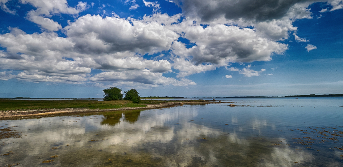
| 93 |
Jun 20 |
Comment |
This image deserves recognition. when I first saw this image as a thumbnail it was captivating----even in a small size. Why? Simply because it was taken by a photographer---not a want-to-be-snapshot-camera-pointer. As you noted the crowds went for the commercial postcard type image but you went in search of a topic. You mention your style of a seeking a foreground and you found nothing and made it into something. You found and understood the quality of light. You created a strong composition, utilizing the upper and lower right side fixation points. The beauty of your composition lies in the clarity of the lower reeds and how it fades to soft light of the rising sun forcing the eye to travel through the image. There are a host of wonderful leading lines running from the left to the right to guide the viewer. The artists of the Renaissance understood the power of the triangle and this images uses these elements in a masterful manner. The two triangles created by the reeds. the triangle created by the left side trees and their reflection. The triangle formed by the bright light on the right that points to the rising sun. All of this is genius.
For me the subtle reflection of the rising sun found in the midst of the reeds makes the image. Little touches matter--this one does. Whether you actually thought of all these elements or they were a product of your subconscious mind you, the guy with the camera, put all this together. This is masterful.
I have been a judge for quite a number of photo contests. This image would get my vote.
I hope someone in the PSA sees this, it should be in their monthly journal. |
Jun 1st |
1 comment - 0 replies for Group 93
|
56 comments - 45 replies Total
|


