|
| Group |
Round |
C/R |
Comment |
Date |
Image |
| 7 |
Apr 20 |
Comment |
Sometimes the simply things are the best. You were lucky to have the boats giving you a flowing "S" curve to help fill the frame and and interest. This is one of those vacation shots that is just a lot of fun.
I do have a question----where is the raft?? |
Apr 5th |
1 comment - 0 replies for Group 7
|
| 9 |
Apr 20 |
Comment |
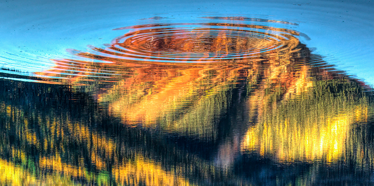
Love the colors and the circle in the water. Both are really interesting. But I just could not get my head around the total composition.
Than I had a out of the box thought. I flipped the image, cropped out reality and thought of selling as an abstract and calling it Crown on the Mountain. Just my strange mind at work. Hoe you do not mind. Any thoughts? |
Apr 13th |
 |
| 9 |
Apr 20 |
Comment |
You have a good eye and captured an interesting aspect of this plant. I like how you cropped out the most annoying parts from the original.
The best part of the image is the whites threads of the plant. As it is shown here the the large pod that dominates the top of the image is a major distraction. |
Apr 13th |
| 9 |
Apr 20 |
Comment |
I feel this is an unusual and eye catching image. The broken framing is a different approach.
I REALLY REALLY REALLY wish that the flag had not be cut off and that is was fully open. That bit of color would really make a difference in the over all image. Since you posted two different images I'm wondering if you have any more that might have the flag more open. |
Apr 13th |
| 9 |
Apr 20 |
Comment |
I feel the lighting and the composition make this an excellent image.
I really wish I could have seen this in a larger format so I could appreciate it. |
Apr 13th |
| 9 |
Apr 20 |
Comment |
This is a unique composition and you certainly made the eye the center of attention. Those are all positives in regard to the image.
For me, the downside of the image is that is feels uncomfortable. The underside of the bird and the awkward crop of the osprey's body leave me unsettled. |
Apr 13th |
| 9 |
Apr 20 |
Comment |
This is a nice centered composition showing a grooming position with nicely frozen action.
Sadly the bird's face is in shadow. The eye is naturally drawn to the brighter parts of the image and this means that I am drawn to the back end of the bird. I would suggest toning down the highlights and even opening the shadows on the face of the bird.
For future consideration, white birds rarely photograph well in bright light. IN this kind of light I usually just skip them and look for another subject |
Apr 13th |
| 9 |
Apr 20 |
Comment |
I like the drama and power the imaged exudes. I also find the angle of the camera adds to this feeling.
For me the unsettling part is the appearance on the right side. I am left quite uncomfortable seeing the bridge left hanging in mid air. It appears as if the pint of attachment is just outside the image and I really wish it had been added. Was there a reason why you cropped it in this fashion. would like to know your thoughts.
I also feel the image lacks sharpness. |
Apr 13th |
7 comments - 0 replies for Group 9
|
| 12 |
Apr 20 |
Comment |
You have a great story to go with this. Thanks.
I think Carole has a good idea with her post work.
Mid day light is so very hard to work with, especially with a white subject.
YOur composition works quite well with this subject. |
Apr 13th |
| 12 |
Apr 20 |
Comment |
Carole you hit exactly what I was going to say. Colonial America really stands out. I would take you thought one step further and also clone out the tree parts on the far right. Like the concrete you mention, they are distractions. |
Apr 13th |
| 12 |
Apr 20 |
Comment |
I really like the power of the image with the monument looking so much like a rocket and the tree at the base reminding me of the clouds that surround the rocket at launch. I just wish that the tree on the left was not present. The clouds are a dramatic touch that works well. |
Apr 13th |
| 12 |
Apr 20 |
Comment |
First a thought. This is not your fault but as an outsider just dropping by to visit I really wish I knew what the assigned topic was. Is there any way to have that information on the page or the image?? |
Apr 13th |
4 comments - 0 replies for Group 12
|
| 13 |
Apr 20 |
Comment |
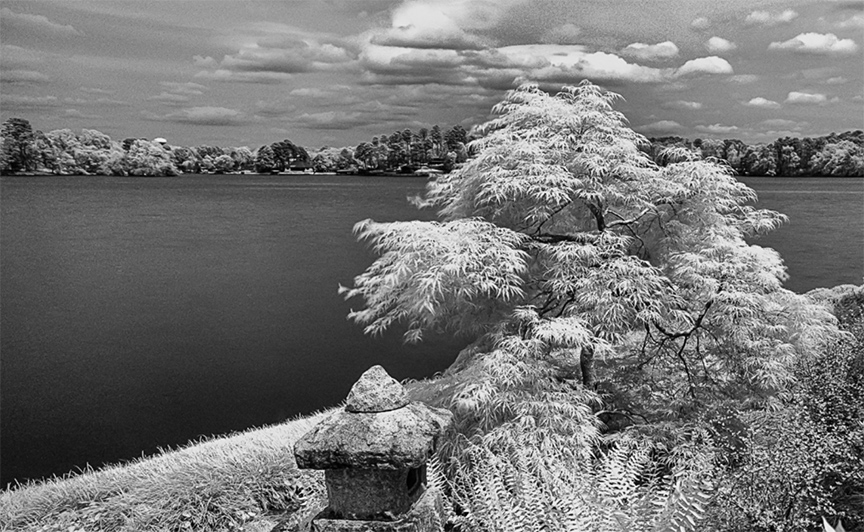
A very powerful study in textures. The ferns and the tree are quite interesting and draw the eye in to study them closer. I like how the nearly flat water sets off the foliage. This portion of the image has powerful contrasts.
I feel there is too much foreground that distracts from the tree. I would therefore suggest cropping from the bottom of the image so that the viewer's eye stays with the tree.
I also noted that the sky is quite noisy. I would suggest that using a noise reducing tool on JUST the sky would clean this up and make the image even more visually appealing. |
Apr 16th |
 |
| 13 |
Apr 20 |
Comment |
Please keep on tweaking. For the record, as I was browsing the current images page this is what attracted me to visit your group The striking contrast simply arrested my roving eye. For me the infrared format makes me look at the details and the textures and that is what draws me in. I really like the composition with rising line beginning on the left and climaxing with the tree. The rapid falloff that follows into the void (black area) simply makes me go back to the tree again and again.
I would suggest that you crop at least half of the flat area on the right. In that it is bright it tends to draw the eye away from the subject. Your subject is too worth whle to e treated so shamefully. |
Apr 16th |
| 13 |
Apr 20 |
Comment |
Not only is this a very clever idea it is a most striking image. For me this image creates a ghostly feeling--a surreal view of the world. It is different and it draws the eye of the viewer. The white branches against the dark sky are captivating. In many cultures the color yellow invokes a connection to a deity and in this image it feel that it tells a story of life and death and thus give a story line to the image.
I would suggest cropping the the little bit of yellow off the left edge It is visually distracting.
Over all this is stunning. I just wish I knew how to do something like this. Very well done. |
Apr 16th |
| 13 |
Apr 20 |
Comment |
In that we are on lockdown I see nothing wrong with using old photos.
Let me be up front as say what I know about infrared will not fill a thimble, but I think I can look and enjoy a photo.
I have read much of John Muir's work and understand his love of the forest. That is what I feet from this image. Muir understood what it meant to become part of the forest and the different types of foliage in this create an inviting view of the forest. The strong leading line of the downed tree drags the viewer into the frame. I feel the infrared conversion brings out the textures more than the colors and so it makes the viewer look closer. In this sense, the image is quite appealing.
|
Apr 16th |
4 comments - 0 replies for Group 13
|
| 15 |
Apr 20 |
Reply |
The only way to know would e to try it out. But if it were me I would give it a try. |
Apr 7th |
| 15 |
Apr 20 |
Reply |
What I really like about the two stemmed version is the very powerful diagonal line created by the position of the peppers. I think that diagonal makes the image. |
Apr 6th |
| 15 |
Apr 20 |
Reply |
Great idea to get rid of those highlights...
I may give that a try myself. |
Apr 6th |
| 15 |
Apr 20 |
Comment |
Very interesting. As art both of these make me think. The choice of the red tones has an arresting effect on the image and compelled me to stop and look.
Then I run into trouble. I view this as sort of an abstract and so it is the shapes and colors the attract me. In the image with the two green stems I feel conflicted and I keep bouncing between the two. In the second image the single green stem allows my eye to rest and then I can enjoy the rest of the image.
Which do you prefer and why---after all, you are the maker of the image and since you are asking, you must have a preference. |
Apr 6th |
| 15 |
Apr 20 |
Comment |
I really admire people who can create this type of art in PS. My efforts pale by comparison. I feel the main part of the image is quite nice, and the frame I think is necessary for this type of art.
I am certainly no expert with this genre but for me the background inside the frame seems quite busy and distracting. I would really like to know your thought process in including this type of background because this is all out of my comfort zone. Your explanation would help me understand this process.
Thanks |
Apr 6th |
| 15 |
Apr 20 |
Comment |
This is such a delightful documentary shot of the shrimping fleet. The composition, with the bright red boat on the right fixation point really works. I really do not mind the slightly blurred masts in the reflection, they are after all a reflection. And I also approve of how you moved the horizon slightly above center.
Did you think about cropping or cloning out the disconnected mast and line on the left edge? I would love to know your thoughts on that matter. Thanks |
Apr 6th |
3 comments - 3 replies for Group 15
|
| 25 |
Apr 20 |
Comment |
Oh my gosh, what beautiful light you captured. The colors of the building really compliment the sky.
What would you think about the idea of cropping out the red brick on the right? Since the building is mostly already out of the image it might clean up that right edge just a bit.
I'd like to hear your opinion. |
Apr 8th |
| 25 |
Apr 20 |
Comment |
Devils Tower is such an iconic scene and the detail you captured is crisp and sharp.
I took the liberty of playing around with a bit with contrast, and shadow. By raising the contrast and making the shadow darker it added a bit of drama. These are easy things to pay around with in Lightroom or Photoshop if you can do some dodging and burning.
What I would like to know is if you think this sort of post work does anything to change the impact of the image. I would be interested in your opinion. |
Apr 8th |
| 25 |
Apr 20 |
Comment |
What a lovely spring time image. I love photos that use old wood because of all the textures that are on display. I think you use of the burn tool really helped the foreground.
You say this was taken in your front yard. Would you mind taking a shot where you get much closer to the fence post so we (really me) can see the textures? You could fill the rest of the frame with flowers. I would really love to see it.
|
Apr 8th |
3 comments - 0 replies for Group 25
|
| 32 |
Apr 20 |
Comment |
I really like this type of image with the blurred train.
I just wish the people were a bit more dominate in the image. The use of the B/W is a good idea, it fits the image much better. |
Apr 13th |
| 32 |
Apr 20 |
Comment |
I like the antique feel of the image. Like Diana I wish the modern silos were not in the image.
I am drawn to the oddities of the image and they are what I think makes it interesting.
The woman driving the team caught my eye immediately
The mule with the hanging head adds interest.
And what really gets me are the horses on each end
For me all these things add interest. |
Apr 13th |
| 32 |
Apr 20 |
Comment |
Ha!!! you are wrong. I won't even mention the things you thing I'm going to talk about.
The moment I see this image I am drawn to the action on the right. I really like the activity in the scene and the price list interests me.
To lock me in tothe scene better I thought of cropping and then I brought up the contrast and darkened the blacks and increased the white to add some punch.
Now excuse me,I want some lunch.
|
Apr 13th |
3 comments - 0 replies for Group 32
|
| 36 |
Apr 20 |
Reply |
Thanks Richard
Getting rid of them was not a big problem. I shot this very close to dark and people were leaving. I just set everything up and waited until no one was in the scene. Next months photo was a whole different story. Stay tuned.
I appreciate you stopping to to comment. |
Apr 26th |
| 36 |
Apr 20 |
Reply |
Thanks Bill. I exactly agree with your thought on the chimney stones. I know it is not exactly accurate, but I thought it added tot he mood. I was even more important when the image was darker.
I really appreciate your thoughts on this image. |
Apr 10th |
| 36 |
Apr 20 |
Reply |
Thanks so much for dropping by and commenting. Originally I had the image quite a bit darker but a judge at a competition told me to make it brighter. That is the real reason made it lighter to post here. I wanted to here other opinions. It is heartening to hear that just about everyone agrees that it should be toned down.
Thanks again for your expert thoughts. I appreciate it. |
Apr 10th |
| 36 |
Apr 20 |
Reply |
Kind of you to take the time to edit the image. It sure looks different without the light on the chimney. That is one edit, I never thought of. |
Apr 10th |
| 36 |
Apr 20 |
Reply |
Thanks for stopping by. |
Apr 10th |
| 36 |
Apr 20 |
Reply |
Thanks for your thoughts. The entire group seems to be in agreement about darkening the image. I will make the adjustments. |
Apr 9th |
| 36 |
Apr 20 |
Reply |
I see what you mean. Visually it makes sense. |
Apr 8th |
| 36 |
Apr 20 |
Reply |
Thank you for your kind comment. To my knowledge there has never been a light in the cabin since John Oliver departed. The light in this image was created by my flash units with yellow balloons pulled over the flash heads.
Thank you for your suggestion regarding the logs. |
Apr 8th |
| 36 |
Apr 20 |
Reply |
That is a most interesting philosophical point of view. I'll have to think about that the next time I and shooting a man made structure. |
Apr 8th |
| 36 |
Apr 20 |
Reply |
Thank you for looking. Yes, this is a great group, they are not only talented but supportive of each other and everyone comes up with great suggestions. |
Apr 6th |
| 36 |
Apr 20 |
Comment |
The Soviet occupation was indeed a dark period in the history of Poland. This moody image harkens back to that dark time. I especially like the way the plant life partially hides the "past". The feeling imparted by the looming cranes brings back the feeling of yesteryear. To me the white smoke (steam) almost shows the defiance of the Poles.
Personally I would clone out the little structure on the right edge, it just seems lost. I like the ominous dark tones and would not brighten anything. At first I thought there was too much sky but the more I look,the more I feel that sky adds to the story. Maybe there could be a bit more space on the right.
I should note I am an historian and know the history of the period. For me the image brings it all to life. I feel this is an excellent job of story telling.
I'd like to know what you were thinking when you created this. |
Apr 5th |
| 36 |
Apr 20 |
Reply |
This is OK, but I would drop the bottom rock.
Both of these get rid of the overexposed regions but the first crop puts much more attention on the water. The second one puts more weight on the rocks.
Glad the crops worked out. |
Apr 4th |
| 36 |
Apr 20 |
Reply |
I like this one. |
Apr 4th |
| 36 |
Apr 20 |
Reply |
Thank you very much Tom. Please stop back next month, I will have a far different version then. |
Apr 4th |
| 36 |
Apr 20 |
Comment |
This is a really unique scene. Since the sky is so ordinary, you did well to keep most of it out of the image. The reflection in a nice touch and I like the way the center rocks sort of frame the high peak.
The downside of the image is the very over exposed rocks in the foreground, especially those on the right. I doubt you can bring detail back into the right hand rock but on the positive side I would suggest just cropping that whole right hand rock out of the image. The bottom of your image is very bright and it detracts from the beauty of the lake. So the crop would help focus attention on the lake and eliminate the overexposed area. |
Apr 4th |
| 36 |
Apr 20 |
Reply |
After this shot, I had a year to figure out a way to make it better... Wait until next month. |
Apr 4th |
| 36 |
Apr 20 |
Reply |
Next month I ha e another shot of the cabin and it will be different. |
Apr 4th |
| 36 |
Apr 20 |
Reply |
Thanks Arne
My original was darker but everyone said I should make it brighter. You confirmed that I was better off before. Thanks.
Just wait until you see next month's entry... It will be darker for sure. |
Apr 4th |
| 36 |
Apr 20 |
Reply |
I am so glad to hear that I am not the only one who has struggled with the cabin. So many of the shot I've seen of this place are just snapshots. The suggestion about the chimney is probably spot on. Thanks. |
Apr 4th |
| 36 |
Apr 20 |
Reply |
Well, you are the guy I'm hoping to get some tips from! :-)
Seriously, thanks for your comment and input. |
Apr 4th |
| 36 |
Apr 20 |
Comment |
Le
If you are trying to learn Lightroom check out matt kloskowski and his lightroom video on Youtube. He is very good and has lots of videos. Also because of the virus situation he is offering his Lightroom course a a really big discount.
|
Apr 3rd |
| 36 |
Apr 20 |
Reply |
Sorry for my poor description of what I envisioned as a crop. I'm attaching a screen shot of what I was thinking. |
Apr 3rd |
 |
| 36 |
Apr 20 |
Comment |
As always the Grand Canyon is grand I think the shadows really set this image apart form the normal daylight photo. For me, it is the shadows that make the image. I really like the way that one shadow on the left "points" to this distant cliffs.
I think one of the wonders of the canyon is how enormous it actually is. This image, while beautiful, to me dwarfs the size of the canyon. There I would turn this into more of a pano shot. I would remove about an inch from the bottom and by making this a pano it would make the canyon feel wider. It will not change the size the the cliff, it will just make it feel larger over all. How do you feel about the pano format?
Like Michael I feel that is is a bit over sharp.
I've been looking for your repair and can't find it---so what you did seems to have worked. You may be sensitive to this issue, because you made the repair. Due to the fact that i did not see the original, I don't see a problem. |
Apr 3rd |
| 36 |
Apr 20 |
Comment |
This is a most pleasing image with all the matching tones of the sky, sea and even beach creating a soft frame for the buildings on the hill. The riot of color in the town stands out because everything else is muted and minimalist. I feel it is the empty space that makes the village powerful.
I like the contrast in the sky as it is---soft and neutral so it does not detract from the town.
I would really like to crop about half of the sky from the top because I feel it is too much sky. But that creates a new problem because it places the horizon in the middle of the image. With the crop the sky seems to fit better, but the horizon doesn't.
So now I have to ask. Which is the lesser distraction, too much sky, or a centered horizon? I cant figure out a way to solve this. I would really be interest in the opinion of others. I'd love to know why you make your choice.
|
Apr 3rd |
| 36 |
Apr 20 |
Comment |
At first glance I almost felt like I was looking across the Florida Everglades. We have the same wide, flat looking vistas and get those same kind of storm clouds rolling through. I really like this type of image. The viewer's focus is directed to the storm because that is where the action is. The two toned dark moving to light clouds from the highlights in the clouds and make me feel the storm. You have a perfect placement of the horizon. The image is simple, but powerful.
I feel it can stand on its own merits as is but if pressed to make a suggestion I crop in from the left edge just enough to eliminate the light spot on the horizon line. Then there would be absolutely nothing but darkness all around the scene except for the light in the center and the viewer is trapped.
This is excellent. |
Apr 3rd |
| 36 |
Apr 20 |
Comment |
I have seen photos of this scene several times in the past but none better than this. The image is a riot of color and and cheer. I'll refer to it as "candy for the eyes". I really like the diagonal line because it feels like it is pulling me into the scene. I do agree with Michael about editing that green triangle in the upper left corner. As it is, it just feels like an accident. At first the brown wall on the left between the green and blue umbrella didn't bother me, but the more I look at it the more it does. So that would be my suggestion. What would you think about in from the left to eliminate it? |
Apr 3rd |
7 comments - 19 replies for Group 36
|
| 38 |
Apr 20 |
Reply |
Gabriele
There is never a true right or wrong in a photograph. I will always defer to the maker's point of view because it is their image. In the end the maker is always right. That said when I view an image I bring with me my personal bias, but I try not to be too judgemental. I really enjoy this discussion format because the ideas hep make those who participate think and maybe learn something that can be applied to another image. Without having been to that location personally, I looked at the image as "art". I understood the need to have the poles because they are part of the scene, they provide character and help tell the story. The question that both you and I are addressing is how much of the poles do we need. I will defer to your view, because it is your image.
As I noted it take a good eye to find this type of image. Your knowledge of the area certainly helped shape your point of view. When I get to a scene I try to practice what I call working with scene. Images from every angle possible and framed both vertical and horizontal. I never know what I will prefer in the end.
This has been a wonderful discussion. I've really enjoyed seeing this through your eyes. I sincerely hope we will get to do this again. I'll look forward to it.
Thanks |
Apr 29th |
| 38 |
Apr 20 |
Comment |
I really like the circular feel of the image. I find myself drawn to the figure on the left and the feeling of motion that is projected. I really love all the blur and the swirls.
My question is what causes the sharp edges on the right side? To me they are a distraction. I would appreciate if you would explain what they are and why you included them. It would help me to understand this genre of photography which admittedly I do not know much about. Thanks. |
Apr 6th |
| 38 |
Apr 20 |
Comment |
I'm not sure where Horseshoe lake is located, but to me this looks very much like a giant cypress tree such as I see in Florida. I love these giant trees and find them quite majestic. I think your composition works well being center weighted.
For me, I would have moved the tree toward the right and place it on the right fixation points, then backed off and included more of the lake environment. Since it is your image, I would like to hear your thoughts on this. |
Apr 6th |
| 38 |
Apr 20 |
Comment |
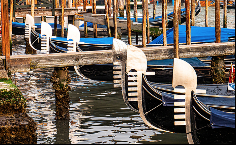
This sort of image takes a good eye to find. I feel the diagonal line with the bright white boat parts really draws the attention of the viewer. Diagonal lines and repeating shapes are powerful compositional tools and you used them quite well.
I feel the image a a bit busy with all the poles sticking up at the top. For me those poles are not the center of interest. I have included a crop suggestion that I feel brings the eye more sharply back to the center of interest--the white boat parts. However,this is YOUR image so I would be quite interesting in your opinion as to why they were included. I'll look forward to your answer. |
Apr 6th |
 |
3 comments - 1 reply for Group 38
|
| 43 |
Apr 20 |
Reply |
I think what you did to the image made a great deal of difference. It was quite nice before but now it approaches that of a masterpiece.
So much better without the tail and with this crop and the eyes it is very captivating.
You did a great job with this.
This is what the discussion groups are all about---we exchange ideas and all sorts of magic happens. |
Apr 17th |
| 43 |
Apr 20 |
Reply |
Well, different strokes for different folks. i like this one. I feel a much stronger attachment to the subject. It makes me look more closing the at "trick" being preformed by the girl. Thanks for trying. I do appreciate your efforts. You certainly have so me excellent PS skills that you put on display. |
Apr 7th |
| 43 |
Apr 20 |
Reply |
Thanks for the tips. I'm using a Nikon D850. It has an auto focus stack, I just have to tell it how many shots I want (I set for 100 but it will stop when it finishes the subject)
I agree it is time consuming.
I tried some landscaped and adjusted the focus point by hand. They came out better.
Had not thought of using a rail---I may look into that.
Thanks for your help---I really do appreciate your expertise. |
Apr 7th |
| 43 |
Apr 20 |
Reply |
Thanks for the reply. If you try the blurring, I'd love to see it.
And you are a better street photographer than many I have seen. Keep it up. |
Apr 6th |
| 43 |
Apr 20 |
Reply |
It was my pleasure. I love looking at photos where the photographer tries things out of the ordinary. When they use their gear in creative ways I find it exciting. I will drop by again. Thanks for the eye candy. |
Apr 6th |
| 43 |
Apr 20 |
Comment |
Nice work with the focus stacking. With the virus confining us currently, I've been playing with the process. More difficult than it appears.j Like Mark I find the green to be a distraction.
But what I really want to know know is any tips you can provide on the focus stacking process. I tried an orchid using a 105 macro lens and found that it took 6 tries to get it all sharp. I found that where you put the initial focus point really mattered as the lens seemed to skip areas.that were not in a straight line with the original focus point.
I'd really like to hear some advice from the expert. Thanks. |
Apr 6th |
| 43 |
Apr 20 |
Comment |
Street photography is an interesting genre with lots of challenges. It is something I really don't do well. One aspect I really like is the story telling you captured. Mark mentioned that he like the clear background, but I would prefer it a little bit blurred as it would draw more attention to the subjects. So as a street photographer I would like to hear your rational either way and why. It would really help me understand this style of photography. |
Apr 6th |
| 43 |
Apr 20 |
Comment |
I think you got this exactly right. I seldom see someone use that razor thing DOF that a 1.4 lens provides. I really like the textures in the dark greens and how the bright green demands the attention of the viewer. The diagonal position of the log is also powerful.
I would suggest two possible improvements. First, I'd give just a bit more space on the right edge so the bright greens aren't so cramped. Also, what would you think about darkening that light grey twig in the lower right corner. It would easy the distraction. Your thoughts? |
Apr 6th |
| 43 |
Apr 20 |
Comment |
What a fine capture of a bird inflight. I really like the sharpness and the wing position because it shows the detail in the feathers.
Others have mentioned the noise in the background and it is distracting. Have you tried using the Lightroom adjustment brush and a mask to reduce it? If you don't know how to do this, Matt Kloskowsky has some excellent Youtube videos that are easy to follow where you can learn the technique.
You placed the bird in the center of the image which creates a static feel to the image. If you were to crop some of the left side off, it would make the right side look like the bird had a place to fly into and give the image some movement. Would you feel such a crop may have any effect? I'd like to know. |
Apr 6th |
| 43 |
Apr 20 |
Comment |
This is a very power image. The B/W was a good choice. What I like the most is the eyes. They are the entire essence of this image. I'm going to agree with Mark that the tail, because it is sharp, detracts from those amazing eyes. My choice would be to simply crop it out altogether.
As Mark suggests, I also would like to see the round of the face made a bit brighter. If you make such an adjustment,I would really like to see it. |
Apr 6th |
5 comments - 5 replies for Group 43
|
| 44 |
Apr 20 |
Comment |
This image actually feels right. It carries a strong feeling of reality and does not feel fake as I personally find most HDR images to be.
For the record, I just up graded my Adobe from PS6 and Lightromm 6
The major reason was the camera profiles as the RAW files of my Nikon D850 were unreadable. |
Apr 19th |
| 44 |
Apr 20 |
Comment |
This is an eye catching image, but I feel while the lack of shadows had brought out the detail that the image is almost blinding in its brightness. To me it almost feel over exposed. Maybe it could be toned down a bit??? I also feel the bottom and the right side have to many distracting elements. I'm offering an alternative crop and wonder about your thoughts regarding it.
|
Apr 19th |
 |
| 44 |
Apr 20 |
Comment |
This image is quite eye catching. I feel the composition works well, but may be enhanced if the right side were cropped tighter to match the left side. If this is framed as a symmetrical composition it brings more attention to the hook.
It may be the way the image actually looks, but to me the hook and its assemble seems to be a bit muddy and lacks crispness. |
Apr 19th |
| 44 |
Apr 20 |
Comment |
I think Rick is on target with his assessment. The textures of the tree and what make this image appealing. Anything that will add more drama to draw attention to that tree is worth investigating.
Might the White and Black point be adjusted to crate a more pronounced effect? |
Apr 19th |
| 44 |
Apr 20 |
Comment |
I feel there is something to be said the the use of line throughout the image as a way to guide the eye of the viewer.
While the HDR process has made the image bright and eye catching I feel the manner in which major elements of the composition are cut off such as the platform and the lightpole make the final product feel awkward. |
Apr 19th |
5 comments - 0 replies for Group 44
|
| 49 |
Apr 20 |
Reply |
It does sound like a good plan. |
Apr 8th |
| 49 |
Apr 20 |
Comment |
I am immediately drawn to the individual walking down the aisle. I tighter crop eliminating things along the edge that could distract might make the i mage more powerful I've included a crop suggestion for your consideration. What do you think? |
Apr 8th |
 |
| 49 |
Apr 20 |
Comment |
You have an interesting image with excellent color. The white flowers are a real attention grabber.
You mention wanting to make the image more competitive so I am offering a thought. I have attached a crop that eliminates much of the reeds at the bottom of the image. There are still enough to provide the feel of the reeds but I feel this cleans it up a bit and brings more attention to the flowers.
What are your thoughts on this? |
Apr 8th |
 |
| 49 |
Apr 20 |
Comment |
This is an interesting angle of view. I think you gave the image some power by placing the statue on a right fixation point where it draws the most attention.
As a suggestion, I would consider cropping the little piece of building on the left edge. Since most of it is already missing, it would serve to clean the edge up just a bit. What do you think? |
Apr 8th |
| 49 |
Apr 20 |
Comment |
Wow, excellent catch---both you and the eagle! You managed to get great light on the under side of the bird so that it is not just a dark shadow. You also did well in not blowing out any highlights.
What you you think about giving this more of a landscape pano look and cropping off about half of the upper section of water? This would draw more attention to the powerful position of the bird. Your thoughts? |
Apr 8th |
4 comments - 1 reply for Group 49
|
| 65 |
Apr 20 |
Reply |
Thank you. I did not know about this tool. I will check it out. |
Apr 27th |
| 65 |
Apr 20 |
Reply |
Thank you for all the info. I've copied it so I can save it for future reference. Since I'm home now I will have sometime to try it out. |
Apr 27th |
| 65 |
Apr 20 |
Reply |
Thanks for your help. I'll check our your article and try to use your tips from this forum. I really appreciate your time.
|
Apr 25th |
| 65 |
Apr 20 |
Reply |
Sound like it might be a useful program. Thanks for the info. |
Apr 9th |
| 65 |
Apr 20 |
Comment |
I really like the colors and the clarity. I shoot a D810 and D850 but have never tried a crop this deep. I am stunned by the clarity you have managed to maintain.
As as as the composition---your crop produced a dramatic image. |
Apr 8th |
| 65 |
Apr 20 |
Comment |
Since I am just learning the process of focus stacking I am in awe. I have brought my flowers indoors to try the focus stack because even the slightest breeze blew the flowers enough to mess up the focus stack.
Thus my question is how do you control the movement with the wind and having to shoot multiple images? I can use any tips yu are willing to share. |
Apr 8th |
| 65 |
Apr 20 |
Comment |
First, I love it. This is a type of photography I know nothing about but I can certainly appreciate the skill involved.
Is something like this shot in a burst mode? Or do you just try to time it? If so I assume the flash units recycle fast enough to capture the burst.
I would love to ask more questions,but I don't know enough to know what to ask. |
Apr 8th |
3 comments - 4 replies for Group 65
|
| 67 |
Apr 20 |
Reply |
Well done with the blue tone It certainly changes the feeling of the entire image. |
Apr 19th |
| 67 |
Apr 20 |
Reply |
This is great. Mom giving one kid the scolding and the other, the well behaved one, so completely bored with the whole thing. I love this one. |
Apr 18th |
| 67 |
Apr 20 |
Reply |
Ok. So you have some with good expressions----I bet that there are some folks here that would LOVE to see at least one more of them.
Well, what's taking so long??? :-) |
Apr 18th |
| 67 |
Apr 20 |
Reply |
Thank you Todd. I can't imagine where you might have seen this before. :-)
I thought the group here might profit from the technique used to capture this image. |
Apr 18th |
| 67 |
Apr 20 |
Comment |
I feel the story telling part of this image is quite powerful and that the conversion to black and white works in your favor. The cracked ice on their backs and the the detail in the foreground snow are what makes the image work for me.
There are two things that I would note that may improve the image. The first is the that the rump of the bison in the upper right corner is cut off. Since that is the only bison that is clipped it becomes a visual distraction. Ideally his rump should be included and there should e a bit of space between him and the edge of the image.
The second thing is my wildlife bias. Eye contact is so important in wildlife images. All of the bison in the forefront are partially turned away and the eye is lost. If even one of them had a visible eye it would add a great deal to the strength of the image. |
Apr 11th |
| 67 |
Apr 20 |
Reply |
Great photographic minds think alike. Hope we get to shoot together some time. |
Apr 7th |
| 67 |
Apr 20 |
Reply |
The blue was real---it was inthe original, more of a reflection to a result of the gloss of the wet feathers.
Thanks so much for looking. |
Apr 7th |
| 67 |
Apr 20 |
Reply |
I won't get to close to a snake either---But I'll walk with gators---go figure... |
Apr 7th |
| 67 |
Apr 20 |
Reply |
Here is a quick job. My brush was about as small as a zero in the date of this reply. |
Apr 7th |
 |
| 67 |
Apr 20 |
Reply |
I would use the clone tool.
First make a copy of your image so you do not work on the original.
Click on the clone tool.
Under the brush, I always use a soft brush with blurred edges.
Use the bracket keys to resize the brush. You want the brush slightly larger than what you are trying to remove.
Look around the image to find something that looks like what you want replace the object with.
Place the brush over that object and hold the option key.
YOur brush will turn into a cross hair target. Then click the mouse.
Move the mouse to where you want to make the replacement (over the blade of grass.
As your move the mouse over the grass it will be covered with what you sampled.
I always work small and clone little bits at a time
If you do not like what you cloned command z will remove your cloning and you try again.
|
Apr 7th |
| 67 |
Apr 20 |
Reply |
Thanks Mark.
I often add a bit of panning to the birds in flight. I find it helps to create background separation.
I also really liked this background because it is environmental but also seamless. It think this is better than those ordinary blue skies. |
Apr 7th |
| 67 |
Apr 20 |
Reply |
Mark
Why are you trying to socially distance your self from these sweet creatures? Many of them just want to give you a friendly squeeze!
(sorry) :-) |
Apr 7th |
| 67 |
Apr 20 |
Reply |
Oh my yes!!! Personally I like this better because the eyes clearly show. It would be better without that blade of grass, but I really don't care----the action and the story are quite clear! Great shot. |
Apr 7th |
| 67 |
Apr 20 |
Reply |
Good thinking and I liked the way you moved about.
I'll look forward to seeing the other shot. |
Apr 5th |
| 67 |
Apr 20 |
Reply |
Most cameras have a similar system to Nikon's Dynamic Grouping. check your manual. |
Apr 5th |
| 67 |
Apr 20 |
Reply |
On my Nikon I have what is called Dynamic Group Focus. While I can set the camera to single spot By setting the dynamic group to 9 , 21, or 51 spots the camera will use the entire group to find focus. That way if I am tracking a bird with the center spot and the bird shifts to the left--the camera will shift to the left spot and maintain focus. I usually use 9 points (spots) unless the bird is really weaving or turning in flight.
Also, keep the shutter speed high. At least 1/100- but I try for 1/2500 to really get clean shots. I was recently chasing eagles diving and shooting at 1/3200 |
Apr 5th |
| 67 |
Apr 20 |
Reply |
Always go with eye contact. It is the most powerful part of a relationship. |
Apr 5th |
| 67 |
Apr 20 |
Reply |
You are exactly right. The image is still excellent. That flipper presents an issue that just can't be solved. Sometimes you just have to ignore the rules and do it your way. |
Apr 4th |
| 67 |
Apr 20 |
Reply |
All right! Now we are talking about a stellar image. This just jumps off the page The only real color is the owl and with absolutely no distractions he is a real attention grabber.
Your improvement over the last months has been amazing. |
Apr 4th |
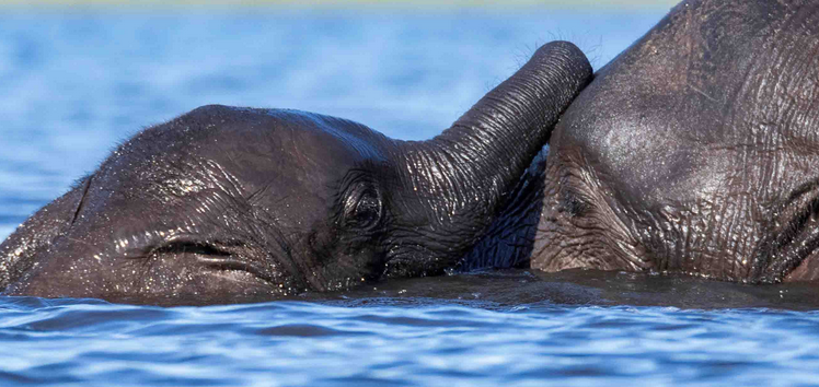
| 67 |
Apr 20 |
Comment |
You have a quite nice intimate family portrait of mam and her pups. You handled the background nicely as there are no distracting elements and it is softly out of focus. Your angle of view works since you are shooting at eye level which enhances that feeling of intimacy. I also like that you managed to get at least one eye for all of the sea lions.
My suggestion has to do with the crop. In general it is not proper to cut body parts as you did with the pup on the right. Note that the flipper clipped making the pup crippled. Pictorially it should be either included or excluded. I tried cropping it out but it makes the pup look overly cropped compared to the rest of the family. I tried including more from the original but the length of the flipper makes the pup look too large.
With these crop suggestions, I wonder what you now think about cropping. I would be interested in hearing your thoughts. As it stands I think a judge would reduce the mark for the crop (note, they won't have seen the original) so this whole question becomes hard to solve.
It is a really interesting image. |
Apr 4th |
| 67 |
Apr 20 |
Comment |
This is a nature image with a very powerful intimate story line. The connection between mother and child work quite well. I know you are at nearly eye level and that is good. but this time it might have been better if you were just a bit higher. The problem is that bright band of beach just above the loving pair. It is so bright that it is distracting. If this was not a nature category you could just select it and replace it. However since that is not allowed I would crop it deeper. The trunk tip on the left is also not helping so that could be removed as well. This is such a strong intimate portrait and the eyes so powerful that is where I would make the image focus. What do you think of the crop I've placed below? I'd really beinterested in knowing your thoughts. |
Apr 3rd |
 |
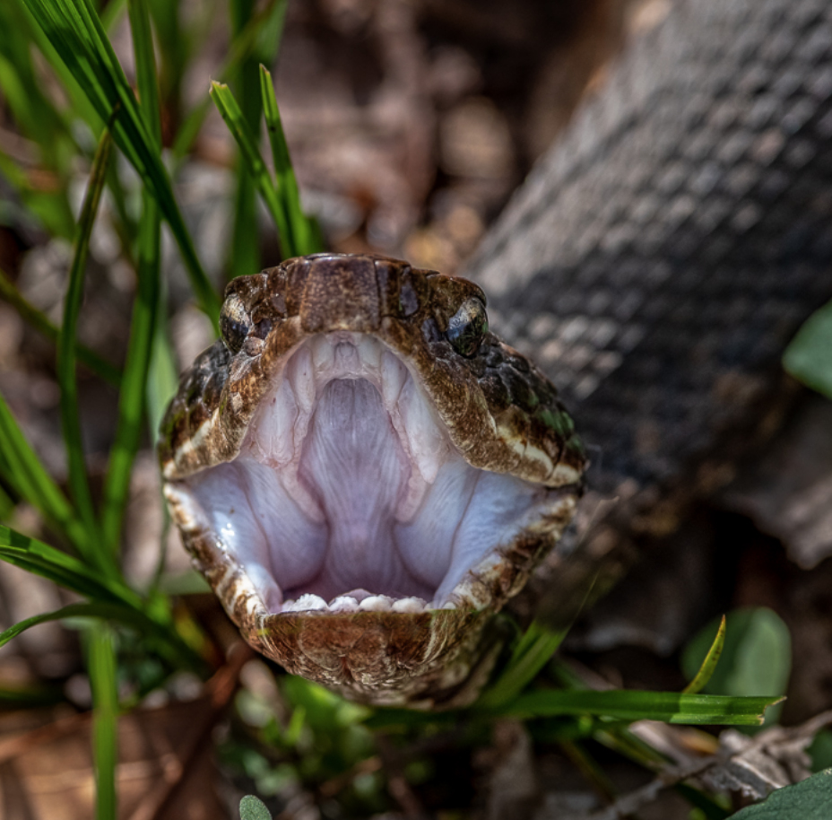
| 67 |
Apr 20 |
Comment |
Oh yes. Mr. Cotton and I are quite familiar. On the ground they don't scare me too badly, but I really hate when they hang in the trees. I had one at eye level once.
This is a fine shot, showing the "business" end of the snake. With your 300mm (plus crop factor) you really got pretty close. You managed good sharpness on the mouth. I would offer two simple fixes. First I would darken that leaf just to the left and above the open mouth. And i would do the same for the bright part of a stick next to the body of the snake on the right. They are bright spots that compete with the cottonmouth.
The only thing that would make this even better is if had a bit of the eye. Nature (wildlife) images are always better when the eye is visible.
What I really like is how this image grabs the eye of the viewer. That works really well.
Did you get any other shots? Just curious. |
Apr 3rd |
| 67 |
Apr 20 |
Comment |
That is a magical capture. You got great contrast between the owl and the tree (and background.) The owl looks to be sharp enough especially when you look at the fine feathers near the eye. He even granted you an eye level shot!!
Since we are confined to home and computers right now i would suggest spending some time with Photoshop and removing that branch on the right. It would make the image cleaner and even more stunning than it already is. You used all the right gear and used it really well. |
Apr 3rd |
5 comments - 18 replies for Group 67
|
| 72 |
Apr 20 |
Comment |
I am a great fan of minimalist compositions.
This one is set up nicely. The tree is in the right location (rule of thirds) the diagonal live of the shore adds drama and power to the scene. finally the fact that nothing is there makes the tree quite dramatic. Strong image over all. I would try adding a bit of contrast to the sky and maybe some selective darkening of some clouds. You might also dim those highlights on the sea.
Hope to see some more of this style of image. |
Apr 18th |
| 72 |
Apr 20 |
Reply |
This is the one that I like!!
I agree with Bruce regarding the original image---the background is too busy. But in this image you have a really great story line and with the two kids clearly visible it really makes the image pop. The bright sky is no distraction because the subject is so very compelling. I also like your camera angle here better. In this you are shooting at eye level and I feel this delivers more power to the scene. |
Apr 18th |
| 72 |
Apr 20 |
Comment |
This is an excellent job of isolating the subject from the background. The sharpness of the image against that soft background is excellent.
I would offer two thoughts, maybe back off just a bit with the crop and give the bird a bit more space in which to live.
But even more important might be to tone down those bright leaves in the foreground. Everything else is soft and a bit muted but those leaves are full of bright spots that draw the eye. You can't crop them off because the bird needs a place to stand, but you could dim them just a bit. What do you think? |
Apr 18th |
| 72 |
Apr 20 |
Comment |
I really applaud your efforts and the fact that you got down to eye level with this little 9 inch guy.
I agree with Isaac that the colors look a bit surreal, maybe they could be toned down a bit. Those eye are so very compelling that as Isaac suggests you could back out just a bit with your crop and still have the same impact.
You did great job capturing this little bit of fluff. |
Apr 18th |
| 72 |
Apr 20 |
Comment |
This is really a neat image. I really like the way the light hits the mountain while the rest of the work is in shadow.
I know this may not fit the rules for a Nature Plus group but were is my suggestion. I've love to know your thoughts.
OK--in your image the light has lit the peaks of the mountains in the distance Because they are higher than the rock forms in Arches NP. As the sun rises, it hits the highest points first so---what if you used a careful application of the adjustment brush and just lit the little tip at the top of balance rock with a bit of alpen glow. Can you imagine how that would just draw the viewer's eye?
Just a silly suggestion. |
Apr 18th |
| 72 |
Apr 20 |
Comment |
Adrian
This is really neat... I think it has a GREAT Nature Story line. You should put this in the Nature2 forum next month. If you do, I know where you can get at least on score of 10.
:-)
Larry T. |
Apr 18th |
| 72 |
Apr 20 |
Comment |
Something clever to go with the times.
Now---can you steal a "death star" toy from some unsuspecting kid and fit that into the sky for next month??? You are ona roll----don't stop now. :-) |
Apr 18th |
6 comments - 1 reply for Group 72
|
| 73 |
Apr 20 |
Reply |
I'll look forward to your images. :-) |
Apr 11th |
| 73 |
Apr 20 |
Comment |
I think this is a classic image i really like how the yellow sky matches the flowers. i think I am with Mark in wondering how it would look with that center path removed. I would also consider cropping out the structures on the right edge and then cropping an equal amount off the left. It would make the image more of a vertical but it would avoid distractions. What do you think, after all, you are the maker of the image. |
Apr 11th |
| 73 |
Apr 20 |
Comment |
I've got to drop by this group again. There are some really wonderful images on display.
I do applaud your photographic effort in making the image. Standing in the water is certainly going the extra mile and paid off. |
Apr 11th |
| 73 |
Apr 20 |
Comment |
This is an amazing image. The very powerful curve from the foreground to the background works quite will. I soft muted colors really make this scene feel cold and dramatic. This is wonderful.
I like the curve so much that I was wondering if you had moved to reposition the sun on the right would that work as a composition. I played around with a quick PS edit to show what I was thinking about. However, as you are the maker,I would like your opinion. |
Apr 11th |
 |
| 73 |
Apr 20 |
Comment |
I do like the drama of this image. The composition is about perfect with the position on the left fixation point of the main subject.
However for me it is the use of the light. This is something most photographers seem to avoid. Your foreground shadows, the bright spots of the mountain and the broken clouds are all pieces of photographic magic. Allowing Halfdome to peak through the clouds is a great final touch.
My only suggestion would be to remove the light colored patch inthe lower left corner.
This should be in a contest somewhere. |
Apr 11th |
| 73 |
Apr 20 |
Comment |
This is a classic shot of the mitten's. The composition is satisfactory for an image in the record category and as you say you want to return.
So my question would be, what would you do differently if you could do it over again?
Have you thought about backing up and including some of the large boulders behind where you stood for this image? |
Apr 11th |
5 comments - 1 reply for Group 73
|
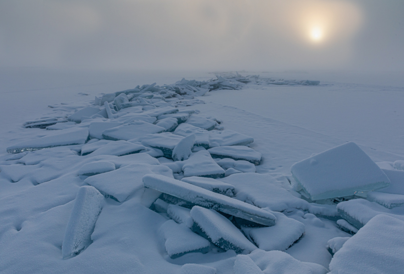
| 89 |
Apr 20 |
Comment |
A very interesting composition of the minimalist nature. Did you use a soft focus lens or filter to get this type of effect? |
Apr 11th |
| 89 |
Apr 20 |
Comment |
I really like the textures in the ice. I think that is what makes the image work.
what would you think of cropping off about half of the foreground. Doing so would draw more attention to the ice. The bare tundra is not adding anything to the image and as it is that rock in the front on the right draws too much attention. |
Apr 11th |
2 comments - 0 replies for Group 89
|
| 91 |
Apr 20 |
Comment |
The processing from the original to the finished product is stunning. I did not know infrared could look like this. The result is beautiful.
Since you worked so hard on this may I suggest removing those two red spots on the bottom edge and the whites on the top edge. I feel that would remove distractions and make it even more powerful |
Apr 11th |
1 comment - 0 replies for Group 91
|
71 comments - 53 replies Total
|


