|
| Group |
Round |
C/R |
Comment |
Date |
Image |
| 3 |
Mar 20 |
Comment |
Just visiting from another group.
What an adorable dog! You have a really nice photo of the dog and you even got catch lights in the eyes. The frame is an interesting touch. It may be my monitor but the frame looks to be a bit bright Maybe if it was darkened just a bit it would make the dog really pop from the frame since the viewer's eye is always attracted to light and bright.
May I ask why you chose this particular frame for this dog? I'm guessing that maybe because the dog is y and the frame has the baroque trimming on it, but that is just a guess. I'm interested in your thought process.
|
Mar 15th |
1 comment - 0 replies for Group 3
|
| 8 |
Mar 20 |
Reply |
I agree. I wondered about that word and while it is noticeable I will agree that it is relatively unobtrusive.
In the attachment here I might remove the white section at the top since it is so small. but either way it works since this has that abstract feel to it.
Thanks for replying and for your efforts. I'll look forward to see more images from you. |
Mar 16th |
| 8 |
Mar 20 |
Reply |
Yes. The reflections in the glass are another more abstract version. I do like this, mostly I think because of the lines. Thanks for replying and the efforts.
My vote is for this---my eye is just connected to those wavy lines.
|
Mar 16th |
| 8 |
Mar 20 |
Comment |
Just visiting from Group 36
You really have a fine image here with lots to look at. The composition is very well balanced and is appealing.
After reading Marcus' comment I'm wondering if there are multiple images contained with in this single shot. For example would the Fannie May sign and window make a decent image all by itself? Just curious what you think. |
Mar 16th |
1 comment - 2 replies for Group 8
|
| 15 |
Mar 20 |
Comment |
This is quite an interesting image on many levels. Like others who viewed this I did not realize he was swimming until I read the description, but visually it really does not matter. You have several power elements working for you. First is the show stopper--the arresting hand that is in the classic "STOP" position---so my eye stops! Then following the pointing fingers I come the equally arresting eyes. So I stop again. In photographic composition a powerful tool is repeating patterns. Well, you have those as well--the hand and its shadow create the repeat. All of these elements combine to make this an "arresting" image.
Quite well done for a quick grab shot.
All the items mentioned make the image. I actually didn't notice the white patch on the jacket until I had looked at all the other elements. I would agree with others that that could easily be cloned out to remove the distraction from the image.
The one thing that really puzzles me is your ISO setting. 6400 for an ISO is really high and usually reserved for shooting in nearly dark situations. Clearly the day on which this was taken was pretty bright (how else could you get such sharp shadows?) So my inquiring mind wants to know why you used that ISO? Perhaps if you had posted your shutter speed it would have helped me understand. Anyway, I've come to the source so to speak----I would really appreciate if could explain the ISO. I look forward to your answer. Thank you so much. |
Mar 30th |
1 comment - 0 replies for Group 15
|
| 24 |
Mar 20 |
Reply |
Lucky mistakes still count!!
First, didn't I read some where that you used a Nikon D800 at one point?? I have shot the D800, but currently use the D810 and D850. I say this because the Z7 has a record of slow and spotty auto focus with any lens. So the issue is probably the camera not you!! Keep Smiling!! You say images were noisy but this one was shot at ISO 500---that should not be noisy. Check and find out exactly what the ISO actually was so we can get to a starting point.
Did you use single point focus or one of the dynamic groups?
For a stationary subject you can use single point, for moving subjects try one of the dynamic groups like 9 or 21.
You can practice using an empty coke bottle. Attach a string to the coke bottle and hang it from a tree limb. make the bottle swing in a wide arc left to right. Back up take the camera and try to focus on the coke bottle. Practice makes perfect. Let me know how it works.
If you ask questions, you can get answers in the Discussion Groups. Post some of your results. I'll look forward to seeing them. |
Mar 12th |
| 24 |
Mar 20 |
Comment |
Hi Laura. I'm just visiting from Groups 36 & 67. In that I'm located in south Florida when I was looking over this month thumbnails I was instantly taken by your flamingo. There is a great deal to like about this image. Few photographers actually use light and you were skilled enough to catch some interesting highlights on the neck and some of the back feathers. This really makes the image come more alive. You have an interesting unifying curve leading from the bottom right,moving to the underside of the bird, up the neck and ending with the beak. This line holds the image together and leads the eye. Of course the image is sharp,there are no overexposed areas and you included the all important eye. I'd say you did pretty well with a wild life image
Your write up mentions two issues. One you say you are not certain you like your lens. I would love to know why? It seems to have captured a pretty good image and it has good contrast and sharpness. Would you care to explain your issues with the lens?
I am a nature and wildlife photographer and find that there is a great deal of difference with these areas and street photography. If you have questions about any of these areas I would be happy to try and provide some guidance. Please feel free to ask. I'd love to see some of your landscapes.
BTW--if you are interesting in street photograph try looking at images from Henri Cartier-Bresson, |
Mar 12th |
1 comment - 1 reply for Group 24
|
| 29 |
Mar 20 |
Comment |
Hi, just visiting. I was scrolling though the current images and this one, even in a thumb nail, just caught my eye. As you noted, images with impact are what photography is all about and this one qualifies. It is an art to have a "dark" image that is more than just moody-- this one certainly is. I feel you did especially well with control of the shadows and the the blacks. The reflections in the pools are very impressive.
This is well done indeed.
May I ask, what was your camera angle. Basically, how much was the camera position below 6 feet? |
Mar 9th |
1 comment - 0 replies for Group 29
|
| 30 |
Mar 20 |
Comment |
Hi, just visiting. I love baseball (life long Cub fan) so I had to check out this photo. Background looks great---almost like Wrigley with the tarp in center field. What you did worked really well. The eyes are everything and they tell the story. I agree with Robert about wanting to see the grip. Baseball fans really like that part.
Since I'm sure you will photograph this budding star again, try slowing the shutter speed and get the shot with his throwing arm just as it comes forward with a bit of motion blur. Very dramatic. The post the shot because I want to see it! Good luck. :-)
I photographed College Baseball for years---got any questions? Get a bag of peanuts and we can chat digitally. |
Mar 12th |
1 comment - 0 replies for Group 30
|
| 32 |
Mar 20 |
Reply |
No problem. Just tell folks he shot it off. :-)
Sorry I didn't think about the boot. Now that you mention it it is really obvious. |
Mar 24th |
| 32 |
Mar 20 |
Comment |
Great choice with the BW conversion. Those colored shirts in the original make them look fake. In the BW I'm thinking the OK Corral.
personally, I would like a bit more space on the right (he almost looks clipped off. But then there is the bright spot that is burned out.
How are your Photoshop skills, could it be cloned? |
Mar 19th |
1 comment - 1 reply for Group 32
|
| 36 |
Mar 20 |
Reply |
Thanks for your input. I don't do much B/W and wanted to try one. I should have been more careful and cleaned up the dust. I did on the color print but got lazy on the B/W. good thing there are folks like you to keep me on my toes. I promise to do much better next month.
I do like your version of my photo. Thanks for putting the time in on it. |
Mar 19th |
| 36 |
Mar 20 |
Reply |
Thanks for taking a look. I work on it some more. |
Mar 16th |
| 36 |
Mar 20 |
Reply |
Good luck in the contest. Be sure to let us know how it does. |
Mar 14th |
| 36 |
Mar 20 |
Comment |
Arne's images make me go to his black and white group each month and study what he shows there as well. He certainly has a touch for this genre. |
Mar 14th |
| 36 |
Mar 20 |
Reply |
Thanks Bill. I've processed this image both ways, B/W and color. The wife likes the color, but since I have lots of color sunsets, I sorta like the B/W for this one.
|
Mar 14th |
| 36 |
Mar 20 |
Reply |
You are quite right, I should have cropped some off the top. The dark sky could easily go.
You are right about the wolf---top center!
I'm still working on Le's darting wolf---I think it show a bit more in the revised B/W shot. |
Mar 14th |
| 36 |
Mar 20 |
Comment |
Actually the best part of this image is all the different ideas it has generated. All of these thoughts will give everyone something to think about when we approach this situation.
I have frequently just made the correction I originally mentioned. Now I'm getting second thoughts and will try some different approaches the next time. It been a great learning exercise. |
Mar 14th |
| 36 |
Mar 20 |
Reply |
Hey, great minds think alike! :-) |
Mar 14th |
| 36 |
Mar 20 |
Reply |
Well, back to the drawing board. . . I have no idea if I'm right or wrong. Everything is just an opinion, and probably everyone has one. So here is my take.
This building is really not very tall---think skyscraper. And the building is much wider than it is tall. For me, the building doesn't look too far off---at least upon first glance. However the narrow flag poles, being tall and thin looked out of place and my eye saw them. Because the image makes me feel that I am close to the building, and because it is taller than I am seeing the underside of the portico seemed natural so I ignored it.
I think each person brings their own bias to each image that they see. For example, an urban dweller will look at tall building differently than some one from the rural regions. Thus they will interpret an image differently-- neither is right or wrong.
In the end the photographer is right. It is his/her image and they have artistic license to create it as they see fit. We who comment offer our suggestions, but the maker has the final say. That is why I always encourage the maker to explain what they were trying to show or what they saw. Then I can try to see the image as they do.
I found all the comments in this discussion really interesting. They many differing views and comments provide a world of information. All of these will make me think the next time I photograph a building. In the end I hope I will get a better image---at least one I like.
My thanks to everyone who contributed to this discussion. It has really been a learning experience.
|
Mar 10th |
| 36 |
Mar 20 |
Reply |
I really like that dodge and burn suggestion. I had not even thought about doing something like that but after viewing some of your previous BW images (the large mountain comes to mind) I can see how your idea would work. |
Mar 10th |
| 36 |
Mar 20 |
Reply |
First, I do not do much black and white (just a personal choice) but recently I've decided I should work harder at it. The idea of trying to teach an old dog a new trick comes to mind.
I posted this image because I was inspired by your work in recent months and decided to try more B/W. My hope was that you, being the master, would offer some advice. After reviewing your pier shot (and I have spent a good deal of time going over it) your wide aperture suggestions makes even more sense. I'll look for opportunities to try this. I used Lightroom to make the conversion but I will note that I liked the old Lightroom much better than the new Lightroom because in that version I could convert to BW simply by desaturating. I will look into Nik but would ask your opinion of Silver FX
In the future please feel free to critique anything you wish regarding my images. It is the only way I will learn and I have a great deal to learn. I am no expert. Comments like your are why I joined these DD groups.
Thanks again.
|
Mar 10th |
| 36 |
Mar 20 |
Reply |
Thanks for the quick demo. |
Mar 8th |
| 36 |
Mar 20 |
Reply |
I agree. That's why I went with the B/W image. The sunset is nice, but it is not THAT fantastic that it could not be sacrificed to the gods of Black and White. Thanks for your help with this shot.
Thankfully you can't see the sand fleas that were trying to eat me ankles while taking this shot. |
Mar 8th |
| 36 |
Mar 20 |
Reply |
You have an interesting idea. While I do not think I would remove the highlights from the little tree because doing that would make it blend in too much with the trees behind it, I really think the brightening the castle itself would accomplish the goal. If the castle were lighter it would easily draw the eye, since it is in the middle all the greens would act as a frame and you would then hardly notice the tree.
It is a good idea Michael. |
Mar 8th |
| 36 |
Mar 20 |
Reply |
Michael
I'm interested in this dehaze thing. I'm not familiar with the tool since I only recently got a Lightroom version that has dehaze. Would you mind giving it a try so I can see how it might work. I appreciate it. |
Mar 7th |
| 36 |
Mar 20 |
Reply |
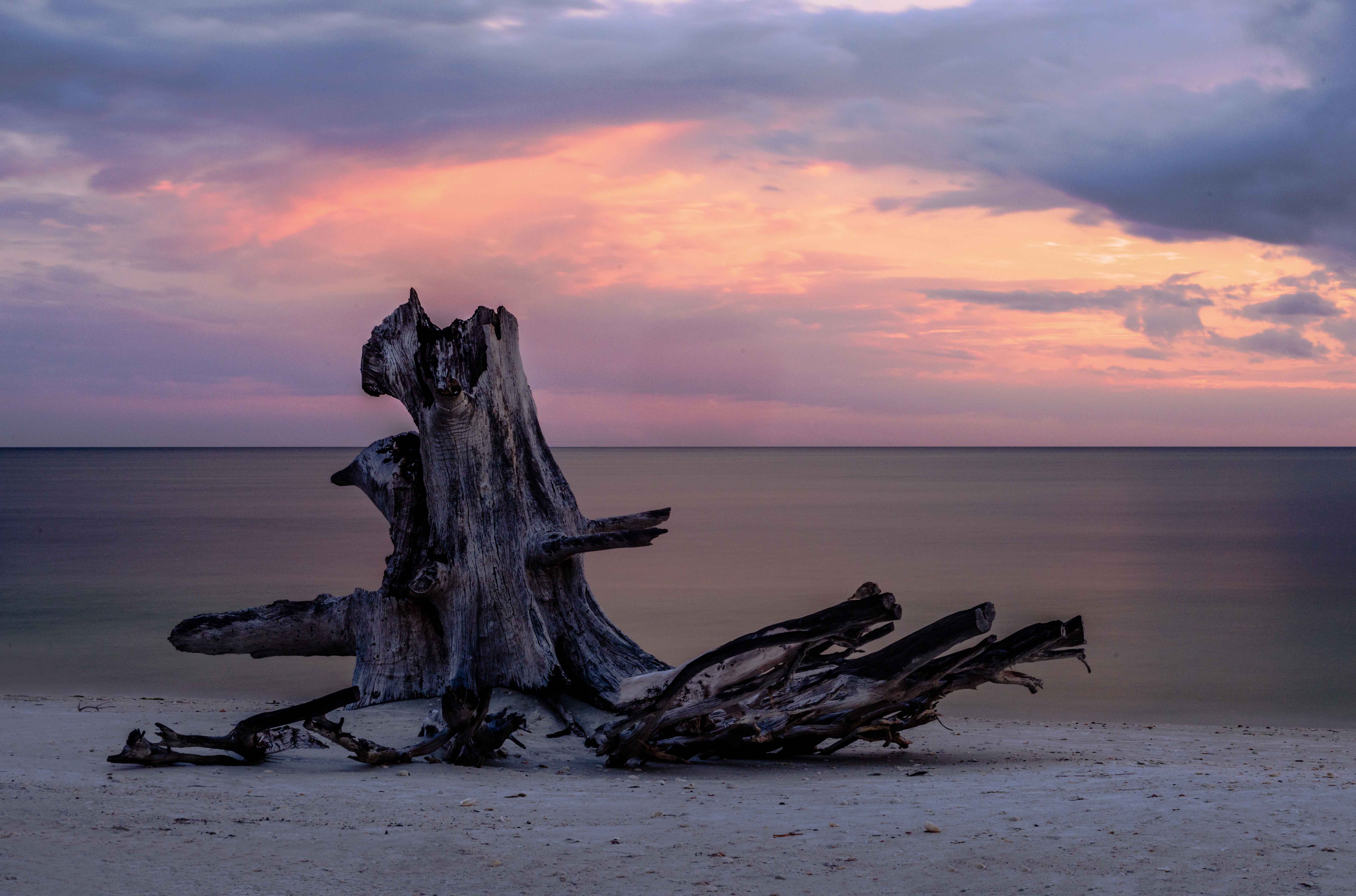
I am also posting here the original color image just in case anyone wants to see how all this started.
Thanks for the suggestions. It keeps me on my toes. :-) |
Mar 7th |
 |
| 36 |
Mar 20 |
Reply |
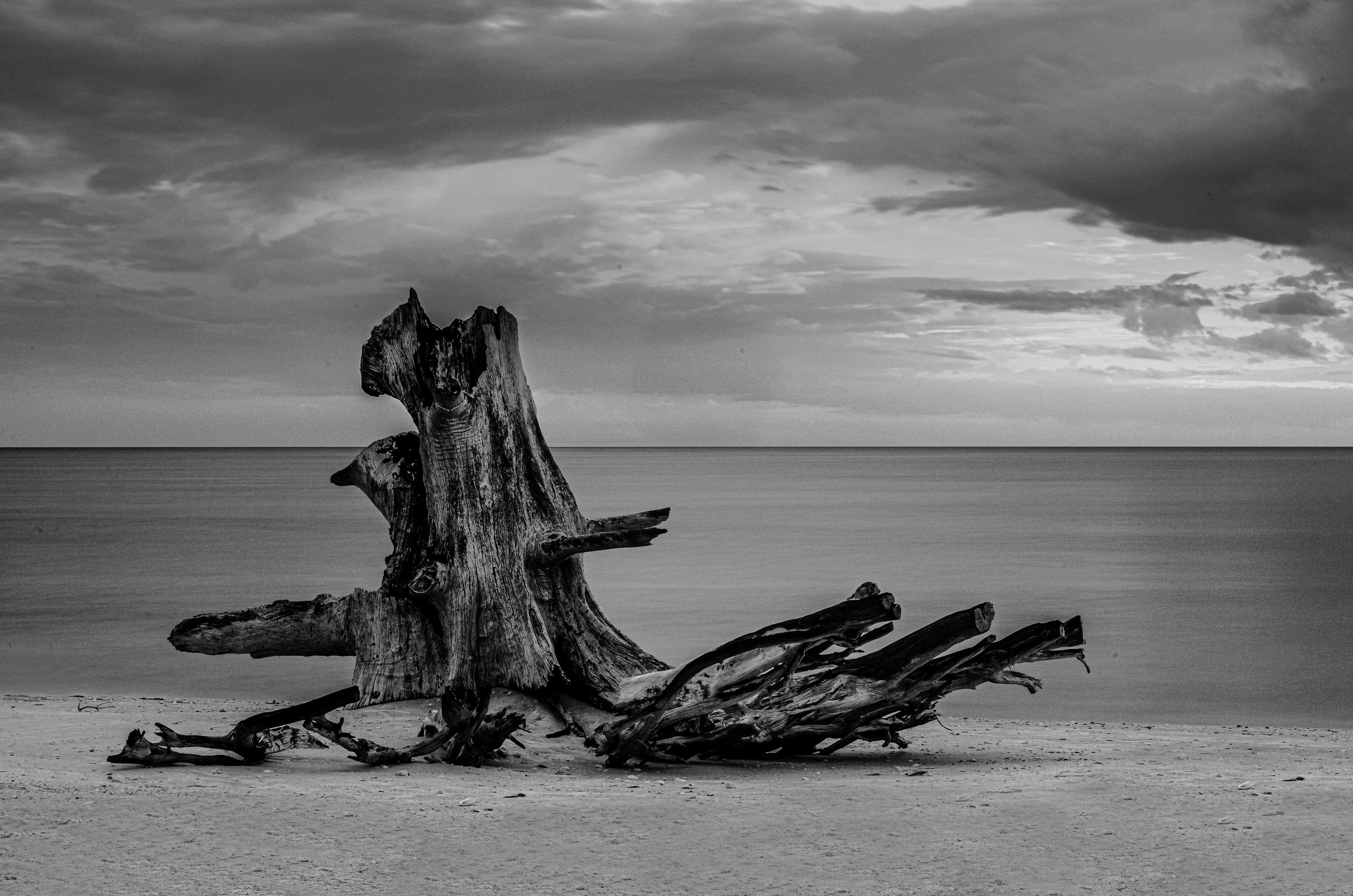
OK Michael, thanks for the wake up call.
I've been making changes
I'm now posting below a revised BW stump on which I backed off a bit and made sure there is no visible artifacts around the edge. They didn't show on my computer but I noticed they were visible when I posted the image. Do you think this one is any better??? |
Mar 7th |
 |
| 36 |
Mar 20 |
Comment |
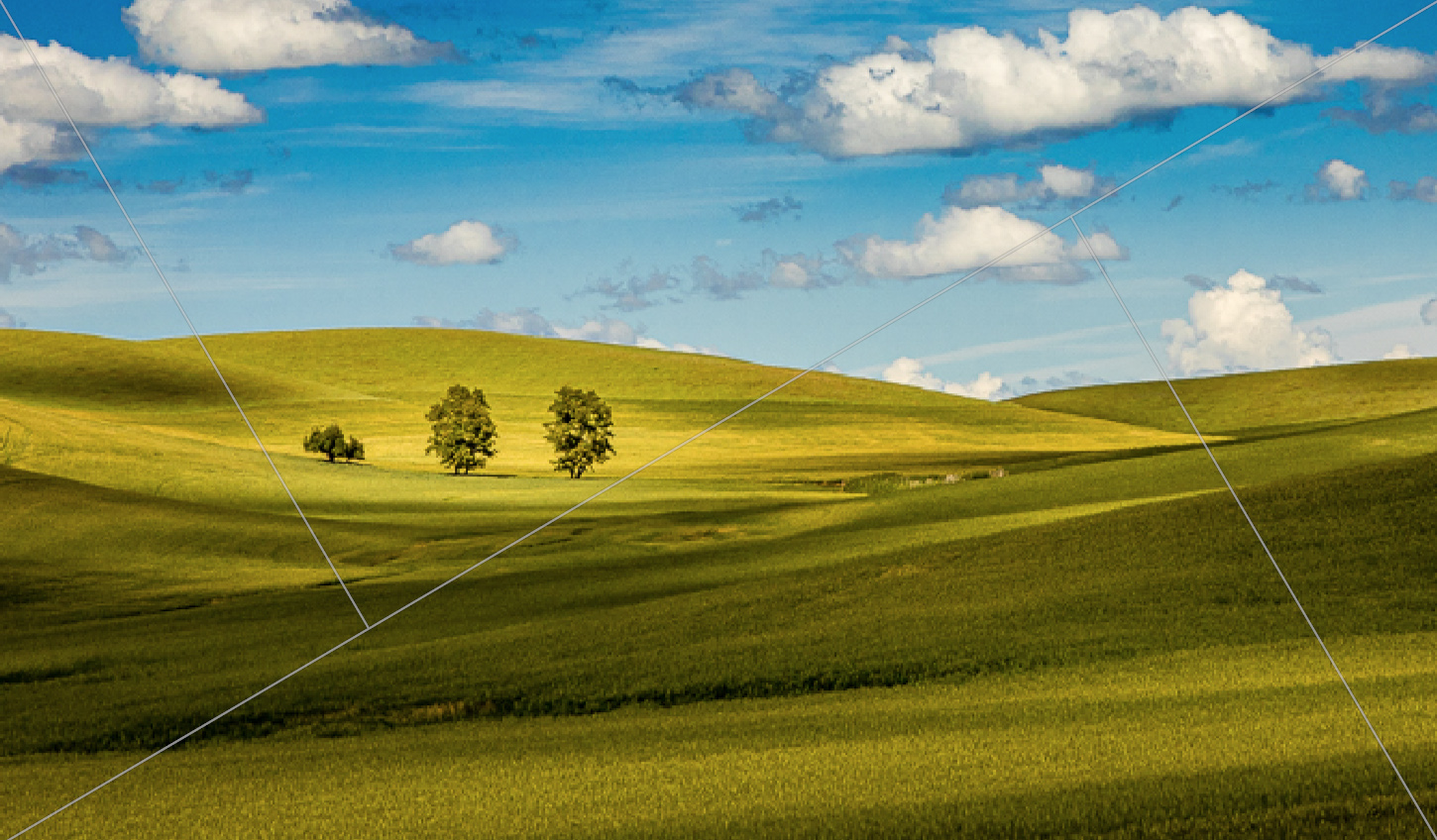
I'm really enjoying your series from the Palouse and this is another good one. While I generally do not like mid day images, this one seems to work. While I enjoy the image for me it just seems like it is too much of a good thing. At first I wanted to crop just from the right but I didn't like how that positioned the trees. Therefore I cropped a bit more from the left and that allowed the trees to remain on one of the fixation points. I also accessed Lightroom's crop ratios and selected one that I thought worked. If you enlarge my attachment you can see the super imposed lines that I used.
I also feel you could run some sharpening over the image the trees look a bit soft. |
Mar 6th |
 |
| 36 |
Mar 20 |
Comment |
I have seen lots of images of this castle over the years and most have been quite ordinary. This image certainly rises above all the others. This has a nice moody that I think has appeal. I think the sky and the moss on the tower walls compliment each other and blend with the other greens throughout the images.
I will offer three suggestions. First just run a sharpening apt over the image. It will add some detail to the leaves.
Then I would crop a bit from both sides. On the right crop off the little bit of white road on the right edge. On the left I would crop above half of the massive tree may be as far as the dark bush.
However the big questions are did you kiss the stone??? and are you full of Blarney??? :-) |
Mar 5th |
| 36 |
Mar 20 |
Comment |
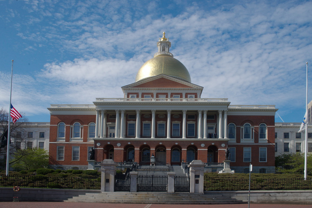
Being a fan of historical style buildings I found this to be an interesting photos of record. My only thought for this photo is the fact that the perspective is off with the flag poles leaning inward along with the sides of the building. This is usually caused by not keeping the camera level but tipping it upward when shooting. There is a sort of quick fix that can be applied by using Photoshop.
Load the image, then make a copy of the image. Next go to Edit > Transform > Perspective. Grab one of the little handles on the upper corners and simply dragging it to either the left or the right until the side of the building look straight.
I did this quickly and attached the results. See what you think. |
Mar 3rd |
 |
| 36 |
Mar 20 |
Comment |
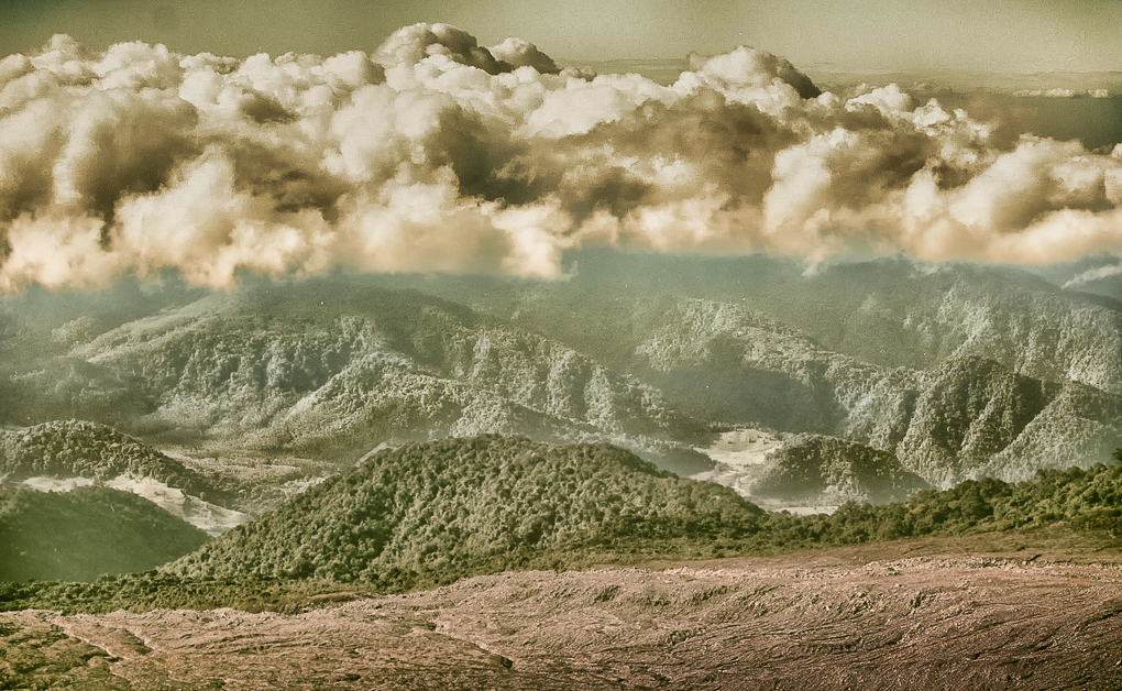
Has the Chamber of Commerce contacted you for the rights to this photo? It certainly captures the majesty and rugged contours of the mountain. The crown of clouds really helps the feeling. I really hate images with those cloudless skies. You chose a good format in going with the pano appearance as this best sets off the mountain. The addition of the trees in the foreground adds a feeling of scale and shows the environment. |
Mar 3rd |
| 36 |
Mar 20 |
Comment |
You managed to produce a very moody image that clearly executes the feeling of the title you chose. The technique of fading or blurring the horizon line worked out quite well. The pier feels like it is hanging in nothingness. The more than 5 minutes used for the exposure really added to effect. It is easily seen that all of your choices including the shallow DOF all paid off in the final product.
I salute your creativity both the mental part and the technical part. This is truly an amazing image and demonstrates your mastery. |
Mar 3rd |
| 36 |
Mar 20 |
Comment |
This is a most inviting image. This is an image that just makes you want to walk down that road and enjoy the cool clear air and fall colors.
When looking at the image closely much of it seems to be a bit soft and lacks critical focus sharpness. This is most likely due to the most shallow DOF of 5.6. Even if hand holding, note that your ISO is only 100, so you could have bumped up that ISO and that would allow for an increase in the aperture.
If it were mine, I would crop out the bright tree trunk on the far right. It is a bright spot that just draws my eye.
It would appear that the image was taken while you were standing and perhaps lowering the camera position would drawn the viewer a bit more into the image.
Wish I lived where I could see more roads like this. the scene is really beautiful. It took a good eye to spot this.
|
Mar 3rd |
8 comments - 15 replies for Group 36
|
| 38 |
Mar 20 |
Comment |
Thanks so much for my baseball fix! I have shot High School and College baseball here in south Florida for years and I can tell you this is an excellent shot. I love the look you captured in the Tampa players eyes---that is where the story is.
You certainly have the right camera for the job. I used my 600mm and my 200-400 (both Nikon lenses). I see you used the 80-400 how do you like it? I heard it was a bit slow on the auto focus so I'd be interested in a first had report.
Hope you go another baseball shotfornext month. :-) |
Mar 14th |
1 comment - 0 replies for Group 38
|
| 46 |
Mar 20 |
Reply |
Yep, you got the leaves i was talking about.
I think you did a fine job with this new version. I liked the first one, but this is much better.
If you have more from UM I'd love to seem them.
I'll drop by again. |
Mar 17th |
| 46 |
Mar 20 |
Reply |
Go Big BLUE!!
I love this building! Of course I am an alum so I have to love it!!
Now to the image. Getting"clean" shots of building on a old campus like Michigan is really hard because as you say the blend together and have all those wings. Having been there I really like the picture, it is like a walk down memory lane in springtime,or early fall on a football weekend. You captured this feeling quite well and since you couldn't get rid of the left side portion of the building it is best to keep it. I'm, not a big fan of HDR but you make it work quite nicely in this image. The building looks like it has been kept up and very inviting. Sometimes those old building look a bit worn.
I would offer two to suggestions and would like to know if you approve. First to crop those random leaves on the top left and second to croop up from the bottom to remove thatlittle bit of curb onthe right. |
Mar 16th |
0 comments - 2 replies for Group 46
|
| 48 |
Mar 20 |
Reply |
Your rationale makes perfect sense. As I see the expanded version I agree that the flames add too much at the top and does reduce the focus on the eyes. You made the right choice. As for the portrait format that would really be dramatic and powerful because those eye are so piercing.
You did quite well with this image. At our Day of the Dead celebration many of the participants ask to have their photo taken. Did you select her on your own? If so you really picked the right girl! |
Mar 16th |
| 48 |
Mar 20 |
Reply |
You had a really great model and handled the shot quite well. The food truck was an inspirational background! I'm surprised that you got such good DOF with an f2.8 but it worked really well.
It is your photo, and so you are right but I would like to ask why you cut the flames on several of the candles? As was noted it might take attention away from the eyes if they were all present. However I would like your opinion, please share... Thanks |
Mar 15th |
| 48 |
Mar 20 |
Reply |
Margaret
Many of the folks at the Day of the Dead spend a fortune on their attire and the WANT to to photograph them. Many will even ask to be photographed. |
Mar 15th |
| 48 |
Mar 20 |
Reply |
You were at the day of the dead in Ft.Laud! So was I. It is a lot of fun. |
Mar 15th |
0 comments - 4 replies for Group 48
|
| 49 |
Mar 20 |
Reply |
An easy and fun way to learn Lightroom techniques is to checkout serge ramelli lightroom tutorials on youtube. He has lots of free lessons that will give you ideas. His use of the GND filter and the radial filter are interesting. He is kind of a nut, a bit of warped funny but he knows Lightroom. |
Mar 23rd |
| 49 |
Mar 20 |
Reply |
I've often done that sort of retouching. It takes a subtle hand, but your description sounds like you have the skills. I tried playing with a download copy of your, but it is too small for fine work.
If you get something neat---I'd really love to see it. |
Mar 22nd |
| 49 |
Mar 20 |
Comment |
Hi JoAnne
I'm just visiting and was stopped by the drama of those clouds. They are some of the best I've seen in a long time. You did wonderful in capturing that drama.
Hope you don't mind but I took the image and did some playing with it in Lightroom.
I underexposed and added contrast to the clouds and brought down the highlights just a bit. I used the adjustment brush and with shadows darkened, highlight increased a bit and clarity added I brushed the center grey mountains so give them some character since they seemed a bit flat. Then I added a reversed GND filter in the bottom right with a little under exposure added to bring out detail in the lower foreground.
Do you think this adds any character or life to the image? Lightroom has some powerful tools if you play with them a bit. I be interested in your opinion? |
Mar 22nd |
 |
| 49 |
Mar 20 |
Comment |
Wow! What a dramatic image. I really love the colors and chilly feeling.
While I really like this image (wish I had one---but I'm in Florida--ice comes in glasses) I see you use Lightroom creatively. So I'm just wondering what would happen if you used the adjustment brush, with a tiny bit of yellow and increased exposure if some lightbrushing could make some of the ice appear to glow? Any thought on this? |
Mar 22nd |
2 comments - 2 replies for Group 49
|
| 56 |
Mar 20 |
Reply |
Your kingfishers are not as smart as mine in Florida. If I even slow the car down, they take off. If I just park the car and sit they will gather on trees or post about 200 years away and I swear I can hear them laughing. Where is Chincoteague, I should come visit. :-) |
Mar 10th |
| 56 |
Mar 20 |
Comment |
Congratulations. You did well to capture a kingfisher as they are quite elusive. I'd love to know how you got that close to the bird with him taking off. |
Mar 5th |
1 comment - 1 reply for Group 56
|
| 61 |
Mar 20 |
Reply |
Actually, that sounds like the perfect answer. :-) |
Mar 21st |
| 61 |
Mar 20 |
Comment |
One of the more creative and dramatic portraits that i have seen in quite a while. I think I fall in line with Manfred regarding the highlights---especially the one on the forehead. The shadow in the top right appears to be the natural falling of the well placed lights and works for me.
However, I would love to her why you included the white adornment in her hair? My is is really drawn to that bright spot and I can't seem to keep from back to it repeatedly. You placed everything in the photo so accurately and purposefully that i would love to hear your rationale for this single adornment. Thanks. |
Mar 19th |
1 comment - 1 reply for Group 61
|
| 67 |
Mar 20 |
Reply |
Be safe. You are a valued member around here. |
Mar 19th |
| 67 |
Mar 20 |
Reply |
OK. Now it is ready for a frame! |
Mar 15th |
| 67 |
Mar 20 |
Reply |
Wow Michael, sharp eye to see that dark spot.
The only problem with this image is that I wish I had taken it! Good shot Madhu! |
Mar 14th |
| 67 |
Mar 20 |
Reply |
One trick to getting closer is to walk diagonally to the left or right, but start at a point so that you will decrease the distance slowly. Get your shot of record first and then as you walk do not point the lens at the subject. They see that big hunk of glass as a giant eye staring at them.
But with Kestrels---it is really a big problem. |
Mar 14th |
| 67 |
Mar 20 |
Reply |
Thank you. I thought the same thing when I first looked at the image on the computer. |
Mar 14th |
| 67 |
Mar 20 |
Reply |
Thank you. Like I mentions to Richard above, the greens may be a bit bright, but not that much. Color was abundant everywhere. |
Mar 14th |
| 67 |
Mar 20 |
Reply |
Thanks. When you get clear evenings the colors just come alive. I agree that the greens are a b it bright. It is just one of those colors that I struggle with. Greens and reds just seem to absorb color. I keep trying to bring them down a bit but it does not always work. Still after the afternoon rain they were not dull. |
Mar 14th |
| 67 |
Mar 20 |
Reply |
I am from the school of giving critters room to breathe. Many of the PSA like the tighter crops. This gets to be a personal choice. The only trouble with a wider crop on this image is the white and yellow flower at the bottom. Getting rid of those would solve the problem. |
Mar 14th |
| 67 |
Mar 20 |
Reply |
Have I mentioned that I own a travel agency. I could book your trip. |
Mar 14th |
| 67 |
Mar 20 |
Reply |
I also like the cloud on the right. I've been mulling a different crop that would draw more attention to the ricks and that cloud. Maybe a square crop? |
Mar 14th |
| 67 |
Mar 20 |
Reply |
Using the white flower really helps the foreground. It was a great compositional idea! |
Mar 12th |
| 67 |
Mar 20 |
Reply |
We live and learn.
The tripod would surely have helped. I always use one with landscapes. But I bet the noise was caused by having the foreground underexposed in the original and then you opened the shadows to get your image that you posted and now between us we opened the shadows some more and we struck it rich and found the mother load of NOISE!!
Camera on tripod, using an GND filter ( I usually use a 3 stop grad) would allow you to better expose the foreground and the filter would have kept the sky from becoming over exposed and instantly you would have the perfect shot. |
Mar 12th |
| 67 |
Mar 20 |
Reply |
Don't fret. I've done that with lots of images. You fall in love with it and that can blind you. But if you continue to use this misses as learning tools things get better. That is why I study my images, and all the others closely to figure out what went wrong.
But over the months you have been in this group you have improved a great deal. So keep on shooting... |
Mar 10th |
| 67 |
Mar 20 |
Reply |
Single point should not matter for sharpness, unless that point was more towards the back half of the bird. But with an f10 there should e more DOF. I am perplexed.
Try the clone tool to fix the lily pad. The you could carefully patch the front edge of the lily pad and keep the edge line perfect. Aline with the cross hairs that appear when you click the Alt or option key. |
Mar 10th |
| 67 |
Mar 20 |
Reply |
Just for the record, I did have a CPL on the lens. Had to check my notes.
Maybe a hike could be arranged. I love hiking in that park. |
Mar 10th |
| 67 |
Mar 20 |
Reply |
The far bank does not bother me too much. Perhaps a bit could be cropped from the top and the rest darkened just a bit. Check out my sample below. I agree that a more frontal view would be interesting, which is why I previously noted about any departure shots. |
Mar 10th |
 |
| 67 |
Mar 20 |
Reply |
Oh yes, this is much better. The trees now look like trees and less like a black mass and the foreground has some interest to set the state. I was going to suggest cropping some of the sky off the left because it got to be too much of the same thing. But now the sky has character and interest. This is a 1000 times better than the original.
The one thing I can't tell, because the sample size is to small, is there much noise in the foreground? |
Mar 10th |
| 67 |
Mar 20 |
Comment |
WOW what a sky!! I have always been a fan of those Big Sky country sunsets and this is no exception. I feel the panorama format does well for this image and the the stitching was a great idea. Did you shoot this with the camera in horizontal or vertical position? I think that the real story of the image is on the right side where there is some light in the sky. While this is a sunset image I feel it would have greater impact if the foreground was a bit lighter (brighter) I tried to created an edit with a lighter foreground but the image was so small it became too pixelated. It also appeared that the grasses were a bit windblown but that was hard to tell. For me as it is too much of the image space is dark and this make me look even more to the bright spot in the sky and ignore the rest of the scene. Adding a bit of light to the foreground may soften this feeling.
|
Mar 9th |
| 67 |
Mar 20 |
Reply |
Thanks Michael for the suggestions. I didn't see the artifacts in my original but they did appear when I reduced the image for posting here. I reworked the image taking into account your suggestions. The brightness of the grass has bothered me for a while, but green is one of those problematic colors (along with red) that just seems to look bright. I played quite a bit with the HSL sliders and reduced the punch of the greens. I also brought down the brightness in the river as per your "rule of thumb". I was actually surprised at how bright it was in the original RAW file. I used a gradient and played with the highlights to accomplish this edit. I used the adjustment brush to work the noise in the sky. I actually applied it several times. I did not do it globally so I would not lose sharpness in the trees. I would appreciate your opinion on these edits.
Your suggestions addressed some issues I've had with this image in the past. Your comments really helped to make me more aware of my shortcomings and I do appreciate your thoughts and efforts.
I uploaded the file as the Original. However the artifacts now look worse than before as it appears here. I can't see them onmy monitor at home. I am really confused. |
Mar 9th |
| 67 |
Mar 20 |
Comment |
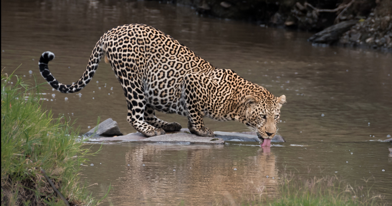
Looks like you had a pretty good day since you were able to shoot at a fairly low ISO. Since you did not mention cropping I'm wondering how much of the frame this image represents.
You certainly pulled the trigger at the perfect time as you captured his tongue lapping up the water. That little bit of pink does a lot for the photo. The diagonal line formed by the cat's back leads to the tongue that is perfectly placed on one of the right fixation points.
My only suggestion would be to get lower so you are not shooting down on the cat's back. I don't know if this was possible in that you were in a vehicle but i reference that I was shooting from a boat last weekend and ended up sitting on the floor of the boat to get a lower angle. I wonder if this is possible in the vehicle?
I'm wondering if you got any shots of the cat leaving this location? If he turned toward the camera when he departed that may have been a neat shot. (Will I see it next month?)
This ends up being a perfect portrait of a wild leopard. You did really well with this one. |
Mar 6th |
| 67 |
Mar 20 |
Comment |
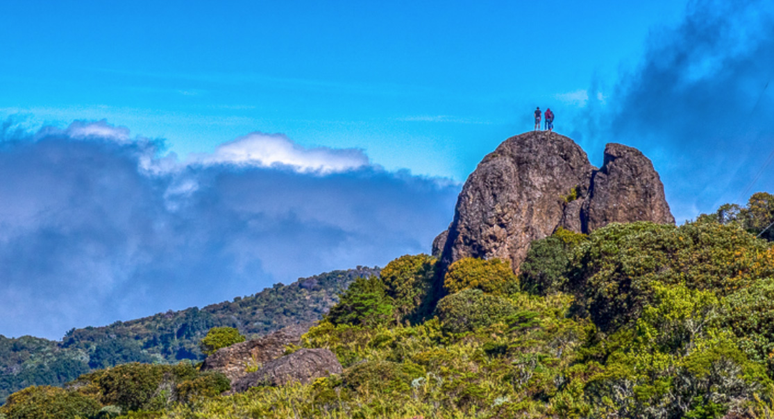
This is an interesting image with lots of really good compositional lines that lead to the large boulders. These include several lines of foliage and two lines from the clouds, one from the left and one coming down from the top.
I think the people at the top are vital to the image because they bring scale to the image and one of them is even wearing a red coat to draw the viewer's eye.
I feel the image takes on a static feeling because there is just too much of it. The powerful subject is the large boulders and the more attention you can draw to them the better. I've included a heavy cropped image as an example. I tried to reduce the overpowering foliage in the lower right corner. Since the left side is just an expanse of the same thing I reduced that as well and even brought down the sky into a more panoramic format. All of these crops just draw attention to the large boulders. |
Mar 5th |
 |
| 67 |
Mar 20 |
Comment |
It is really good to see that you continued the low angle shooting this month. Getting down to eye level really helps with the dynamics of the image. You even managed to get a catch light in the eye. This is well done. You also did well by jacking up the shutter speed which really helps with the sharpness as can be seen in the sharpness of the back wing. I would be interested in knowing what focus system you used. Were you using single point only or did you work with a dynamic grouping. I'm asking because the tips of the front wing are blurred and I'm trying to figure out why.
I also noticed that you tried a bit of surgery in removing that flower in the lower right foreground. Removing it was a great idea (I looked at the original) but you left a couple of tell tale signs. One shows on the front edge of the lily pad and there is another in the water at the top of the lily pad. Note the black stick does not match up and there is an issue with the water. What software did you use? If Photoshop--what tools ?
It might be my monitor, but maybe you could open some of the shadows on the dark underside of the wing.
I do like the tension in the photo with the raised wigs.
|
Mar 5th |
| 67 |
Mar 20 |
Comment |
It is really hard to get close up shots of this bird as it is almost as skittish as a kingfisher. Using the car as a blind and a beanbag to steady the camera was a stroke of genius. For such a drastic crop you have managed to keep pretty good detail in the feathers. My suggestion would be to crop about 3/4 of the green area off the top as it is doing nothing to help the image. |
Mar 5th |
| 67 |
Mar 20 |
Comment |
Thank you Isaac. It is moments like this that makes me want to just keep shooting. The joy never gets old.
Thanks again my friend. |
Mar 5th |
6 comments - 18 replies for Group 67
|
| 70 |
Mar 20 |
Comment |
First I really like your composition. It is a bit different than what is usually shown. I like the way the clouds are streaked and seem to match the reaching lines of the trees. Together these lines seem quite powerful.
As for your caption, to me it seems too much. The majority of the image contains dark tones and the caption is so very bright that it captures my eye. No matter how hard I try, I remain drawn to the caption. |
Mar 6th |
1 comment - 0 replies for Group 70
|
| 75 |
Mar 20 |
Reply |
When I visit acene that I like I generally do what I call working the scene. That means I will probably that the straight on scene that attracted me and then try higher and lower, Then I'll move to the left and right and repeat the process. If it is early or late in the day I'll look at what the light is doing to the subject and try to incorporate that as well. Depending on the scene I may back up for the environmental shot as well. Like you noted, I may never get back to the location so I better get it the first time.
Good Luck with future shootings. |
Mar 23rd |
| 75 |
Mar 20 |
Reply |
I will certainly look forward to seeing the polar bear photos. |
Mar 21st |
| 75 |
Mar 20 |
Comment |
Quite stunning! So few photographers with with high key and even fewer do it this well. I can just see this with a silver frame in a large format hanging on a wall. You seem to have gotten everything right, the wings raised are a nice touch as is the soft focus look. I also think the way you brightened the whites was a great idea. Did you have this in mind when you set out or was this a spur of the moment thought? I keep looking for opportunities for something like this but seldom seem to find them so I'm interested in your approach?
Since you do this high key work so well, may I suggest that you do a quick internet search for David Yarrow Polar Bear. He has a photo of a polar bear walking way, and all you see is the bottom of his foot. Let me know what you think of it? It may give you an idea for future shots.
Well done! |
Mar 20th |
| 75 |
Mar 20 |
Comment |
Hi Kerry. I'm just visiting from Group 67.
When I think about this image I do get a sense awe and think of the vast expanses of land that come to my mind when I think of Australia. I feel you did a great job in passing that feeling on to the viewer.
As I study the image I am drawn to the little fenced area that you have selected for your subject. One thing that attracts me is the character of the fence posts. The detail in that wood is amazing. This makes me wonder what the impact would be if you lowered your angle of view by getting the camera closer to the ground. This would raise the position of the fence posts in relation to the horizon and make them stand out even more and thus the viewer would connect to them even better. I would be interested to know if you thought of this when you took the image? I'm really interested in learning what you were thinking when you created your image. As the photographer, you are always right, it is your image. I'm just trying to think along with you. I appreciate knowing your thoughts. |
Mar 20th |
2 comments - 2 replies for Group 75
|
| 77 |
Mar 20 |
Comment |
This is why these groups are supposed to be dialogues. Here can can exchange ideas. No one is right or wrong but we all get things to think about and that is how we grow. I got some go ideas to think about (Thanks Georgianne)
It is fun to talk photography with pros. |
Mar 22nd |
| 77 |
Mar 20 |
Reply |
Hi again Witta
Sorry about the sand mix up. My error not yours. :-)
I also love long exposures and use a 6 stop and a 10 stop ND plus a 3 stop GND Those filters really can add some drama to an image.
It is really good to find someone you is willing to do "Lightroom" work. I'll have to keep an eye out for more of your images. I also enjoy the magic of Lightroom and like you want my images to be the best they can be. Have you tried using the Lightroom GND filter from the bottom or even diagonal? That helps in controlling angles of light.
Do you have anything in the Group archives that I should go see? |
Mar 19th |
| 77 |
Mar 20 |
Comment |
Witta, you certainly put a great deal of thought into the processing of this image. You had some well thought out ideas and they worked quite well to enhance the image. Your results make the image so much better than the original.
With your processing skills do you often spend this much time on your images?
This image looks so peaceful with the tidal pool that you made me think of a different angle. You said you had your tripod with you so I'm wondering about running a long exposure to make the ripples in the foreground smooth out and enhance the feeling of calm? You don't mention your camera settings, but dropping the ISO to its lowest setting, raising the aperture to the highest and even adding a polarlizing filter might be enough to still that water?
So I guess this brings up two questions. First what do you think of the idea and do you use long exposures? |
Mar 19th |
| 77 |
Mar 20 |
Reply |
Hi Witta. I think you really have something with adding some punch to the flowers and you did a good job with your edits.
As you no doubt know the eye of the viewer is always drawn to the brightest part of the image. In this image that would be the path and the bright flowers you created.
For me you created two bright spots to draw the eye. However, the bright spots and both above and below the mill thus the eye is trapped in the middle and becomes focused on the mill.
Do you think this makes a difference in how a person looks at the image? I'd love to hear your thoughts on this subject. |
Mar 19th |
| 77 |
Mar 20 |
Comment |
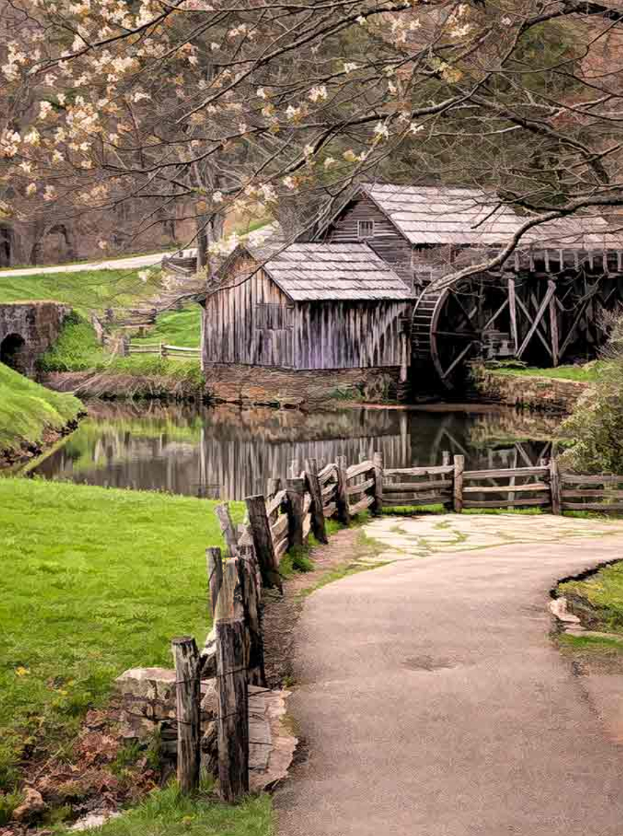
Hi Connie. I'm just visiting from Groups 36 and 67.
I was browsing the current images and came across Mabrey Mill and had to stop. This is one of my favorite locations and I'm always interested in how others see this icon. You have captured a view seldom scene in photos and so your unique point of view is quite refreshing. You really created strong dominate lines and with the curve in the pathway it worked well. Great choice. I also think your vertical format is different and quite appealing. I can tell thought went into this creations.
I would like to ask a couple of question and would really be interested in your thoughts. First, the eye of the viewer is always drawn to the brightest part of the image. You want the viewer to see the walkway and so that brightness works well. As I viewed the image my eye kept drifting to the top and the area where the white sky bleed through the leaves. To that end, I cropped out the area by bringing down the top edge. Do you think this matters or not? I also noted that the fence rail in the front was a bit overexposed so I brought that down so that the wood was darker. I felt this kept the eye pinned to the pathway. But I would like to know if you think either of these matter?
|
Mar 19th |
 |
3 comments - 2 replies for Group 77
|
| 84 |
Mar 20 |
Reply |
Thank you for your responses and for all the information. I learned a great deal both from your video and from your responses.
Viewing your video was a pleasure. |
Mar 26th |
| 84 |
Mar 20 |
Reply |
Ah, it seems you are having your own Alfred Hitchcock moments. You are certainly entitled to do so. :-)
That is you in the white shirt correct???
Your comments about altitude were about what I figured, but I had to ask. |
Mar 23rd |
| 84 |
Mar 20 |
Comment |
Please allow me to add an additional thought. As a still photographer I watch several video showing how the movie 1917 was made. I did this to study camera angles and techniques. I watched these videos several times each. As I write the critiques for this group I thought maybe some of you could used some of these techniques yourselves.
This forum is about making our photography grow and I thought this was a good learning tool. If I'm off base, please forgive me. Enjoy the videos and best of luck in your future film making efforts. I have really enjoyed my visit.
There are two video links provided.
https://www.youtube.com/watch?v=ypvd2LJCJHg
https://www.youtube.com/watch?v=kMBnvz-dEXw |
Mar 18th |
| 84 |
Mar 20 |
Comment |
Here in the United States, in Las Vegas there is a hotel known as the Bellagio that has a "Dancing Waters" light show nightly. This video very much reminds me of the night I saw that show.
You did quite well handling the exposures and the basic composition was well suited to the scene. I was worried in the beginning about the excessive amounts of water but the lights flashing on the water at the end validated the need for the amount of water. The lead in photos at the beginning worked well to set the stage. I really like the one with the moon in the upper left. I am wondering if the shots with the building where the lights were stationed would have been better at the end of the sequence rather than starting with those, moving to different structures and back to the building. I'd would like to know your opinion and reasoning for your order. Not a critique, I'm just trying to understand how this is done. I like the inclusion of the occasional boat sailing by this adds to the scene and creates interest---this is a nice touch. I read your comments and noted that this was hand held. That is the only part I really don't like. As a photographer I lug my tripod everywhere, to me it is as important as my camera. I like steady sharp photos. While I have not done any videos (just not my thing) I enjoy them. I have used my Iphone for photos and carry a little portable tripod (about 6 inches high) in my camera bag. I generally mount my phone, especially at night. May I ask your reasoning for hand holding the camera for this video. Is there a technique or style you were trying to create? Again, I'm just trying to understand.
I enjoyed the show, especially seeing a part of the world I will most likely never visit. You video made it appealing enough that I would like to visit. |
Mar 18th |
| 84 |
Mar 20 |
Comment |
Please read my first comment on Dick's video BEFORE you read my comments on your entry this month just so you know my point of reference for my comments. Thanks. |
Mar 18th |
| 84 |
Mar 20 |
Comment |
Sometimes being whimsical is all that is necessary. This little video is very seasonal and just seems to fit. I feel you have the perfect opening to set the stage, Your title screen let's the viewer know that this is going to be fun. The music in no way detracted. It was perfect background white noise. It left me completely free to just enjoy the scenes passing before me.
I also find the green house setting a good opening because the sprouts start from nothing (a beginning) I would like to know how long the camera had to be set up to capture all these images for this scene. (also for the other scenes) Did you have more than one camera operating or did you use multiple setups? Also how long did this take to make? Dick's River Run was a one day event---this clearly was not so I'm interested. How did you protect the camera over time in some of the field scenes.
Please note that I enjoyed this a great deal my questions are not meant to be negative. It is more that inquiring minds want to know. I'm a photographer but I don't do this sort of thing and I'm interested in technique.
As a photographer I know the eye is drawn to light and bright. In your second scene there are white flowers in the background on the left that distract my eye. I wish they were not there.
In the scene beginning around 1:06 I noticed a black line around the edges of the growing plants. In a still image this would be a tell that there was an extract taking place. So my question was did you do some sot of extract to create this sequence and if so---just how many frames did you have to extract. This is not a critique, I'm just trying to understand the process since I do not do any video at all.
There is a great deal of animation, pelicans flying, outline flowers growing and butterflies flying. Did you create these animations yourself? And if so using what platform.
Thanks for the smiles I liked the presentation and really want to know more about how it was done. I'm especially interested in the time involved. |
Mar 18th |
| 84 |
Mar 20 |
Comment |
Please read my first post on Dick's page to understand my point of view in reviewing this video BEFORE you read the review itself. |
Mar 18th |
| 84 |
Mar 20 |
Comment |
This is a thrilling capture of something I have only read about and seen a few photos about. I think the video is superb and while my comments may sound a bit negative, please be assured they are not. I'm commenting on the little difference between an amazing video and one that could be simply off the charts outstanding. I'm speaking from the point of view of a nature photographer and a photo judge who was worked international competitions. This is a good video.
I watched this 3 times often backing up to review a scene several times and I took notes throughout. Most of the photographer is excellent.
As a film maker you not only have to get the great shot of the still photographer but also the lead up and the follow through. This is a tougher job.
Now my thoughts.
The photography is SO GOOD that you do not need the fake spotlight black screen for the title. Put the title on and real photo. There are so many good photos the shots of mounds of snow aren't necessary, choose one with the trees. show the best photos and win the hearts of the audience. You have the photos to pick from. During the opening stills there are some rumble sounds, like motors (?) that don't add to the story,can you edit those out? Since I don't know what is making the sounds they distract me and I'm having too much fun to be distracted. The introductry stills really set the stage all those scenes make me feel like I was there. The treads on the snow tractor, the photo gear---this is magic stuff. You have one video clip of the mother bear sitting up that starts with her back being overexposed and then adjusts to correct exposure. May I suggest editing out the overexposed part. You photos have made me fall in love with the bear. Don't show me something negative about her. Let me enjoy the fantasy. The interaction between mom and cub just pulls on the heart strings. She is so tender and you caught perfect moments. When Mom with her cub next to her turns to face the camera is a WOW moment. There is protection of her cub and an implied warning to stay away. It is tender, yet chilling. The scene at 3:09 is simply pure magic. Near the end you use a number of vertical images. This is my personal opinion---but I don't like them. My reason is that you leave too much blank screen. I feel they would be better as horizontals. But that is my opinion. If this was a still photo show they are fine, but in video I don't like them. I'd really love to hear your opinion on this. At the very end you have two photos of the aurora. one with just the aurora and one with a building and the aurora. I would make the last shot the one of just the aurora, show the building first.
I would really love to hear your thoughts on my comments. I would like to better understand how and what you were thinking.
This is really an excellent video, I'm picking at very little things. I want you to understand not of this is negative. The show was amazing.
By the way. I love the rodeo video as well. There was such drama. The photos and music were a great match and I felt connected. But that is another story. |
Mar 18th |
| 84 |
Mar 20 |
Comment |
Please read my first comment on Dick's video BEFORE you read my comments on your entry this month just so you know my point of reference for my comments. Thanks. |
Mar 18th |
| 84 |
Mar 20 |
Comment |
When I viewed this video I was first struck by the clear title (thought I was at the movies). The surrounding scene with the added insert was a unique touch that drew me in. Since the action was not fast this simple step help maintain my interest. I thought the music fit the tranquil feeling of the entire film and was a good choice. From my point of view the drone seems more difficult to use (maybe not) so another kudo to you. I realize you had to set a scene but I felt the whole into think was a bit long and some of the parking lot scenes may not have been necessary. Please note, I don't know your requirements (is there a required length?). I found the river itself quite interesting. The 360 turn of the camera was a nice touch. It felt to me that a great many skills and techniques were incorporated in creating this and that in itself was very impressive. The five plus minute video held my attention to the end, and I actually watched it twice. As a photographer I worry and focus a great deal on the light and its quality and I thought the light was well handled throughout the film.
My only real suggestion would a change or two in the camera angle. Perhaps it this started with the drone at a lower, closer view of just moving water and then rose to show the grand view it might create more interest. I will note that when the camera turned it raised my interest.
I don't know the rules for flying drones and if this may have impacted camera angles.
I am not trying to be critical of this, I am just musing. I found it quite good and from my photography point of view this was well done indeed. You worked much harder than I did to create this months submission.
If you would take the time to address some of my thoughts from your point of view, it would make my next visit to this group more meaningful. Thanks.
Next time I'll bring popcorn. |
Mar 18th |
| 84 |
Mar 20 |
Comment |
I just stumbled upon this group and I'm fascinated. I would like to offer a few observations if I may. I would ask that you this preamble with the other group members so I don't haveto type it over and over for each video. Thanks.
This may well end up being a long comment but I want you to understand my point of view before I begin.
I consider myself to be a hardworking nature and wildlife photographer. I spend a great deal of time researching my subjects before I venture into the field. Recently while on a shoot I was approached by a videographer who asked if he could photograph me at work. Over the course of the day he worked much harder than I did. He was relentless in his efforts, when I took a break he was still gathering clips. He wired me for sound, forced untrained me to think out loud and led me with questions. Since then he has made two videos of me at work. I have the utmost appreciation for him and his craft. I think the video required much more work than me captured that one special shot. Video required that one shot and so much more.
|
Mar 18th |
12 comments - 2 replies for Group 84
|
| 90 |
Mar 20 |
Reply |
You are correct that cloning is not allowed in PSA nature competitions. However, here in the DD groups I see people doing it all the time. The purpose of these groups to to learn how to get better photos so it becomes part of the learning process. Talking about it also makes people more aware of issues in photos and thus as they continue to shoot they will learn to look to avoid this type of inclusion in their photos.
I'll look forward to more images, branch or no branch. Besides, I didn't take it out,it was that darn bird!! |
Mar 22nd |
| 90 |
Mar 20 |
Reply |
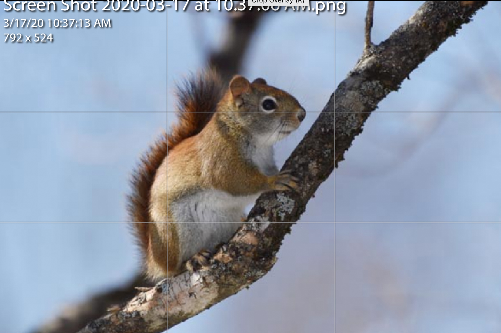
I used Lightroom's crop tool to make this next edit. By typing the "O" not the zero you will get the crop guidelines. If you keep typing O you will get additional crop guides to help with your images (just for future reference)
In this example I reduces the space on the left to move the squirrel closer to the Rule of Thirds guideline and out of the center.
Do you think this improves the image? I'd love to know your thoughts. |
Mar 17th |
 |
| 90 |
Mar 20 |
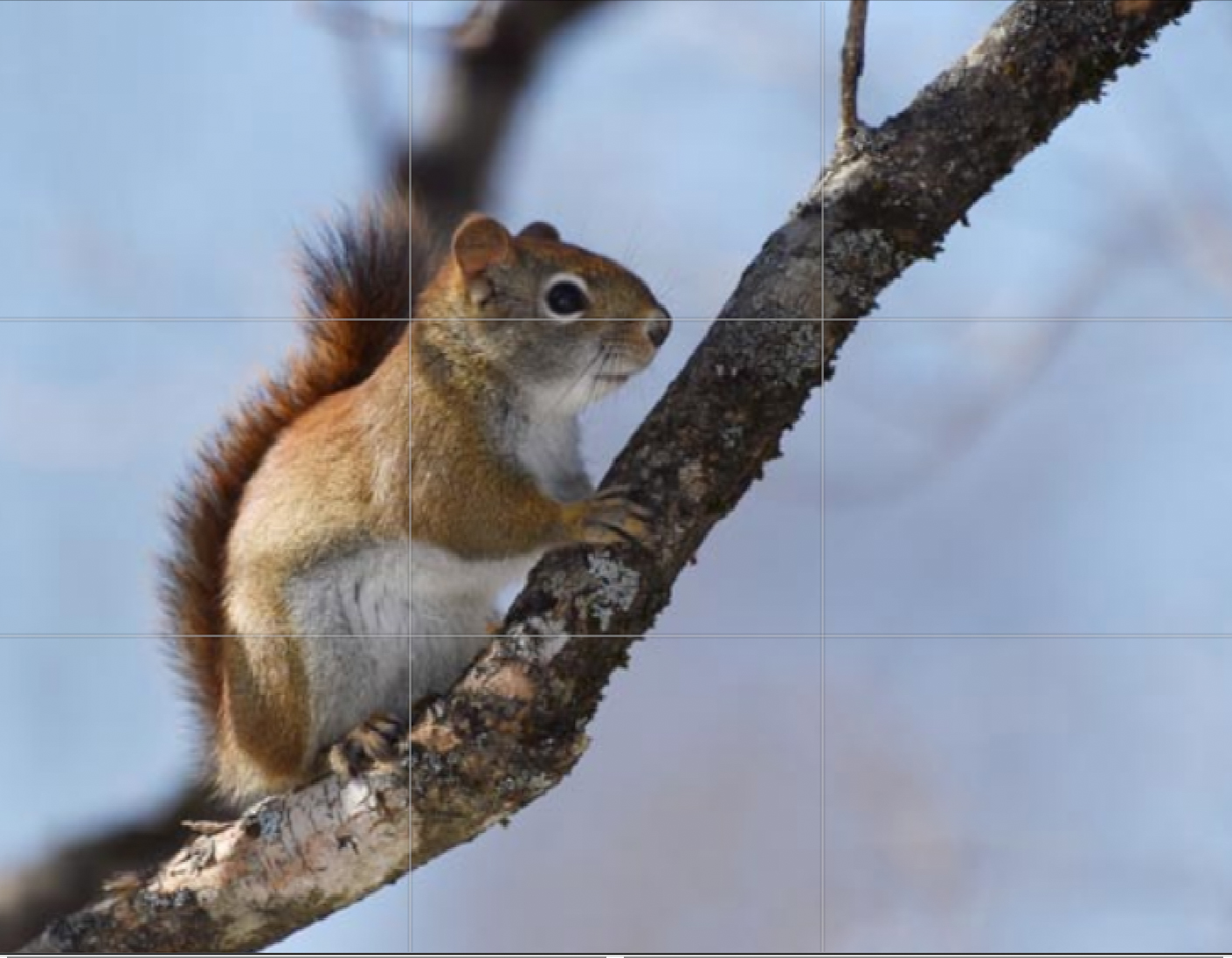
Comment |
Nice image of the little thief!
I really like the strong diagonal line created by the branch. That adds a great deal to the composition. Just to offer a different view point I don't mind the face shadow. Nature is full of shadows and for me the face is not in DEEP shadow and only looks a bit dark because the back of the squirrel is highlighted.
What is your opinion on the shadow issue?
The PSA is very big on using the rule of thirds and keeping the subject out of the center of the image. With the subject in the center it fixes the eye of the viewer and does not allow it to move through the image.
Note in my first attached image how the squirrel in in the center position. Please expand so you can see the guidelines. |
Mar 17th |
 |
| 90 |
Mar 20 |
Reply |
I just asked the Great White to prune that branch. :-)
Hope you don't mind my edit, it took me less than five minutes in Photoshop with the clone tool. Do you like this version any better? |
Mar 17th |
 |
| 90 |
Mar 20 |
Comment |
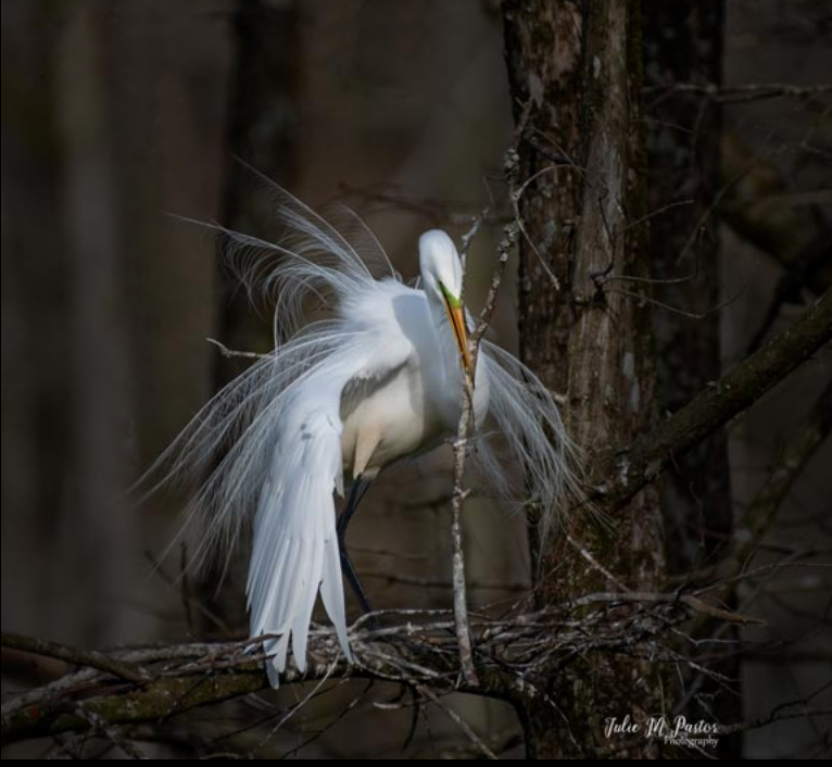
Beautiful shot of the breeding plumage of a Great Egret. Best, you were able to place the bird in a perfect background that has little in the line of distractions which is really hard to do. Too bad you couldn't get the bird to "prune" that hanging branch on the left.
My thought is that you could create an even stronger image if you cropped the top down just past the horizontal branch. I feel it might draw more attention to the beautiful bird. What are your thoughts on this type of a crop? |
Mar 17th |
 |
| 90 |
Mar 20 |
Comment |
Just visiting from another Nature + group.
This is a most unusual scene showing a geography few will have seen. I feel the composition is strong especially with the large rock in the foreground. You mention the "rather dull sky" so I took the liberty of trying a slight fix up. In Lightroom I used the GND filter placing it on a diagonal and applied some under exposure and a bit of contrast. I was not able to do anything to the white water on the far right. Did you use a polarizer when you took this image? I ask because it looks like the overexposure may be due to glare. Since you mention you cropped for composition, I would love to see the original if you would be good enough to post it.
Thanks for sharing the image. |
Mar 17th |
3 comments - 3 replies for Group 90
|
| 92 |
Mar 20 |
Comment |
Hi Brandon
I was just surfing the monthly thumbnails and your alley Katz caught my eye. I've been playing with a bit of street photography documenting night scenes in small towns and i was drawn to this.
I think this is a place I would like to visit. The name carries interest and I love the doors and the old looking building. I think you show a great eye in finding this scene.
I noted that you were hoping for better skies (don't you hate the white sky?) but I was wondering what you would think of cropping this into a more square composition featuring the leading sidewalk,the doors and the sign.
I don't know what your intent was when you captured this scene ( I would like to know it you will tell me) But I love those doors and sign. To me that is the story.
Still this is your image and as the photographer you are always right. I'm fairly new to this street thing so I would really like to hear your thought on this and most important why. Thanks. |
Mar 16th |
1 comment - 0 replies for Group 92
|
48 comments - 56 replies Total
|


