|
| Group |
Round |
C/R |
Comment |
Date |
Image |
| 28 |
Feb 20 |
Comment |
I'm going to agree with Wanda in that you should crop out the entire white sky at the top. That extra brightness draws the eye away from the main subject---the perfectly framed bridge. Bringing up the reds worked quite well.
My only regret is that I'm not on the Christmas Mailing List so I could have received the pretty little card.
|
Feb 4th |
| 28 |
Feb 20 |
Comment |
The courage and the risk yielded a grand image. I'd say it was work it! You will certainly treasure this image.
Can you bring out any more detail in the ice on the lighthouse? Just wondering. |
Feb 4th |
| 28 |
Feb 20 |
Comment |
I'm so glad to know there are other photographer who lug their tripods along on hikes. Good Job.
I like to see photographers who do not just settle for the grand view but try to get intimate with their subjects and find those little details in a scene that will yield good subjects.
I think your composition shows off the details in the flowing water and makes the image carry greater weight. Your choice of shutter speed captured several different volumes of flow and rendered each of them slightly different adding to the interest of the image.
Yes, the stone face clearly shows. As is it almost looks like the face has thinning hair and a coat with solid collar to stand against the cold of the day.
I think the use of a polarizer would have helped the overall image and maybe slightly bringing down the exposure.
You did a good job. |
Feb 4th |
3 comments - 0 replies for Group 28
|
| 32 |
Feb 20 |
Comment |
Stephen
Thank you. I am pleased and honored that in a small way I could impact in a small way a memory of an event that means so much to your family. Please know that this was my very great pleasure.
|
Feb 19th |
| 32 |
Feb 20 |
Reply |
First let me offer my deep appreciate for the message you sent to Barb Miller and that she posted on my Group 67 page. It was very kind of you. It really exemplifies the purpose of the Digital Discussion Groups and the quality of people like you who participate in them.
Secondly, I'm glad you liked my edits on your fine original image.
Keep on shooting I enjoy looking at the images. |
Feb 12th |
| 32 |
Feb 20 |
Comment |
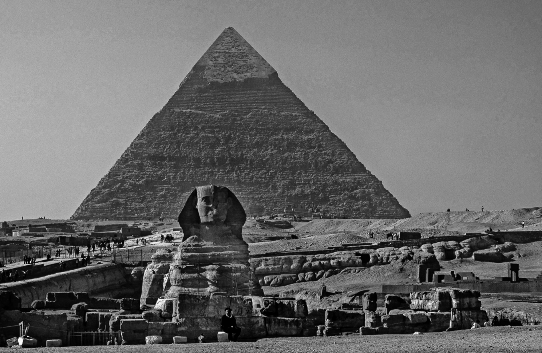
Someplace I've always dreamed of visiting so I always enjoy images of the pyramids.
I do not have Elements so I just played a bit in Lightroom. I just juggled highlights, shadows, clarity and contrast. The image is so small I can't do much else. Would love to play with a bigger file. |
Feb 2nd |
 |
2 comments - 1 reply for Group 32
|
| 35 |
Feb 20 |
Comment |
I do like the final result and I certainly laud the time and effort you went to in post to create this image. The result is well worth the time you spent.
In that you went to such lengths to edit this image, may i suggest that you just move (clone) a few bricks to cover over those black drainage holes in the foreground curb? |
Feb 6th |
1 comment - 0 replies for Group 35
|
| 36 |
Feb 20 |
Reply |
You did a really nice job with this. Maybe there is a career move in line for you as a photo editor. :-) |
Feb 27th |
| 36 |
Feb 20 |
Comment |
Thanks very much Bill. Your choice is the same as mine. I just liked how the backlight really made the fog light up with drama. |
Feb 17th |
| 36 |
Feb 20 |
Reply |
I thought it was amazing how a mere 6 minutes changed the mood of the image so completely. T hanks for the compliment and I do agree that waiting for the perfect moment pays off. |
Feb 17th |
| 36 |
Feb 20 |
Reply |
I like this version. Since the goal was color---this version really brings out the color. Nice work. |
Feb 17th |
| 36 |
Feb 20 |
Reply |
I was not familiar with this 1/60 second concept. So after first reading your comment I've done a bit of experimenting and from my limited experiment there does seem to be something to it. I'll have to see how this works the next time I set up for a waterfall photograph. Thanks for the tip. |
Feb 17th |
| 36 |
Feb 20 |
Comment |
While this is an interesting scene and shows off the unusual character of the California coastline I feel the scene lacks pop or the ever elusive "Wow" factor. I do like the fact that in your crop you eliminated the rocky distraction on the left that shows in the original image. Technically everything in the image works. The colors are crisp, the image is sharp and and the highlights are well handled. For me everything is always about the light (its color or quality) and that is what the image lacks. As Michael noted capturing this image during one of the golden hours or with a stormy sky and crashing waves would add interest. As it is it remains a image of record. |
Feb 17th |
| 36 |
Feb 20 |
Comment |
I played around with this some more. Please forgive the quality because this is a serious crop (maybe 75%) but I increased exposure of the ice and added some contrast. I also made some adjustments to the sky.
Just an example of a different way of working this image |
Feb 16th |
 |
| 36 |
Feb 20 |
Reply |
Here is a photo taken 6 minutes earlier and processed with more blue. |
Feb 16th |
 |
| 36 |
Feb 20 |
Reply |
Actually knowing the real size is a downer. Your choice of angle not only makes them look bigger but adds a feeling of majesty and power. Therefore, you have actually improved on the original art.
It really is amazing what a camera angle can accomplish especially when the camera is handled by a pro. |
Feb 14th |
| 36 |
Feb 20 |
Reply |
Michael
I know exactly how you feel I have some of these same type of images that for one reason or another I have an emotional attachment to and keep thinking it can be "saved". However when I start comparing it to my better images I see the faults that made me question it in the first place. The act of comparing the images makes me think and I hope grow as a photographer. Sometimes the best image isn't the grand scene, but just a corner of the scene. I've used telephoto lenses for landscapes just to get that corner. Just something to think about. |
Feb 12th |
| 36 |
Feb 20 |
Reply |
I think you may have a good point. Since the eye goes to white and bright, I get lost between the center of the foreground and the city buildings. between cropping and darkening the foreground all that would be left to look at is the city itself.
Since it is a daylight scene after darkening the foreground if the whites of the skyscrapers were made brighter the buildings might just sparkle in the light. There are just so many options. |
Feb 8th |
| 36 |
Feb 20 |
Reply |
I think you hit on a good idea. A whiter, brighter monument would certainly change the overall contrast of the image and also add some pop. |
Feb 8th |
| 36 |
Feb 20 |
Reply |
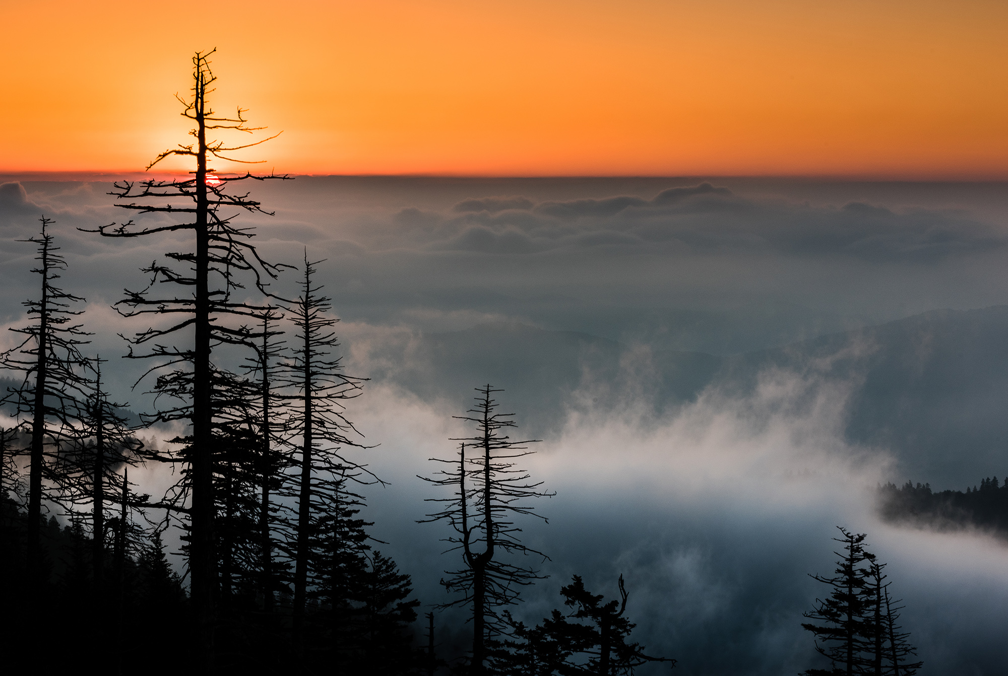
You are absolutely right about waiting for the sun. There was a very small window to get this shot. When the sun was lower, there was no backlight on the fog and when it got higher, the drama vanished as the light got brighter.
I visit Clingman's Dome frequently but most of the tie the light is boring. I've found the best images work with telephoto lenses and trying to capture just slices of the scene and not the expanse. Really wish there were some better foregrounds up there. |
Feb 8th |
| 36 |
Feb 20 |
Comment |
I love looking at images that have an eye catching impact--such as this. The moment the image appears the eye of the viewer is fixed on the monument. The placement of the monument on the left fixation points adds to the power of the image. The cloud cover imparts a beautiful soft light to the entire image and the rays of sunlight filtering through clouds seem to pick up and repeat the general shapes of the pieces of the monument. I like the rugged feel of the foreground boulders that act as a contrast to the smooth appearance of monument shapes. After studying the original it is evident of the processing work that was done to the monument and this work enhances the end product of the image. I very much like that you placed the monument in the lower corner rather than centering it on the left as this low position allows the monument to appear to be reaching for the sky.
While not a fault, I wonder what the impact of a slower shutter and the resulting blur to the clouds would have on the image. |
Feb 5th |
| 36 |
Feb 20 |
Comment |
Richard
I'm a real sucker for waterfalls and so this one draws me in quite easily. I like the composition and the leading lines formed by the reflection in the water The addition of the stone in the left foreground really brings balance and interest to the image. These are strong points. As you note,the fall colors in the water tell the story that it is fall and thus contribute to the positive nature of the image.
When I want to show objects in the water and weaken the visual fixation caused by the bright water I find two things work well. One is getting a lower angle, perhaps kneeling, and the second is working with that polarizer filter. When you stated that you used one I was really surprised and a polarizer usually does better with the glare than what is shown here. Did you rotate it as much as possible to get the full effect? I would have thought you could reduce that glare more and see into the water better.
A second thought may be the polarizer itself. Is this a kit polarizer or did you upgrade the filter? I've been using Breakthrough Technologies or B&W (a German company) for my filters. Both are really good quality. My current polarizer is from Breakthrough, it is thin, really thin, and has absolutely NO color shift. It also comes with a lifetime guarantee and I think that is a great idea. Another advantage is that it is not as dark as most polarizers and I only lose about a stop of light, not nearly as much as other filters.
I think with more polarization this might be a much stronger image. |
Feb 3rd |
| 36 |
Feb 20 |
Reply |
B&W is not my strong suit either. But then I only play with it when I think I have a strong image that in my opinion will work with B/W.
I tried to work with you image but it is so small that it pixelates when I play with it.
Anyway, this is what I could do before it fell apart.
I used a blue filter in Lightroom to work on the sky and the towers and added a lot of contrast and clarity to the bottom of the image. |
Feb 3rd |
 |
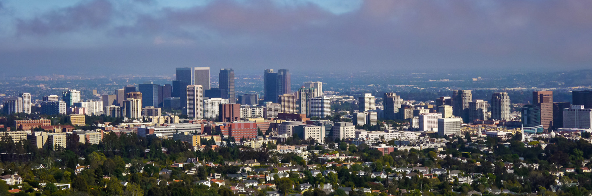
| 36 |
Feb 20 |
Comment |
Bill
Not being familiar with the Los Angelos skyline I don't know if this is THE signature skyline or not. What I see is a panoramic urban skyline. For me, I feel that there is too much going on. My suggestion would be a panoramic crop. i would reduce the foreground by a half to a third and if, as you say you are trying to show the smog, then crop a portion of the sky as well. These crops would bring the focus of the image back to the buildings and make the subject more powerful |
Feb 3rd |
 |
| 36 |
Feb 20 |
Comment |
Michael
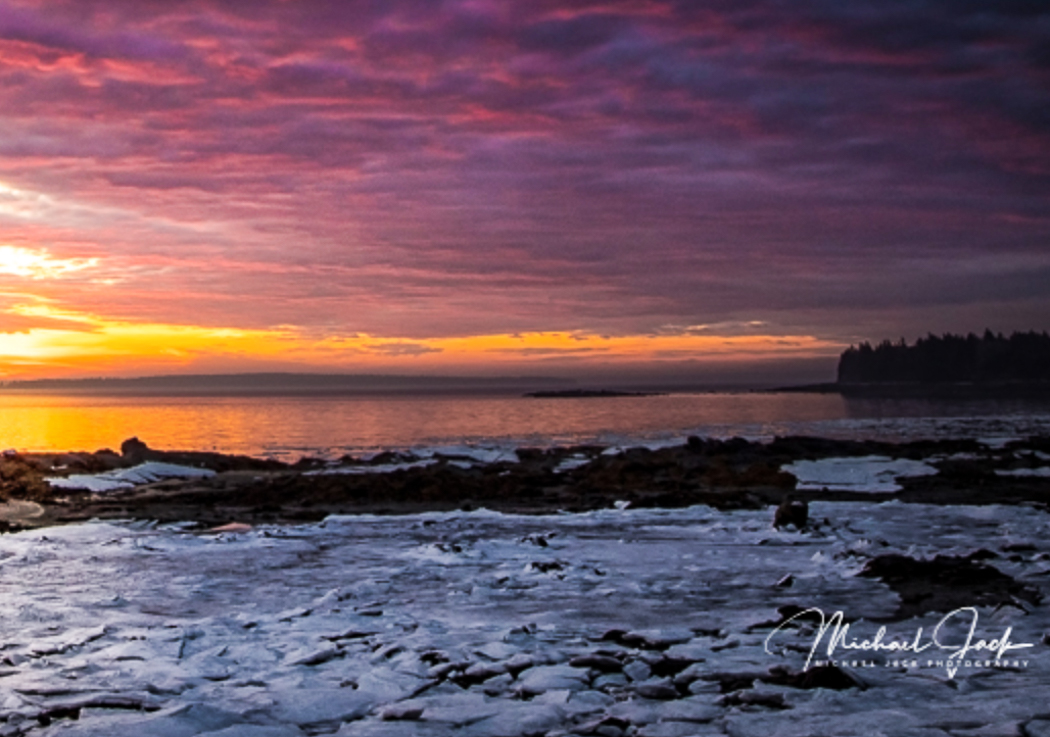
This image reminds me a great deal of what I saw when I was in Acadia in April of 2018. The image has a real feeling of cold with the ice contributing greatly to this feeling. It also has that desolate feeling that I felt while there. The sky is beautiful and you did well placing the horizon in the lower third of the image to add emphasis to the sky.
For me the deal breaker is the bright spot in the sky. The eye of the viewer is naturally drawn to the brightest part of the image and for me this is the sky on the left fixation point. But there is nothing for me come to rest on except that bright spot that looks (if not completely) then mostly overexposed. That bright spot should show subject matter but here it does not. With all the beauty of Acadia I'm looking for that strong subject, and not finding it.
I don't think the issue is you, I feel like the scene itself is lacking. |
Feb 3rd |
| 36 |
Feb 20 |
Reply |
Thank you Richard. Given the time I really try to think through an image before I take it. What story am I trying to tell and what tools will best help me tell that story. To me the telephoto was the the most necessary tool. |
Feb 3rd |
| 36 |
Feb 20 |
Comment |
I'm afraid that my image review this month is going to contain a bit of my personal bias that I have trouble filtering out. But then this is a discussion group so it does fit in.
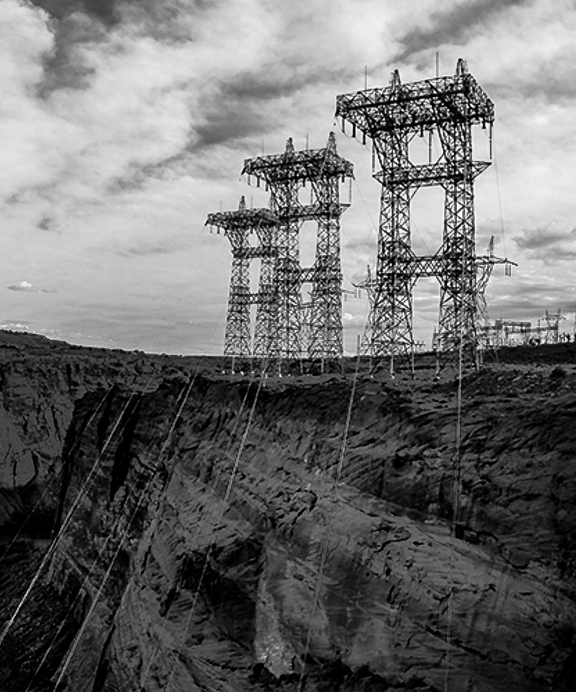
First I like the basic composition and the powerful use of line. This is a compositional element that I don't feel is often used in more than a basic manner (ie: the pier leading off into the frame). In this image you have lines running everywhere from the cables at the bottom edge, to the towers themselves, the striations in the cliffs and finally the lines you note in the clouds. All this works in a manner that is well above average use of line.
For me (my bias) this is where it ends. Personally I like the original (color) version much better and for one reason. In the BW conversion the towers appear to look soft and do not leap out of the background I feel this is because the clouds, being grey, act as almost a layer of camouflage for the lines of the towers. As the towers are the subject, I'm looking for something sharp and something that will pop out. I feel they do this in a more striking manner in the color image.
I do not think all images really convert well to B&W because B&W thrives on contrast and for me in this case there is a lack of contrast.
Last month Arne contributed a superb B&W image that I know he labored over during the conversion. Since I am new to this group and so far (since I've joined) he has shown the most stunning B&W work I'll start by asking him how he sees the contrast in this image. (I'm looking forward to your answer) I would also love to hear what others think. How do you pick an image for B&W and what is the process you use for getting those solid blacks and the true whites as well.
I don't do a lot of B&W, and hope to learn a great deal from this.
I'd love to hear everyone's thoughts. |
Feb 3rd |
| 36 |
Feb 20 |
Reply |
Hey, everyone has those days when the fingers don't quite work as fast and the mind. There are no grammar police here. :-) |
Feb 3rd |
8 comments - 13 replies for Group 36
|
| 42 |
Feb 20 |
Comment |
I am a sucker for night sky photography and so when I saw this in a snapshot version on the forum "Current Images" page I had to take a closer look. I like the lighthouse and the idea of the Milky Way above it and acting as a frame. This type of image can have a great impact. The problem for me is that it appears as a daylight photo.. The Milky Way cannot be seen unless the night is dark and this begins to look fake due to the brightness. Perhaps if this was darkened to make it more believable it would truly be a great photo.
|
Feb 19th |
1 comment - 0 replies for Group 42
|
| 52 |
Feb 20 |
Comment |
I live near this location and frequently photograph the birds. This is perhaps the most creative image I have seen taken at the wetlands. You made a "bird on a stick" into something quite special. Your choice of camera settings were perfect. Well done indeed.
I would love to view more of your work on your Smugmug site if you would share the url. |
Feb 6th |
1 comment - 0 replies for Group 52
|
| 67 |
Feb 20 |
Reply |
For being pretty green you did a really great job. This looks much better and removes the distracting highlight. |
Feb 22nd |
| 67 |
Feb 20 |
Comment |
It is always exciting when you get a great shot. As you say---that is what makes the journey great fun. I look forward to your next one. |
Feb 18th |
| 67 |
Feb 20 |
Comment |
The power of the action and the facial expression, along with the angle of view are what makes this image powerful. The background hill is actually subtle and not really easily visible. I could easily move this image toward the finals in a competition. In the finals it would have to stand up to lots of nit-picking because it would then be up again equally powerful images. That is the point when everything has to be perfect in order to win the big prizes.
Any way you slice this---it is an excellent image. |
Feb 18th |
| 67 |
Feb 20 |
Comment |
If the crop for this image had included any of the sky it would have added a bright spot into the composition that would draw the eye just because it is bright. this crop make it appear that the Hippo came completely out of the marsh. Breaking the rules is fine when it is done for a reason. In this case by centering the hippo I have no where to look but right at the hippo. Moving the hippo either left or right offers the viewer a place to flee. In this image I have no where to go. The tension is omnipresent. That is the power of the image.
I'm quite confident (assuming that the left side of the hippo is toned down just a bit) that this image would quickly move to the finals of any nature competition. I've only seen 3-4 in the past year with thisknid of WOW factor. |
Feb 18th |
| 67 |
Feb 20 |
Comment |
Great comments. Do you see the power of getting that eyeball level shot. Everyone is really saying the same thing, just in slightly different ways. But note how the comments talk of tension, power, intimacy, fright---all the elements that make for great photos. Now we just have to keep shooting like this at every opportunity. |
Feb 18th |
| 67 |
Feb 20 |
Reply |
Thank you for the comments. glad to hear I'm now provided chills (fortunately no spills) with the commentary and images.
For the record, this is an alligator NOT a Croc. The alligators are not nearly as aggressive toward boats and the crocs in the Nile or those off Australia (or so I've heard.) I've had lots of alligators float by my boat during non mating season and they don't even look.
We do have a salt water croc in the everglades. They only get to about 12-15 feet. They are more aggressive than the gators but they are located only areas of the everglades that are quite near the coast and the salt water. The area I was in for this shot is not near the coast.
That painterly effect under the gator may be due to the fact that there are feathers just under the surface and they are blurred by the water. Other than that, I have no idea as to how that appearance occurred.
Thanks for your thoughts. |
Feb 18th |
| 67 |
Feb 20 |
Reply |
Thanks for stopping by to comment. The power of shooting at a low angle was something I really learned while shoot UM football games. |
Feb 16th |
| 67 |
Feb 20 |
Reply |
Thanks Richard. I know that been skunked more than a dozen times over the years. Sometimes I get a pretty fair take off shot when the bird takes flight so all is not a total waste. But these shots take patience. One thing I learned is to appreciate the amazing power of these beasts. They leave me in awe. |
Feb 16th |
| 67 |
Feb 20 |
Comment |
I think your crop and the processing really worked out quite well. With the mountains on the left and in the background plus the little sloping hill on the right I really feel that I'm in a river valley. The meandering nature of the river, brought out by the crop and the less than rugged nature of the mountains creates a feeling of tranquillity and size. I know the valley is large because the bends in the river need space to do their bending. The golden hues of the meadow and the dark reds of the hill on the right create the feeling of fall. Even without your description everything is visible in the image. I think that is what makes this powerful, because simply no words are needed, the photo speaks for itself.
If I was to change anything, I might play with sharpness and contrast to put some texture on the white cliff face in the background. Note that all the lines of the image lead me to that spot, and since that is what I end of looking at making it a bit less featureless might help.
This is a really lovely scene. |
Feb 10th |
| 67 |
Feb 20 |
Reply |
I'm adding this comment to several submissions this month. I am going to suggest that everyone carefully view the bear, hippo, gator and lion images. Note how the eye level camera angle adds intimacy to the image. The angle makes the viewer feel they are in the image The lower the angle the greater the power that is felt. As you look at each image imagine if the angle was higher and you were looking more downward on the animals and how much less impact this would have. Getting to eye level makes a great deal of difference. Take a look and lets discuss what everyone thinks of the impact. After all,this is a discussion group. |
Feb 7th |
| 67 |
Feb 20 |
Comment |
Finding nests of any kind is always a thrill and finding this one so much in the open certainly made for a great photo opt.
Your aperture setting did leave a bit of a blur on the back of the left hand bird but it is really not noticeable unless you look so it works just fine. The background is rendered soft enough that the birds stand out quite well. As seems to be the trend this month you also got a low enough angle of view to create the intimate feeling necessary for a shot like this to work. All three eyes are sharp and this is what really makes the image work.
Fortunately you only needed to make a minimal crop which helps to save the image from the softness of such a high ISO. I would suggest adding just a tiny bit of space to the right of the mother so that she does not appear cramped in the frame. There is some softness visible due to the use of the high ISO.
Still you have a really good image.
A life Lesson: Years ago I came upon my first owl's nest. At the time I was a novice and didn't realize that my camera was previously set to the lowest resolution the camera would allow. To this day I cannot look at those picture without hating my stupidity for not checking my settings before shooting. I did learn a lesson which is with me to this day. When finish shooting for the day, whether I'm at home or on the road, I routinely clean the lens, and reset the settings to my preference. In my early days this usually meant Aperture Mode, and ISO 4-500. I always knew what the settings were because they were always the same. This simple technique has saved countless photos for me over the years. |
Feb 7th |
| 67 |
Feb 20 |
Comment |
This is a fine close up. It really creates a feeling of intimacy due to the eye level angle from which this is taken. There is a strong eye contact created by the sharpness of the bear's eye and draws in the viewer. The snow on its coat places the bear in its environment and adds to the story.
I would suggest that you carefully use an adjustment brush and darken those four spots on the bears face. Doing so would make the photo even more powerful.
I also am really thrilled that you didn't crop this!!! You made my month!!
This is a really nice image.
After seeing some of the images submitted this month I think we can discuss a method that might bring more power to our wildlife images. I'm including this comment on several images as a discussion topic for the month.
I am going to suggest that everyone carefully view the bear, hippo, gator and lion images. Note how the eye level camera angle adds intimacy to the image. The angle makes the viewer feel they are in the image The lower the angle the greater the power that is felt. As you look at each image imagine if the angle was higher and you were looking more downward on the animals and how much less impact this would have. Getting to eye level makes a great deal of difference. Take a look and lets discuss what everyone thinks of the impact. After all,this is a discussion group. |
Feb 5th |
| 67 |
Feb 20 |
Comment |
This is a very dramatic and powerful image. But I do object to your title---RUN! I fear that I cannot run on water and from this angle of view that is where I am standing. Swim or Paddle might be more appropriate. :-)
Seriously, this is frightening. The low angle of view has made the viewer feel they are in the action. This is what wildlife photography is supposed to do. I also like the crop. cropping off the top and or bottom makes the viewer feel more intimacy with the action. I (my opinion) like the environment showing on both sides because it makes me feel that this beast has come out of nowhere. I think cropping from either side will weaken the image. This is perfect as it is. If it were mine, I would clone out the bird on the left as it is a mild distraction (maybe a deduction in a major competition) and I would also use the adjustment brush to bring down the highlights on the left side of the hippo. That side is a bit overexposed. Again these are minor issues and need not be done. But if I was entering this in competition, well,maybe think about doing these.
It is a great image and you did really well.
After seeing some of the images submitted this month I think we can discuss a method that might bring more power to our wildlife images. I'm including this comment on several images as a discussion topic for the month.
I am going to suggest that everyone carefully view the bear, hippo, gator and lion images. Note how the eye level camera angle adds intimacy to the image. The angle makes the viewer feel they are in the image The lower the angle the greater the power that is felt. As you look at each image imagine if the angle was higher and you were looking more downward on the animals and how much less impact this would have. Getting to eye level makes a great deal of difference. Take a look and lets discuss what everyone thinks of the impact. After all,this is a discussion group. |
Feb 5th |
| 67 |
Feb 20 |
Comment |
After seeing some of the images submitted this month I think we can discuss a method that might bring more power to our wildlife images. I'm including this comment all several images as a discussion topic for the month.
I am going to suggest that everyone carefully view the bear, hippo, gator and lion images. Note how the eye level camera angle adds intimacy to the image. The angle makes the viewer feel they are in the image The lower the angle the greater the power that is felt. As you look at each image imagine if the angle was higher and you were looking more downward on the animals and how much less impact this would have. Getting to eye level makes a great deal of difference. Take a look and lets discuss what everyone thinks of the impact. After all,this is a discussion group. |
Feb 5th |
| 67 |
Feb 20 |
Comment |
Thanks for including the back story as I enjoyed being taken along for the ride.
This is a wonderfully powerful image. The even lighting and the nearly perfect background really set off the subject. The facial expressions add a great deal of drama to the image. I like the fact that you used a low as this lower angle adds drama and intimacy to the image. The image looks a bit soft, which I attribute to the 1600 ISO. As you used a shutter speed of 1/4000 that could have been lowered it would have allowed for a lower ISO.
I would suggest you try adding sharpening to the mane of the male as it might bring back some detail
Something else--the viewer would never know this without seeing your original, but after seeing the original the cropped shot is not horizon straight. Note the background of the submitted shot and there appears to be a hill sloping to the right, but on the original there is no hill. So, my inquiring mind, wants to know---it this intentional to change the angle of the cats or is it accidental?
This is a really excellent wildlife image with a great deal of drama and power attached to it. I would think it should score pretty well in competitions.
I'm going to add this comment to several submissions this month. I am going to suggest that everyone carefully view the bear, hippo, gator and lion images. Note how the eye level camera angle adds intimacy to the image. The angle makes the viewer feel they are in the image The lower the angle the greater the power that is felt. As you look at each image imagine if the angle was higher and you were looking more downward on the animals and how much less impact this would have. Getting to eye level makes a great deal of difference. Take a look and lets discuss what everyone thinks of the impact. After all,this is a discussion group. |
Feb 5th |
| 67 |
Feb 20 |
Reply |
I think the back story helps to understand the methods used in the capture and why they were used. I see that as a learning tool.
But at the same time I feel the image should stand on its own and clearly convey the story without the need of a title or storyline. That is my goal with a photo.
I really appreciate you stopping by to comment. Thanks |
Feb 4th |
| 67 |
Feb 20 |
Reply |
Thanks for the kind comment. I find that with the tripod fastened down and mounted to the kayak it is more stable. I never go out in windy conditions and since the everglades water is slow moving (no real current) I don't have to worry about waves. You just have to remember to be calm and not do a lot of waving around. With the camera mounted I don't have to worry about weight shifting to the sides.
I have a friend who went on a swamp walk to take photos and stepped into a gator hole (the gator was not at home) and sunk over his head and drowned his camera. It was only a Canon so no big loss! :-) At least tht is what I told him. |
Feb 4th |
| 67 |
Feb 20 |
Comment |
For utilizing all those pixels you paid so handsomely for and not cropping to ridiculous extremes I hereby bestow the following award upon you!
(Down load, print and frame with pride!) |
Feb 1st |
 |
11 comments - 7 replies for Group 67
|
27 comments - 21 replies Total
|


