|
| Group |
Round |
C/R |
Comment |
Date |
Image |
| 32 |
Jan 20 |
Reply |
Woo Hoo!!! :-) |
Jan 3rd |
| 32 |
Jan 20 |
Comment |
Actually I like the B/W better. My eye is naturally drawn to the light and bright and in the color version the numerous white caps make my eye feel like it is jumping around the image. In the B/W version the more even tones allow me to enjoy the other compositional features such as leading lines. I feel that there are many caps that in one way or the other are pointed at the "Woo" bottle, which for me becomes the dominate subject.
While jumbles like this are not my favorite subjects (I'm a naturalist) I find that this one captivates me. |
Jan 3rd |
1 comment - 1 reply for Group 32
|
| 36 |
Jan 20 |
Reply |
I'm willing to bet that Arne has a great method using Photoshop.
I seem to have my best results using Lightroom as follows:
It is a two part fix. First using Lightroom add some global noise reduction. Use the masking slider by holding down the alt or option key while you move the masking slider to the right. This will turn your screen black. Move the slider until the sky becomes black. Then set the noise reduction slider to about 75. After applying this global noise reduction switch to the Adjustment Brush. Resize the brush to fit what you want to sharpen with a feather setting of about 75%. Set the sharpening slider to somewhere in the 75% ranger and brush over what ever you want to restore sharpening to.
It takes some patience but it works pretty well. |
Jan 20th |
| 36 |
Jan 20 |
Reply |
Your post work is remarkable. I have done similar editing on some photos, but certainly not to the level you did with this. The results are remarkable. There is a good lesson there for me and I appreciate the wake up call. |
Jan 20th |
| 36 |
Jan 20 |
Reply |
Your edits do improve the image. In the expanded view there is still quite a bit of noise in the sky. |
Jan 20th |
| 36 |
Jan 20 |
Reply |
Thanks for the comment. You hit upon the reason I included this amount of water---I was drawn to the reflections. Hearing the comments in this forum have given me something to think about. I can see reasoning for reducing the water, but can't decide if I want to or not.
Thanks for noting the yellow window--that one I will end up by adjusting. |
Jan 19th |
| 36 |
Jan 20 |
Reply |
Thanks, I never even thought about the yellow window before. Now that you mention it, I can't stop looking a it. |
Jan 18th |
| 36 |
Jan 20 |
Reply |
Thank you George
I will cheerfully yield to the majority opinion and crop about half of the water from the image.
Thanks for the input. |
Jan 16th |
| 36 |
Jan 20 |
Comment |
Well, this is certainly done in the spirit of Ansel Adams. Your triangular composition hearkens to the style of the Renaissance masters and for this image is quite appealing. Looking at the light play on the rocks I found you have managed to create a second triangle inside the rocks themselves, nice touch. Your B/W conversion has achieved the rich blacks and the clear whites that Ansel always used. I first note that you replaced the sky, so may I ask what software you used to achieve this? I would likewise like to know the software you used for the conversion.
If you have the time, I would love to know how you created this ad you state it is heavily modified.
Nice work. |
Jan 9th |
| 36 |
Jan 20 |
Reply |
Wow. Those roof tops really add some pop to the image. |
Jan 7th |
| 36 |
Jan 20 |
Reply |
Your new crop looks good. So now you have a dilemma. :-) |
Jan 7th |
| 36 |
Jan 20 |
Reply |
Oh my, what a dramatic difference!!
I don't have Luminar. So now I ha e some questions.I have recently seen that it can do some remarkable things with sky replacement. I can see how this would work quite well on a mountain like this without a tree line. How would it do with for foliage on the skyline. Remember , I live in Florida and have scattered trees on the skyline and I also shoot in the Smokies where there is lush vegetation. I can see where it would work on many scenes in the Rockies.
I also see it does a good job of removing dust spots. :-) |
Jan 7th |
| 36 |
Jan 20 |
Reply |
Thank you Richard. I'll do anything to get a picture. I hae found that security guards get mighty thirsty and a chilled Gatorade often goes a long way. I once got a great photo at Bay Hill Plantation after hours when you aren't allowed in by offering a Lemon/Lime Gatorade as a bribe. It works great in hot weather. |
Jan 7th |
| 36 |
Jan 20 |
Comment |
You certainly put a great deal of work into the editing of this image, and all your enhancements appear to have impacted the image as you intended.
Just as a conversation point (I've used a D7200) I would ask if you would consider the following. While the D7200 handles low light and noise pretty well, I have found it is much better at 800 ISO rather than 1600. Since nothing in your image is moving rapidly perhaps dropping your shutter speed would have allowed for the use of a lower ISO. Your thoughts?
I had a few minutes while waiting for an appointment so I played with the image. Just my poor musings. If you don't like it, please feel free to discard.
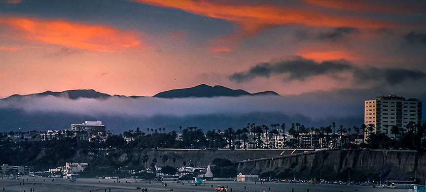
Your statement "What caught my eye was the cloud bank in the mountains contrasting with the clouds lit by the setting sun, which was just below the horizon" struck me quite hard. I agree that that is the portion of the image that first attracts the eye (the eye goes to light and bright). If the color in the sky and the cloud attracted you then I feel the water becomes a competing secondary subject that draws me away from the quite interesting clouds and sky. I would eliminate the water and emphasize the cloud and sky. There is nothing I'm interested in on the beach as everything is quite small in size. So I would work the upper portion of the image.
I had a few minutes while waiting for an appointment so I played this a bit. These are just my musings, if they do not fit your taste please feel free to discard them. |
Jan 7th |
 |
| 36 |
Jan 20 |
Reply |
Thank you for the suggestions. As I stated in the write up I could not include the rest of the arena sign because there was a construction crane blocking that section. If I included the crane I felt it just cluttered up the image so I exercised my artistic license and cropped of the final potential letter A.
I have thought about cropping some of the water, maybe a third. I really liked the reflections and wanted to saved as much as possible. But you may be right in suggesting the crop. As for the brightness score another point for you. After reading you comment, you are probably right. Thanks. |
Jan 7th |
| 36 |
Jan 20 |
Reply |
Thank you very much Le. I rarely run an exposure this long but with the traffic I felt this worked out. It is really much different from the shorter exposed shots I took earlier and changed the entire character of the image.
|
Jan 7th |
| 36 |
Jan 20 |
Comment |
It is always special when you capture something unusual. I don't think I've ever seen a storm in Death Valley or so many flowers. I wish you had included the shutter speed for this image as I think it might have explain at least one mystery. I would also have liked to know the focal length. All of the foliage appears to be either wind tossed or slightly out of focus. An image at f32 should really be quite sharp. I hesitate to offer a suggestion without knowing the two settings I mentioned above. If you care to provide that information, I'll be happy to try again.
In terms of composition everything beyond the floral ridge line appears to become a bit muddy. This may be due to the dark storm clouds but my first thought is that this in at least a stop to a stop and a half under exposed. Not the extremely dark shadows in the floral sections of the center and far right. I feel this scene might have been a candidate for a graduated neutral density filter used in reverse, that is from the bottom. Since the bottom is the bright section using GND diagonally may have tamed those bright spots in the lower portion while allowing you to expose the mountains more accurately. When I expand the view of the image there appears to be some noise in the mountain portion and could be attributed to trying to open of the shadows.
A minor thought on the composition would be to include the clipped parts of the clouds on the far left,or simply crop them offer. Either way would clean up that little area.
Thanks for showing a scene that I will probably never see. Being there with that storm cloud rolling in must have been quite thrilling. |
Jan 7th |
| 36 |
Jan 20 |
Comment |
I am going to have to agree with both Le and Michael on this one. Like Michael I envy your trip to Iceland. In looking at your settings and noting that this is a landscape I would have increased the aperture to at least an 8, and then dropped the shutter speed. The f8 would be closer to the sweet spot of the lens and perhaps added a bit of additional sharpness and depth. I feel the flat feeling of the image is due to the shot being made near the mid part of the day and this reduced the shadows which in turn create the flat feeling. Like Le, for me there is just too much going on in this image. The foreground is the least interesting, for me, and thus I would crop it. I think on its own it could be an interesting image. I might had cropped Le's version a fraction higher to remove the light colored line at the bottom but that line could be used to set off the scene so it becomes a personal choice. Using the adjustment brush in LR to darken shadows, increase contrast and clarity in the brown portion would give the image a bit of drama as would greatly increasing sharpness, contrast and/or clarity on the mountains, especially the group on the far left would give them greater interest.
Finally, just for fun consider shrinking the adjustment brush and enlarging the image. Them,increase magenta, add a bit of saturation and carefully paint the red roofs of the building. Not much just a bit. That would add some pop. Of course if you are a purist this is not an option. I only mention it as something to think about.
You have created a strong image of the Icelandic landscape that is quite inviting. |
Jan 7th |
| 36 |
Jan 20 |
Comment |
I feel this image is a powerful eye stopper. You have accurately captured the dramatic colors of this red rock region of Colorado. I applaud your positioning as you were just high enough to obtain a bit of reflection in the water that I feel adds quite nicely to the composition. You note the reason for not using a GND filter but seem to lament the weakness of the reflection that is a result. Perhaps a bit of selective use of the LR adjustment brush using either clarity or contrast to the reflection might bring it out a bit if this was obtained from a RAW file. Since you also had one of those cloudless skies your compositional choice of reducing the amount of sky worked quite well. My only real suggestion would be to reduce some of the foreground, perhaps as far as the top of the rise on the left. This would in turn draw more attention to the water and to light reflection. It may be my monitor (probably is) but something seems odd about those 4 bright orange peaks on the far right. Your image give me a compelling argument to visit this area again. Well done. |
Jan 7th |
| 36 |
Jan 20 |
Comment |
The high bright mountain on the left is the first part of the composition that I an drawn toward. However the sharp and dramatic downward sweep of that mountain forces my eye to travel through the image and this brings me to both the water and the little valley nestled among the mountains in the center---the valley almost become a second composition. You did well in limiting the amount of visible water and sky as both are relatively featureless. It is truly unfortunate that there were no clouds, but of course that is out of your control. Judging from the shadows, or lack there of, the images appears to be taken in the middle portion of the day and this makes it appear a bit flat. I think this is the lack of shadow detail that Michael refers to in his comment. Perhaps some additional clarity or even contrast might impart a bit more life to the image. Even a slight deepening of selective areas in the shadows in the center together with the aforementioned clarity and contrast may add some life to the image. Overall the image is a realistic rendering of this type of mountain scape in the Sierras. The image is quite well composed. |
Jan 7th |
6 comments - 12 replies for Group 36
|
| 67 |
Jan 20 |
Reply |
For major contests they supply the software in case a judge may not have it available. But you can usually just take a normal size fine and start zooming. Look along the edges of something in the image and you will find pixels that are cut. When you have been taught what to look for they are easy to spot. |
Jan 30th |
| 67 |
Jan 20 |
Reply |
I like this crop as well. Just wish the crows were larger. |
Jan 21st |
| 67 |
Jan 20 |
Reply |
The question of doing surgery on an image to remove unwanted grass or objects is a good one. This really depends on the particular contest. Some will allow editing and others will not. Usually in less contests (local) you can get away with it. In the higher level they often have restrictions. So I guess the answer is read the rules carefully. Generally the larger the size image they require for the contest the more likely they are to look for editing.
I have judged both type of contests and when editing is not allowed we are required to really use the fine tooth comb to examine the image. there are always tell tale marks that reveal editing if you now where to look. |
Jan 20th |
| 67 |
Jan 20 |
Reply |
You are very kind and observant with your comments. You noted several of the things that the judges noted when this photo won third place in an international photo contest. |
Jan 18th |
| 67 |
Jan 20 |
Reply |
I like the improvements you made. It makes it a stronger image.
But I'm still in awe of how sharp this is. Good work! |
Jan 14th |
| 67 |
Jan 20 |
Comment |
Mark
Your image is playing with the concept of High Key. That concept lets the image get away with a partially white sky.
You chose to keep your sky nearly white and that is supported by the right side with the white water. You are the maker, so if you want that white feeling---then it works well in this shot. Or you can bring out some detail in the center of the sky if you feel that will direct the eye back to the main subject. You get to make the choice. |
Jan 14th |
| 67 |
Jan 20 |
Reply |
See you understand Rule #4!! :-) |
Jan 14th |
| 67 |
Jan 20 |
Reply |
Several thoughts on your response. Negative space does not always mean a whole lot of emptiness. I means using the space to tell the story. So the empty space has to have a purpose. I don't do this as much as I probably should. I find it useful to think of the negative space as a background.
I chose this image for this month because I thought it might give you some ideas. I am really glad it got you thinking. That was the entire thought behind my submission.
We all know about raptors pooping before flight. I try to learn something about the critter I plan to shoot It really helps in the field. I always try to take a plan into the field. If nothing shows for my plan then it becomes a matter of winging it. But I try to think about what I want to accomplish. I belong to a PSA Nature Study group. The moderators stress making the image (a single image) tell a story. So if I go into the field with the idea in the back of my head of telling a story, then it makes me think before I click the shutter. Rather than just taking a photo of a deer (that means no "oh look there is a deer" click) I try to think, why is the deer here and what is he going to do and how can I tell that to others. Often it means I have to figure out where and how I'm going to get this photo. That gets me a better shot. |
Jan 14th |
| 67 |
Jan 20 |
Reply |
Thanks for the compliment on the technical aspects of the shoot. As a rule I hate to photograph "birds on a stick" but this one just seemed to have some real possibilities.
No, I do not wear hip waders. Usually just long pants with zip off bottoms and Teva sandals for river walking so the water drains out.
Those who know the Everglades have gator rules.
Rule 1 STAY OUT OF THE WATER IN MATING SEASON then the gators are all about hormones and really dangerous.
Rule 2 Look before you get in. The water is clear and you can see the trouble.
Rule 3 of gators are prowling---stay out. You can see them stalking.
Rule 4 Stay out of cloudy murky water and stay out at dawn and dusk---feeding time.
Rule 5 Cold water is safe water.
Rule 6 Do not splash----then you sound like something wounded and that sounds like dinner.
I learned from a Gator hunter about 25 years ago and got lots of advice and corrections when I was doing it wrong. To date I have had no problems. I don't deal with gators like the ones that caused the problem at Disney World several years ago. People feed those gators and it makes them really dangerous. The ones in the wild, usually just go way. In my 25 years of hanging out with gators I've only had to poke two with my tripod because they were getting a bit close.
I close by noting, as I get older, I tend to stay in the knee deep water of less. I think I'm becoming a chicken. :-) But if I don't post photos one month---then I probably had a bit of an encounter.
If I feed the gator--I only feed them alarm clocks like in Peter Pan. Then I can hear them ticking when they approach.
|
Jan 11th |
| 67 |
Jan 20 |
Reply |
Glad you like my crop and it is also good to know that others struggle with this type of image as well.
My rule (for my self) when I compose an image is to remove anything in the image that distract from what I want viewers to see. To me, the log beam, not being natural, was a distractor, thus---out it goes. If the bridge would have been part of the story,then it stays. |
Jan 11th |
| 67 |
Jan 20 |
Reply |
Looking at my crop I sort of cringe. Maybe a little crop on the left would help. |
Jan 11th |
| 67 |
Jan 20 |
Comment |
I have always liked the look of these little intimate scenes in the wilderness. I have also found them to be the most frustrating things to photograph. They never seem to look on film like I remember them. If this was your first attempt, them you did well with it. You got close and put the viewer into the scene and almost got them wet in the process. You also Did not over blur the water and got textures in the water to add interest. All that is good stuff. Did you use a polarizer? My suggestion is in cropping. The log at the top takes on a chopped up look. I is sort of there, but not there. In brings into the composition the hand of man that somehow does not fit the tranquility of the scene. Maybe because of the angle creating the cut off look or maybe because of the of the vertical parts of the bridge on the top right. I.m not sure my crop is any better,but maybe you get the idea. |
Jan 11th |
 |
| 67 |
Jan 20 |
Comment |
You might want to look at some of the images in group 74 to or Arne's image in my other group #36 to get the feel of a Ansel Adams type image. |
Jan 9th |
| 67 |
Jan 20 |
Comment |
You might want to look at some of the images in group 74 to or Arne's image in my other group #36 to get the feel of a Ansel Adams type image. |
Jan 9th |
| 67 |
Jan 20 |
Comment |
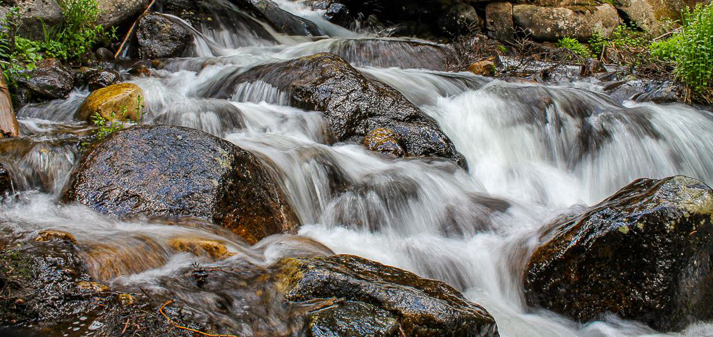
This is a very interesting scene. Your choice of the exposure grad filter was a really good one. I like the darkening effect on the left leading to the brighter part on the right. I might add some contrast to the center part of the sky to help bring out those clouds just a bit as that would act like a frame to bring more attention to the beach and the water.
The choice of the aperture and the slow shutter really make this scene special. You really did manage to produce a calming feel to the image. The blues you managed in the water on the left add a great deal to the image and continue the feel of darkness on the left. That worked quite well. The diagonal slant of the water running out to see add motion in what otherwise would be a static image. The textures in the foreground sand add to the frame.
This is quite well done.
All of your choices worked.
You might try bringing down the highlights just a touch so there is a little bit of detail in the white water on the right. But that is a makers choice. |
Jan 9th |
| 67 |
Jan 20 |
Comment |
This is a very well done Ansel Adamsesque type image.
Personally flipped or not flipped in this case does not bother me. Your overall composition is really excellent for this image although you could crop a bit off the top. The blank space is not helping the image.
Two improvement suggestions are:
First if you look over Ansel's work you will not that he always has rich blacks and clean white. You can easily add this buy using the color sliders in Lightroom. In the old days we would use red and blue filters to do this and you can do the same here. Just work the red and blue channels and then add some contrast. What makes a B/W image work is the contrasts in the final product. Give it a try.
Next is the ISO issue. While the tree looks great the sky has quite a bit of noise in to (this is brought out even more by the high fstop of 16) Here is a way to fix this noise issue. It is a two part fix. First using Lightroom add some global noise reduction. Use the masking slider by holding down the alt or option key while you move the masking slider to the right. This will turn your screen black. Move the slider until the sky becomes black. Then set the noise reduction slider to about 75. Finally,use the adjustment brush with a feather of about 70 to brush sharpening to the tree.
That will leave the sky with less noise and the tree back to its original sharpness.
This would make a great print on a wall.
Really good shooting to capture this one. |
Jan 9th |
| 67 |
Jan 20 |
Comment |
WELL DONE!!! First you ha e got to love having all those pixels on the D800 since they allowed you to give this an extreme crop and still keep it sharp.
Some may quibble over your composition and the placement of the branch on the left, but I personally like it. You have several things really going for you in this image. For me, the first plus is the beautiful light that hits the owl. That light, and the background make this an outstanding shot. The razor sharp appearance of the owl and the moss help give this a strong dramatic feel. Owls have great eyes for photos and this eye really pops--another plus. The slightly darken right side of the owl adds a bit of chiaroscuro that heightens the drama of the image.
My only suggestions are before printing this as large as you can or entering it in a contest do just a bit of housekeeping. Clone out all those little white spots to the left of the owl. Don't forget the one above him near the light green portion of the blurred background. I would also clone out the leaves on the moss near your name.
This is your best work to date. I really love the image. |
Jan 9th |
| 67 |
Jan 20 |
Comment |
Just an after thought. You might have reduced the aperture stop and increased the shutter speed. The cats may have just a bit of motion blur and the reduced aperture would help to soften the grasses giving more separation. |
Jan 9th |
| 67 |
Jan 20 |
Comment |
Madhu
This is a much superior image to the one from last month. This time there is clear action to carry the storyline. The eye or eyes of all three animals is visible (an import thing to have in wildlife photography) and they are sharp. The action is enhanced by the diagonal line from antelope to cat tail. The raised back leg of the younger cat really helps convey the action. It might look like a small thing, but in grading wildlife images these little things improve a score. The composition is strong, although I might crop some of the light brown grass off the top giving the image a more pano format. The image has not been over processed but you might use an adjustment brush to carefully add a bit of yellow, contrast and clarity to the cats to make them stand out just a bit from the grasses. Be careful not to overdo it. When all is considered this is a strong image. Well done! |
Jan 9th |
| 67 |
Jan 20 |
Reply |
Bird Stalking
It starts with biology----I study my subjects and understand their behavior. During mating season I know that male snowy egrets stake out and defend their chosen territory. They will not leave unless they feel threatened and if they leave, they will come back in a few minutes. He actually left before I got into the water. I didn't even move an inch, he came back a couple of minutes later. There was nothing else in the water he could perch on, so the odds were in my favor. Sudden movement introduces panic. For this shot, I was alone, not another human in sight. I made no noise. I was also carrying a tripod already extended, with camera attached. The legs of the tripod were pointing forward so to set it up required only tipping it down into the water, the lens would be pointing toward the subject when the tripod hit the water introducing less movement. I had a 550mm lens attached so I did not have to get real close. Note my subject is actually more than twice the size of the bird because I'm including the reflection and some room both above and below the subject. I literally slid my feet into the water, gliding them forward, not picking them up. I was ever so slow, making no splash, and nearly no ripples. If the bird made any movement, I froze and waited. I took several shots as I crept closer (in case he left) My eye never left the bird I adjusted my camera setting without looking at the camera (this takes practice). It also takes some arm strength to move the tripod and rig while it is in front of you (left hand on the tripod, right on the lens). All this is why I shoot alone. Some of the earlier shots are OK, but the one shown here is what I was trying for. If the bird had left, well, there will be another day. I have patience. Remember last month's alligator picture----I spent 11 hours getting that one.
|
Jan 3rd |
| 67 |
Jan 20 |
Reply |
Finger Roll
The finger roll technique is part of what I refer to as long lens technique. This is something I do EVERY time I shoot with a long lens. Modern camera have so many pixels that they are able to render a final image in amazing detail, but they also will show off any little errors in the photographer's technique. The little flaws in technique are at the heart of most non sharp images. The real issue is vibration. Vibration normally starts at the camera body and travels like a wave toward the front element and then back to the camera body. This is why you should use your left hand to press down on the barrel of the lens while the lens sits on a tripod or monopod. You should next press your eye against the eyecup as it helps to stabilize the camera body. Most photographers poke at the shutter release, actually pushing it down. This down ward stab impacts the body of the camera and introduces vibration. To avoid this do not place you shooting finger on top of the shutter release. Instead slightly rotate your shooting finger backward toward your face while placing the portion of your finger nearest your thumb against the base of the shutter release. Now when you are ready to shoot you roll the finger toward the front of the camera to depress the shutter release. Please note I use back button focus so I am using my thumb to maintain focus. Thus I can partially roll my thumb onto the shutter release to almost the point of firing. When I decide to shoot only the slightest of a roll trips the shutter without introducing vibration. No poking, no stabbing, just a soft roll. It takes practice, but for me it is now second nature. If you want to see the results just look at my images, everything is always sharp and I'm using all those pixels I paid for to best advantage. I actually have used this technique to shoot owls from a monopod at 1/8 of a second and still get sharp images. Oh yes, when you shoot---hold your breath----don't breathe---it is about that vibration thing. |
Jan 3rd |
| 67 |
Jan 20 |
Reply |
To help you get started try to think of the rule of thirds as a starting place. When composing you can rarely place you subject in the center of the center box. This works for symmetrical subjects but it creates static and boring images.
You subject will have greater interest for example if it is small by placing it on ONE of the numbered junctions. The subject can be placed number 1 & 2 or 3 & 4 if it is larger.
Powerful dramatic subjects can be placed on #2 and #3 creating a rising diagonal showing power (think a leaping leopard) or perhaps 1 & 4 for a diving bird enhancing the power of the dive.
You can use 3 of the points to create a relaxing or calming image.
Try looking at images from any source this month and see how well this works. Then seriously think of these techniques as you are shooting in the field.
When you crop---get rid of things that do not make the image look strong. Crop to make your viewer focus on what YOU want them to see. |
Jan 1st |
 |
| 67 |
Jan 20 |
Comment |
Welcome to Group #67
I am at a disadvantage as I look at this picture. Looking at this as a photo judge I should NOT look at the time, but I already know what your chosen title is (after all, I posted the image). So when I think of "Thoughts of Murder" I'm thinking of the crows as the subject. This line of thought is enhanced by your write-up all of which leads to further confusion. When one views an image, the eye is naturally drawn to the light and the bright and so my eye is attracted to the large white area in the upper left. Even when I look to the crows, my eye drifts back to the white. It is a powerful magnet. All this leads me to ask, just what is the subject? If the crows are the subject then the composition is wrong as they are small and positioned almost out of the frame. PSA suggests that the subject should connect to the fixations points in the frame (think, rule of thirds) If I am wrong about the subject then please disregard the crop I've attached. If your subject deals more with the structures please let me know, and I'll retrack this and try again. :-) My crop below is an attempt to make the crows a stronger subject. I'm interested in your thoughts. |
Jan 1st |
 |
| 67 |
Jan 20 |
Reply |
Thank you Michael. For me standing on the bank was not a good option because then I would be shooting down on the bird--not a good angle as I lost the eye level and it foreshortened the reflection. |
Jan 1st |
| 67 |
Jan 20 |
Comment |
I added a white border after I saw the image on our group page. I wanted to be sure you could see the composition and crop of the image as I intended on the black background of the page. Normally I never put borders on my images but I thought seeing the image as it was intended mattered. |
Jan 1st |
11 comments - 14 replies for Group 67
|
18 comments - 27 replies Total
|


