|
| Group |
Round |
C/R |
Comment |
Date |
Image |
| 2 |
Dec 19 |
Comment |
The clouds of smoke are fantastic. You did a wonderful job of processing them. Looking at this I feel like I stepped back 150 years in time. The crowds of people in their mostly dark clothing complement the scene in to a feeling of yesteryear. The engine itself steals the show. The contrast between the smoke and the black engine is perfect.
This is a masterpiece. |
Dec 9th |
1 comment - 0 replies for Group 2
|
| 6 |
Dec 19 |
Comment |
As you well know, I am not a macro expert but from the viewpoint of a photography judge I'll offer my thoughts.
First, let's get the elephant out of the room---those two dust spots or sensor spots have got to go--two easy clicks will do the trick.
I see nothing wrong with trying new techniques--that is how we learn and since there is no cash prize for anything submitted in this forum we all should try some experiments and learn from the attempt.
I would also like to note that I downloaded this image and played a bit with it to see both the highlights and the shadow areas.
Now about the image: As you note that is some noticeable lack of sharpness and that certainly detracts from the image but I know you well enough to believe that you will correct this as a matter of course. I do not mind the tight composition because the important part of the image is the action near the head and the head is placed on the left fixation points. Granted some breathing room could be added to the left edge of the image.
Rim lighting is always dramatic and seldom used so it draws attention and in this case I like the use of it. However I would like to see a bi more of it. As my eye is naturally drawn to the light and part portions of an image I find myself fixated on the wings and NOT the action at the head. I tried to increase the highlights in Photoshop and also do a bit of brightening to increase the rim effect and it seemed to help. By the way, the wings are really beautiful if they are brightened just a bit. If all those hairs along the body were lit they would increase the silhouette effect and had drama.
For me the deal breaker is that there is too much darkness in the head area. Increased rim lighting there would help a great deal.
In the end I see two suggestions: 1) increase the rim lighting, 2) add a reflector to the front to lighten the shadows of the body.
My eye craves something bright. If all those hairs on the legs and the body were better lit, and the rim of light around the head was a bit brighter you could completely darken the body and have a positively dramatic and stunning image with the rim and the accompanying back light. I think that could be a big winner.
As it is the subject becomes the wings (because that is what is bright) and I lose interest.
I'll be looking forward to the next edition of this concept.
Larry
|
Dec 9th |
1 comment - 0 replies for Group 6
|
| 8 |
Dec 19 |
Comment |
There are a number of elements that make this image appealing. In no particular order the soft light and muted colors give the image an almost dream like feeling. The diagonal placement creates drama and tension and elevates what could easily be a static feeling. While the image is not razor sharp the various veins and textures create interest throughout the image. For me, both the white vein, and the water drop (that appears to be running) actually direct be to the purple area and help direct my eye. While others may feel the water drop is a distraction, I do not mind it. |
Dec 19th |
1 comment - 0 replies for Group 8
|
| 18 |
Dec 19 |
Comment |
I really like this effect. Creative. Wish I knew how to duplicate it. |
Dec 19th |
| 18 |
Dec 19 |
Comment |
While I tend to be a naturalist this Christmas card does have holiday appeal. The addition of the starbursts on the tree give it a festive feeling that was lacking and the star in the upper corner mimics the Christmas Star a great connector. May I offer two thoughts: Since this is a creative category can you be creative enough to add a bit of black on the right side of the tree so that it is a bit more centered? To me it feels unbalanced. Secondly, at least for me, I would move the word Christmas down a bit to center it with the word Merry. I think it stands up a bit too much toward the top of the image. However, it is your image, so it should go as you like it. Merry Christmas. |
Dec 19th |
2 comments - 0 replies for Group 18
|
| 45 |
Dec 19 |
Comment |
I find this image most appealing. The warm glow of sunset is quite inviting. The glow of the city connects nicely to the white caps of the mountains and the sea leads nicely to the color in the sky. I'm really glad you didn't it lighten the image and kept the dusky feeling.
If it were mine I mine crop the detached part of the town off on the left hand edge. But that is just a maker's choice--and you are the maker.
Nice work. |
Dec 1st |
1 comment - 0 replies for Group 45
|
| 48 |
Dec 19 |
Comment |
I have seen so many photos is this lighthouse and most (sadly) all look the same. You have created a unique image that few would even see. You are fortunate to have great light both on the rocks and in the sky and you used it quite well.
As for the crop, well if it were mine I would clone out the left house and flagpole. If you crop it you make the leading line of the beautiful light into less of a line and more of a spot. It would also move the lighthouse away from the left fixation point and make it feel more crowded near the left edge. But it is your photo---so it is your choice. |
Dec 9th |
1 comment - 0 replies for Group 48
|
| 67 |
Dec 19 |
Reply |
In closing---I DID NOT WIN! |
Dec 26th |
| 67 |
Dec 19 |
Reply |
Thank you Mark.
I also thought the eye and the raindrops are what made the photo. But for the amount of rain coming down I thought for sure there would be more drops hitting the water. For me that was the biggest surprise of the photo. I'll have to work on the idea of getting more raindrops to hit water in a single exposure. |
Dec 19th |
| 67 |
Dec 19 |
Reply |
Thank your for stopping by the review the image. I didn't notice the bright spot, but thankfully your eagle eye caught it. I appreciate your comment and suggestion. |
Dec 19th |
| 67 |
Dec 19 |
Reply |
The Florida Lottery is currently over $100 million. I have bought a ticket. If I win. . . :-) |
Dec 18th |
| 67 |
Dec 19 |
Reply |
Todd
Just for fun, I went back and reviewed all my attempts at photographing this cascade. All of mine look very similar to yours. I guess there just isn't a better angle. :-(
I do have one shot in the snow that looks different but that is all. It would appear that you are the master photographer of this cascade.
There is one photographer in Estes Park (Erik Stenland) who is the unofficial park photographer and had photographed everything in the park and published several books on Rocky. He does not even show a photograph of this cascade---Thus you are the unchallenged MASTER!! (Your award is in the mail) |
Dec 18th |
| 67 |
Dec 19 |
Comment |
I've noticed several folks remarked about sharpness so I thought I'd enter my two cents worth. Modern digital camera and lenses are constructed to create greater sharpness than ever before in the history of photography. I know the PSA contests are very critical about sharpness when assigning their scores in contests. For me, unless it is being done for purely creative purposes, something in the image needs to be razor sharp. Lacking that sharpness in generally regarded as being a serious flaw. Just for reference, when I review my images the first thing I look for is sharpness. If it is not there----well the delete button is. I have trashed some images I liked because when viewed on the computer, they were not sharp. |
Dec 18th |
| 67 |
Dec 19 |
Reply |
Mark--PLEASE reread my post in this thread CAREFULLY. I noted that it was easy for me to spend HIS money. Therefore since Madhu will be spending money it is HE who will be purchasing new lenses for us!! :-) |
Dec 18th |
| 67 |
Dec 19 |
Reply |
Currently gators and I have an understanding. I won't eat them, if they won't eat me. So fr it has been working!
Like you I thought the yellow eye was necessary since everything thing else in grey or black. I needed something to attract the eye of the viewer.
Thanks for commenting and being concerned about my health. |
Dec 15th |
| 67 |
Dec 19 |
Reply |
Thanks a lot----I really struggle with titles. Glad I got one right!! :-)
I always see these guys as lurking in the shadow and maybe I finally found a way to put that into an image. I've seen them rise out of a patch of duckweed completely covered with it as camouflage and just float toward their prey.
Glad you noticed the yellow eye---I thought that part came out quite well. This is one of my favorite images of the year. Glad you enjoyed it. |
Dec 14th |
| 67 |
Dec 19 |
Reply |
Thanks for the compliment Richard. I usually try to figure out my images before I shoot or sometimes I have read of a new technique and plan to try it out if the opportunity presents itself. But, even for me, this was an extreme amount of planning. I will say, that the raindrops came out looking better than I expected. I was surprised that there were notmore of them with the amount of rain coming down. |
Dec 14th |
| 67 |
Dec 19 |
Reply |
Hi Issac. Thanks for dropping by and for the compliment. I appreciate it. |
Dec 14th |
| 67 |
Dec 19 |
Reply |
Wayne. Thanks for the book reference--I checked it out. I'm always interested in finding new techniques or ideas and these images gave me something to think about.
Long ago a very good photographer told me that as photographers we should strive to show the world in ways that other do not generally see it. It is something I've remembered for years. I see lots of gators here in south Florida and look for unique images. I've seen gators in the rain before and just recently figured out a way to capture this. (Note, I've lived in Florida for decades---so you can see I'm not a quick learner. I figured out what I thought I wanted and being stubborn I just kept at it until I got it. It came out better than I expected.
Thanks for the positive feed back---I'm glad you thought it worked. |
Dec 14th |
| 67 |
Dec 19 |
Comment |
The Great Blue is one of the more colorful of the large wading birds and generally makes for good photos and you did a good job with this one. The composition is solid and you handled the reflection quite well. I do agree with Richard that the 1/1250 is near the bottom of the acceptable range for freezing bird action (1/1000 is my basement shutter speed). Richard also mentioned background blur and I agree that it could be better. However, your bird is pretty close to the background so a smooth seamless blur is out of the question. Unless I'm looking for flight shots I try to shoot this species at around f5.6 to soften the background. If I'm trying for flight then your f11 is a minimum but for a side view you can probably get away with a more shallow f-stop. When I'm in my kayak I keep the lens set at 1/100, f5.6 and use auto ISO so I can just pick up and shoot and not worry about settings (this is a trick I learned from Steve Perry)
As for cropping, I would crop out the bright leaves just above the bird and the bright leaf in the upper left corner. They are bight enough to attract the eye and draw it away from the ain subject. |
Dec 14th |
| 67 |
Dec 19 |
Comment |
If the eyes are the window to the soul then these eyes present a very clear view into the world of this cat. I feel you did a got job being able to isolate the cat within a space in the grasses. You have a grand environmental image that captures the real nature of "wild Africa".
Since the eyes are so very expressive I feel they are the real story of the image. I see by your write up that you were using a 70-200mm lens and I'm guessing it was at the 200mm setting. Thus my suggestion would be how much can you crop this without losing detail. The more you can close in on those eyes, the more powerful the image will be.
While I've not been to Africa and I know the drivers can often get you quite close I'm wondering if bringing a zoom with longer reach would help getting more intimate with the animals. I don't know, but would the Nikon 200-500 be a good choice for safari? (Notice how easy it is for me to suggest how you canspend your money) |
Dec 14th |
| 67 |
Dec 19 |
Reply |
Something to go along with Richard's reply that helps with focus issues is the use of back button focus and continuous focus. I find this works best when I'm chasing fast moving critters.
|
Dec 14th |
| 67 |
Dec 19 |
Comment |
Working with negative space gives a photographer the opportunity to really focus the viewer's attention on the subject. The stark contrast shown here with a black background and I white subject certainly created a great deal of drama. As Stephen noted this type of image works well with around 50% black. When all the attention is drawn to the subject it needs to be razor sharp and in this case the bird appears a bit soft. Of course since it is white, part of the problem may be that it is a bit overexposed. Since the entire image is black, other than the bird you can bring the exposure down quite a bit and it will still look white. This type of work takes lots of practice. I hope you will stick with it and we will see more of this in the future. |
Dec 13th |
| 67 |
Dec 19 |
Comment |
The unique diamond like shape of the flowers makes for a more interesting composition than it they were positioned in a line or some other shape. Saturation is an iffy thing. If you push the saturation you run the risk created something that takes on a surreal feel rather than natural. How far you push this is up to the taste of the maker so I offer this as a word of caution. White flowers are real problems for photographers. In this instance all the things you did in post helped to contributed to taking detail out of the white flowers and thus gives them a sort of plastic feel. You might trying playing with the adjustment brush and trying to slightly bring down the whites and increase the clarity or contrast to recapture some detail in the flowers. Otherwise you achieved your goal of getting bright fowers on a flat, non - de background. |
Dec 13th |
| 67 |
Dec 19 |
Comment |
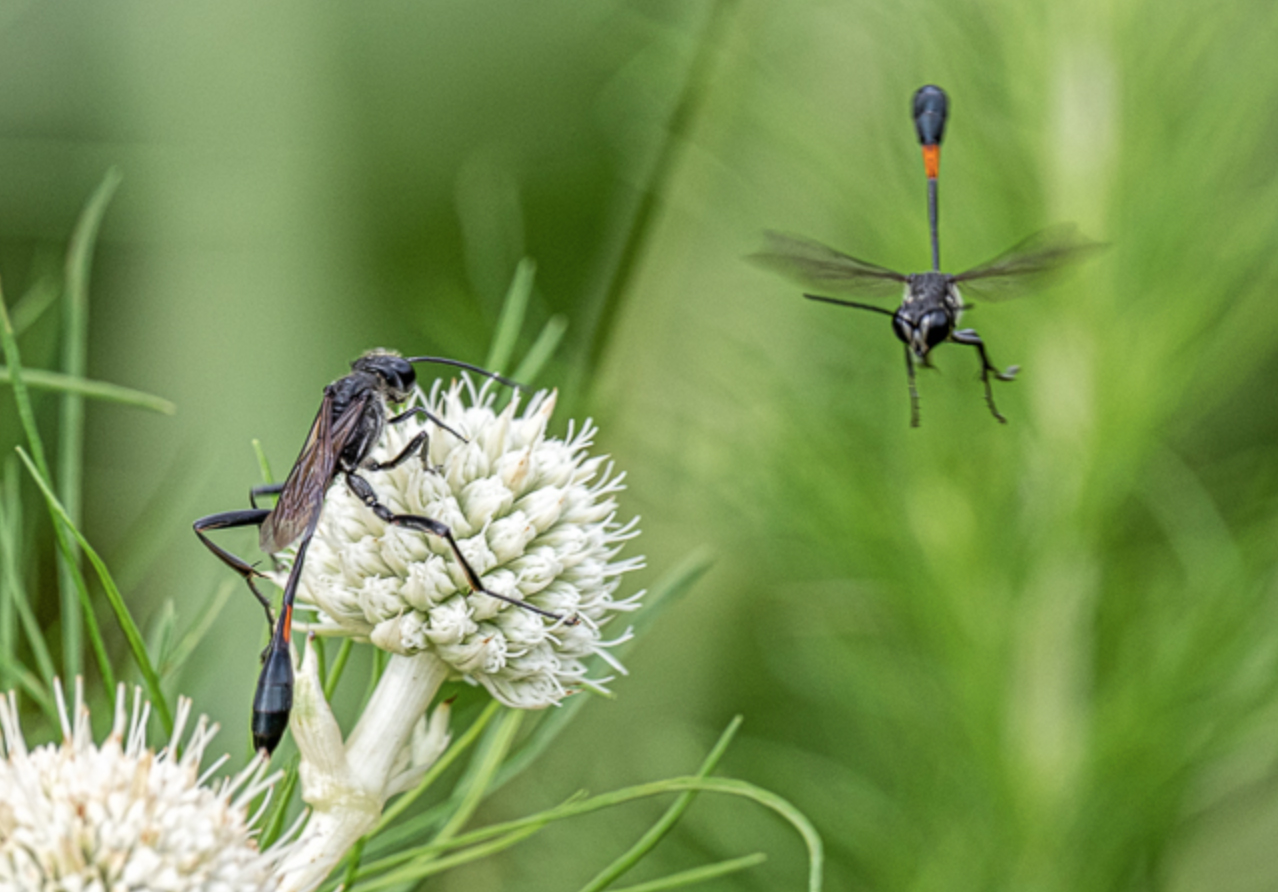
First thank you for showing a subject that I didn't even know existed. I feel the capture of the insects is sharp and clear and you rendered the background in a pleasing manner that really helps to bring out the subject.
For me the large white flowers work against the subject. Since the eye is drawn to the light and bright my eye goes immediately to the flowers and not the wasps. I have included a rather heavily cropped sample that I feel brings the wasps into a more powerful position in the image. The two wasps are position so that the one on the left is on a fixation point and the one of the right is on an upper fixation point. This creates a diagonal line type of composition that is more powerful. You might even consider bringing down the highlights just a bit to reduce the impact of bright white flowers. |
Dec 13th |
 |
| 67 |
Dec 19 |
Comment |
This is a favorite location when I hike in Wild Basin. I feel you did well to crop out the sky and it is bright and simply takes the eye away from the main subject. I also like the treatment of the water as you managed to show so me texture in the water which gives it greater interest. This is easily one of the better summertime images I've seen of this cascade. This composition works quite well ( the bridge really makes it hard to shoot anything else). I've often wondered if there is a composition other than this straight on format----but I have not found one. :-(
This is an engaging and interesting shot. Well done. |
Dec 13th |
7 comments - 12 replies for Group 67
|
| 69 |
Dec 19 |
Comment |
Brenda
Here is the crop I had in mind. I also made a few adjusted to the image. I was working from a screen capture so the quality is not the best.
I'm traveling right now--- I'll comment on the snow leopard when I get home. |
Dec 2nd |
 |
| 69 |
Dec 19 |
Reply |
Glad you like the idea. I think when it comes to cropping we too often fall into the trap of trying to save the whole thing (you know--keep all those pixels we paid for) or we fall for one of the standard size formats (8x10, 11x14, etc) When the image is displayed digitally, we are free to get it perfect, so why not. I recently read an article by some noted photographer who said that most of the time we can crop 1/2 of the foreground from most images and not even miss it. I have thought about that quite a bit over the last few months---it works more than you think.
If you send me an email address, I'd like to comment about your snow leopard shot, I just saw it tonight. treadwl@comcast.net
Anyway---you still have a great image. |
Dec 1st |
| 69 |
Dec 19 |
Comment |
This has lots of interest. The sky is lovely. There is a goo natural frame at the top. You have a foreground with detail and it all ties together well. I would consider cropping off the area on the left side including at least half of the big dark tree and serves only to chop up the scene. |
Dec 1st |
2 comments - 1 reply for Group 69
|
| 78 |
Dec 19 |
Reply |
I think I like this one best of the vertical shots. Overall the horizontal is a better composition. The color vertical makes the boat on the far right such a dominate force that it is disturbing. However the B/W I think works for what you are trying to accomplish. |
Dec 26th |
| 78 |
Dec 19 |
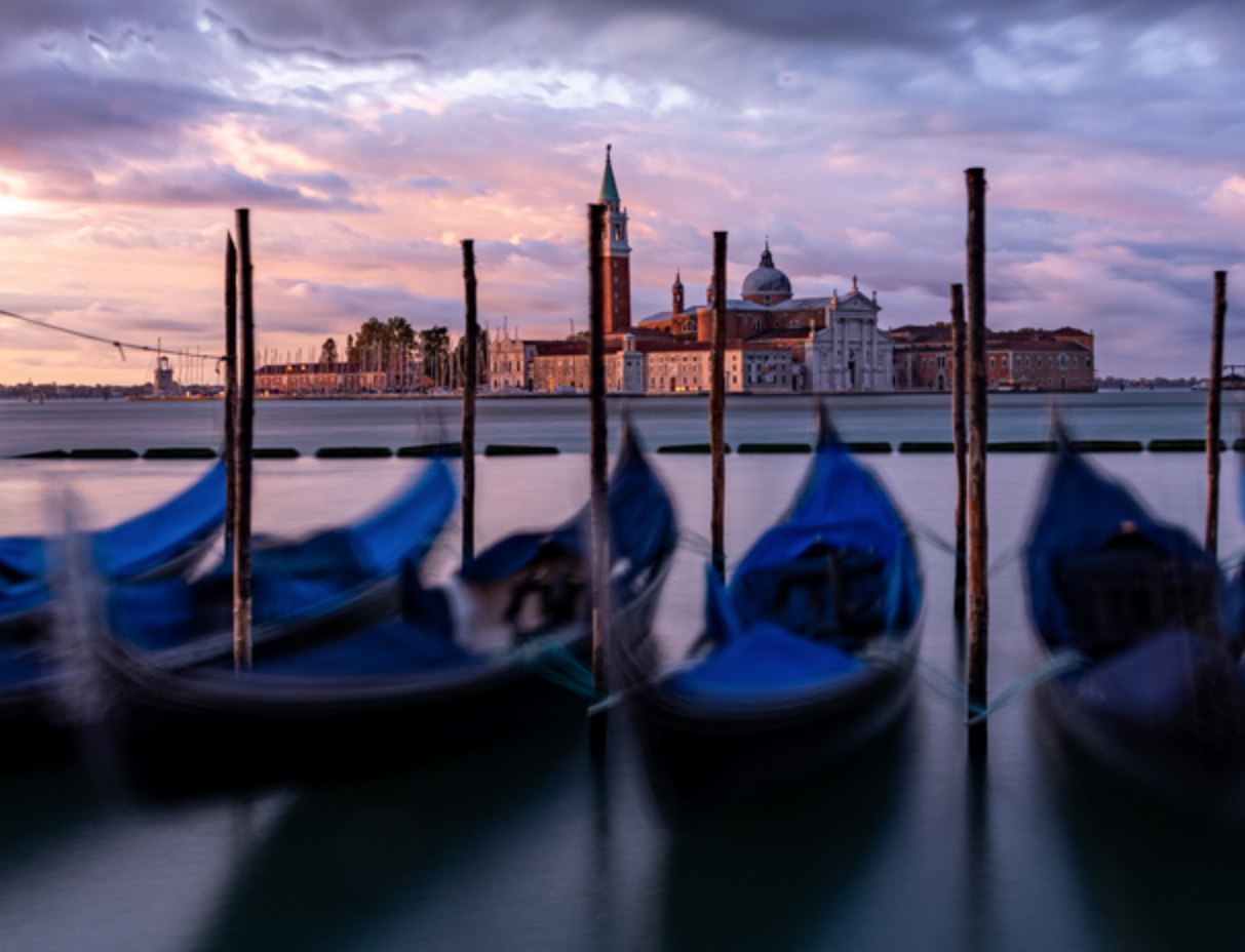
Comment |
This is an interesting effect, but not really my personal preference. What you did worked well, but maybe could be a bit more blurred.
I have several crop suggestions. First the boat pole that merges with the tower might be adjusted to separate the two of them. Since the boats are the real subject maybe give them a bit of breathing room at the bottom edge and use their shadows to create leading lines to the boats. I would crop off the crowd of poles on the far left and the partial boat on the far right. The poles look very busy and the partial boat (since it is so small) looks lost. By cropping some of the dark sky you drive more attention to the boats and also help to shift the horizon line out of the middle.
Opps---maybe just barely crop off the pole on the right in my attached image.
Just some things to think about. Maybe try some variations andsee what you like. |
Dec 5th |
 |
1 comment - 1 reply for Group 78
|
| 89 |
Dec 19 |
Comment |
If you are working on the concept of negative space,then this works quite nicely. Even better if you moved it up just a little bit from the bottom.
Everything doesn't have to be cropped tight.
Nice shot. |
Dec 9th |
1 comment - 0 replies for Group 89
|
18 comments - 14 replies Total
|


