|
| Group |
Round |
C/R |
Comment |
Date |
Image |
| 7 |
Nov 19 |
Comment |
I do love the drama of the old time engines. If it were mine I'd crop off the engine on the right. It is not contributing much smoke and you would also lose the white building behind it that is annoying.
This is just plain awesome. |
Nov 6th |
1 comment - 0 replies for Group 7
|
| 15 |
Nov 19 |
Comment |
This is a real eye grabber. The red really does hold the eye as a focal point. You also have a unique sky that draws attention and I like the way you blended it in the water.
That said I would reduce the foreground water maybe up to the reflection of the mast in the water. As is the horizon is too much in the center for me and the reflection of the sky would still be in the water even with the crop and thus preserving interest.
This is a neat Maine harbor image and captures that region quite well. |
Nov 10th |
1 comment - 0 replies for Group 15
|
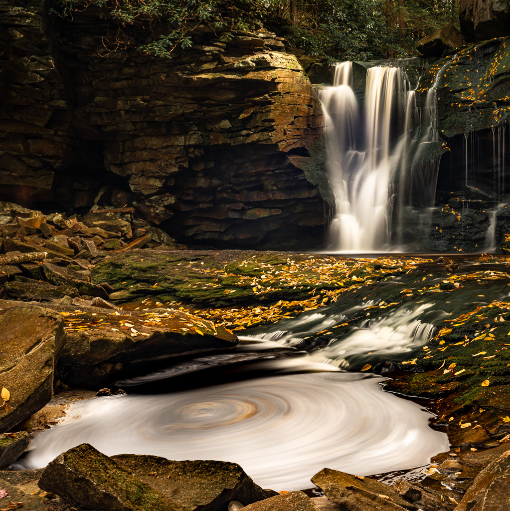
| 29 |
Nov 19 |
Comment |
OK, just color me green with envy. I've been looking for a swirling pool of water with fall leaves to blur with a long exposure as you have done. I have not found one as yet. Note I live in Florida and we do not have that sort of thing.
I really like this image it is the unique look of the swirl that makes this a winner. Too bad you can't do something to darken that overexposed bit of sky just above the falls. Maybe it can be dimmed. |
Nov 10th |
1 comment - 0 replies for Group 29
|
| 32 |
Nov 19 |
Comment |
I think your title of "Jumbles" works well. This is a talent I do not have. You have done a fine job of creating something out of nothing. A real talent. I also like your processing. The highlights make the image come to life and provide character. I've seen several of your images and this is by far the best. Well done. |
Nov 11th |
1 comment - 0 replies for Group 32
|
| 47 |
Nov 19 |
Comment |
Hi Don. Stephen's suggestion I am visiting from Group 67. This is an exceptional shot. I read your description and noted how you "suffered" to capture this image. For me, the adventure of getting to some of these iconic locations is half the fun and satisfaction. However when you get there you must have the gear and the skills to make the capture worth while. In this shot your angle of view is spot on and the time of day and the light make all the difference in creating this masterpiece. May I suggest a slight crop on the left edge. There is a small spot that looks to be burned and a slight crop will make it perfect. I like how you used the dynamic range of your camera to capture the shadow areas with detail without the loss of detail in most highlights.
Well done. |
Nov 10th |
1 comment - 0 replies for Group 47
|
| 48 |
Nov 19 |
Comment |
Is this the Nubble (Portland Head Light) in Maine?
It is a excellent concept, but I wish it was straight |
Nov 6th |
1 comment - 0 replies for Group 48
|
| 62 |
Nov 19 |
Comment |
After reviewing all three images, and reading your comments i think I like #3 the best. I also like the crop suggested by Oliver. That was going to be my suggestions. That crop helps to frame the lighthouse. |
Nov 10th |
1 comment - 0 replies for Group 62
|
| 67 |
Nov 19 |
Reply |
Wayne
Thanks for your thoughts.
PSA does not allow cloning out parts of an image in the Nature category. If it is for your own purposes, then cloning is just wonderful. If the stick you mean is the one that sort of connects the two rocks in the left hand pool, well that one I do not mind. For me it is sort of a leading line to follow the direction of the creek. I do get your point. I would be more concerned if the stick were in the middle of a lake with still flat water---then it would probably have to be removed.
Thanks for your suggestion. |
Nov 22nd |
| 67 |
Nov 19 |
Reply |
In the end, it is your images and what is right is what you like. Conventional wisdom (what the photo gods say) is that diagonal shorelines, streets, fences and the like should be anchored in shallow corner if they reach most of the way across an image. On the other hand if the little bit of shore line only covers 25% or less of the bottom it is acceptable (maybe not in a vertical format)
In your image I don't mind the way you cropped this image. Mostly because the shore is not a sharp contrasting color to the water and it sort of blends in. I do like this crop.
One other note--it is generally a bad idea to flip iconic landmarks. If it is something people will recognize they will notice what you did. If you are flipping for yourself--all is good. |
Nov 22nd |
| 67 |
Nov 19 |
Comment |
Let me start by saying that I am not a fan of Topaz as I personally feel it is too much of a gimmick and detracts from the feel of nature. But in this image it really seems to work quite well. This just drips with the feeling of nostalgia. While the trees are softly blurred the cabin is just sharp enough. It works quite well. The low angle of view creates a powerful foreground that draws the viewer into the scene. The composition in this image is perfection. As Todd suggests, a slower shutter speed creating the cotton appearance for the water will make it more visible and more importantly contribute to the dream like feeling.
Looking at this image I feel like I've gone 100 years back in time---it is a good feeling. This had better be on a wall. |
Nov 11th |
| 67 |
Nov 19 |
Comment |
There is much to like with the image and I can see why it is a favorite. Normally the tree canopy would be too much and make the image feel top heavy but the fall colors make this composition work well. Also, you low angle of view adds a great deal of drama to the image so that was a good choice as well. The large rocks in the foreground and the leaves scattered about help to bring the viewer into the scene. I would suggest cropping out some of dark area in the lower left corner as it serves no purpose. I know you like faster shutter speeds for water but in this case it makes the water disappear. I slower shutter, would turn the water whiter and help to make it stand out. I also agree that these colors could be enriched and build the feeling of being in the forest. You also made a great choice to eliminate the sky. Forest images just look better without sky. Todd is correct about that technique--that Art Wolfe class paid off.
I do hope you have this hanging on a wall. |
Nov 11th |
| 67 |
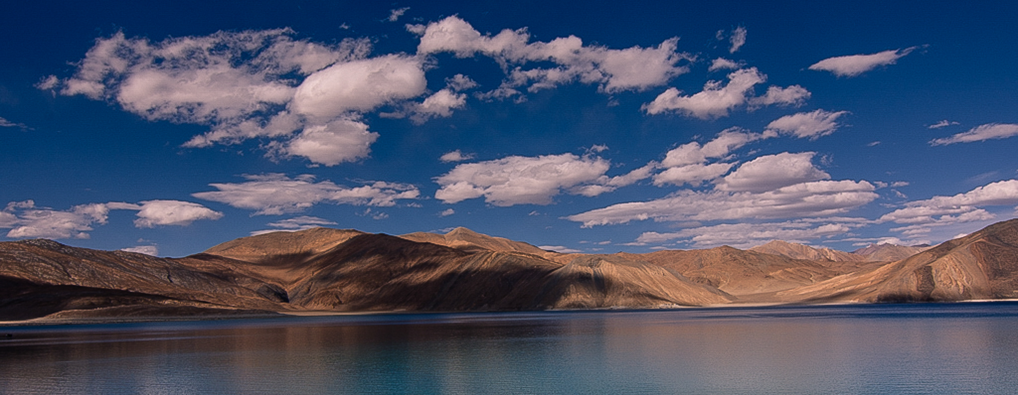
Nov 19 |
Comment |
Stark high altitude lakes like this can be so dramatic in appearance and this is no exception to that rule.
I have two thoughts on composition. The first is if you are going to have a diagonal shoreline at the bottom you should anchor it in the corner. That is move it all the way to the right corner so that there is a piece of land all the way across the composition. Second, I'd crop it off altogether creating a more panoramic view. There is just too much blank space on the water that lacks interest.
I'm including my crop suggestion. Note I also cropped some of the sky and tried to add some punch to the mountains as well.
The image is a bit pixelated since I had toworkoff the small size. |
Nov 11th |
 |
| 67 |
Nov 19 |
Comment |
Wayne
Stormy weather often look quite good in B&W so I feel you made a fine choice. I think your crop is good, but I like Todd's crop even better. The real story here is the clouds and Todd's crop makes you look at them. Madhusudhan is also right about the position of the tree. Moving it to the left just a bit would a line it more with the rule of thirds since as it is it seems to be falling out of the frame.
My thought is that perhaps you should be lower. That river or lake on the far left really draws the eye. If you were lower it would disappear and then the total focus would be on the sky and the wind tossed tree. You are right about the tree---it certainly looks wind tossed and I can actually feel the wind blowing. |
Nov 11th |
| 67 |
Nov 19 |
Comment |
When ever I come across a field of flowers I always look for the loner, the one that stands somewhat separate, so that I can isolate it. Using a telephoto is a great way to do this. You made some great choices with this shot. Using the sky for your background (doesn't look like a sky) really creates the space needed to make the background smooth and seamless.
I agree with Michael about the sharpening. The flower does look soft. In Lightroom in the sharpening menu try the following: Amount set to 40-50, Radius set to .5 and detail set to 90-100. Do this after you have made all your other edits. It must be the last thing you do.
In the realm of composition the big leave at the bottom is quite distracting. A bit of careful pruning would certainly help. Otherwise positioning is great.
As a side note, I've found using long telephoto lenses in this manner since (I'm guessing) you hand held this makes seeing everything in the back ground harder.
Still, this is a real eye catcher. |
Nov 11th |
| 67 |
Nov 19 |
Comment |
OK
With thanks to all here is a new edit.
The big log has been dimmed (looks better I think)
The intruders with the white hat were requested to leave and have departed.
You guys are the best! |
Nov 10th |
 |
| 67 |
Nov 19 |
Reply |
Great eye Todd. I did see those people when I finished the edits. So I put the image back into Photoshop and removed them. I just posted the original and not the edited version.
Thanks for calling it to my attention. I removed the people version from my files today. I appreciate the heads up. |
Nov 10th |
| 67 |
Nov 19 |
Reply |
Hi Bob. Thanks for stopping by. As I mentioned to several others---moving to the right is not possible, there is a drop off and a serious hazard to my well being if I tried.
I agree with you--yes, I might have too much log, but no it does not bother me. The log sort of acts as a leading line to the falls. That is my story and I'm sticking to it! |
Nov 10th |
| 67 |
Nov 19 |
Reply |
As I told Mark, moving to the right would be hazardous to my health. Somethings just can't be done. I did give it a thought however. I'm sorts of dumb light that sometimes. |
Nov 10th |
| 67 |
Nov 19 |
Reply |
Thanks for the suggestion about moving to the right. If I did you might need a new administrator for this group--there is this drop off and I didn't like the idea of falling in. :-)
As for the other photographer---well, to each their own... |
Nov 10th |
| 67 |
Nov 19 |
Reply |
I gave the darkening a try when I was working on this image. If I darken it then the side starts to become a black hole and then I could just crop it off. If I crop the brightest part then the pool at the bottom left loses its boundary.
What a mess!
I'll try dimming the brightest part and see how that goes.
Thanks |
Nov 10th |
| 67 |
Nov 19 |
Reply |
Thanks for commenting. |
Nov 10th |
| 67 |
Nov 19 |
Comment |
Since Mark is now to our group I'm going to help him out this time. Mark, when you make a comment you can add an image such as the one you just sent me. This is the purpose of the Discussion Group. When people make suggestion they can make an edit of your image and post it with comments as to what they did. You can likewise read comments and suggestions and try the edits yourself and post your results. Since you sent me the edits you made based on my comments, I'm just posting it for you to save time and avoid the back and forth. I'll add my comments on this edit later as I have to get out to take a photo this evening.
Here is Mark's comment based on my comments and his new edit of the photo.
I really appreciate the feedback on my photo. I made a number of changes, listening to your guidance. I tried to change this to a vertical composition. Although slightly less rectangular, I was able to get the waterfall on the 3rds, and I cropped it to include the small waterfall on the right. That and the flowing water into the pool seems to be a natural diagonal line. I am not sure if you can post this one as well or not, but I would be curious to get feedback on this version.
|
Nov 7th |
 |
| 67 |
Nov 19 |
Comment |
I forgot to mention. I really like the frame of rocks you placed around the pool. These rocks contain the pool visually and add emphasis to it. You provided neither too much nor too little of a frame. Well done. |
Nov 7th |
| 67 |
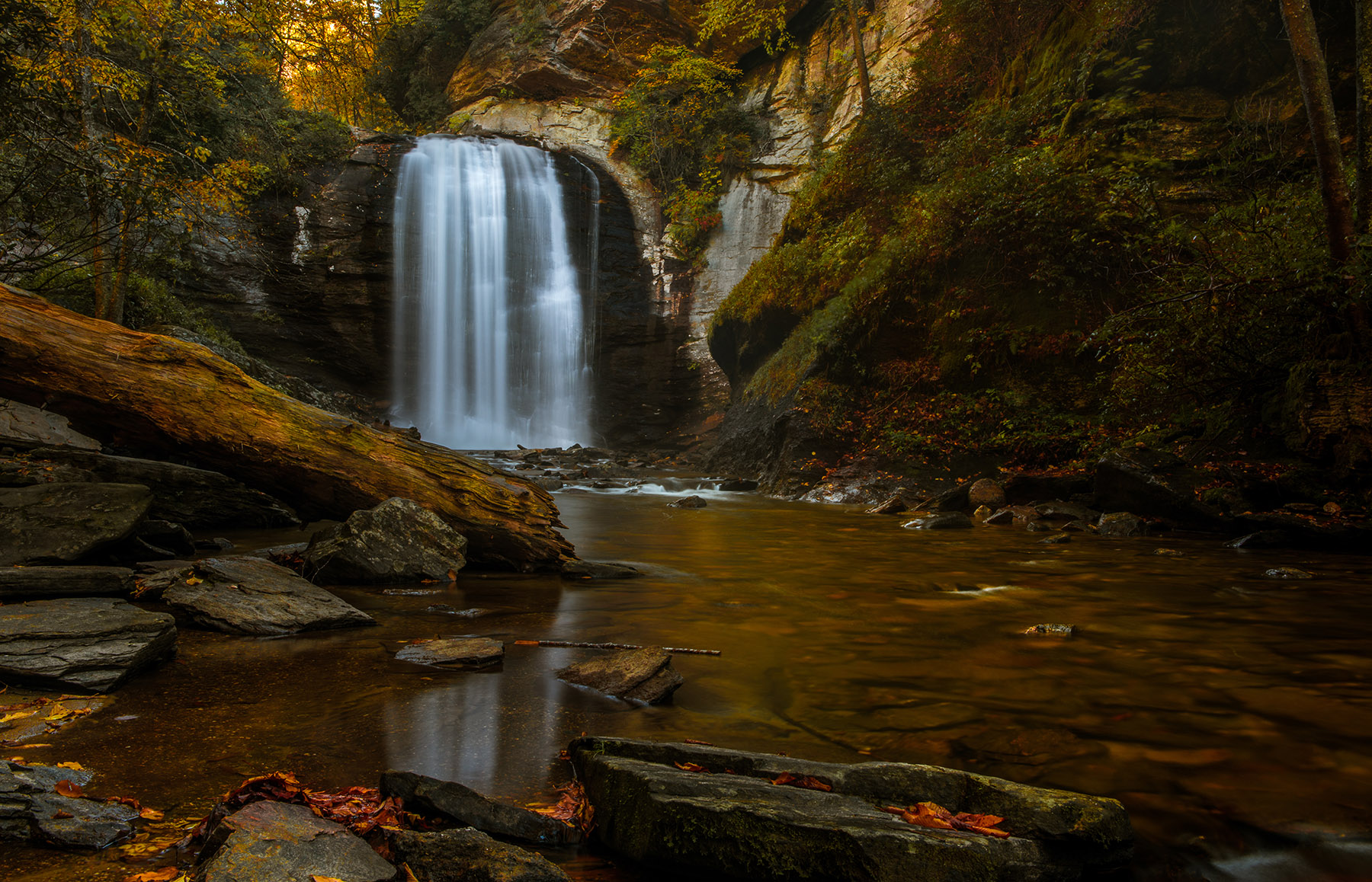
Nov 19 |
Comment |
Mark
Both your falls and mine share the common concept of being a bit on the dark and moody side. It would appear that much of what we do revolves around how we "feel" the image should look. There is no right or wrong to this approach, as it is after all our work and we are pleasing our own tastes. That said I offer the following thoughts---these are how I would deal with this same image and may not be to your tastes.
First, and this may be a matter of both taste and/or appearance on the monitor. Modern camera have a wide dynamic range, not as good as our eye, but good none the less. When you were onsite your eye saw much ore detail in the shadow areas then what shows in your image. I am not saying to eliminate shadows, some of your dark areas might be opened a bit in lightroom to replicate what the eye sees.
Second, as this image stands please consider cropping off the tree trunk on the far left edge.. It adds nothing and is annoying.
You mentioned trying to enhance the colors so I offer this technique as a suggestion. In Lightroom using the HSL sliders and working with both saturation and luminance separately start by moving the green slider to the far left. Then drag the yellow, orange and red sliders toward the far right as your tastes dictate. For this image, maybe not the red slider so much. I generally work the saturation first andthen use the luminance to add some "glow".
Now I am speaking like a photo judge. Your image has the feel of being quite centered. When working with symmetrical images this works fairly well, but in competitions it generally does not.
You subject is captivation but you could perhaps add some dynamics to it using diagonal lines. Rising diagonal lines add power to an image. You have a natural diagonal line rising from the pool in the foreground to the falls in the background. This line can be magnified if you shift your position slightly to the right moving the pool to the left and placing it on on the lower left fixation point while shifting the falls to the upper right fixation point.
All of your tones in the image are dark, even the falls is not really white. If you like this feeling or mood then it is perfect and keep it as as. Contrast draws the eye of the viewer so by selectively brightening the pool slightly and adding some contrast then brightening the falls slightly more than the pool you would move the eye across the scene as well as forcing it on the subject of the falls. All this can be done with the adjustment rush.
Finally, and this might be due to the reduction of quality necessary to post this image and or my monitor, but sharpen the image as it appears toe somewhat soft. PSA judges are fanatics about sharpness.
Make no mistake. This is a truly fine image and anyone would be proud to claim it. This shows a good eye and some fine camera skills. As is it stands out as one of the better images I've seen from all 90 groups of the digital discussion forum. Fell free to reject any or all of my comments. Your work does not need my approval, it is excellent. |
Nov 7th |
| 67 |
Nov 19 |
Reply |
Oh good---one vote for my preferred crop. Thanks. When shooting falls and pools like this I always use a polarizer---that is what makes the clarity possible. A secondary effect is how it really enhances the colors. Controlling the dynamic range is just something I think about all the time. It is the reason I get out early when the light is not harsh. Mid day photos do not work well for me. I was looking over my favorite 12 photos from last year recently and every one of them was shot within 90 minutes of sunrise or sunset or in the dark.
Thanks for stopping by to comment. |
Nov 6th |
| 67 |
Nov 19 |
Comment |
I'll write a more detailed comment later but for now just color me green with envy. I have looked for this kind of swirl (I have hope for colored leaves) for several years and have not as yet found one. I really like this look. Nice shot. |
Nov 5th |
| 67 |
Nov 19 |
Comment |
I would welcome a discussion on my cropping dilemma. Should I crop out the tree in the upper right corner? and should I crop off some of the left side so that the long is not so long? Should I do one or the other or both?
Personally,I've tried it all three ways and I like this the est, but I'm open to suggestions from the experts. |
Nov 3rd |
11 comments - 9 replies for Group 67
|
| 71 |
Nov 19 |
Comment |
This just leaves me speechless. I love the rim lighting on the sheep and the dust makes it simply over the top.
If you have to crop this to make a print---I suggest cropping from the right. |
Nov 6th |
| 71 |
Nov 19 |
Comment |
I love shots of the Milky Way so I am naturally drawn to this image. I really like the composition idea and the placement of the MW. I agree that the light painting may be a bit much.
While I like the image and I've been looking at it a long time the longer I look the more it just feels unnatural. The fact that you left part of the drift wood unlit makes the image look a bit fake. I know you will go back next year and try again----I wish you the best of luck. |
Nov 6th |
| 71 |
Nov 19 |
Comment |
Hi, just visiting from group 67 and have been admiring your image. I'm afraid that I'm going to agree with Mike. The overexposed section in the sky where the sun is can be a bit annoying. In the future it may be best to let the sun get a bit lower and avoid that burn. May I also suggest cropping half of the lower section of water out. It would force more attention on the sky where the drama really is.
I agree that the rays of light and the drama in the cloud really make this image powerful. Over all, this is a fine image. |
Nov 6th |
3 comments - 0 replies for Group 71
|
21 comments - 9 replies Total
|


