|
| Group |
Round |
C/R |
Comment |
Date |
Image |
| 1 |
Sep 19 |
Comment |
I agree with the suggestions that have been made and if I may I would add one more. The very black areas of forest in the upper right corner just appear as black holes. This is not a natural look. If you were standing there you would see trees. not the black hole. I would suggest lightening those shadows just a bit.
Otherwise, this is a love and dramatic image. |
Sep 29th |
1 comment - 0 replies for Group 1
|
| 19 |
Sep 19 |
Comment |
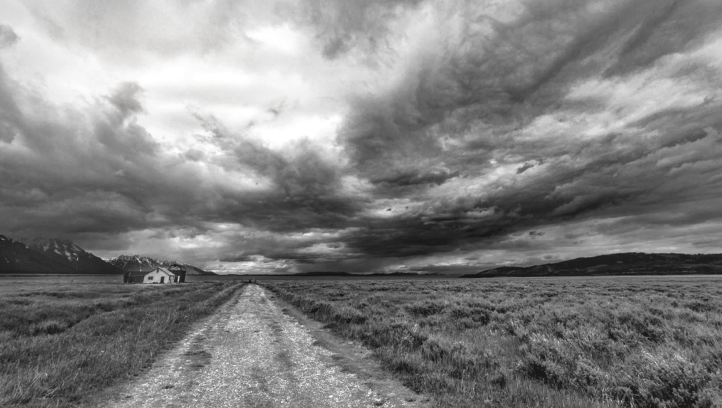
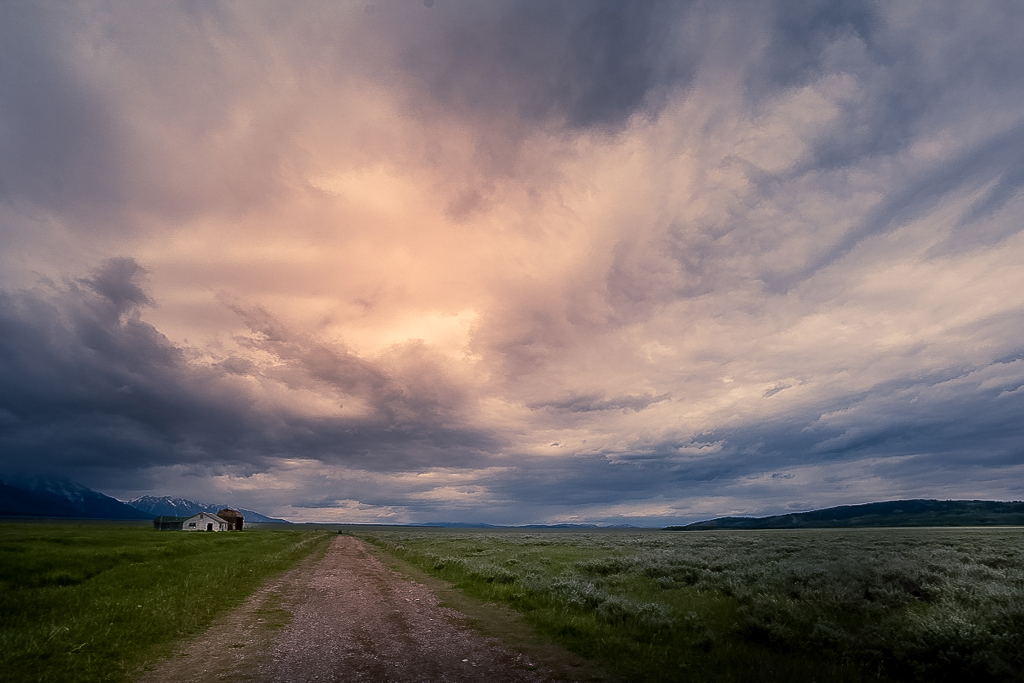
This is a powerful and most interesting image. However, have you thought about cropping off have of the clouds from the top? I think it makes the final image even more powerful.
Just a thought. |
Sep 29th |
1 comment - 0 replies for Group 19
|
| 24 |
Sep 19 |
Comment |
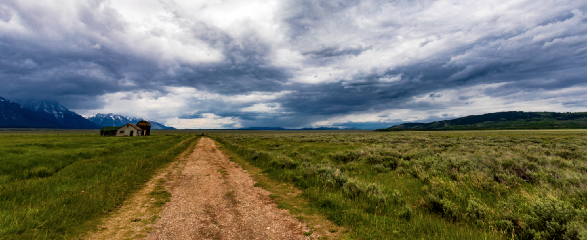
I feel you have created a beautiful Chamber of Commerce photo. Your composition is basically flawless, colors are rich and vibrant, and you have used the rule of thirds well both for the horizon and the vertical view. You have the perfect photo.
My suggestions for improvement are two. This looks like it was taken from a slightly elevated view and give me the feeling of a stand up handheld photo at eye level. Thus I suggest either getting lower and accenting the road and foreground to give greater strength to your title by making the road more dominant or getting higher to perhaps show more of the "S" bend of the road and thus create a more serene feeling. This would reduce the drama of the seen so you have to decide which feeling you want.
My second suggestion is to wait for the sun to get lower and thus create more dramatic shadows. Once you get the dramatic shadows then you would be back to choosing the angle of view I mentioned above.
As it is, you still have a quality image. Well done.
|
Sep 2nd |
1 comment - 0 replies for Group 24
|
| 28 |
Sep 19 |
Comment |
May I suggest to be careful with cropping from the right.d If you do crop from the right you will leave the moose in the center of the image and thus give the image a more static and less dynamic look. As is, this is a good environmental shot and there is nothing wrong with that. Speaking as a photo judge, I would award this a higher score as is than if you cropped it from the right. If you crop anything maybe a bit off the bottom to draw more attention to the moose. |
Sep 29th |
1 comment - 0 replies for Group 28
|
| 29 |
Sep 19 |
Comment |
As someone else mentioned, I am a sucker for waterfalls and this is a lovely beautiful settings. I'm not sure of it is due to the HDR or if it is just a bit over exposed. If you look at the heavy flow of water in the center of the falls there is no detail everything is just washed out. I don't know it you shot this in raw and can recover some of the detail or not but you might give it a look. |
Sep 29th |
1 comment - 0 replies for Group 29
|
| 32 |
Sep 19 |
Comment |
This is a clever "street" type image on a crowded bus. It does well to convey the feeling the the crowd and shows some creativity. You did a good job of keeping the brightness from the outside from entering the composition.
My only suggestions are in the area of composition. Note on the left side of the image there is a post like object. I would move the angle of the camera to eliminate this item. The other composition issue for me is the cropping of the rim of the mirror at the top. I feel that you should have included the entire rim since your photo is about the crowd as seen in the mirror. |
Sep 2nd |
1 comment - 0 replies for Group 32
|
| 33 |
Sep 19 |
Comment |
I feel as if this image has two competing subjects, the tree and the towers. You eye is drawn to the white trees and this helps to create the busy feelings. |
Sep 29th |
1 comment - 0 replies for Group 33
|
| 36 |
Sep 19 |
Comment |
What a grand image of a stunning scene.
Quiet--don't tell anyone, but there is a sensor dust spot in the dark cloud upper left quarter. :-)
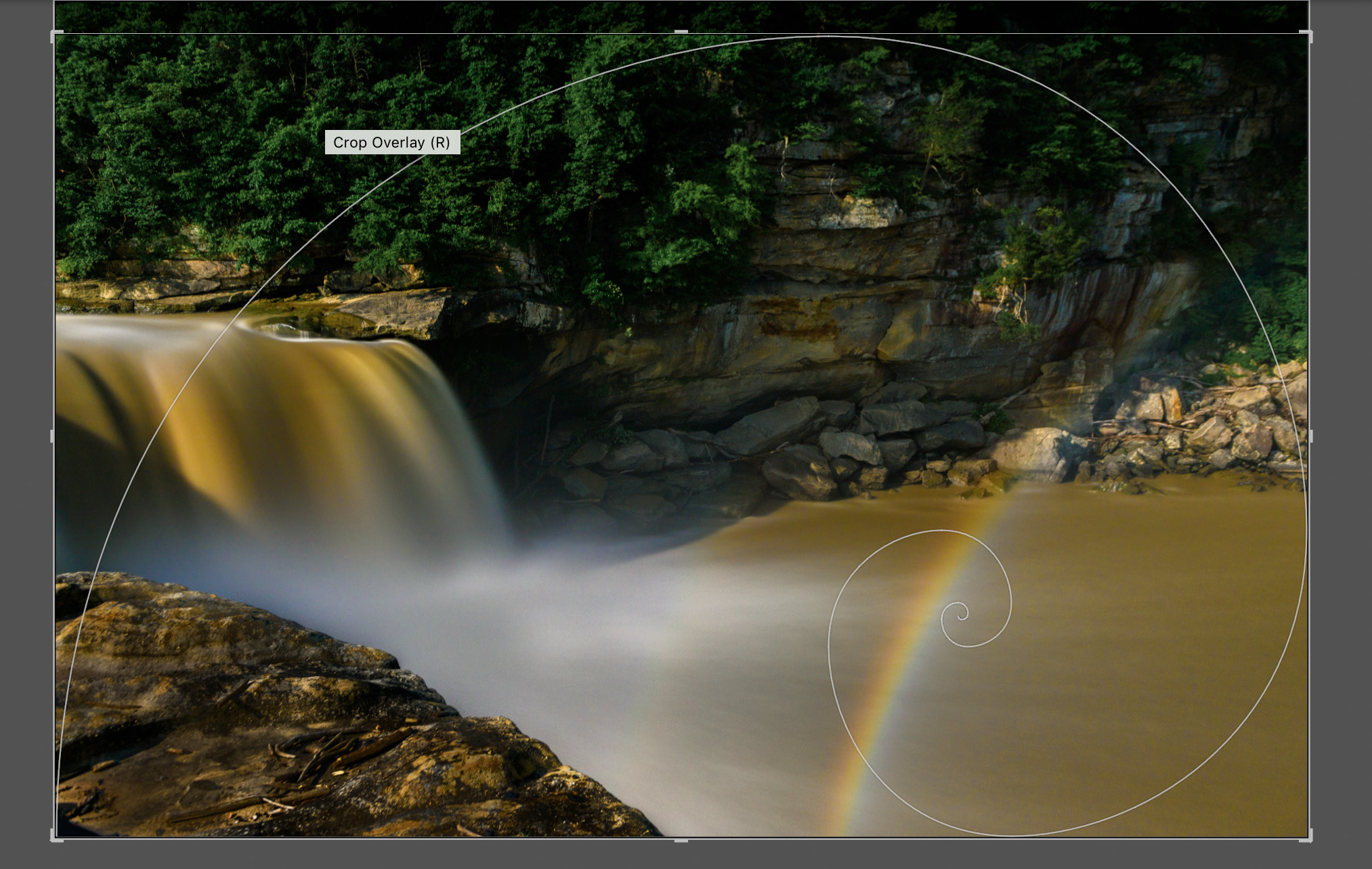
I really like your image however since this is a forum for discussion and suggestions I would like to offer the following. When I looked at your image and got past the initial impact I felt that there was too much sky. I put your image into Lightroom and then opened the crop tool. Then, by typing the letter "O" (not zero) Lightroom opens some crop overlays. I selected the Golden Ratio or the Fibonacci Curve. Using it as a guide I reduced the sky and and slightly moved the focal point of the curve to land on the falls. According to the Golden Ratio rule this crop produces a gentle and natural curve that is pleasing to the human eye. I offer it here just as a thought. You already have a fine image, maybe this could improve its visual impact? |
Sep 2nd |
1 comment - 0 replies for Group 36
|
| 67 |
Sep 19 |
Comment |
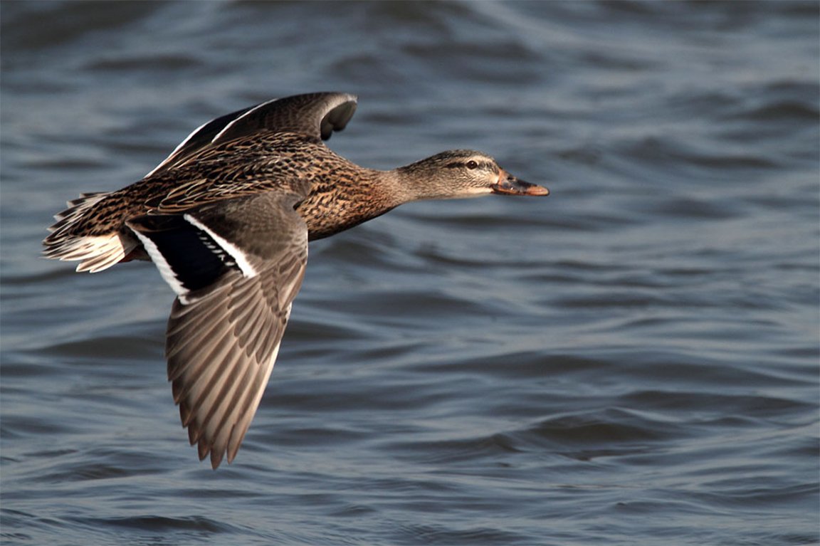
My last note for now. This image was entered in the contest.
While the background is clean and looks nice, the image itself is too ordinary. It is just a bird in flight.
It is sharp, had good color and is placed appropriately on the left fixation point it lack impact. We selected 45 of 302 images to move to the final round. This did not make the cut.
Tonight or tomorrow I'll show some of the final images so you can see what works.
Madhu---I also had a category of animals----I'll show you a few of those so you get the idea for beasts since tomorrow I'll show the fowl. |
Sep 24th |
 |
| 67 |
Sep 19 |
Comment |
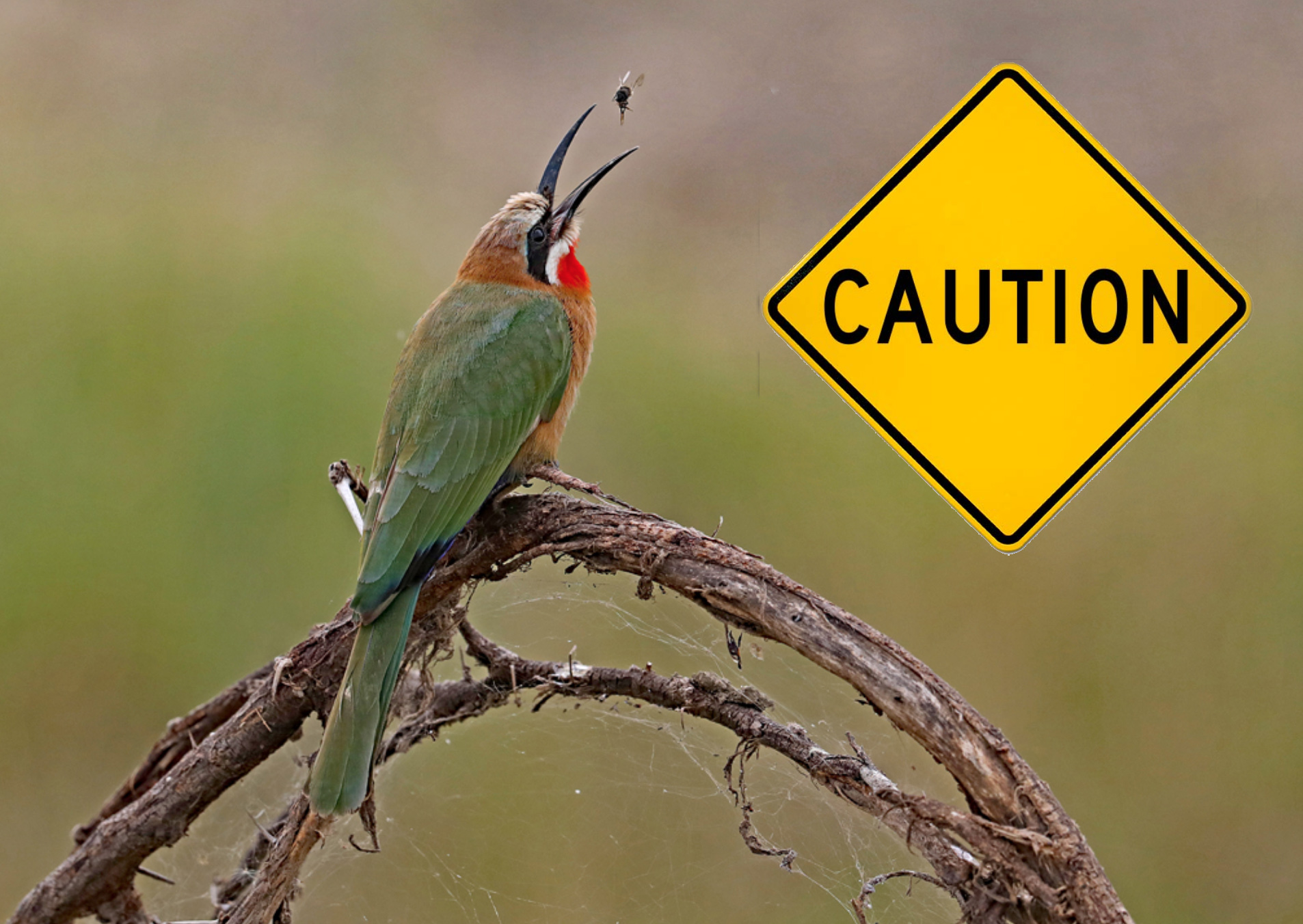
This is the flipped version so the birds faces the PSA approved left.
However, in this photo there is a "tell" that shows the photo is flipped--the sign. If you flip the photo the sign is reversed and gives away the fact that you flipped the image.
Does this make sense? |
Sep 24th |
 |
| 67 |
Sep 19 |
Comment |
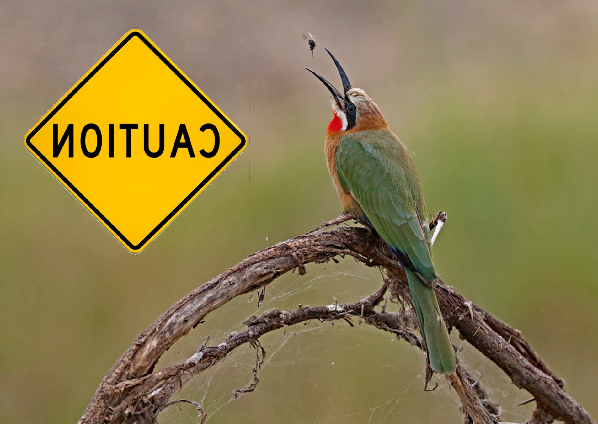
Hi Guys----this is a two part post. I finished the international contest judging and when I get all the final scores compiled I'll show some of the winners and why. For now I'll post two photos about flipping. First---I put in the caution sign for demo purposes.
In the first photo the bird is facing to the right. PSA does not like this. So if the sign was NOT in the photo we could flip this so that the bird faces left. So here is the first shot. |
Sep 24th |
 |
| 67 |
Sep 19 |
Reply |
I'll be looking forward to your questions about the crop guides. Ask what ever you want.
You were very kind with your compliment for this months image. Most do not know about moonbows and sadly in contest most judges don't even read the title so they get no clue. I really shot this just because I wanted to do it. Didn't care if anyone else liked it or not. But I do think the image is pretty neat.
Thanks again. |
Sep 23rd |
| 67 |
Sep 19 |
Reply |
I just posted a bit of PSA guidelines for birds on Richard's image. Most of what I mentioned you already have demonstrated but you might want to check it out just for reference sake |
Sep 23rd |
| 67 |
Sep 19 |
Comment |
When editing, or for that matter when shooting, always remember, the best images have the least distractions.
The following is just a bit of PSA guideline for images of birds.
I'm currently judging a international photo contest for the PSA and one of the categories was BIRDS. Just for the record, not a single photo made it past the elimination round (the first cut) if the bird was static (just sitting on a branch) or if the background contained distractions. Every bird was doing something. Also no flight photos if the birds was just flying in a sky. Something had to be happening even if it was just carrying a twig or a meal. |
Sep 23rd |
| 67 |
Sep 19 |
Reply |
Then I will be looking forward to a real mind blower for sure! |
Sep 23rd |
| 67 |
Sep 19 |
Reply |
Just so you know. While there is no written rule about which way an image should face the PSA favors having the image face to the left. If you are entering their contests the image should face left unless there is a tell in the image that would make it known that you flipped the image. Say something like a sing that would read backwards if you did the flip. |
Sep 23rd |
| 67 |
Sep 19 |
Comment |
I like the "Flamingo March" that you captured here. Just a question, I have hear that flamingo get part of their coloring from the shrimp that they eat. It may work for ours here in FLorida because we have lots of shrimp but do yours have access to shrimp?
Over all I think the image has a kind of comic appeal with all the birds lined up and the "officer" in the back (the biggest bird) sort of herding them along. If I were to make a suggest it would be to crop some of the blank sky, at least half of it. Since the sky is featureless, not even a cloud, it is really adding nothing to the image so why not get rid of most of it? Also, are the birds a bit on the soft side?? |
Sep 17th |
| 67 |
Sep 19 |
Reply |
I think the B&W makes the image more dramatic.
If you make the clouds on the right a bit darker than they already are it may increase the drama. |
Sep 17th |
 |
| 67 |
Sep 19 |
Reply |
Don't feel strange Richard. There were quite a number of people who were there who didn't even know that it was going to happen that night. Some even grew up in the area. Heck, one park ranger who said he had worked there for 8 years had never taken the time to see it. I found it really strange that people come from all over the world to see it and those who live in the area can't be bothered. Just so you don't think I'm completely stupid, I didn't stand there, I waited while sitting on the ground and even while taking a short nap.
Hope you enjoyed the image. The crop guides are not something I use all the time, but when I have a problem image sometimes they help me figure out what to do with it. |
Sep 17th |
| 67 |
Sep 19 |
Reply |
You don't need the lasso or any other tools.
First you make the new layer. Click on the layer to make it active.
Then click on EDIT. Scroll down to TRANSFORM. There will be an arrow on right. click on the arrow and a dropdown menu will appear. In that menu you will find PERSPECTIVE. Chose that option.
On the corners of your layer little handles will appear. Place you mouse on the handle in the upper left corner and drag it to the left.
If you do not have enough room to drag the handle reduce the size of the image by using COMMAND and the "(" key. |
Sep 9th |
| 67 |
Sep 19 |
Reply |
Most people really don't know what to do with that radial filter in Lightroom. There are lots of tricks like that that I introduce to people when I teach classes in how to use Lightroom creatively. You should just play with it. It might give you more ideas. |
Sep 9th |
| 67 |
Sep 19 |
Reply |
I agree with not centering the image. On the other hand something has to be done with the reds.
I also agree about shooting birds when they are "doing" something. However the really ruffled feathers do provide a good look. |
Sep 8th |
| 67 |
Sep 19 |
Comment |
Michael
Overall the image is quite exciting. The pose, action or color of the egret are all well handled. The eye, face and talon are exceptional.
There are two composition issues. Since Todd mentioned it there is that issue with the snag. PSA says you cannot remove it--but. . . As shown in the submitted image I think it looks worse (phony). By PSA rules I'd leave it and just silently curse it for being there. Otherwise I would remove it in Photoshop. Using the clone tool you could do it quite easily.
The other issue involves all those highlights on the left side. Since the eye goes to light and bright they just draw the viewer's eye. There is not much you can do but crop them out. You would have a few left at the top, but again, there is that clone tool that would clean it up nicely. |
Sep 8th |
 |
| 67 |
Sep 19 |
Reply |
Thanks Todd. You have no idea how exciting it is when that first image shows upon the LCD screen. After a 3 minute exposure and another 3 minute wait for Long Exposure Noise Reduction there is a lot of excitement when I finally shows up.
I did get to do some reading while waiting--at least until it got dark.
|
Sep 8th |
| 67 |
Sep 19 |
Comment |
First and foremost I want to compliment you on your selection of gear. PSA always likes to consider the photographer's gear and set of as part of the image. I think you chose wisely. But did you include lemon for the tea??
While I never like to see heavy crops you seem to have managed to keep good detail in the subject. The eye is clearly visible and the bird itself has a bit of character with the ruffled feathers.
Otherwise this little guys is really cute and appealing. I like him much better than if his feathers had been all smoothed down. It is amazing what you can find in a backyard when you have the proper gear at hand.
While you sort of honor the rule of thirds by moving the bird slightly off center I feel a slightly greater move to the right would improve its position. The bigger issue is the reds particularly those in the upper left corner. Red is an eye arresting color and it competes with your subject. |
Sep 5th |
| 67 |
Sep 19 |
Comment |
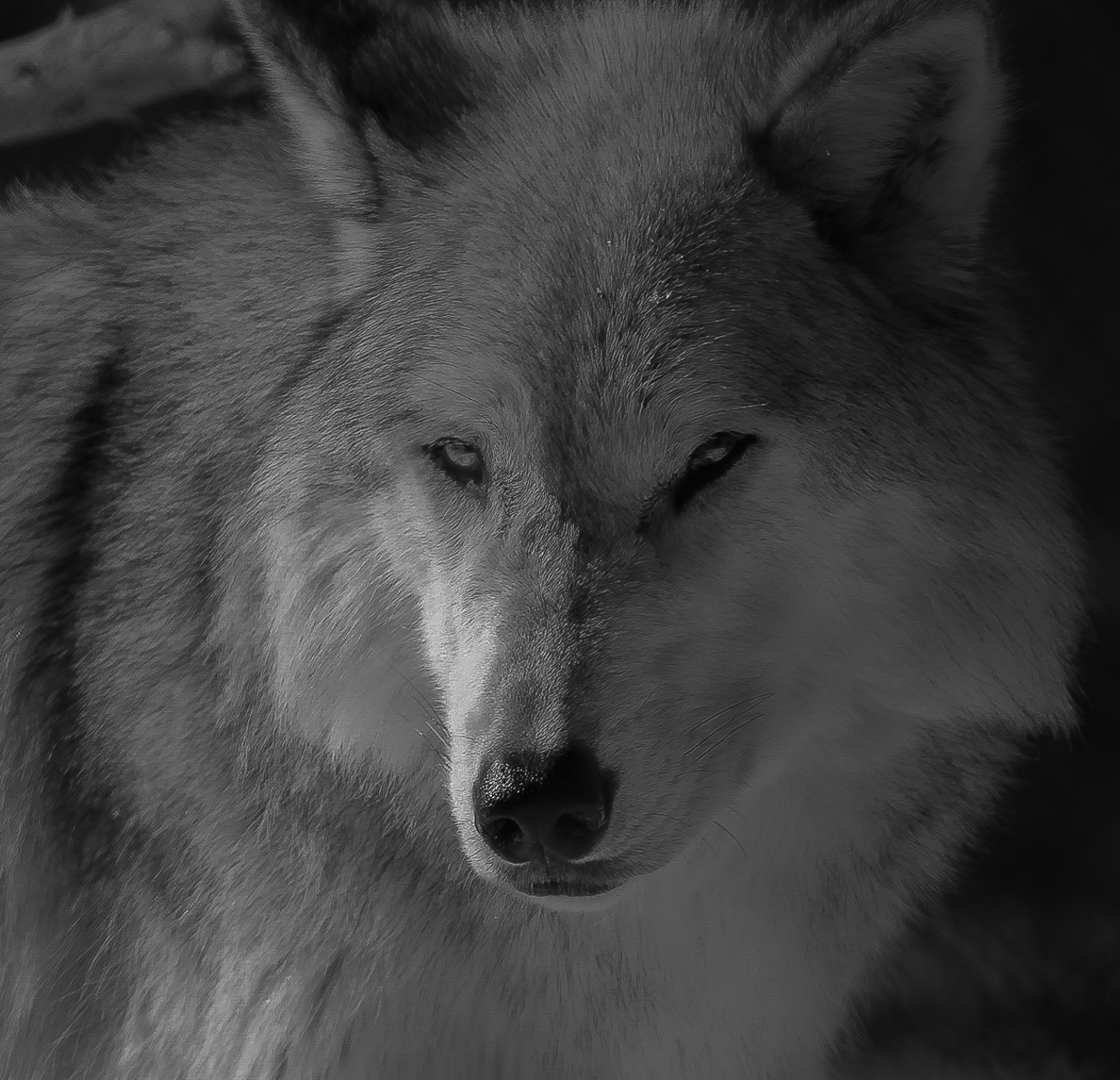
I think wolves and man have a kind of primal connection that I think makes many a nature photographer think of them as special subjects. This photo speaks to that connection. To be able to get this close to a wolf opens the door for all kinds of compositions. Your attempt to connect to the soul of the wolf is admirable.
After entering several photos in PSA contests I have become keenly aware of any burned highlights. These are always cause for a deduction. On the right side of the snout is an area that is partially blown. One way to prevent this is to always expose for the highlights. If you get those right, you can always open shadows to recover detail. It is hard to do the reverse. I spent so me time playing with your image and was able to recover most of the burned highlights, but in doing so it made some of the darker areas a bit darker as well. Since I was creating shadows I decided to embrace them and use them to enhance mood.
I did this with the GND filter in Lightroom.
Another thought that occurred to me was to turn this into a high key white photo leaving the eyes and nose the only things really visible. I saw a shot like this when I was in Colorado and it was quite powerful. Just something else to think about.
This is truly an eye catching image and make me fell almost intimate with the wolf. That is the mark of a successful photo. Well done.
|
Sep 5th |
| 67 |
Sep 19 |
Reply |
However, the more I looked at the clouds and remembered your intent to make the scene more ominous I thought about adding contrast and some clarity to clouds. When I did this I now regretted cropping the clouds. So I put the clouds back but kept the contrast and clarity.
On a whim I added a radial filter to the highlights in the clouds and then reduced the liminous of the entire scene. I took the adjustment brush and lightened the building (increased exposure) to make them a little bit more visible. The result is below.
It may change your vision, but it is an alternative. If you don'tlike it--throw it out. |
Sep 5th |
 |
| 67 |
Sep 19 |
Comment |
When I first looked at your original image I fully understood what you were talking about with the ominous clouds and the vastness. However when I looked at the edited version my eye was immediately drawn to the huge amount of now white clouds that dominated the sky. Thus my initial response was to consider cropping off about a third of the clouds from the top as shown in the screen capture below. |
Sep 5th |
 |
| 67 |
Sep 19 |
Comment |
Todd
I've always loved wolves, I just never get to see them in the wild. Love your image. I didn't have anything to do last night when I received your image so I did some playing with it. If you like what I did let me know and I'll explain my adjustments. |
Sep 5th |
 |
| 67 |
Sep 19 |
Reply |
Stephen, thanks for dropping by to comment.
You are basically right on both counts. In this shot there is a very faint secondary moonbow to the left of the main moonbow. The other time when I managed to get an image of the moonbow this did not occur.
You are also correct about the DOF indicators on older lenses and the new lenses work the same way. It works because of the optics with the glass and the apertures. thus at f22 with a 24mm lenses if you focus at about 15 feet in front of the lens you will also have infinity in focus. My problem when shooting the moonbow was that I could not shoot at a higher fstop. It is the reason I tried very hard to keep foreground objects from being in the image. I was afraid they would not be in focus. Therefore I had to get there even earlier to be sure I could get the spot where I could get the camera over the edge of the cliff and thus eliminate all foreground and still see the bottom of the falls where the moonbow would be visible. When I had previously shot the moonbow it appeared closer to the base of the falls. This it was more to the right which sort of surprised me. If you are interested you can see the winter moonbow I previously took here. The somewhat foggy weather caused the winter shot to be less clear:
https://reminisces.smugmug.com/America-the-Beautiful/Cumberland-Falls-Kentucky/Winter-Moonbow/i-Xvkc86K/A |
Sep 4th |
| 67 |
Sep 19 |
Reply |
Thanks very much Wayne. Cumberland was on my bucket list for a long time but well worth the trip. Even the one in March when the temperature was in the teens with wind.
I do know the math related to the fractals (the golden ratio is 1.618) and the theory says you find this in nature in things like the shell of nautilus and the the pattern of hurricane winds (how timely). All that doesn't mean much tome, I just like the way it builds strength in some of my compositions.
Over time I have discovered that the harder I work on a shot, the better it comes out. I've read books by many of the masters and try to take their comment to heart and then apply them. Heck, if they can do it, so can I--right?
But basically---I just enjoy it a heck of a lot. Being out trying to solve a photographic problem give me a natural high. |
Sep 2nd |
| 67 |
Sep 19 |
Comment |
As for your "LeaningTower" there is a very easy fix. Simply put the photo in Photoshop. Then make a new layer of the photo. Next go to Edit/Transform/Perspective. When the image appears there will be little adjustment handles in the four corners. Place your mouse on the handle in the upper left corner and drag it to the left until the building becomes straight. Then hit the return key to lock in the changes. Save the photo and you are done. |
Sep 1st |
| 67 |
Sep 19 |
Comment |
Something to discuss this month is my original photo posted here. It is a screen shot taken while processing this image in Lightroom. In the crop mode Lightroom has several cropping overlays to aid you in selecting the best crop for your image. The overlay shown here is the Golden Ratio, something that was known to the ancient Greeks and based on a mathematical formula. It is said to be the most pleasing ratio to the human eye. Note how the of the ratio is positioned on the bright mist of the falls. A second photo attached here shows how Lightroom allows me to shift the overlay. In this shifted position the of the ratio is now on the moonbow--a second focal point.
To access these crop overlays all you need do is while in the crop mode type the letter O (not the zero) and the overlays appear. To shift the position of the overlay hold the shift key and type the letter O again. The overlay will change positions. There are several different overlays available |
Sep 1st |
 |
12 comments - 13 replies for Group 67
|
| 73 |
Sep 19 |
Comment |
I love to the work of a master. You certainly got everything right with this image. The light is soft, the image is sharp where it needs to be and all lines lead to the subject. You have taken control of your viewer and lead them into your vision of this world.
Great to see a pro at work...
Larry |
Sep 18th |
1 comment - 0 replies for Group 73
|
| 88 |
Sep 19 |
Comment |
I went to Acadia a year ago and stood at just about the same location as where you took this image. You brought back some wonderful memories.
I think your composition works quite well for this scene and I very much agree that you cannot lose that coastline on the right edge. Like Lou I am a bit unsettled by the clouds in the left corner. However, I think that is a product of using HDR. Overall, I think you did quite well in the transformation from the original to the final photo. I have found that HDR generally brings out any sensor dust spots and I see a few in your sky area. I would also suggest you do some selective noise reduction in the sky--especially on the right side. Again the HDR process often brings out this sort of issue.
I feel this image really brings out the character of Schooner Point and this is certainly one of the better images I've seen of this location. |
Sep 3rd |
| 88 |
Sep 19 |
Comment |
I like the shot. The well is dramatic. I especially like a photographer who is willing to work to get his shot. Waiting for the right moment takes patience, but the rewards are always worth the suffering. Hope the water was not too cold. How did you shield your camera from the waves and the spray?
You did quite well getting this shot. Print it on metallic paper and frame it! |
Sep 2nd |
2 comments - 0 replies for Group 88
|
23 comments - 13 replies Total
|


